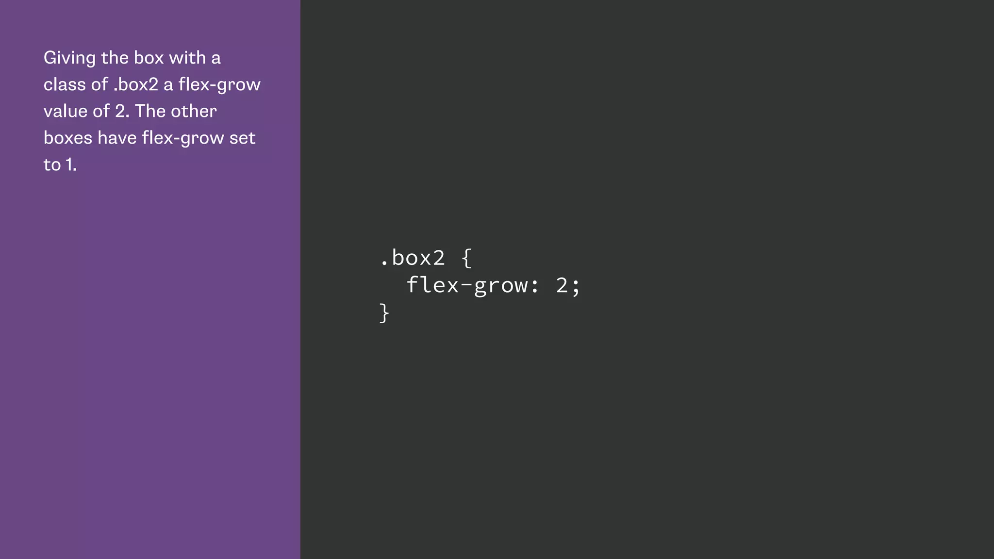
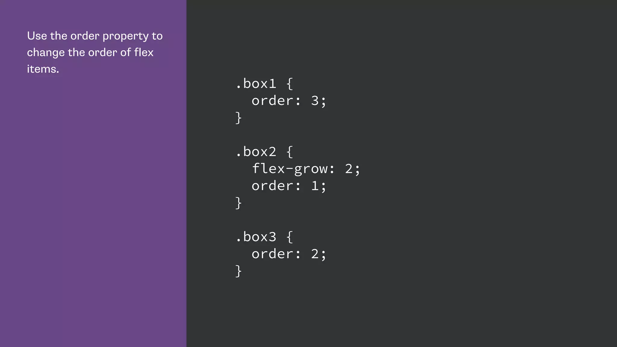
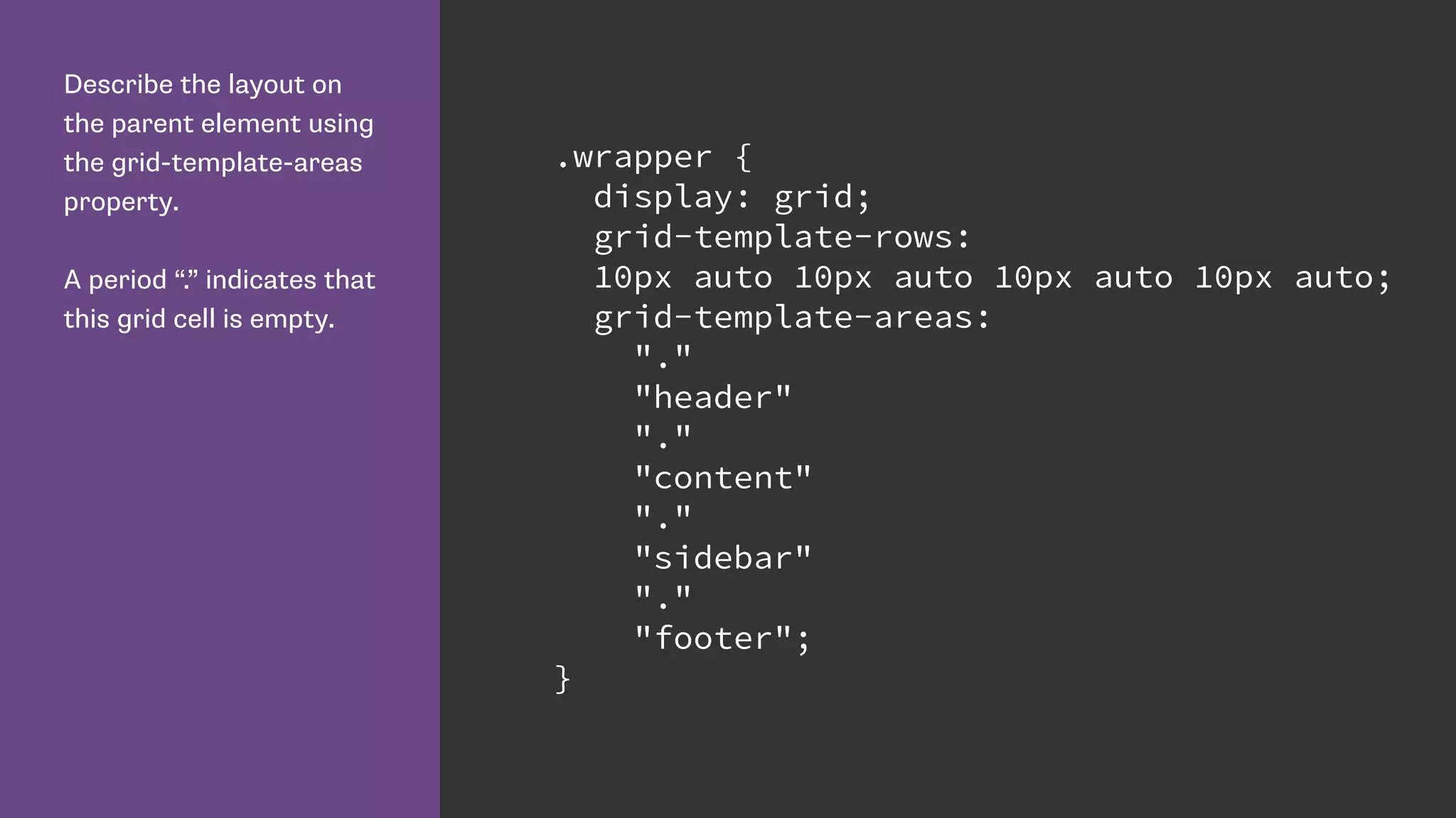
Download as PDF, PPTX

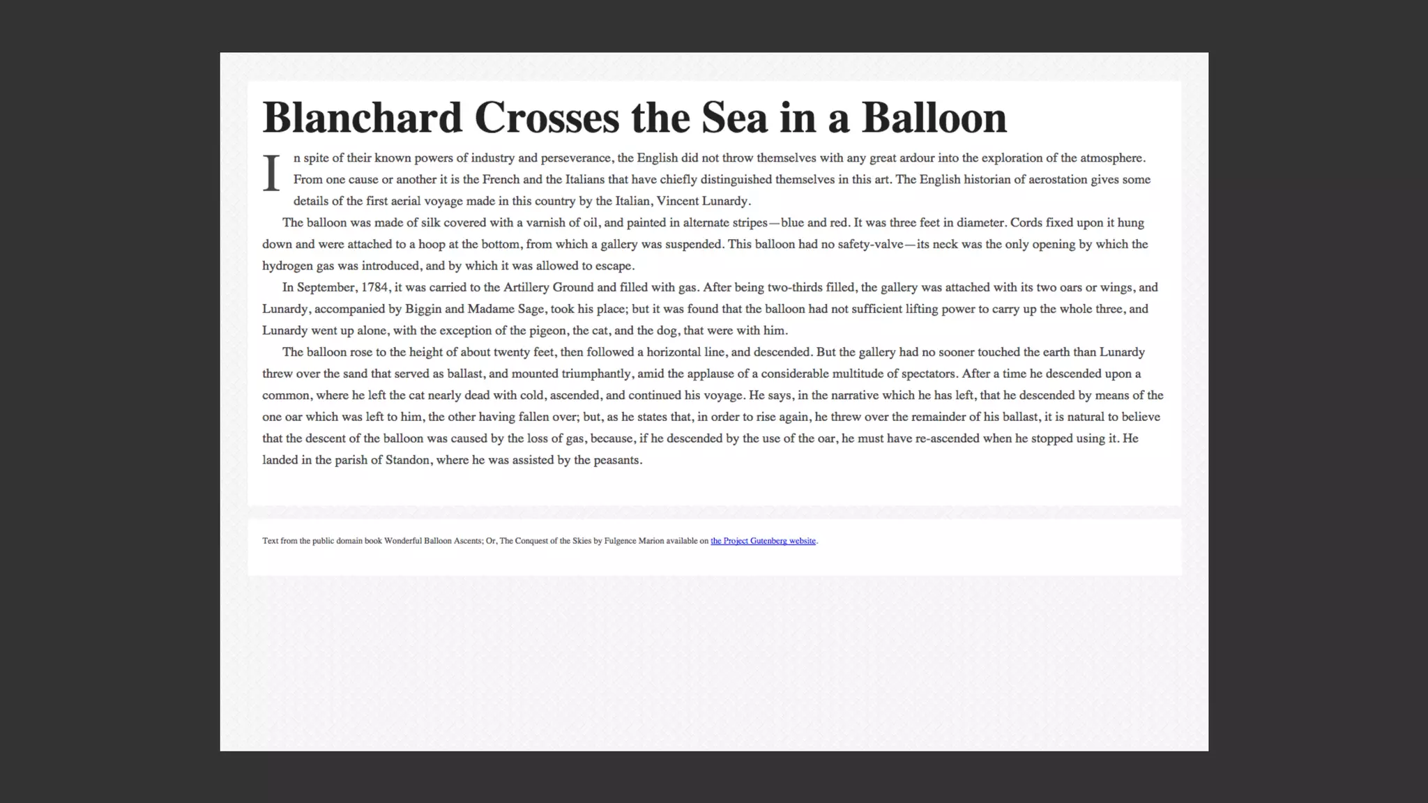
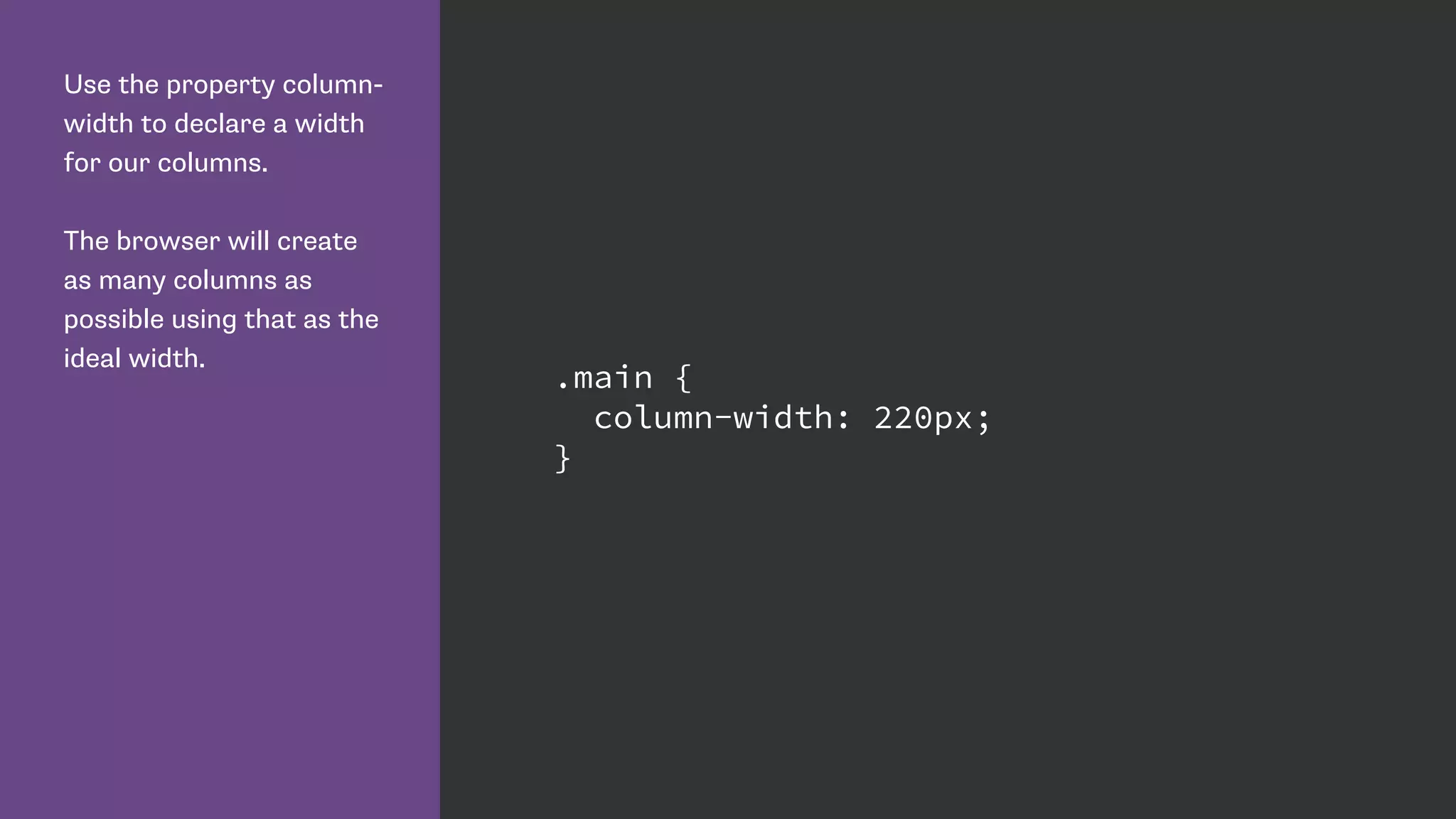
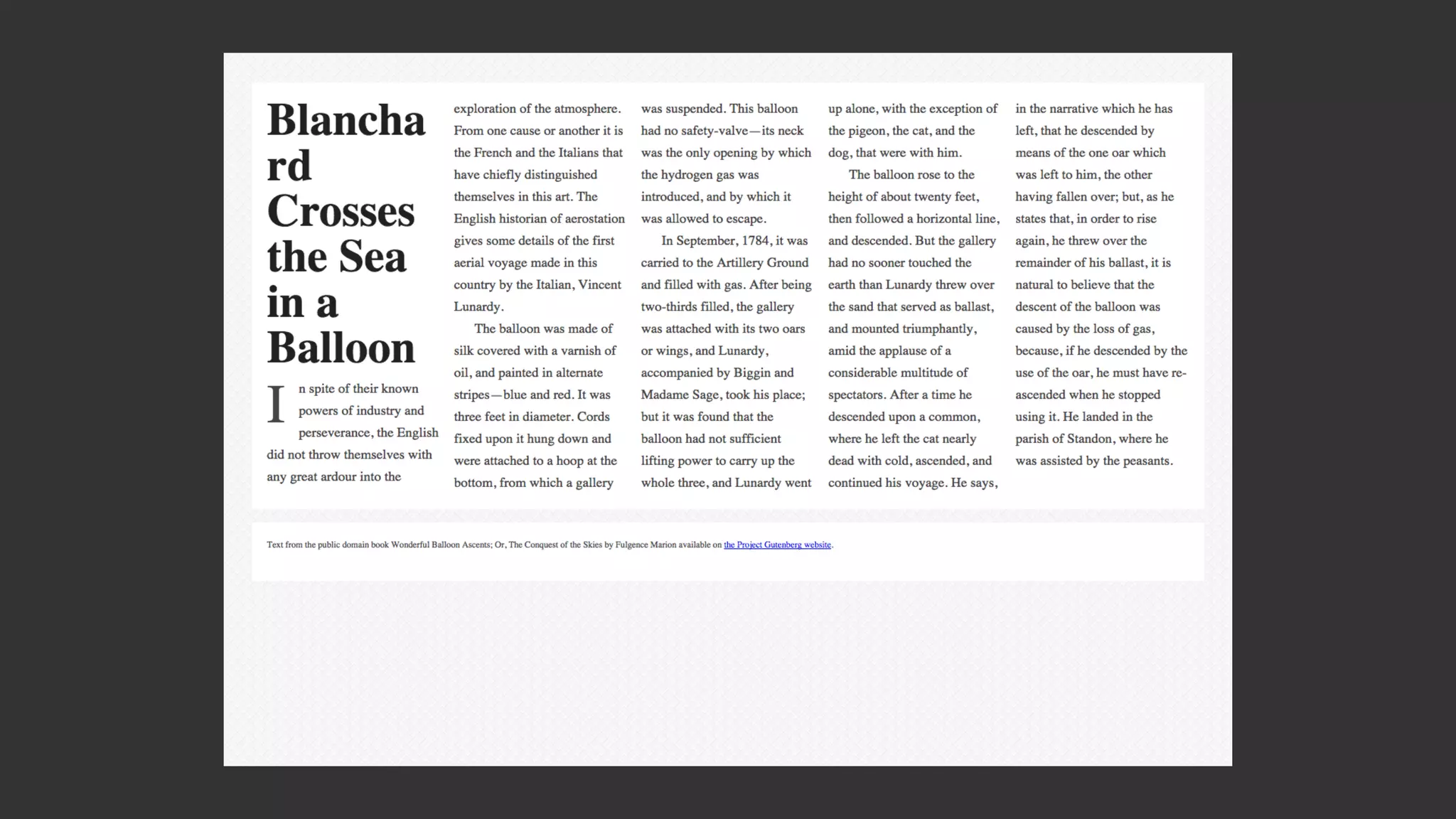
![CSS Multiple column layout
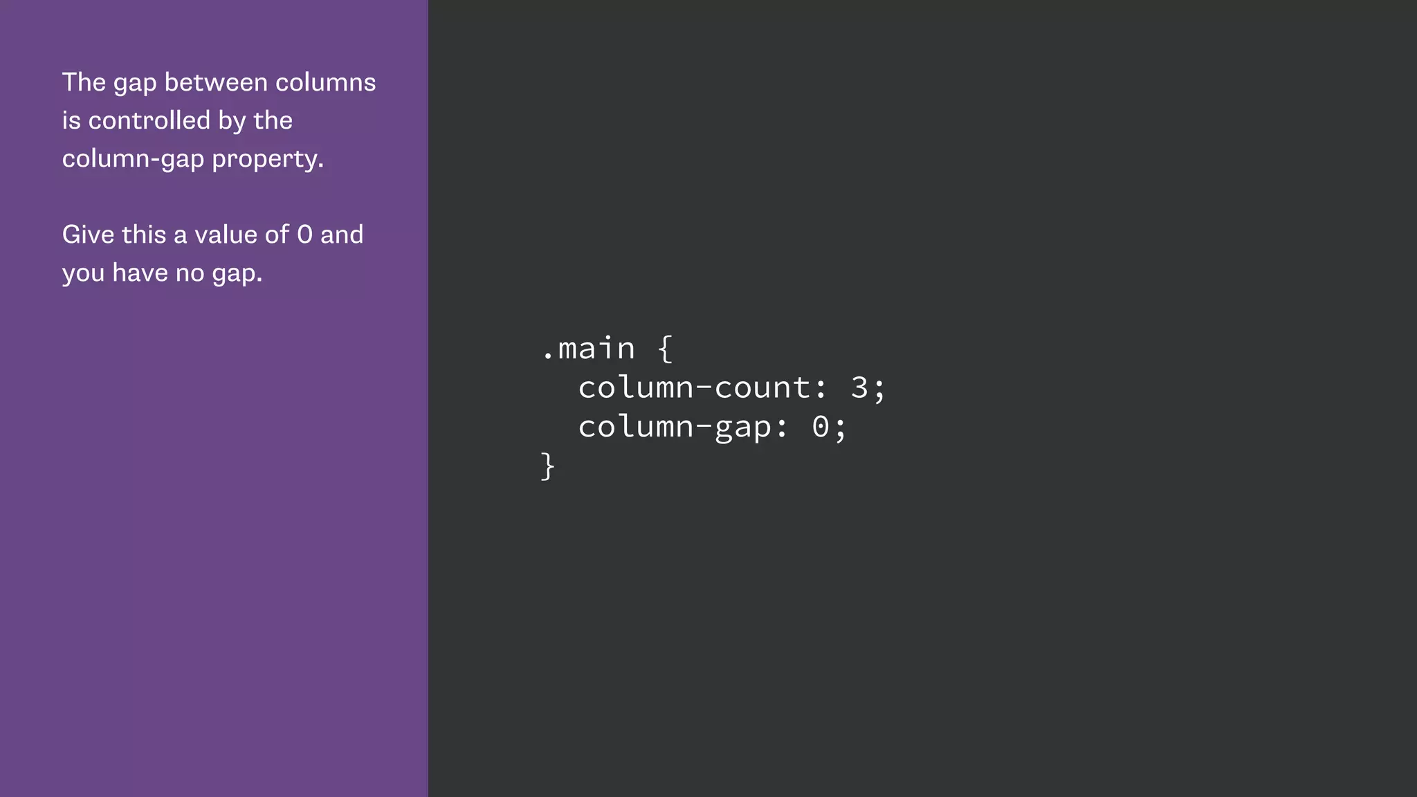
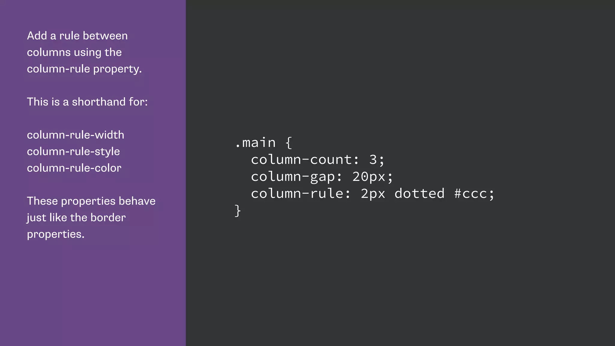
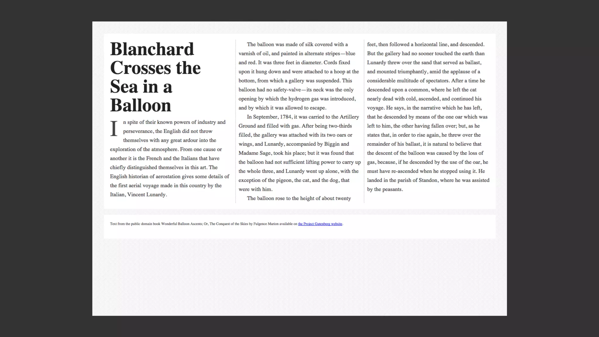
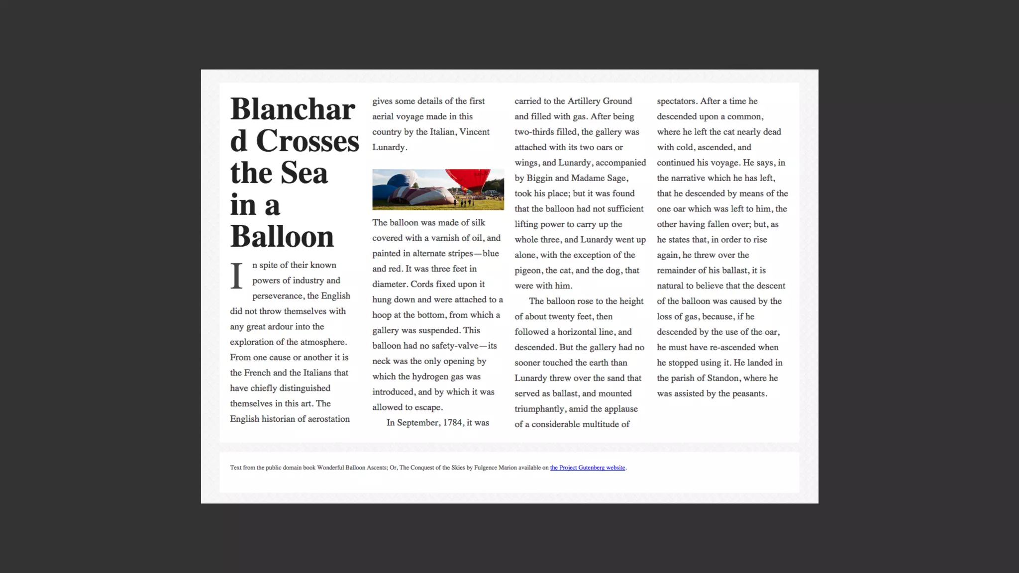
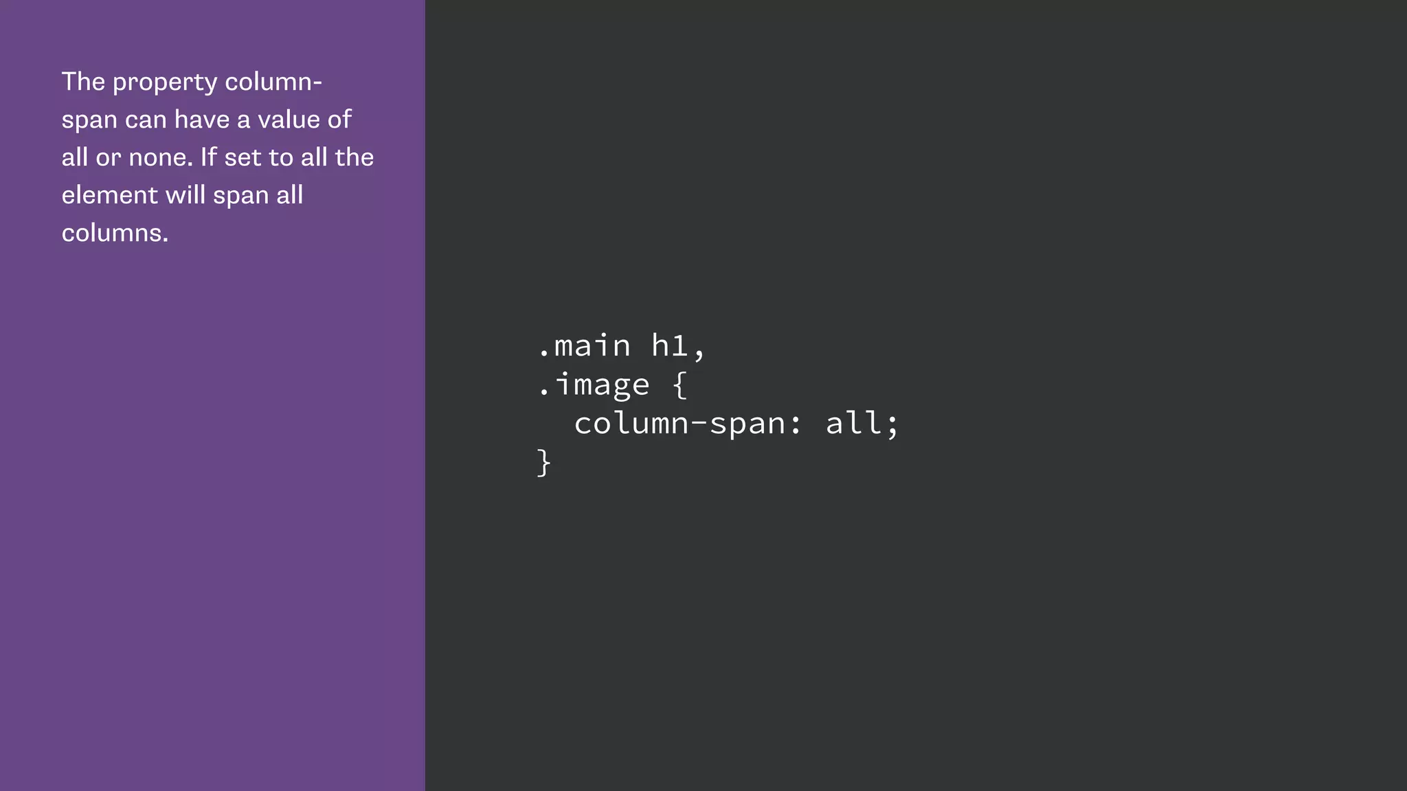
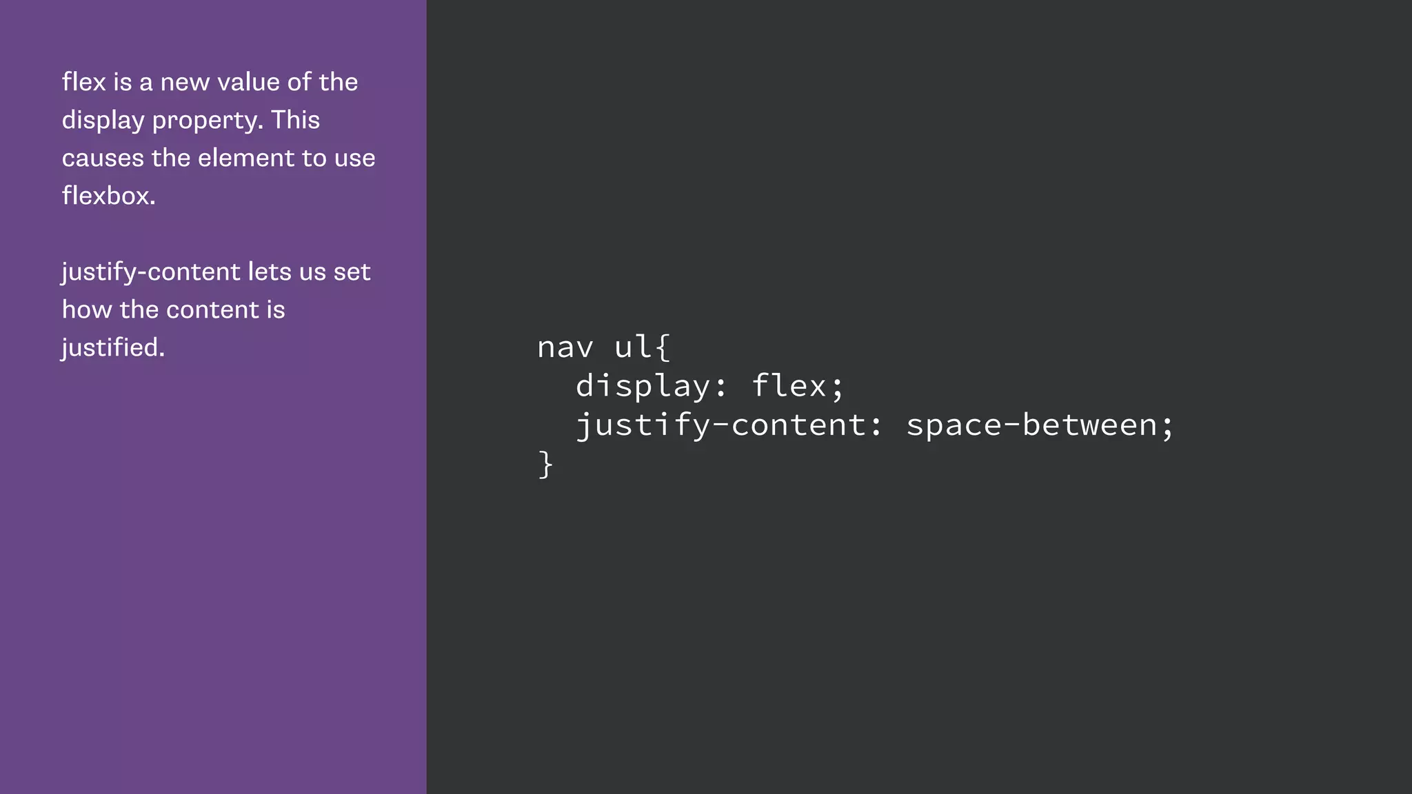
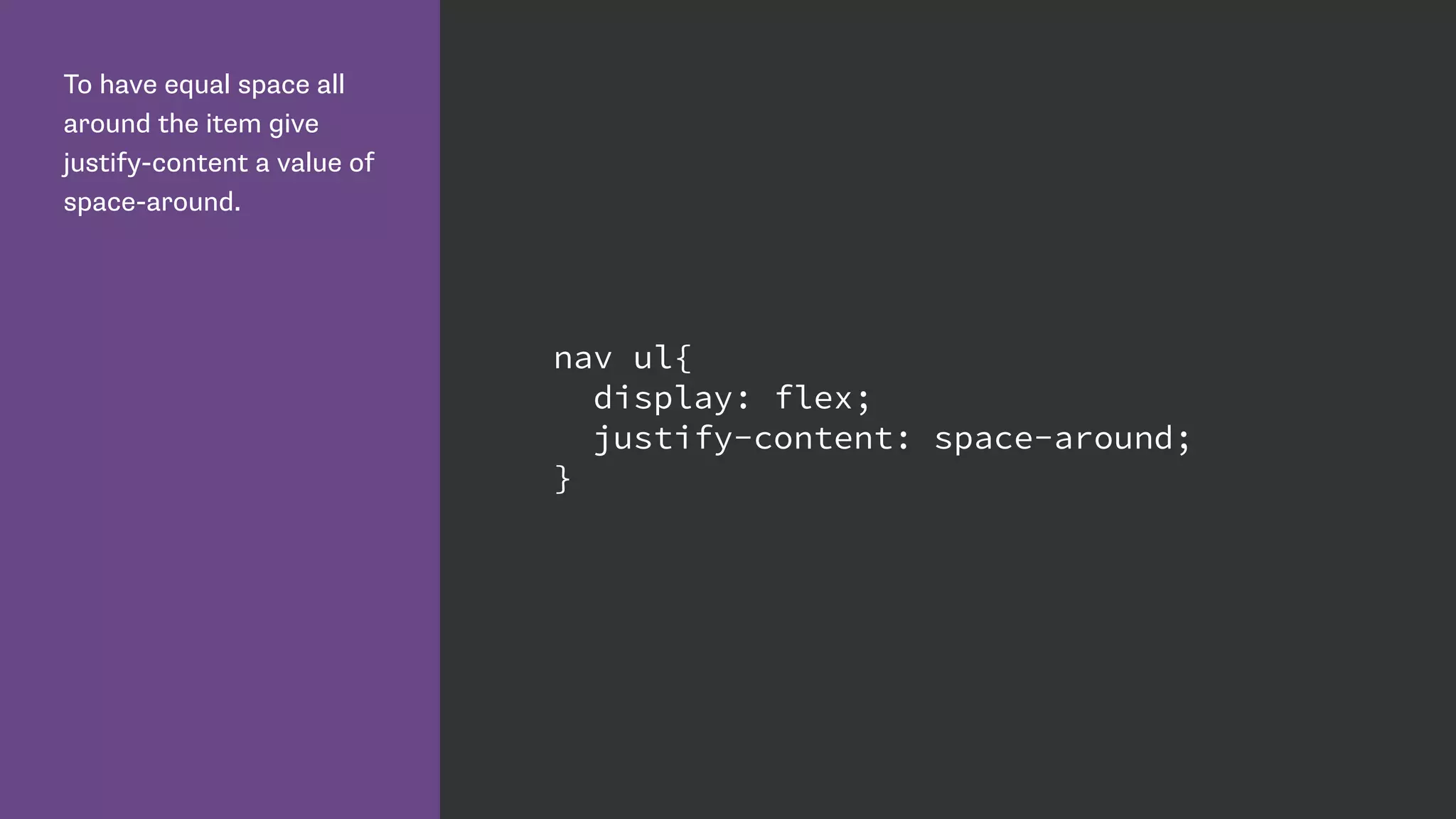
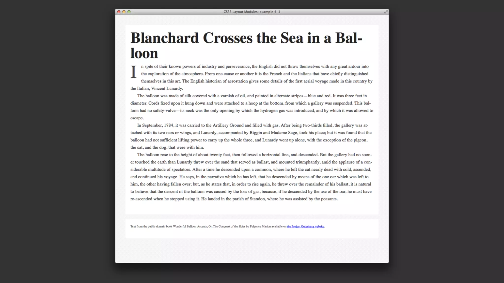
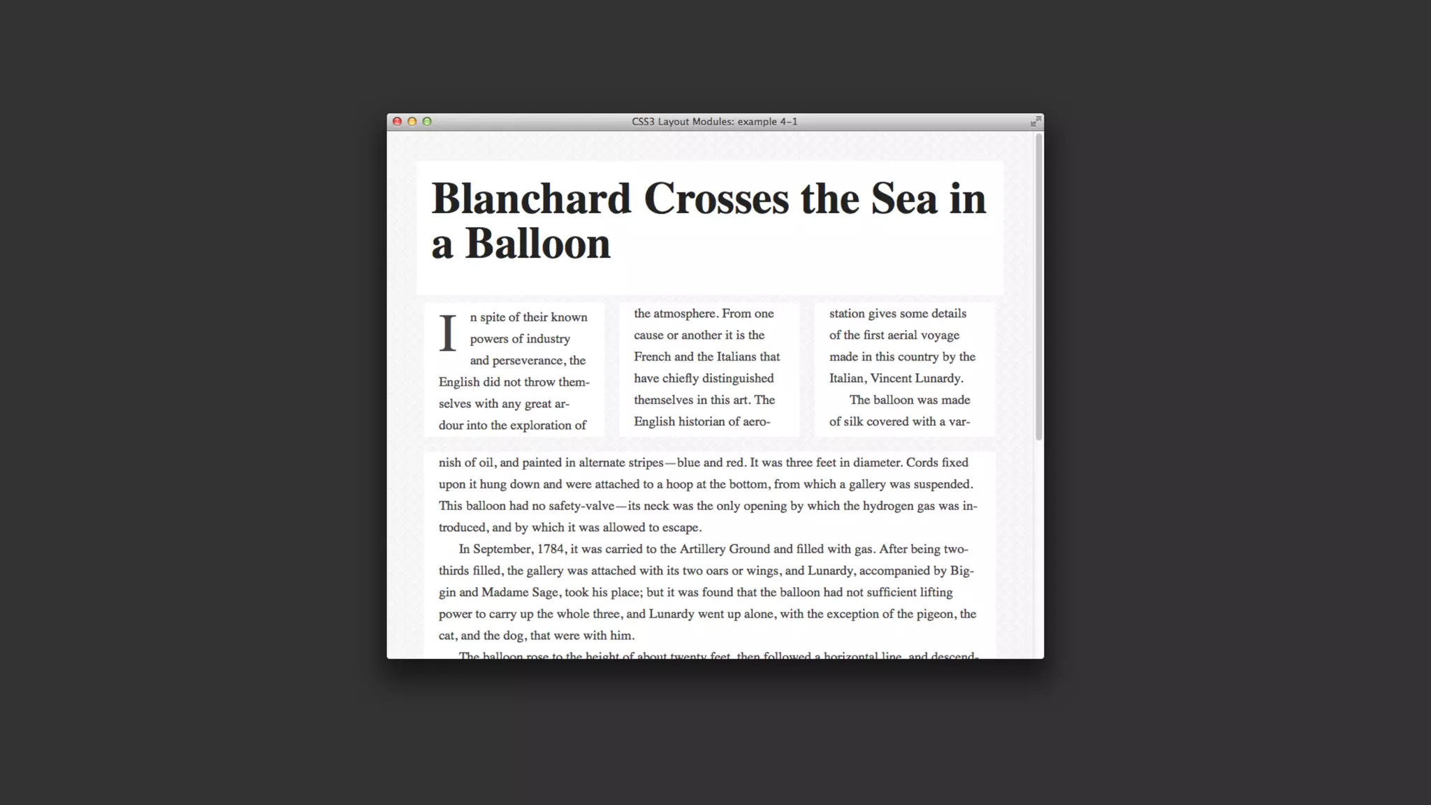
[The column-width value] describes the optimal
column width. The actual column width may be
wider (to fill the available space), or narrower
(only if the available space is smaller than the
specified column width). Specified values must
be greater than 0.](https://image.slidesharecdn.com/the-new-css-layout-dutch-php-150626052514-lva1-app6892/75/The-New-CSS-Layout-Dutch-PHP-Conference-11-2048.jpg)


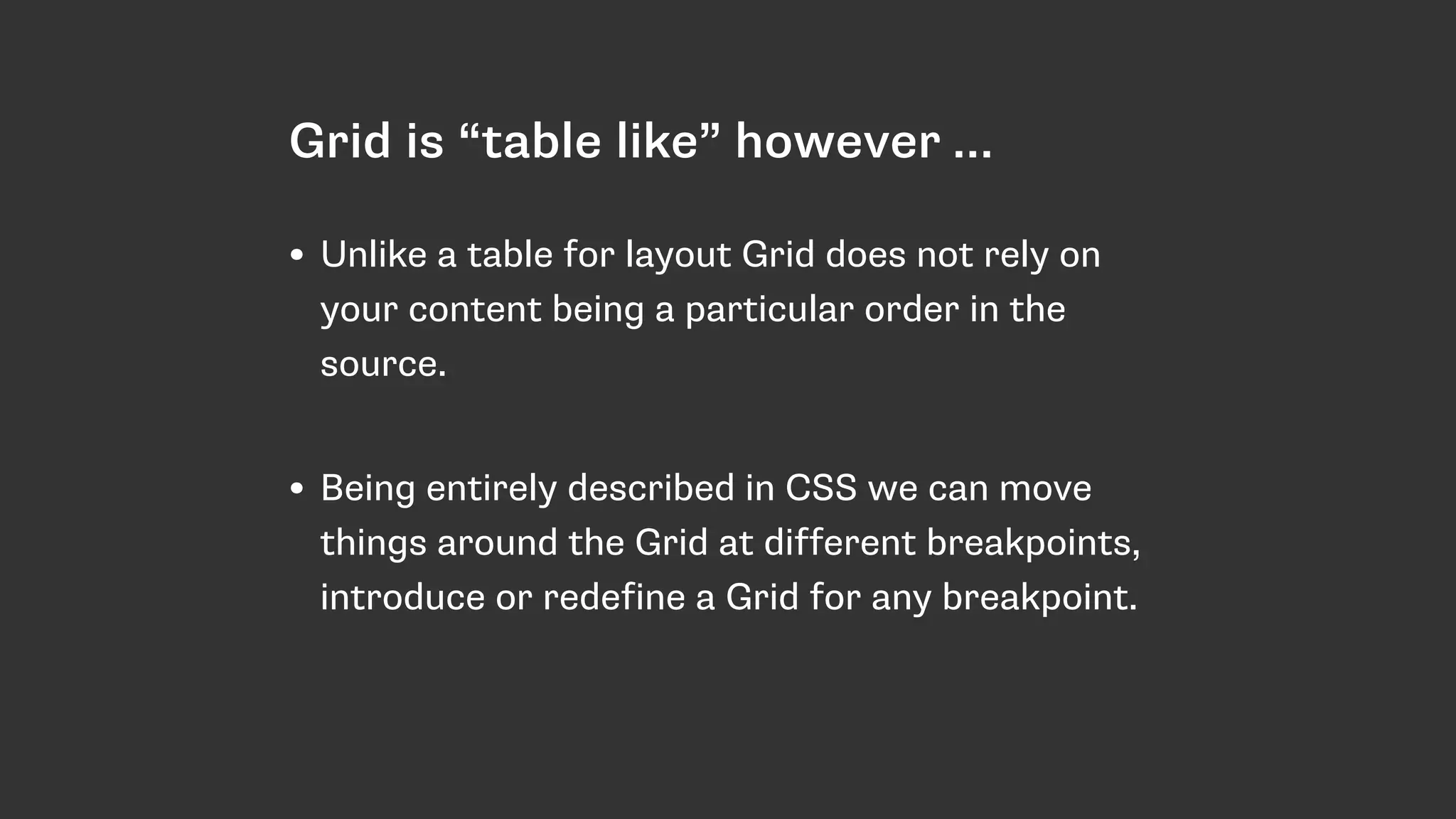
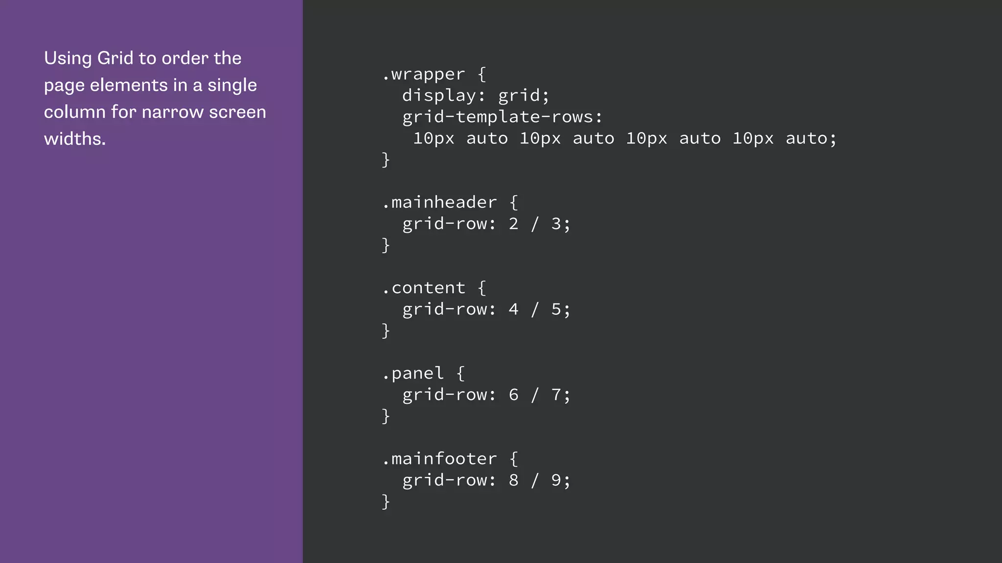

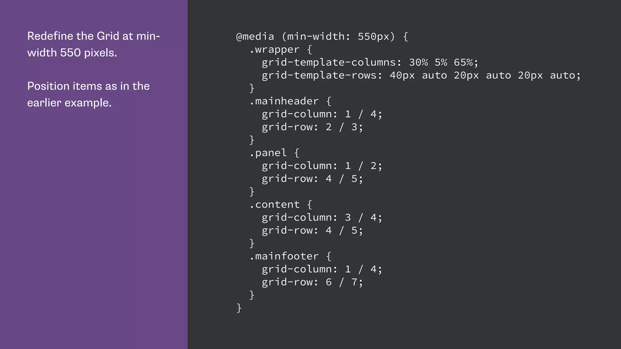


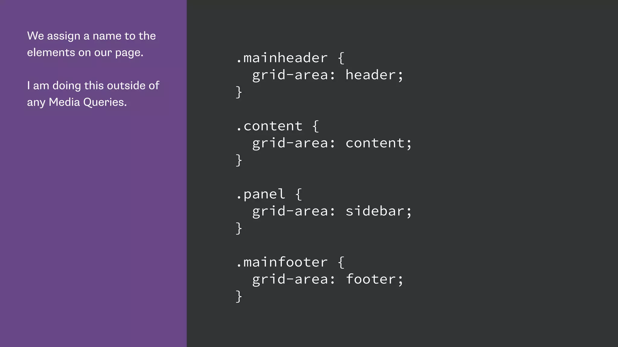


The document provides a comprehensive overview of various CSS layout techniques, including multi-column layout, flexible box layout, CSS shapes, and grid layout. It explains each method's properties, potential styling capabilities, and limitations, along with code examples to illustrate usage. Additionally, it references resources for further learning and outlines browser compatibility considerations.