Download as PDF, PPTX
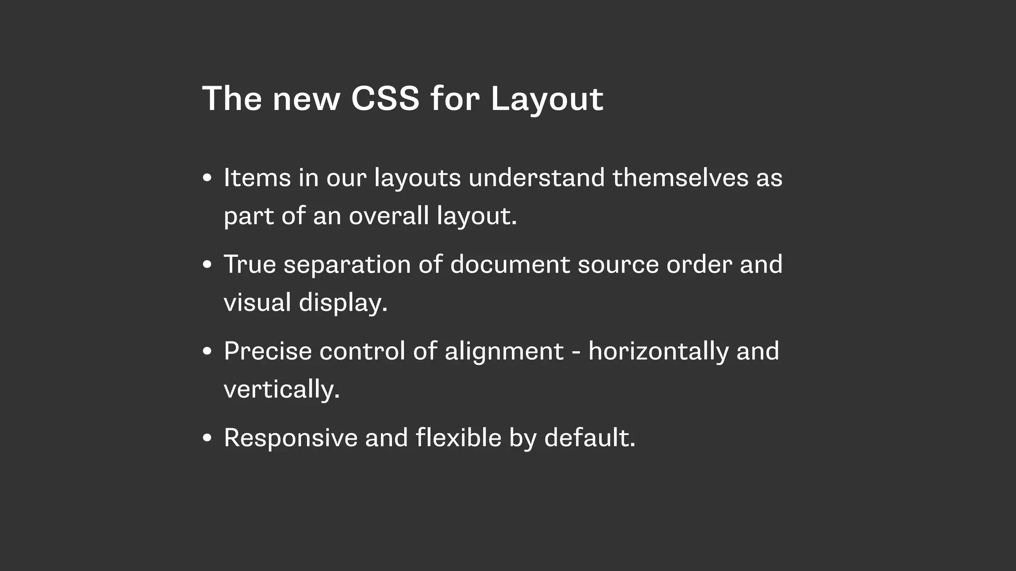
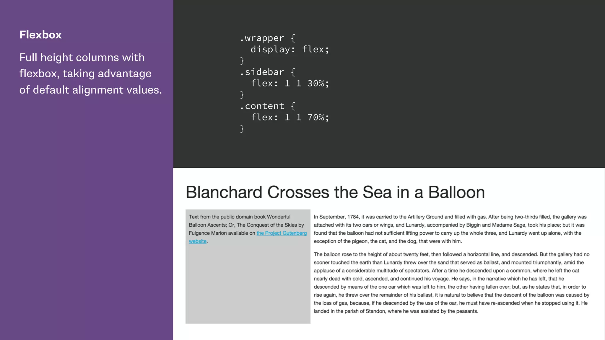
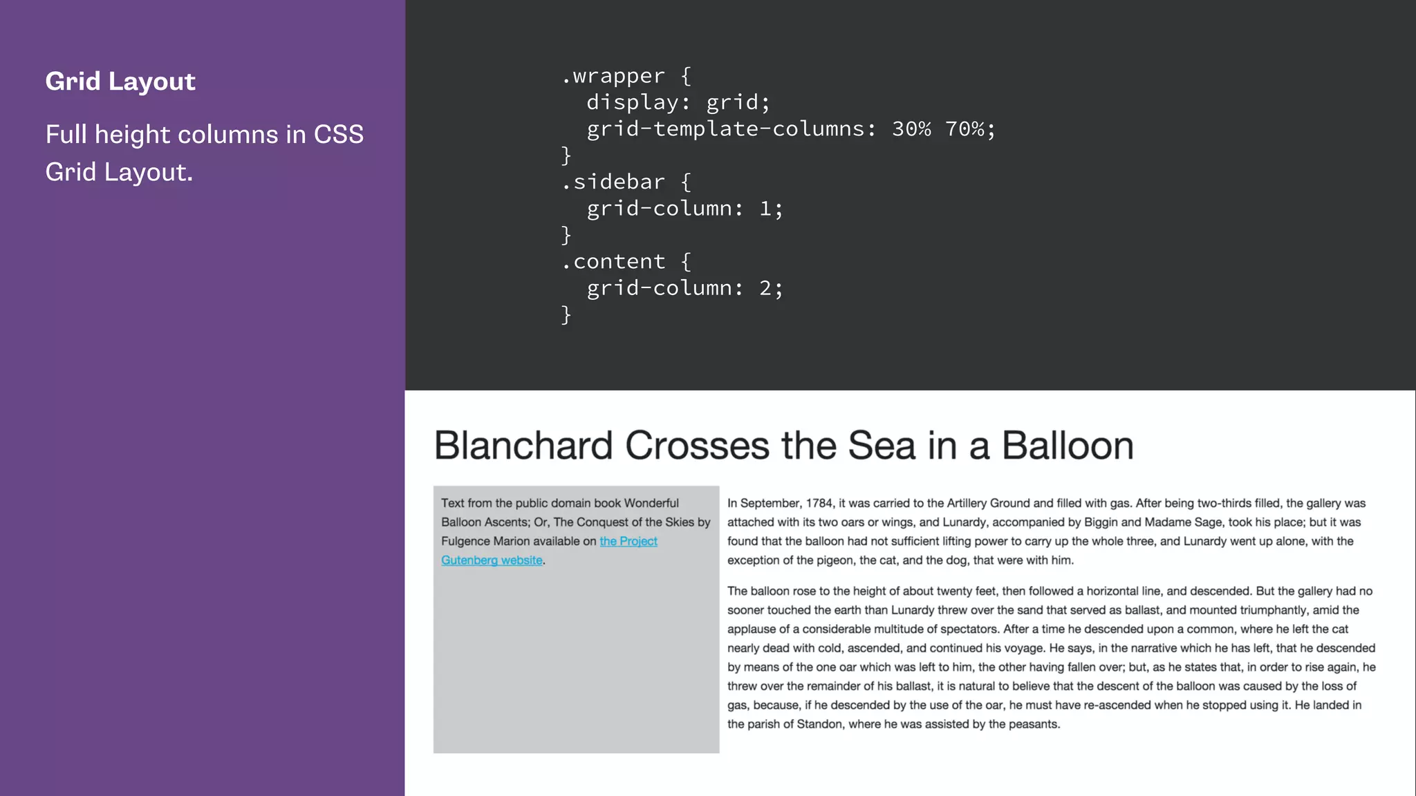
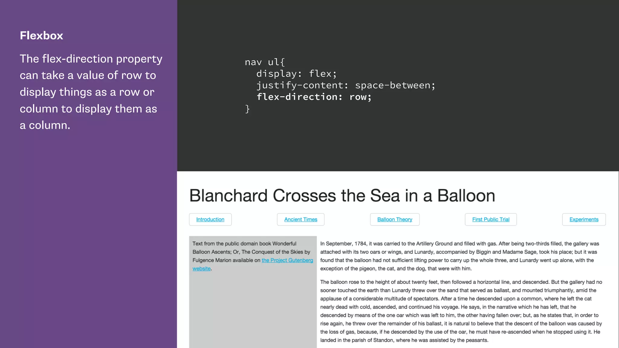
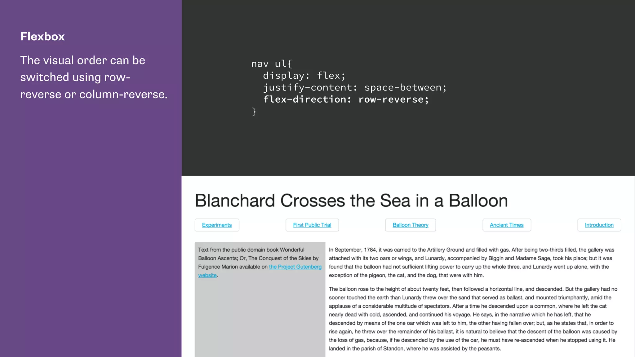
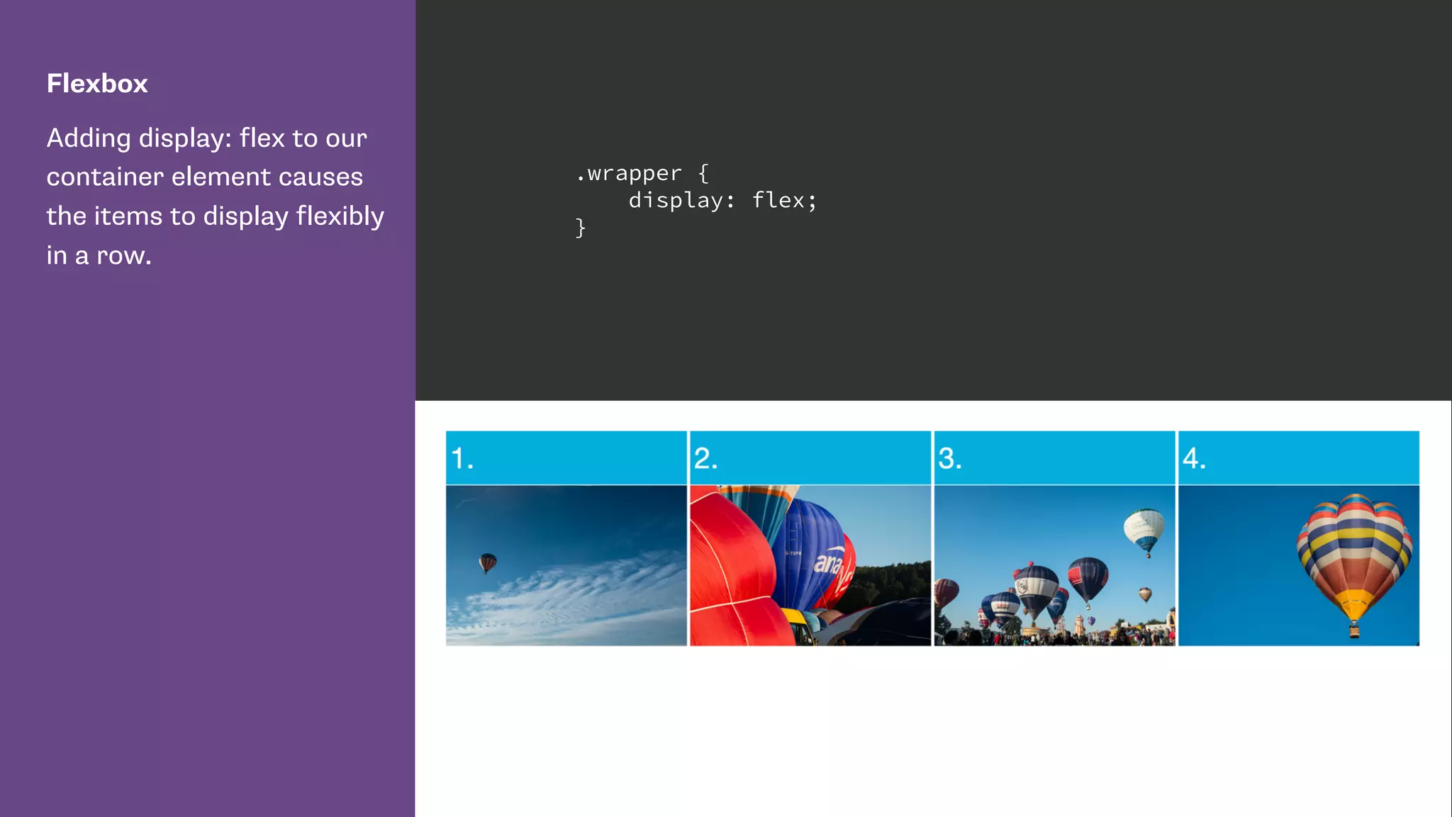
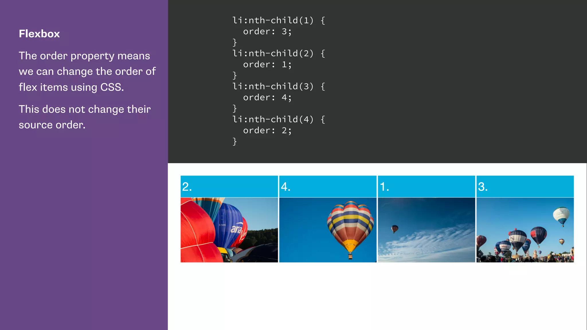
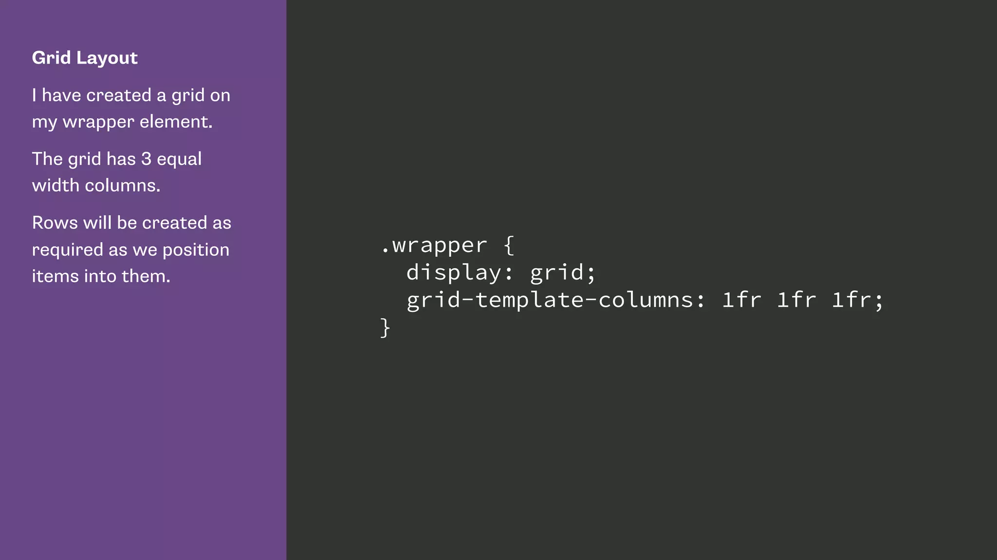
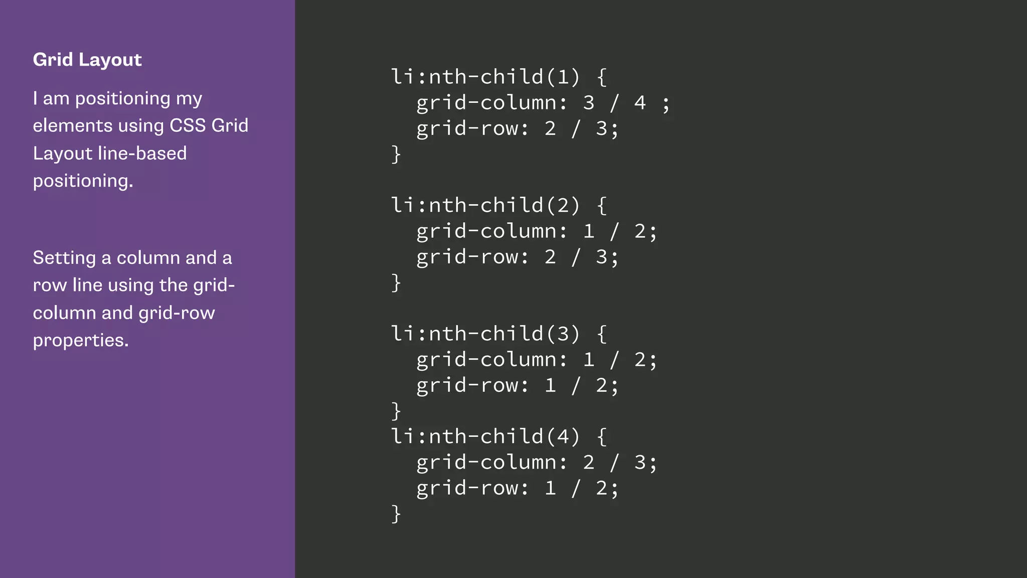
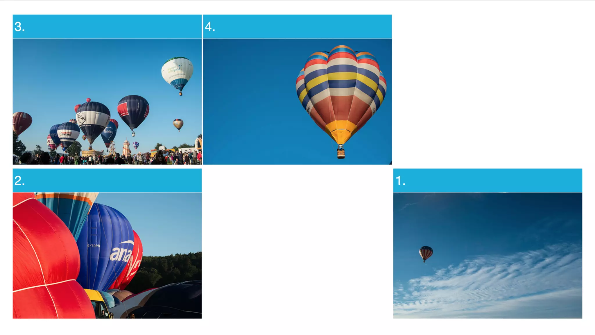
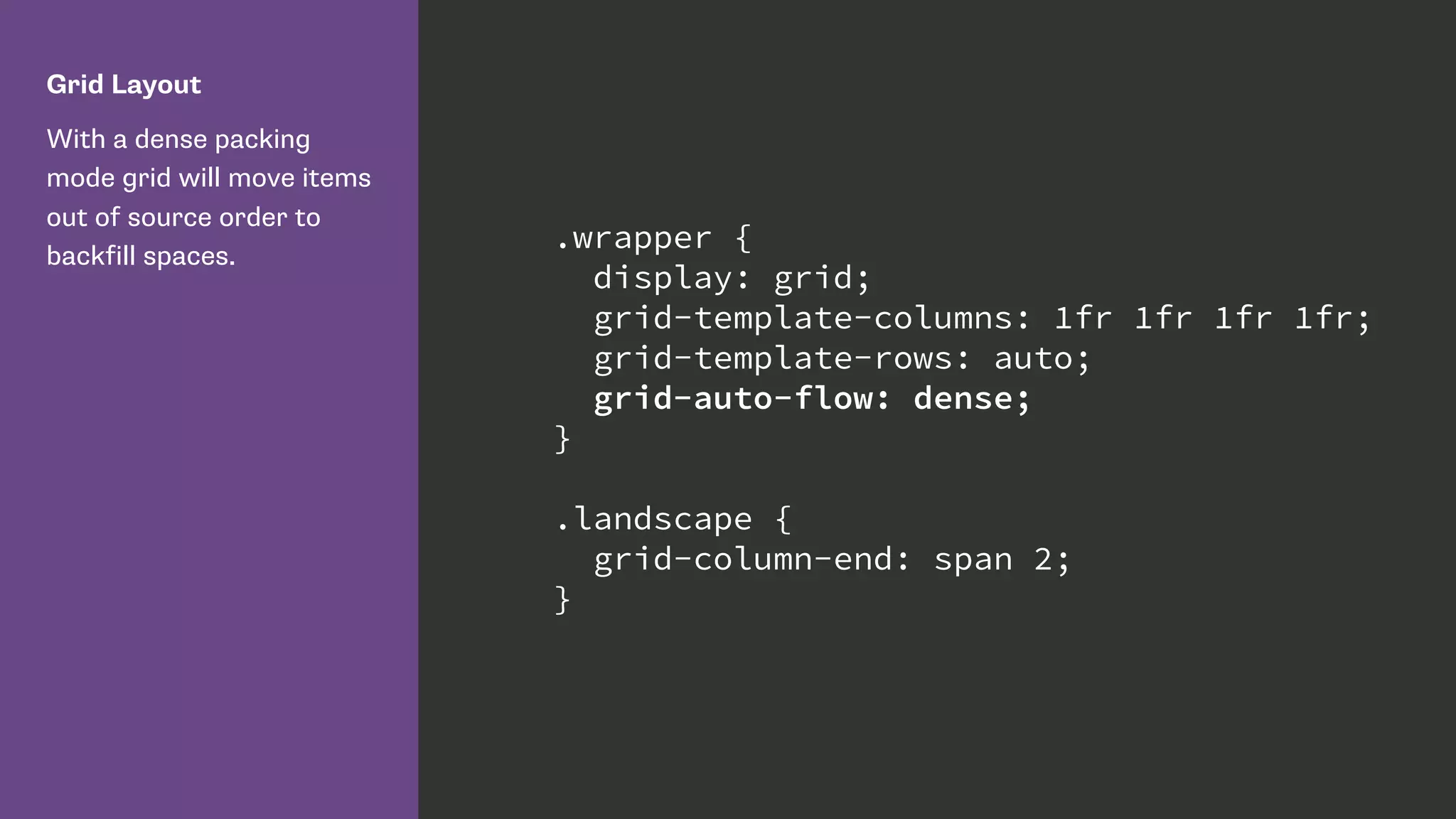
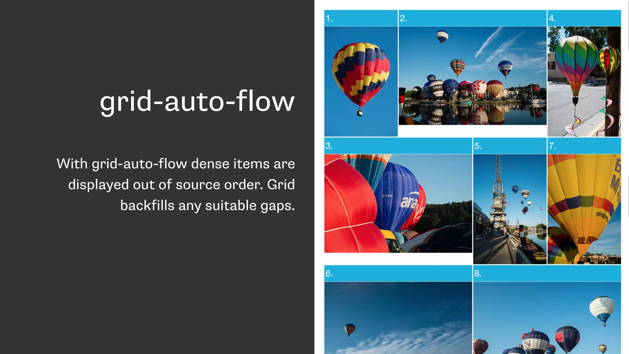
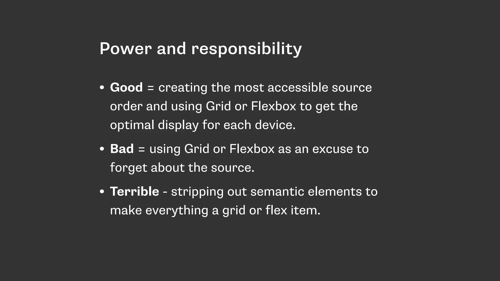
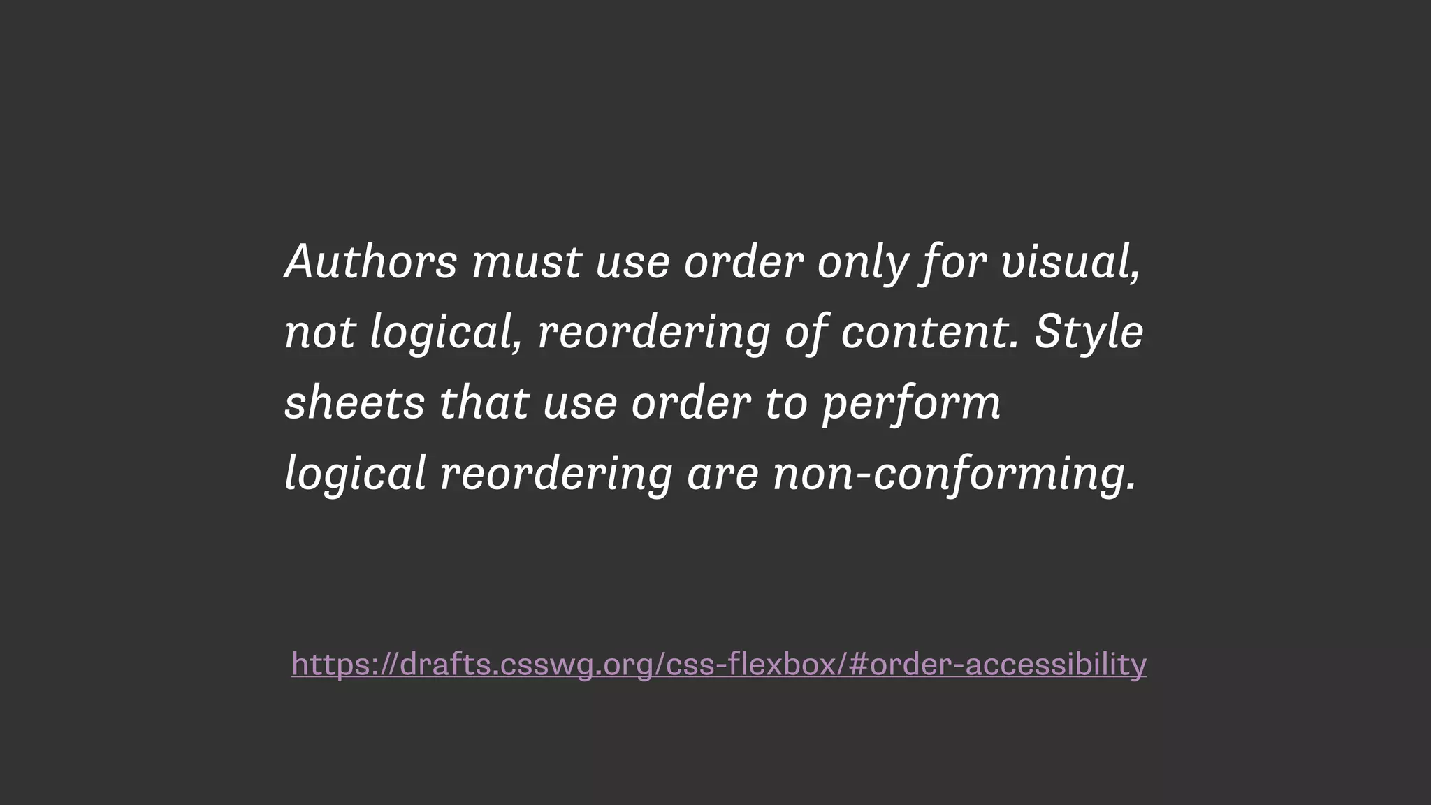
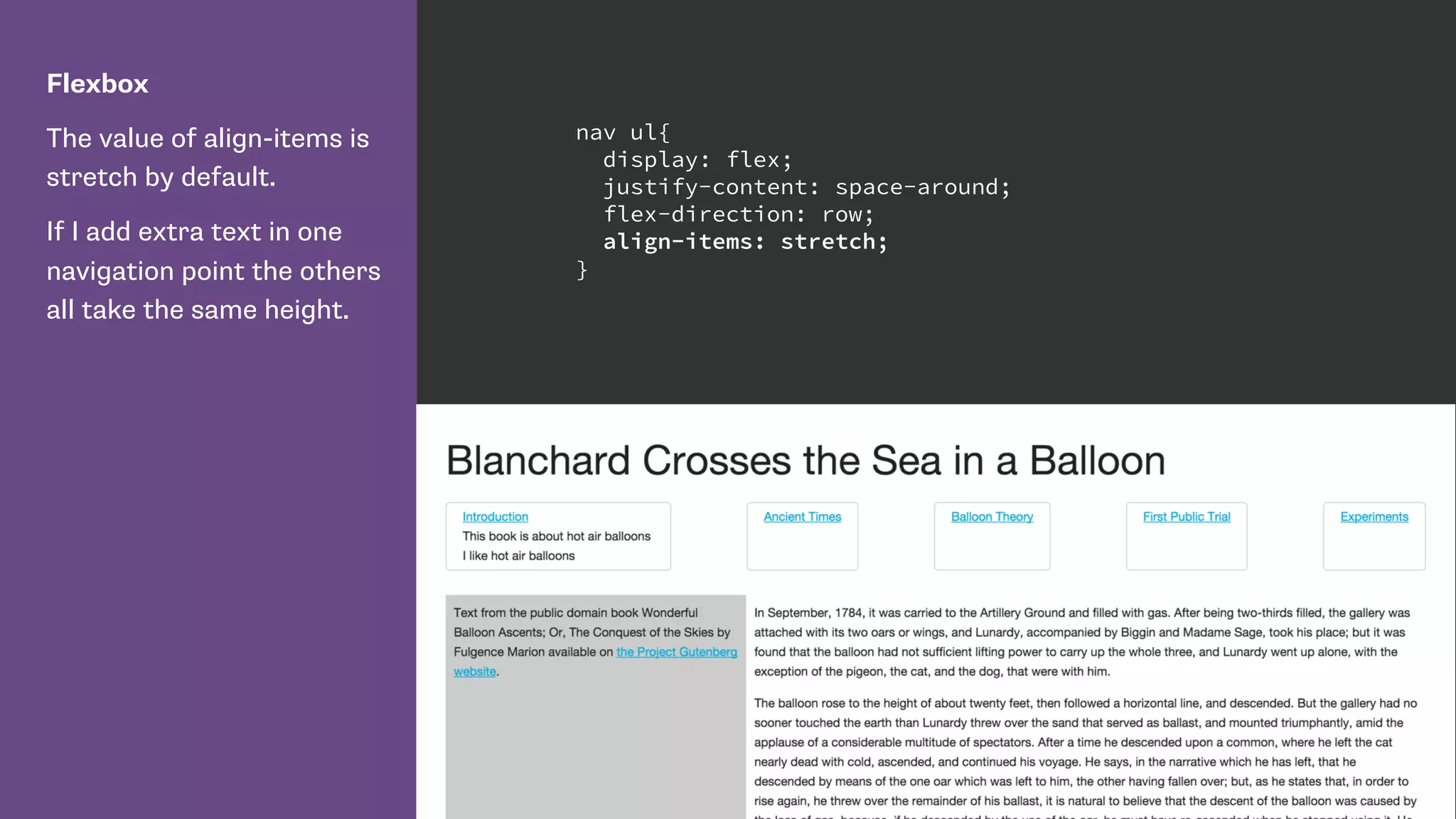
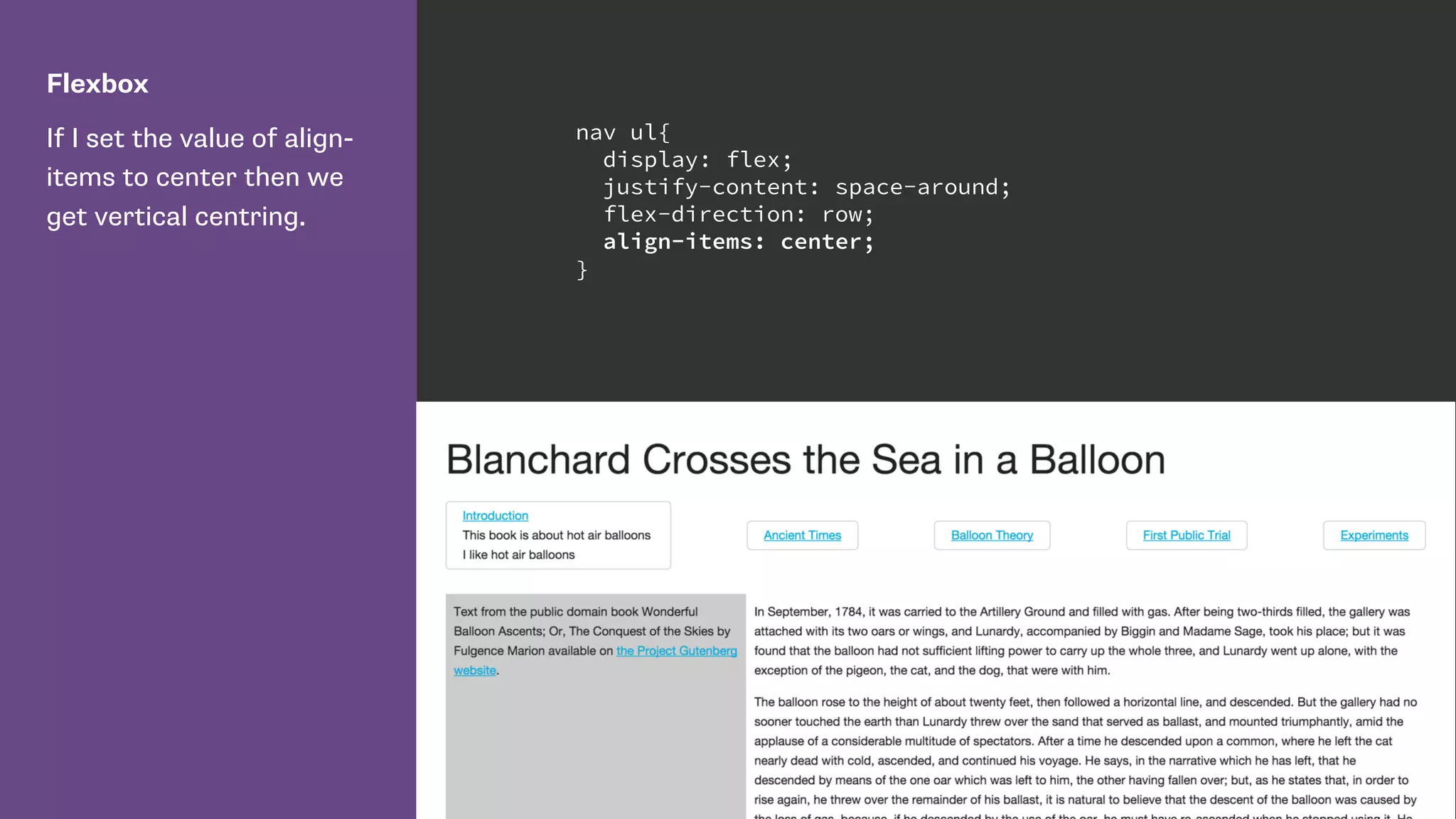
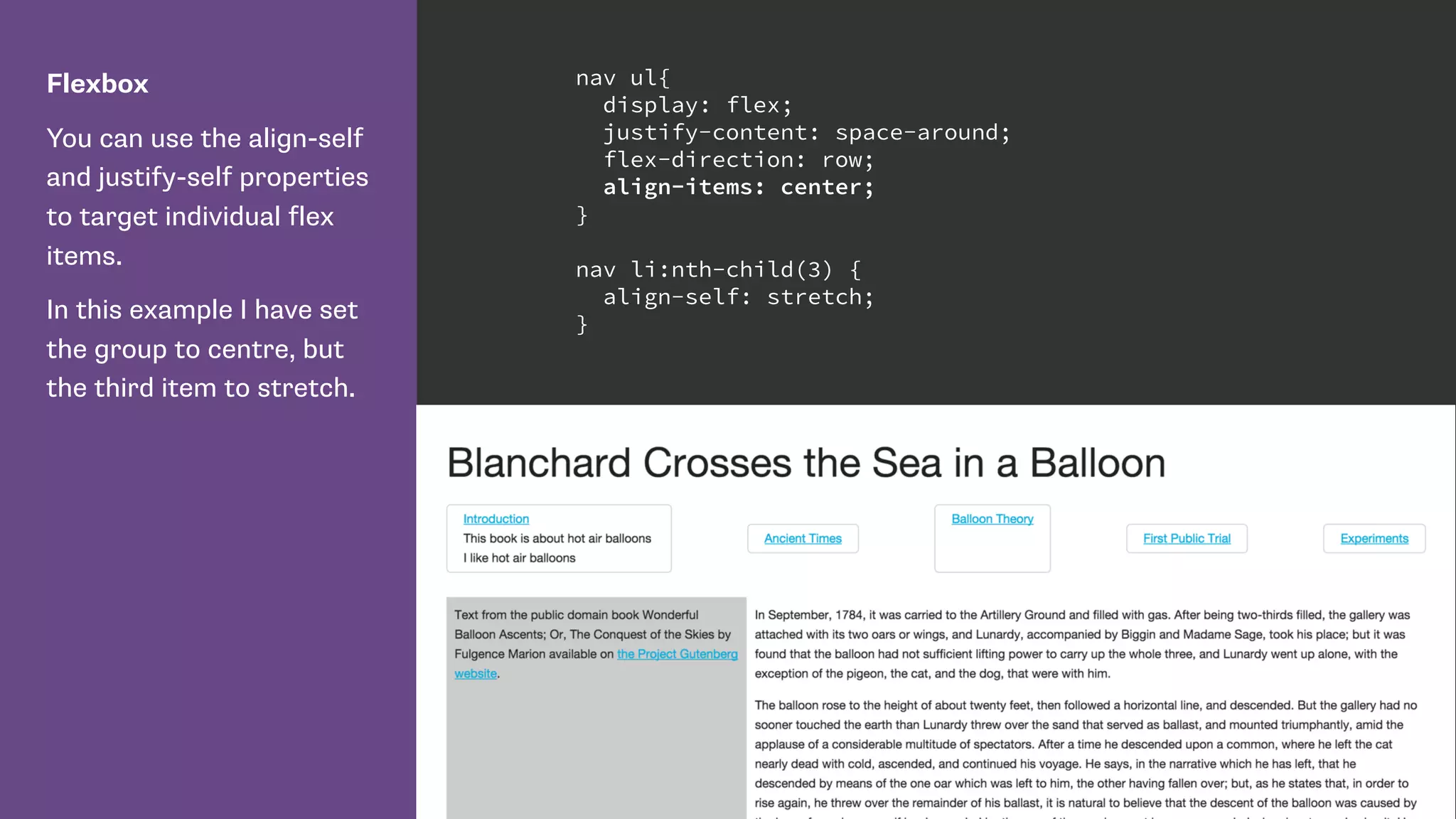
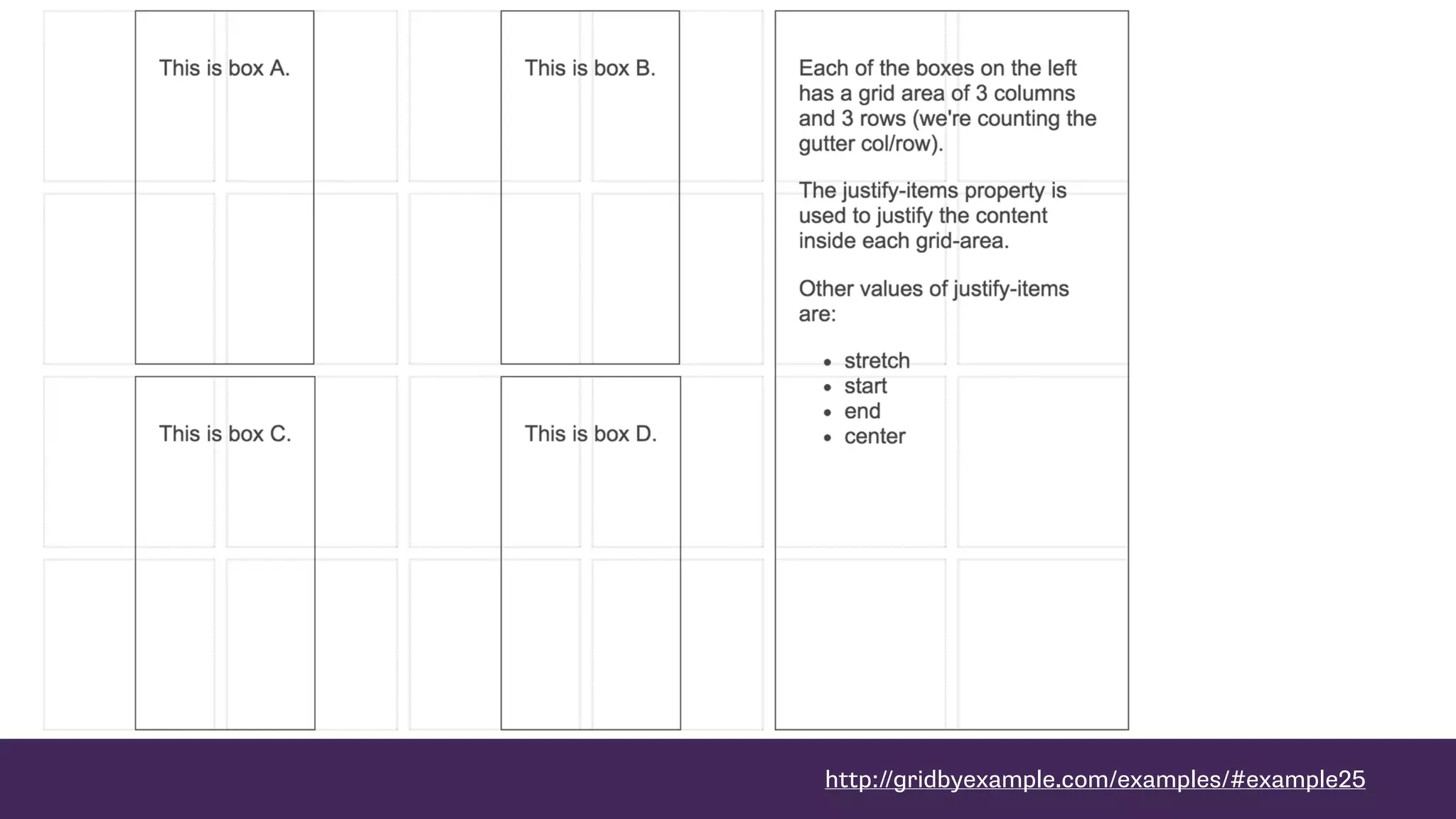
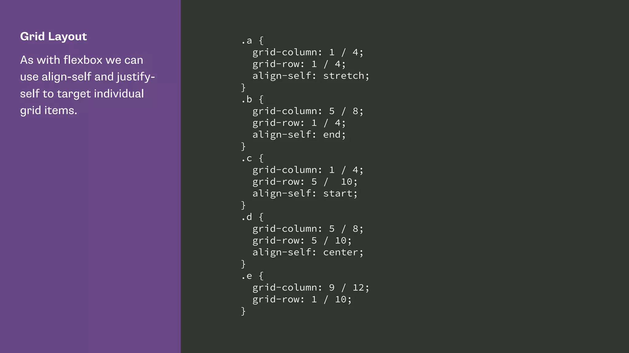
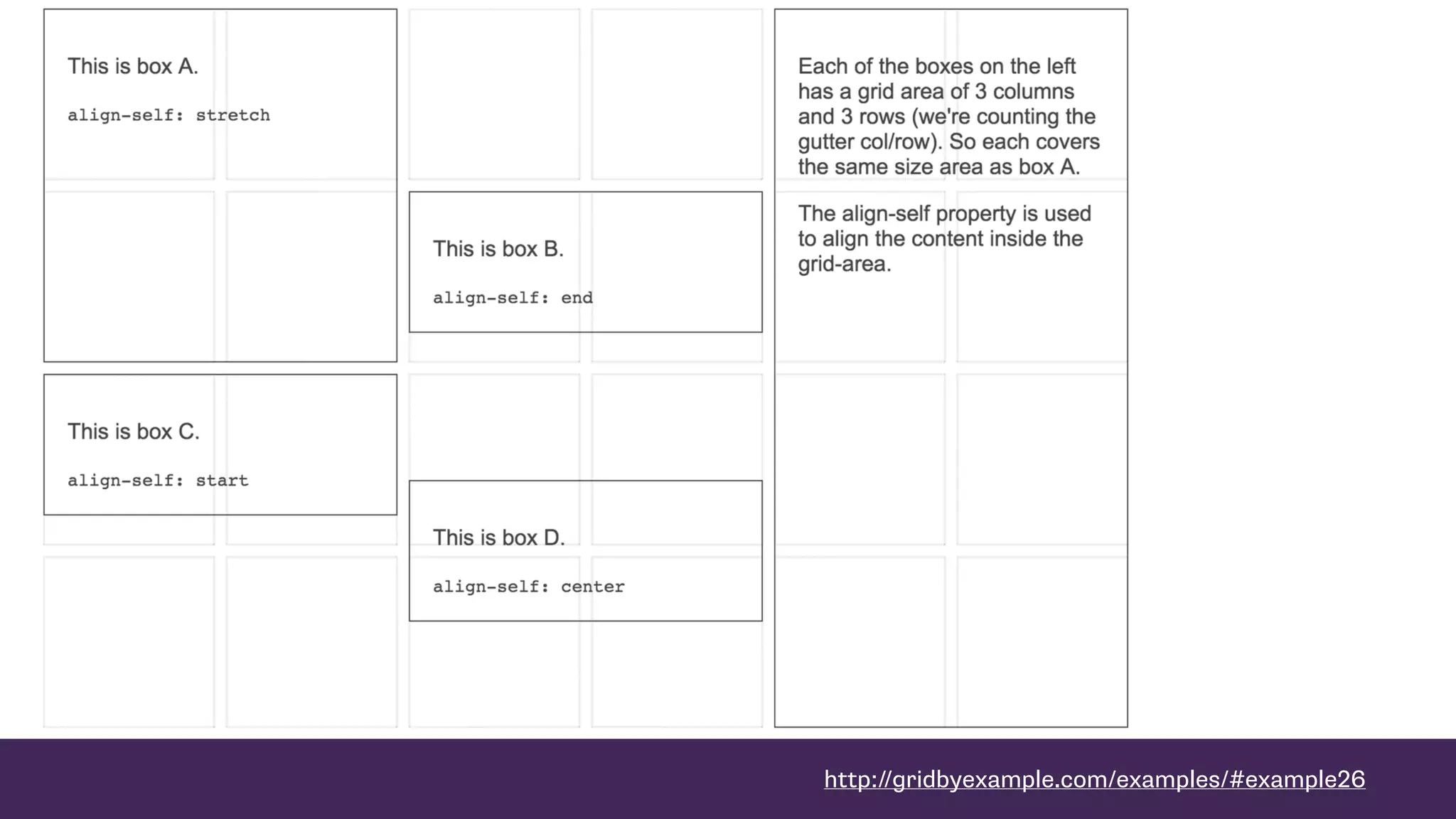
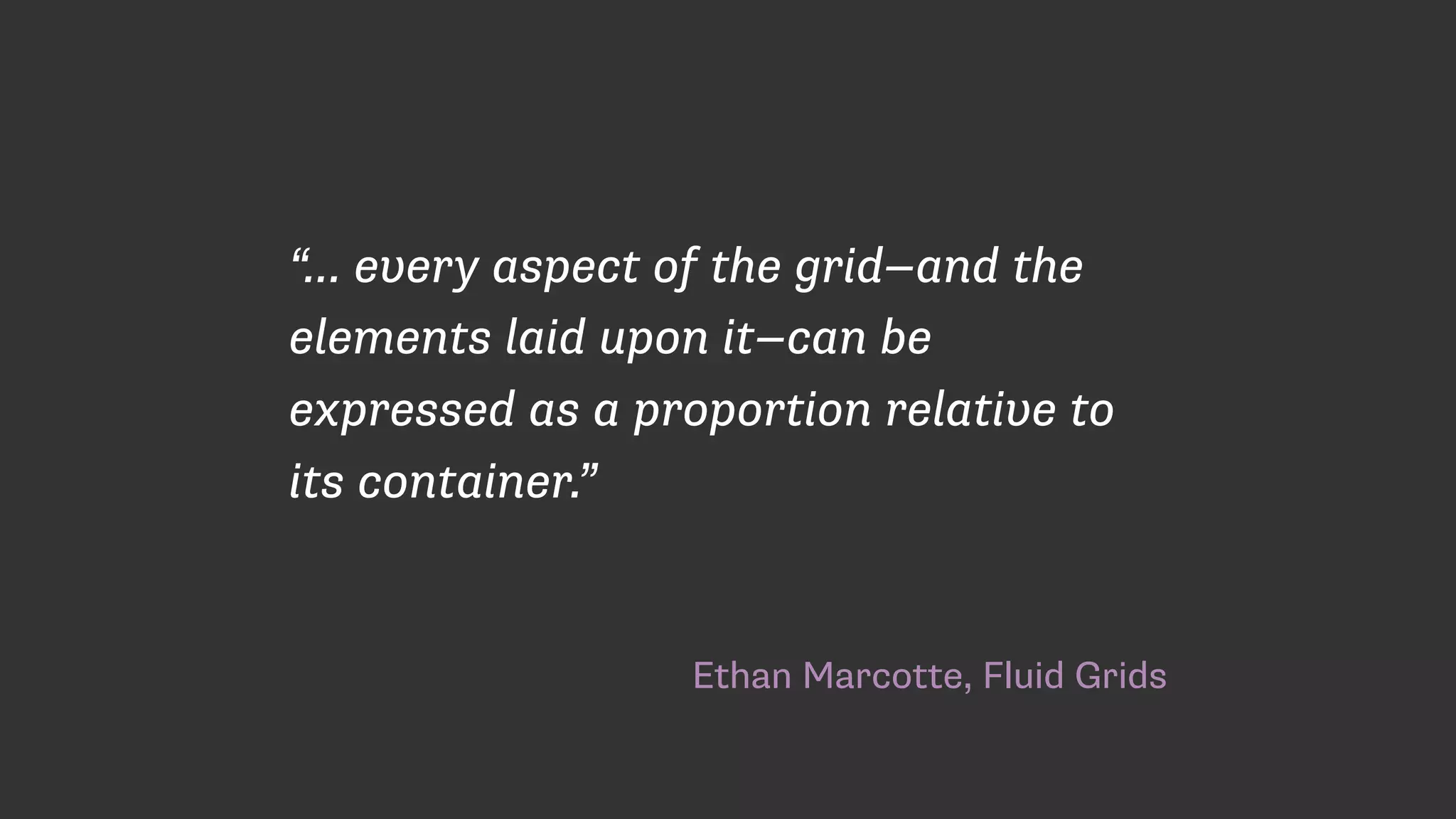
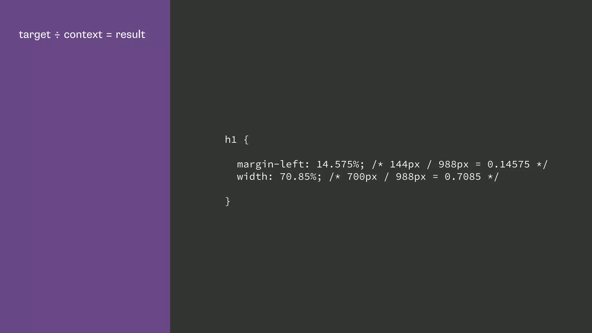
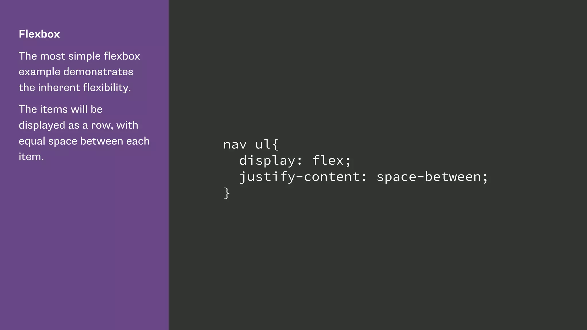
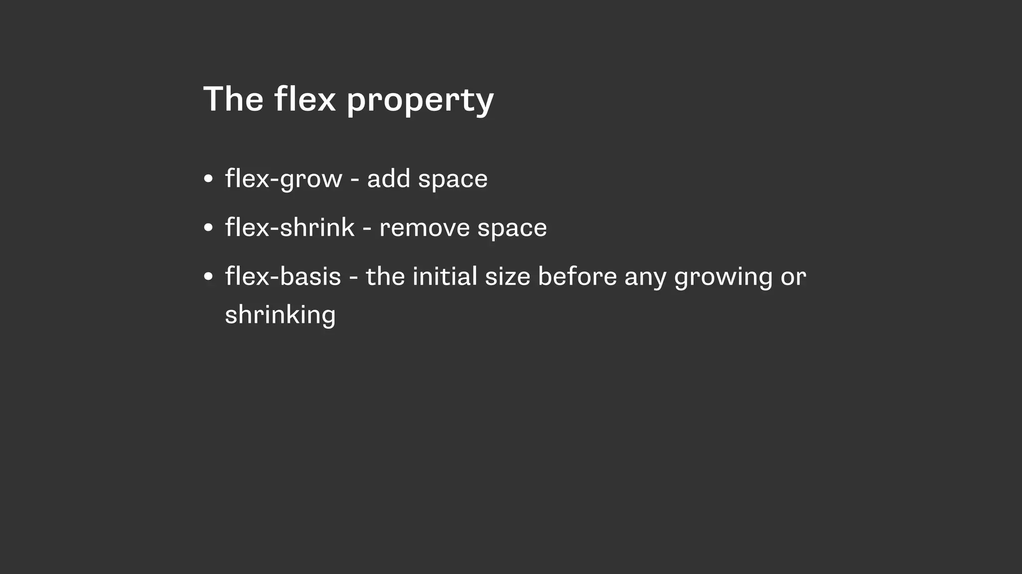
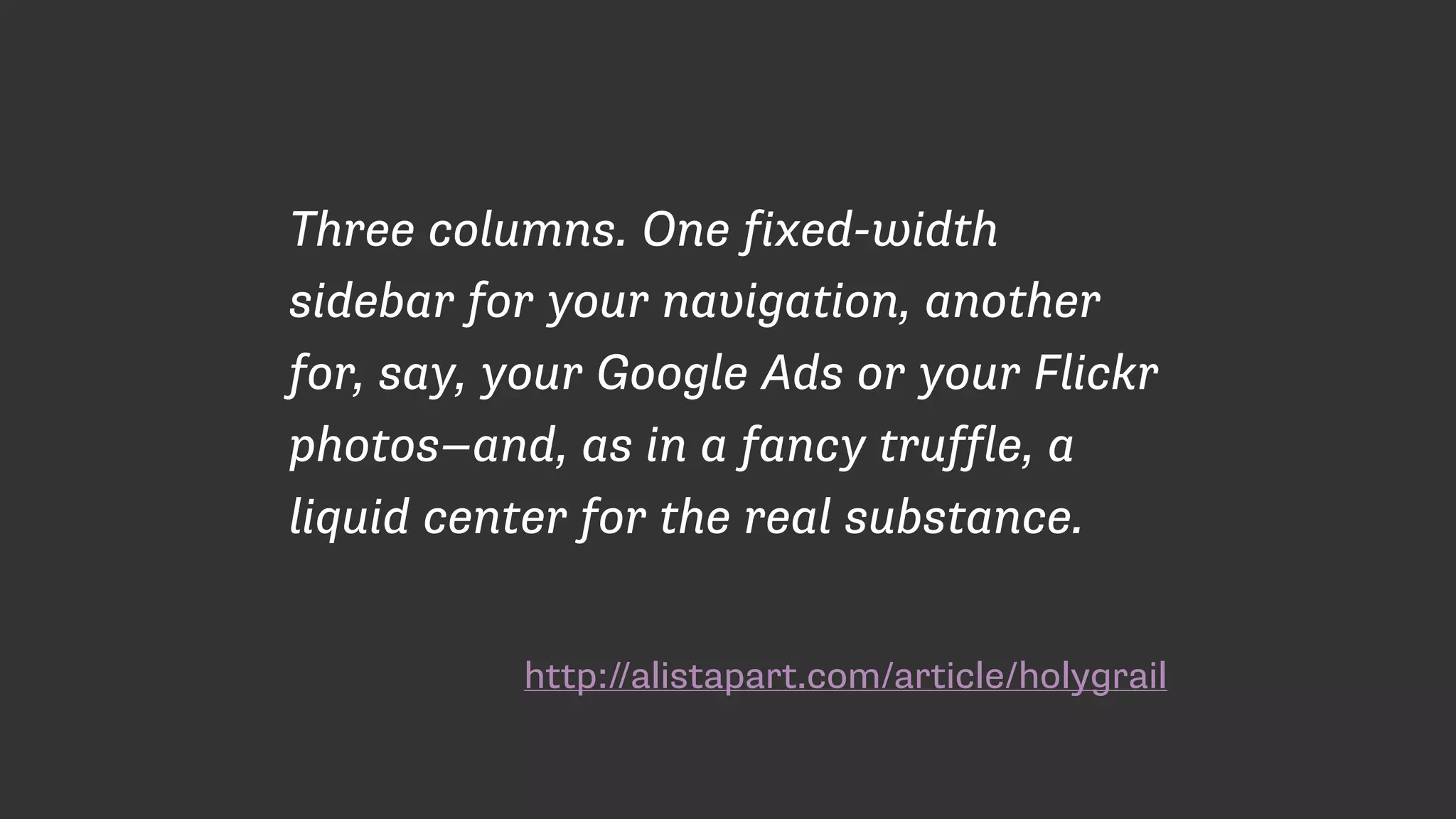
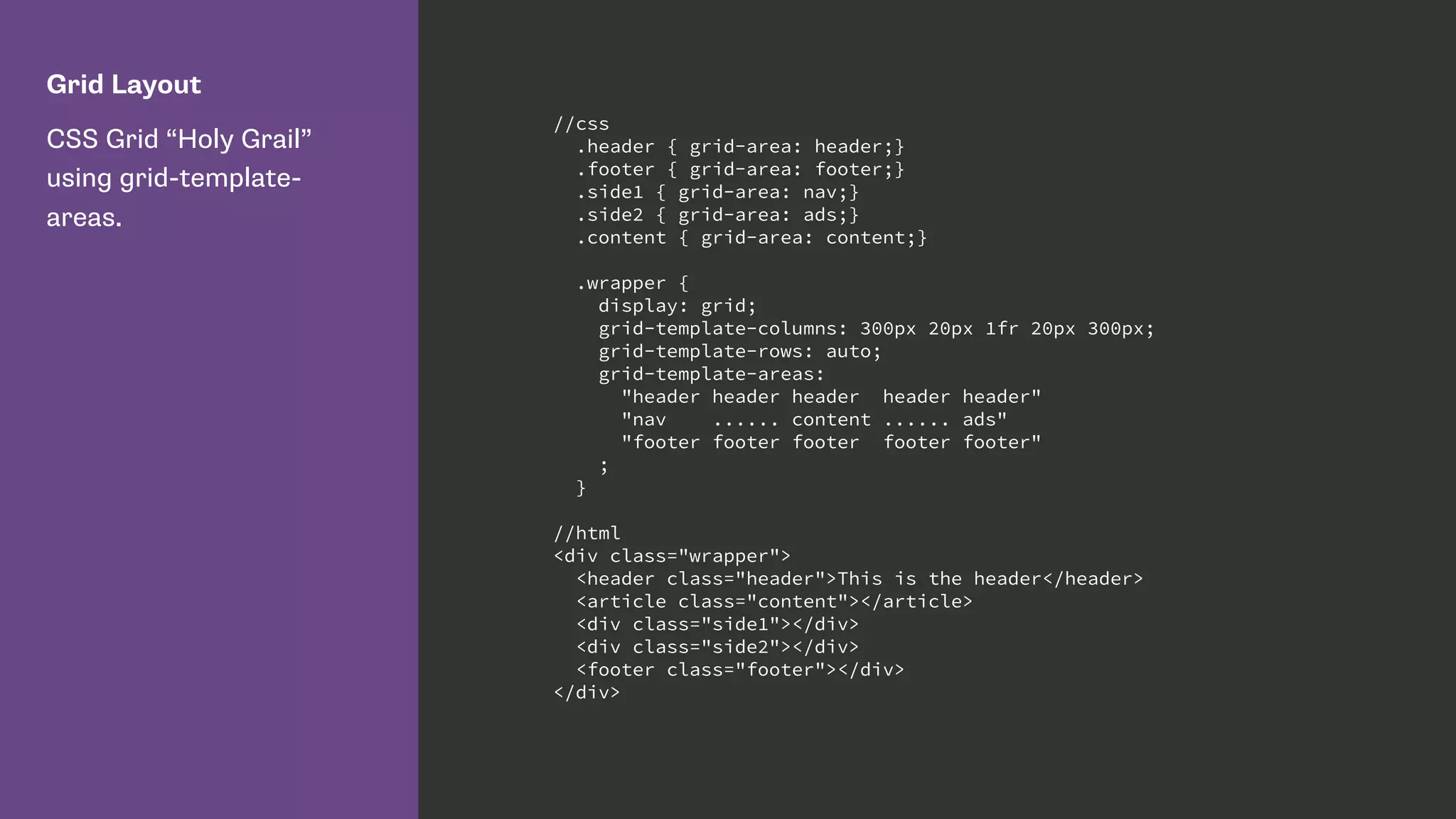
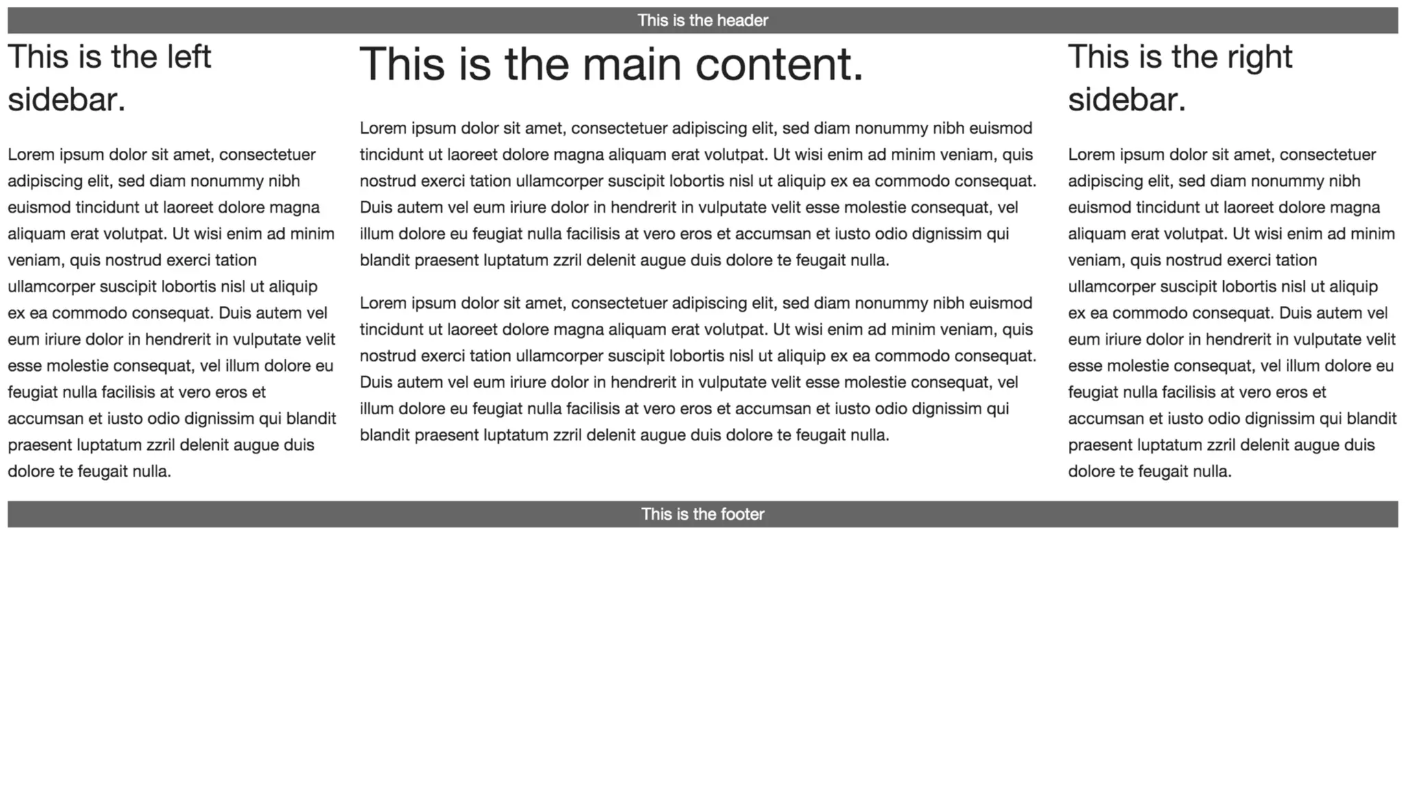
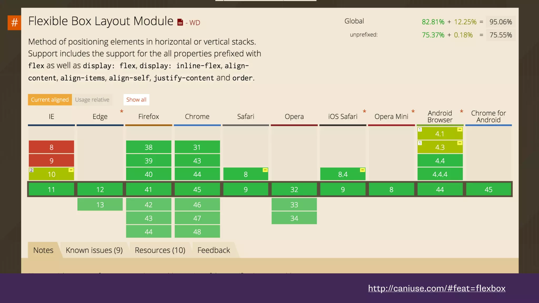

The document discusses new CSS layout techniques including Flexbox and CSS Grid Layout. These allow for precise control of alignment both horizontally and vertically, separation of document structure from visual display, and responsive and flexible layouts by default. Examples are provided showing how Flexbox and Grid Layout can be used to create common layout patterns like equal height columns and reordering of content in a responsive way.


