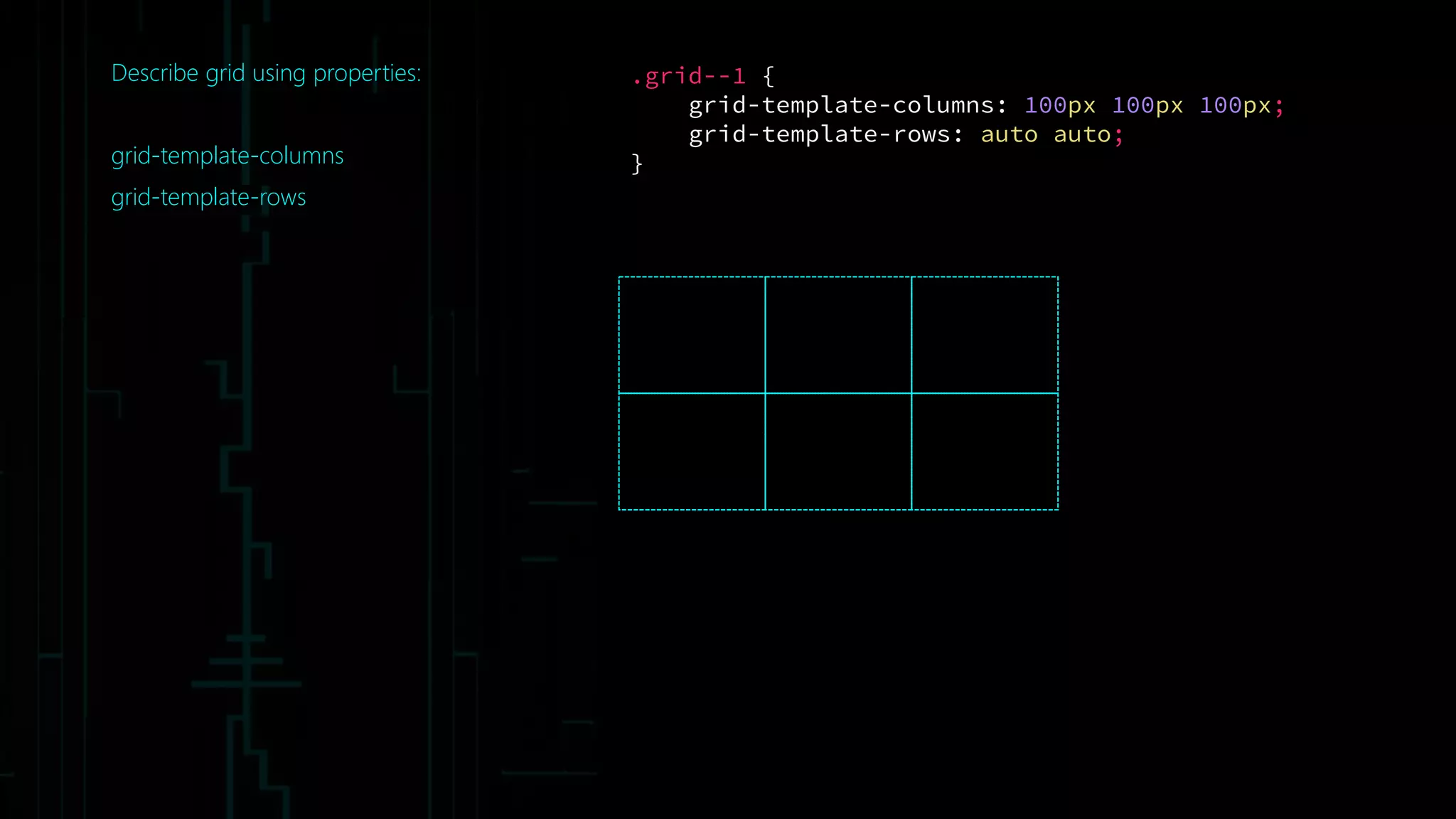
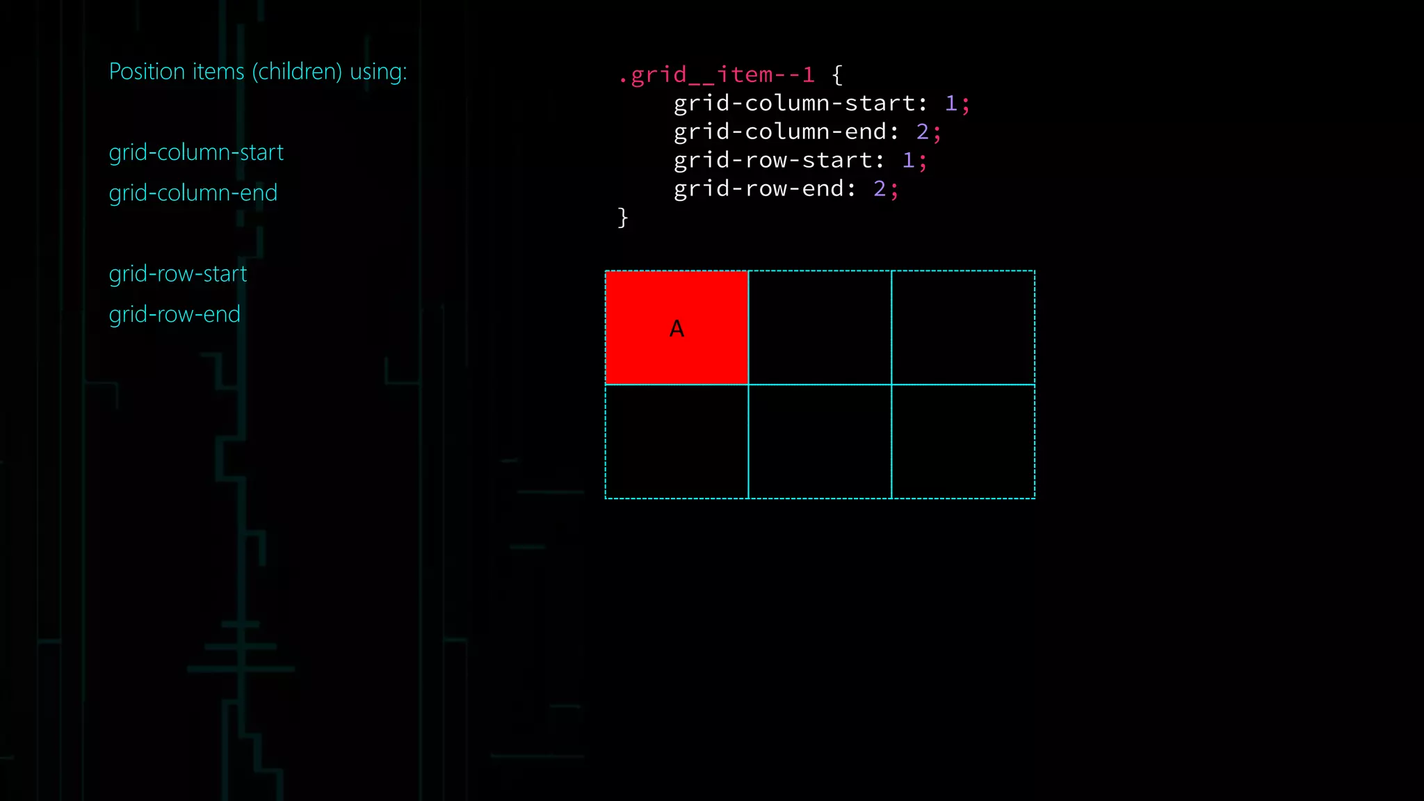
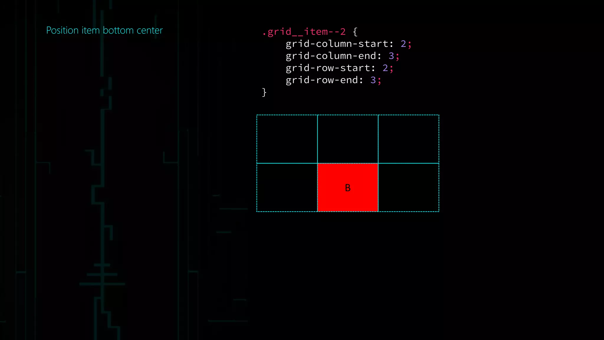
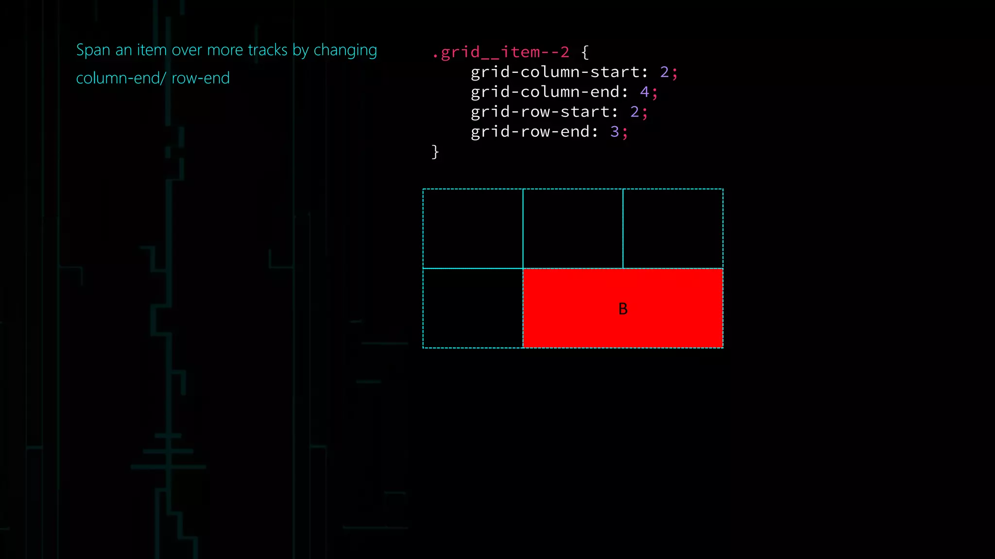
Download as PDF, PPTX


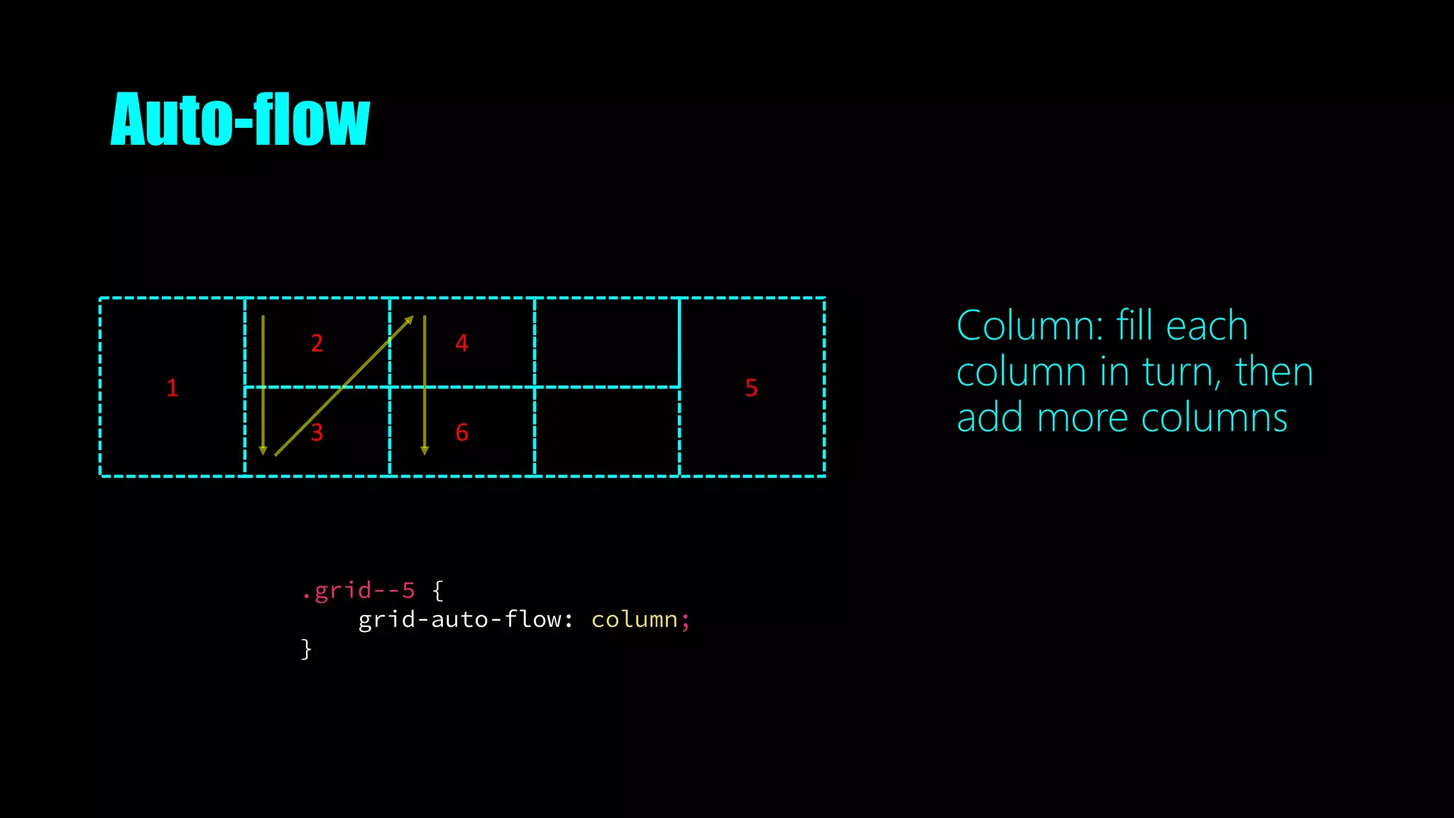

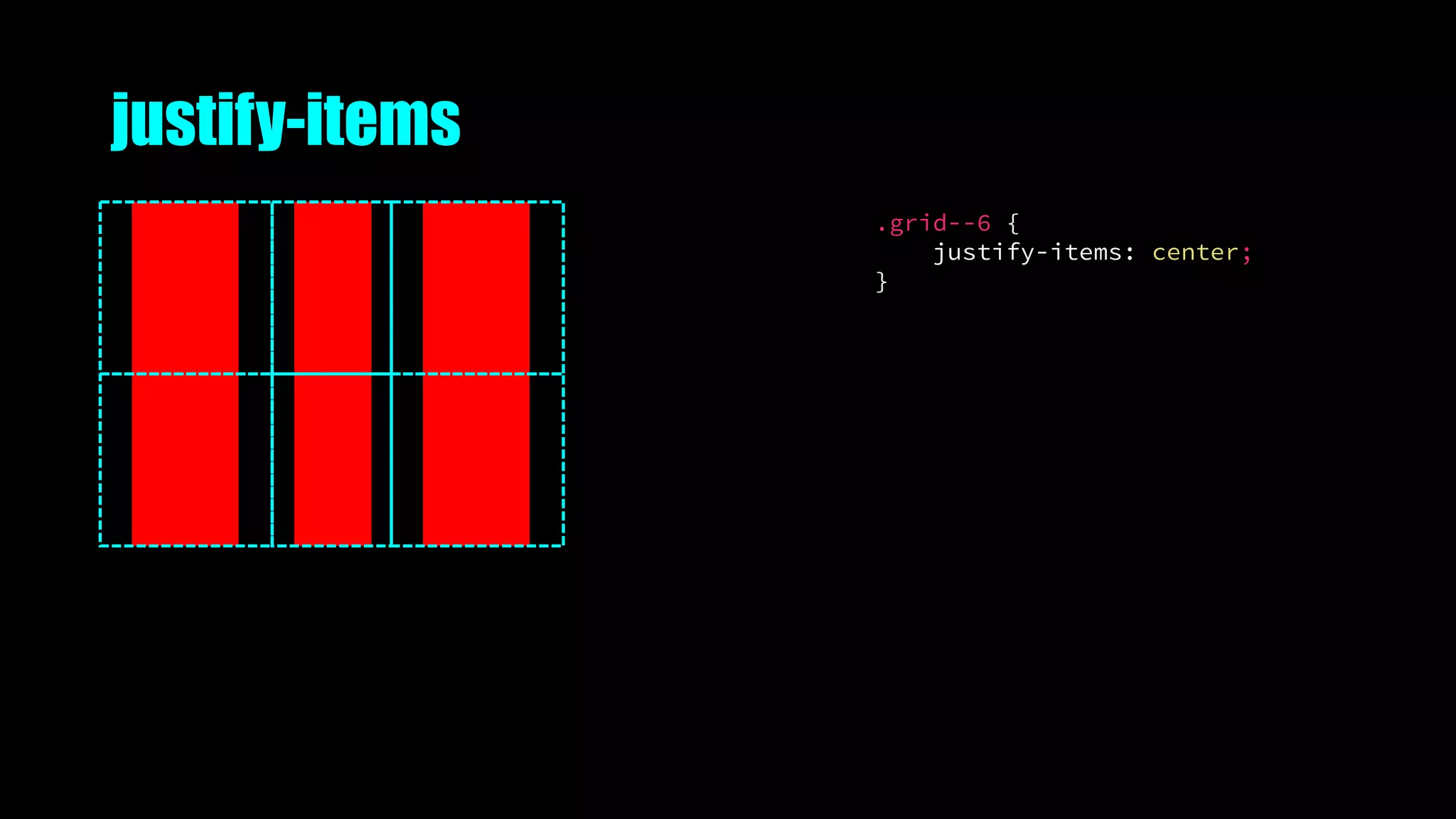

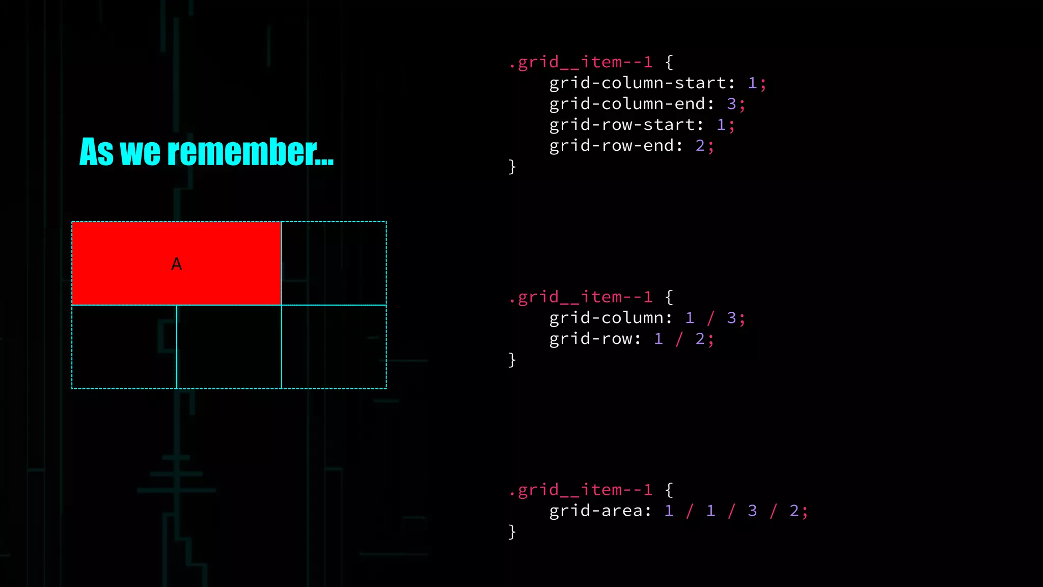
![Named lines
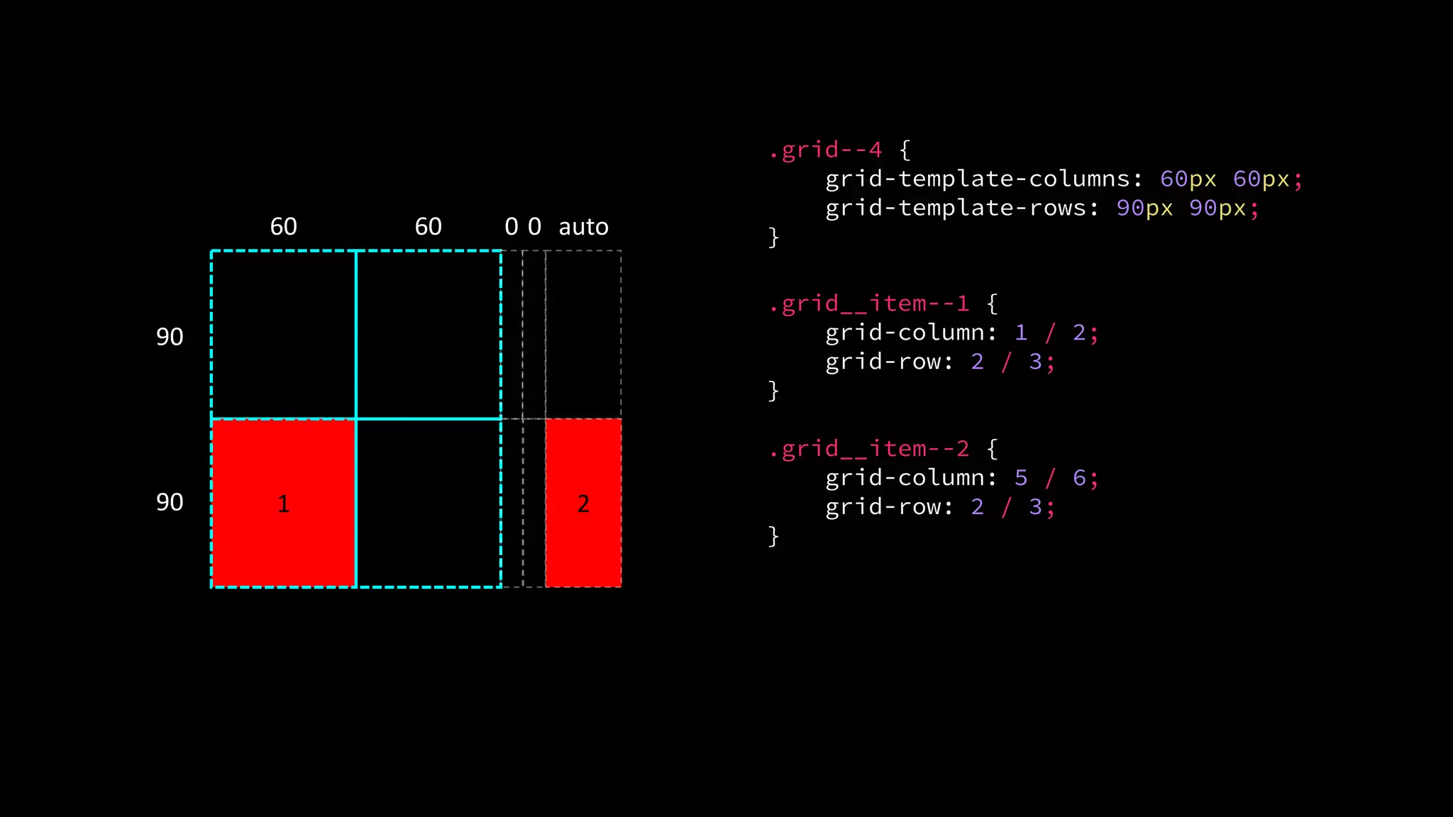
.grid__item--1 {
grid-column: col1-start / col3-start;
grid-row: row1-start;
}
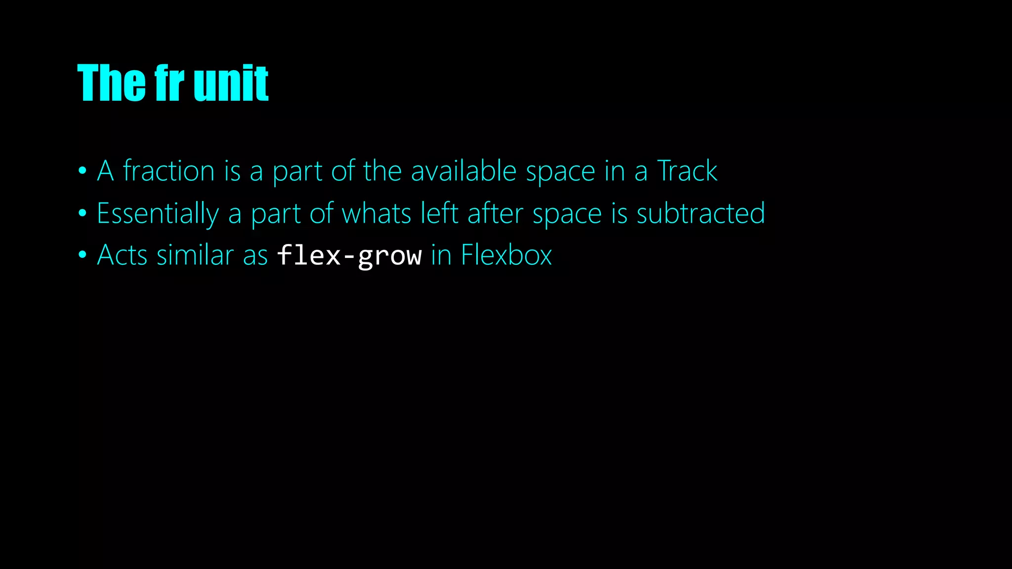
A
.grid--5 {
grid-template-columns: [col1-start] 100px
[col2-start] 100px
[col3-start] 100px
[col3-end];
grid-template-rows: [row1-start] auto
[row2-start] auto
[row2-end];
}](https://image.slidesharecdn.com/thegrid-futureofcsslayout-191010052102/75/The-Grid-The-Future-of-CSS-Layout-73-2048.jpg)
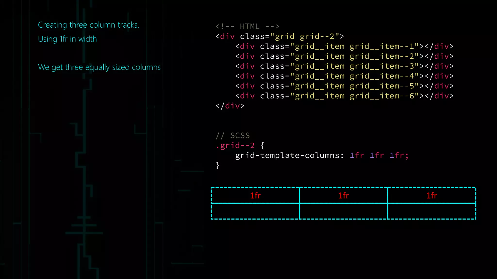
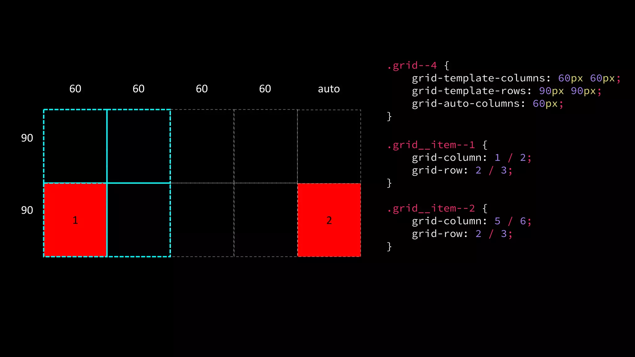
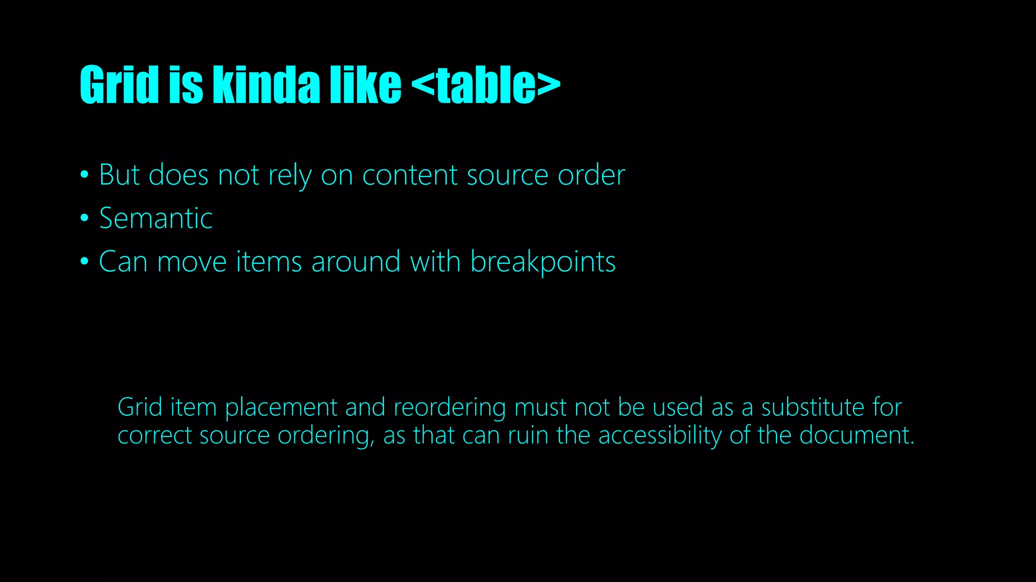
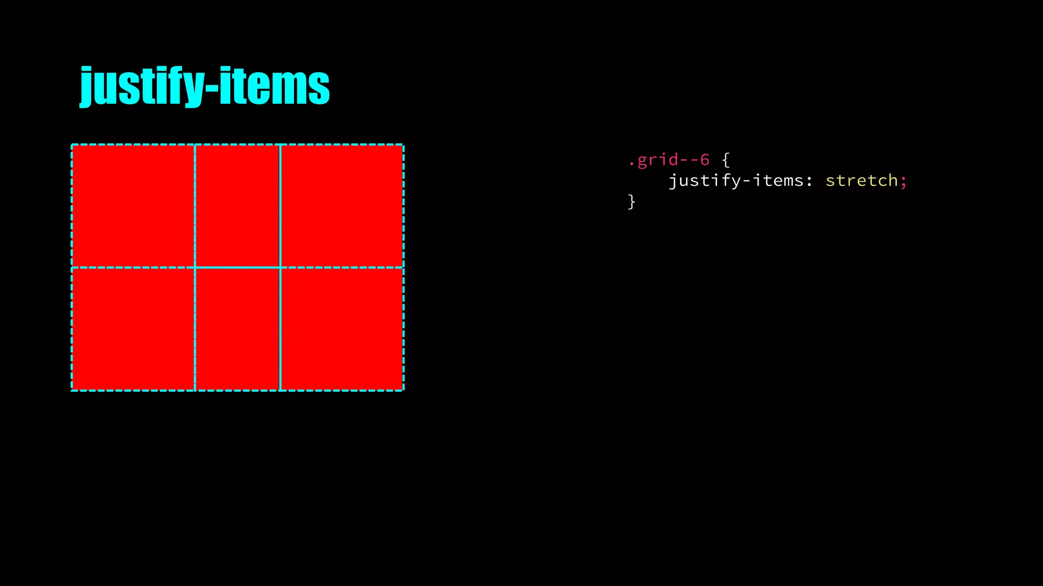
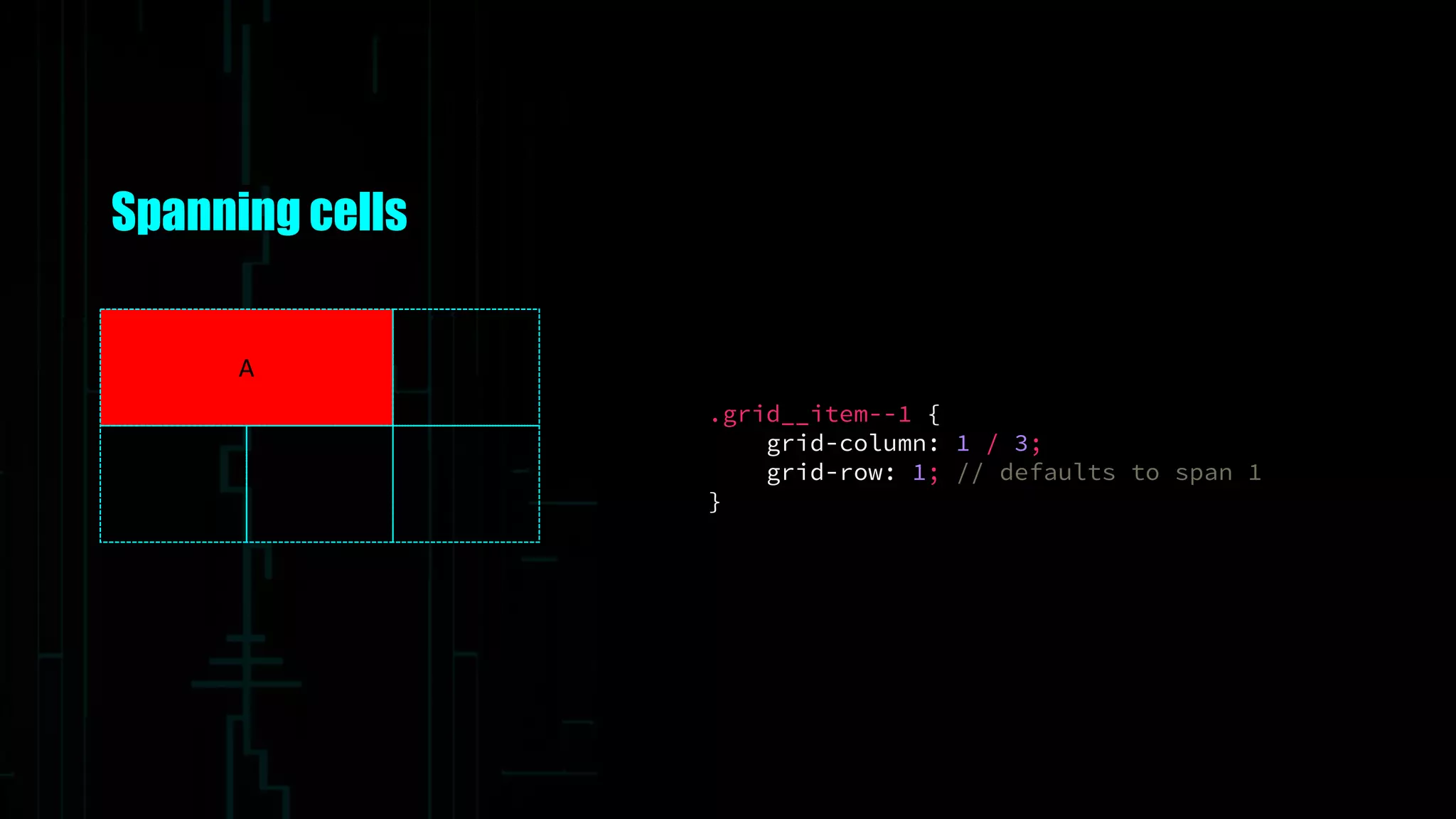
![Named lines with span
.grid__item--1 {
grid-column: col / span 2;
grid-row: row;
}
A
.grid--5 {
grid-template-columns: [col] 100px
[col] 100px
[col] 100px
[col];
grid-template-rows: [row] auto
[row] auto
[row];
}](https://image.slidesharecdn.com/thegrid-futureofcsslayout-191010052102/75/The-Grid-The-Future-of-CSS-Layout-74-2048.jpg)
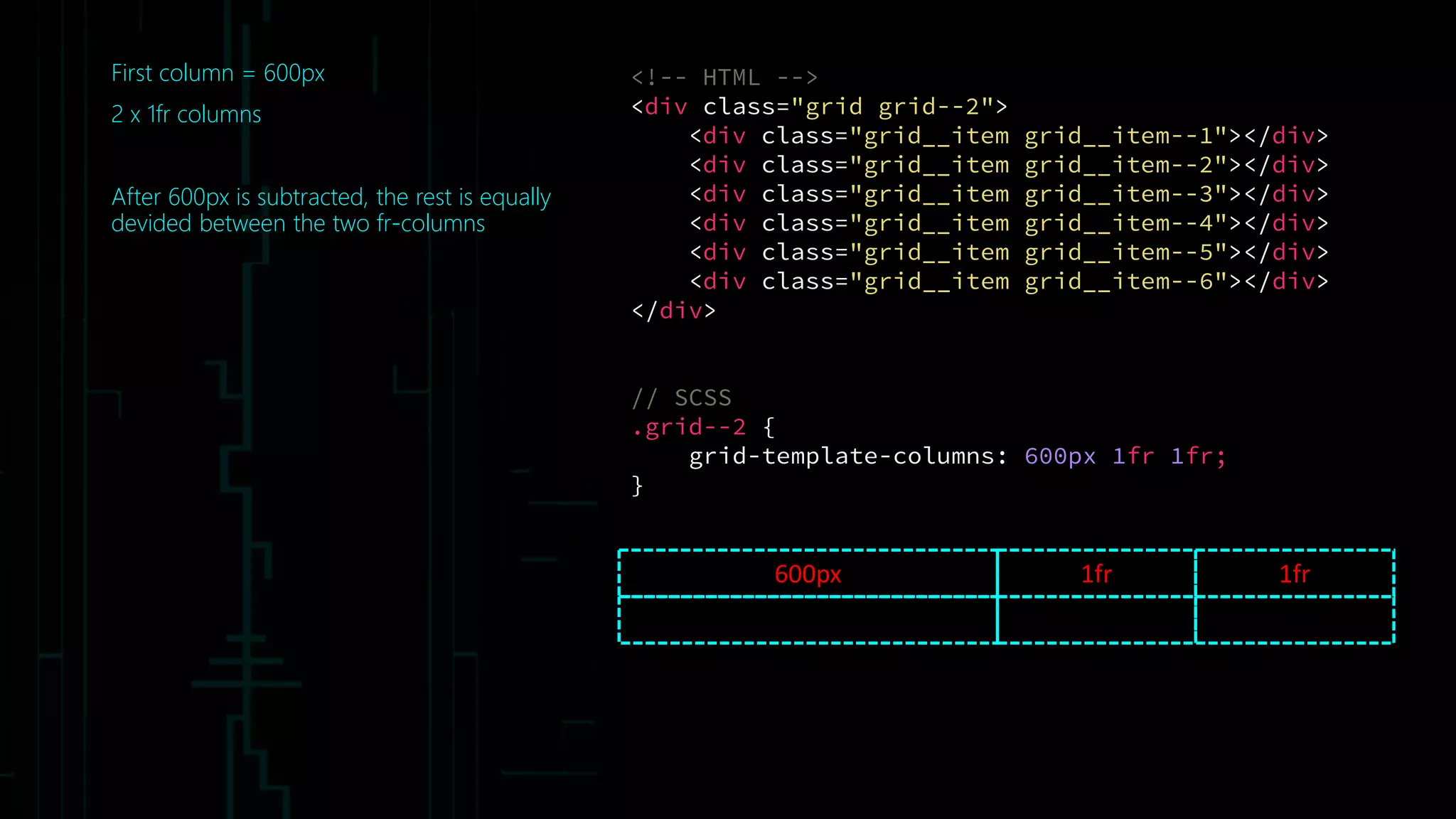
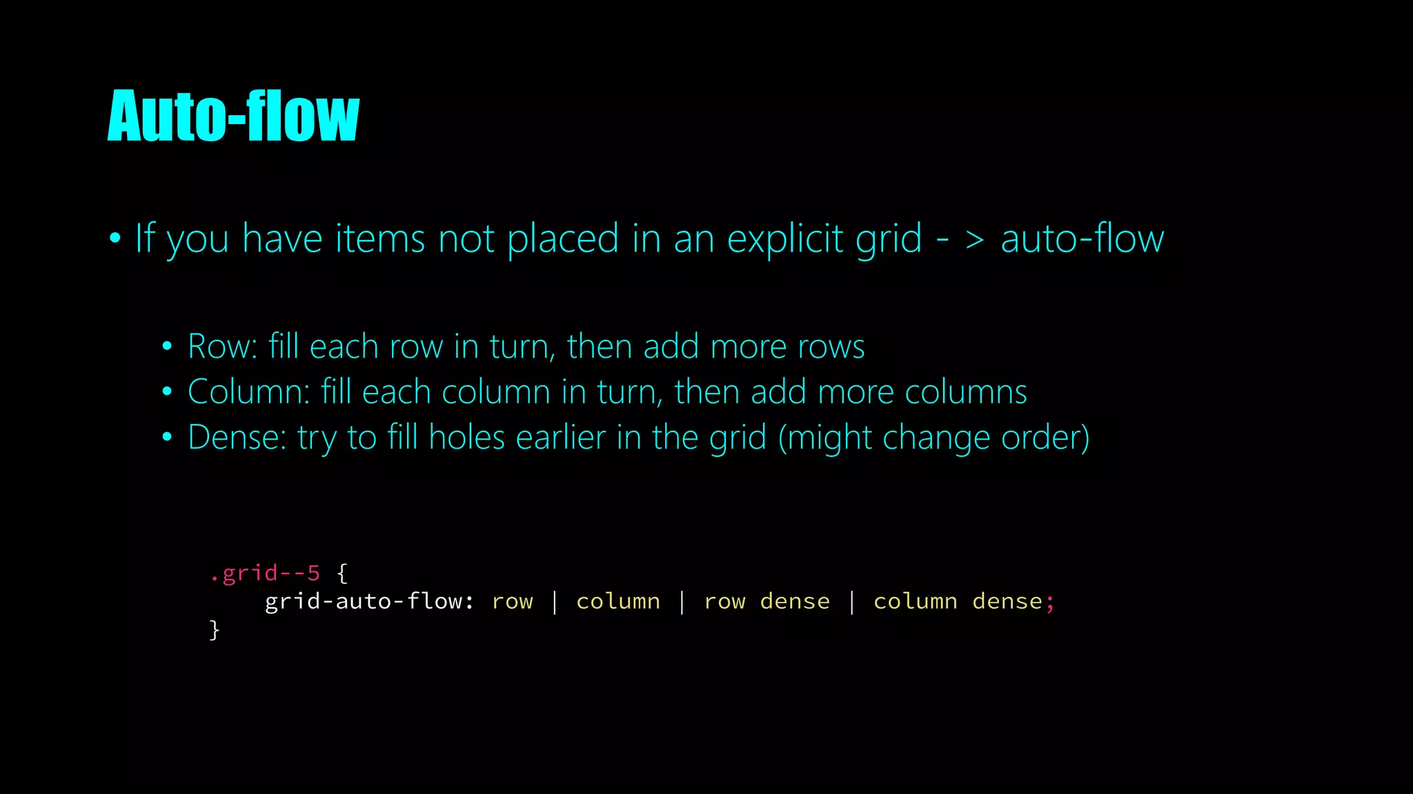
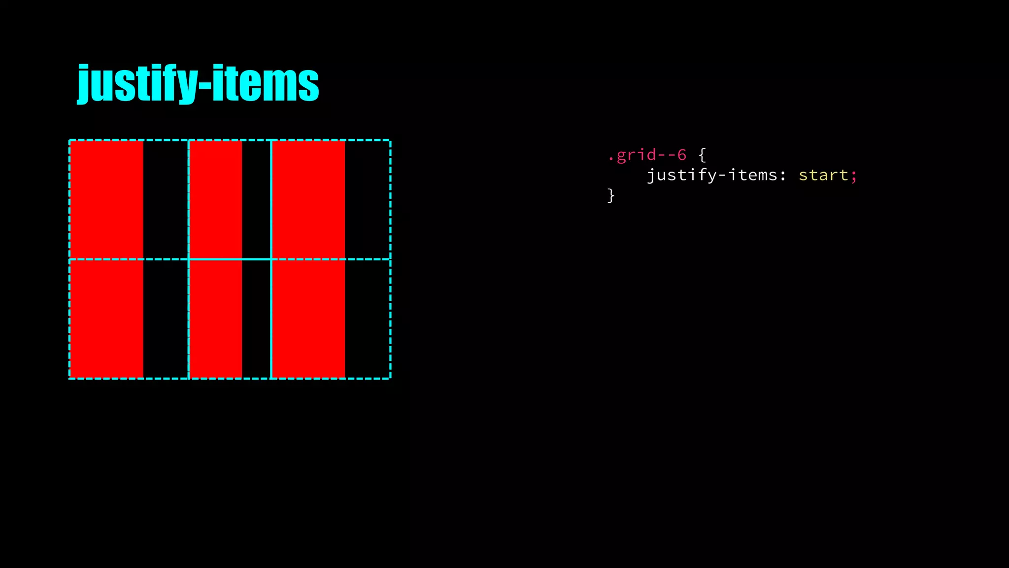
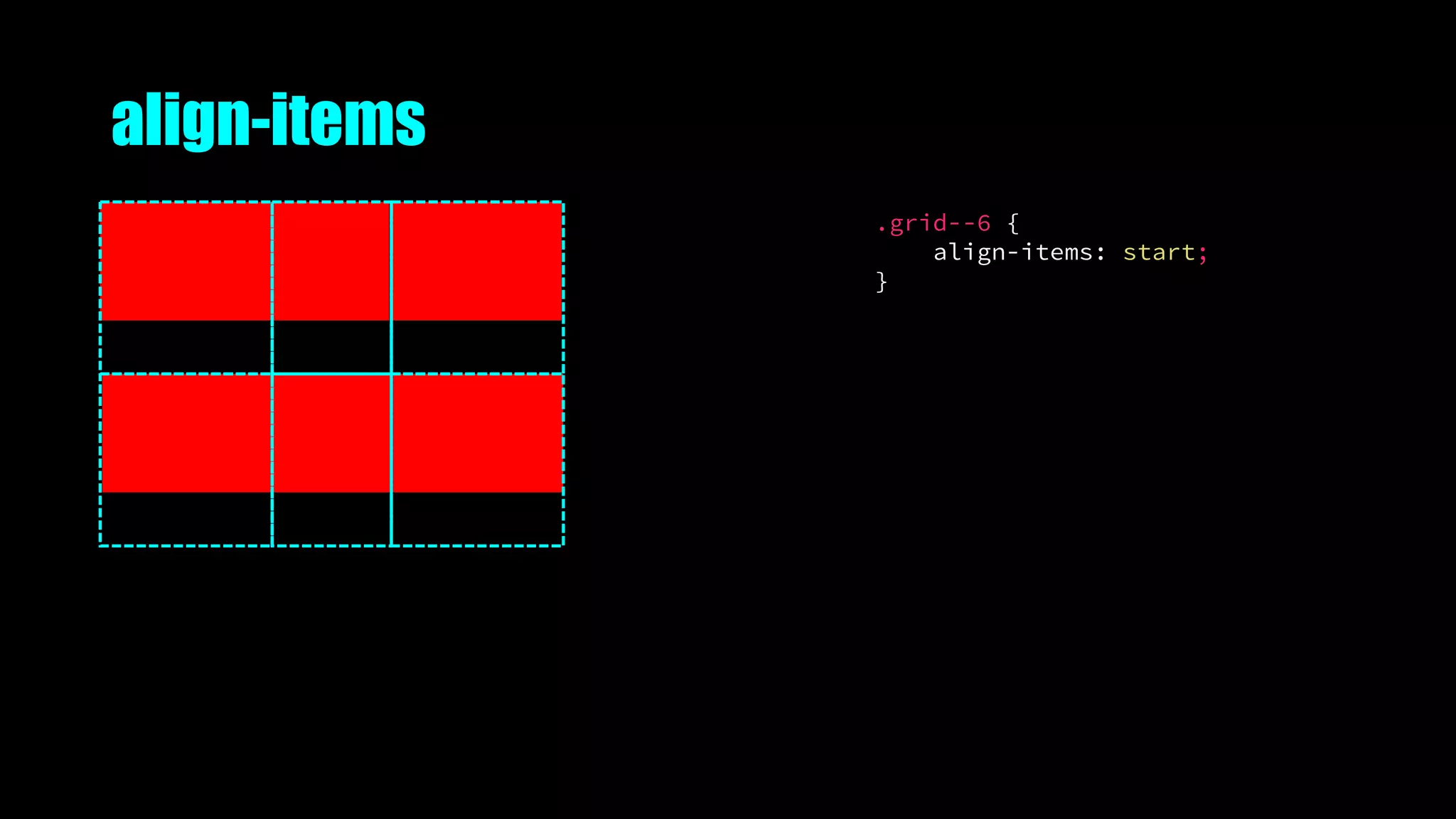
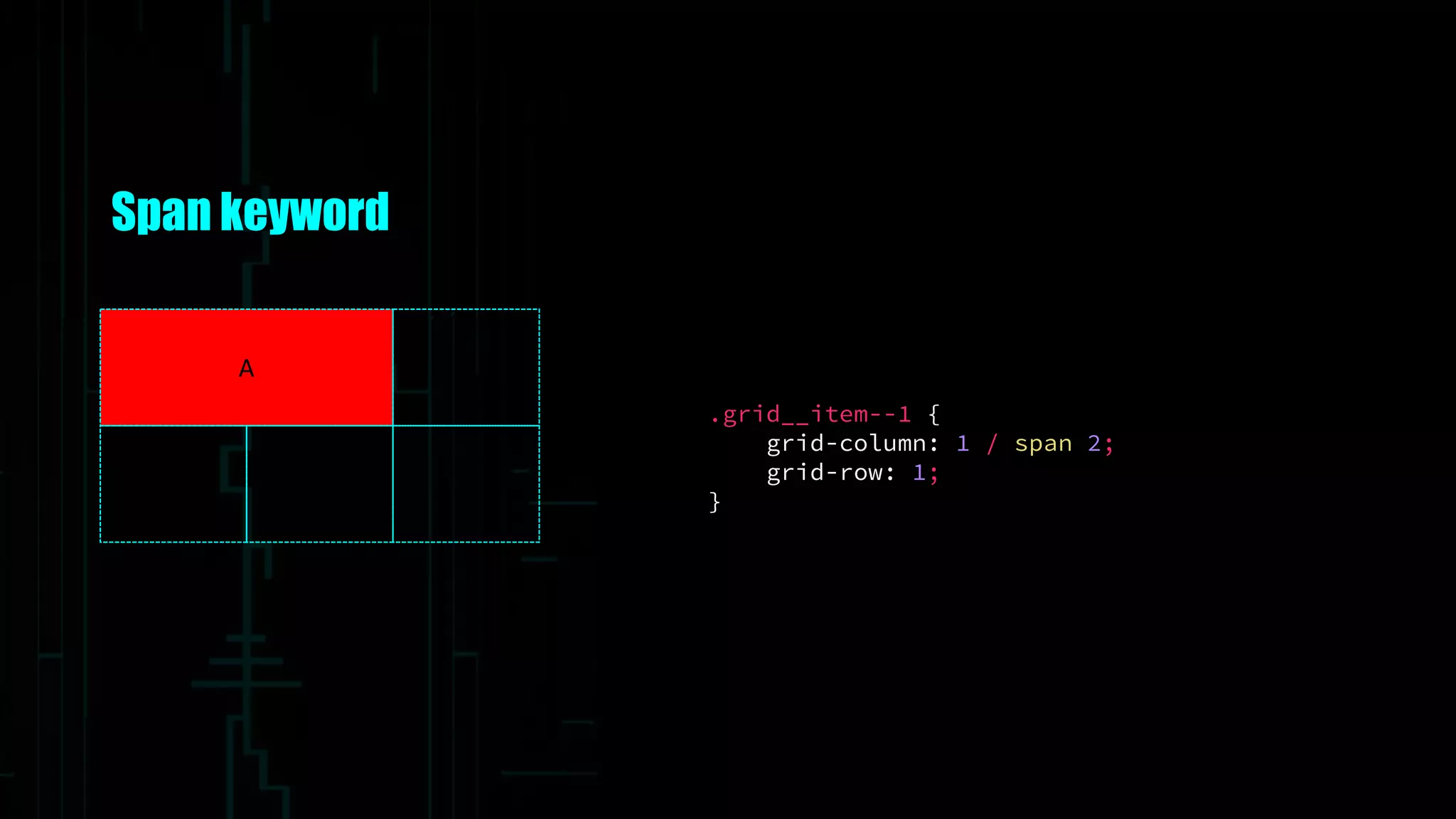
![Repeat keyword
.grid__item--1 {
grid-column: col / span 2;
grid-row: row;
}
A
.grid--5 {
grid-template-columns: repeat(3, [col] 100px);
grid-template-rows: repeat(2, [row] auto);
}](https://image.slidesharecdn.com/thegrid-futureofcsslayout-191010052102/75/The-Grid-The-Future-of-CSS-Layout-75-2048.jpg)
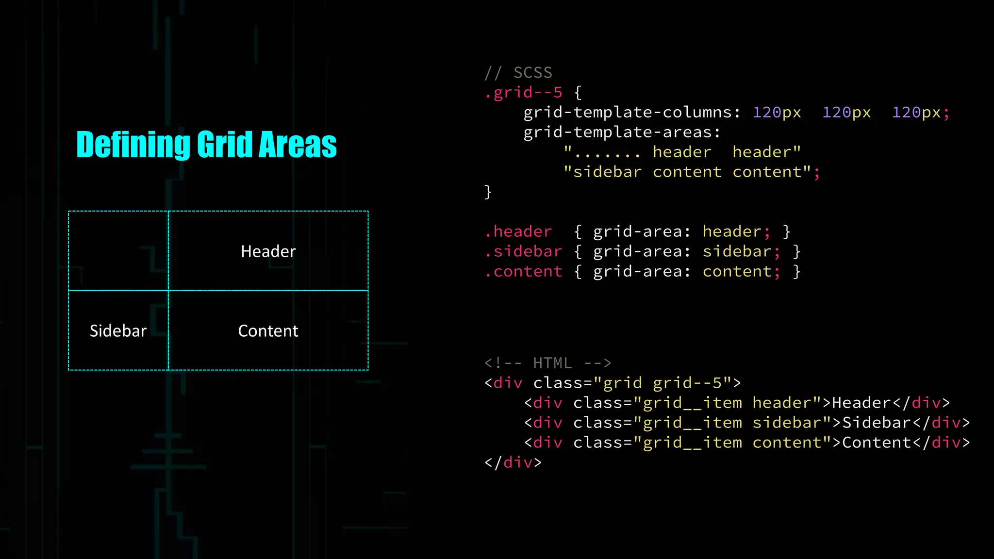
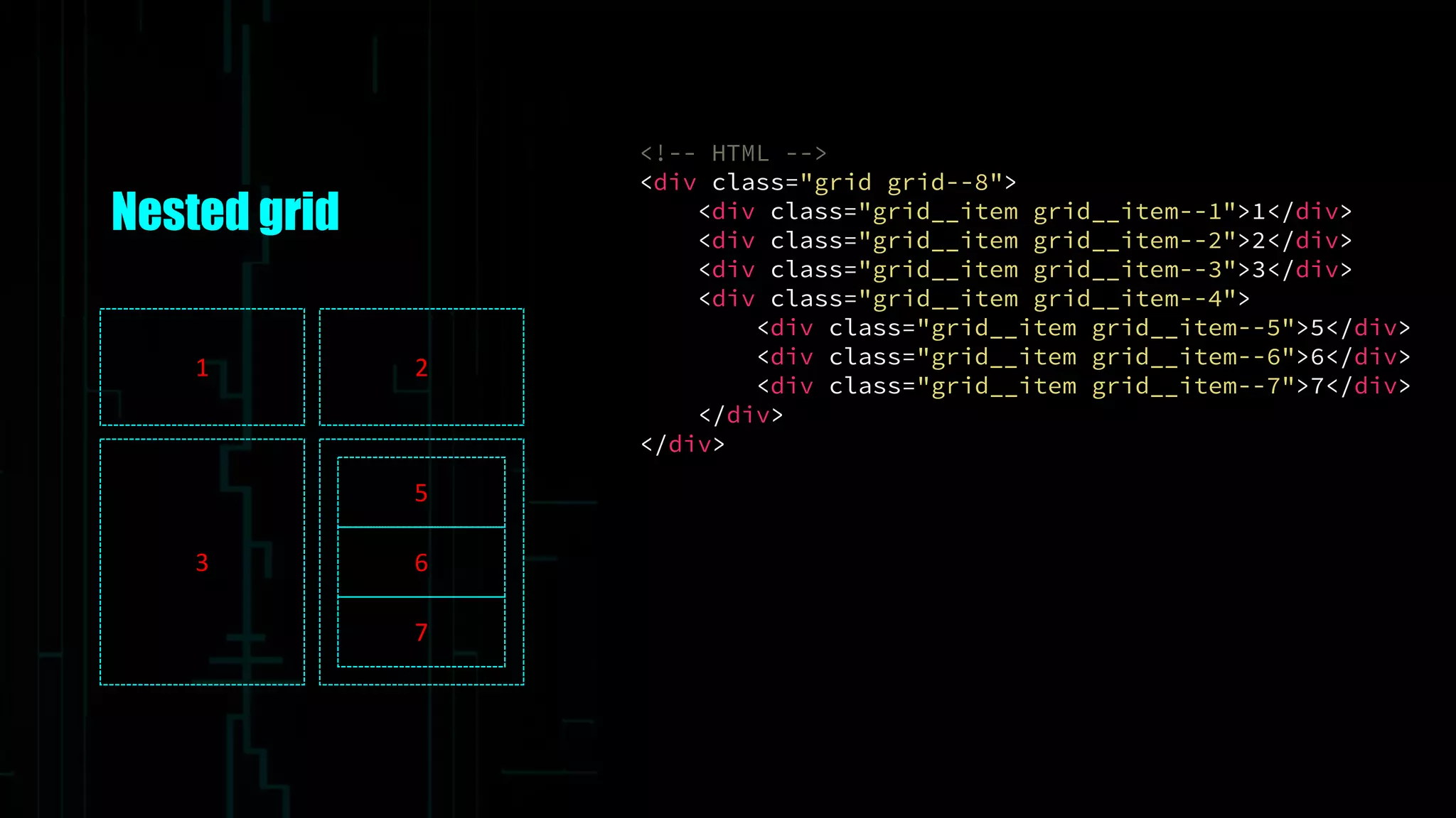
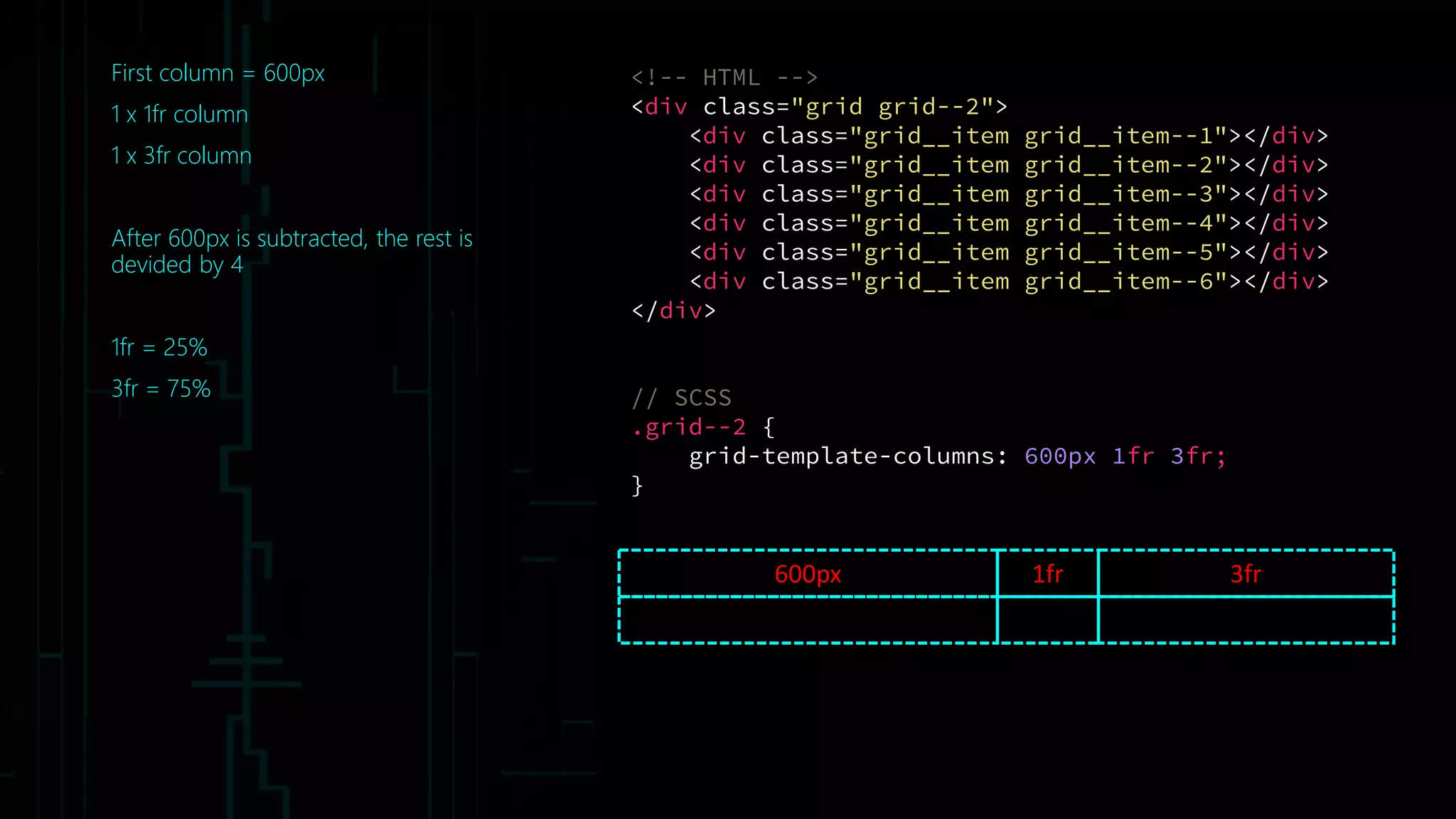
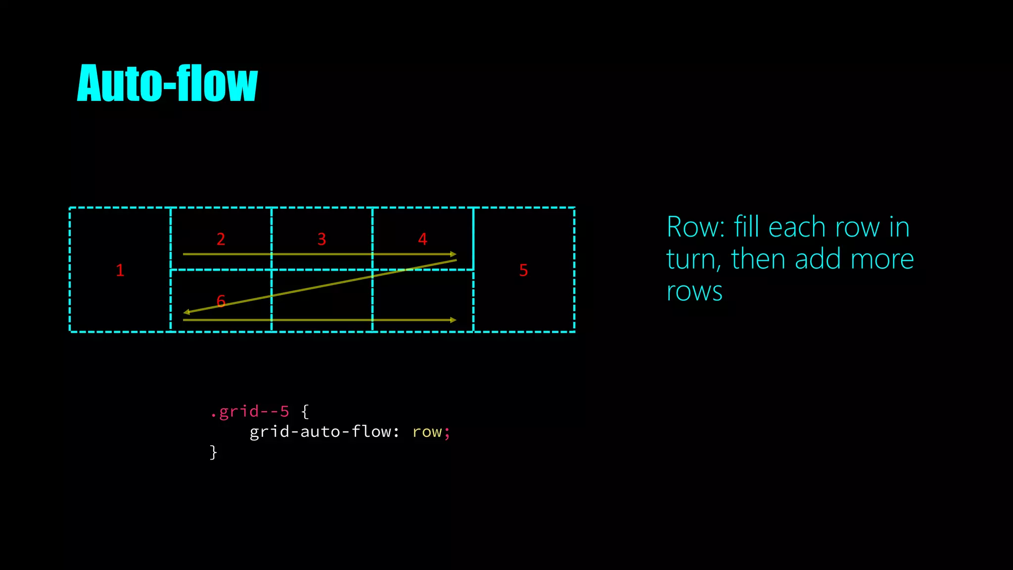
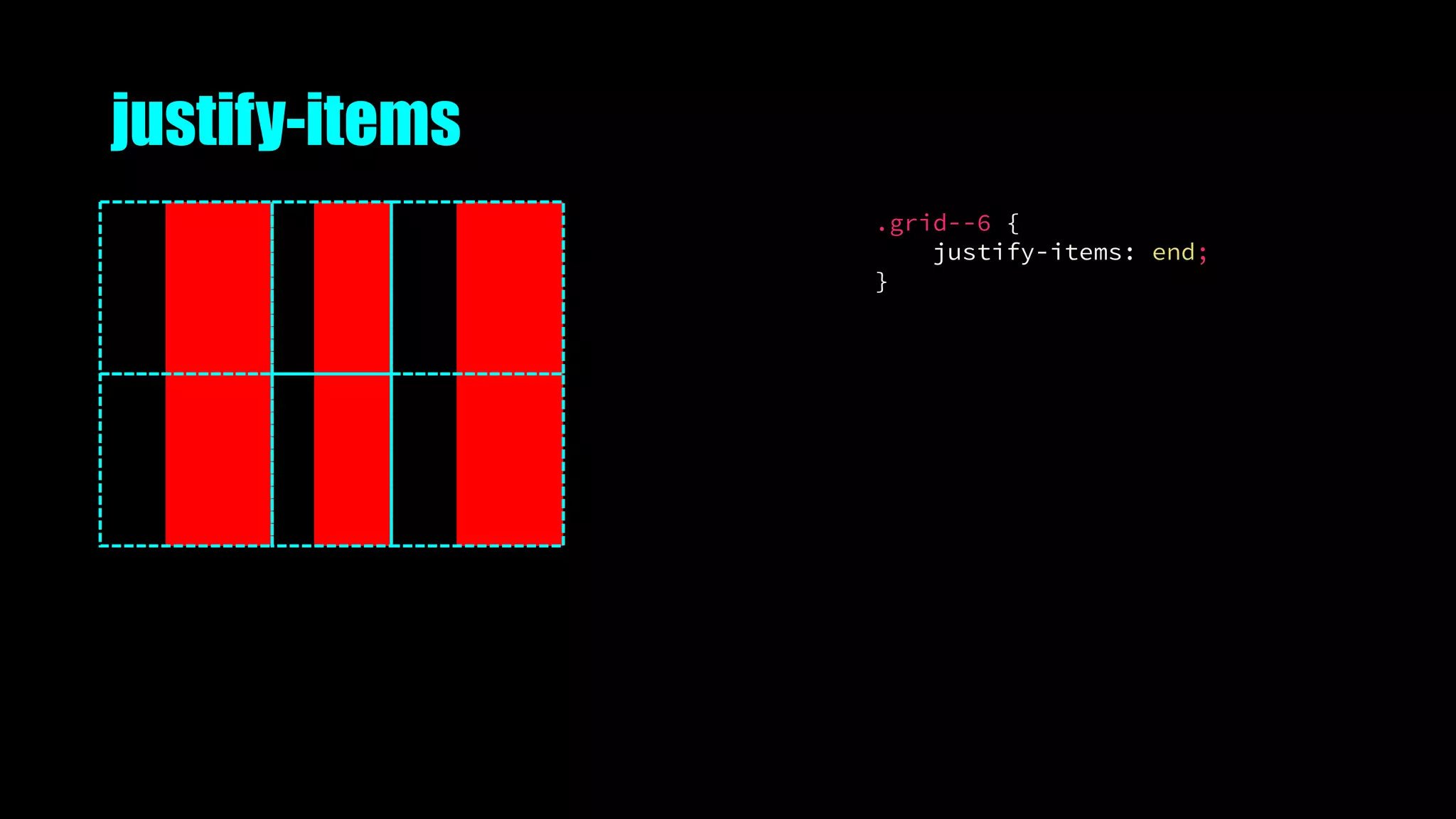
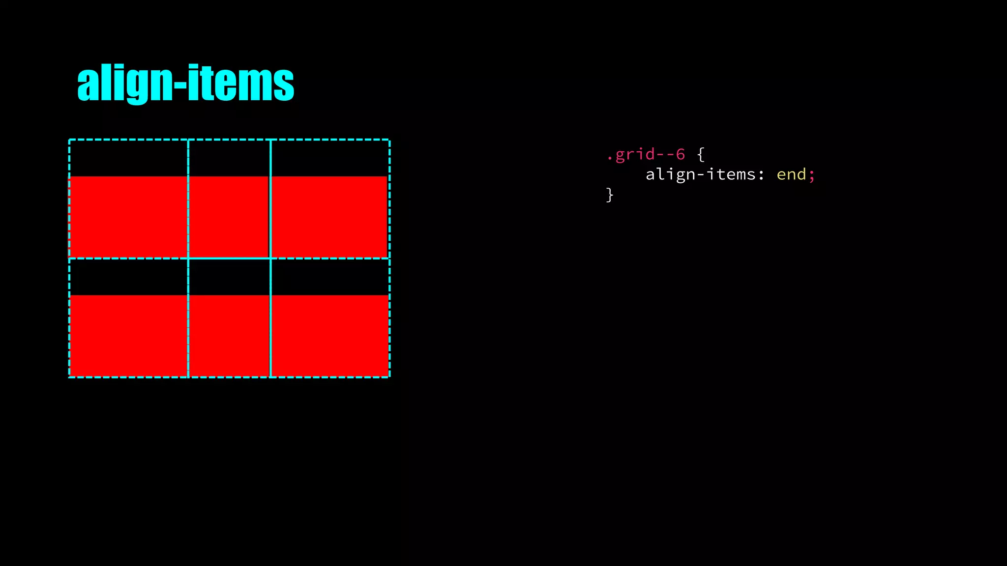
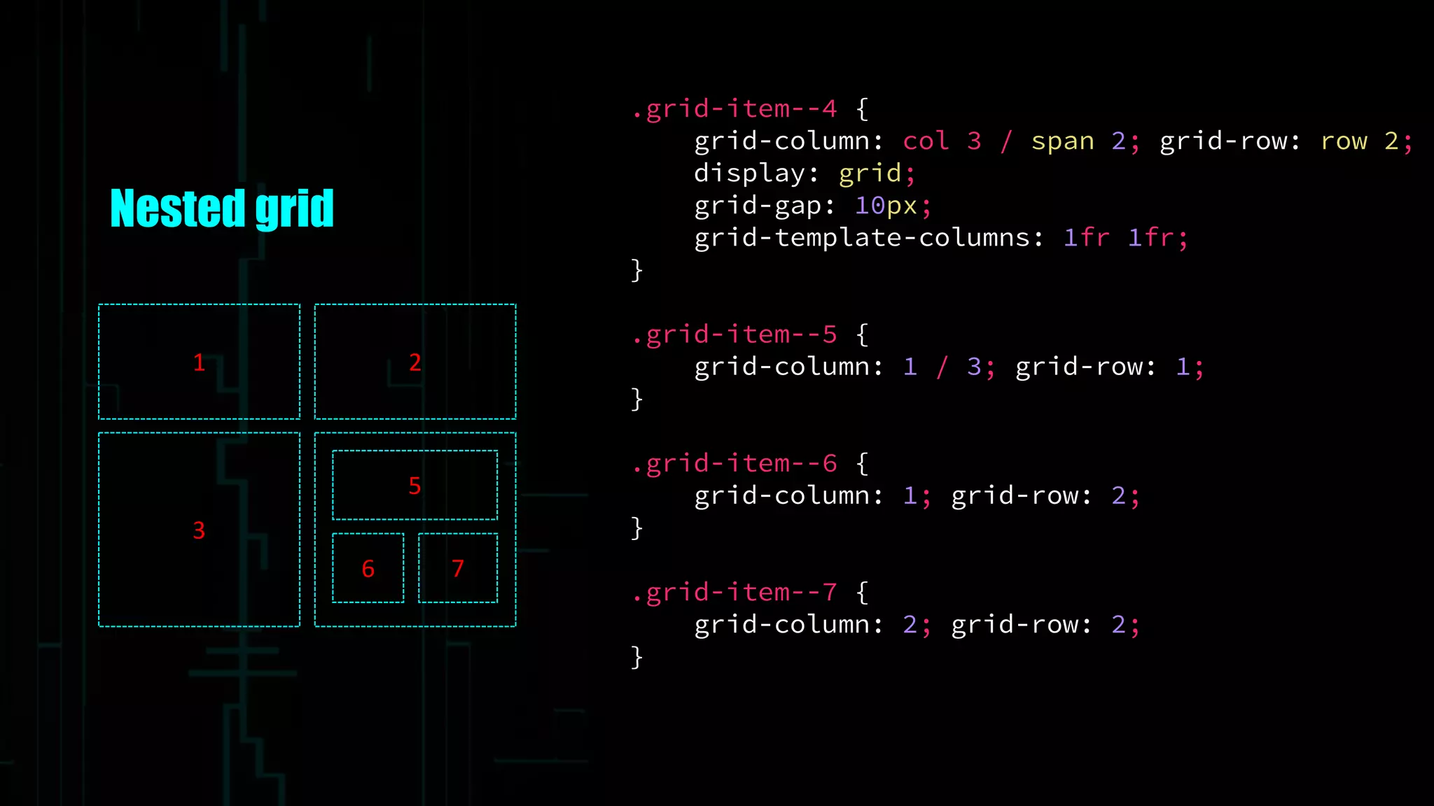
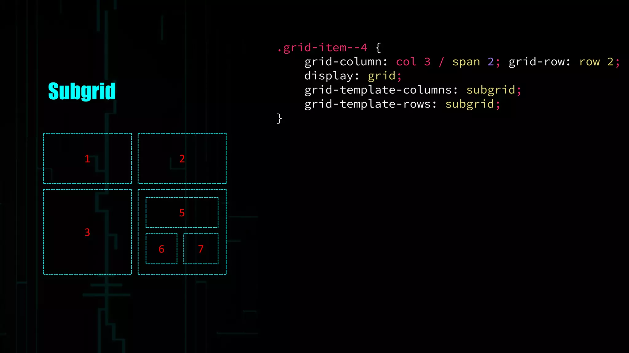
![Nested grid
// SCSS
.grid--8 {
grid-gap: 10px;
grid-template-columns:
repeat(4, [col] 150px);
repeat(4, [row] auto);
}
1 2
3
5
6
7
.grid-item--1 {
grid-column: col / span 2; grid-row: row;
}
.grid-item--2 {
grid-column: col 3 / span 2; grid-row: row;
}
.grid-item--3 {
grid-column: col / span 2; grid-row: row 2;
}
.grid-item--4 {
grid-column: col 3 / span 2; grid-row: row 2;
}](https://image.slidesharecdn.com/thegrid-futureofcsslayout-191010052102/75/The-Grid-The-Future-of-CSS-Layout-79-2048.jpg)


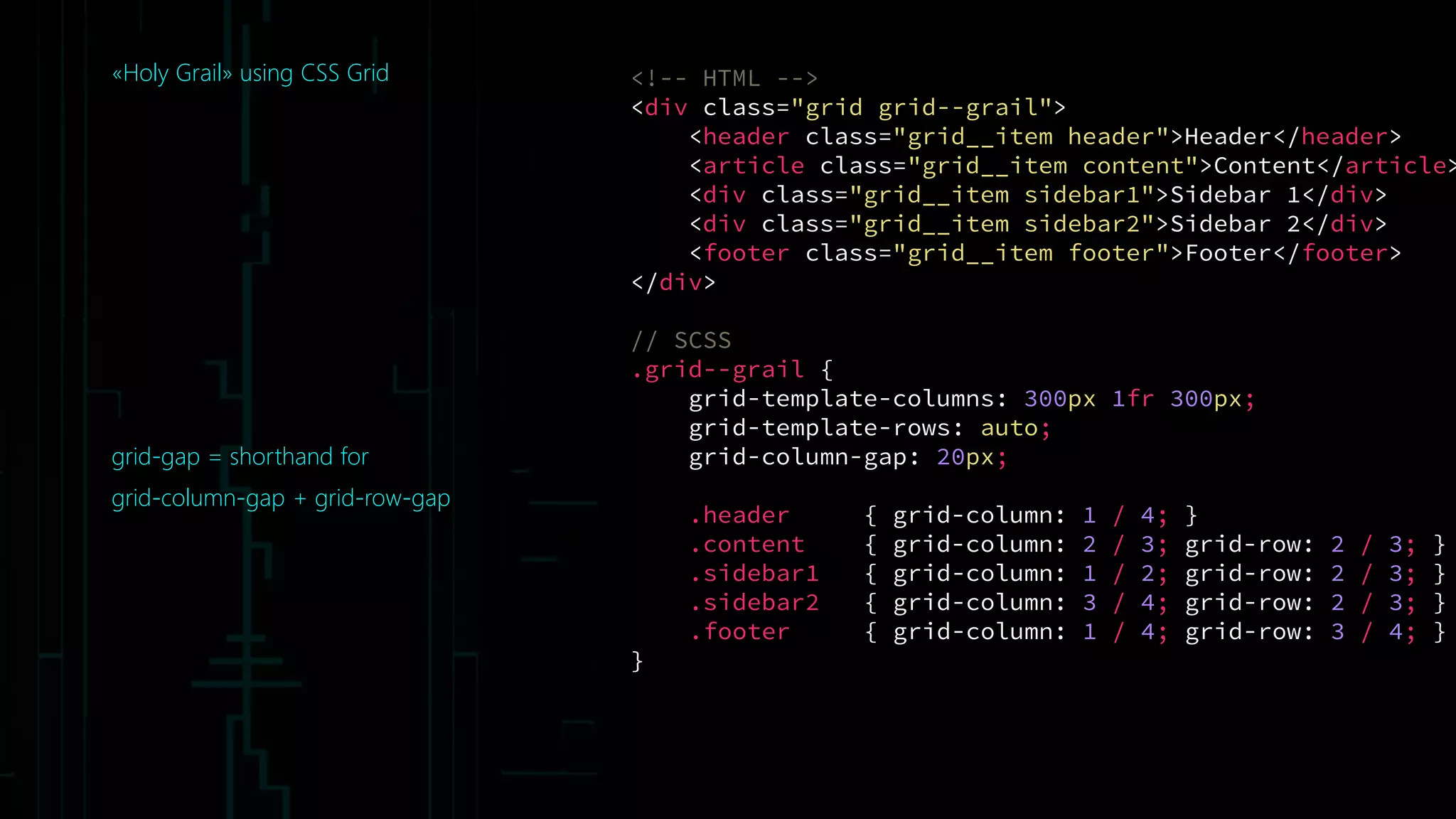
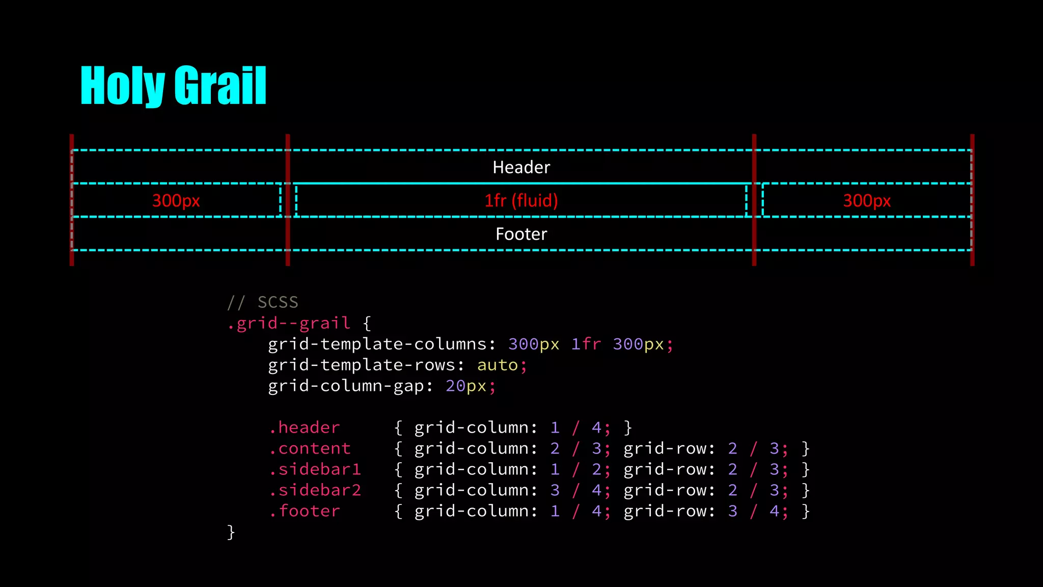
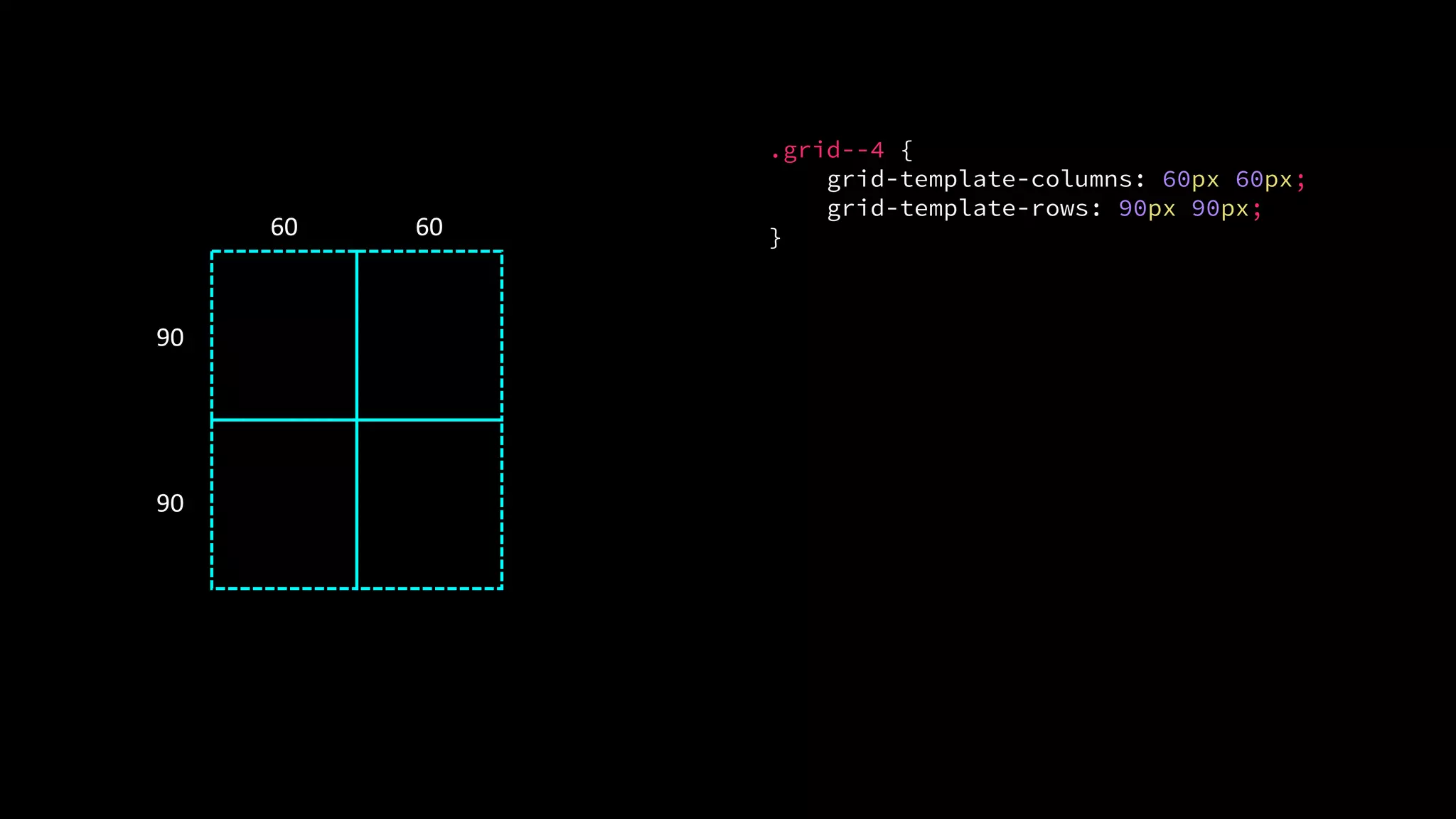
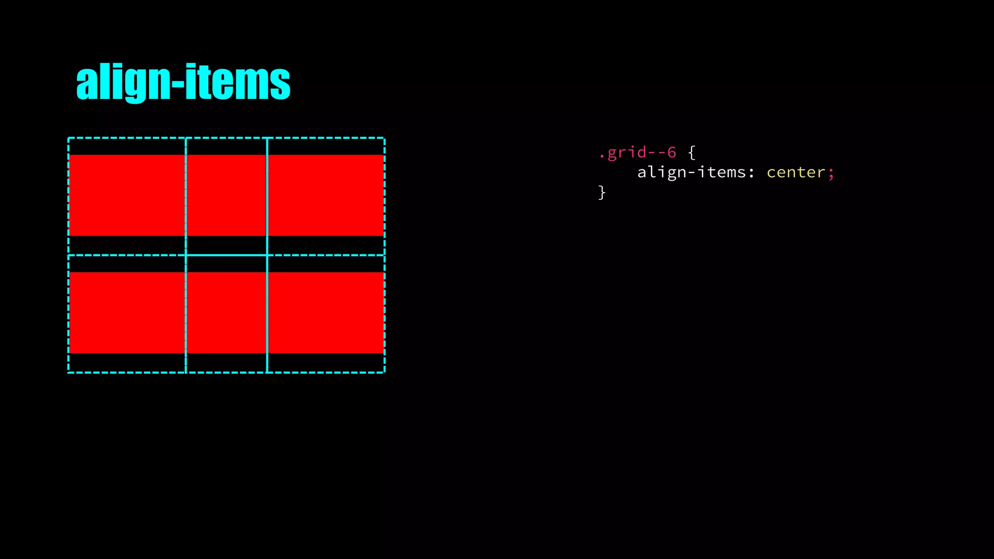
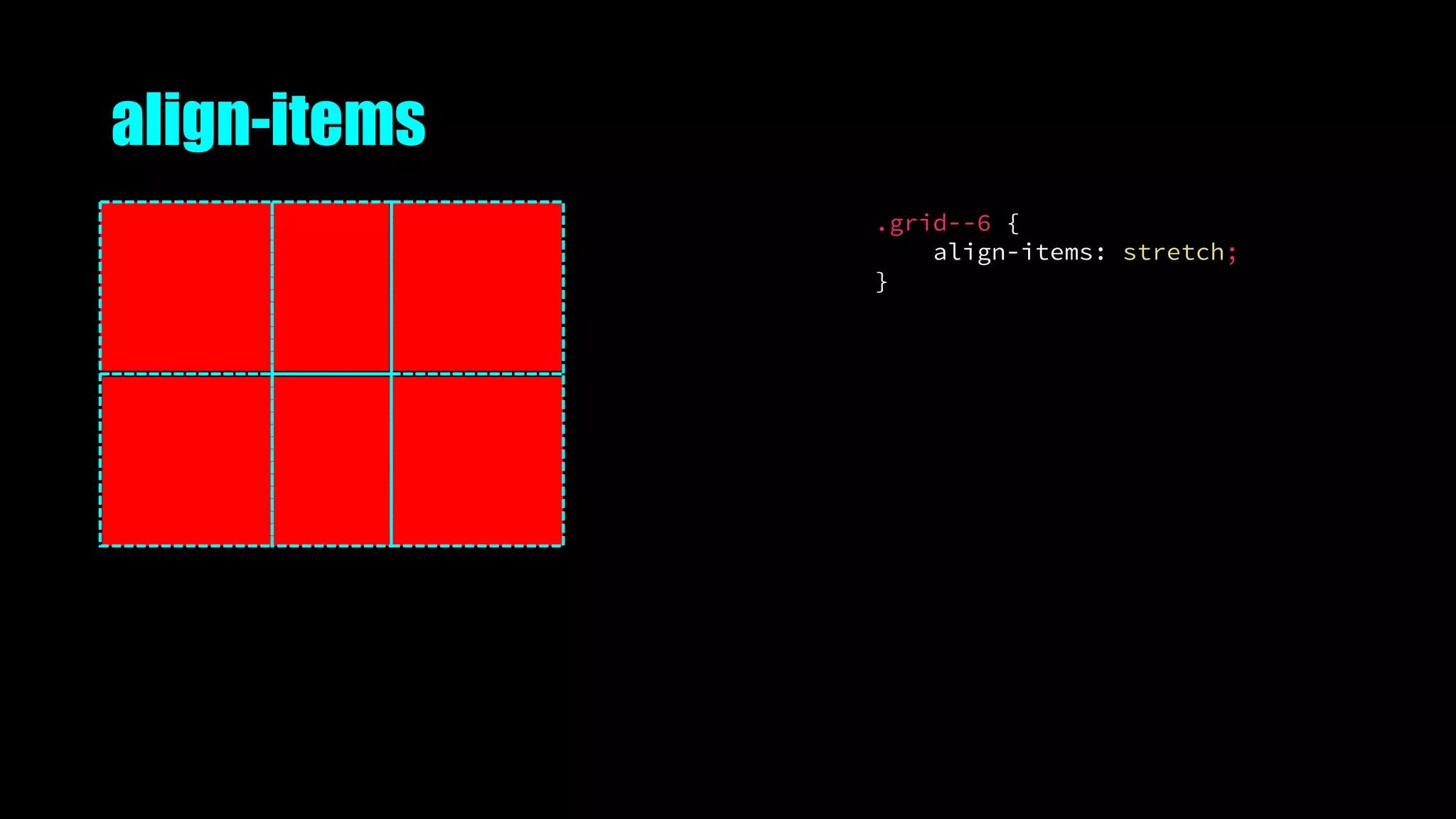
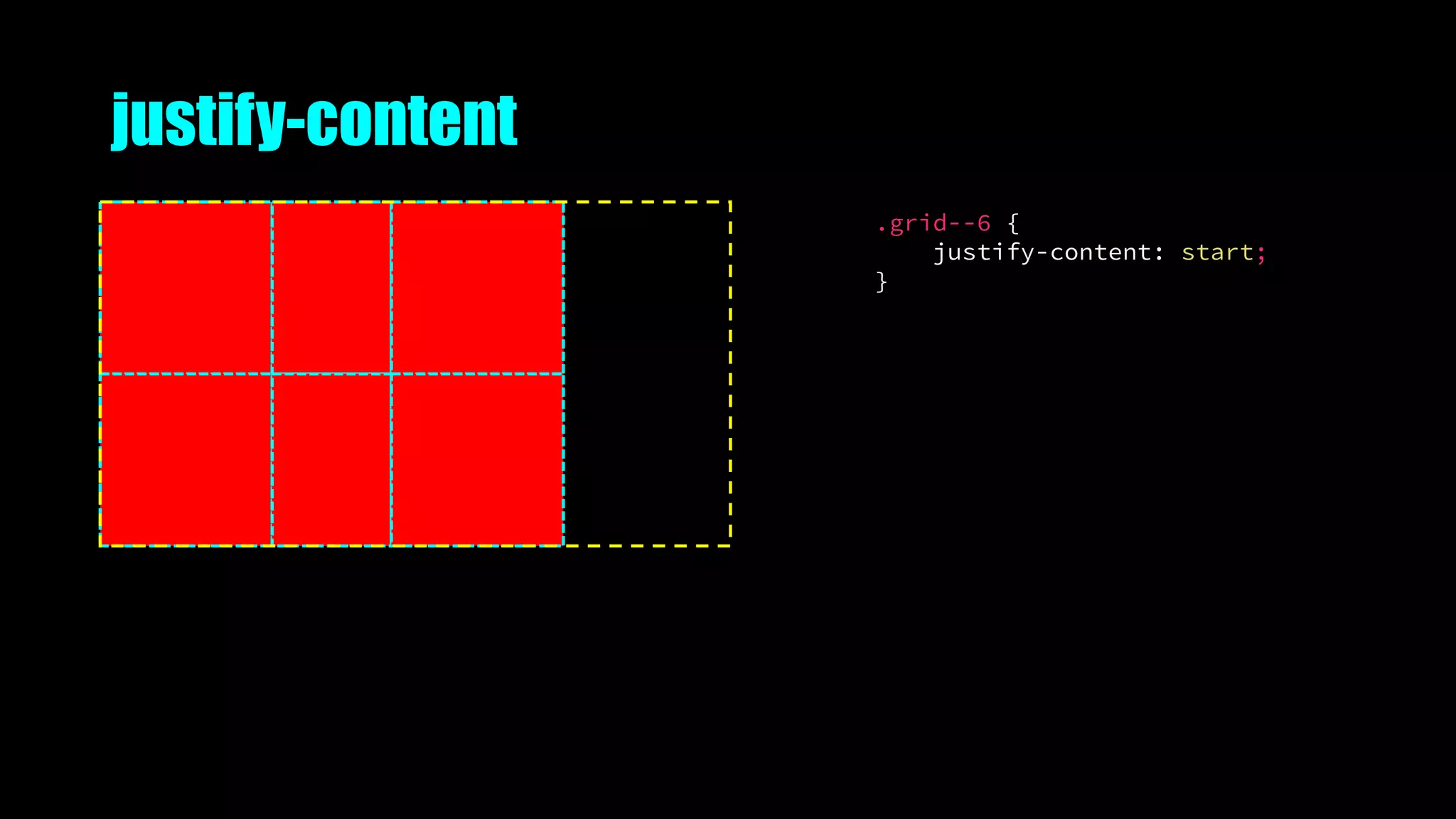
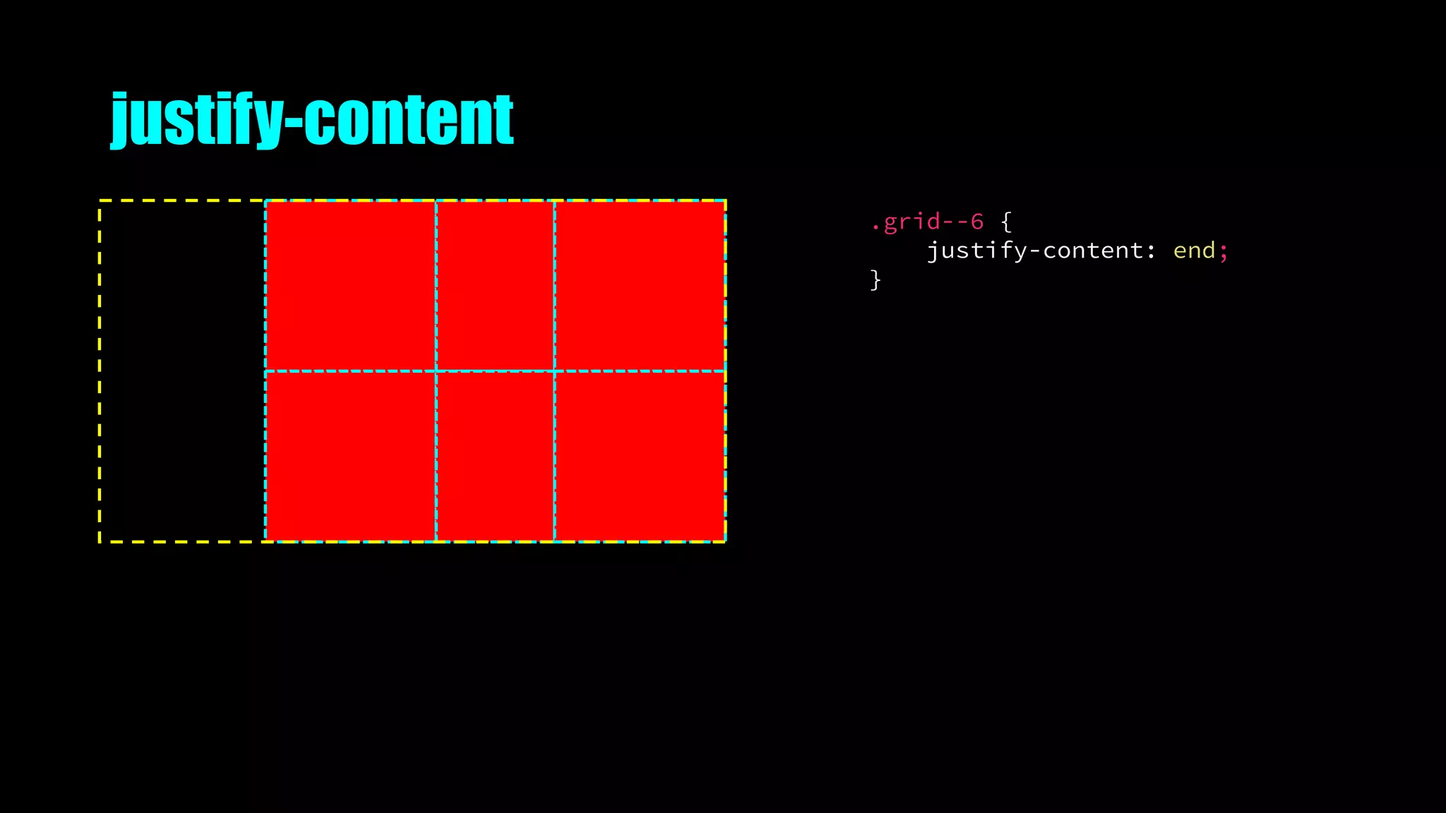
The document provides an overview of CSS Grid Layout, a new two-dimensional layout system for CSS. It discusses the evolution of web layout techniques, basics of the CSS Grid model including grid lines, tracks, cells and areas. It covers grid properties for defining templates, placing items, and alignment. Examples demonstrate common layout patterns like holy grail, nested grids, and named lines. Resources for further learning about CSS Grid are also included.


