Downloaded 1,956 times
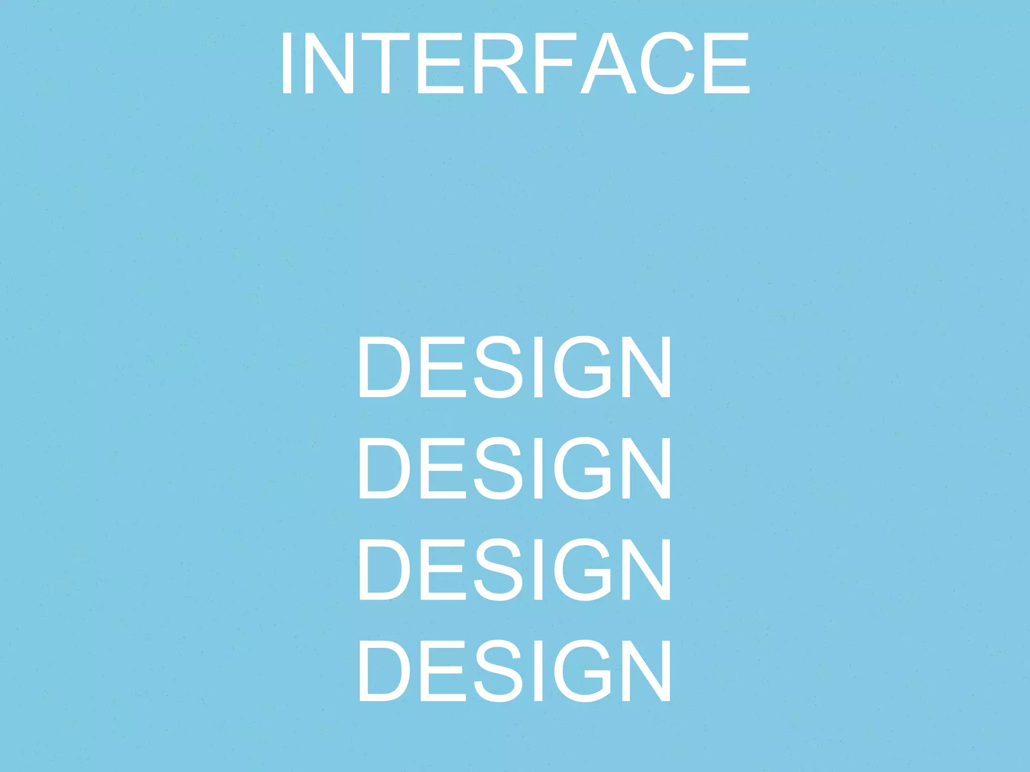
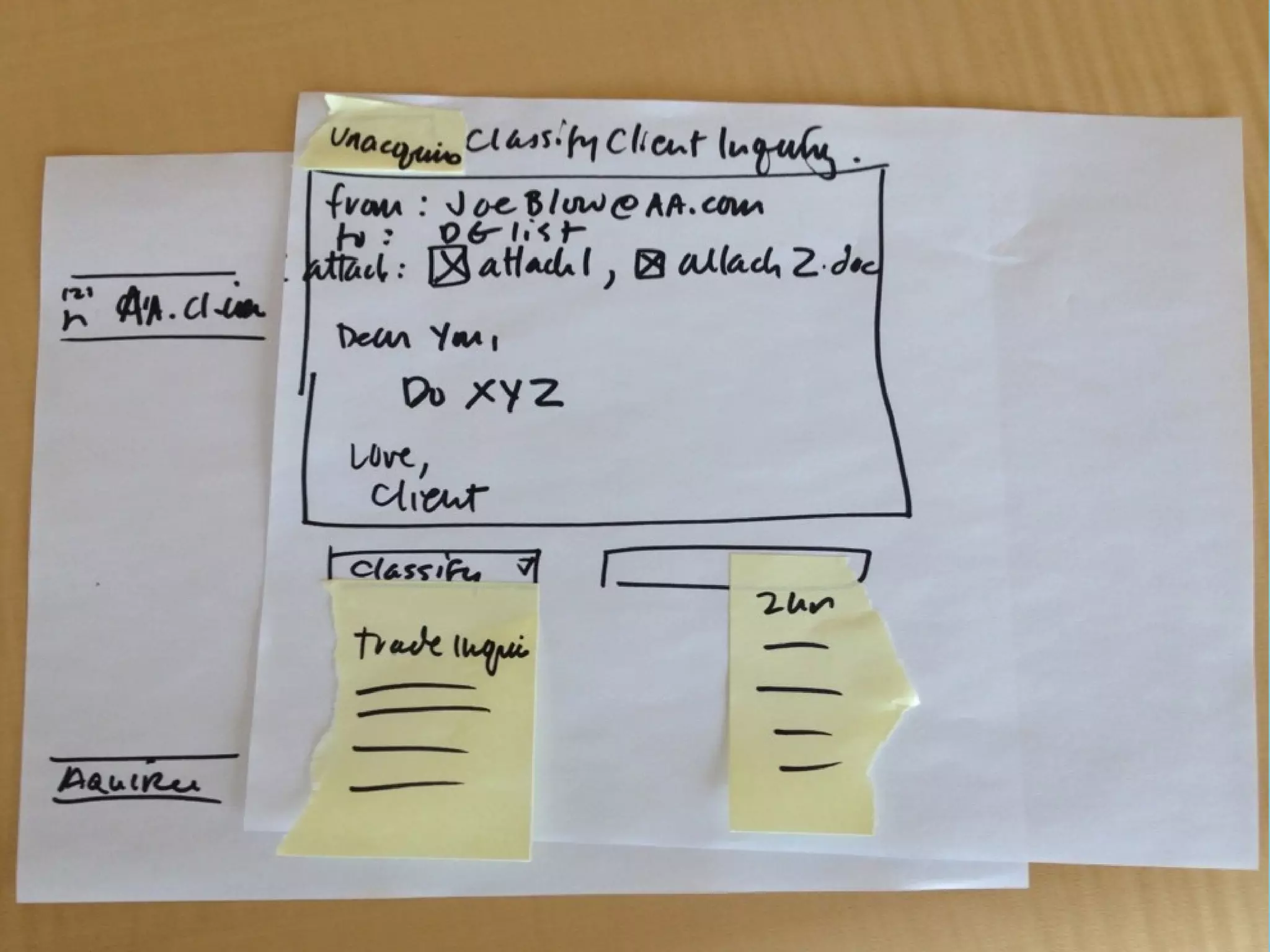
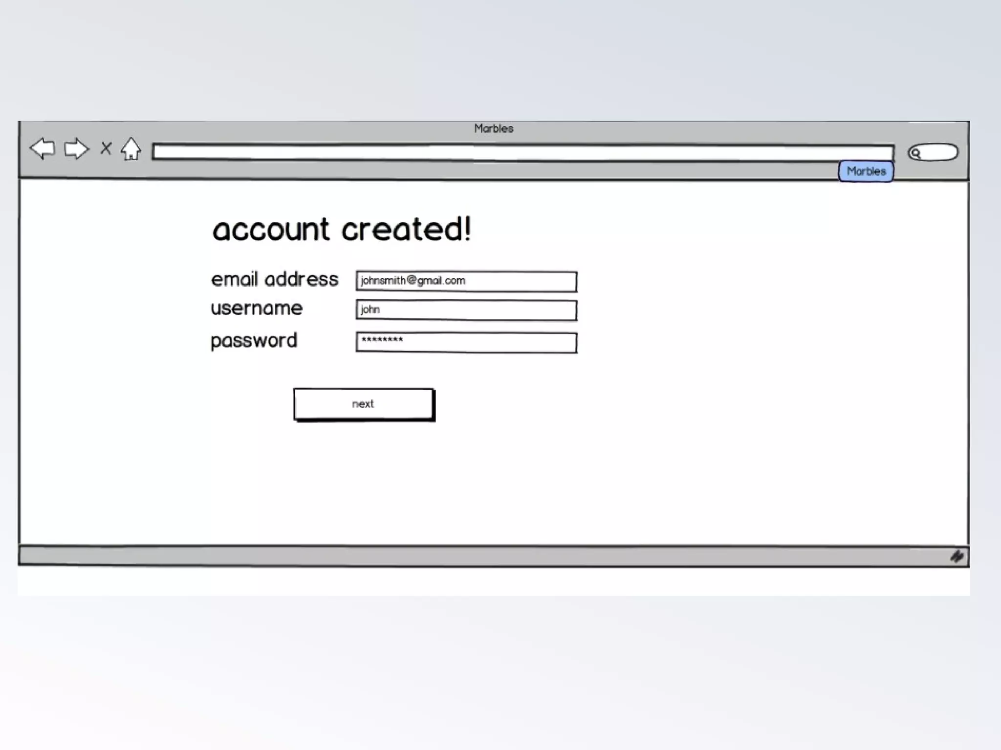


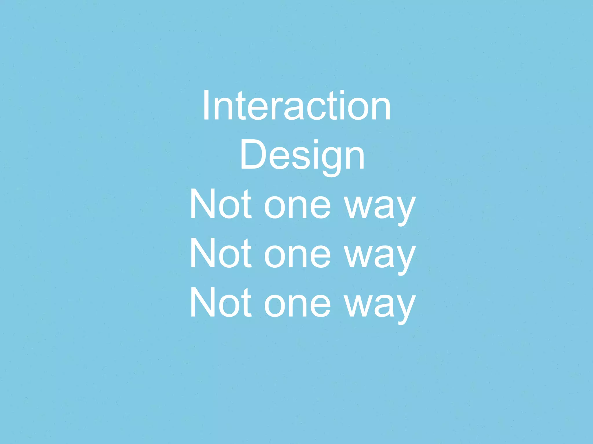

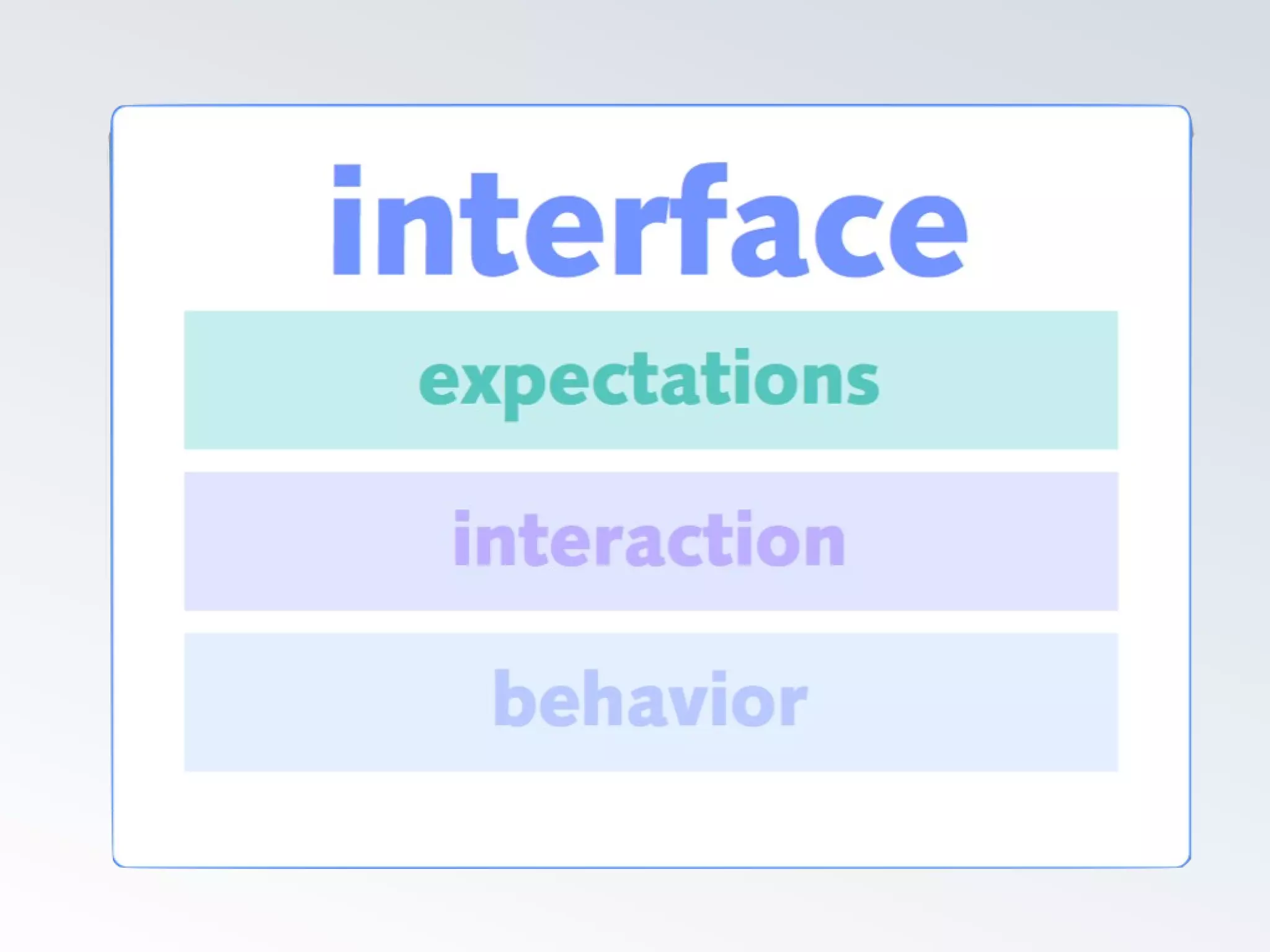
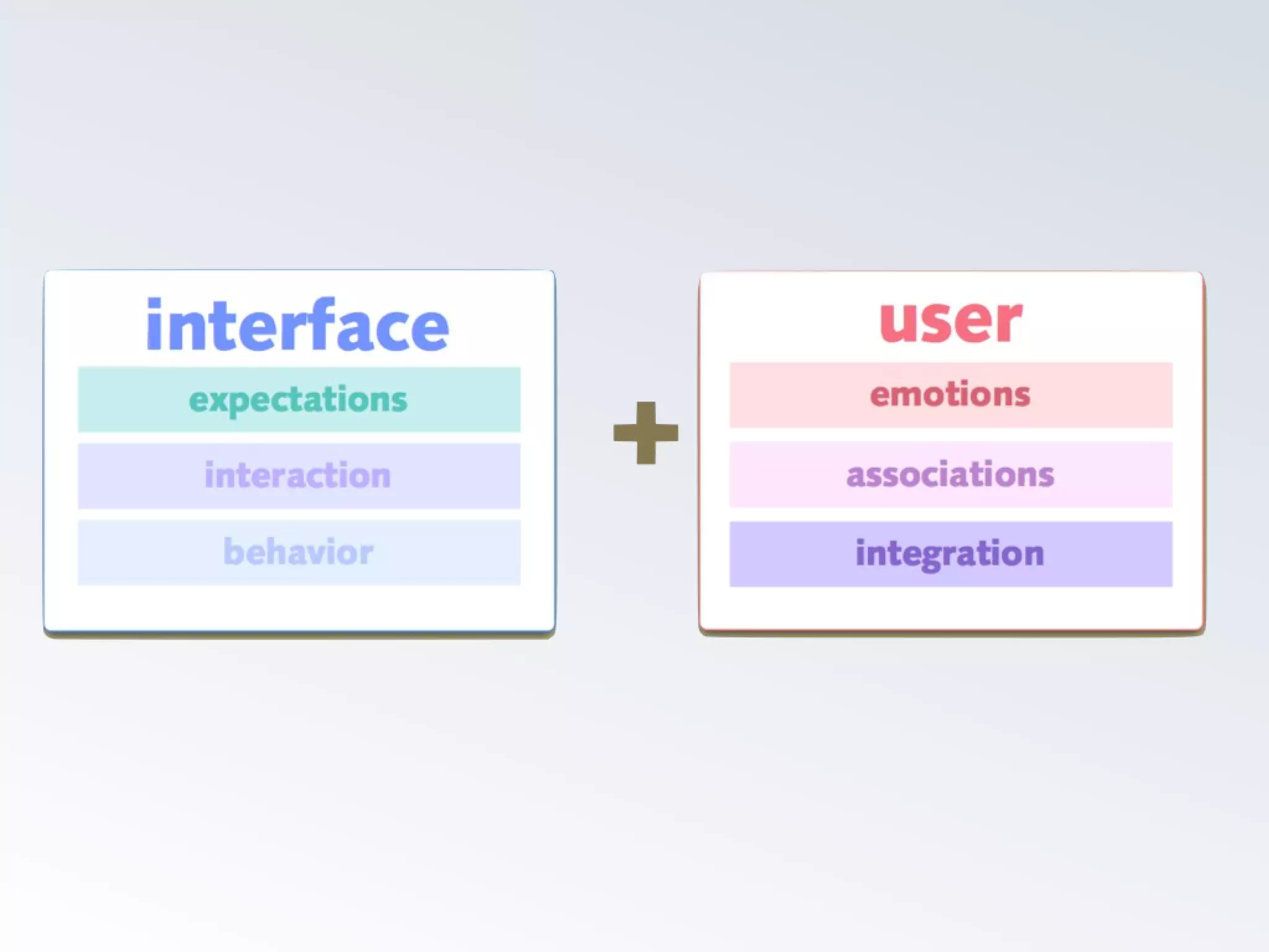
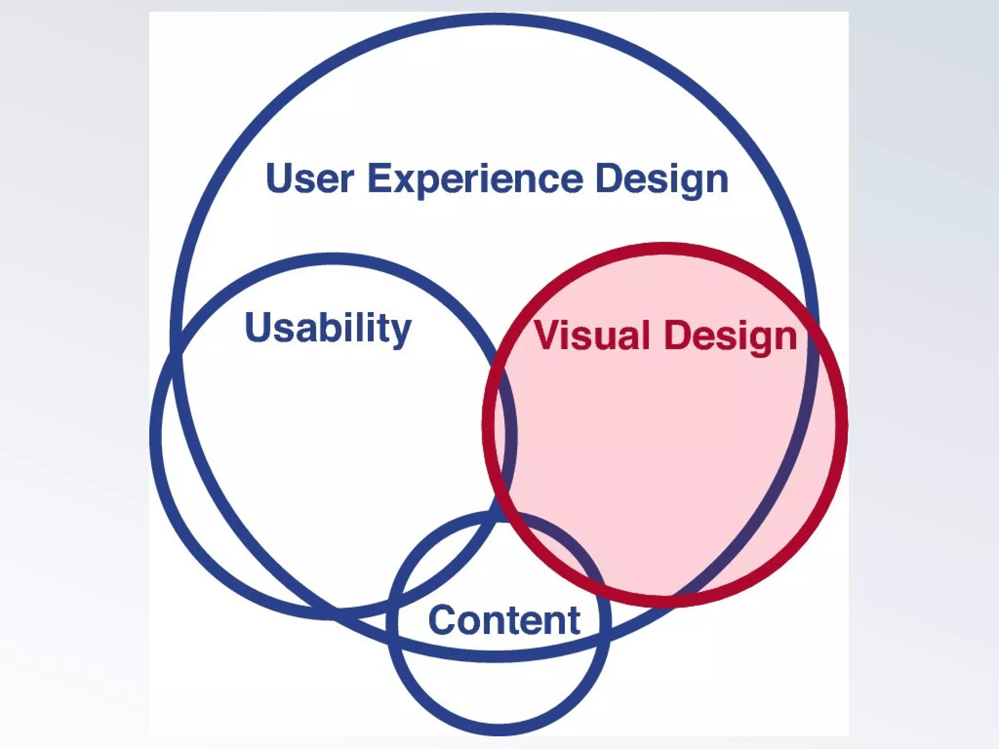


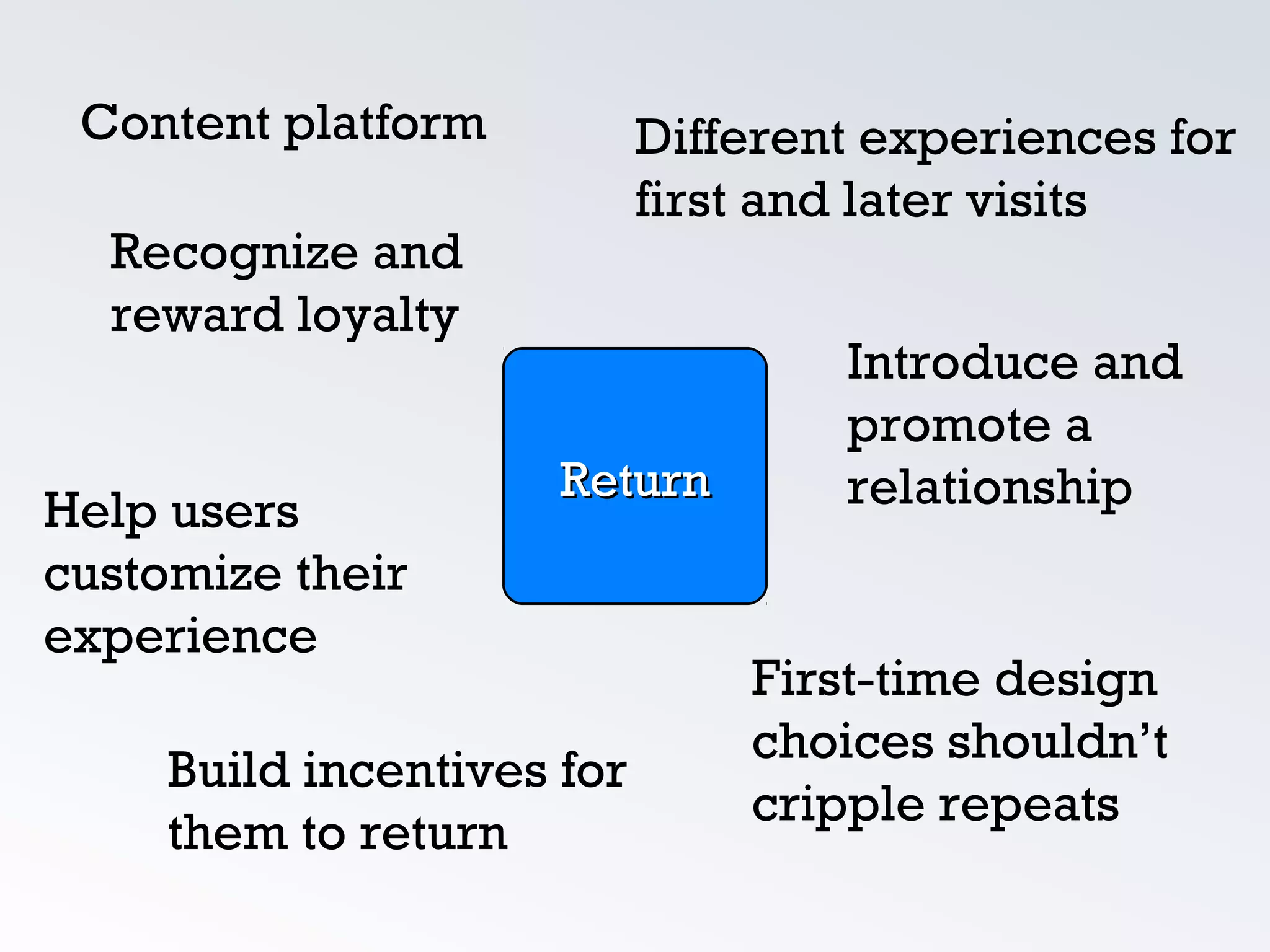
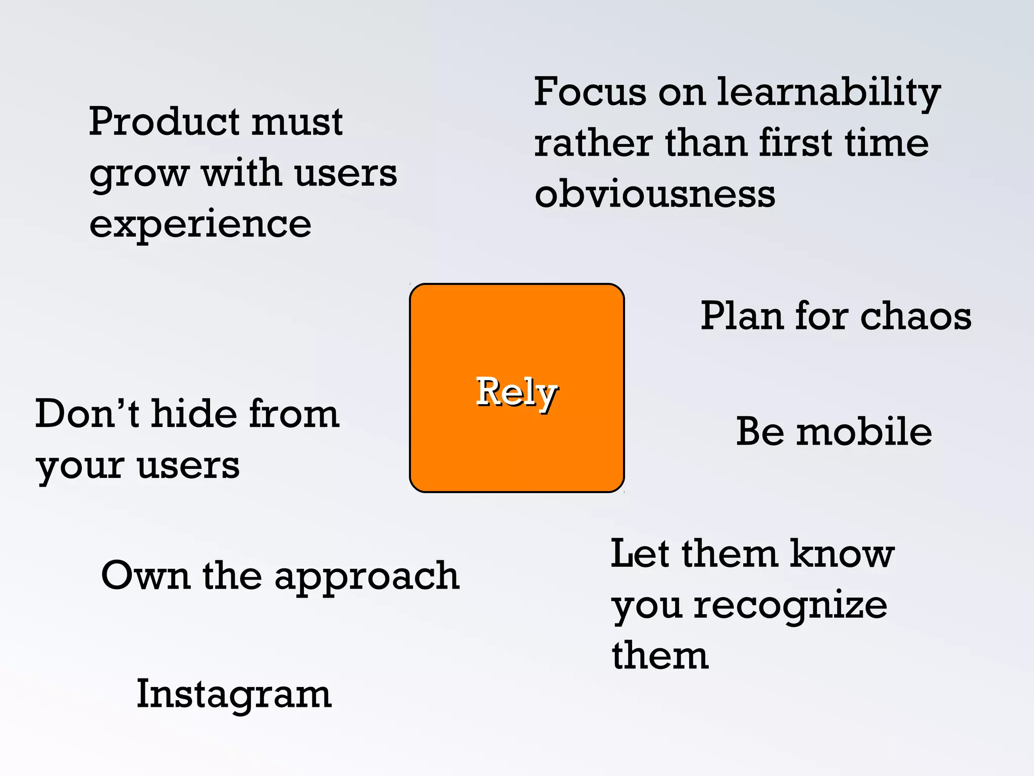


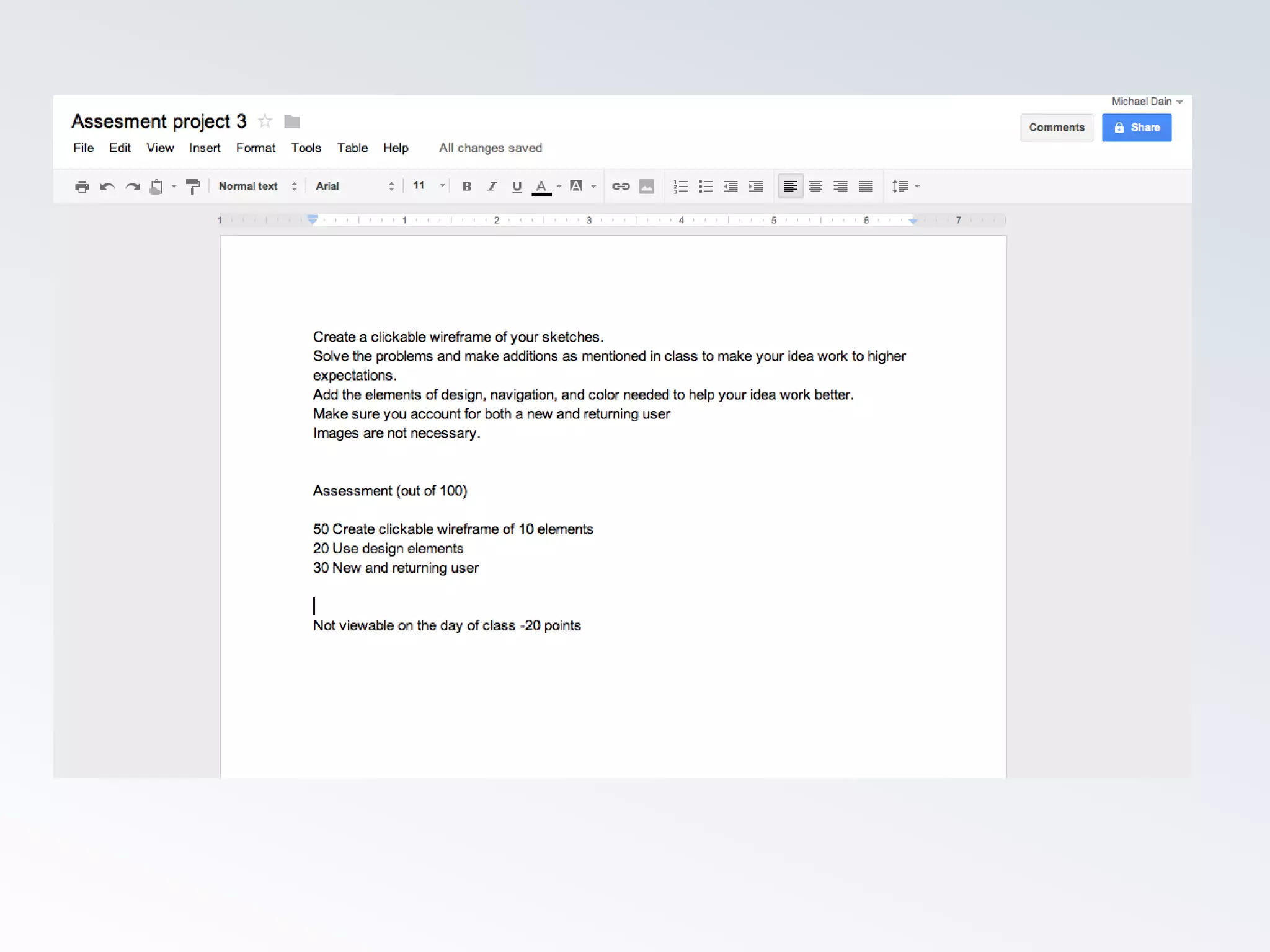


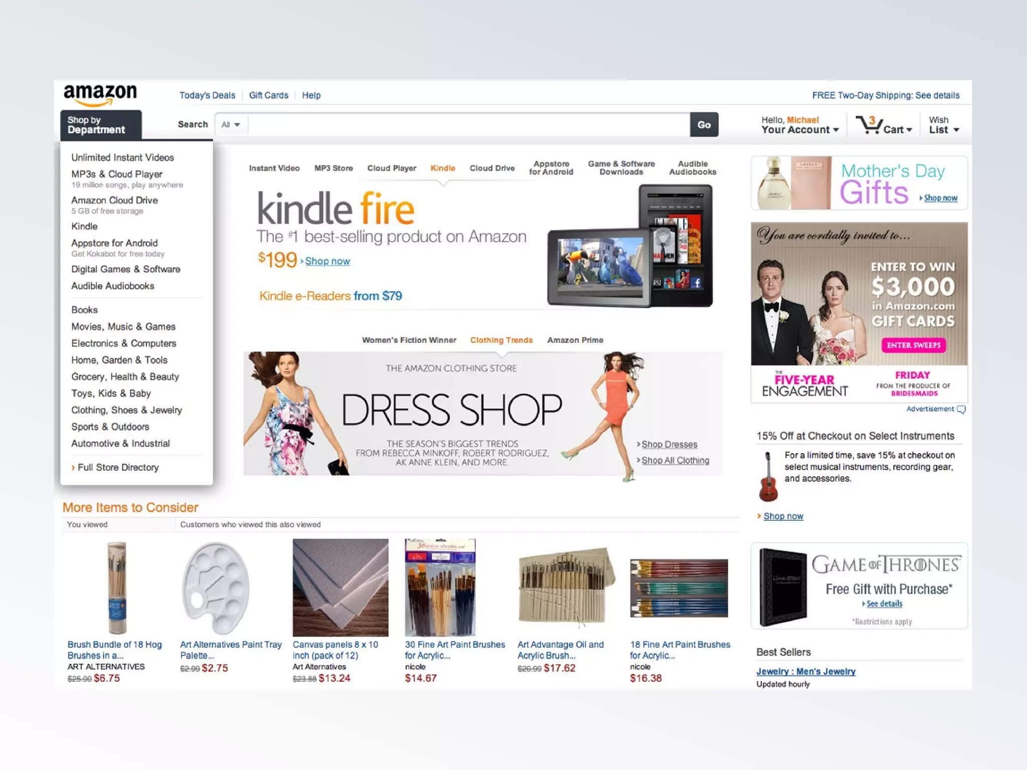
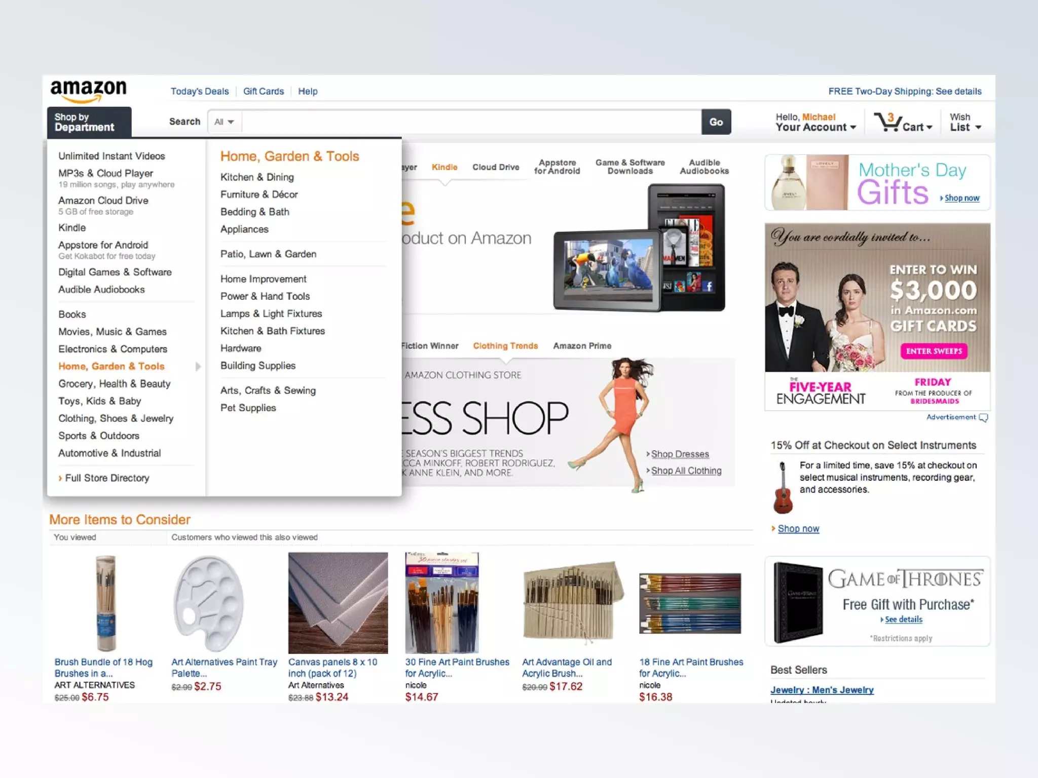
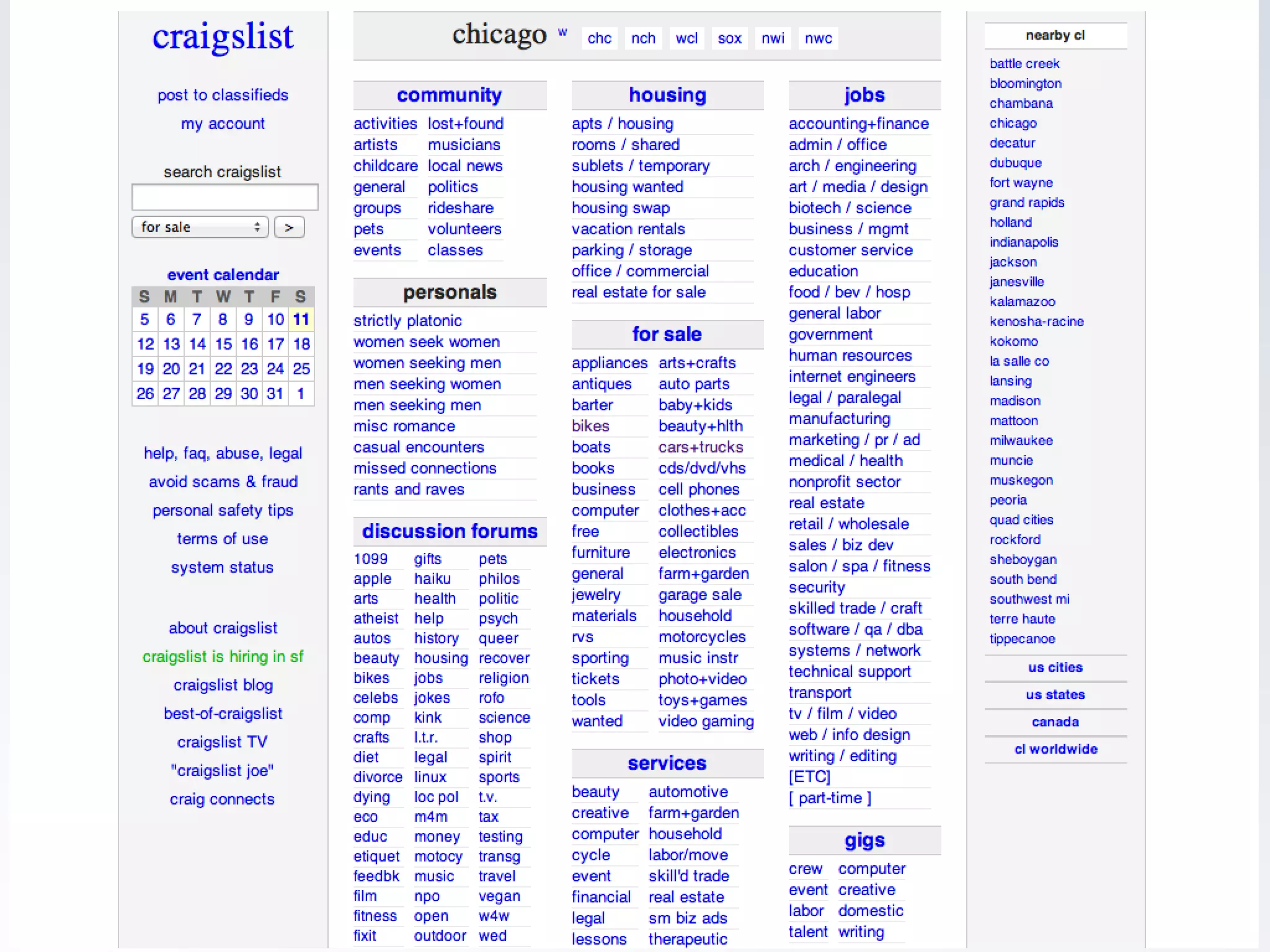
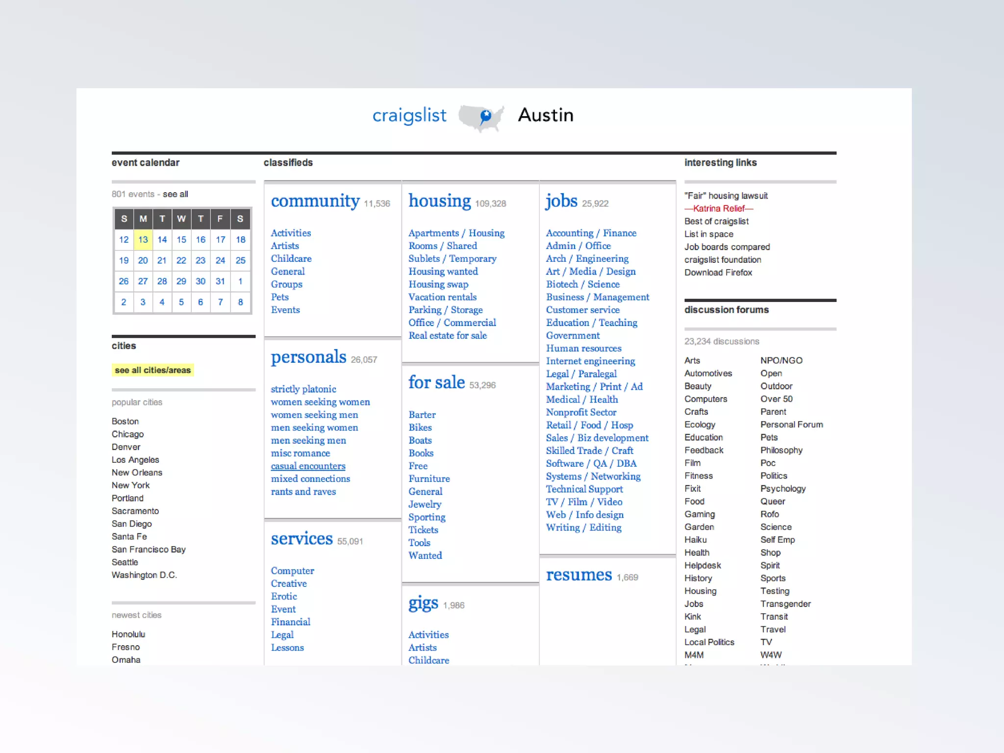


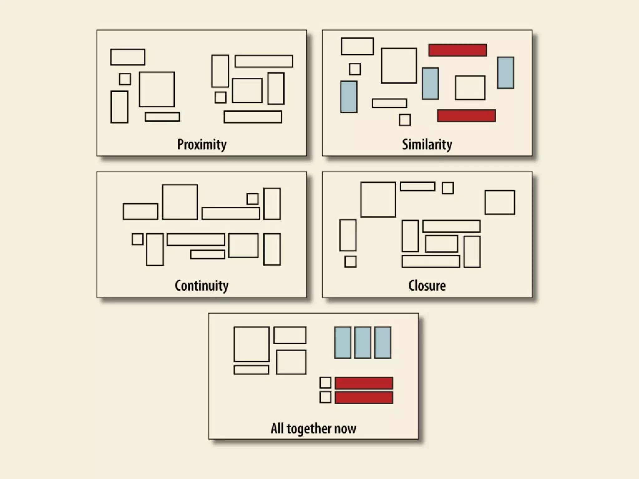

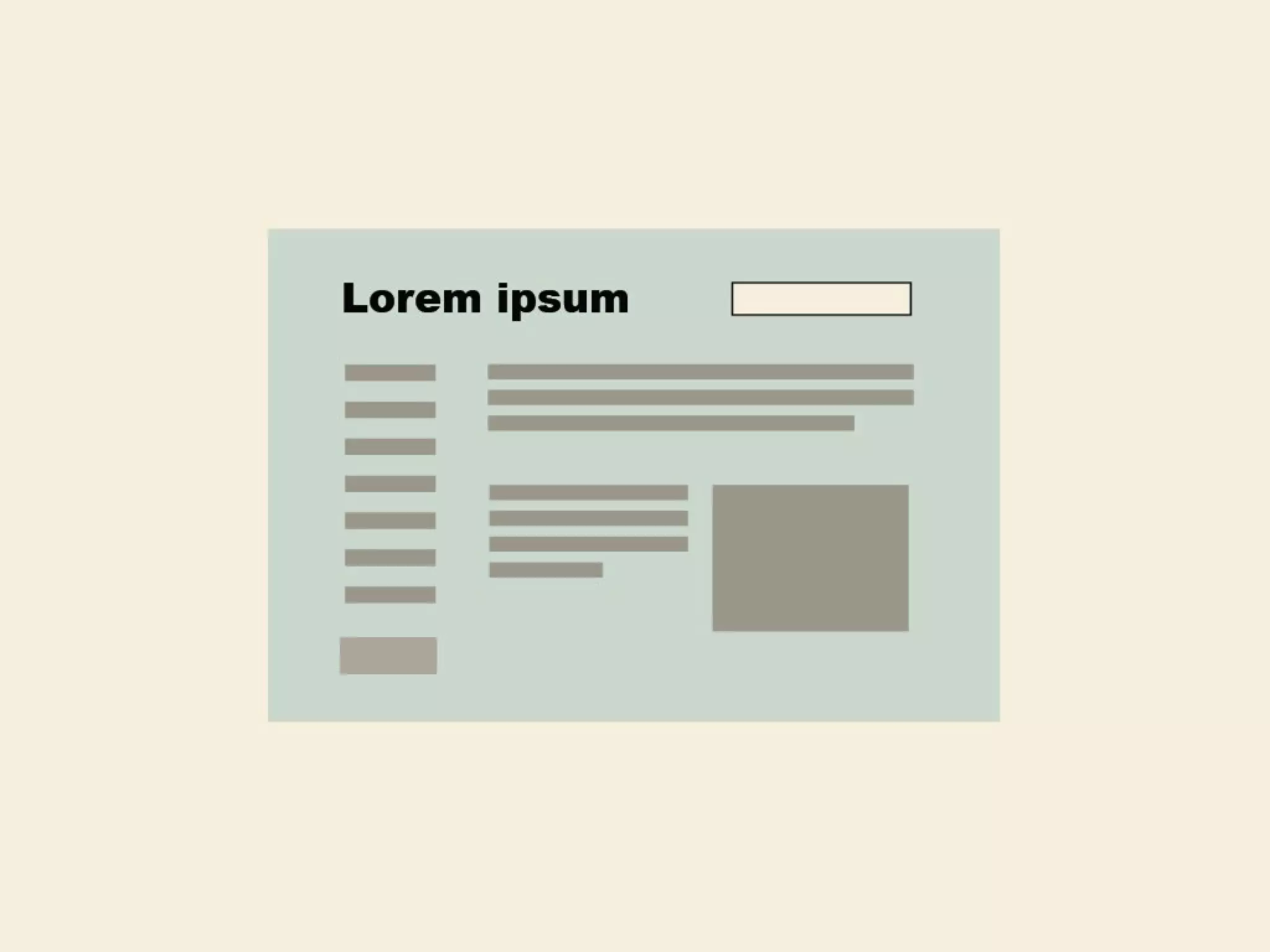
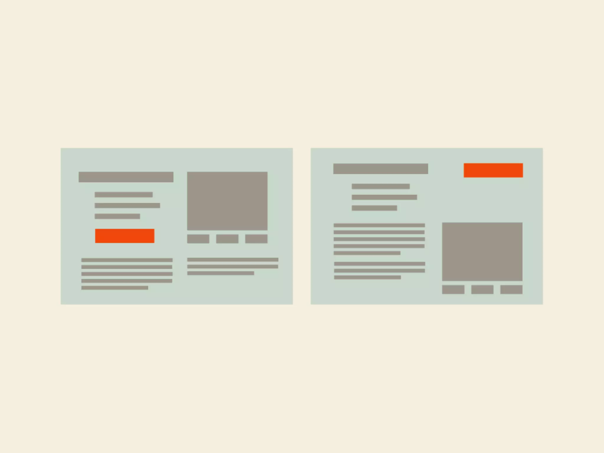

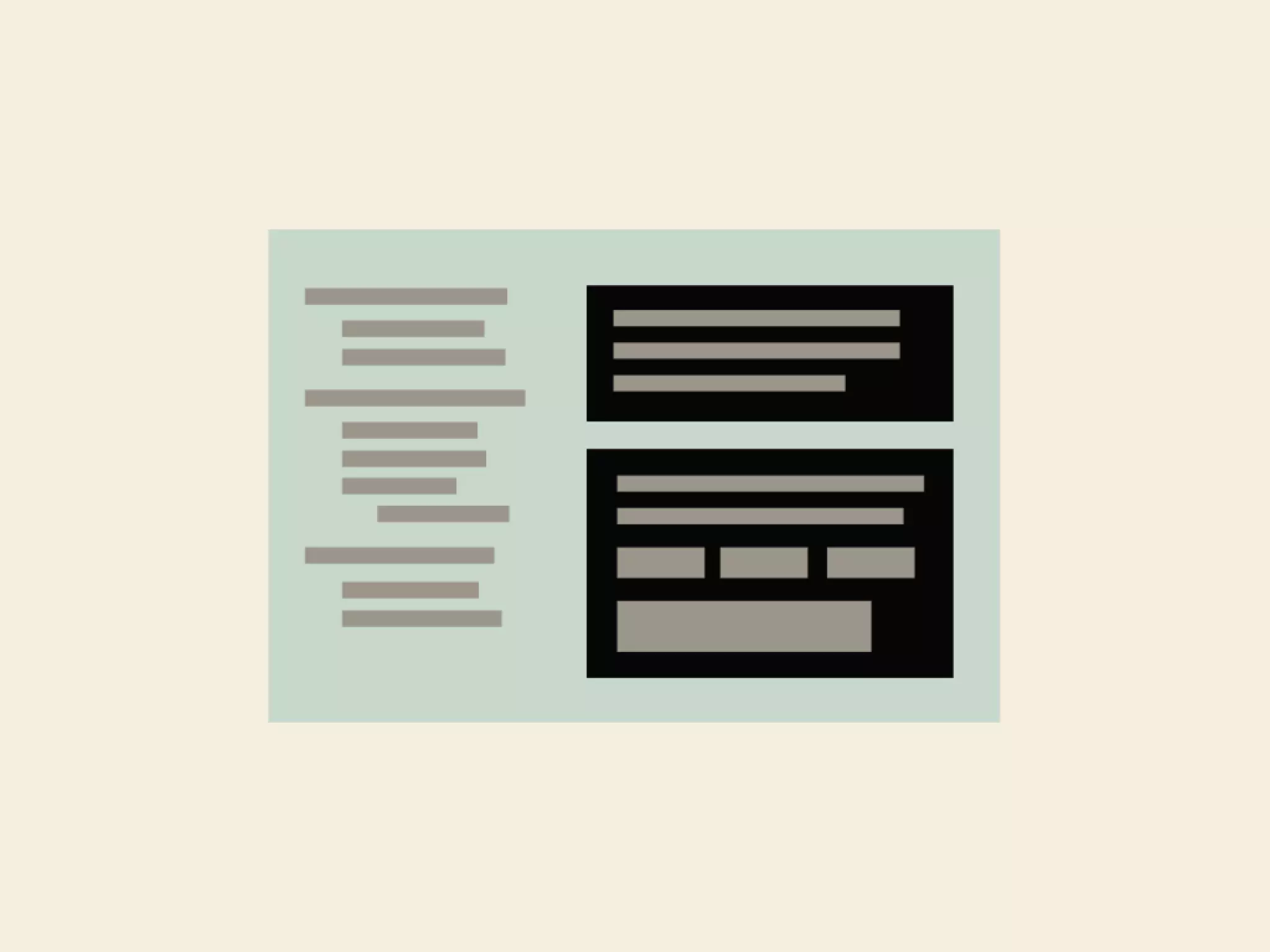


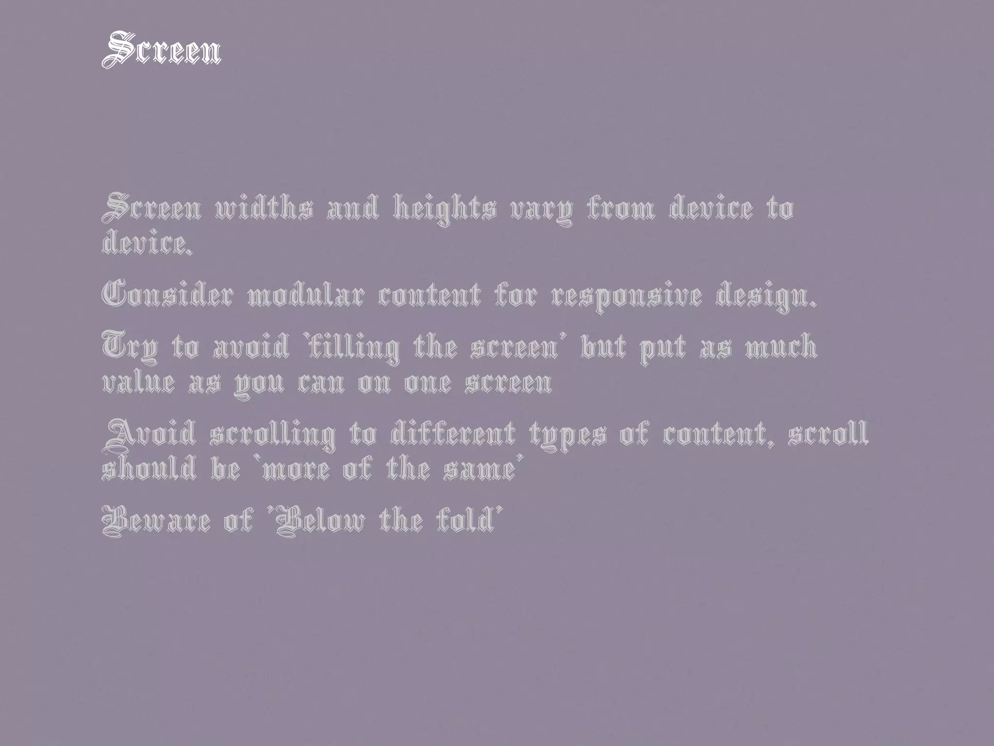


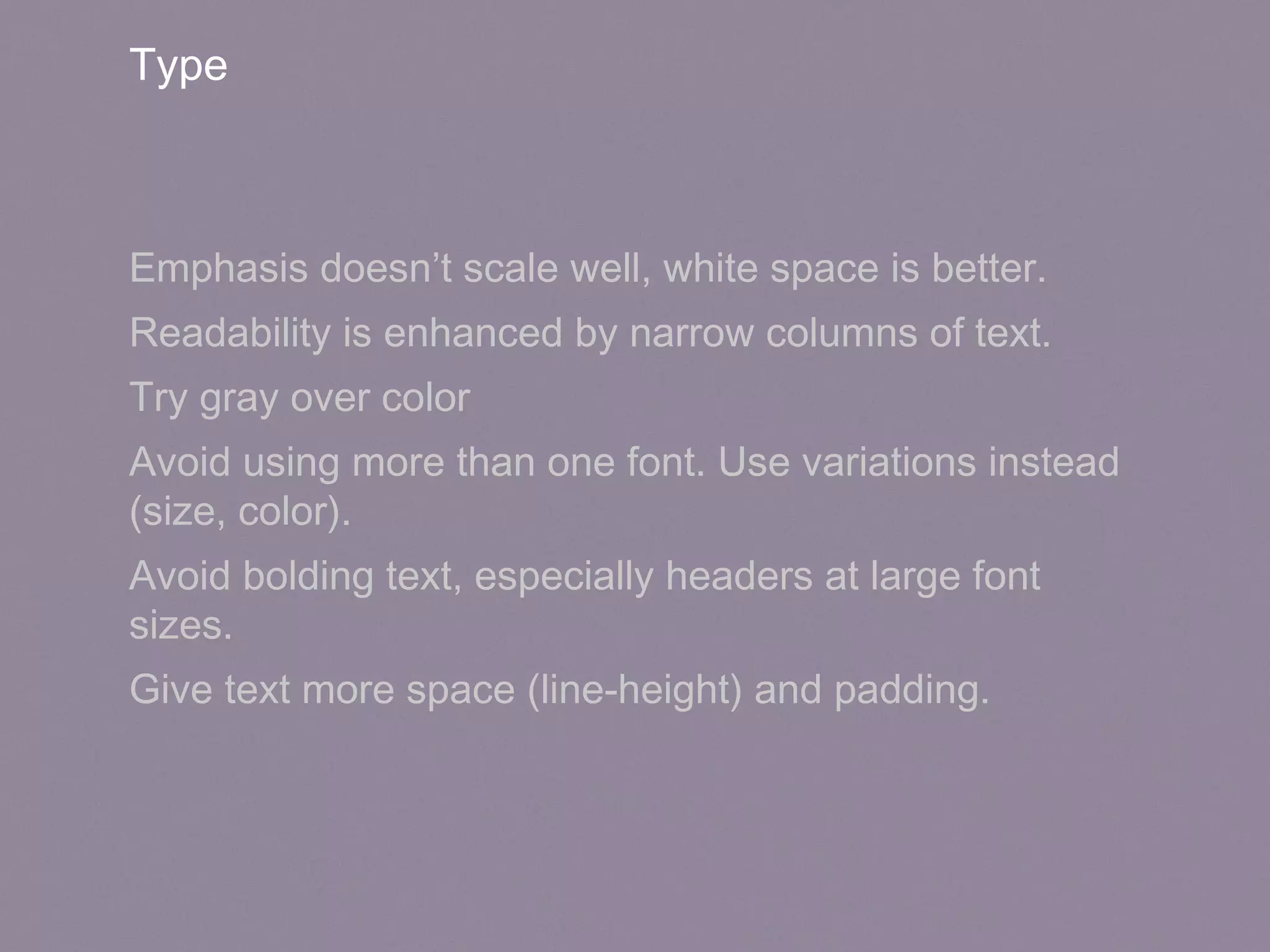


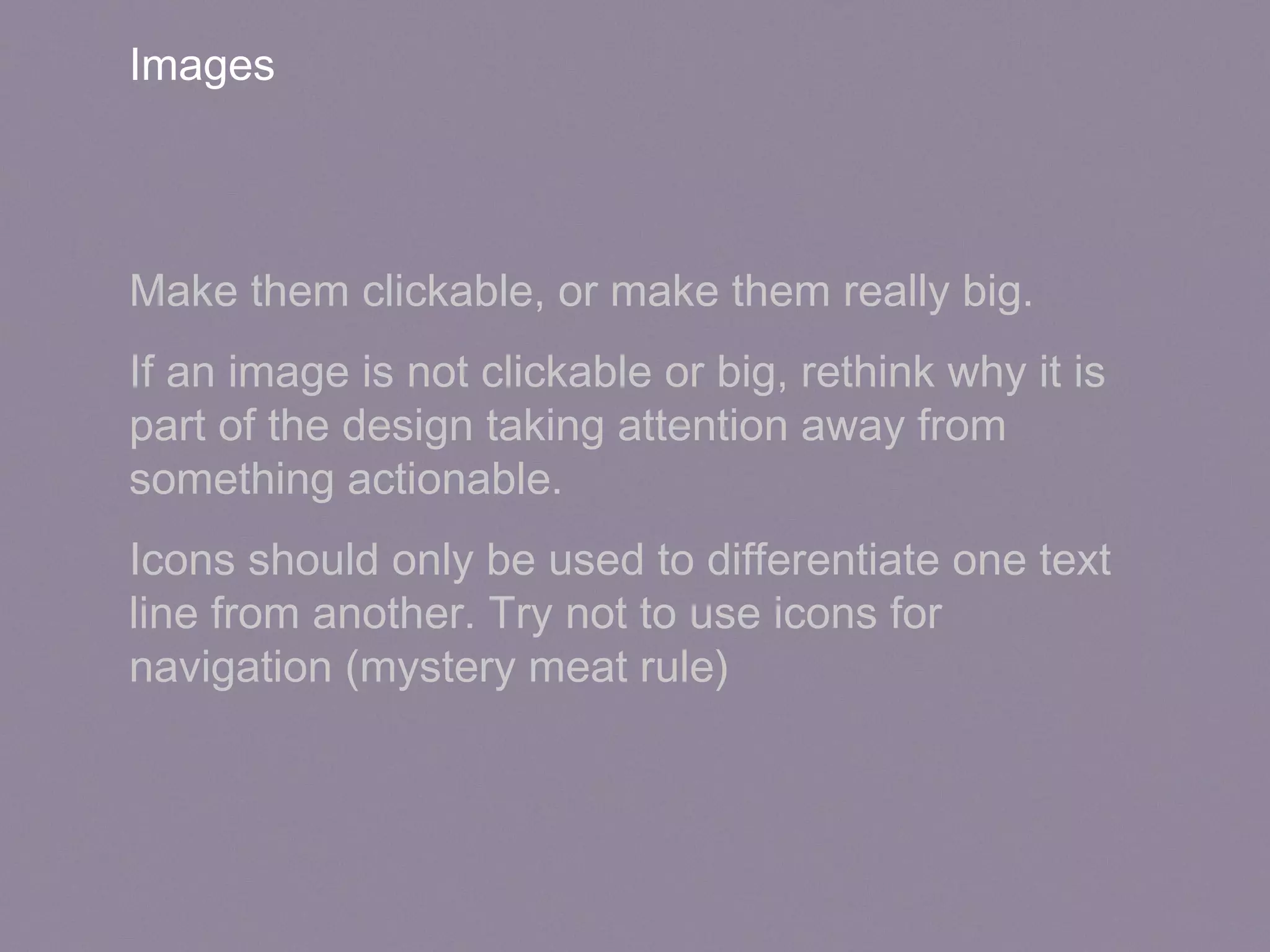


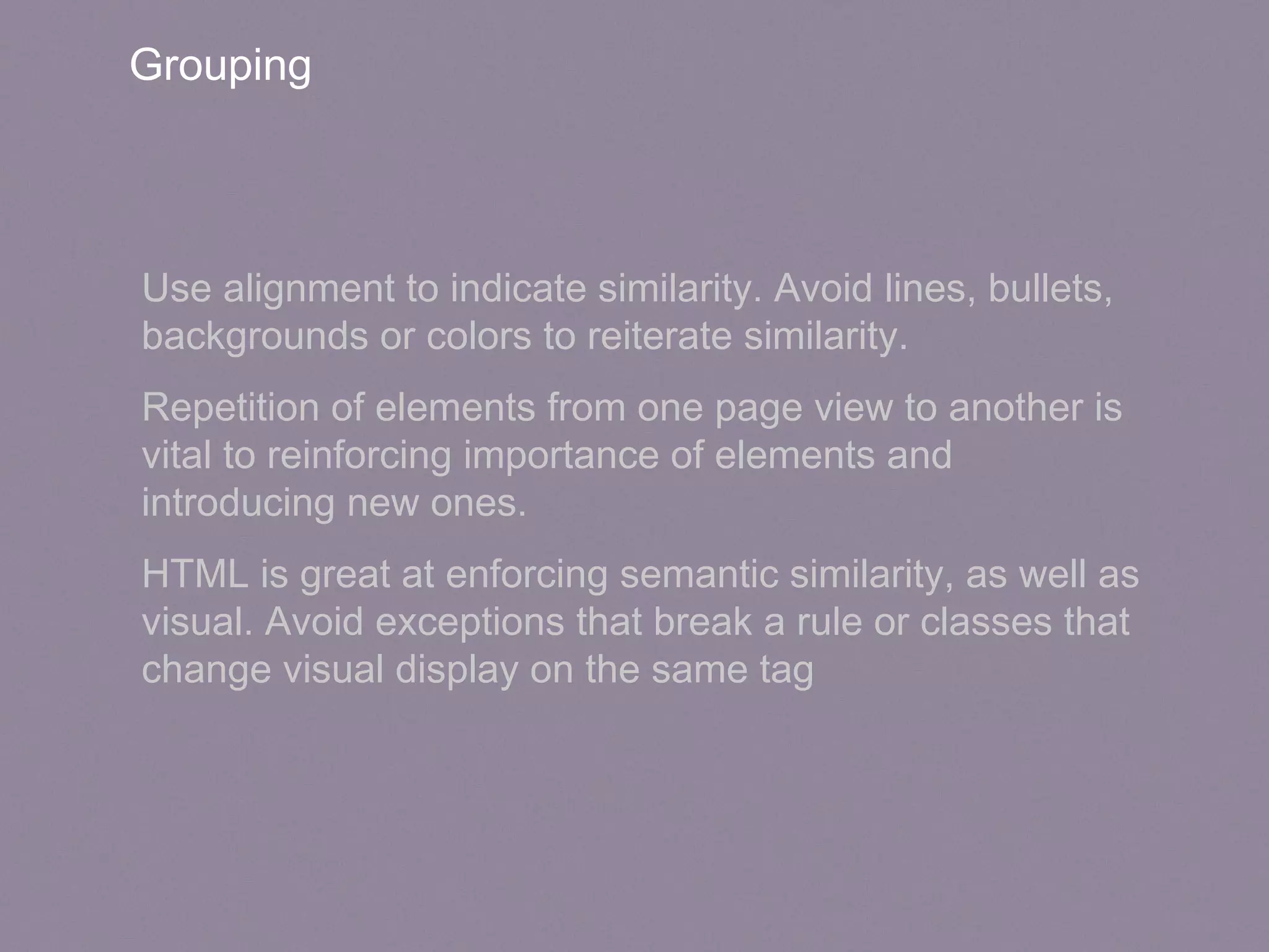
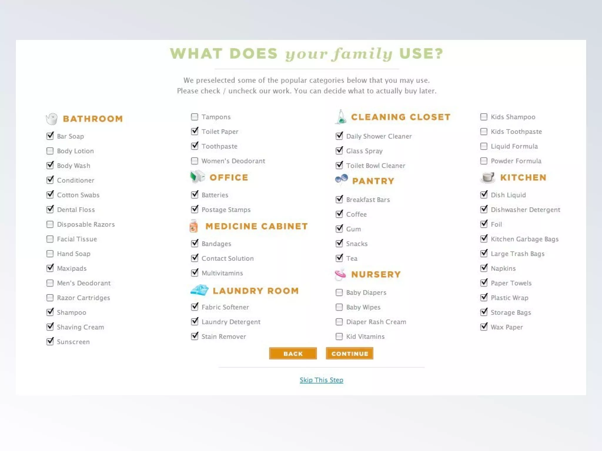
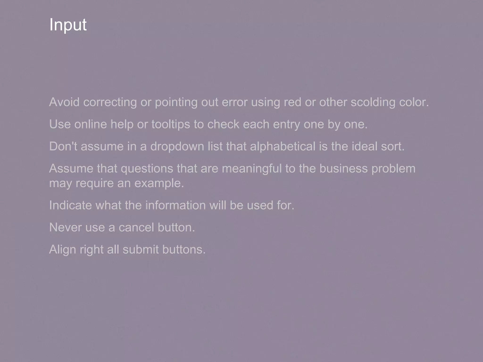
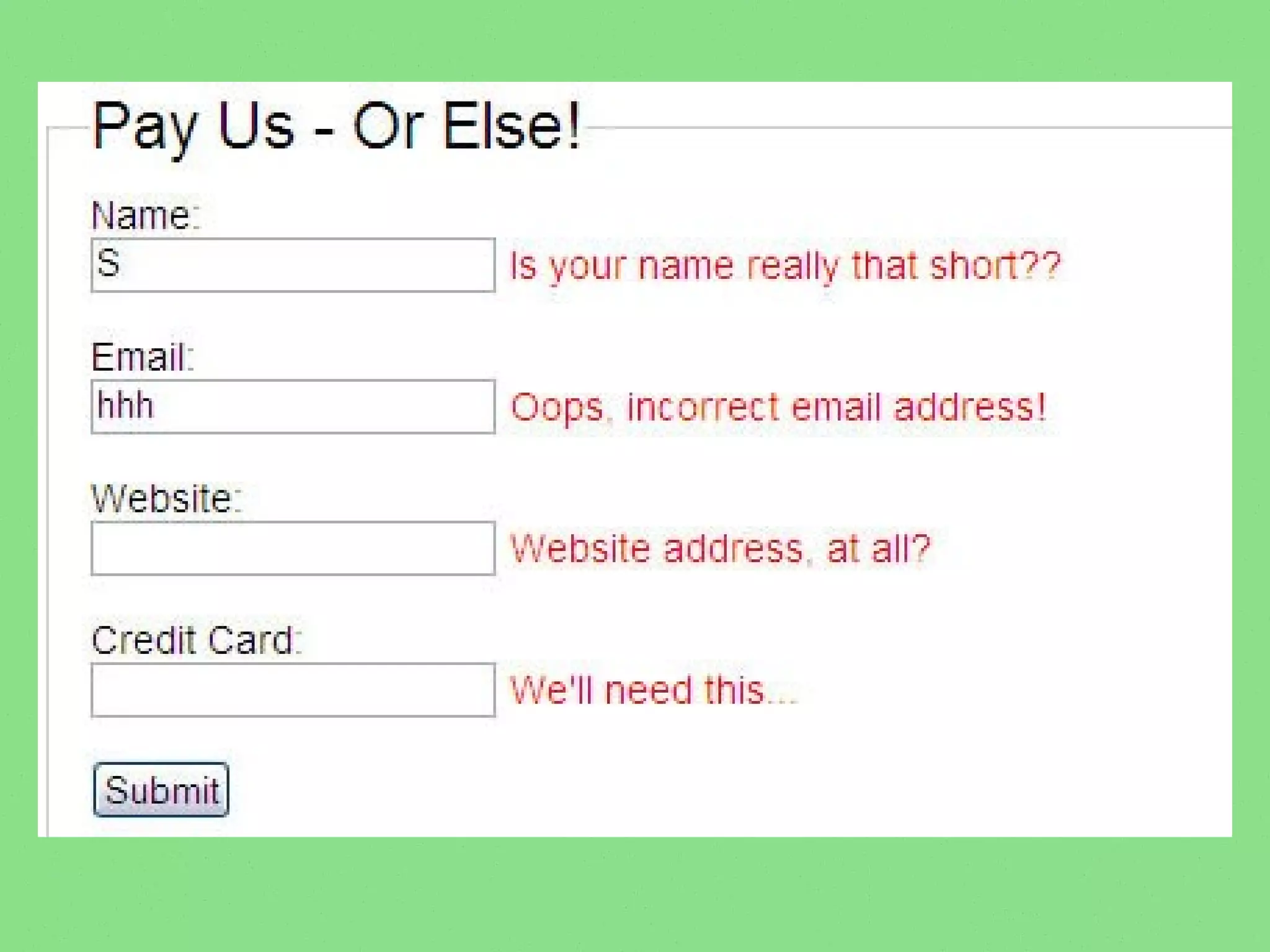
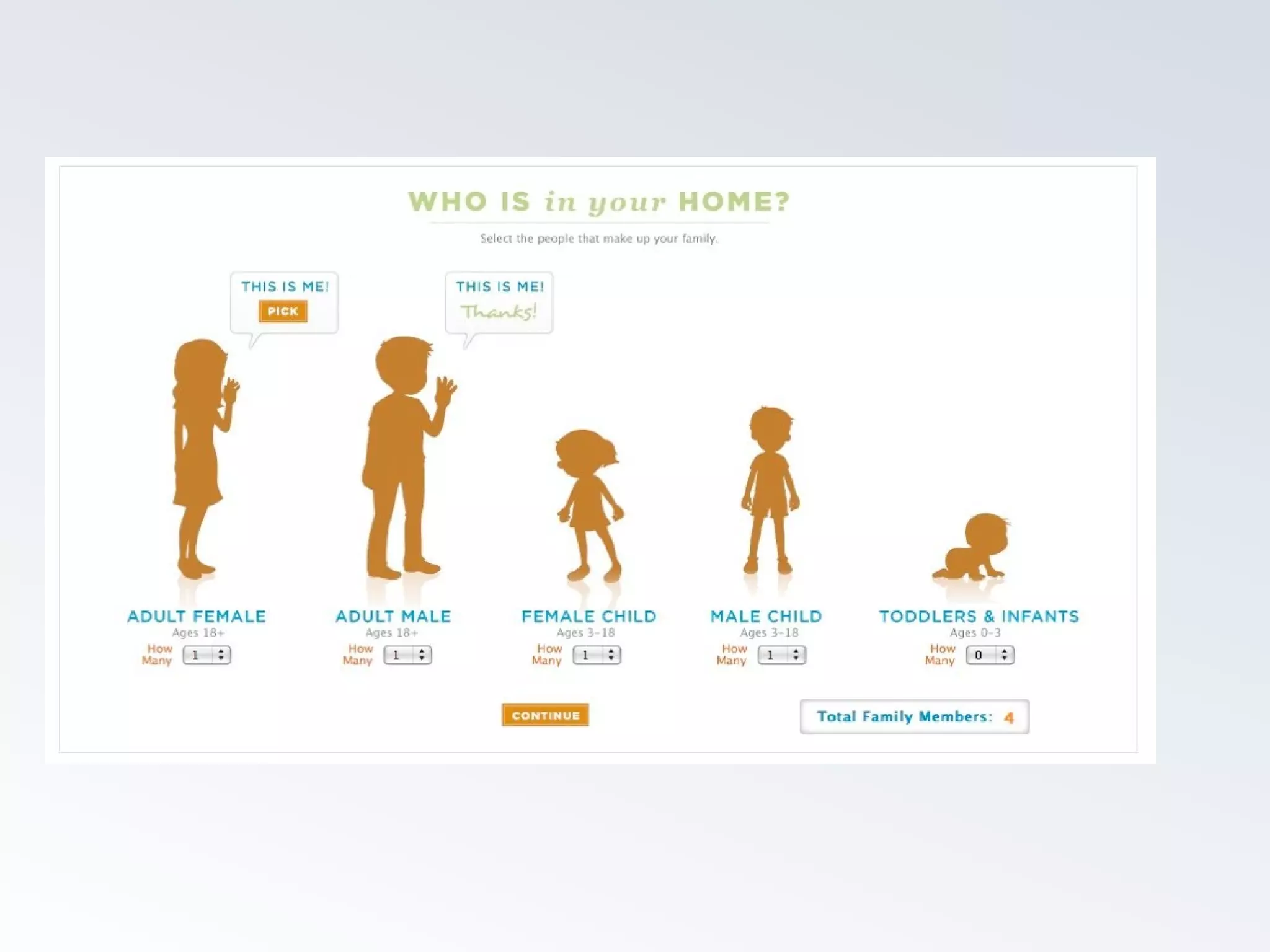
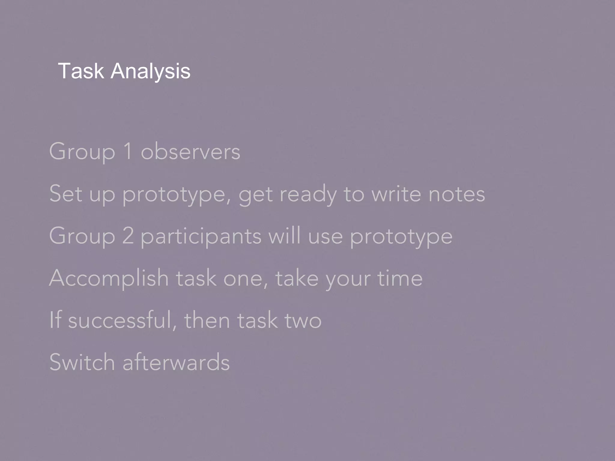
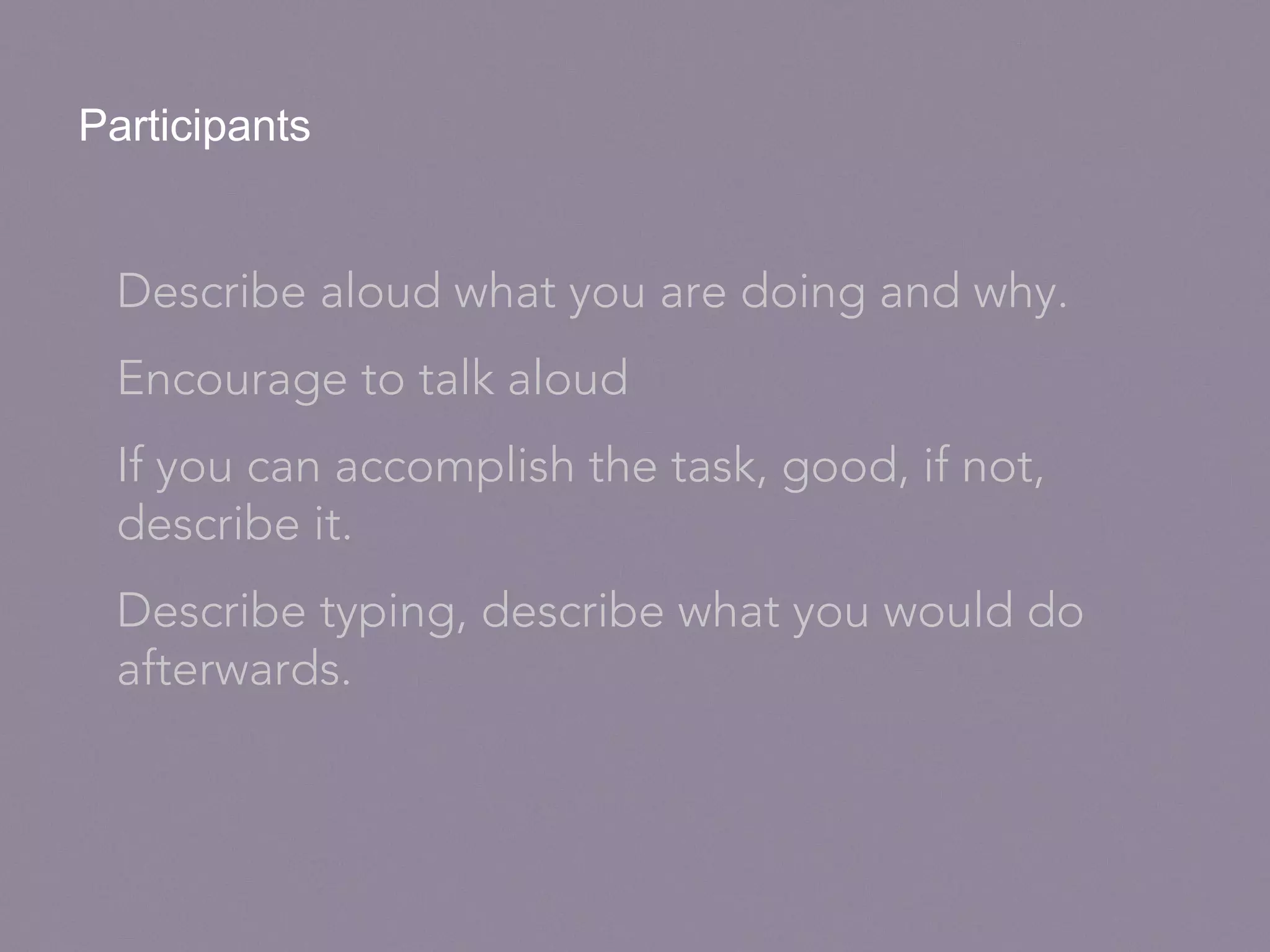
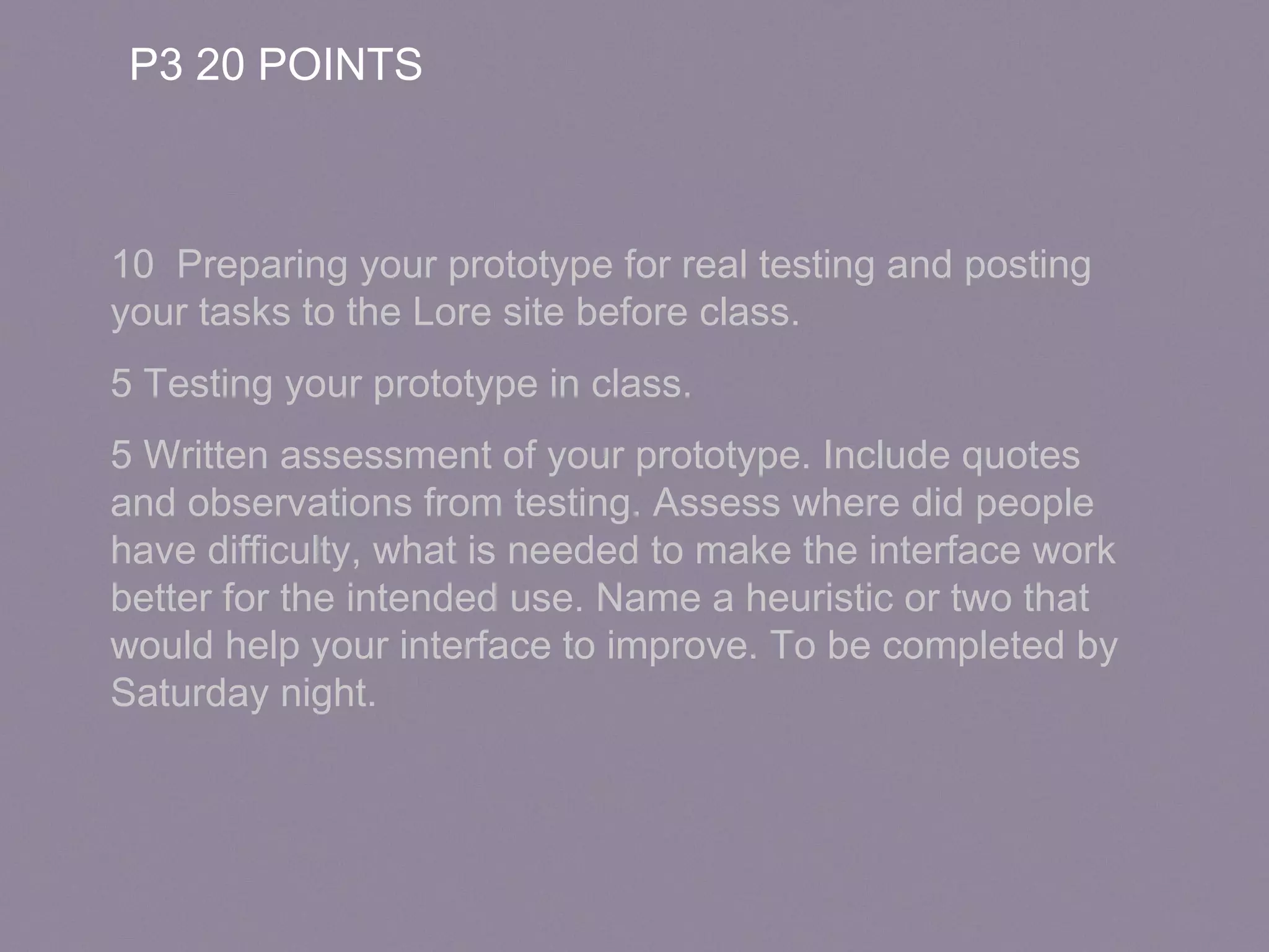

The document emphasizes effective interface design principles, highlighting the importance of understanding user needs and enhancing their experience. It advises on visual elements, content organization, and interaction design to make websites intuitive and engaging, while maintaining a focus on accessibility and learnability. Additionally, it outlines a task analysis process for testing prototypes to gather user feedback for improvements.


![[Ixda campinas]- 1º Encontro de UX - 2017](https://cdn.slidesharecdn.com/ss_thumbnails/ixda-campinas-1encontrodeux-2017-170315174834-thumbnail.jpg?width=640&height=640&fit=bounds)


![[BROCHURE] Italy Tour Project | @SlideON](https://cdn.slidesharecdn.com/ss_thumbnails/brochure8-251215152319-2805af68-thumbnail.jpg?width=640&height=640&fit=bounds)


