The document is a comprehensive tutorial on data visualization using the Python library Matplotlib, covering the basics of data visualization, types of charts, and specific functionalities of Matplotlib. It includes examples and code snippets for different types of charts such as bar charts, histograms, pie charts, scatter plots, and stack plots, along with instructions for creating subplots. Additionally, the document emphasizes the importance of data visualization in enhancing understanding of data through graphical representation.


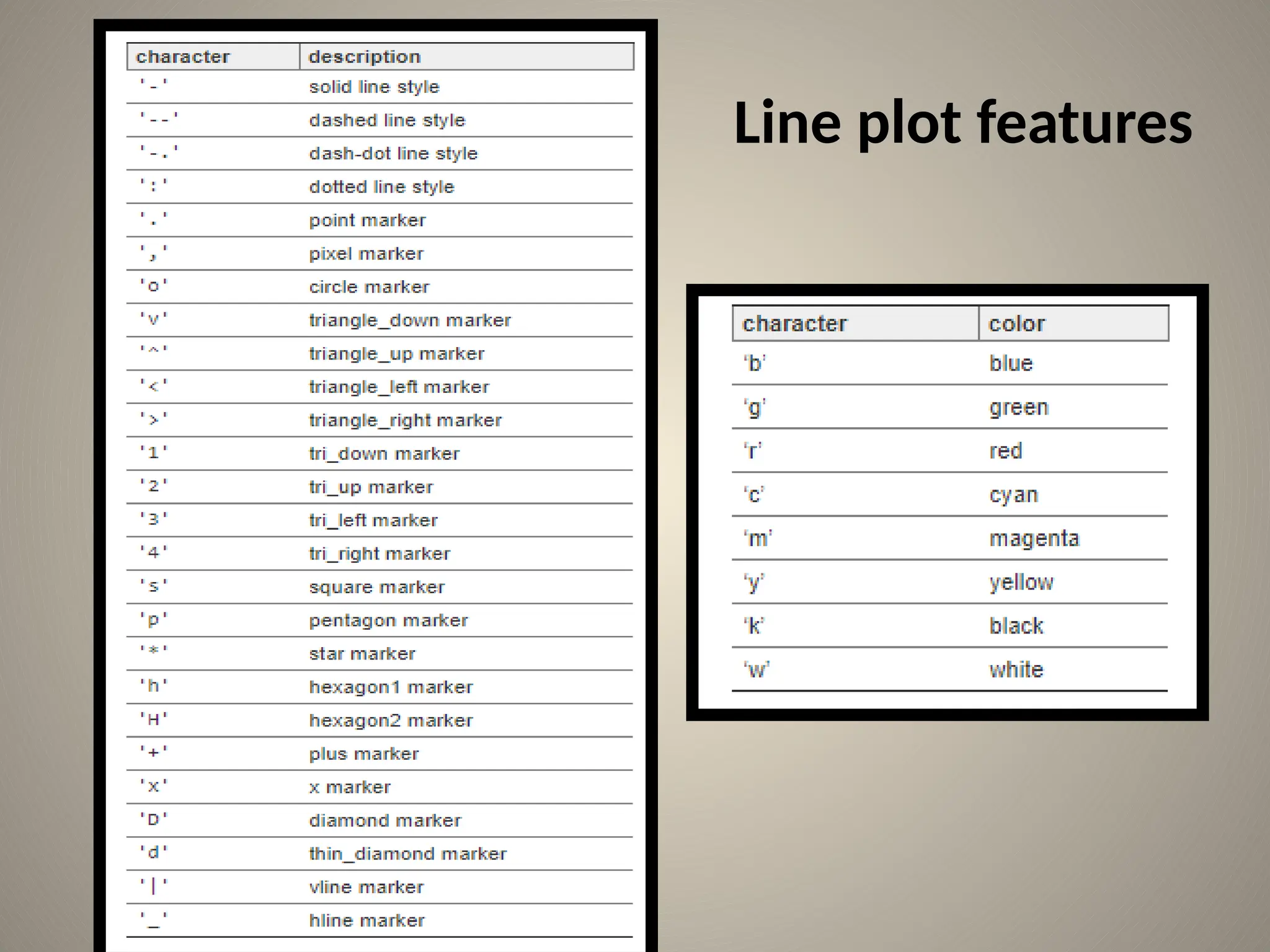
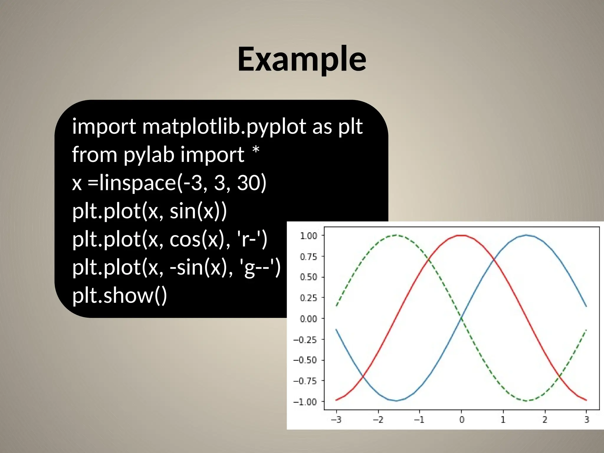
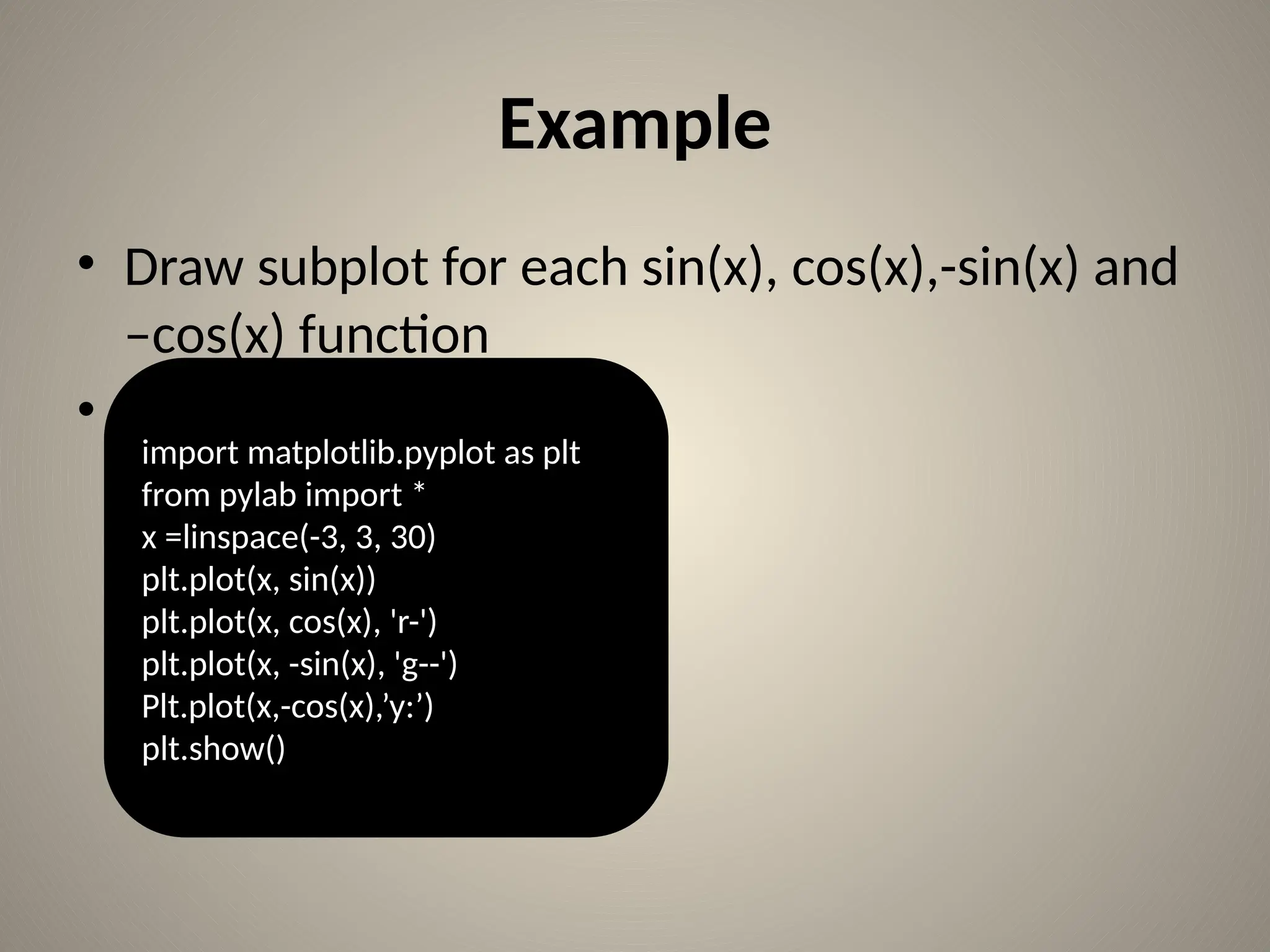
![Line plot
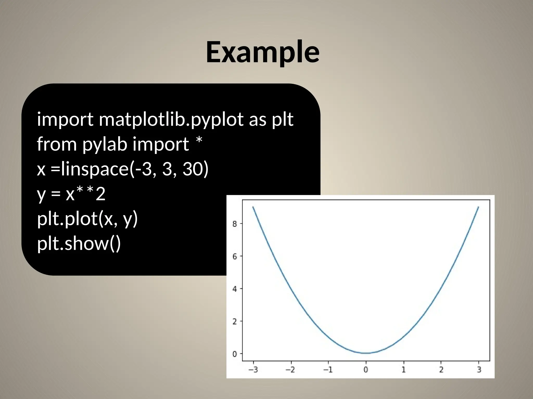
• Some basic code to plot simple graph.
• Co-ordinates:(1,4)(2,5)(3,1)
import matplotlib.pyplot as plt
plt.plot([1,2,3],[4,5,1])
plt.show()](https://image.slidesharecdn.com/usingmatplotlib-241007093526-8827f426/75/Python-chart-plotting-using-Matplotlib-pptx-8-2048.jpg)
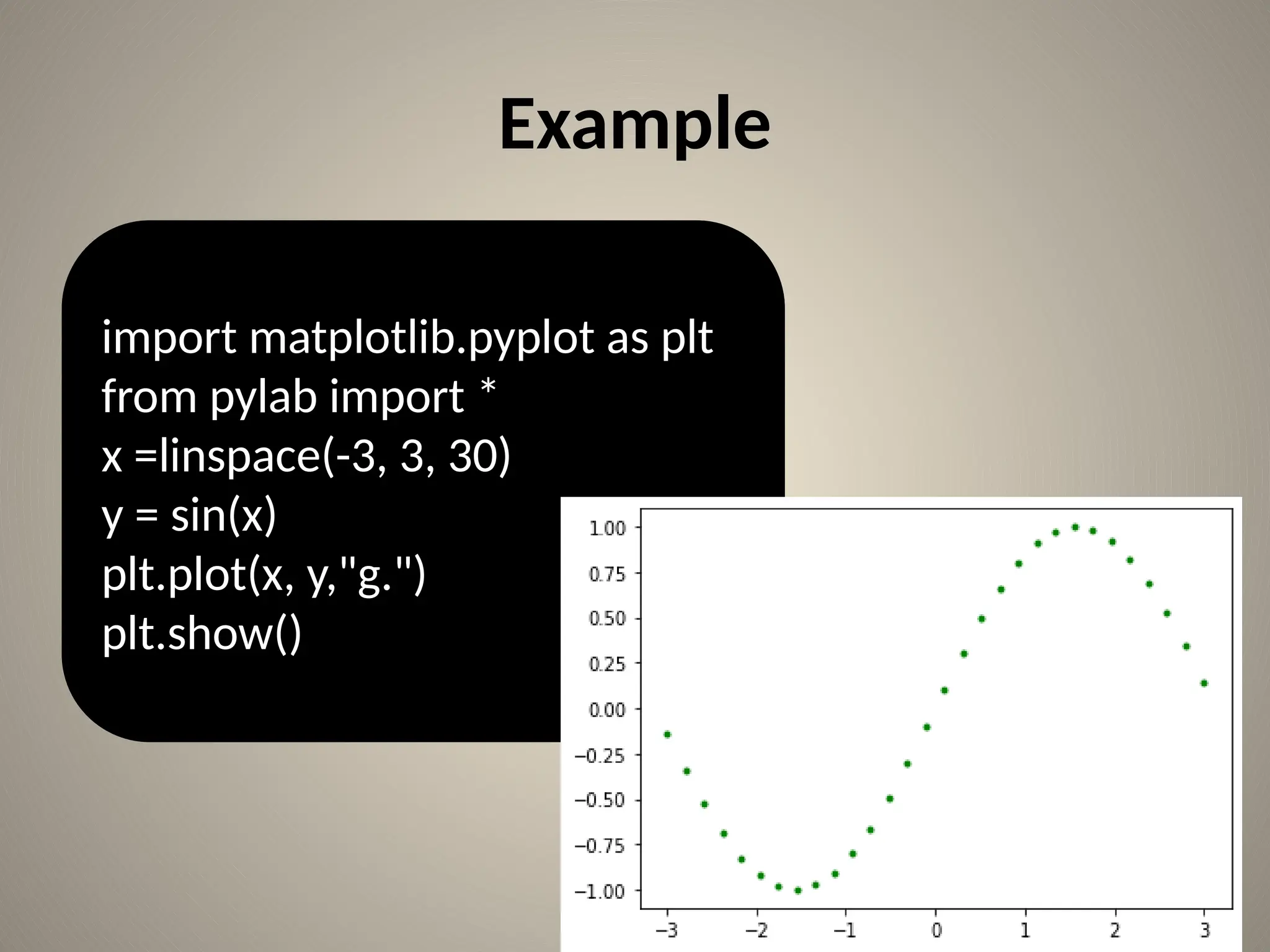
![Line plot Cont…
• Lets add label to the graph:
import matplotlib.pyplot as plt
x=[1,2,3]
y=[4,5,1]
plt.plot(x , y)
plt.title("Info")
plt.xlabel("x-axis")
plt.ylabel("y-axis")
plt.show()](https://image.slidesharecdn.com/usingmatplotlib-241007093526-8827f426/75/Python-chart-plotting-using-Matplotlib-pptx-9-2048.jpg)
![Line Plot cont…
import matplotlib.pyplot as plt
x1=[1,2,3]
y1=[4,5,1]
x2=[5,8,10]
y2=[12,16,6]
plt.plot(x1,y1,color='g', label='line one', linewidth=6)
plt.plot(x2,y2,color='b', label='line two', linewidth=6)
plt.title("Info")
plt.xlabel("x-axis")
plt.ylabel("y-axis")
plt.legend()
plt.grid(True, color='k')
plt.show()](https://image.slidesharecdn.com/usingmatplotlib-241007093526-8827f426/75/Python-chart-plotting-using-Matplotlib-pptx-10-2048.jpg)
![Bar chart
import matplotlib.pyplot as plt
plt.bar([1,2,3],[4,5,1],label='example one')
plt.bar([4,5,7],[6,8,9],label="example two",
color='g')
plt.legend()
plt.title("info")
plt.xlabel("x-axis")
plt.ylabel("y-axis")
plt.show()](https://image.slidesharecdn.com/usingmatplotlib-241007093526-8827f426/75/Python-chart-plotting-using-Matplotlib-pptx-16-2048.jpg)
![Bar chart cont…
Q)Create Bar chart for following data:
Languages known = [c++,c,java,python,php]
No. of students=[26,25,34,54,23]](https://image.slidesharecdn.com/usingmatplotlib-241007093526-8827f426/75/Python-chart-plotting-using-Matplotlib-pptx-17-2048.jpg)
![Bar chart cont…
from matplotlib import pyplot as plt
import numpy as np
no_of_students=[22,34,54,34,45]
lang_known=['c','c++','java', 'python', 'php']
plt.bar(lang_known, no_of_students)
plt.show()](https://image.slidesharecdn.com/usingmatplotlib-241007093526-8827f426/75/Python-chart-plotting-using-Matplotlib-pptx-18-2048.jpg)
![from matplotlib import pyplot as plt Example
import numpy as np
no_of_students=[22,34,54,34,45]
lang_known=['c', 'c++','java', 'python', 'php']
plt.bar(lang_known, no_of_students)
plt.minorticks_on()
plt.grid(which='major', linestyle='-', linewidth='0.5', color='red')
# Customize the minor grid
plt.grid(which='minor', linestyle=':', linewidth='0.5', color='black')
plt.show()](https://image.slidesharecdn.com/usingmatplotlib-241007093526-8827f426/75/Python-chart-plotting-using-Matplotlib-pptx-19-2048.jpg)
![Example
import numpy as np
import matplotlib.pyplot as plt
data = [30, 25, 50, 20],
[39, 23, 51.5, 17],
[34.8, 21.8, 45, 19]]
X = np.arange(4)
plt.bar(X + 0.00, data[0], color = 'b', width = 0.25,label='raisoni college')
plt.bar(X + 0.25, data[1], color = 'g', width = 0.25,label='JSPM')
plt.bar(X + 0.50, data[2], color = 'r', width = 0.25,label='DPCOE')
plt.legend()
plt.xticks(X,('2015','2016','2017','2018'))
plt.show()](https://image.slidesharecdn.com/usingmatplotlib-241007093526-8827f426/75/Python-chart-plotting-using-Matplotlib-pptx-20-2048.jpg)
![Assignment
• stud_marks=[45,56,32,67,56,76,34,28,67,70,59,61,
34,42,76,54,52,47]
• bins=[0,25,50,75,100]
• Find the students makes in range 0-24,25-49,50-
74,75-100
• Solution: 0-24: 0
25-49:7
50-74:9
75-100:2](https://image.slidesharecdn.com/usingmatplotlib-241007093526-8827f426/75/Python-chart-plotting-using-Matplotlib-pptx-22-2048.jpg)
![Solution
import matplotlib.pyplot as plt
stud_marks=[45,56,32,67,56,76,34,28,67,70,59,61,34,42,76,54,52,47]
bins=[0,25,50,75,100]
plt.hist(stud_marks, bins, histtype='bar', rwidth=0.8)
plt.title("Info")
plt.xlabel("x-axis")
plt.ylabel("y-axis")
plt.xticks([0,25,50,75,100])
plt.legend()
plt.show()](https://image.slidesharecdn.com/usingmatplotlib-241007093526-8827f426/75/Python-chart-plotting-using-Matplotlib-pptx-23-2048.jpg)

![Histogram Example
Q)Draw histogram for following data:
[3,5,8,11,13,2,19,23,22,25,3,10,21,14,9,12,17,
22,23,14]
• Use range as 1-8,9-16,17-25
• plot histogram type as ‘stepfilled’.](https://image.slidesharecdn.com/usingmatplotlib-241007093526-8827f426/75/Python-chart-plotting-using-Matplotlib-pptx-25-2048.jpg)
![Pie chart example
from matplotlib import pyplot as plt
import numpy as np
langs = ['C', 'C++', 'Java', 'Python', 'PHP']
students = [23,17,35,29,12]
plt.pie(students, labels = langs,autopct='%1.2f%%')
plt.show()](https://image.slidesharecdn.com/usingmatplotlib-241007093526-8827f426/75/Python-chart-plotting-using-Matplotlib-pptx-27-2048.jpg)
![Example
from matplotlib import pyplot as plt
import numpy as np
langs = ['C', 'C++', 'Java', 'Python', 'PHP']
students = [23,17,35,29,12]
cols=['b' ,'r', 'm', 'y', 'g']
plt.pie(students, labels = langs, colors=cols, autopct='%1.2f%
%',shadow=True ,explode=(0,0.1,0,0,0))
plt.show()](https://image.slidesharecdn.com/usingmatplotlib-241007093526-8827f426/75/Python-chart-plotting-using-Matplotlib-pptx-28-2048.jpg)

![Scatter Plot
• Scatter plot plots data on vertical & horizontal
axis as per its values.
import matplotlib.pyplot as plt
x=[1,2,3]
y=[4,5,1]
plt.scatter(x, y)
plt.title("Info")
plt.xlabel("x-axis")
plt.ylabel("y-axis")
plt.show()](https://image.slidesharecdn.com/usingmatplotlib-241007093526-8827f426/75/Python-chart-plotting-using-Matplotlib-pptx-30-2048.jpg)
![Example
import matplotlib.pyplot as plt
girls_grades = [89, 90, 70, 89, 100, 80, 90, 100, 80, 34]
boys_grades = [30, 29, 49, 48, 100, 48, 38, 45, 20, 30]
grades_range = [10, 20, 30, 40, 50, 60, 70, 80, 90, 100]
plt.scatter(grades_range, girls_grades, color='r',label='girls grade',linewidths=3)
plt.scatter(grades_range, boys_grades, color='b',label='boys grade',linewidths=3)
plt.xlabel('Grades Range')
plt.ylabel('Grades Scored')
plt.title('scatter plot',color='r',loc='left')
plt.legend()
plt.show()](https://image.slidesharecdn.com/usingmatplotlib-241007093526-8827f426/75/Python-chart-plotting-using-Matplotlib-pptx-31-2048.jpg)
![Assignment
• Write a Python program to draw a scatter plot
comparing two subject marks of Mathematics and
Science. Use marks of 10 students.
• Test Data:
math_marks = [88, 92, 80, 89, 100, 80, 60, 100, 80,
34]
science_marks = [35, 79, 79, 48, 100, 88, 32, 45, 20,
30]
marks_range = [10, 20, 30, 40, 50, 60, 70, 80, 90,
100]](https://image.slidesharecdn.com/usingmatplotlib-241007093526-8827f426/75/Python-chart-plotting-using-Matplotlib-pptx-32-2048.jpg)
![Stack plots
• Stackplots are formed by plotting different
datasets vertically on top of one another
rather than overlapping with one another.
import numpy as np
import matplotlib.pyplot as plt
x = [1, 2, 3, 4, 5]
y1 = [1, 1, 2, 3, 5]
y2 = [0, 4, 2, 6, 8]
y3 = [1, 3, 5, 7, 9]
labels = ["Fibonacci ", "Evens", "Odds"]
plt.stackplot(x, y1, y2, y3, labels=labels)
plt.legend(loc='upper left')
plt.show()](https://image.slidesharecdn.com/usingmatplotlib-241007093526-8827f426/75/Python-chart-plotting-using-Matplotlib-pptx-33-2048.jpg)

![Example
import matplotlib.pyplot as plt
import numpy as np
t = np.arange(0.0, 20.0, 1)
s = [1,2,3,4,5,6,7,8,9,10,11,12,13,14,15,16,17,18,19,20]
plt.subplot(2,1,1)
plt.title('subplot(2,1,1)')
plt.plot(t,s)
plt.subplot(2,1,2)
plt.title('subplot(2,1,2)')
plt.plot(t,s,'r-')
plt.show()](https://image.slidesharecdn.com/usingmatplotlib-241007093526-8827f426/75/Python-chart-plotting-using-Matplotlib-pptx-35-2048.jpg)
![Example
import matplotlib.pyplot as plt
import numpy as np
t = np.arange(0.0, 20.0, 1)
s = [1,2,3,4,5,6,7,8,9,10,11,12,13,14,15,16,17,18,19,20]
plt.subplot(2,2,1)
plt.title('subplot(2,2,1)')
plt.plot(t,s,'k')
plt.subplot(2,2,2)
plt.title('subplot(2,2,2)')
plt.plot(t,s,'r')
plt.subplot(2,2,3)
plt.title('subplot(2,2,3)')
plt.plot(t,s,'g')
plt.subplot(2,2,4)
plt.title('subplot(2,2,4)')
plt.plot(t,s,'y')
plt.show()](https://image.slidesharecdn.com/usingmatplotlib-241007093526-8827f426/75/Python-chart-plotting-using-Matplotlib-pptx-36-2048.jpg)
![References
[1] https://www.geeksforgeeks.org/python-
introduction-matplotlib/
[2]https://matplotlib.org
[3]https://www.tutorialspoint.com/matplotlib/
index.htm](https://image.slidesharecdn.com/usingmatplotlib-241007093526-8827f426/75/Python-chart-plotting-using-Matplotlib-pptx-38-2048.jpg)