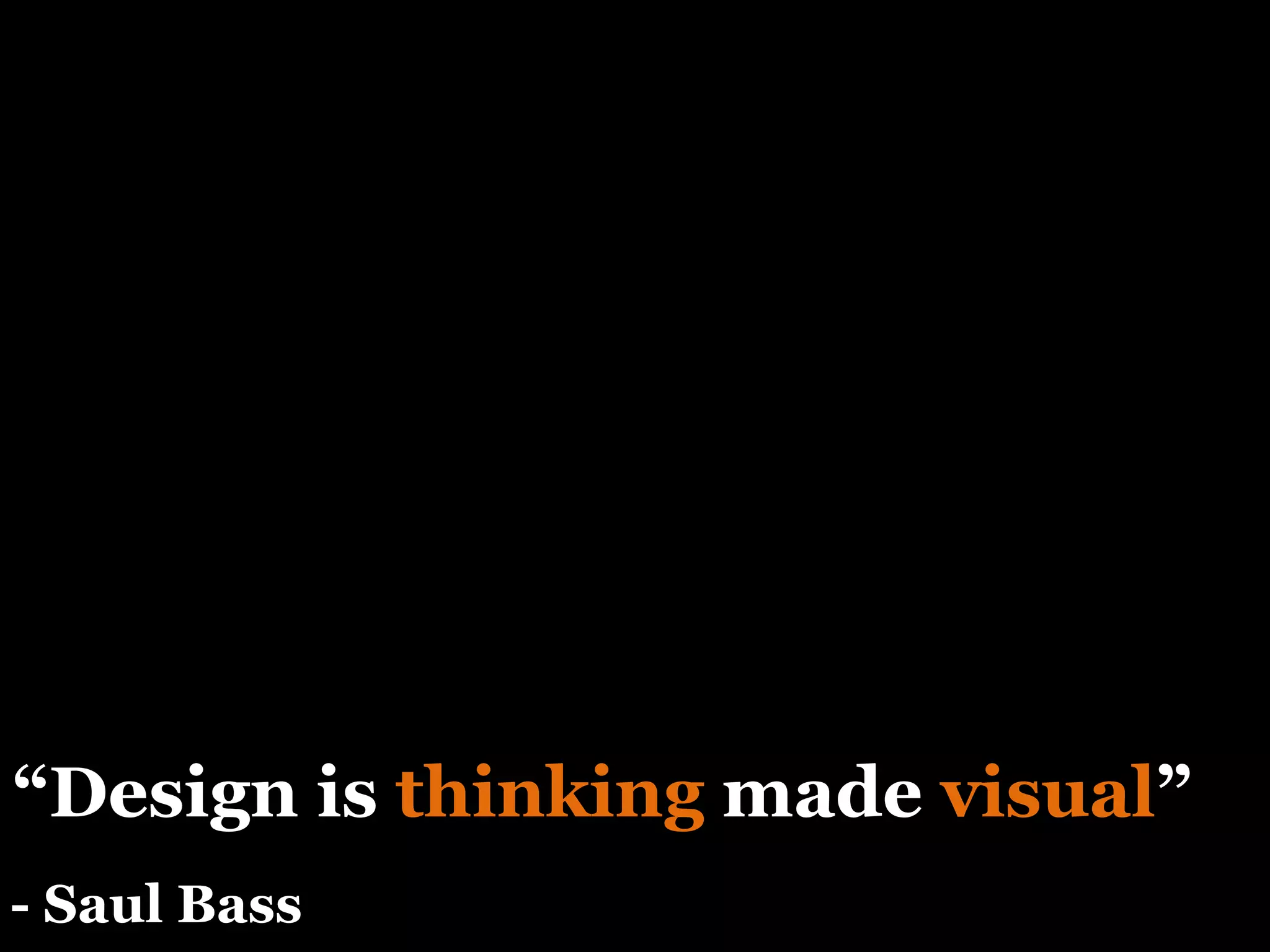
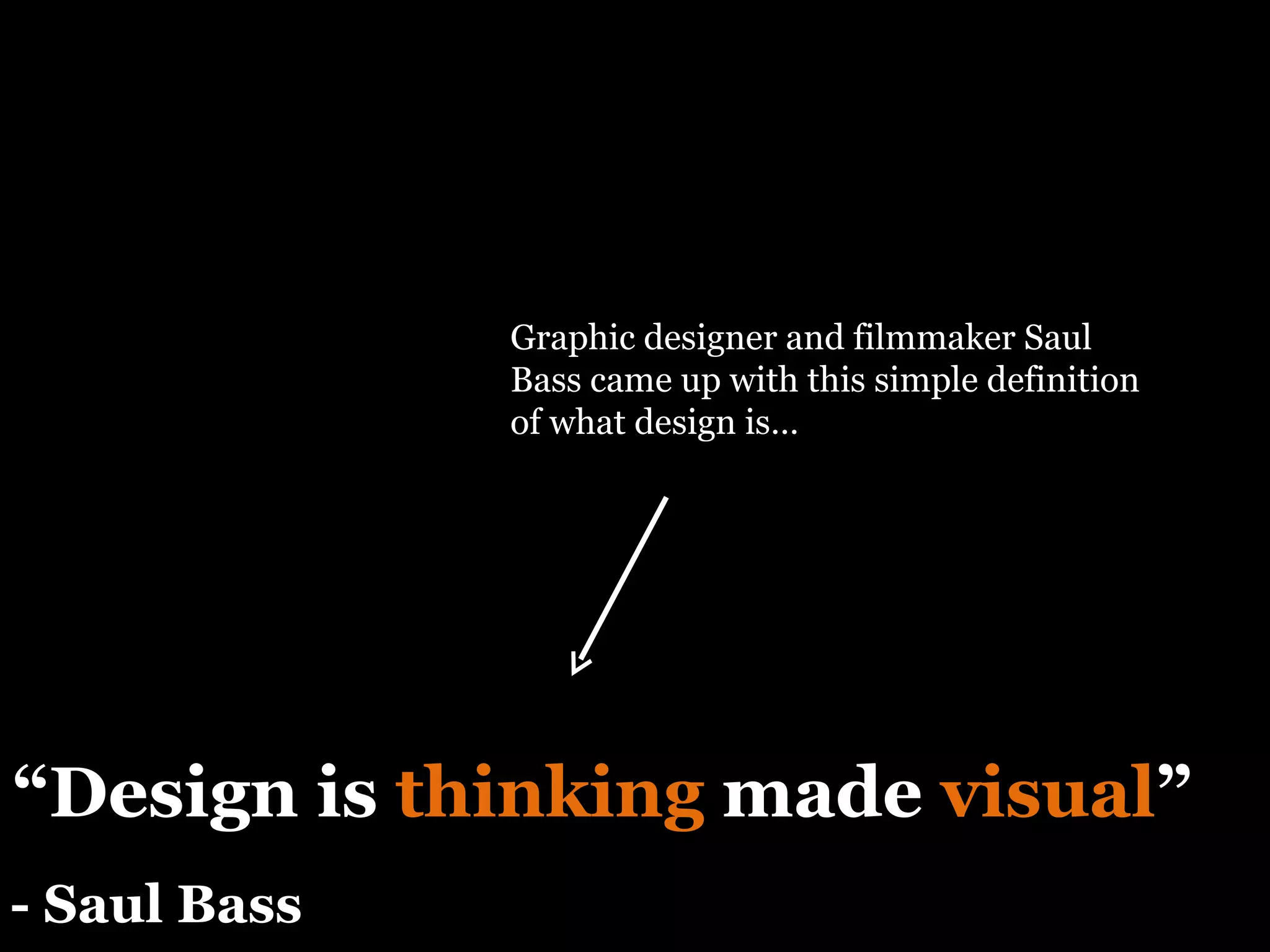
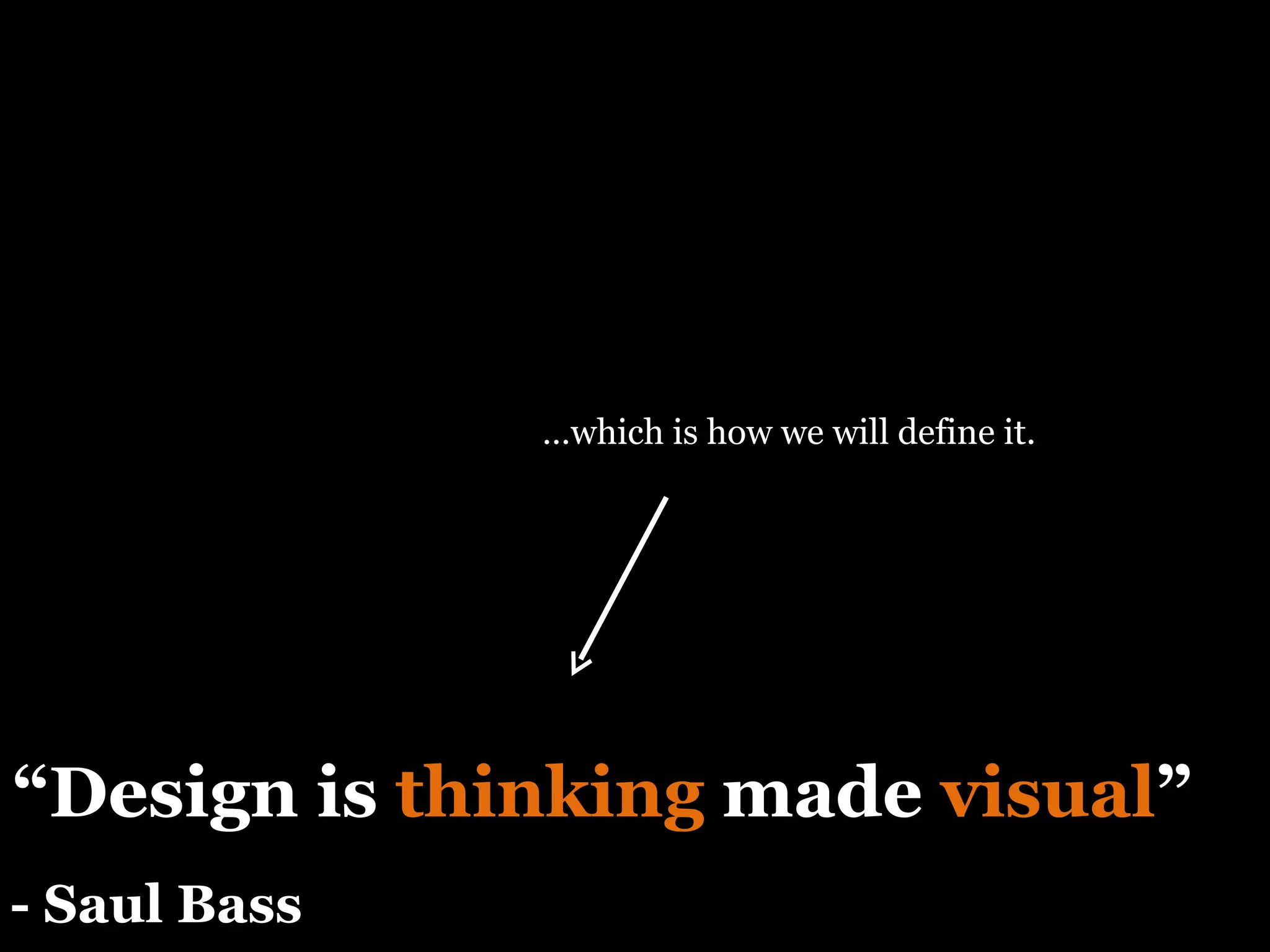
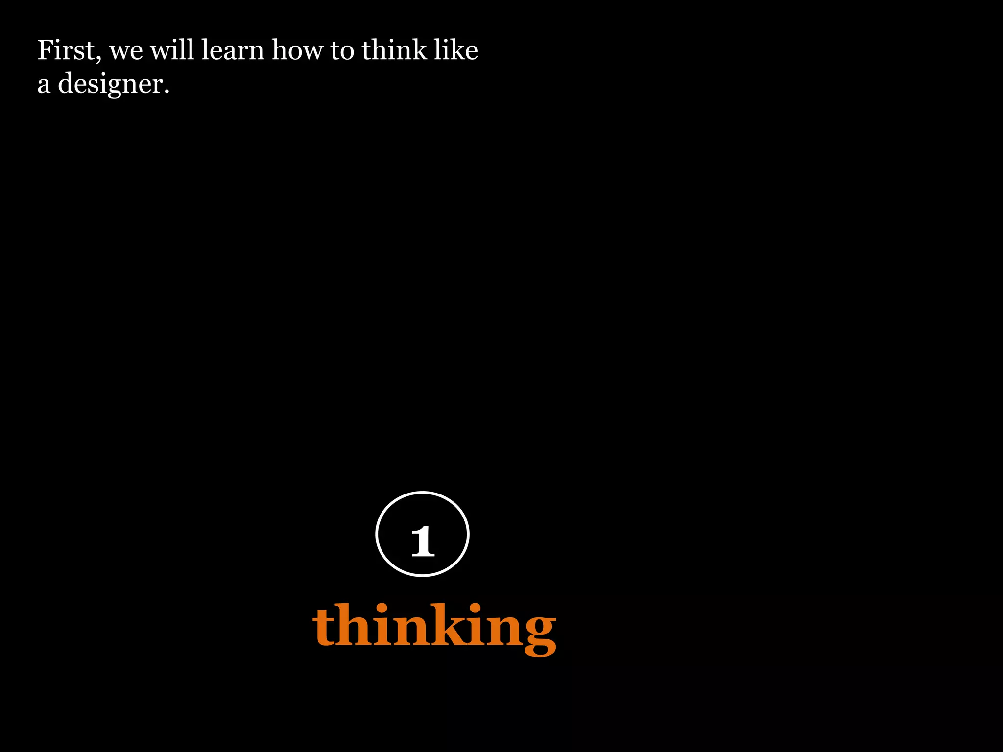
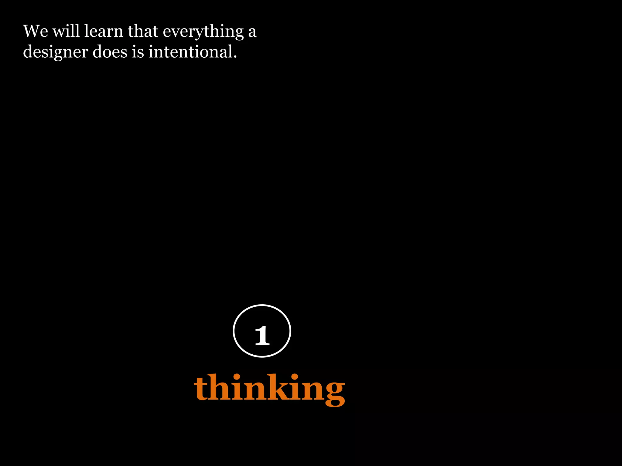
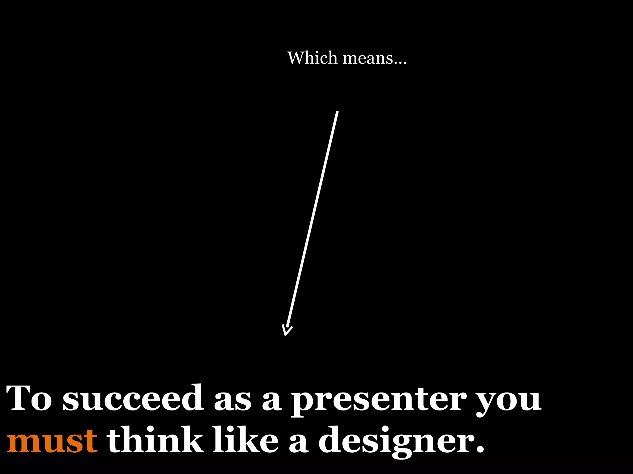
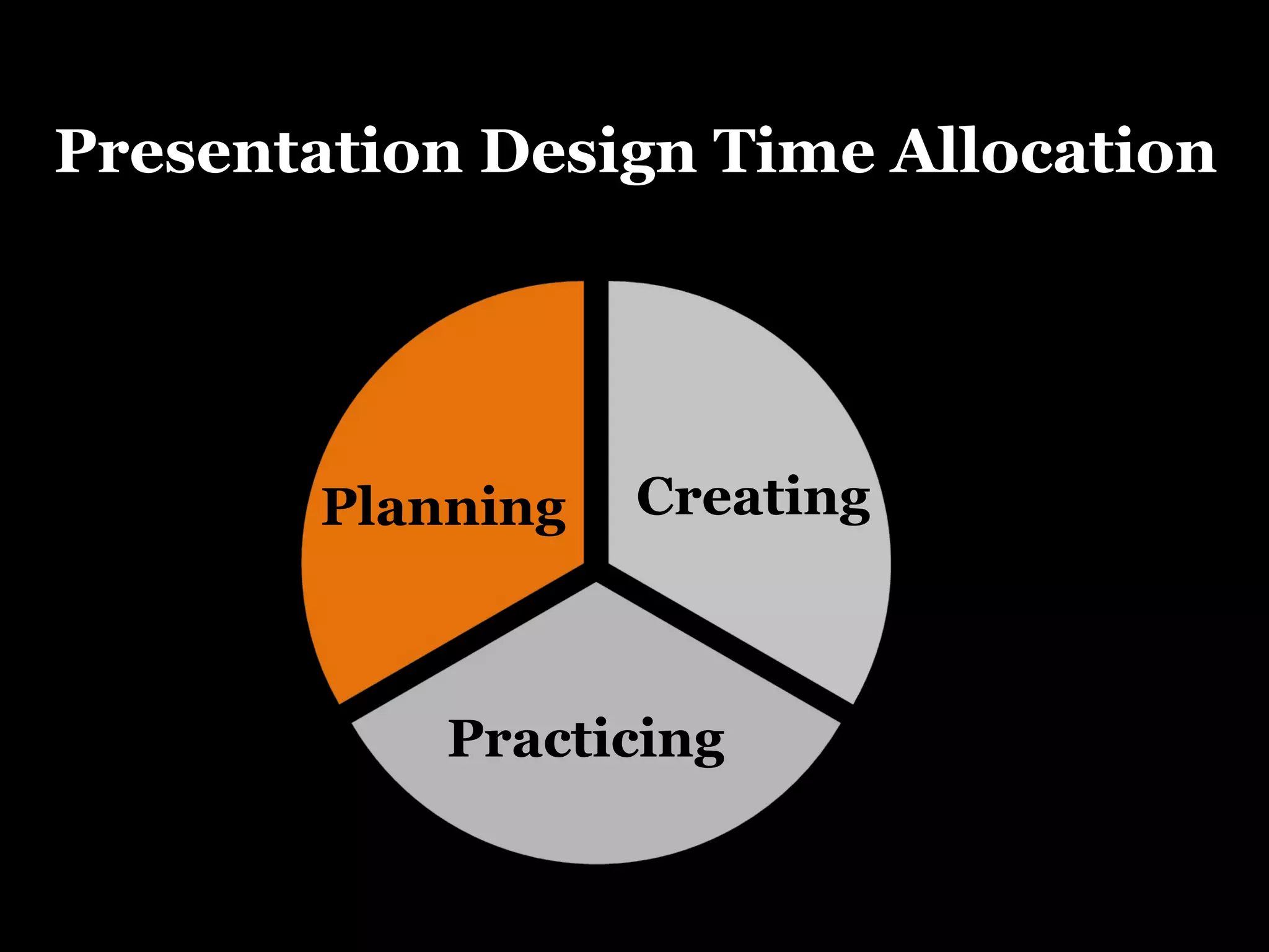
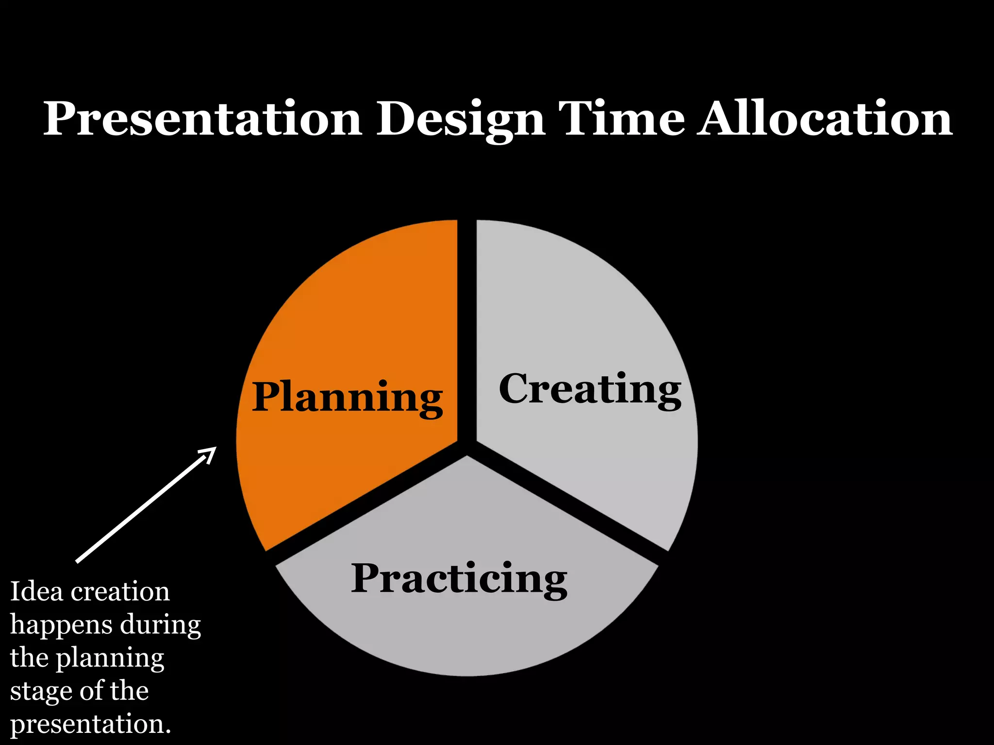
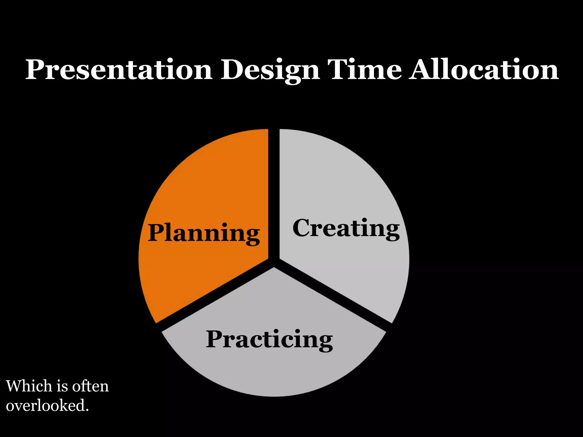
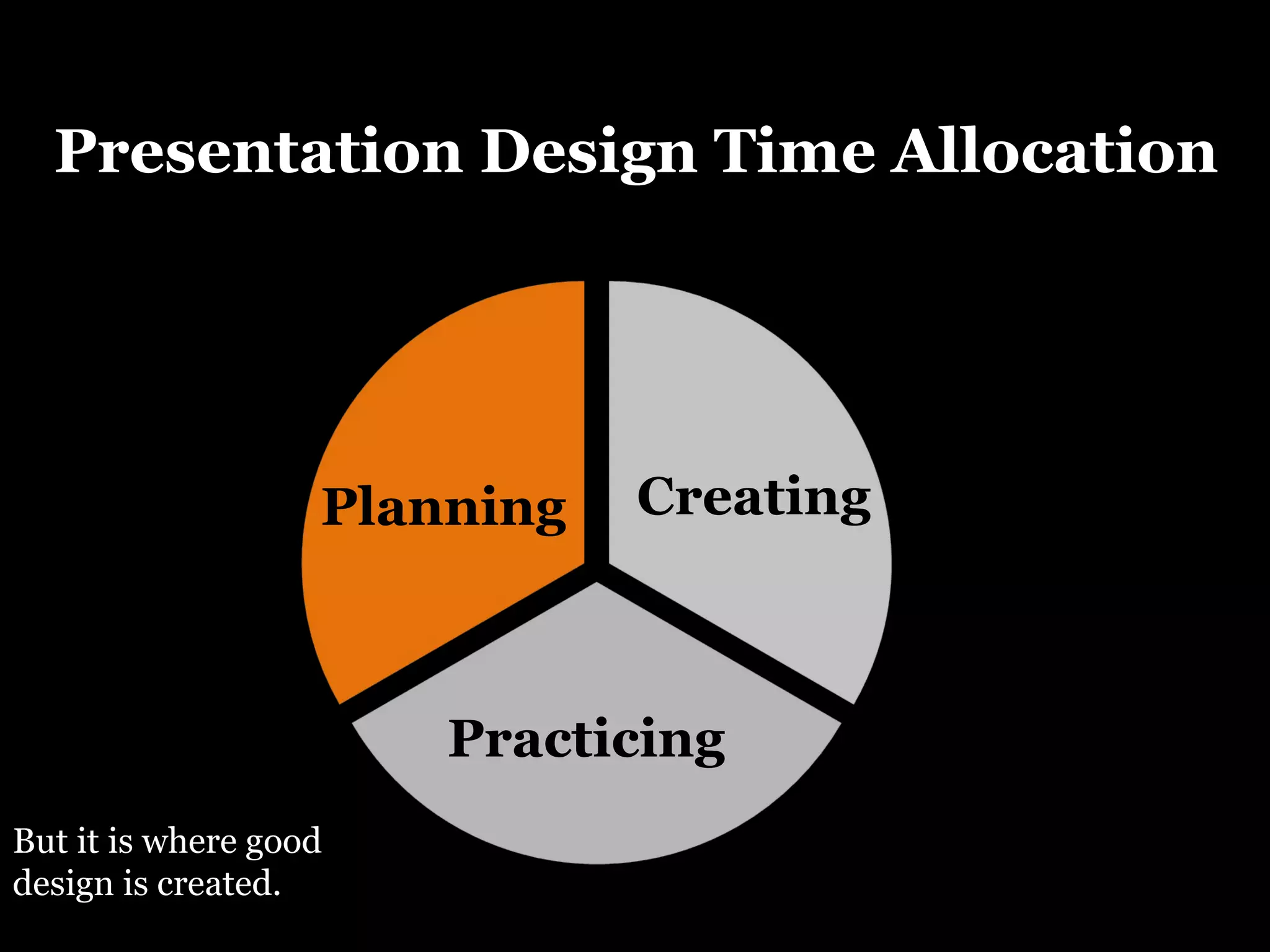
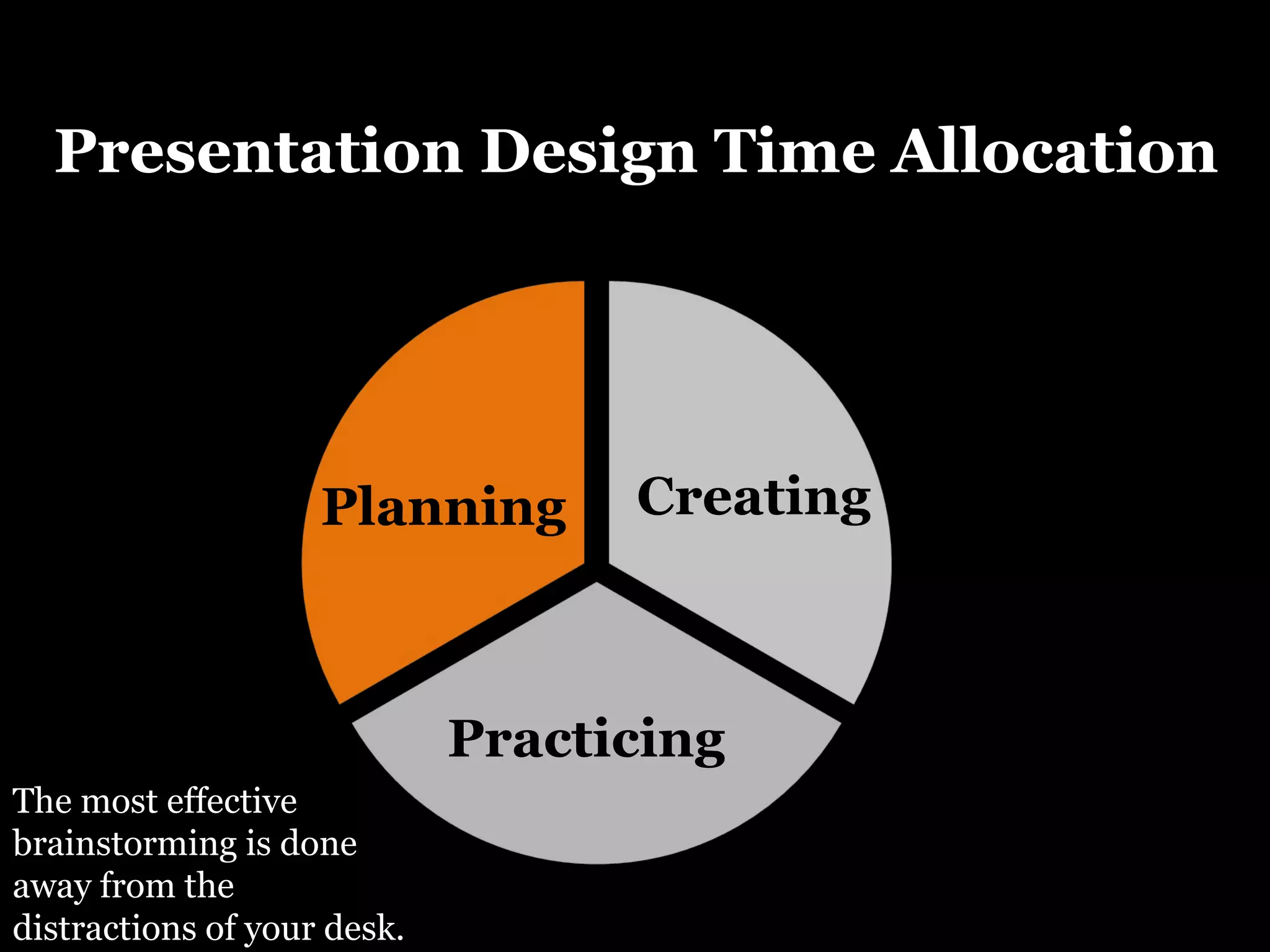
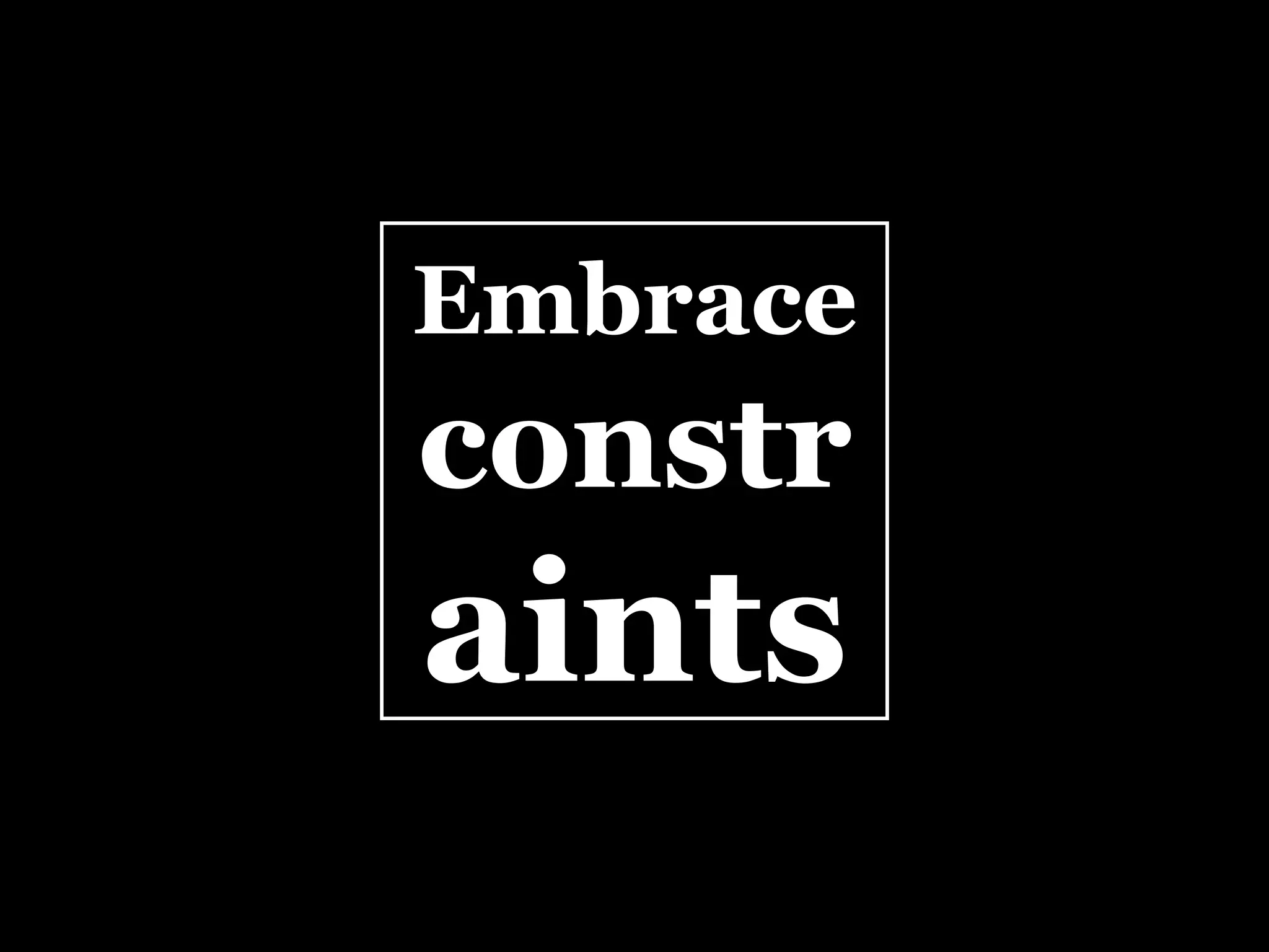
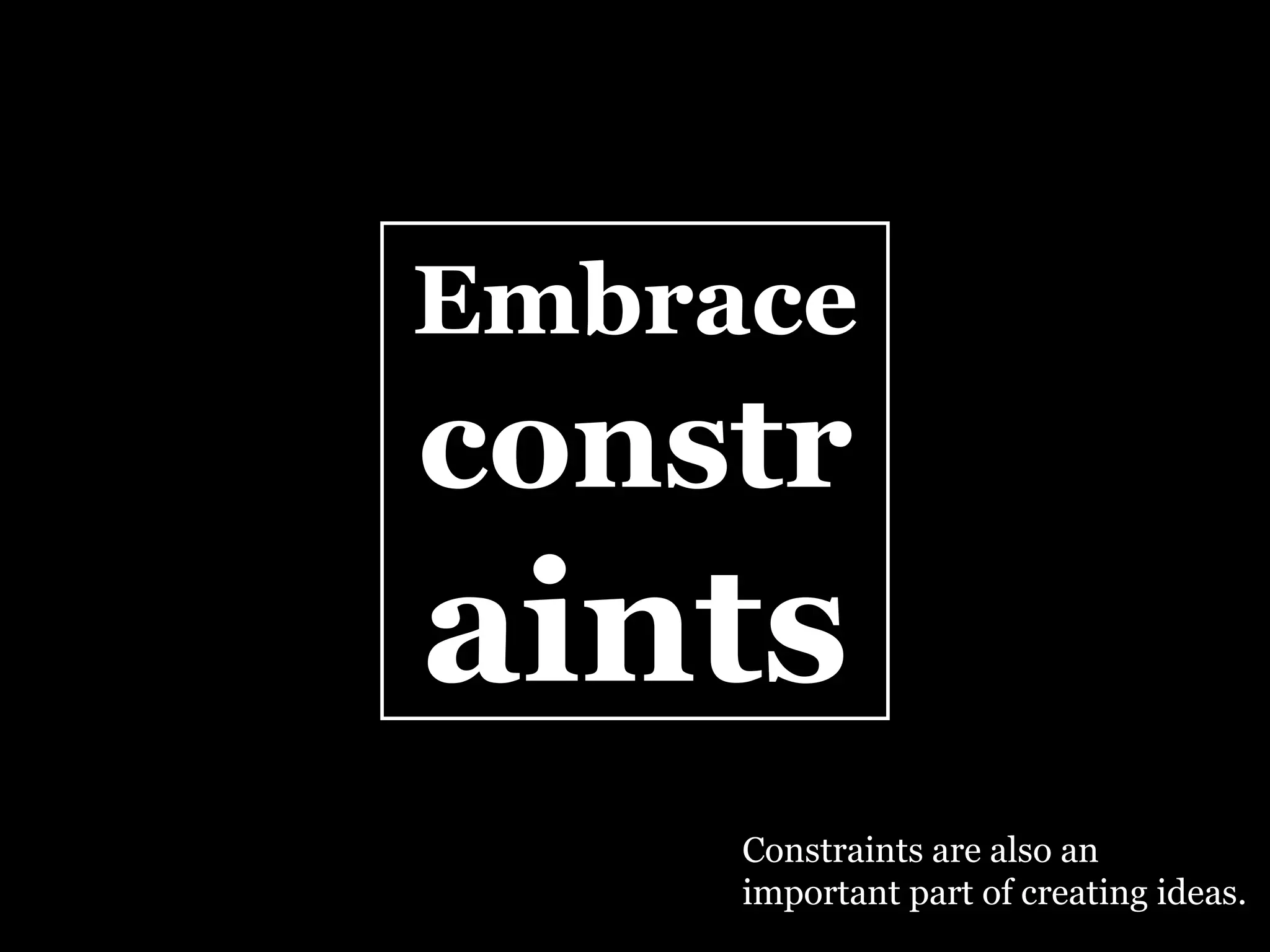
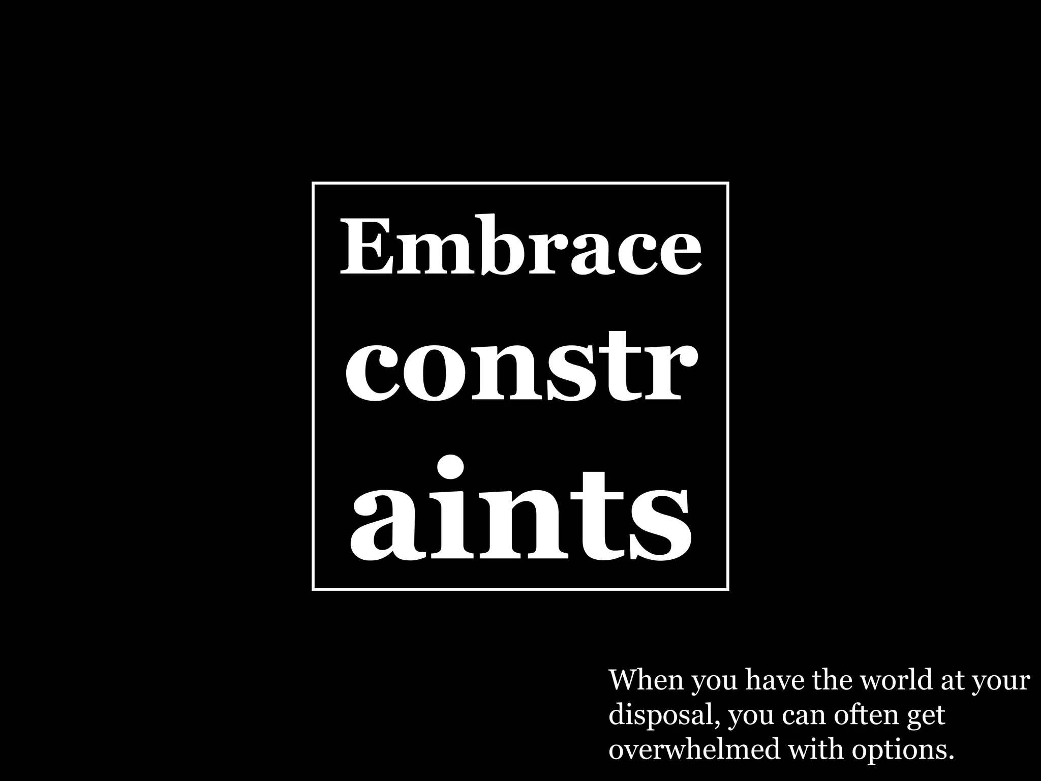
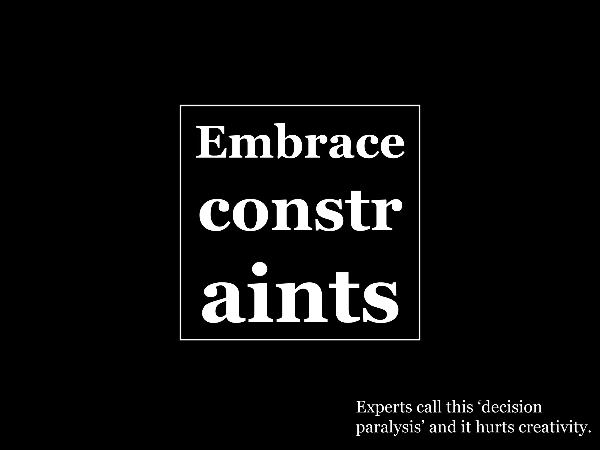
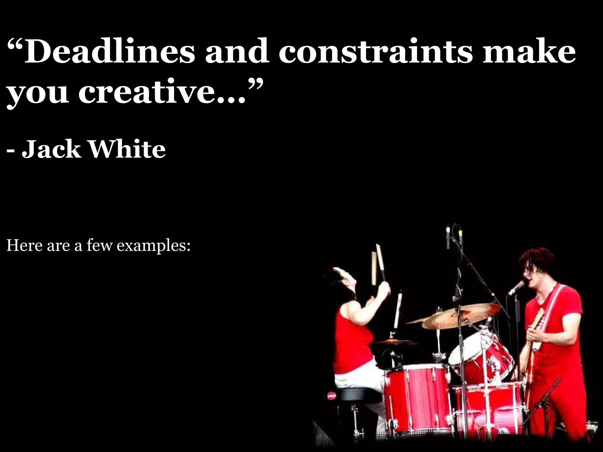
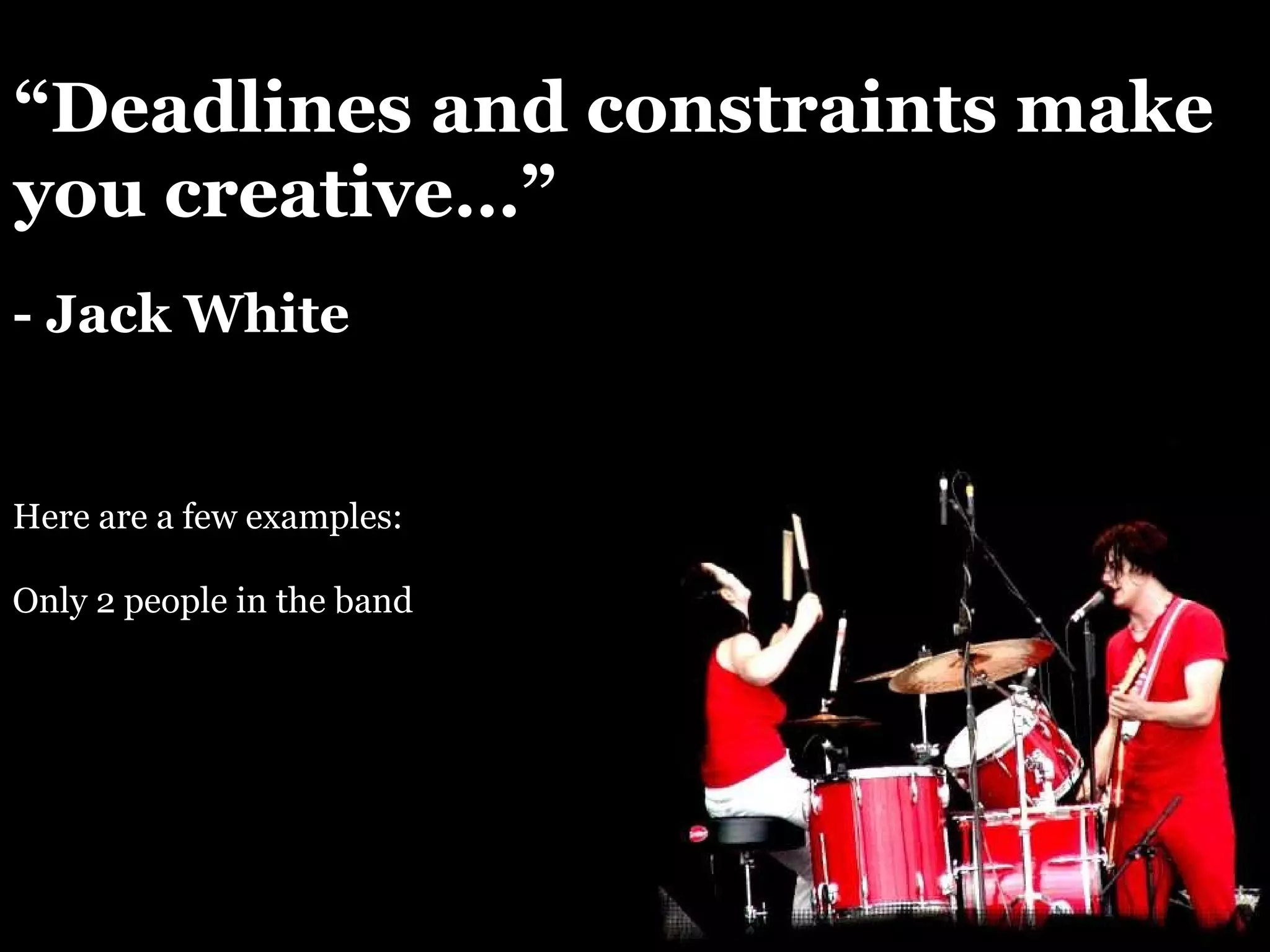
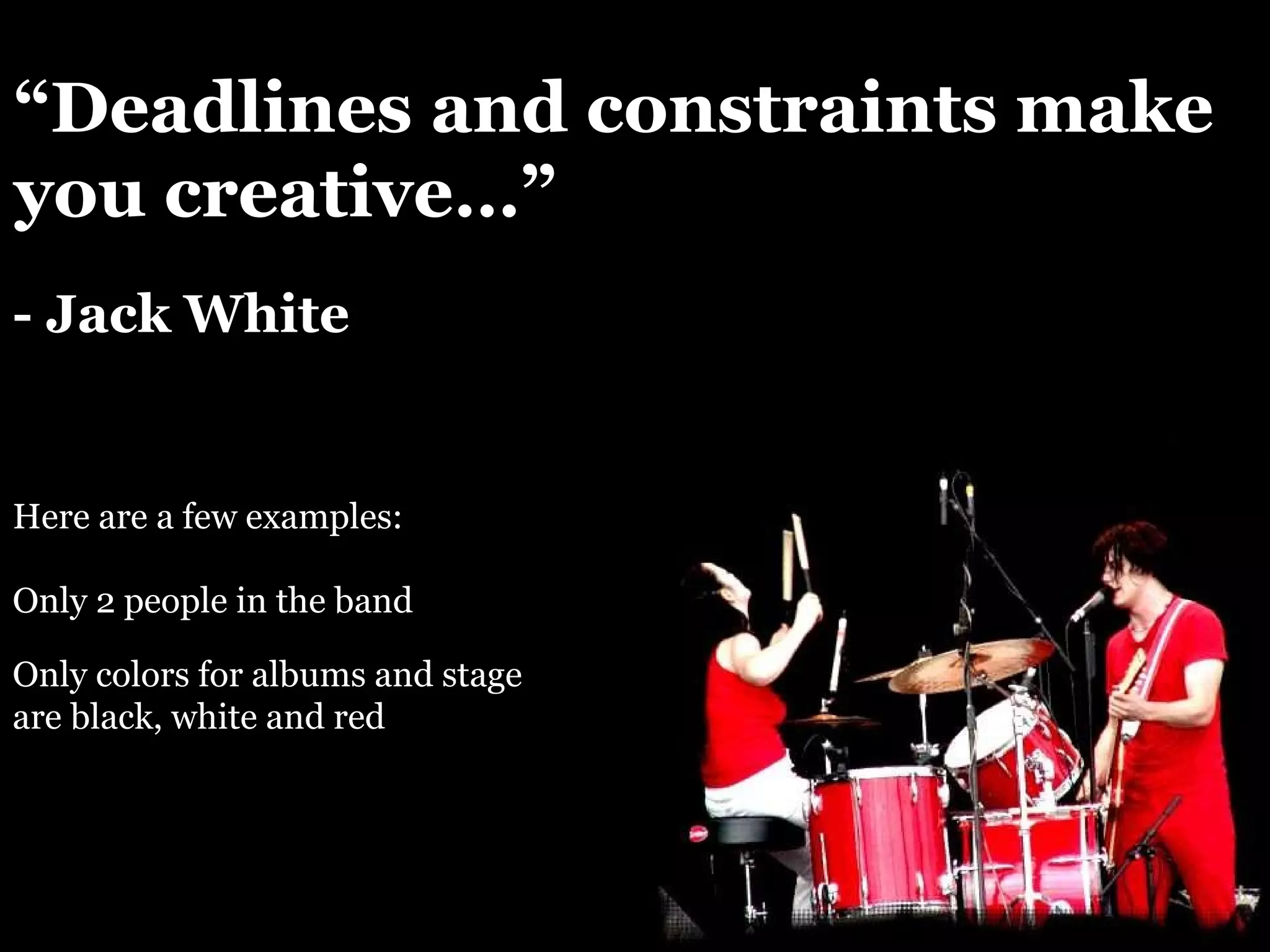
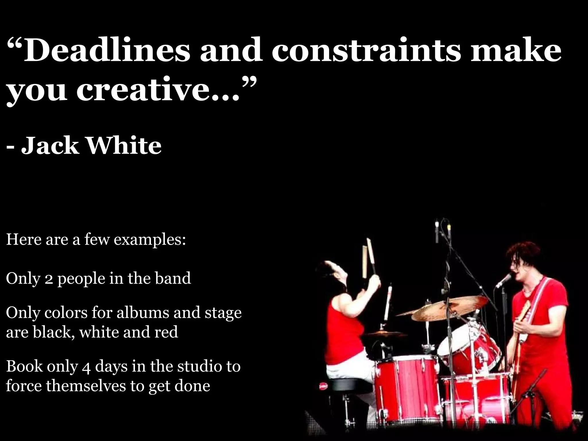
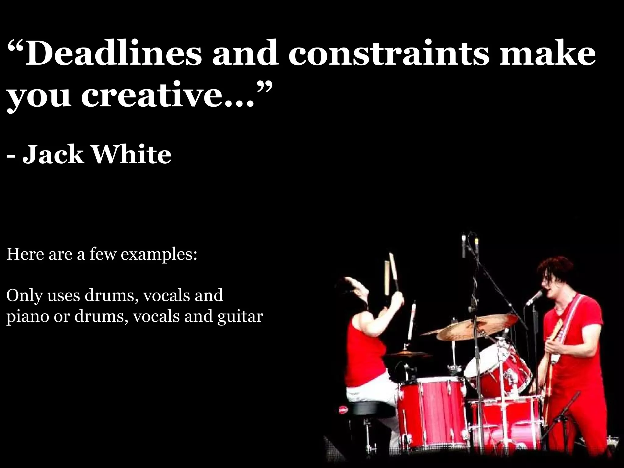
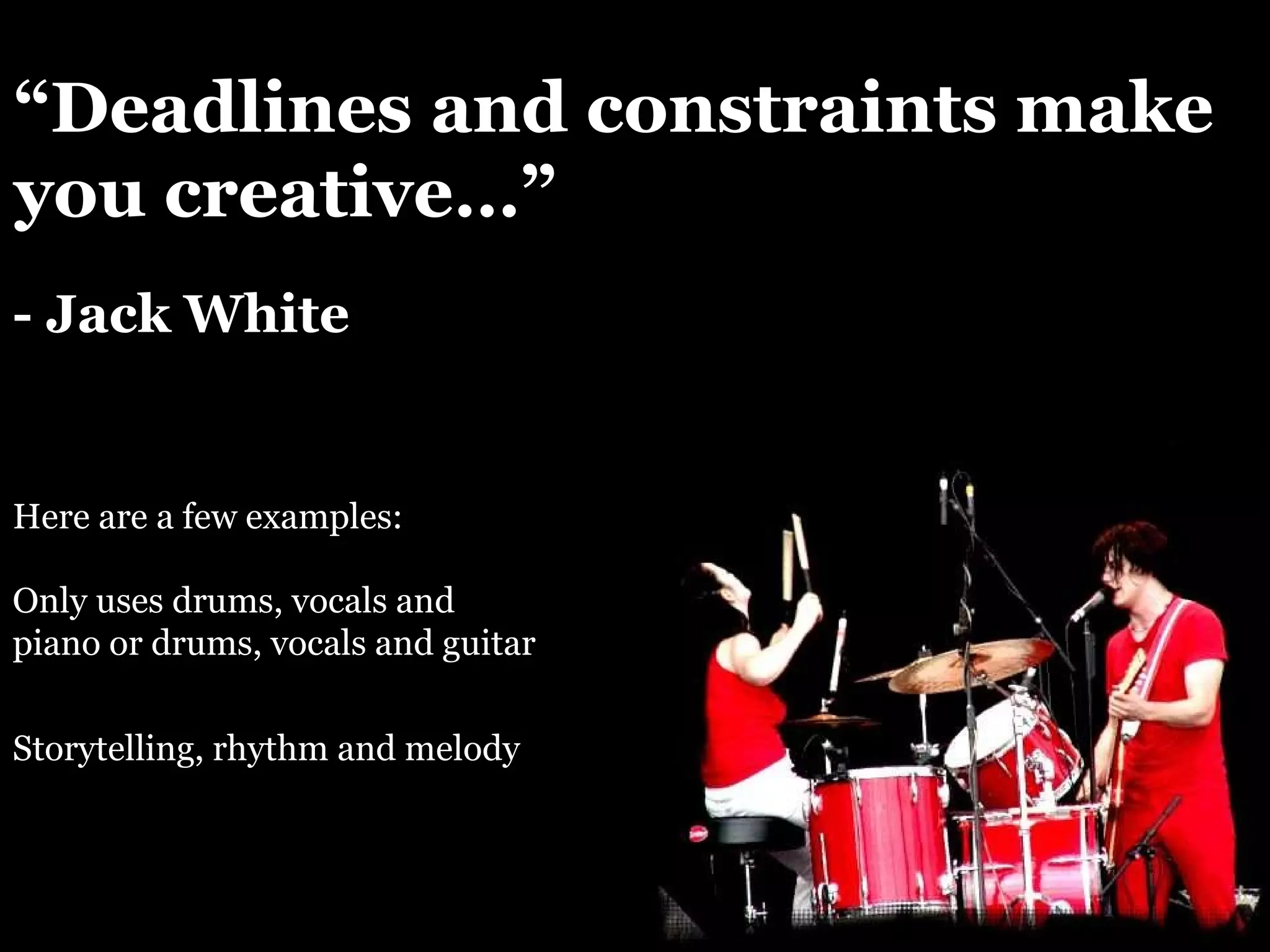
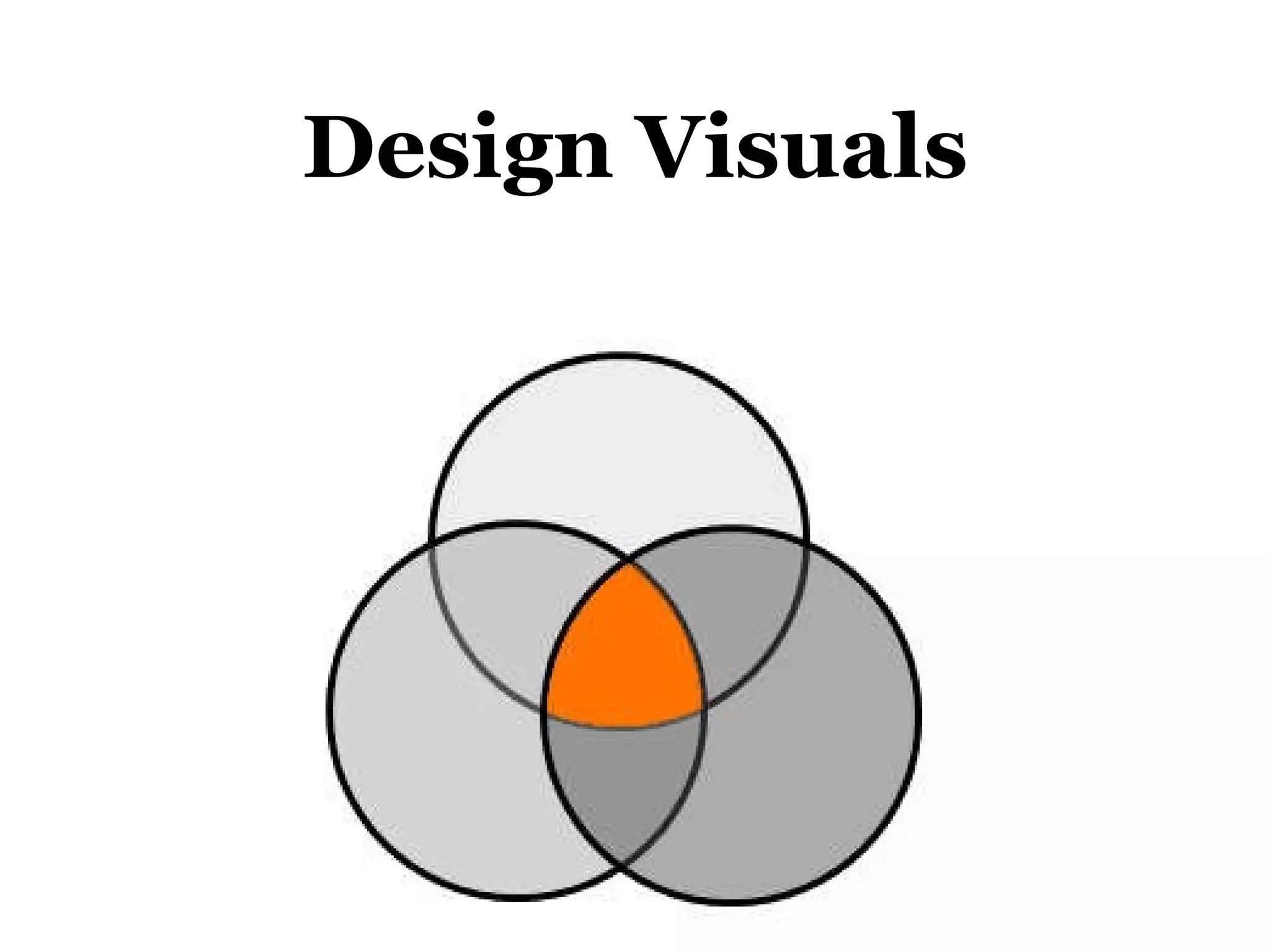
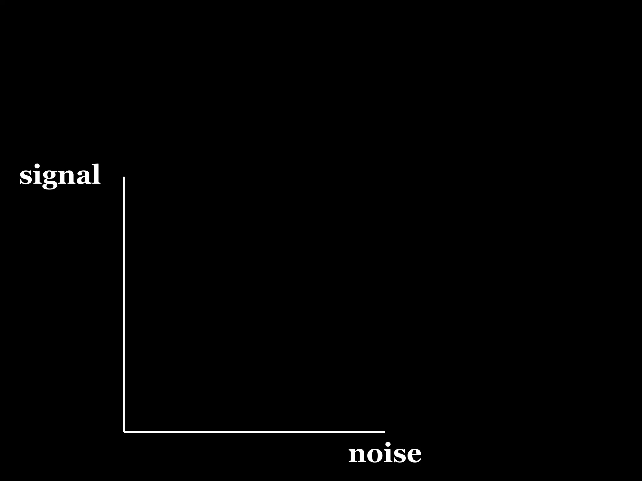
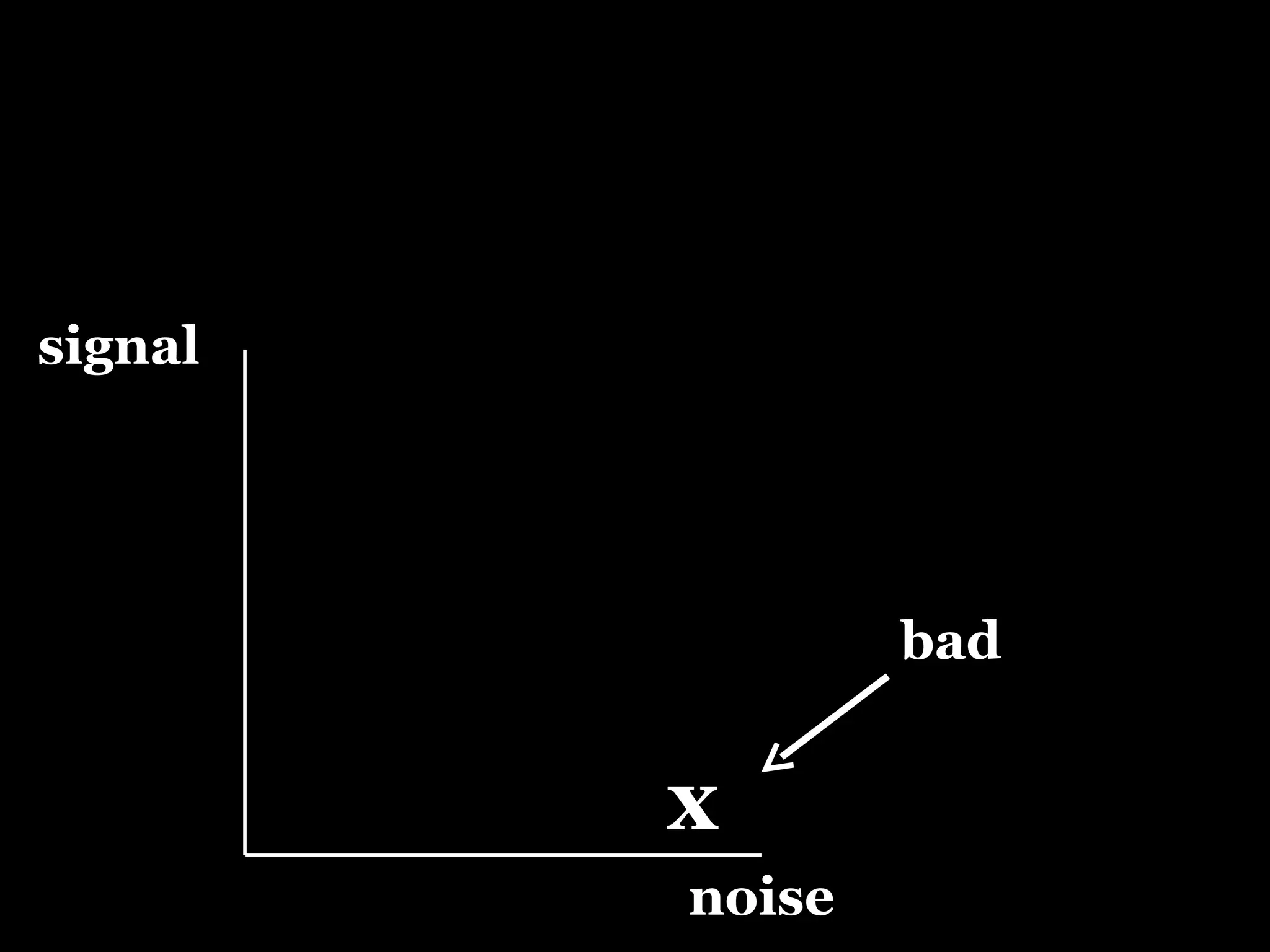
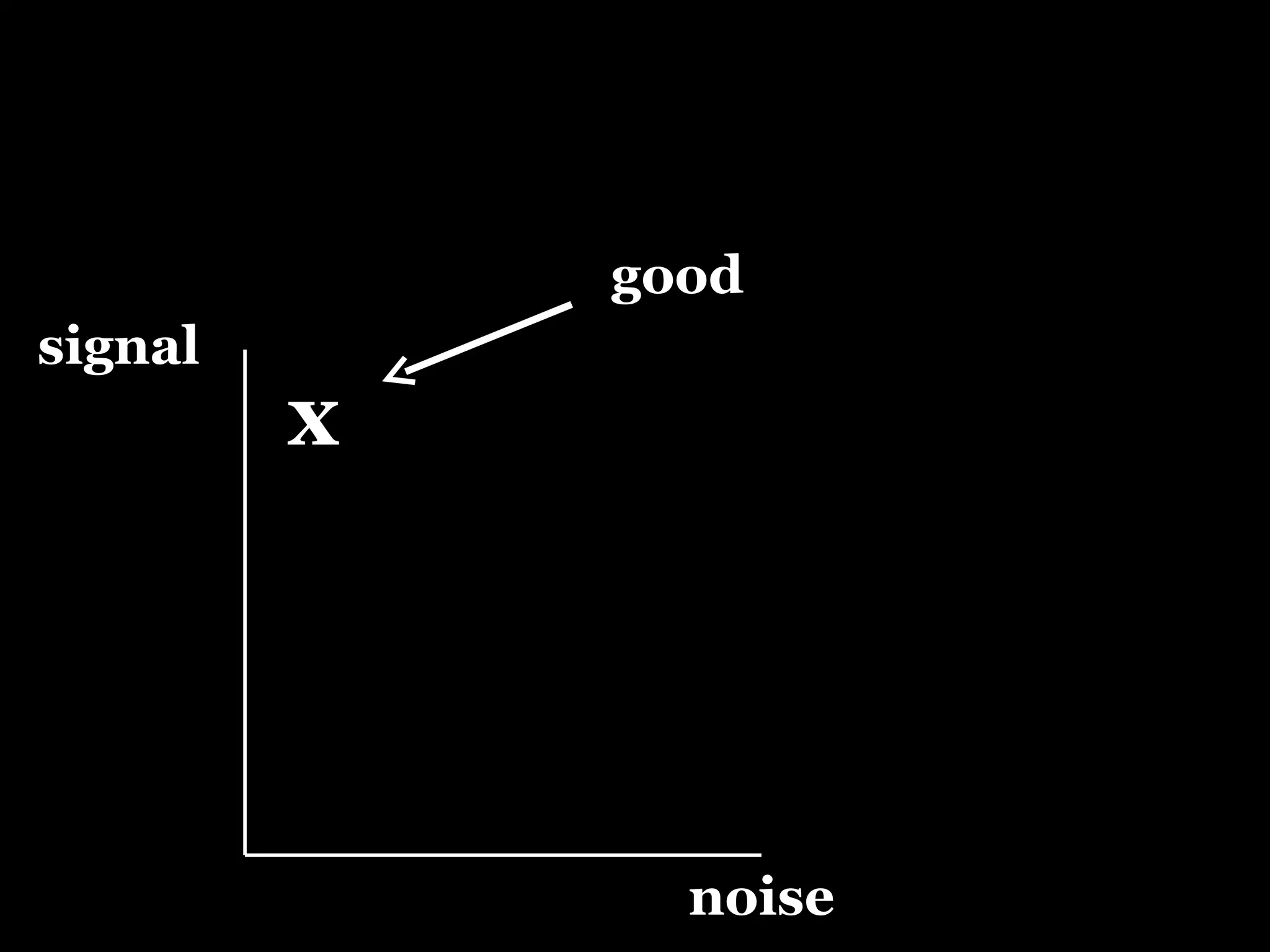
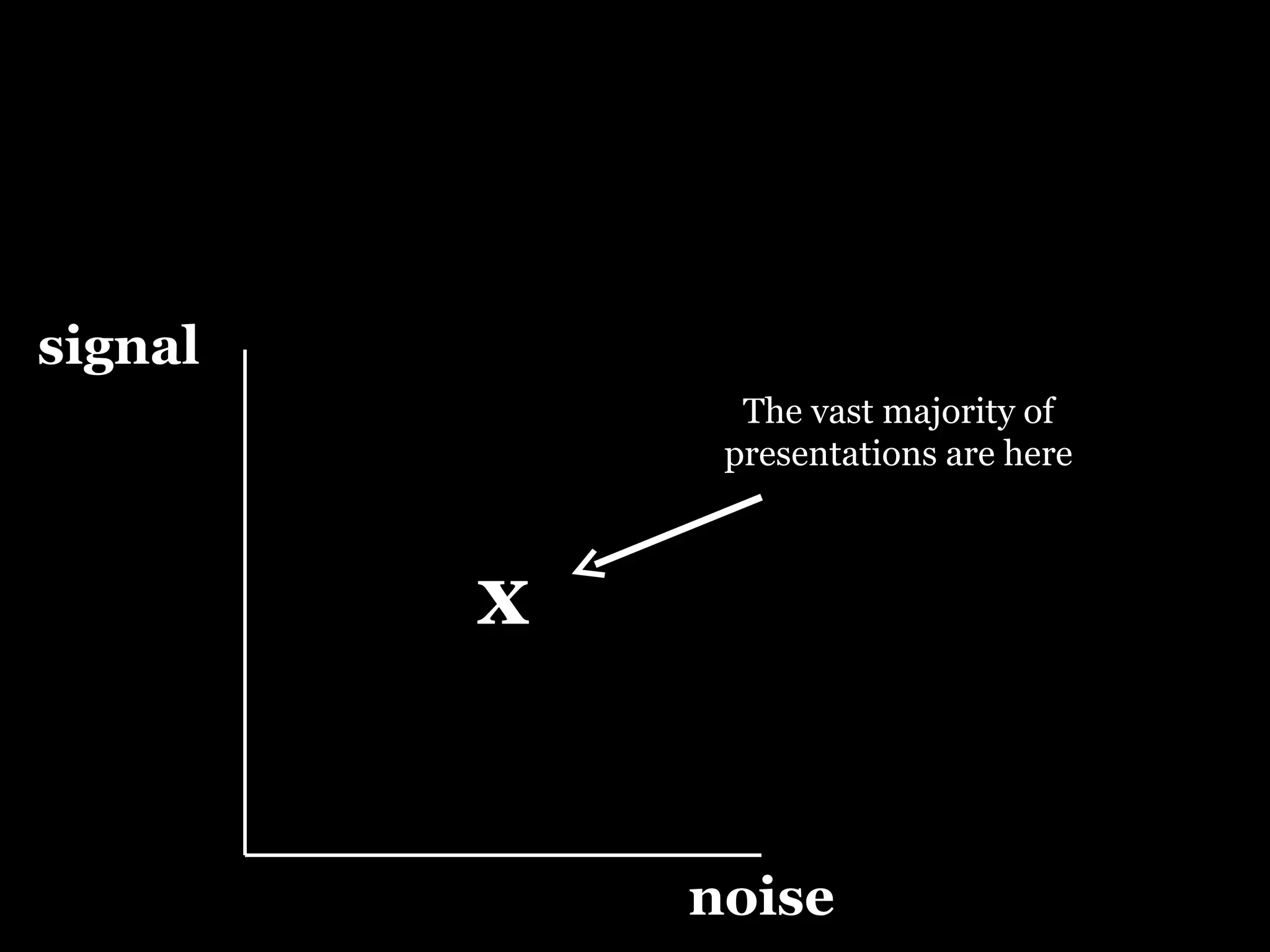
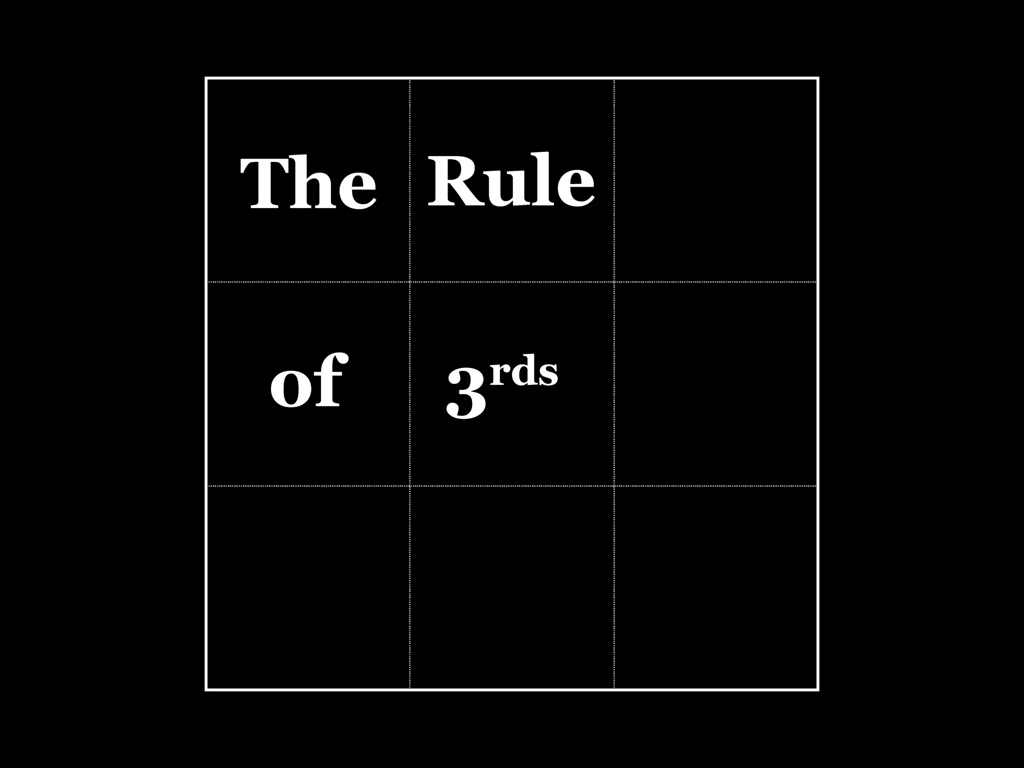
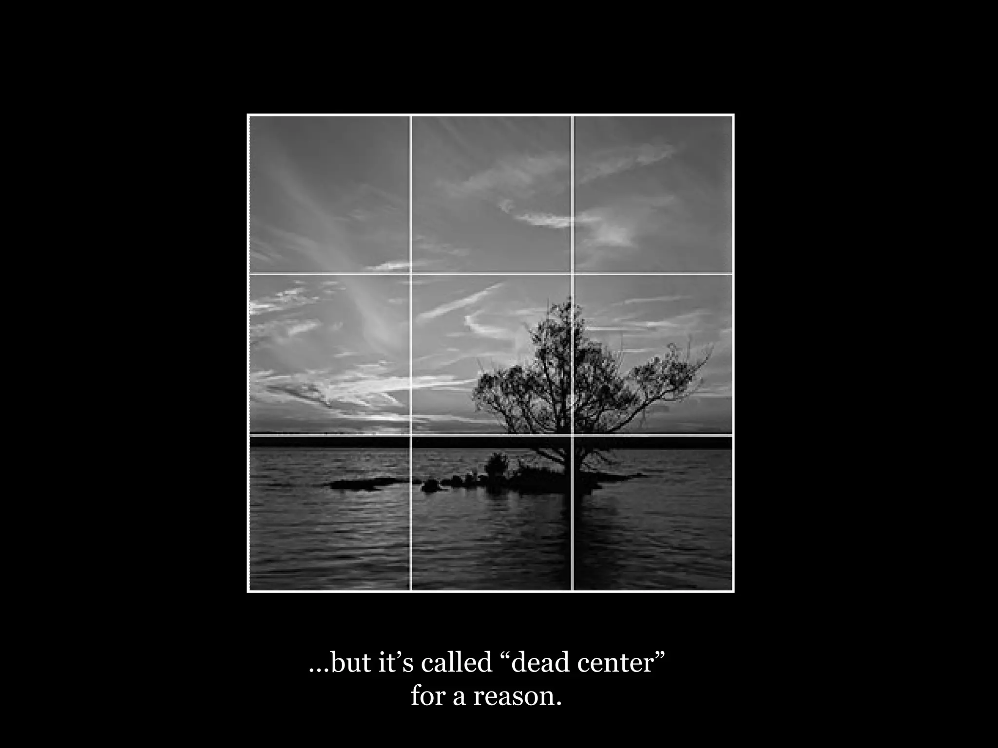
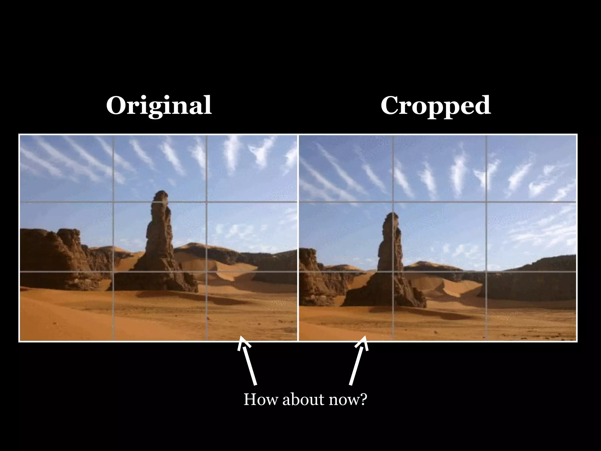
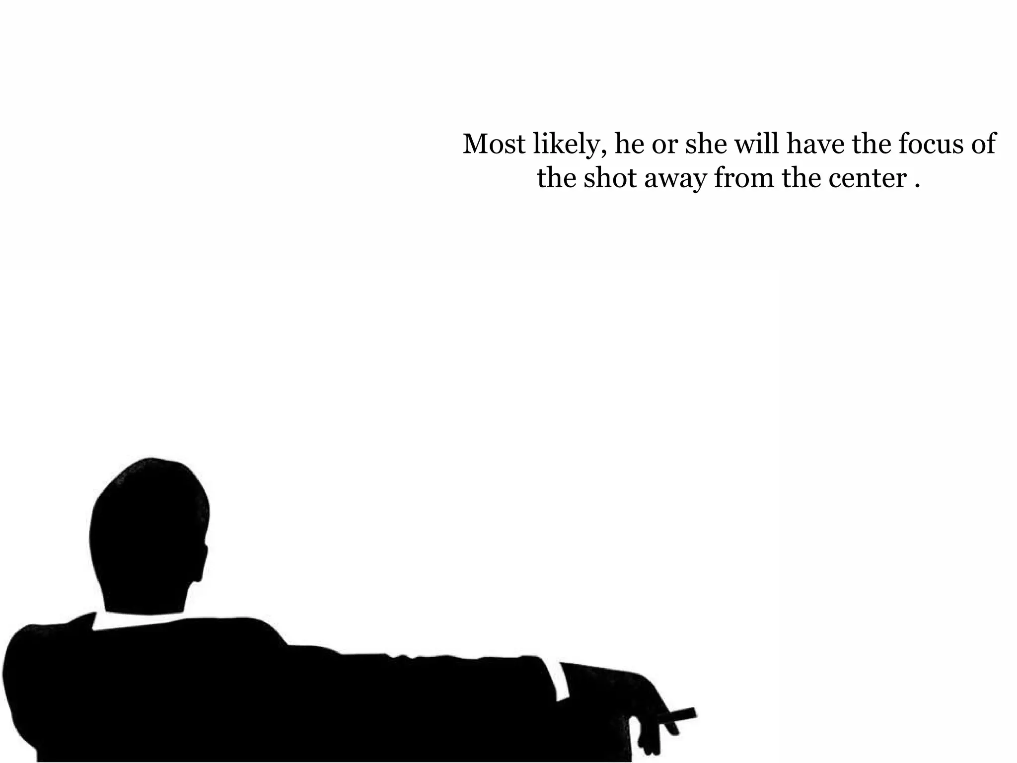
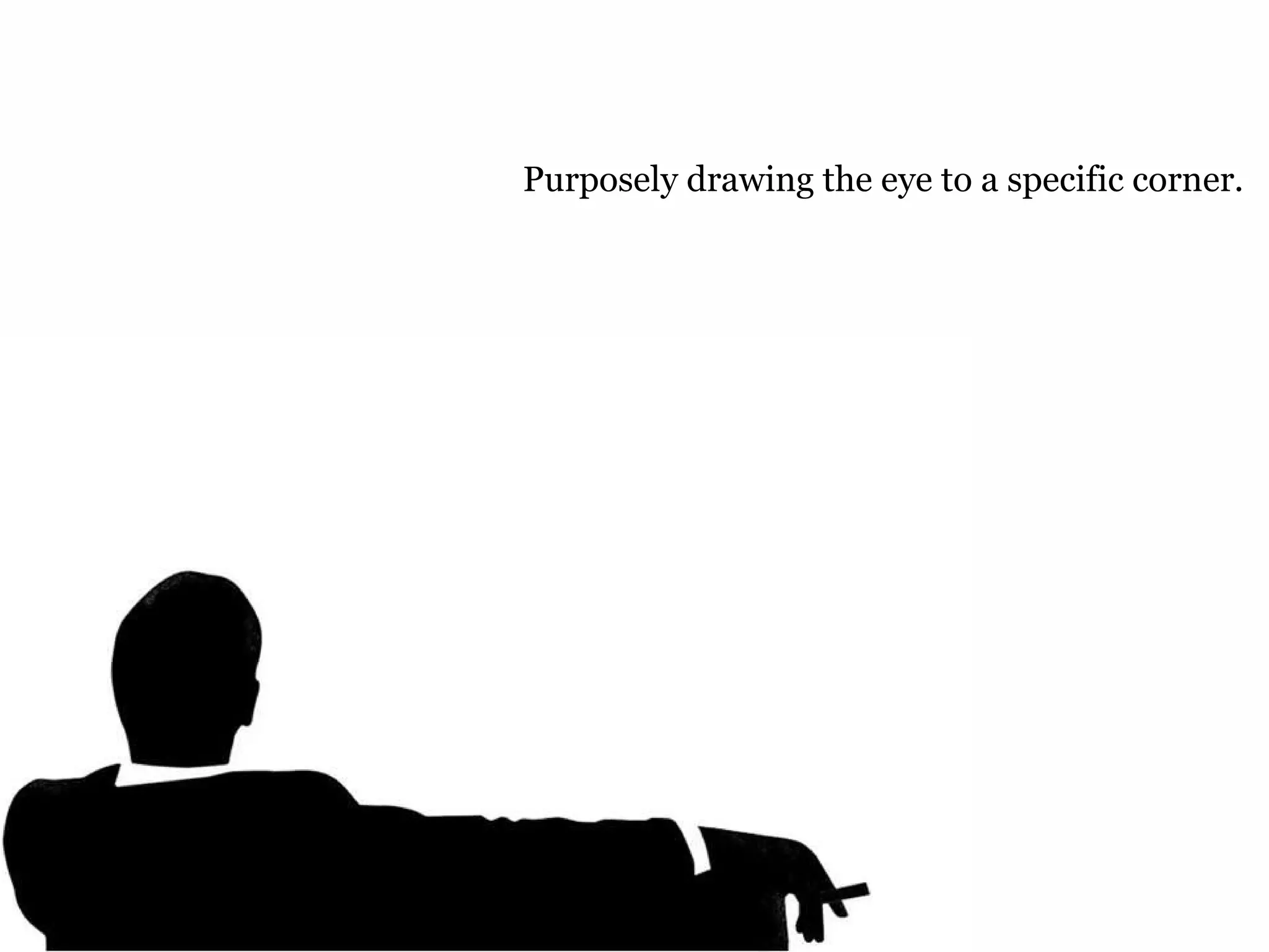
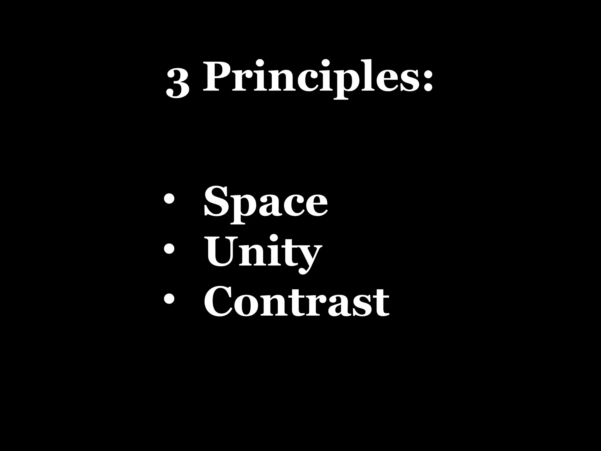
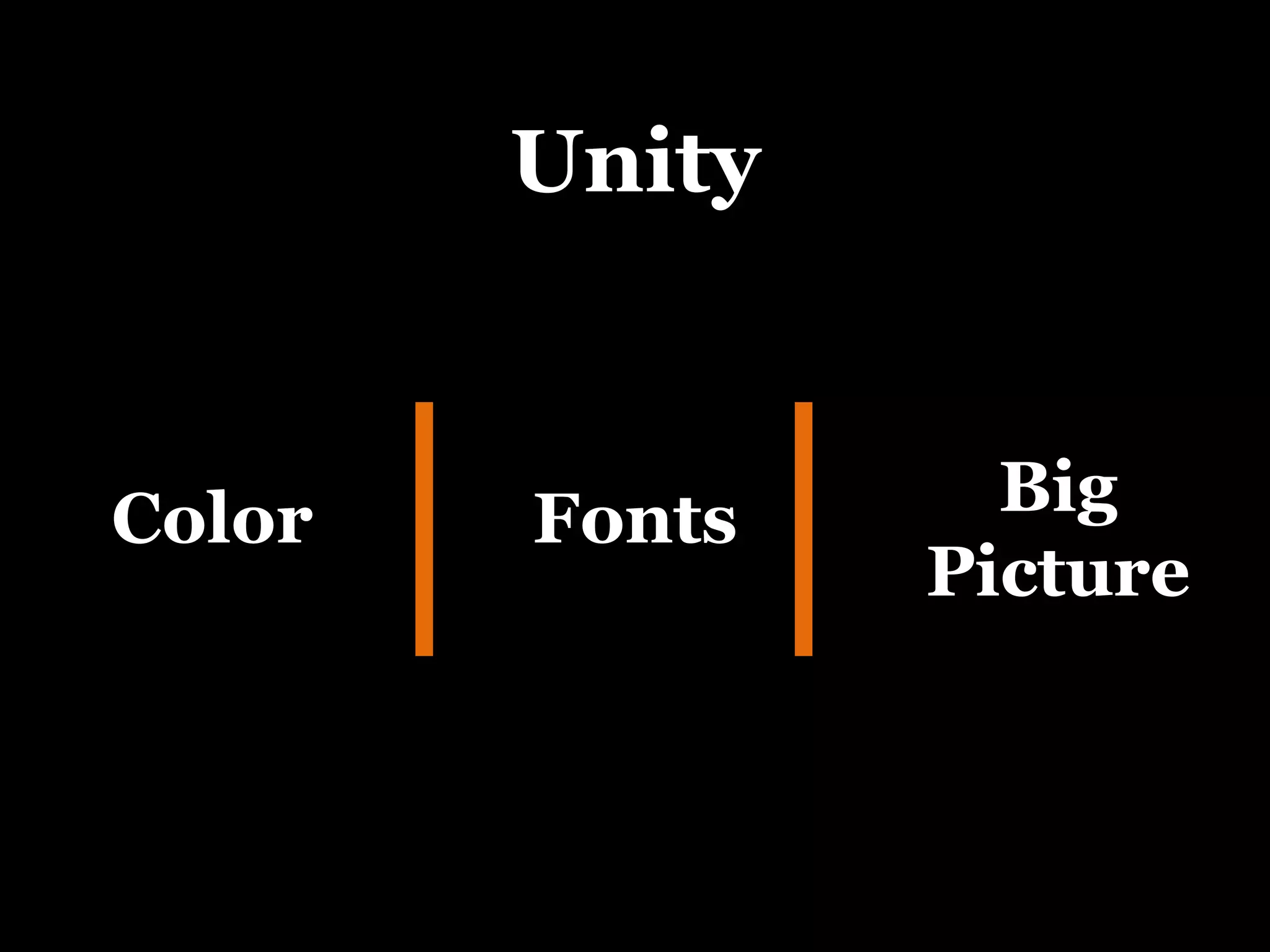
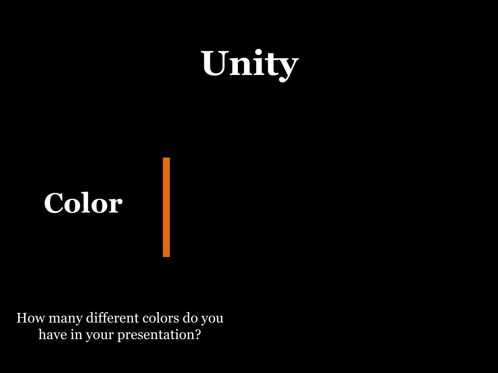
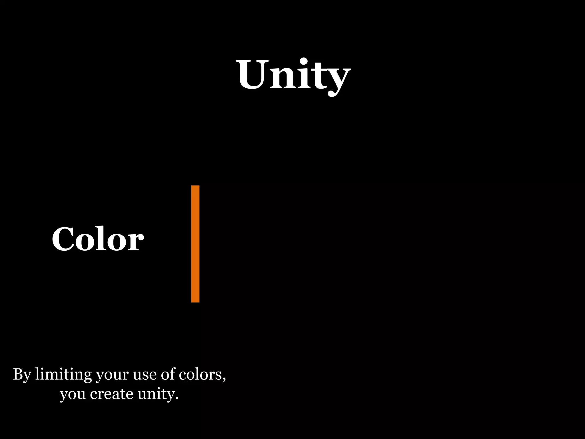
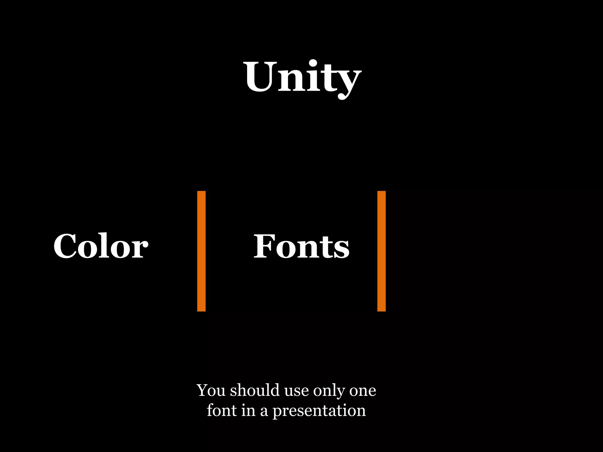
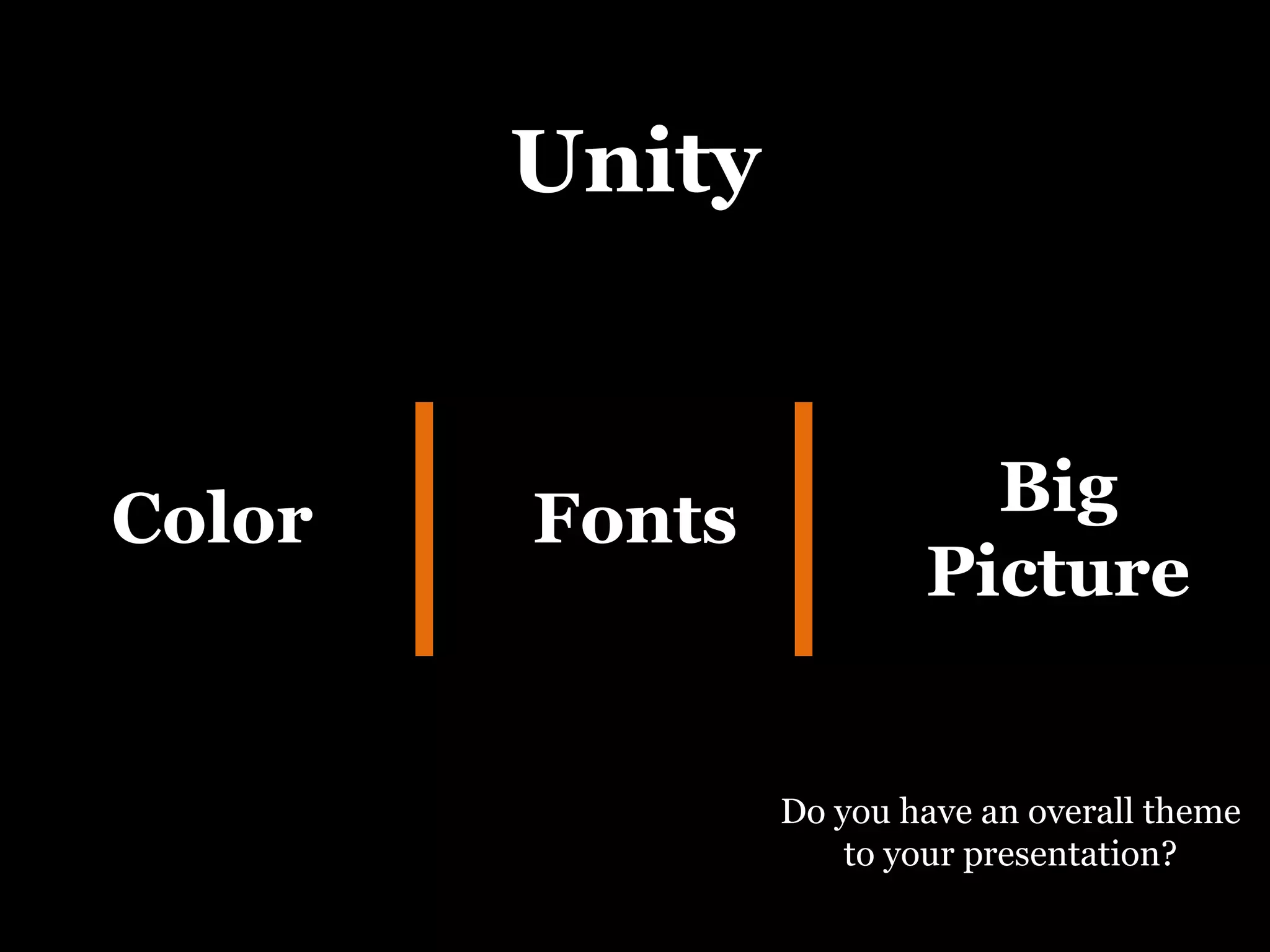
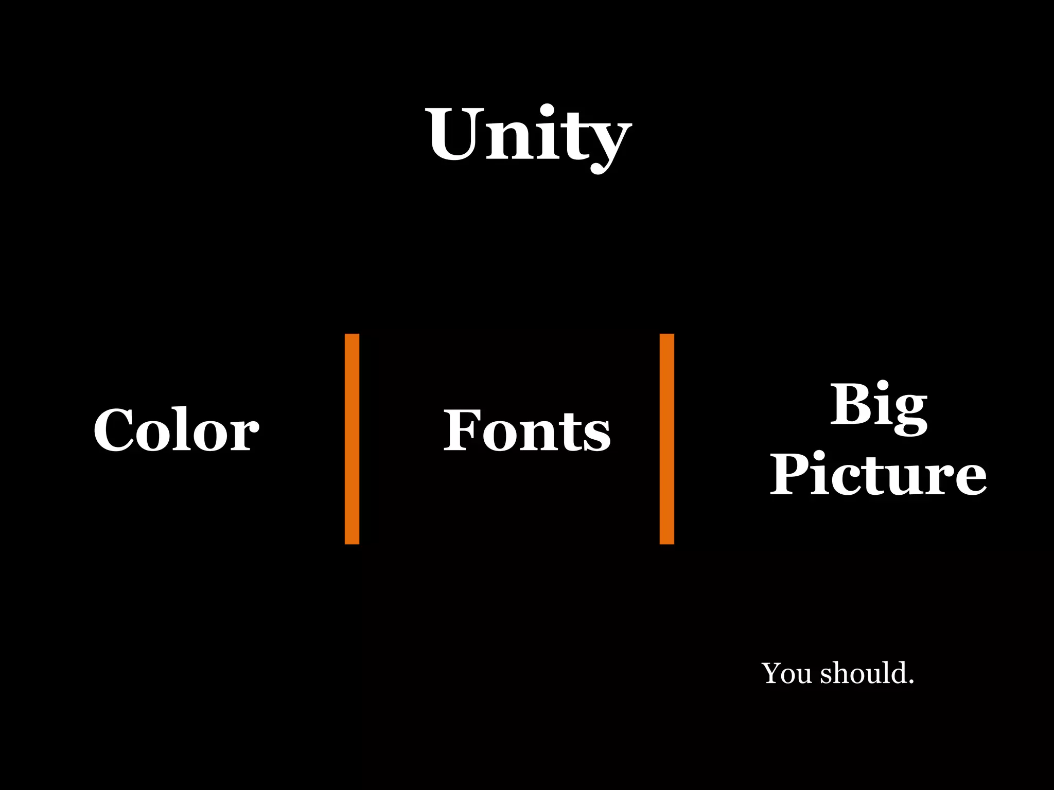
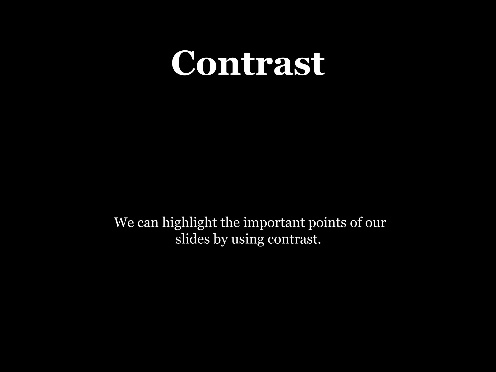
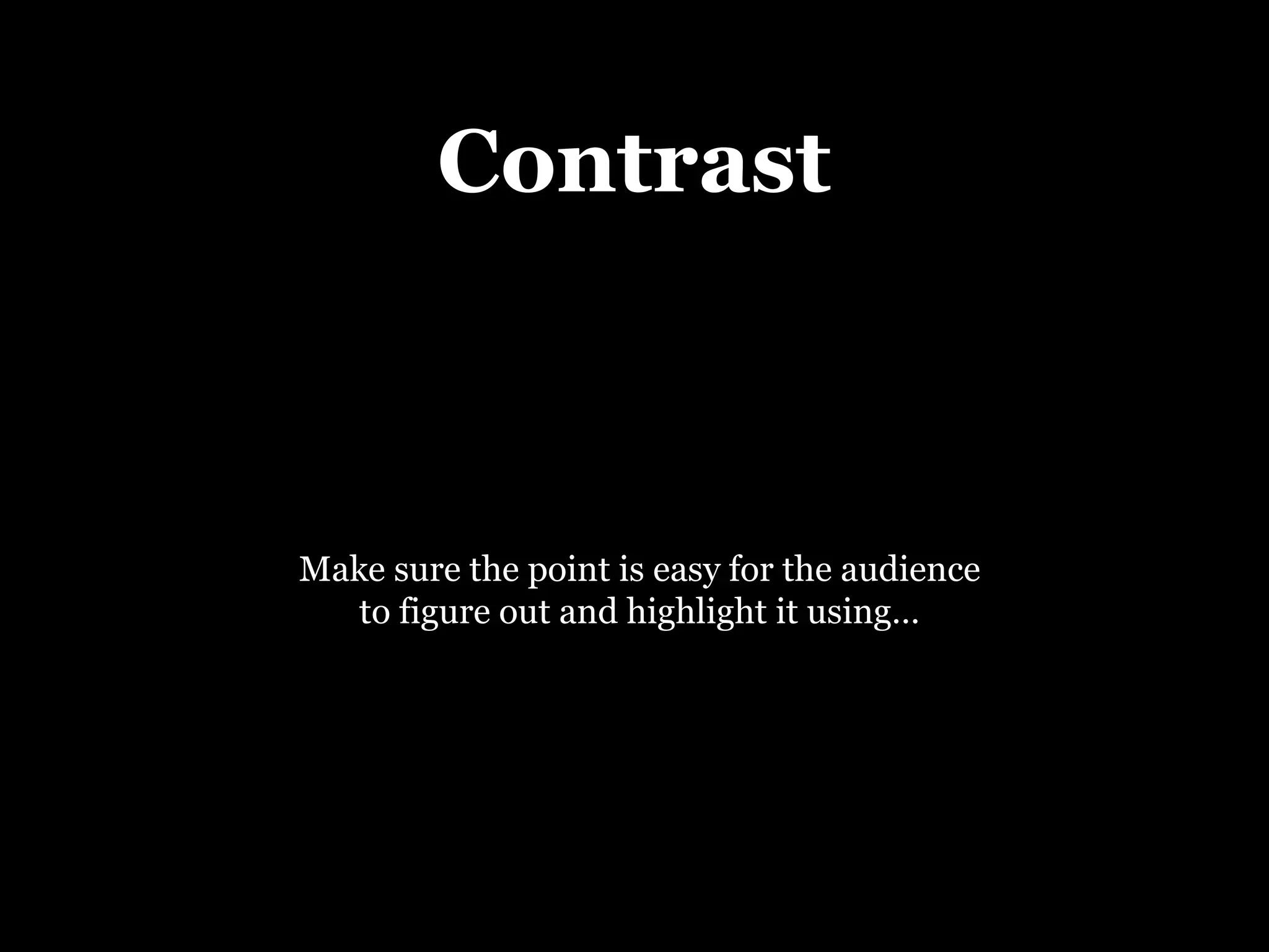
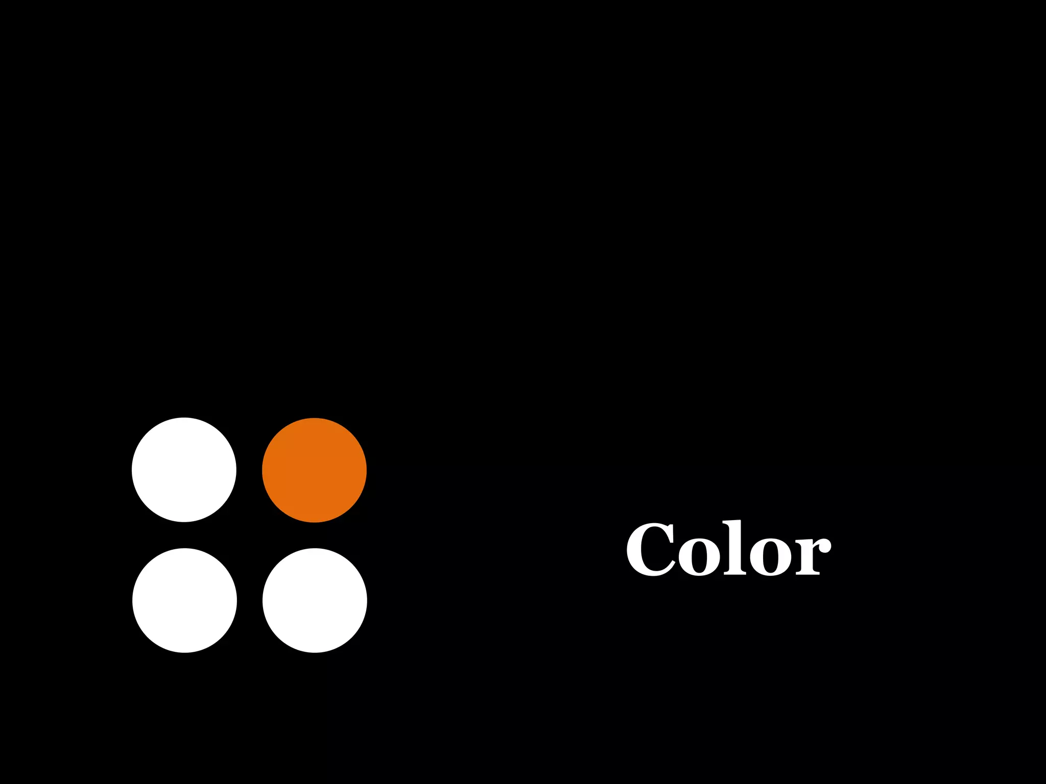
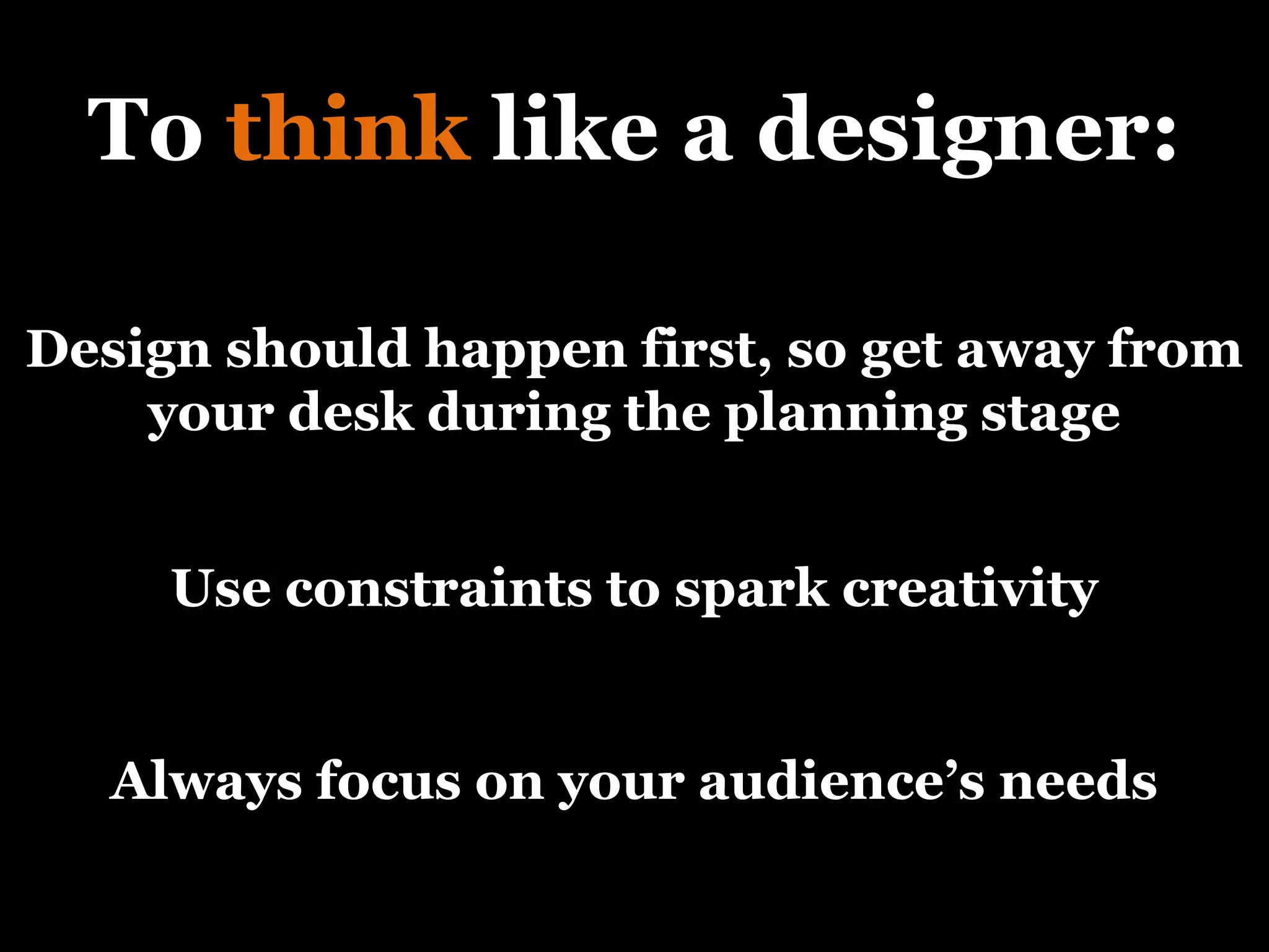
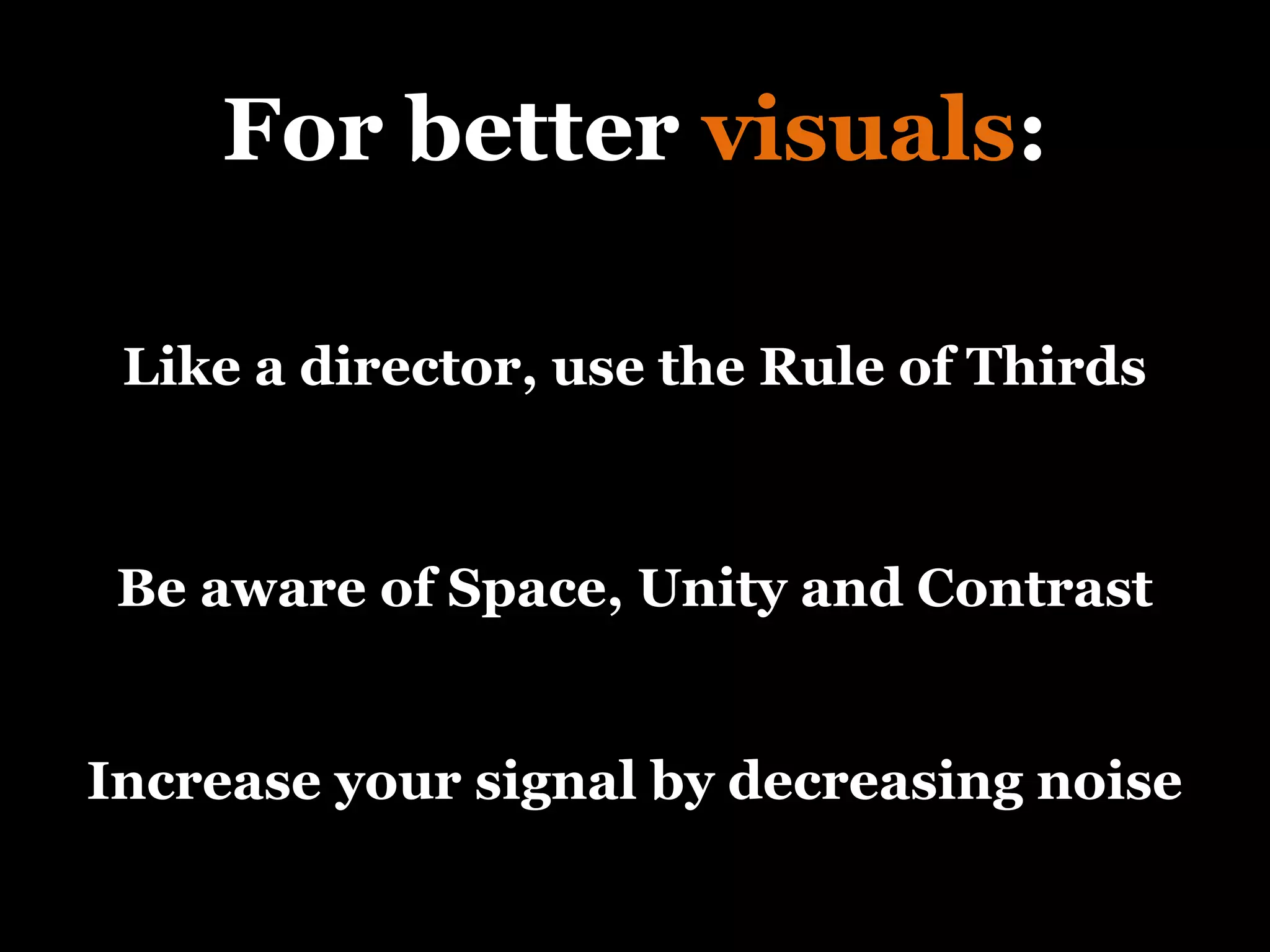
Presentation  Design Written and Presented by Michael Evanchan
?
? What does ‘design’ make you think of?
? Architecture?
? Interior Decorating?
? Designer Clothes?
? Creativity?
? Simplicity?
? How about presentations?
? So what is design?
“ Design is  thinking  made  visual ” - Saul Bass
“ Design is  thinking  made  visual ” - Saul Bass Graphic designer and filmmaker Saul Bass came up with this simple definition of what design is…
“ Design is  thinking  made  visual ” - Saul Bass … which is how we will define it.
“ Design is  thinking  made visual” 1
“ Design is  thinking  made visual” 1 First, we will learn how to think like a designer.
“ Design is  thinking  made visual” 1 We will learn that everything a designer does is intentional.
“ Design is  thinking  made visual” 1 We will also find out what  The White Stripes  can teach us about creativity…
“ Design is  thinking  made visual” 1 … and where a designer’s focus should always be.
“ Design is thinking  made  visual ” 2
“ Design is thinking  made  visual ” 2 Next, we will learn a few principles on how to design visually…
“ Design is thinking  made  visual ” 2 … about signal vs. noise…
“ Design is thinking  made  visual ” 2 … how to think like a director…
“ Design is thinking  made  visual ” 2 … and about space,  unity and contrast.
“ Design is thinking  made  visual ” 2 … and about space,  unity,  and contrast.
“ Design is thinking  made  visual ” 2 … and about space, unity  and contrast.
A few more thoughts before we get started.
Design should be  first … not last
Design should be first …not last
Design is not just aesthetics… it’s about solving problems
Design is not just aesthetics …it’s about  solving problems
Design should  not  be noticed
 
The success of a football team is largely dependent on the offensive line.
Their job is to protect the quarterback.
It’s a thankless job, one that only gets noticed when they fail.
Design is the offensive line of a presentation.
When it is good, it goes unnoticed.  When it’s bad, it is obvious (and frustrating).
To be successful in life and business, you need to be able to spread your ideas.
To spread your ideas, you need a clear, elegant, well thought-out presentation.
Which means…
To succeed as a presenter you  must  think like a designer. Which means…
Design Thinking
All design really is…
Creating ideas
Planning Creating Practicing Presentation Design Time Allocation
Planning Creating Practicing Presentation Design Time Allocation Idea creation happens during the planning stage of the presentation.
Planning Creating Practicing Presentation Design Time Allocation Which is often overlooked.
Planning Creating Practicing Presentation Design Time Allocation But it is where good design is created.
Planning Creating Practicing Presentation Design Time Allocation The most effective brainstorming is done away from the distractions of your desk.
Embrace   constr aints
Embrace   constr aints Constraints are also an important part of creating ideas.
Embrace   constr aints When you have the world at your disposal, you can often get overwhelmed with options.
Embrace   constr aints Experts call this ‘decision paralysis’ and it hurts creativity.
“ Deadlines and constraints make you creative…” - Jack White
“ Deadlines and constraints make you creative…” - Jack White Jack White, the lead singer for “The White Stripes” has used constraints to create 6 albums, with 26 singles, make 14 videos, get nominated for 9 Grammys and win 6 of them.
“ Deadlines and constraints make you creative…” - Jack White Here are a few examples:
“ Deadlines and constraints make you creative…” - Jack White Here are a few examples: Only 2 people in the band
“ Deadlines and constraints make you creative…” - Jack White Here are a few examples: Only 2 people in the band Only colors for albums and stage are black, white and red
“ Deadlines and constraints make you creative…” - Jack White Here are a few examples: Only 2 people in the band Only colors for albums and stage are black, white and red Book only 4 days in the studio to force themselves to get done
“ Deadlines and constraints make you creative…” - Jack White Here are a few examples: Only uses drums, vocals and piano or drums, vocals and guitar
“ Deadlines and constraints make you creative…” - Jack White Here are a few examples: Storytelling, rhythm and melody Only uses drums, vocals and piano or drums, vocals and guitar
So remember…
Constraints are our friends!
The last thing to know to think like a designer…
Focus on the end-user
or in our case…
Focus on your audience
Why should I care?
What can you do for me?
I wish these slides weren’t so cluttered
One last thing
Remember : Everything a designer does is intentional
Remember : Everything a designer does is  intentional
Design Visuals
Signal vs Noise
Signal vs Noise In engineering, S/N is measured to quantify how much a signal has been corrupted by noise.
Signal vs Noise In presentations, we’ll consider it the amount of relevant information corrupted by clutter.
Signal vs Noise So what is noise?
This is noise.
How often do our presentations look like this?
signal noise
signal noise x bad
signal noise x good
signal noise x The vast majority of presentations are here
We can get better by learning to see things like a director or a photographer.
The Rule of 3 rds
 
Many or us would put the focus of this picture on the tree or the sunset.
But not when you see it like a photographer.
Look at the picture now with this grid.
Notice how the horizon is right on the bottom 3 rd ?
And how the tree is sitting on the right line?
The urge for most of us is to put things right in the middle...
… but it’s called “dead center” for a reason.
Original Cropped
Original Cropped Notice the difference between the original and cropped photos
Original Cropped How about now?
The next time you are watching your favorite movie or TV show , try to see what the director is seeing.
Most likely, he or she will have the focus of the shot away from the center .
Purposely drawing the eye to a specific corner.
Here are 3 rules to help your visuals.
3 Principles: Space Unity Contrast
Empty Space
Empty Space The biggest mistake we make when designing presentations is that we feel the need to fill every available inch of space.
Empty Space By leaving strategic empty space, we create elegance and simplicity.
Unity
Unity Color Fonts Big Picture
Unity Color How many different colors do you have in your presentation?
Unity Color By limiting your use of colors, you create unity.
Unity Color Fonts You should use only one font in a presentation
Unity Color Fonts Big Picture Do you have an overall theme to your presentation?
Unity Color Fonts Big Picture You should.
Contrast
Contrast We can highlight the important points of our slides by using contrast.
Contrast Make sure the point is easy for the audience to figure out and highlight it using…
Color
Size
Shape
Congratulations!
You are now a designer!
Remember
To  think  like a designer: Use constraints to spark creativity Design should happen first, so get away from your desk during the planning stage Always focus on your audience’s needs
For better  visuals : Be aware of Space, Unity and Contrast Like a director, use the Rule of Thirds Increase your signal by decreasing noise
Sourcing Signal vs Noise:  http://en.wikipedia.org/wiki/Signal-to-noise_ratio The following notes were taken from Wikipedia:  Saul Bass:  http://en.wikipedia.org/wiki/Saul_Bass The White Stripes:  http://en.wikipedia.org/wiki/The_White_Stripes The Rule of Thirds:  images used  -  http://en.wikipedia.org/wiki/Rule_of_thirds The rest of the information and inspiration came from the following books:
Recommended reading Presentation Zen  by Garr Reynolds Presentation Zen Design  by Garr Reynolds Slideology  by Nancy Duarte
FIN

Presentation Design Thinking