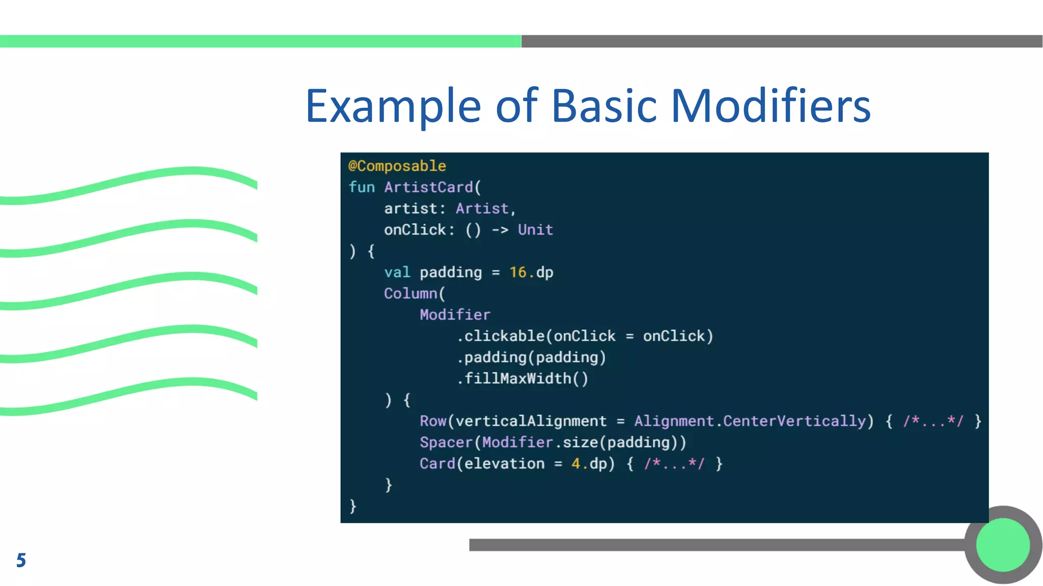
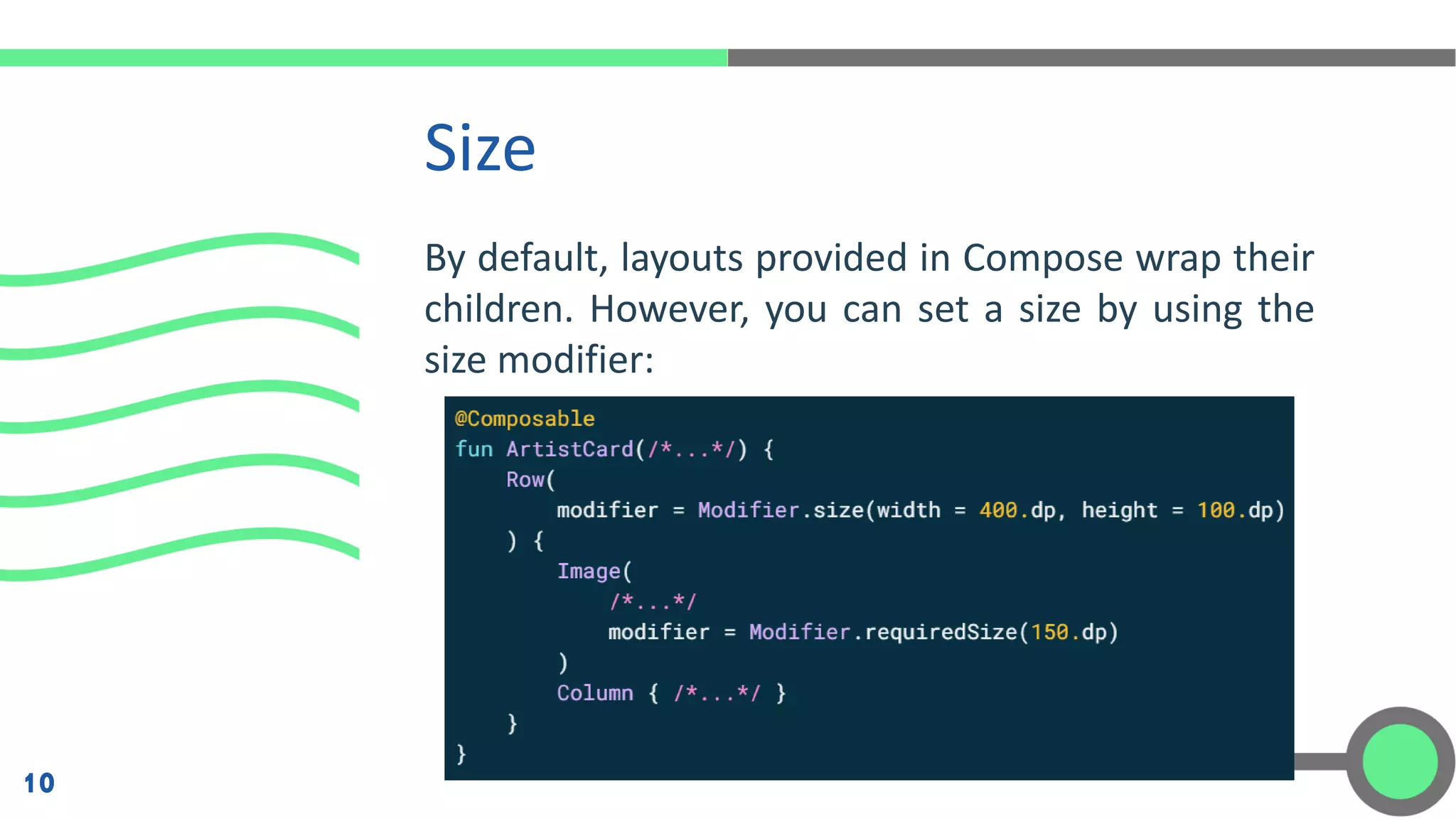
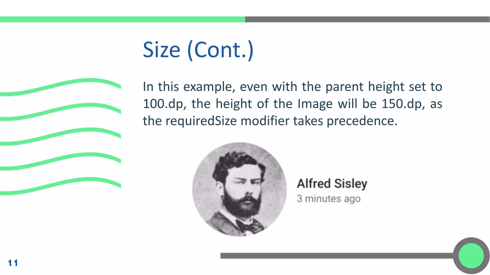
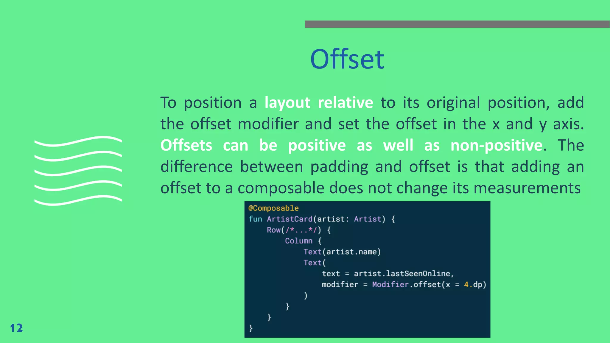
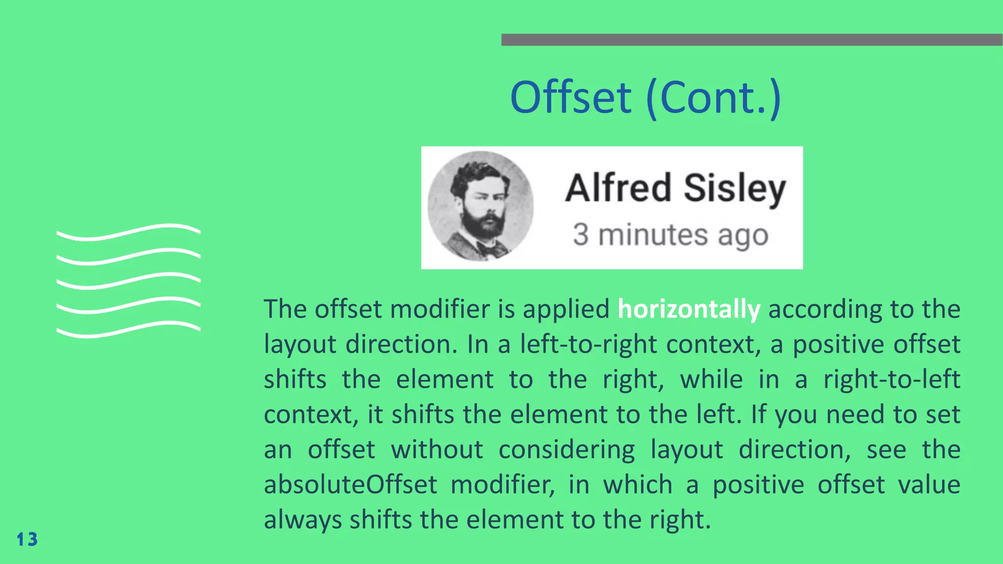
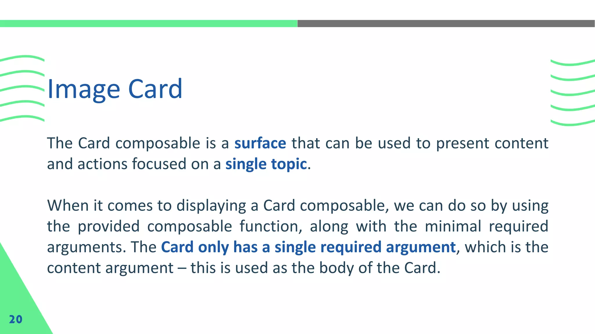
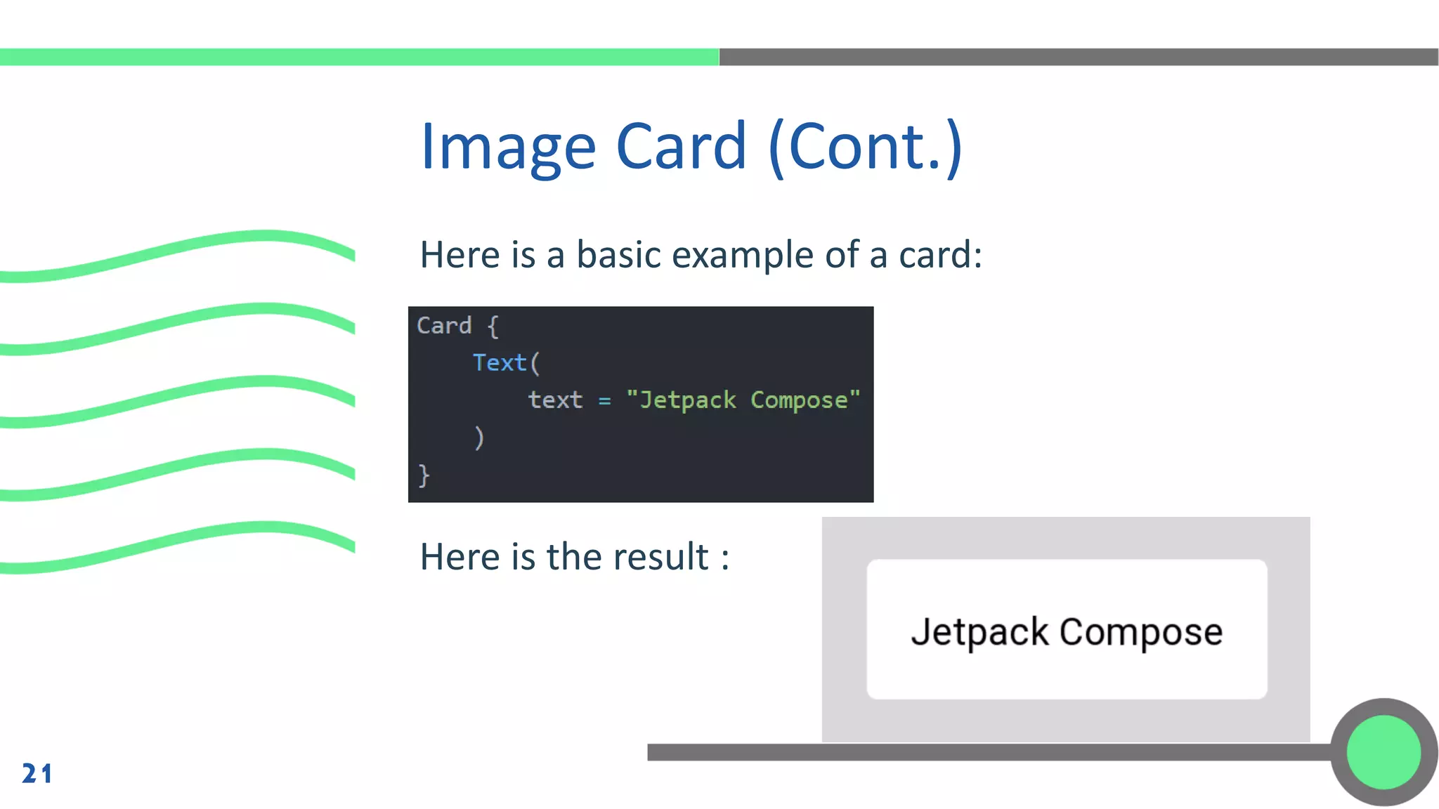
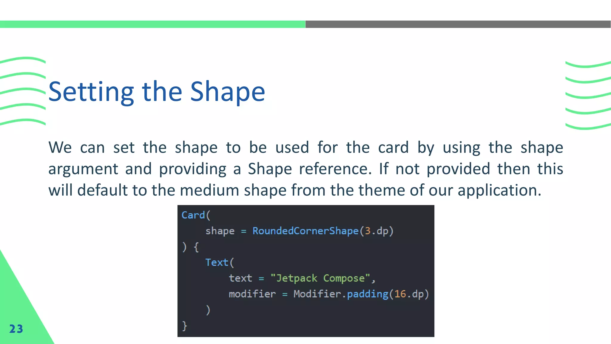
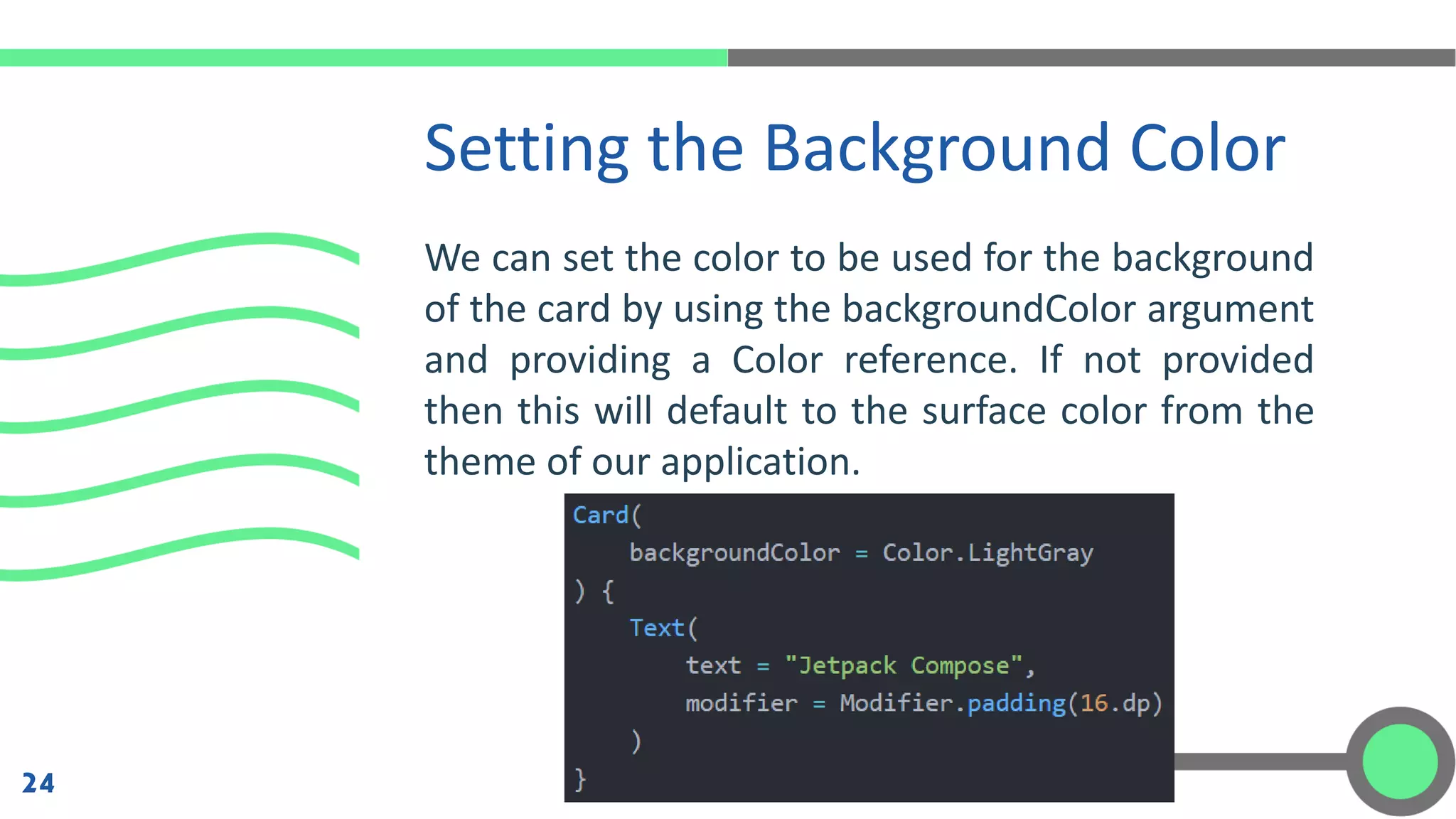
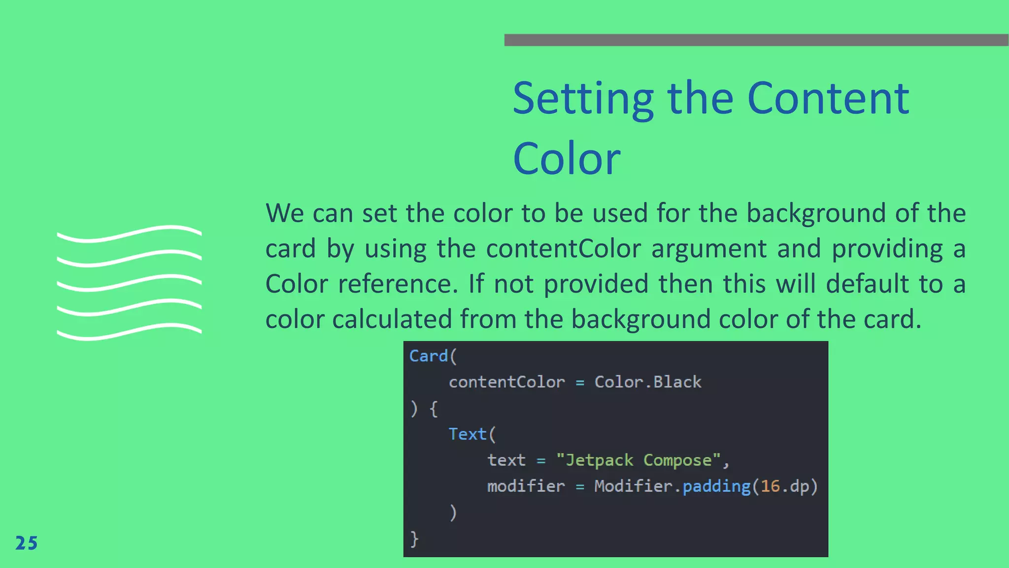
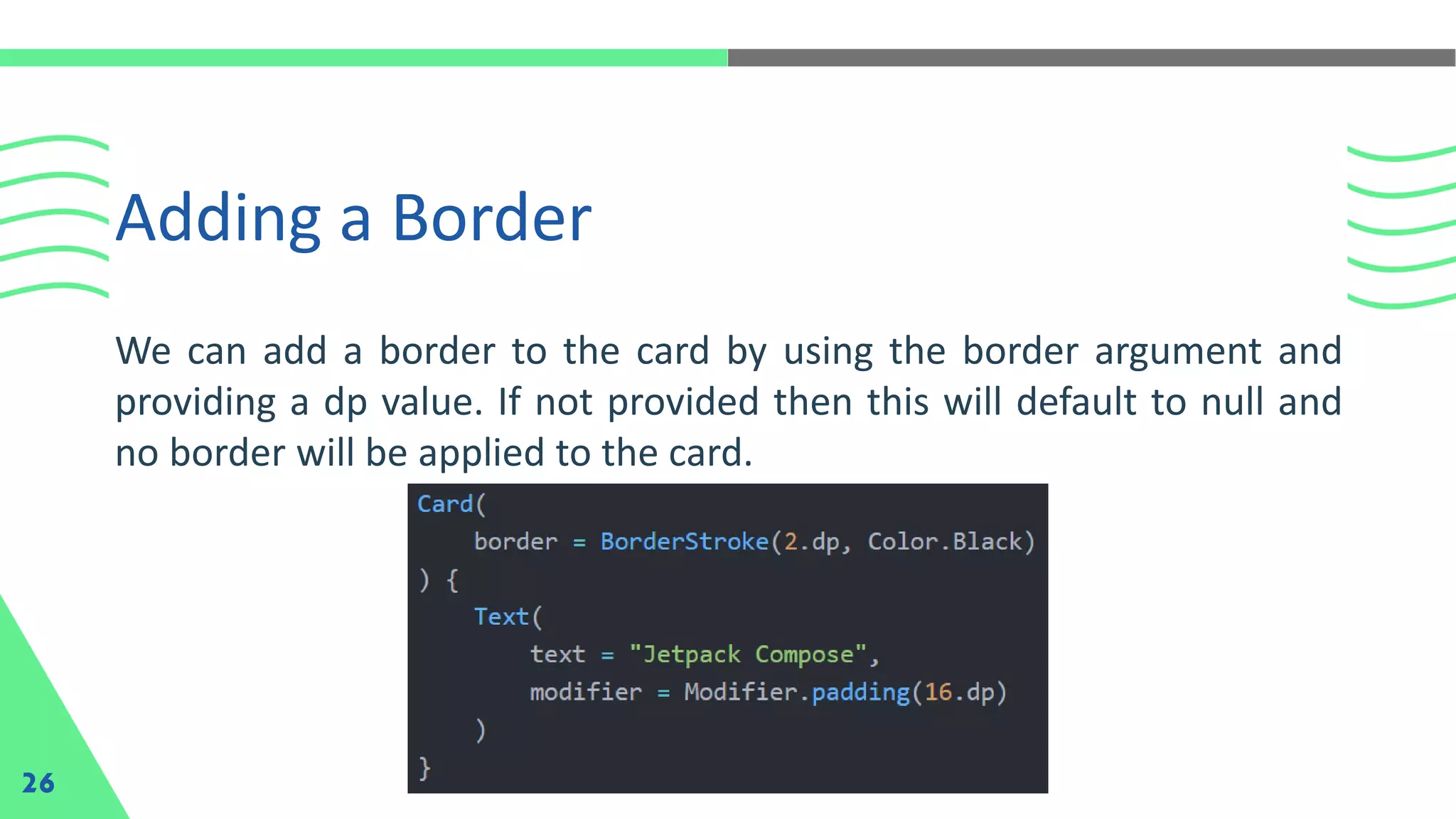
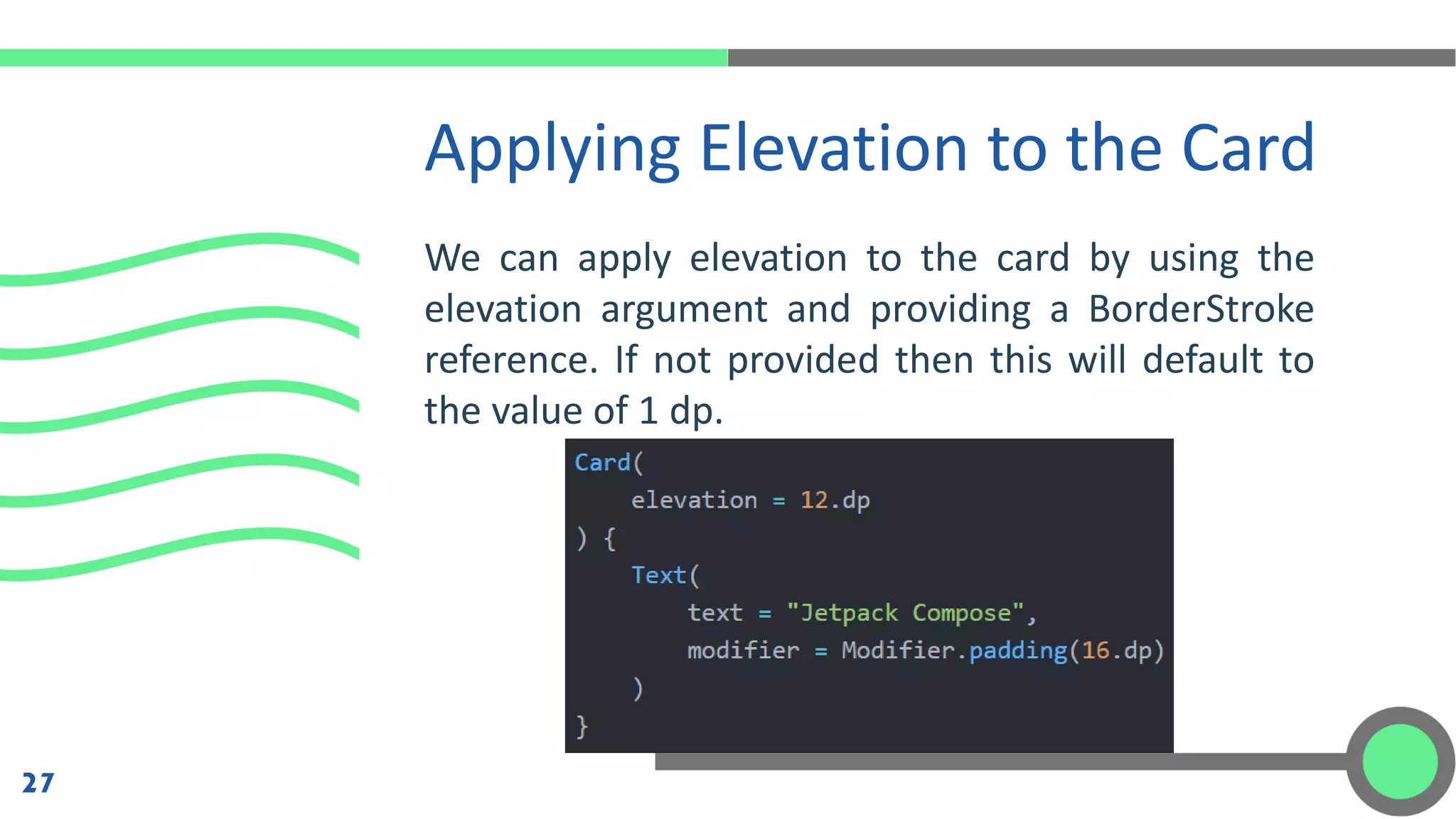
2
Modifiers
Modifiers allow you to decorate or augment a
composable. Modifiers let you do these sorts of things:
• Change the composable's size, layout, behavior, and
appearance
• Add information, like accessibility labels
• Process user input
• Add high-level interactions, like making an element
clickable, scrollable, draggable, or zoomable
3
Modifiers (Cont.)
4
Modifiers can be used modify certain aspects of a Composable. To set
them, a Composable needs to accept a modifier as a parameter.
Modifiers are standard Kotlin objects. Create a modifier by calling one
of the Modifier class functions. You can chain these functions together
to compose them:
Example of Basic Modifiers
5
Example of Basic Modifiers (Cont.)
6
Example of Basic Modifiers (Cont.)
7
In the previous code, notice different modifier
functions used together:
• clickable makes a composable react to user
input and shows a ripple.
• padding puts space around an element.
• fillMaxWidth makes the composable fill the
maximum width given to it from its parent.
• size() specifies an element's preferred width and
height.
Order of Modifiers
Matters
The order of modifier functions is significant. Since each
function makes changes to the Modifier returned by the
previous function, the sequence affects the final result.
8
Built-in Modifiers
9
Jetpack Compose provides a list of built-in modifiers to help you
decorate or augment a composable. Some modifiers such as padding,
clickable, and fillMaxWidth have already been introduced. Here’s a list
of other common modifiers:
• Size
• Offset
• MatchParentSize in Box
• Weight in Row and Column
By default, layouts provided in Compose wrap their
children. However, you can set a size by using the
size modifier:
Size
10
In this example, even with the parent height set to
100.dp, the height of the Image will be 150.dp, as
the requiredSize modifier takes precedence.
Size (Cont.)
11
Offset
To position a layout relative to its original position, add
the offset modifier and set the offset in the x and y axis.
Offsets can be positive as well as non-positive. The
difference between padding and offset is that adding an
offset to a composable does not change its measurements
12
Offset (Cont.)
The offset modifier is applied horizontally according to the
layout direction. In a left-to-right context, a positive offset
shifts the element to the right, while in a right-to-left
context, it shifts the element to the left. If you need to set
an offset without considering layout direction, see the
absoluteOffset modifier, in which a positive offset value
always shifts the element to the right.
13
matchParentSize in Box
14
If you want a child layout to be the same size as a parent Box without
affecting the Box size, use the matchParentSize modifier. Note that
matchParentSize is only available within a Box scope, meaning that it
only applies to direct children of Box composables.
In the example below, the child Spacer takes its size from its parent
Box, which in turn takes its size from the biggest children, ArtistCard in
this case.
Here is the result :
matchParentSize in Box (Cont.)
15
matchParentSize in Box (Cont.)
16
If fillMaxSize were used instead of matchParentSize, the Spacer would
take all the available space allowed to the parent, in turn causing the
parent to expand and fill all the available space.
weight in Row and
Column
You can set a composable size to be flexible within its
parent using the weight Modifier that is only available in
RowScope, and ColumnScope.
Let’s take a Row that contains two Box composables. The
first box is given twice the weight of the second, so it's
given twice the width.
17
weight in Row and
Column (Cont.)
Since the Row is 210.dp
wide, the first Box is 140.dp
wide, and the second is
70.dp:
18
weight in Row and
Column (Cont.)
Here is the result of using weight in row and column on
two elements:
19
Image Card
20
The Card composable is a surface that can be used to present content
and actions focused on a single topic.
When it comes to displaying a Card composable, we can do so by using
the provided composable function, along with the minimal required
arguments. The Card only has a single required argument, which is the
content argument – this is used as the body of the Card.
Here is a basic example of a card:
Here is the result :
Image Card (Cont.)
21
Styling the Card
Once we’ve composed a Card, it might be the case that
we’re going to want to apply some styling to override the
default which is provided by the theme of our application.
In these cases, the Card composable offers several
arguments which can be used to control the look and feel.
22
Setting the Shape
23
We can set the shape to be used for the card by using the shape
argument and providing a Shape reference. If not provided then this
will default to the medium shape from the theme of our application.
We can set the color to be used for the background
of the card by using the backgroundColor argument
and providing a Color reference. If not provided
then this will default to the surface color from the
theme of our application.
Setting the Background Color
24
Setting the Content
Color
We can set the color to be used for the background of the
card by using the contentColor argument and providing a
Color reference. If not provided then this will default to a
color calculated from the background color of the card.
25
Adding a Border
26
We can add a border to the card by using the border argument and
providing a dp value. If not provided then this will default to null and
no border will be applied to the card.
We can apply elevation to the card by using the
elevation argument and providing a BorderStroke
reference. If not provided then this will default to
the value of 1 dp.
Applying Elevation to the Card
27
Mobile Programming - 4 Modifiers and Image Card

Mobile Programming - 4 Modifiers and Image Card

  • 2.
  • 3.
    Modifiers Modifiers allow youto decorate or augment a composable. Modifiers let you do these sorts of things: • Change the composable's size, layout, behavior, and appearance • Add information, like accessibility labels • Process user input • Add high-level interactions, like making an element clickable, scrollable, draggable, or zoomable 3
  • 4.
    Modifiers (Cont.) 4 Modifiers canbe used modify certain aspects of a Composable. To set them, a Composable needs to accept a modifier as a parameter. Modifiers are standard Kotlin objects. Create a modifier by calling one of the Modifier class functions. You can chain these functions together to compose them:
  • 5.
    Example of BasicModifiers 5
  • 6.
    Example of BasicModifiers (Cont.) 6
  • 7.
    Example of BasicModifiers (Cont.) 7 In the previous code, notice different modifier functions used together: • clickable makes a composable react to user input and shows a ripple. • padding puts space around an element. • fillMaxWidth makes the composable fill the maximum width given to it from its parent. • size() specifies an element's preferred width and height.
  • 8.
    Order of Modifiers Matters Theorder of modifier functions is significant. Since each function makes changes to the Modifier returned by the previous function, the sequence affects the final result. 8
  • 9.
    Built-in Modifiers 9 Jetpack Composeprovides a list of built-in modifiers to help you decorate or augment a composable. Some modifiers such as padding, clickable, and fillMaxWidth have already been introduced. Here’s a list of other common modifiers: • Size • Offset • MatchParentSize in Box • Weight in Row and Column
  • 10.
    By default, layoutsprovided in Compose wrap their children. However, you can set a size by using the size modifier: Size 10
  • 11.
    In this example,even with the parent height set to 100.dp, the height of the Image will be 150.dp, as the requiredSize modifier takes precedence. Size (Cont.) 11
  • 12.
    Offset To position alayout relative to its original position, add the offset modifier and set the offset in the x and y axis. Offsets can be positive as well as non-positive. The difference between padding and offset is that adding an offset to a composable does not change its measurements 12
  • 13.
    Offset (Cont.) The offsetmodifier is applied horizontally according to the layout direction. In a left-to-right context, a positive offset shifts the element to the right, while in a right-to-left context, it shifts the element to the left. If you need to set an offset without considering layout direction, see the absoluteOffset modifier, in which a positive offset value always shifts the element to the right. 13
  • 14.
    matchParentSize in Box 14 Ifyou want a child layout to be the same size as a parent Box without affecting the Box size, use the matchParentSize modifier. Note that matchParentSize is only available within a Box scope, meaning that it only applies to direct children of Box composables. In the example below, the child Spacer takes its size from its parent Box, which in turn takes its size from the biggest children, ArtistCard in this case.
  • 15.
    Here is theresult : matchParentSize in Box (Cont.) 15
  • 16.
    matchParentSize in Box(Cont.) 16 If fillMaxSize were used instead of matchParentSize, the Spacer would take all the available space allowed to the parent, in turn causing the parent to expand and fill all the available space.
  • 17.
    weight in Rowand Column You can set a composable size to be flexible within its parent using the weight Modifier that is only available in RowScope, and ColumnScope. Let’s take a Row that contains two Box composables. The first box is given twice the weight of the second, so it's given twice the width. 17
  • 18.
    weight in Rowand Column (Cont.) Since the Row is 210.dp wide, the first Box is 140.dp wide, and the second is 70.dp: 18
  • 19.
    weight in Rowand Column (Cont.) Here is the result of using weight in row and column on two elements: 19
  • 20.
    Image Card 20 The Cardcomposable is a surface that can be used to present content and actions focused on a single topic. When it comes to displaying a Card composable, we can do so by using the provided composable function, along with the minimal required arguments. The Card only has a single required argument, which is the content argument – this is used as the body of the Card.
  • 21.
    Here is abasic example of a card: Here is the result : Image Card (Cont.) 21
  • 22.
    Styling the Card Oncewe’ve composed a Card, it might be the case that we’re going to want to apply some styling to override the default which is provided by the theme of our application. In these cases, the Card composable offers several arguments which can be used to control the look and feel. 22
  • 23.
    Setting the Shape 23 Wecan set the shape to be used for the card by using the shape argument and providing a Shape reference. If not provided then this will default to the medium shape from the theme of our application.
  • 24.
    We can setthe color to be used for the background of the card by using the backgroundColor argument and providing a Color reference. If not provided then this will default to the surface color from the theme of our application. Setting the Background Color 24
  • 25.
    Setting the Content Color Wecan set the color to be used for the background of the card by using the contentColor argument and providing a Color reference. If not provided then this will default to a color calculated from the background color of the card. 25
  • 26.
    Adding a Border 26 Wecan add a border to the card by using the border argument and providing a dp value. If not provided then this will default to null and no border will be applied to the card.
  • 27.
    We can applyelevation to the card by using the elevation argument and providing a BorderStroke reference. If not provided then this will default to the value of 1 dp. Applying Elevation to the Card 27