Download as PDF, PPTX
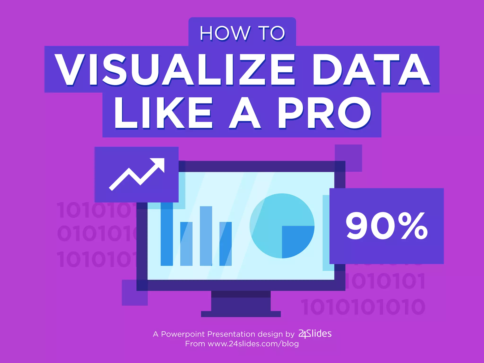
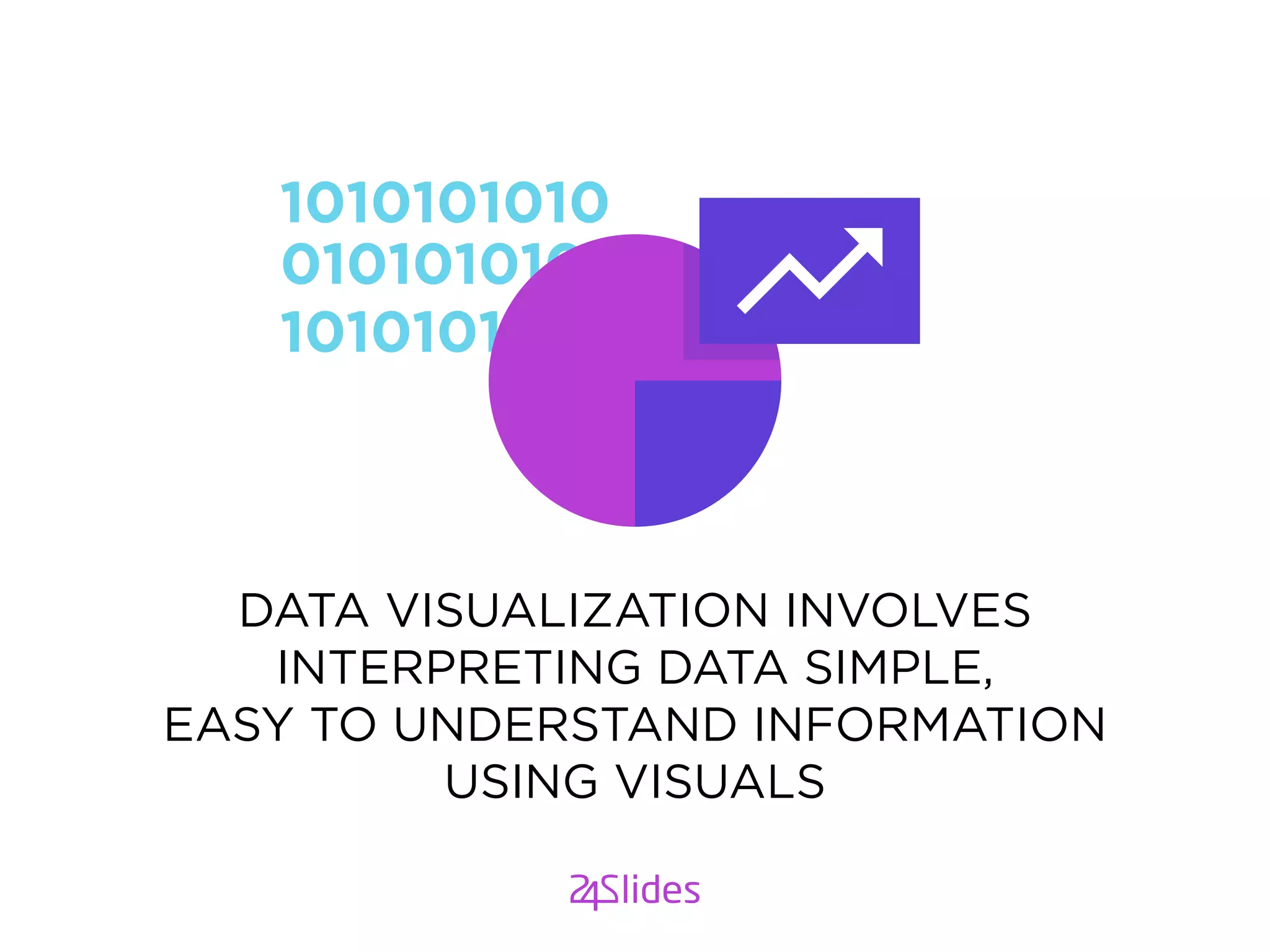
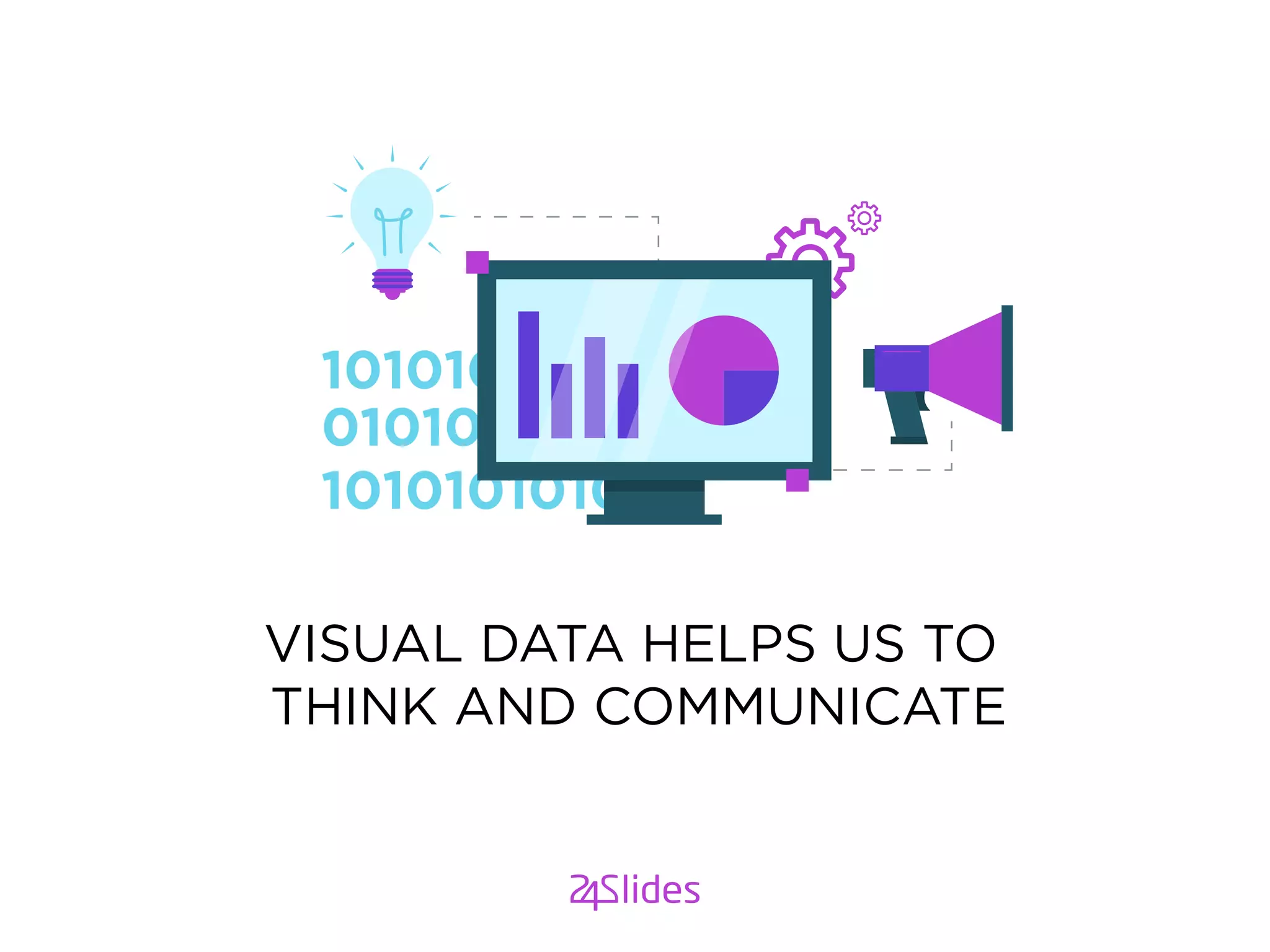


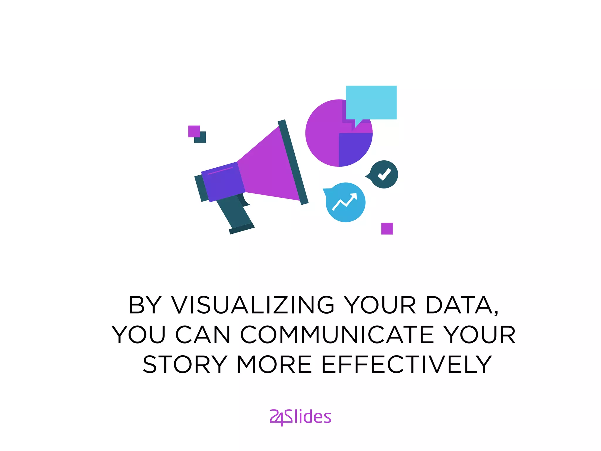
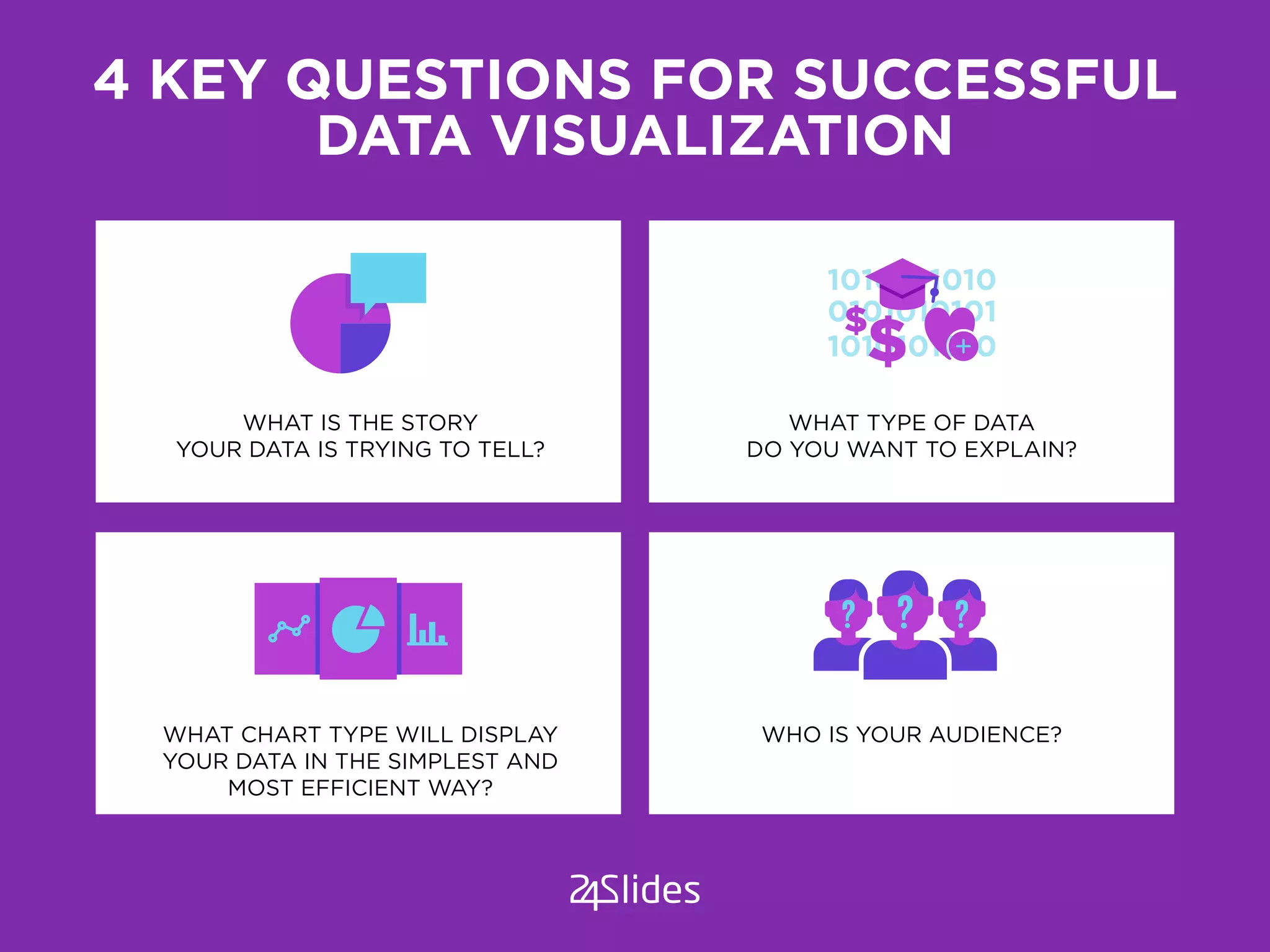
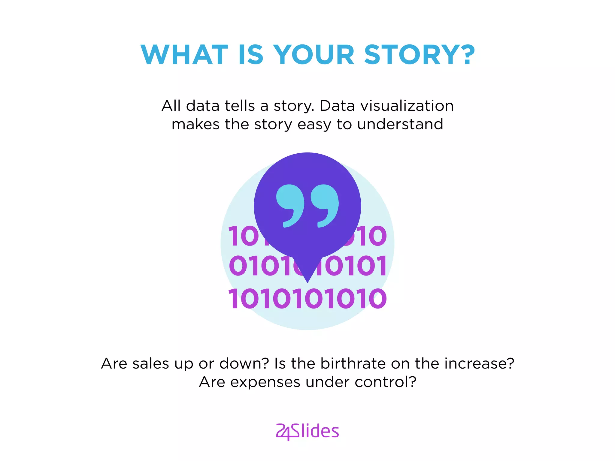


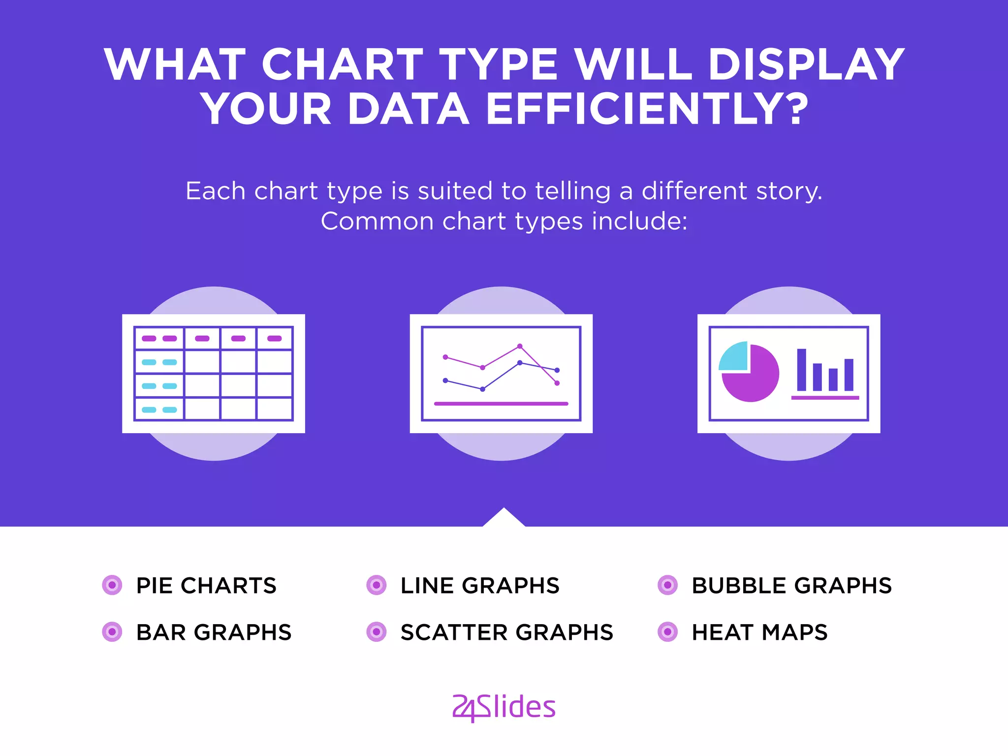
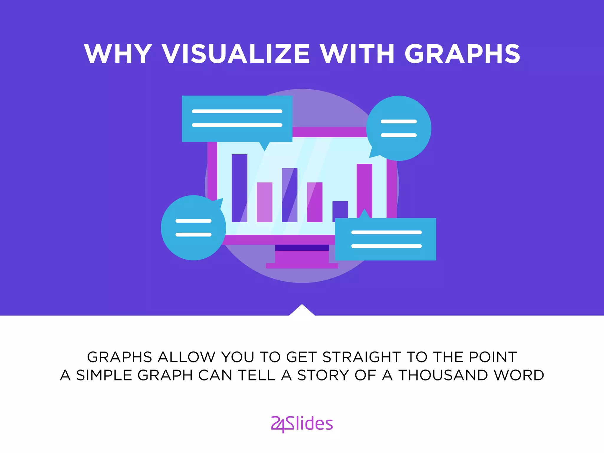
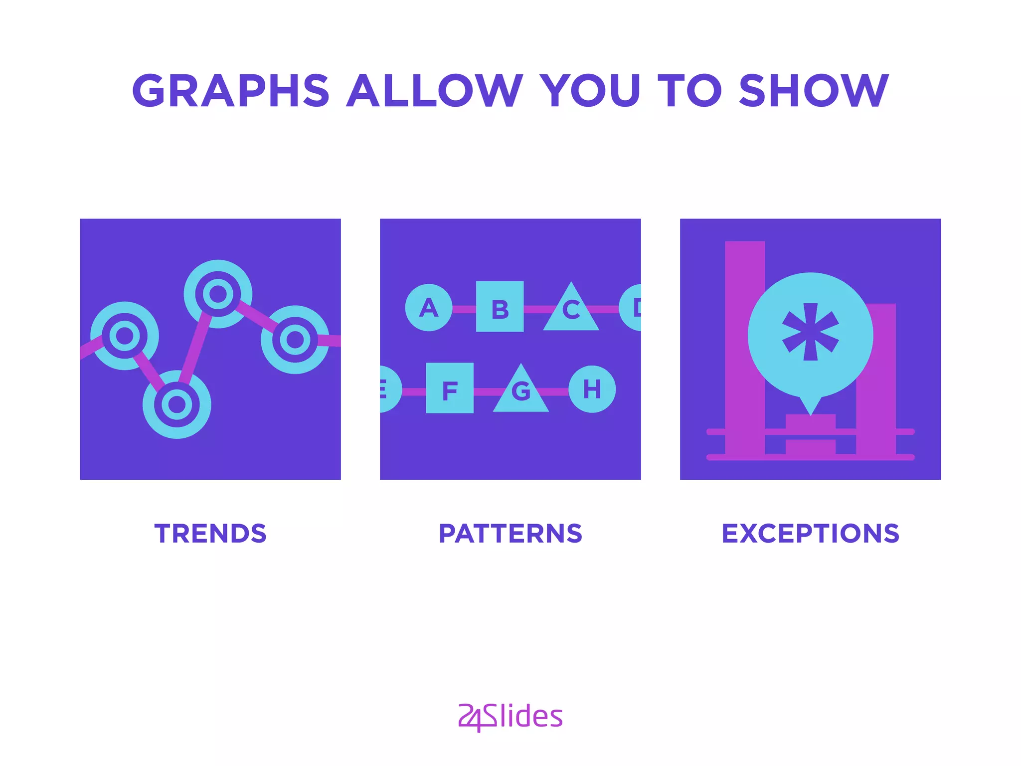
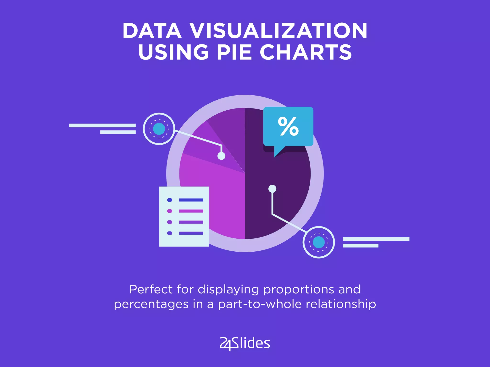
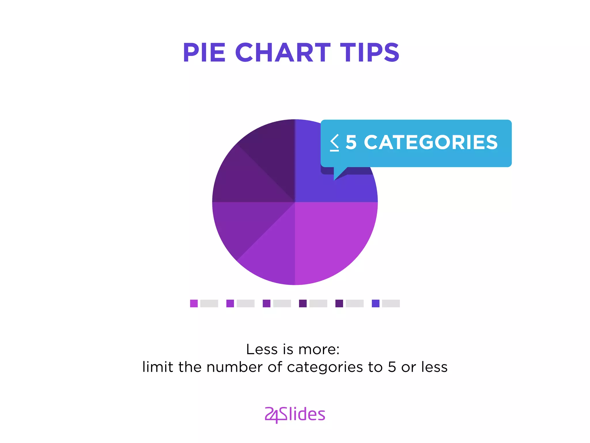
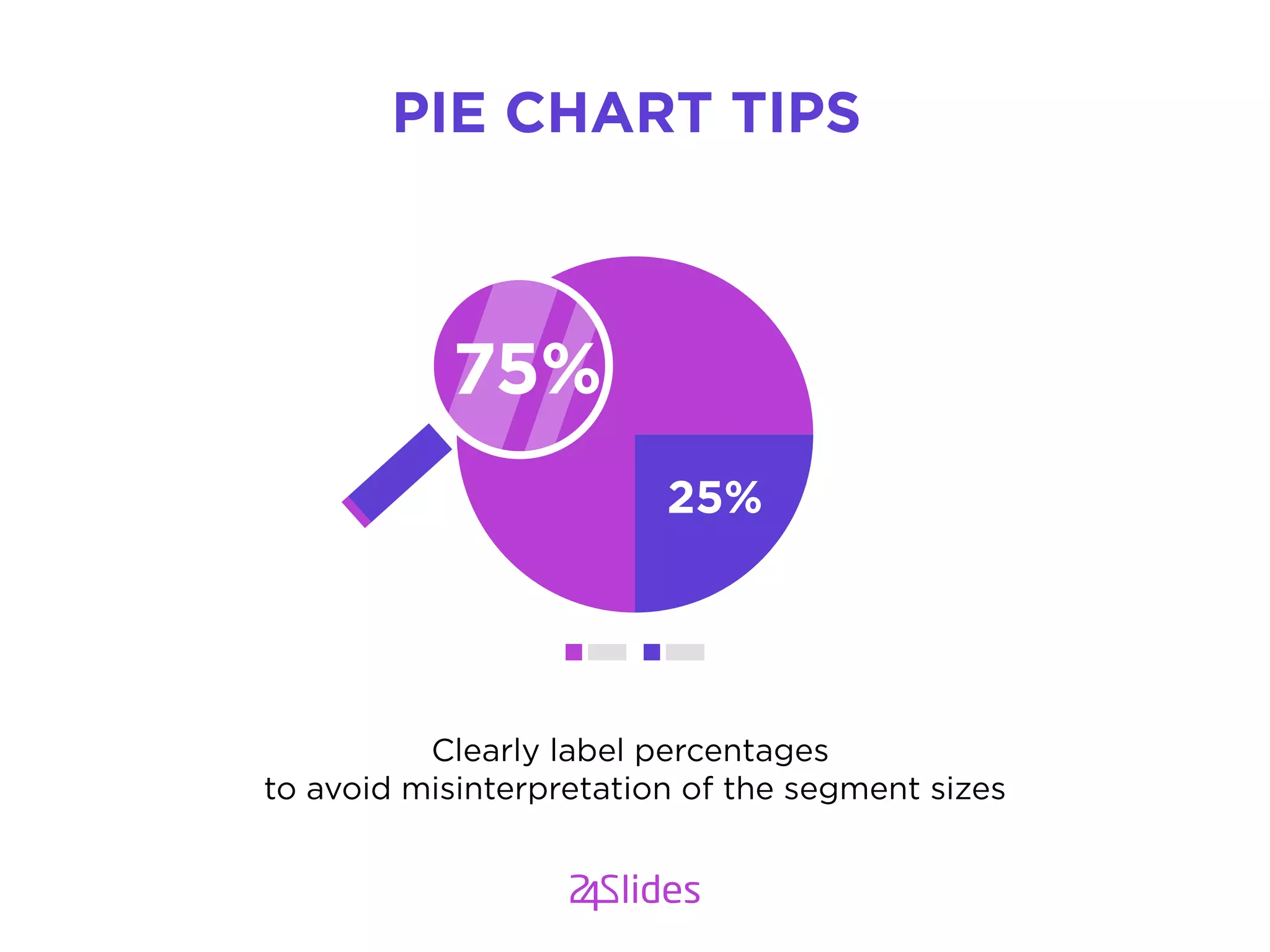
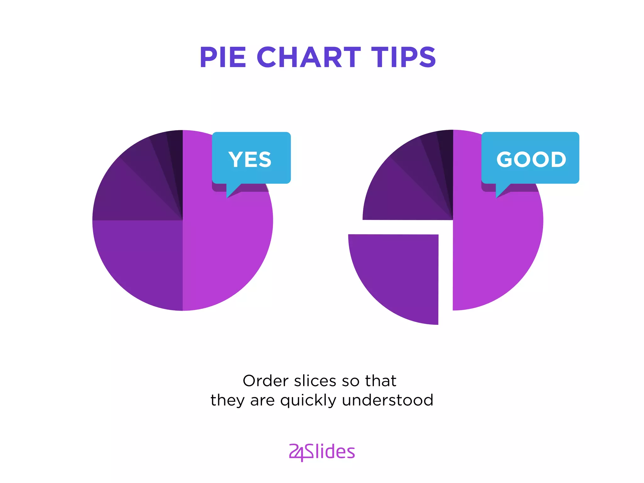
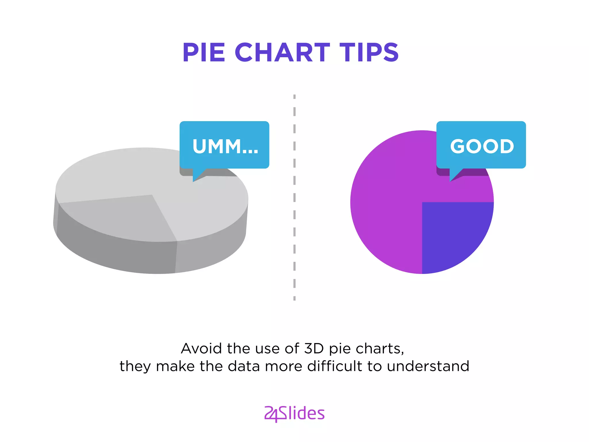
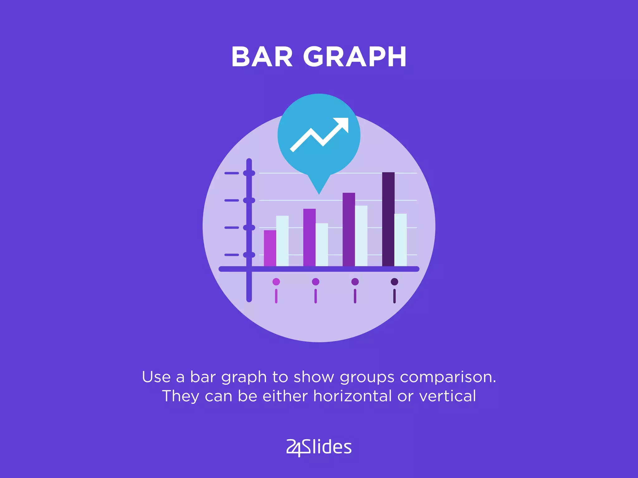
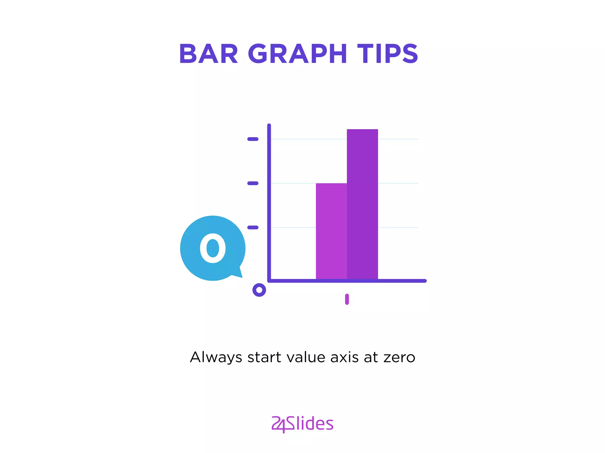
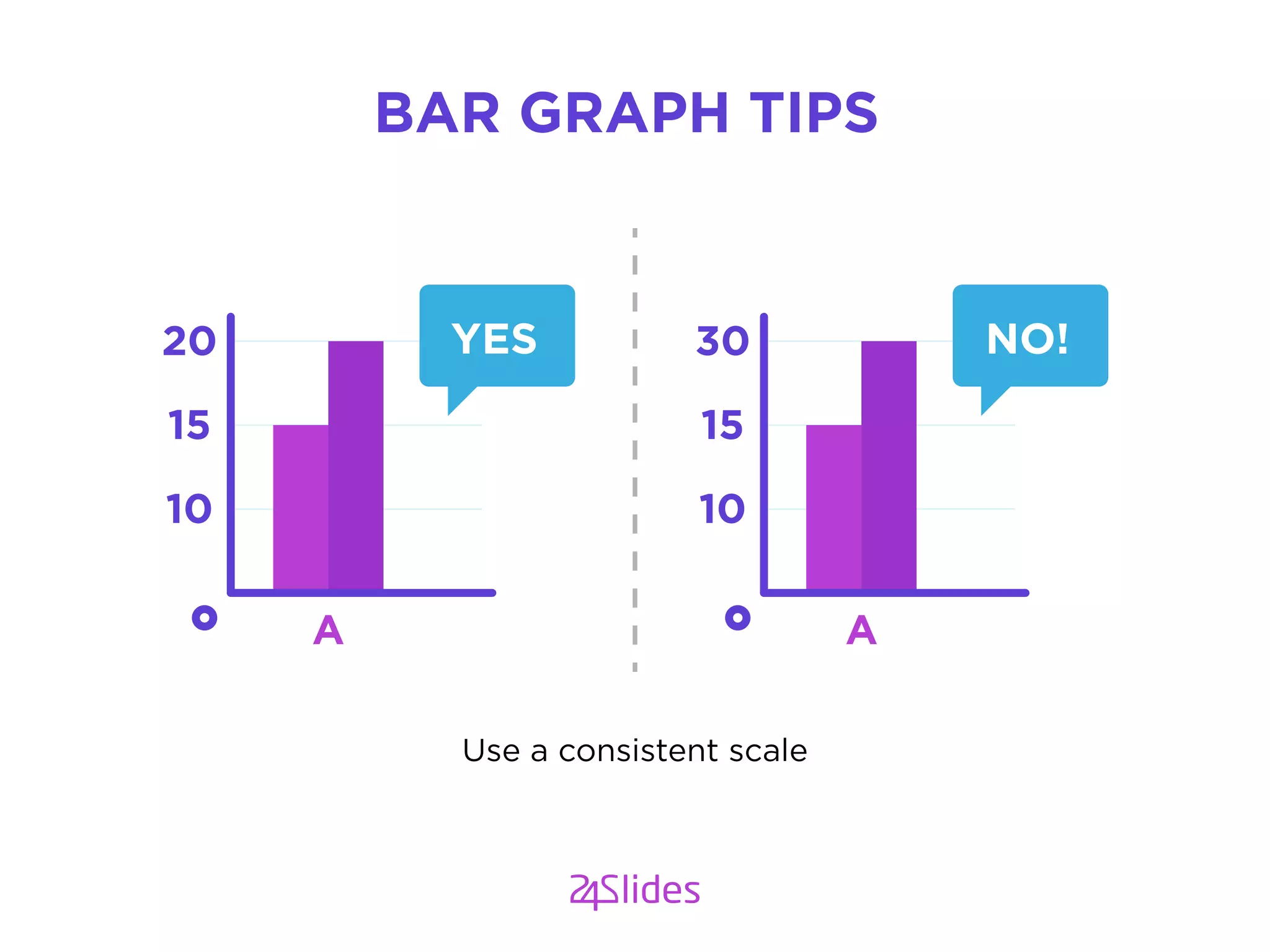
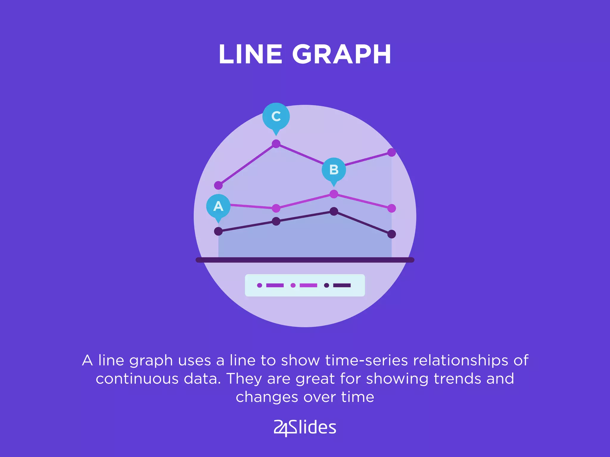
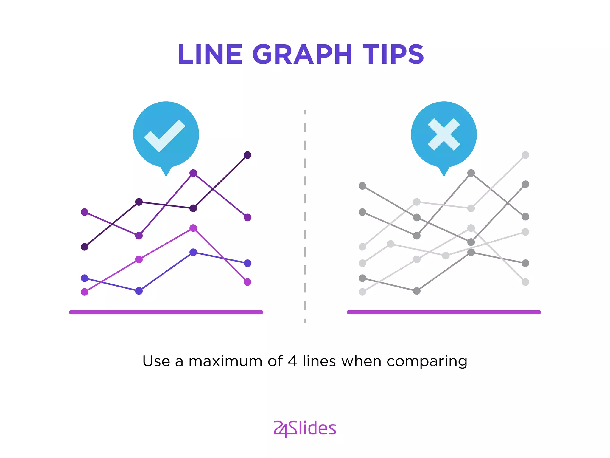
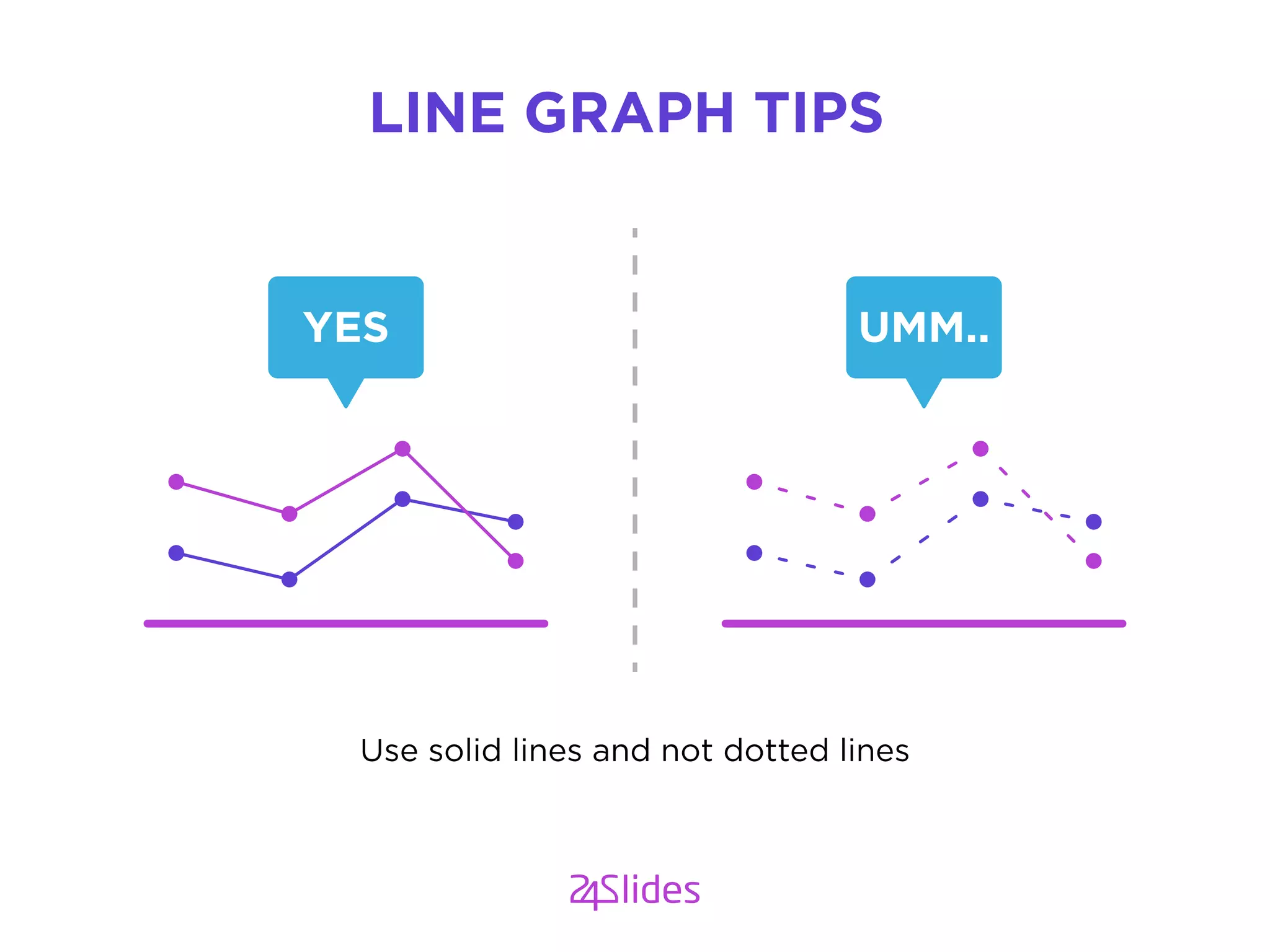
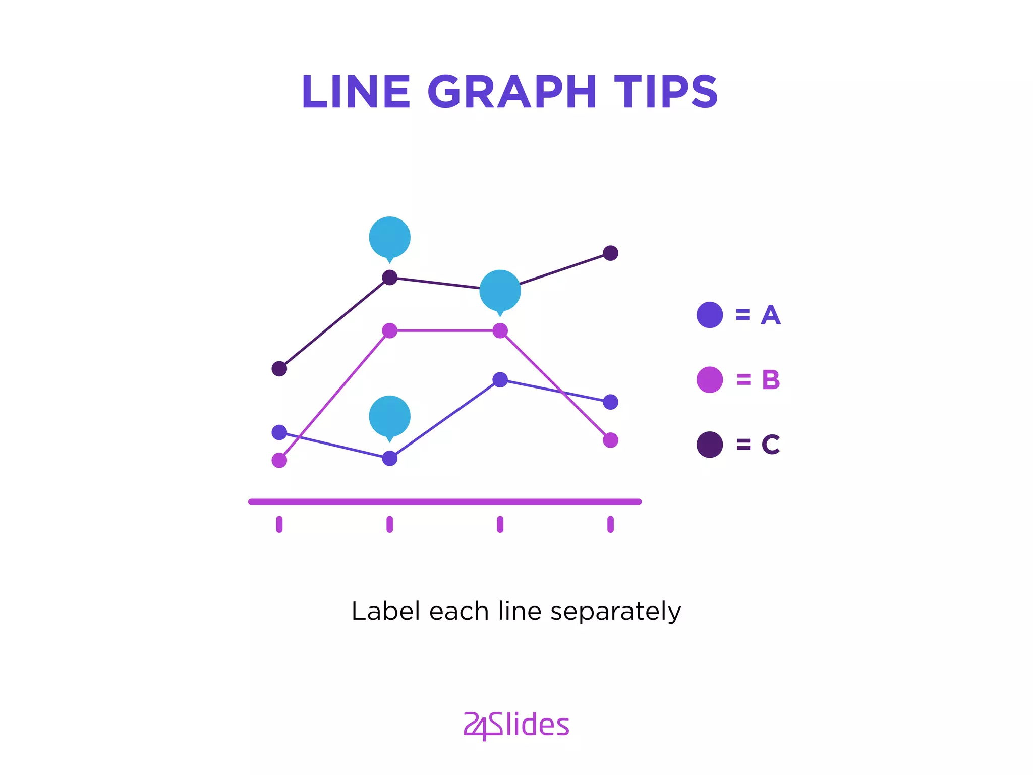
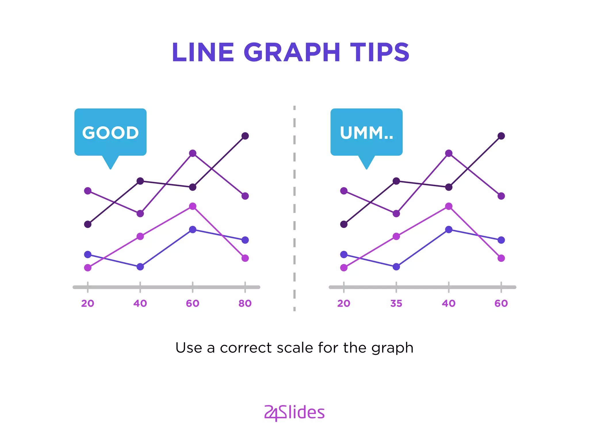
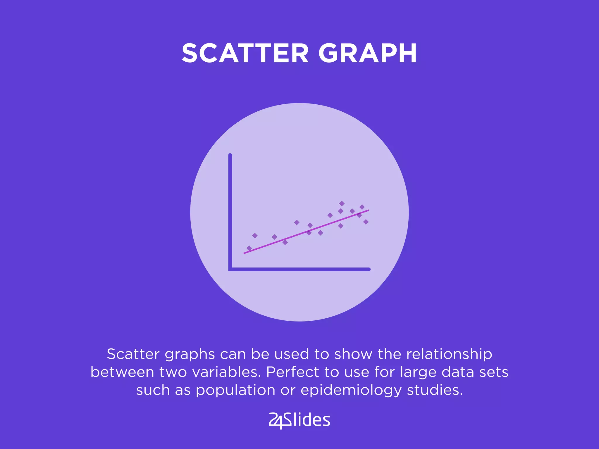
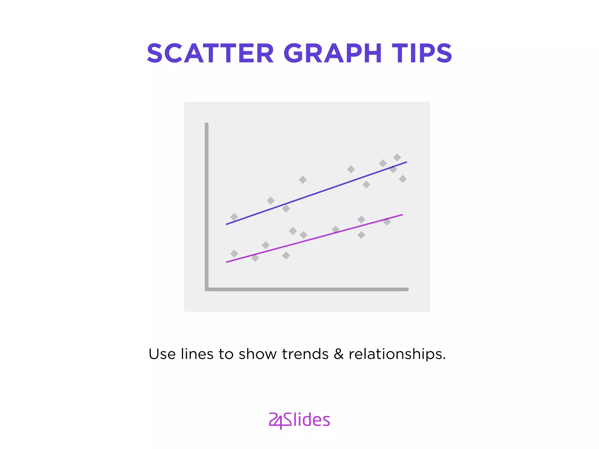
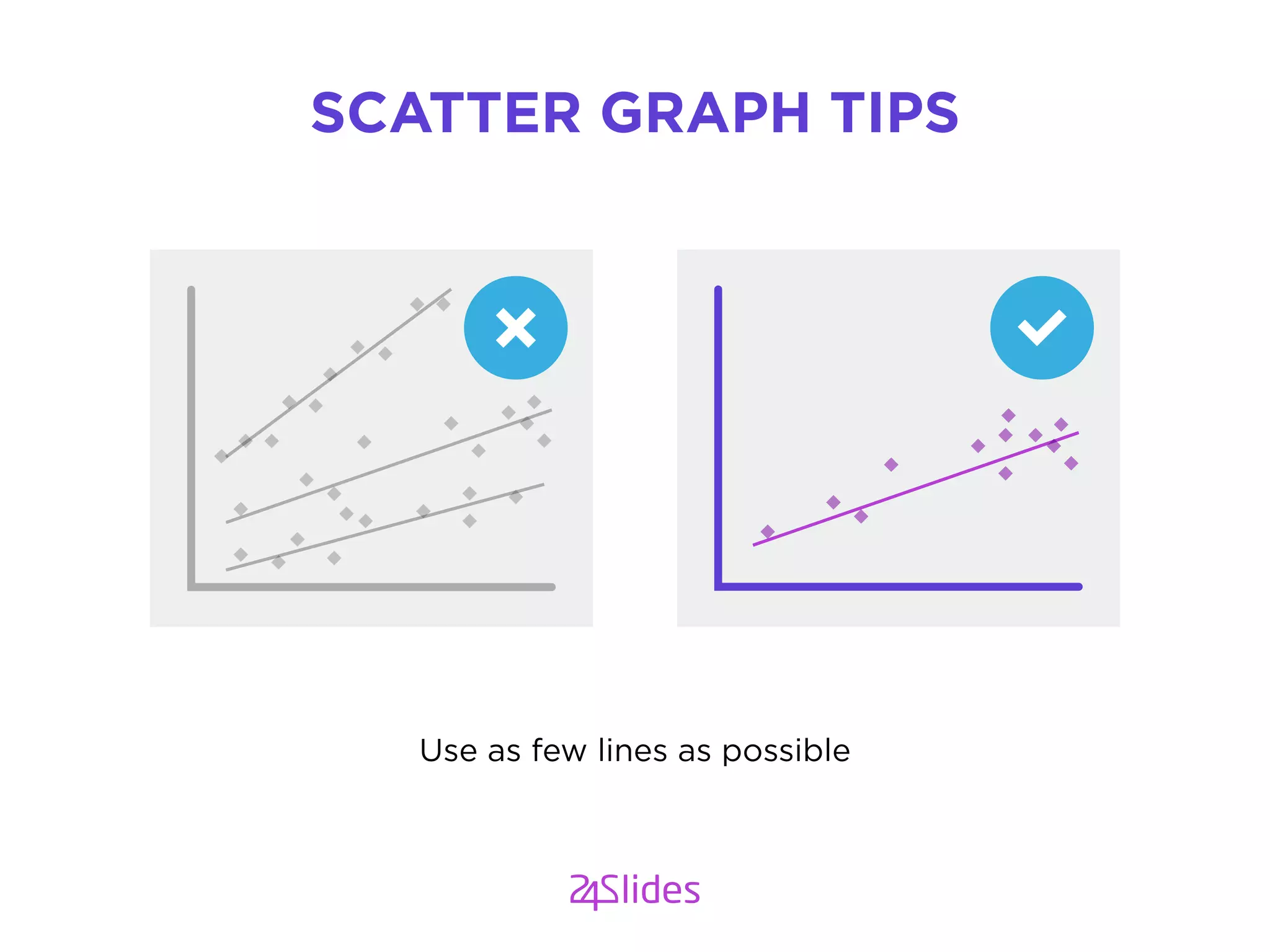
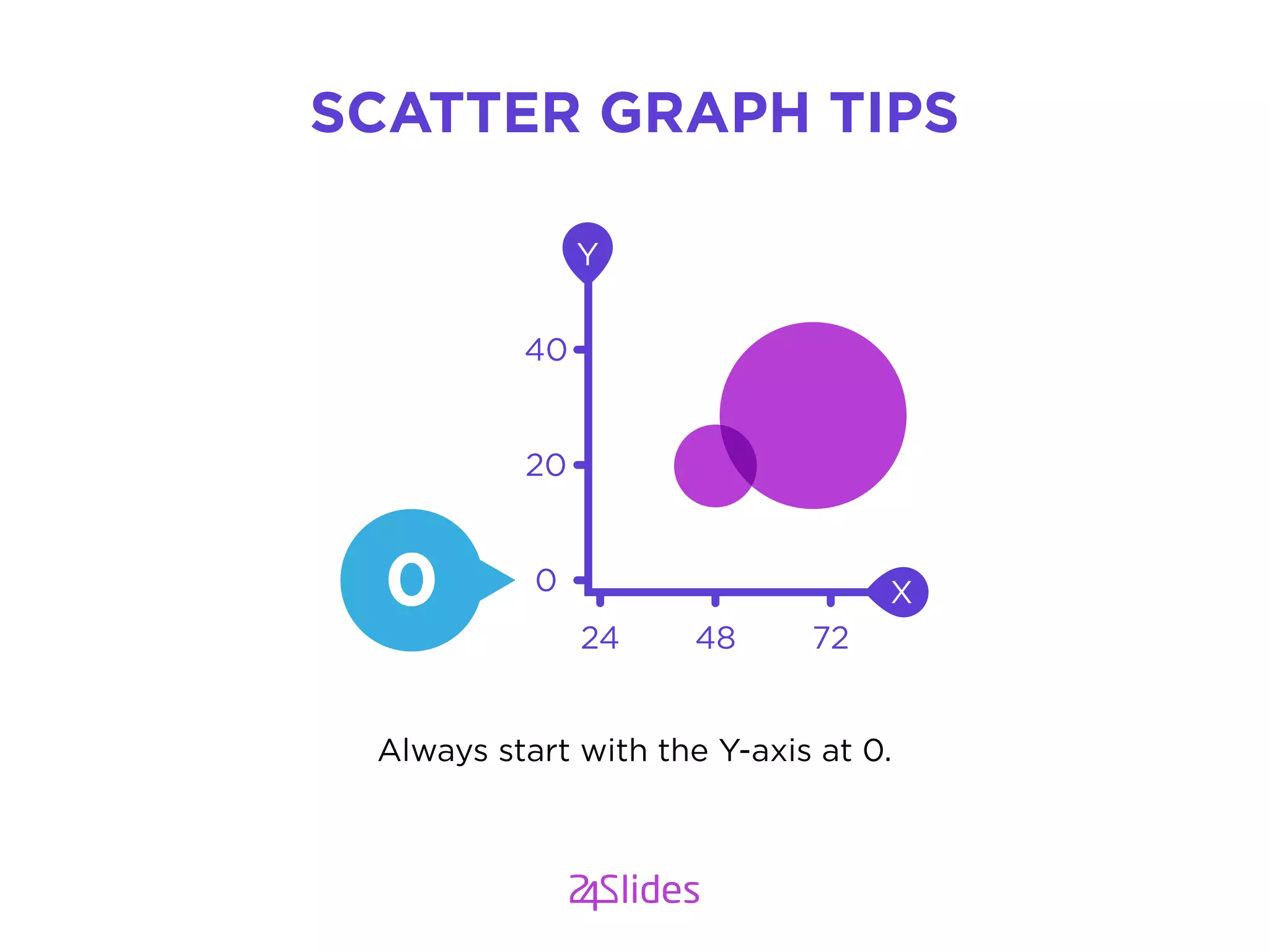
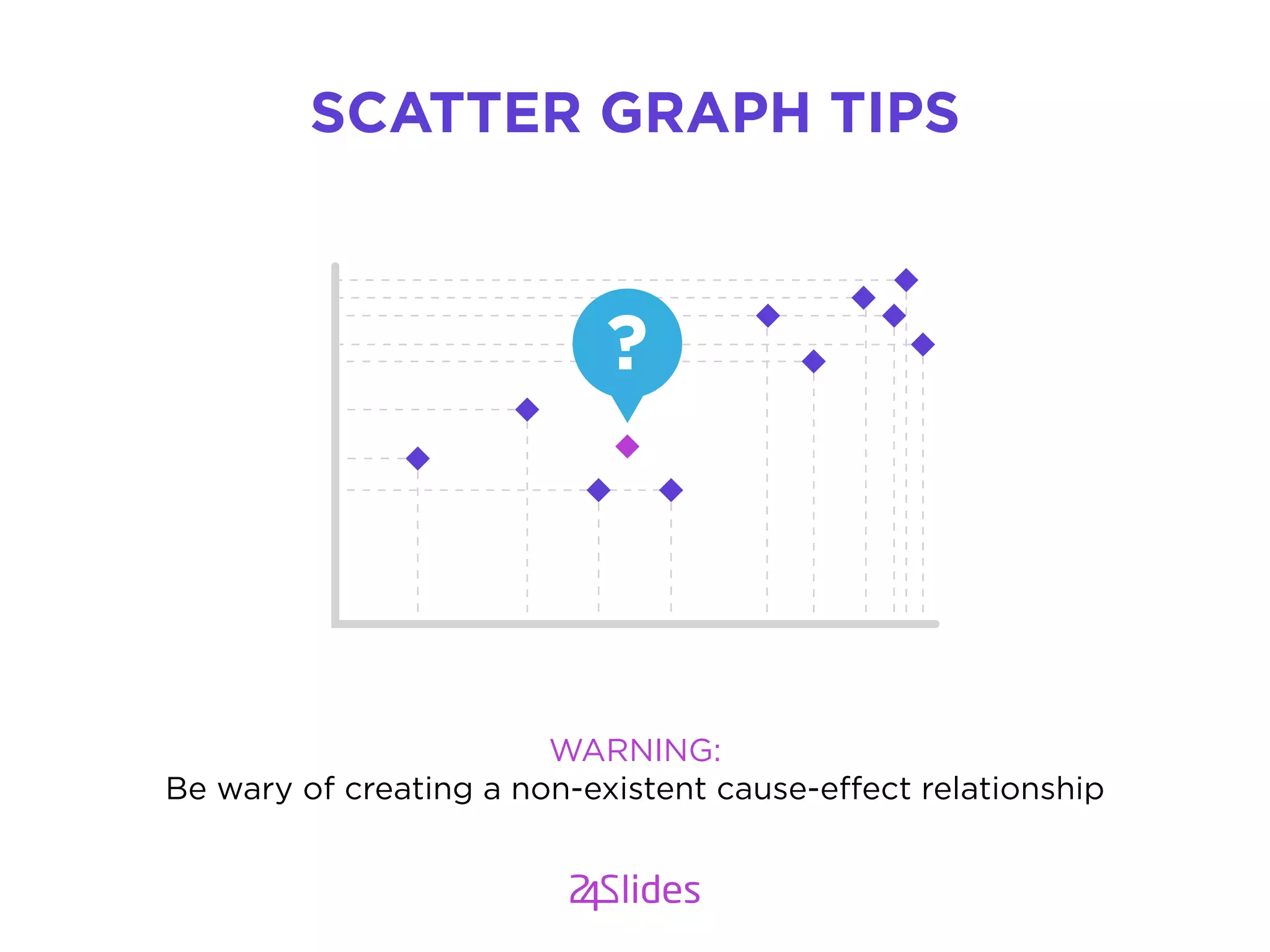
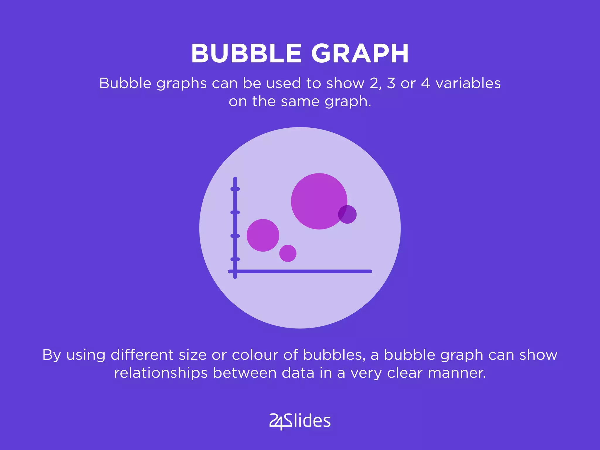
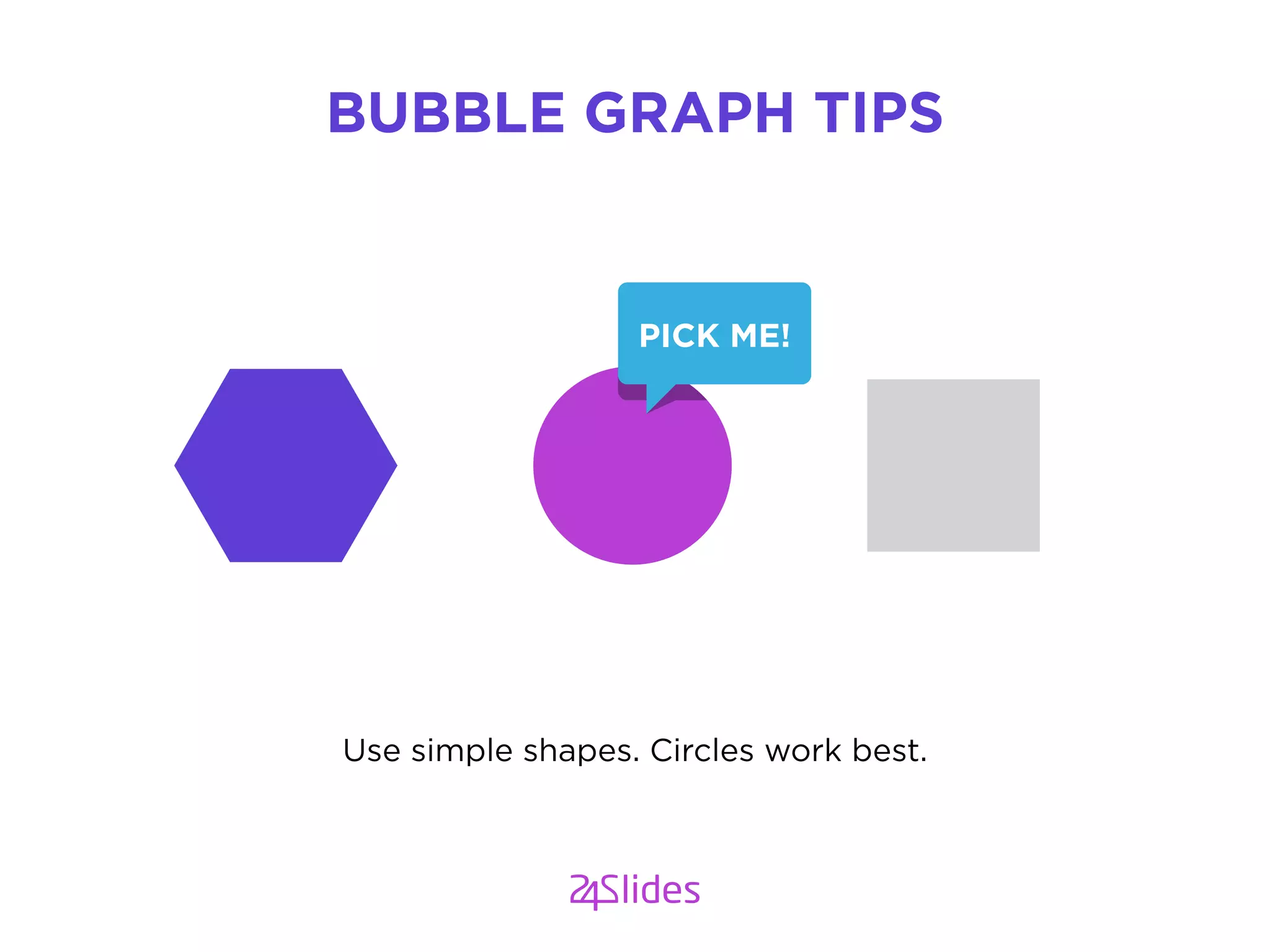
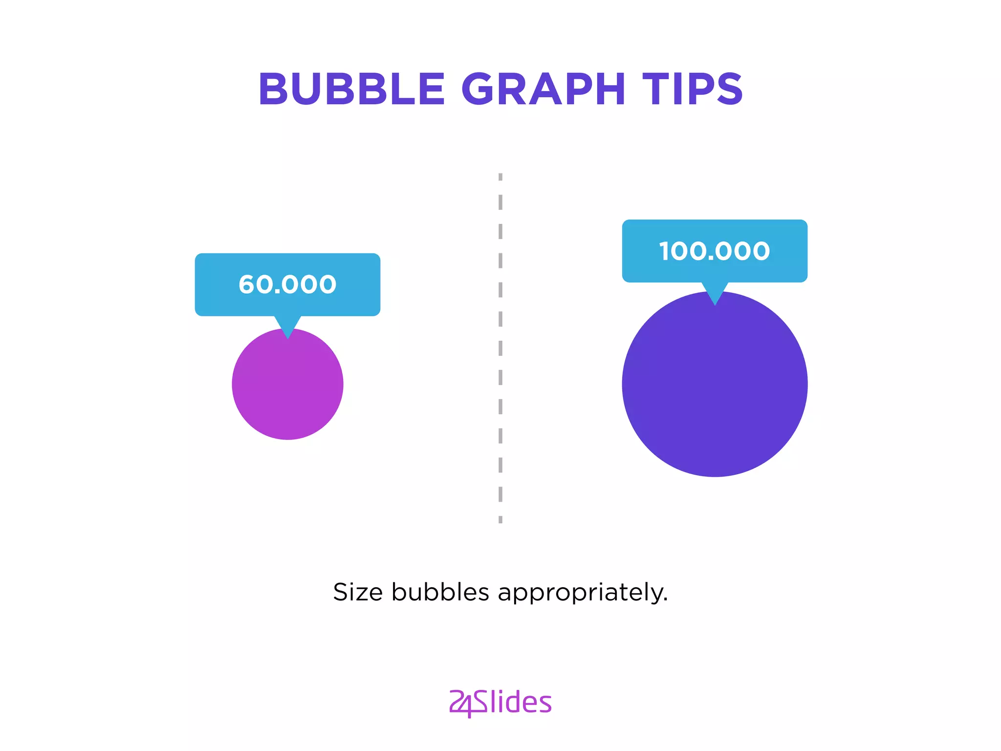
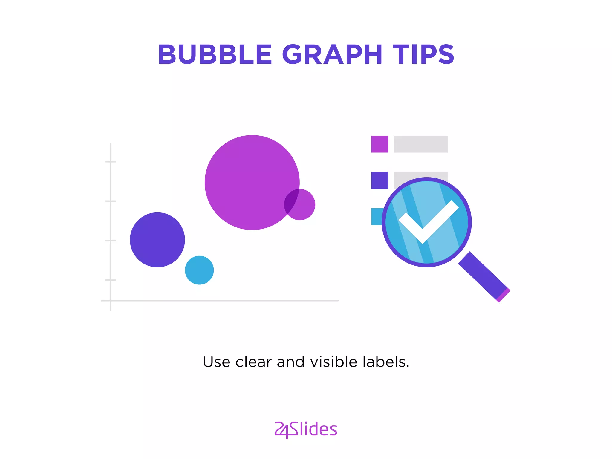
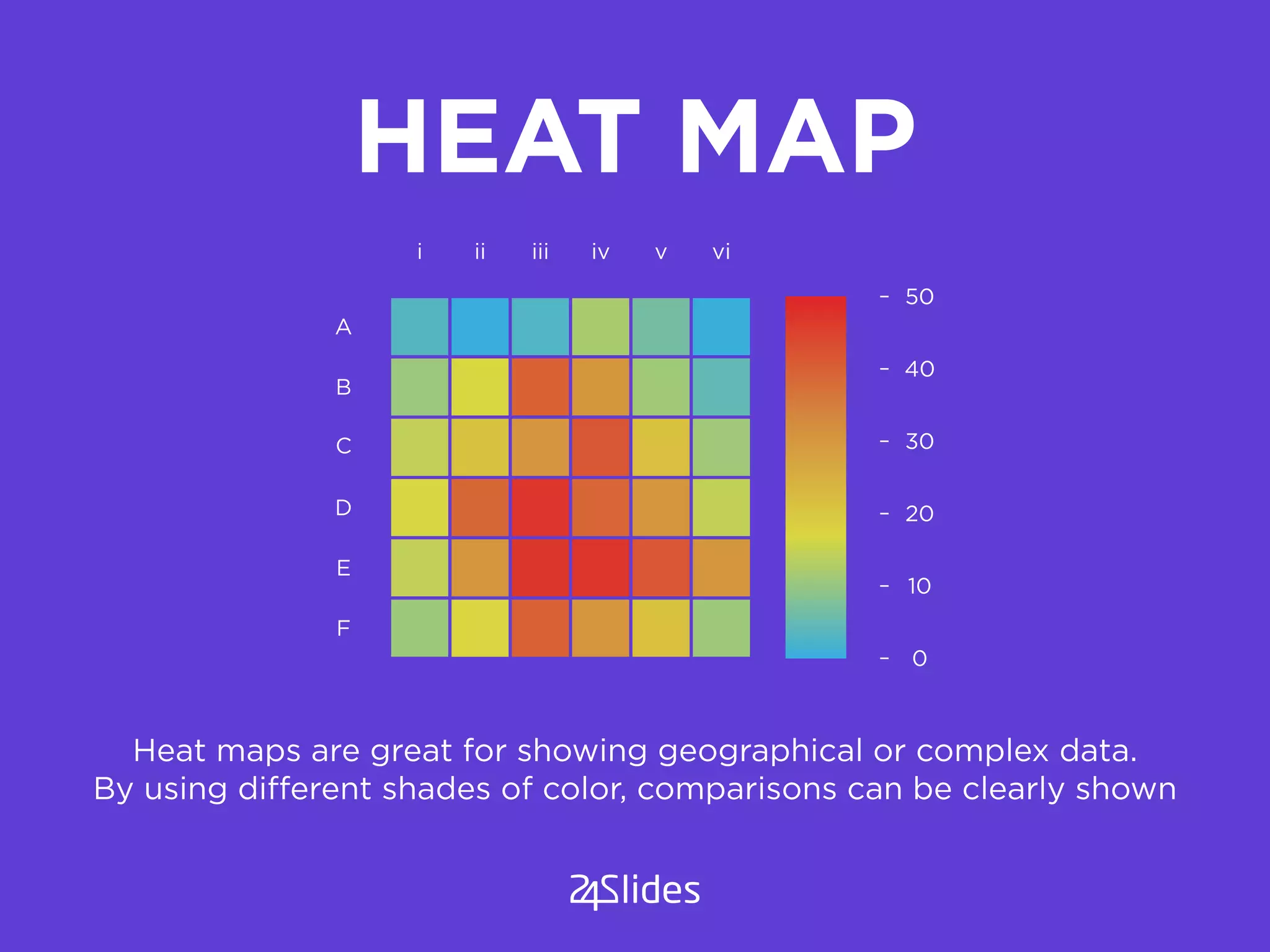


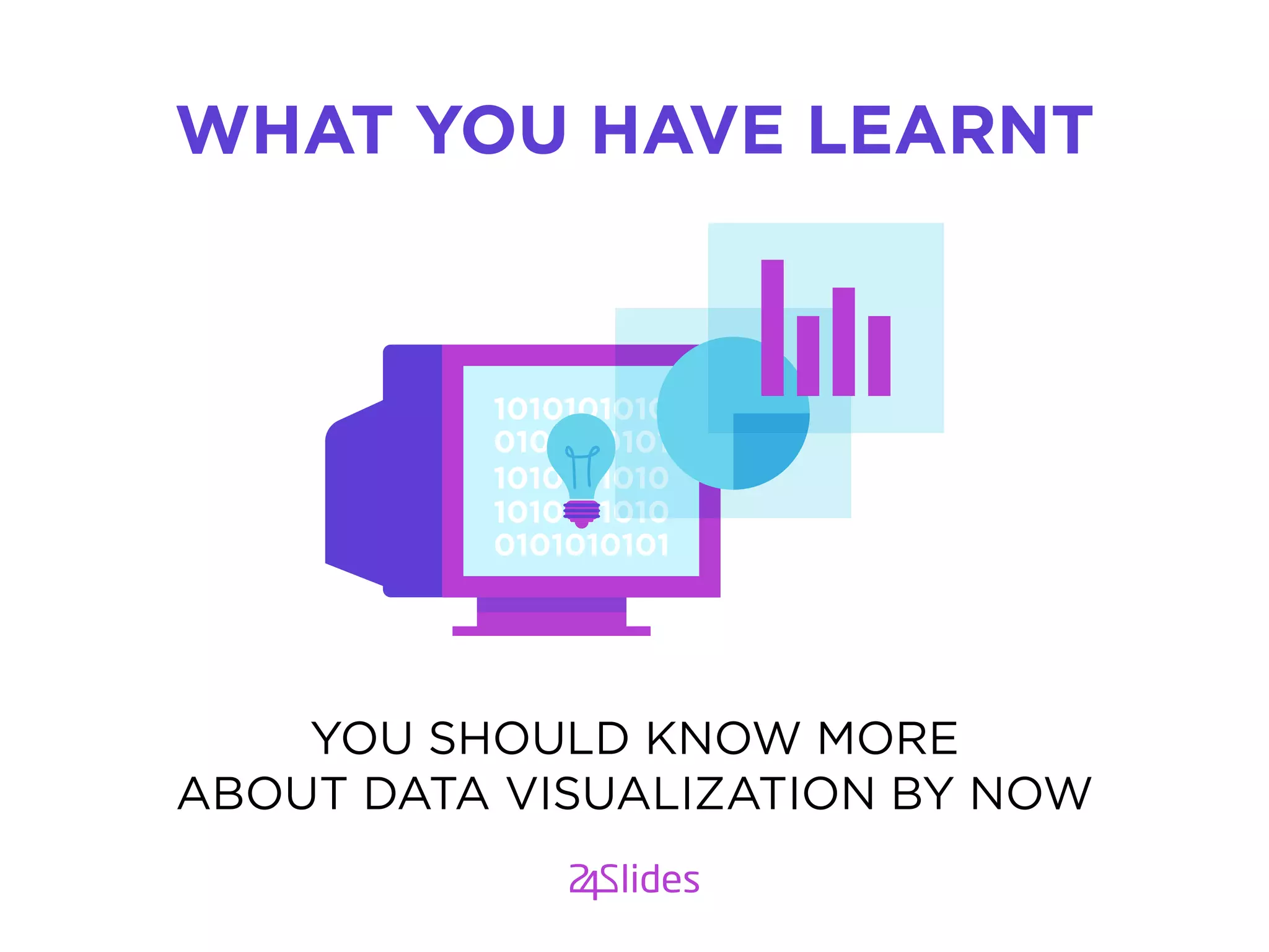
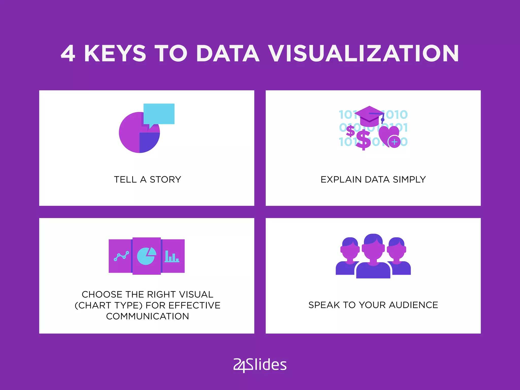


The document discusses data visualization, highlighting its importance in making complex data easily understood through visuals. It outlines key questions for effective visualization, the significance of knowing the audience, and various chart types suitable for different data presentations. Additionally, it offers tips for using specific charts such as pie charts, bar graphs, line graphs, scatter graphs, bubble graphs, and heat maps to effectively communicate data stories.


![[BROCHURE] Italy Tour Project | @SlideON](https://cdn.slidesharecdn.com/ss_thumbnails/brochure8-251215152319-2805af68-thumbnail.jpg?width=640&height=640&fit=bounds)


