GUI Programming with TKinter and Tkinter Widgets.pdf
1.
Sanjivani Rural EducationSociety's
Sanjivani College of Engineering, Kopargaon 423603.
-Department of Strucutral Engineering-
Course Title: (Python-SY & TY B.TECH Structure)
Unit VI- GUI Programming with TKinter
By
Mr. Sumit S. Kolapkar (Assistant Professor)
Mail Id- kolapkarsumitst@sanjivani.org.in
2.
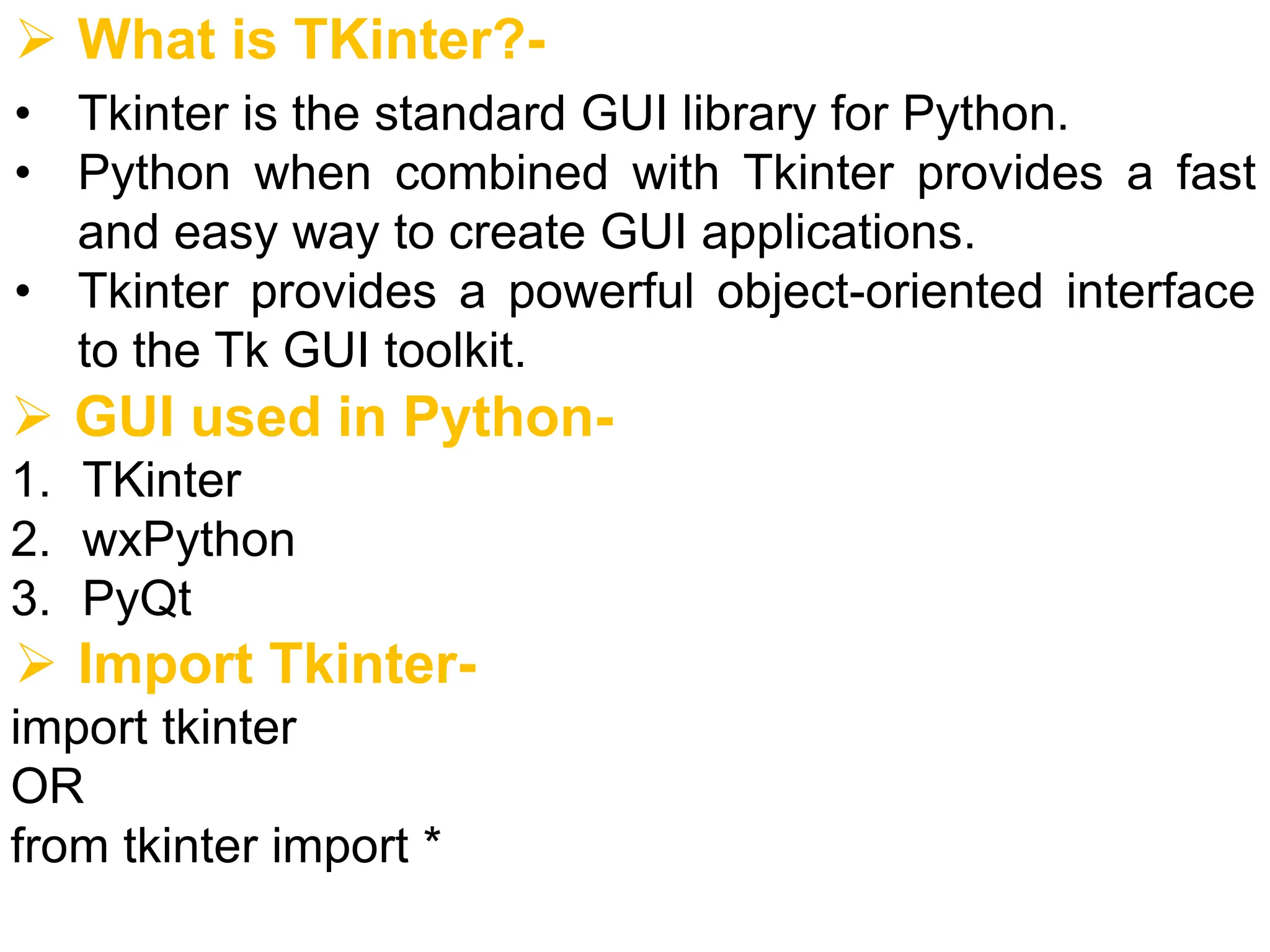
➢ What isTKinter?-
• Tkinter is the standard GUI library for Python.
• Python when combined with Tkinter provides a fast
and easy way to create GUI applications.
• Tkinter provides a powerful object-oriented interface
to the Tk GUI toolkit.
➢ GUI used in Python-
1. TKinter
2. wxPython
3. PyQt
➢ Import Tkinter-
import tkinter
OR
from tkinter import *
3.
➢ What isGUI?-
• GUI is the acronym for Graphical User Interface
• The interface that allows users to interact with
electronic devices, such as computers, laptops,
smartphones and tablets, through graphical
elements.
• It’s a valuable part of software application
programming in regards to human-computer
interaction, replacing text-based commands with
user-friendly actions.
• Its goal is to present the user with decision points that
are easy to find, understand and use.
• In other words, GUI lets you control your device with
a mouse, pen or even your finger.
4.
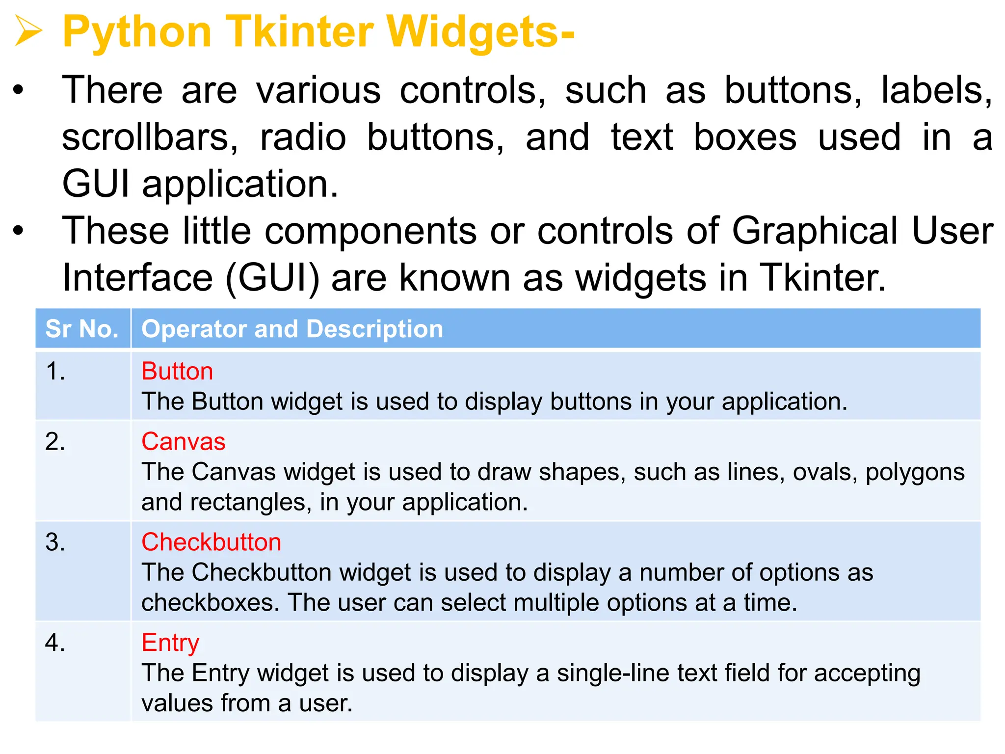
➢ Python TkinterWidgets-
• There are various controls, such as buttons, labels,
scrollbars, radio buttons, and text boxes used in a
GUI application.
• These little components or controls of Graphical User
Interface (GUI) are known as widgets in Tkinter.
Sr No. Operator and Description
1. Button
The Button widget is used to display buttons in your application.
2. Canvas
The Canvas widget is used to draw shapes, such as lines, ovals, polygons
and rectangles, in your application.
3. Checkbutton
The Checkbutton widget is used to display a number of options as
checkboxes. The user can select multiple options at a time.
4. Entry
The Entry widget is used to display a single-line text field for accepting
values from a user.
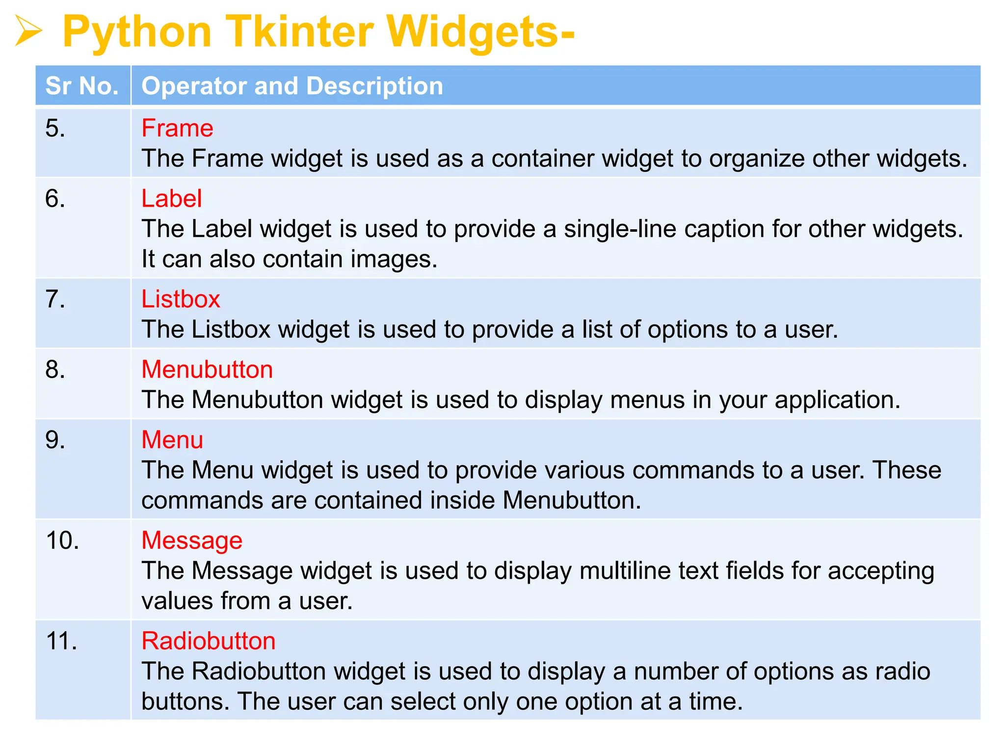
5.
➢ Python TkinterWidgets-
Sr No. Operator and Description
5. Frame
The Frame widget is used as a container widget to organize other widgets.
6. Label
The Label widget is used to provide a single-line caption for other widgets.
It can also contain images.
7. Listbox
The Listbox widget is used to provide a list of options to a user.
8. Menubutton
The Menubutton widget is used to display menus in your application.
9. Menu
The Menu widget is used to provide various commands to a user. These
commands are contained inside Menubutton.
10. Message
The Message widget is used to display multiline text fields for accepting
values from a user.
11. Radiobutton
The Radiobutton widget is used to display a number of options as radio
buttons. The user can select only one option at a time.
6.
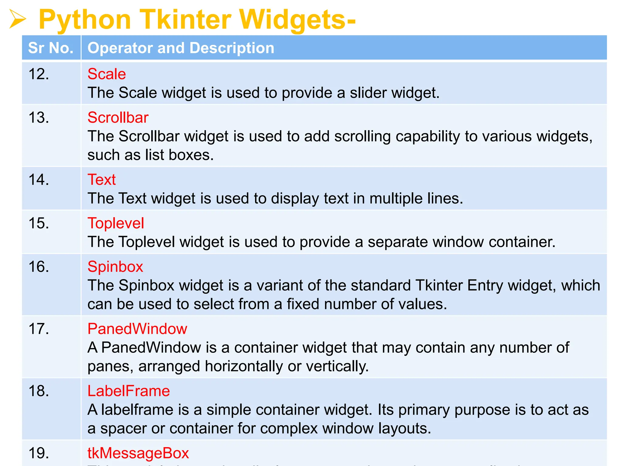
➢ Python TkinterWidgets-
Sr No. Operator and Description
12. Scale
The Scale widget is used to provide a slider widget.
13. Scrollbar
The Scrollbar widget is used to add scrolling capability to various widgets,
such as list boxes.
14. Text
The Text widget is used to display text in multiple lines.
15. Toplevel
The Toplevel widget is used to provide a separate window container.
16. Spinbox
The Spinbox widget is a variant of the standard Tkinter Entry widget, which
can be used to select from a fixed number of values.
17. PanedWindow
A PanedWindow is a container widget that may contain any number of
panes, arranged horizontally or vertically.
18. LabelFrame
A labelframe is a simple container widget. Its primary purpose is to act as
a spacer or container for complex window layouts.
19. tkMessageBox
7.
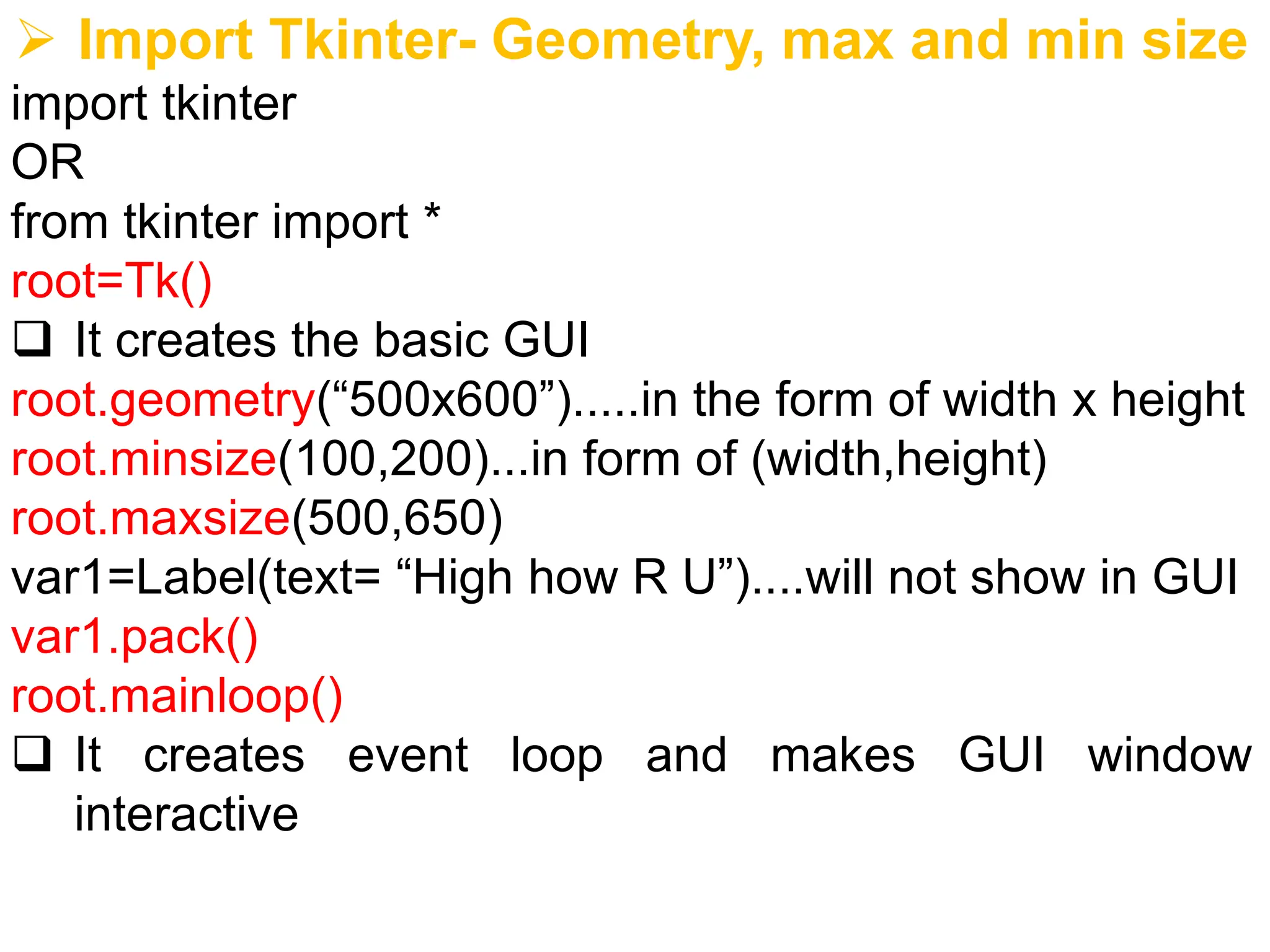
➢ Import Tkinter-Geometry, max and min size
import tkinter
OR
from tkinter import *
root=Tk()
❑ It creates the basic GUI
root.geometry(“500x600”).....in the form of width x height
root.minsize(100,200)...in form of (width,height)
root.maxsize(500,650)
var1=Label(text= “High how R U”)....will not show in GUI
var1.pack()
root.mainloop()
❑ It creates event loop and makes GUI window
interactive
8.
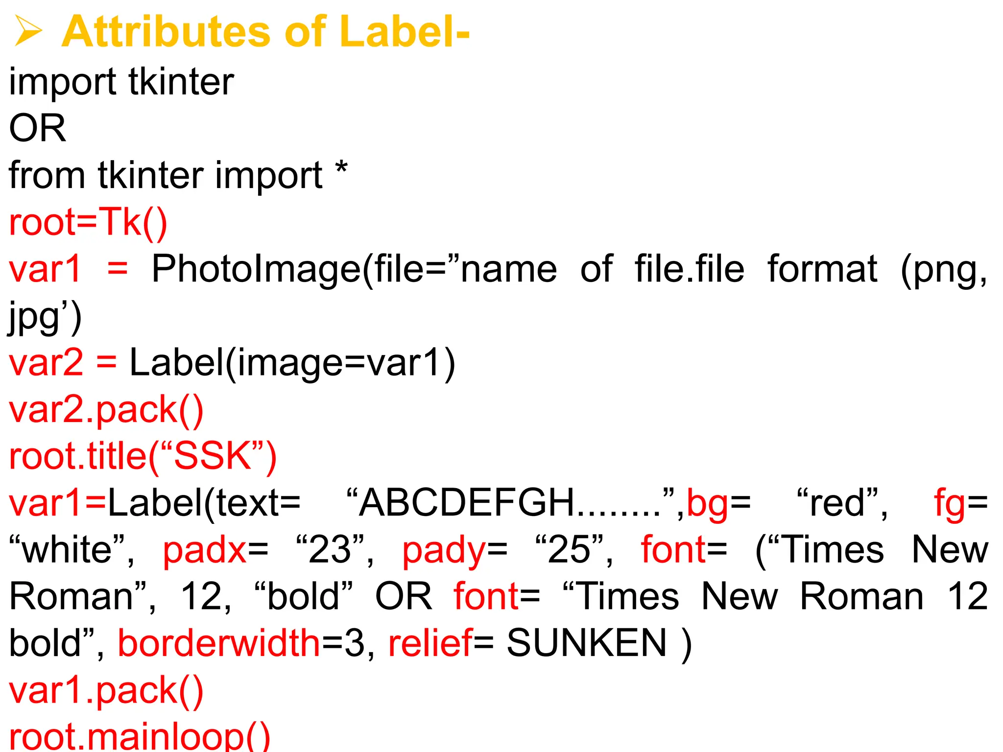
➢ Attributes ofLabel-
import tkinter
OR
from tkinter import *
root=Tk()
var1 = PhotoImage(file=”name of file.file format (png,
jpg’)
var2 = Label(image=var1)
var2.pack()
root.title(“SSK”)
var1=Label(text= “ABCDEFGH........”,bg= “red”, fg=
“white”, padx= “23”, pady= “25”, font= (“Times New
Roman”, 12, “bold” OR font= “Times New Roman 12
bold”, borderwidth=3, relief= SUNKEN )
var1.pack()
root.mainloop()
9.
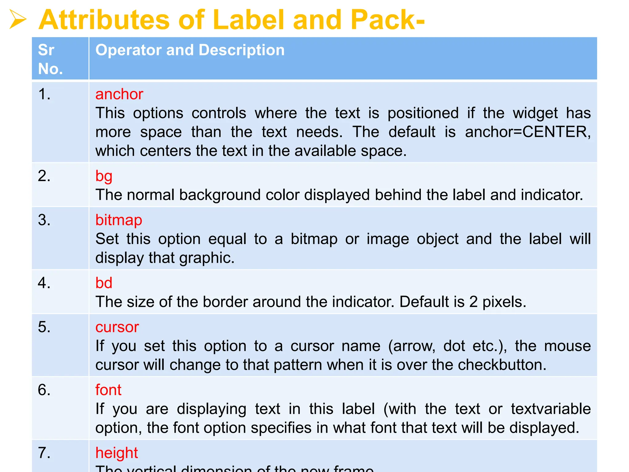
➢ Attributes ofLabel and Pack-
Sr
No.
Operator and Description
1. anchor
This options controls where the text is positioned if the widget has
more space than the text needs. The default is anchor=CENTER,
which centers the text in the available space.
2. bg
The normal background color displayed behind the label and indicator.
3. bitmap
Set this option equal to a bitmap or image object and the label will
display that graphic.
4. bd
The size of the border around the indicator. Default is 2 pixels.
5. cursor
If you set this option to a cursor name (arrow, dot etc.), the mouse
cursor will change to that pattern when it is over the checkbutton.
6. font
If you are displaying text in this label (with the text or textvariable
option, the font option specifies in what font that text will be displayed.
7. height
10.
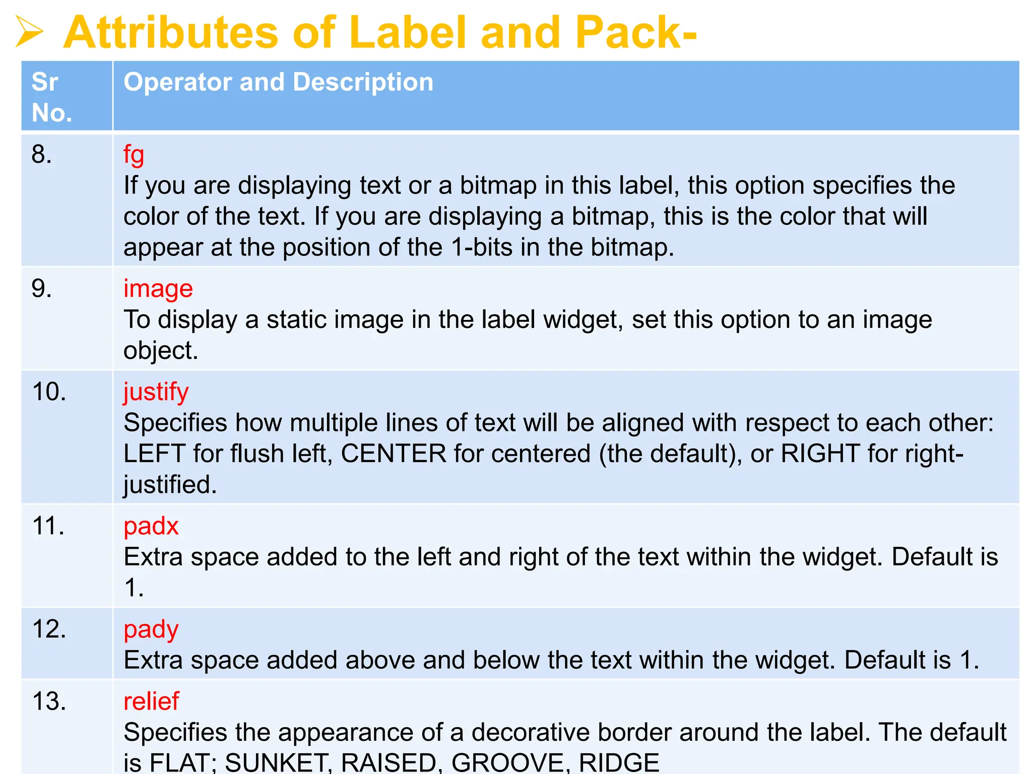
➢ Attributes ofLabel and Pack-
Sr
No.
Operator and Description
8. fg
If you are displaying text or a bitmap in this label, this option specifies the
color of the text. If you are displaying a bitmap, this is the color that will
appear at the position of the 1-bits in the bitmap.
9. image
To display a static image in the label widget, set this option to an image
object.
10. justify
Specifies how multiple lines of text will be aligned with respect to each other:
LEFT for flush left, CENTER for centered (the default), or RIGHT for right-
justified.
11. padx
Extra space added to the left and right of the text within the widget. Default is
1.
12. pady
Extra space added above and below the text within the widget. Default is 1.
13. relief
Specifies the appearance of a decorative border around the label. The default
is FLAT; SUNKET, RAISED, GROOVE, RIDGE
11.
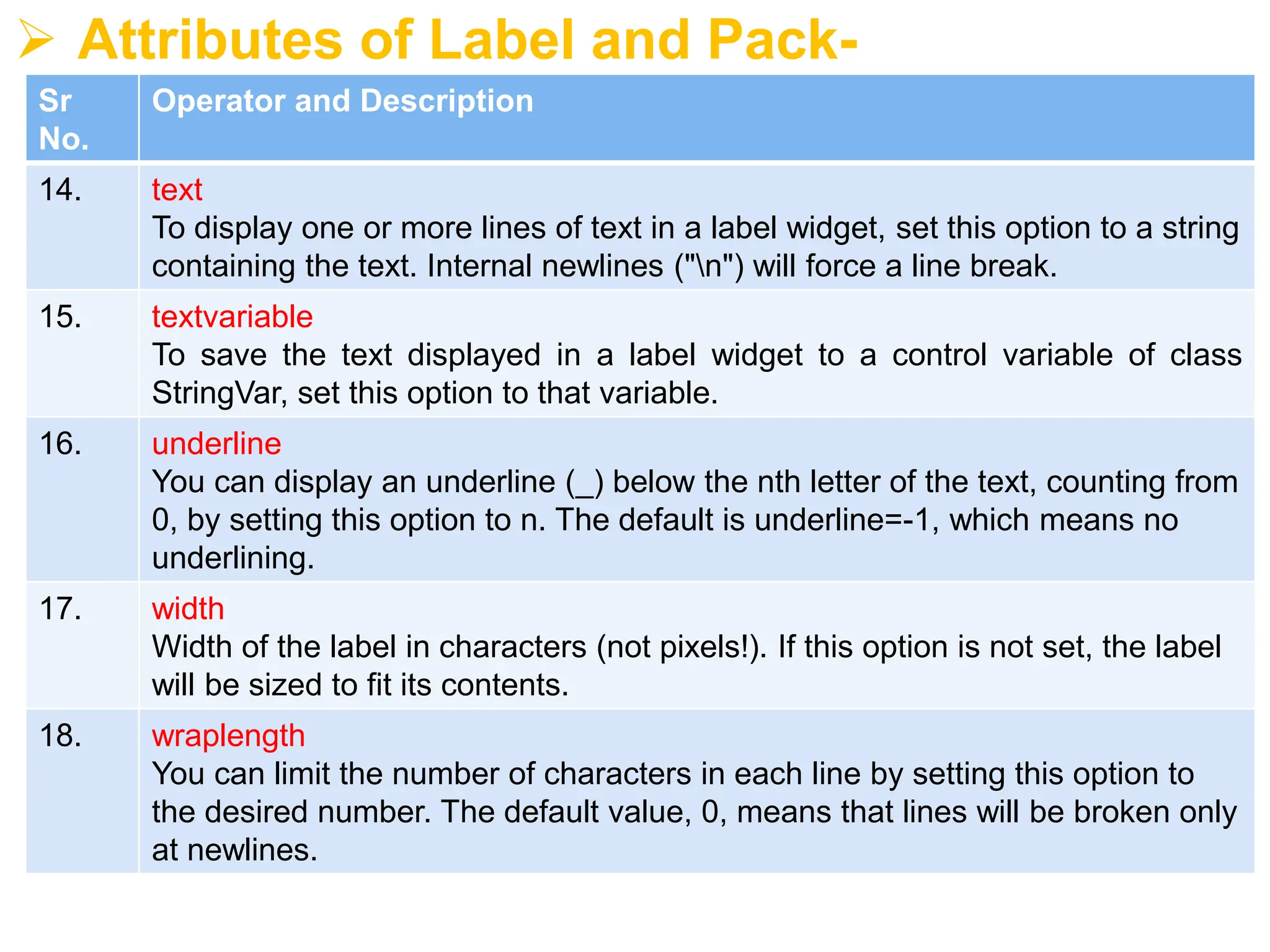
➢ Attributes ofLabel and Pack-
Sr
No.
Operator and Description
14. text
To display one or more lines of text in a label widget, set this option to a string
containing the text. Internal newlines ("n") will force a line break.
15. textvariable
To save the text displayed in a label widget to a control variable of class
StringVar, set this option to that variable.
16. underline
You can display an underline (_) below the nth letter of the text, counting from
0, by setting this option to n. The default is underline=-1, which means no
underlining.
17. width
Width of the label in characters (not pixels!). If this option is not set, the label
will be sized to fit its contents.
18. wraplength
You can limit the number of characters in each line by setting this option to
the desired number. The default value, 0, means that lines will be broken only
at newlines.
12.
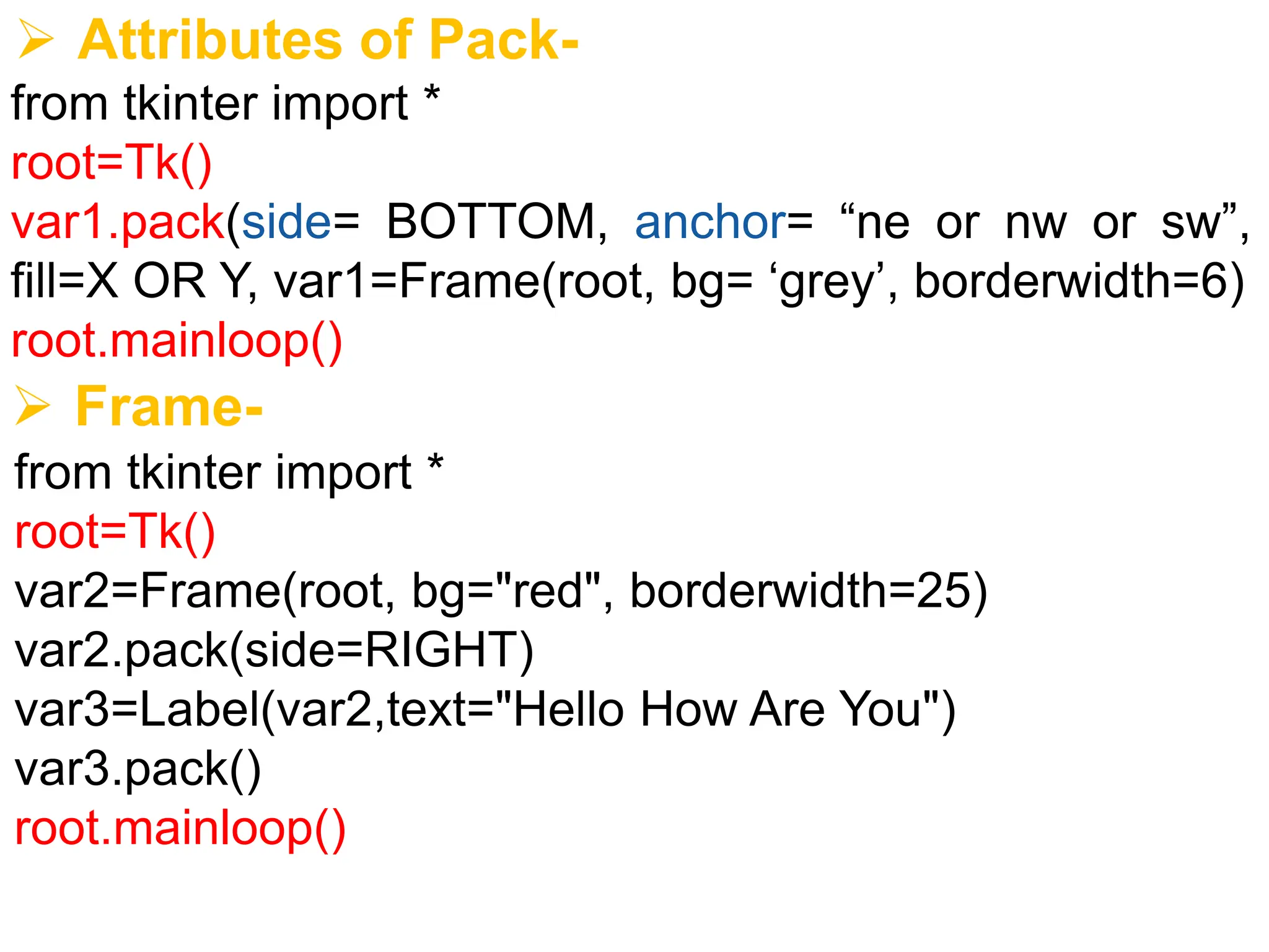
➢ Attributes ofPack-
from tkinter import *
root=Tk()
var1.pack(side= BOTTOM, anchor= “ne or nw or sw”,
fill=X OR Y, var1=Frame(root, bg= ‘grey’, borderwidth=6)
root.mainloop()
➢ Frame-
from tkinter import *
root=Tk()
var2=Frame(root, bg="red", borderwidth=25)
var2.pack(side=RIGHT)
var3=Label(var2,text="Hello How Are You")
var3.pack()
root.mainloop()
13.
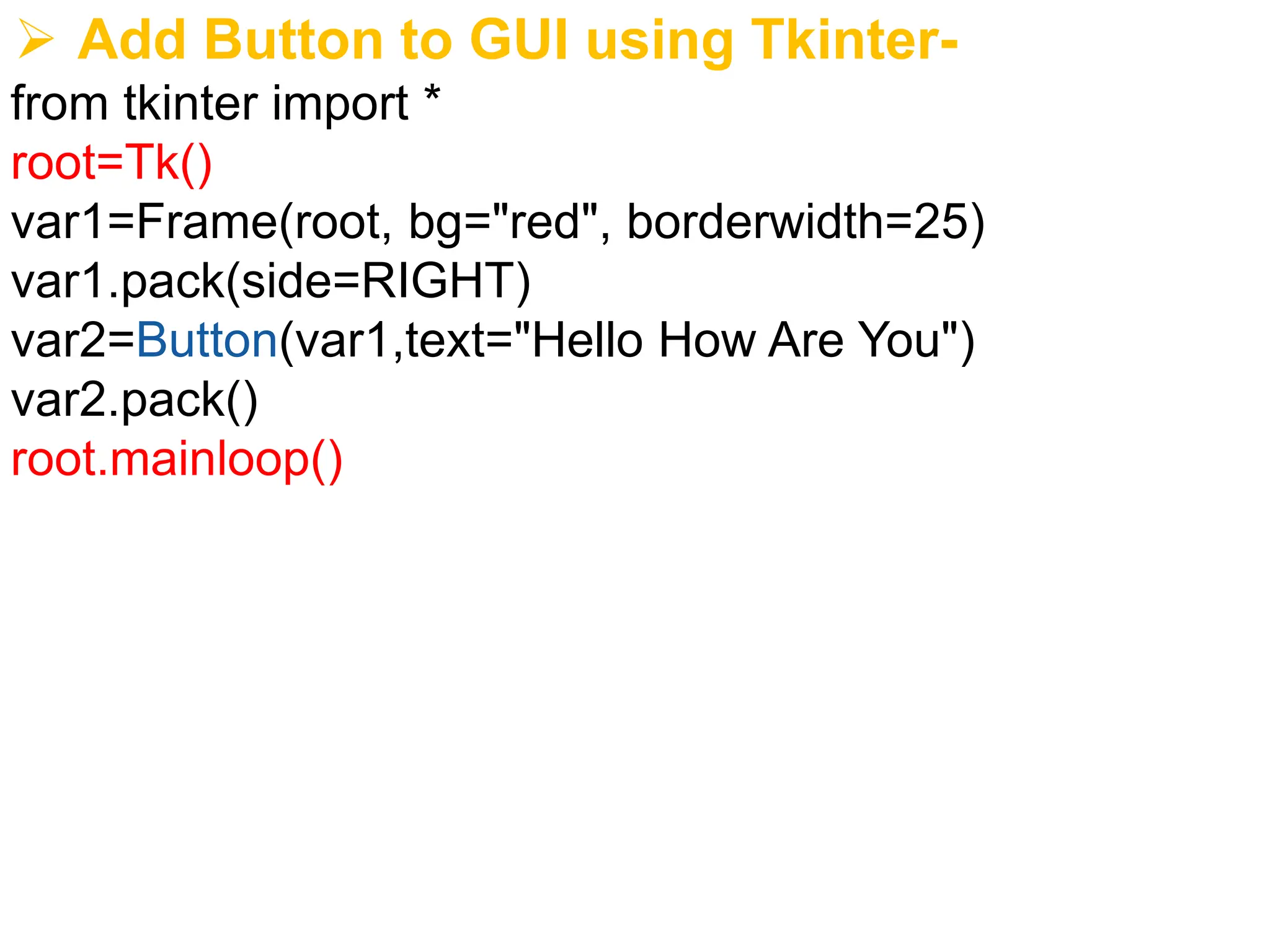
➢ Add Buttonto GUI using Tkinter-
from tkinter import *
root=Tk()
var1=Frame(root, bg="red", borderwidth=25)
var1.pack(side=RIGHT)
var2=Button(var1,text="Hello How Are You")
var2.pack()
root.mainloop()
14.
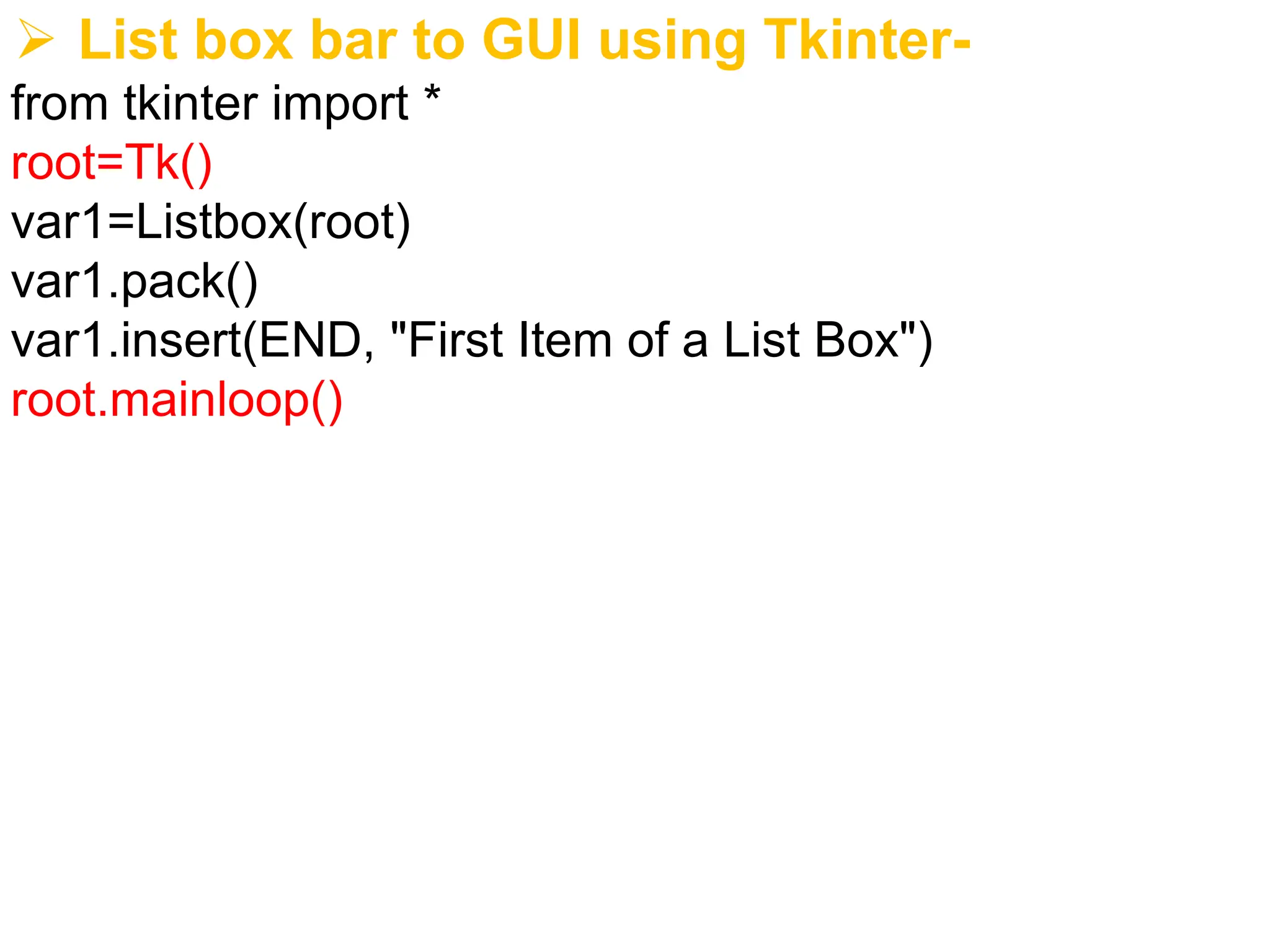
➢ List boxbar to GUI using Tkinter-
from tkinter import *
root=Tk()
var1=Listbox(root)
var1.pack()
var1.insert(END, "First Item of a List Box")
root.mainloop()
15.
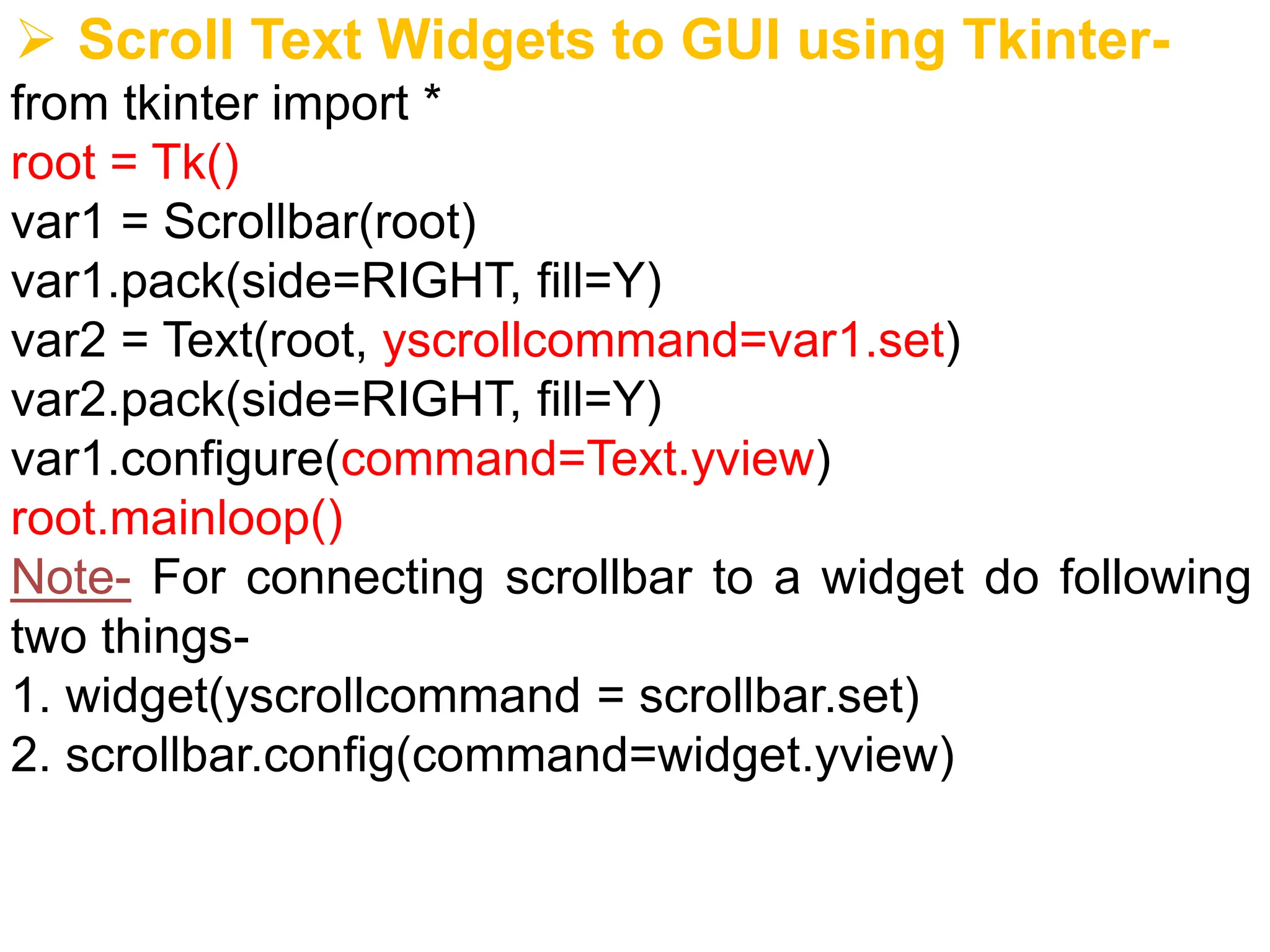
➢ Scroll TextWidgets to GUI using Tkinter-
from tkinter import *
root = Tk()
var1 = Scrollbar(root)
var1.pack(side=RIGHT, fill=Y)
var2 = Text(root, yscrollcommand=var1.set)
var2.pack(side=RIGHT, fill=Y)
var1.configure(command=Text.yview)
root.mainloop()
Note- For connecting scrollbar to a widget do following
two things-
1. widget(yscrollcommand = scrollbar.set)
2. scrollbar.config(command=widget.yview)
16.
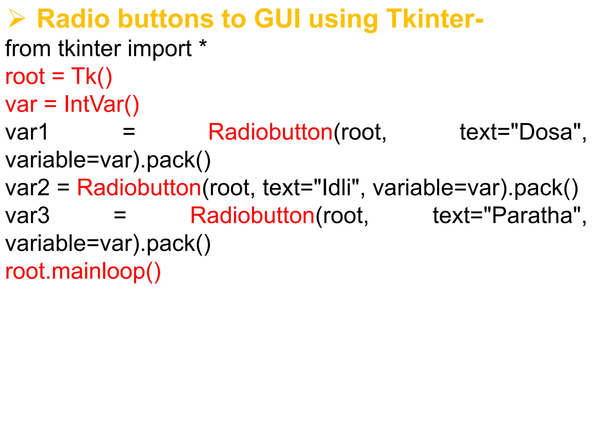
➢ Radio buttonsto GUI using Tkinter-
from tkinter import *
root = Tk()
var = IntVar()
var1 = Radiobutton(root, text="Dosa",
variable=var).pack()
var2 = Radiobutton(root, text="Idli", variable=var).pack()
var3 = Radiobutton(root, text="Paratha",
variable=var).pack()
root.mainloop()