Downloaded 217 times


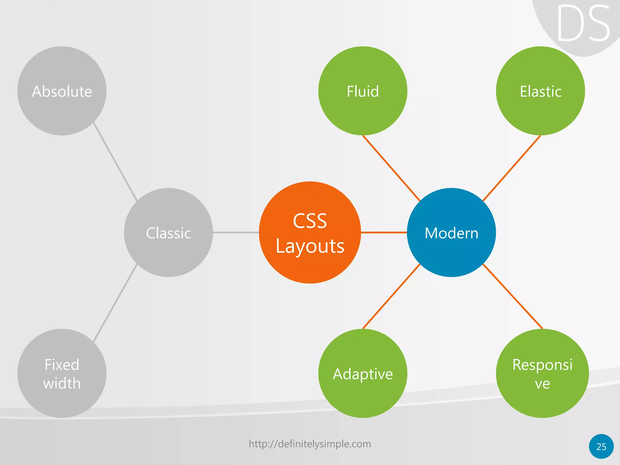


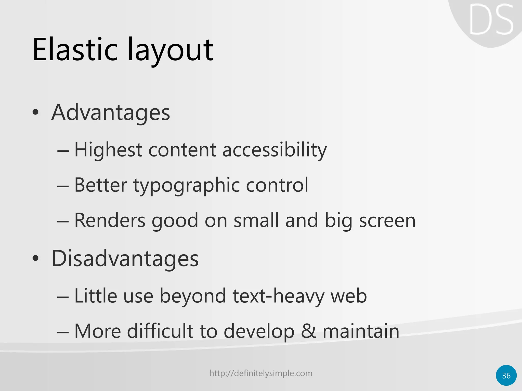
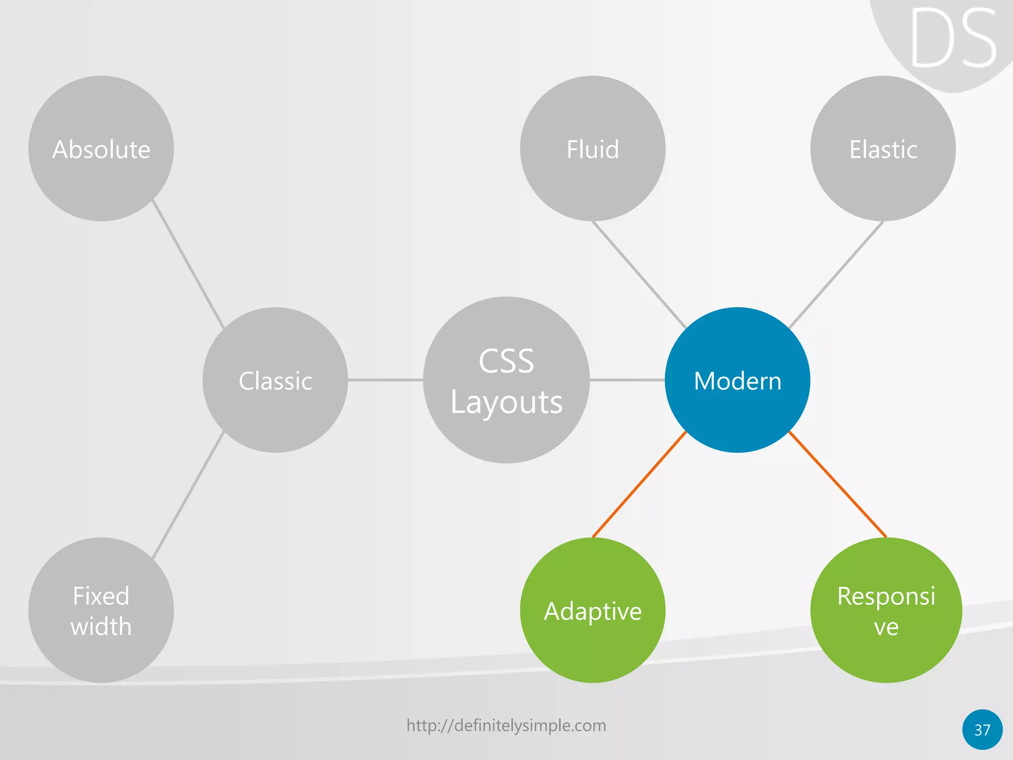


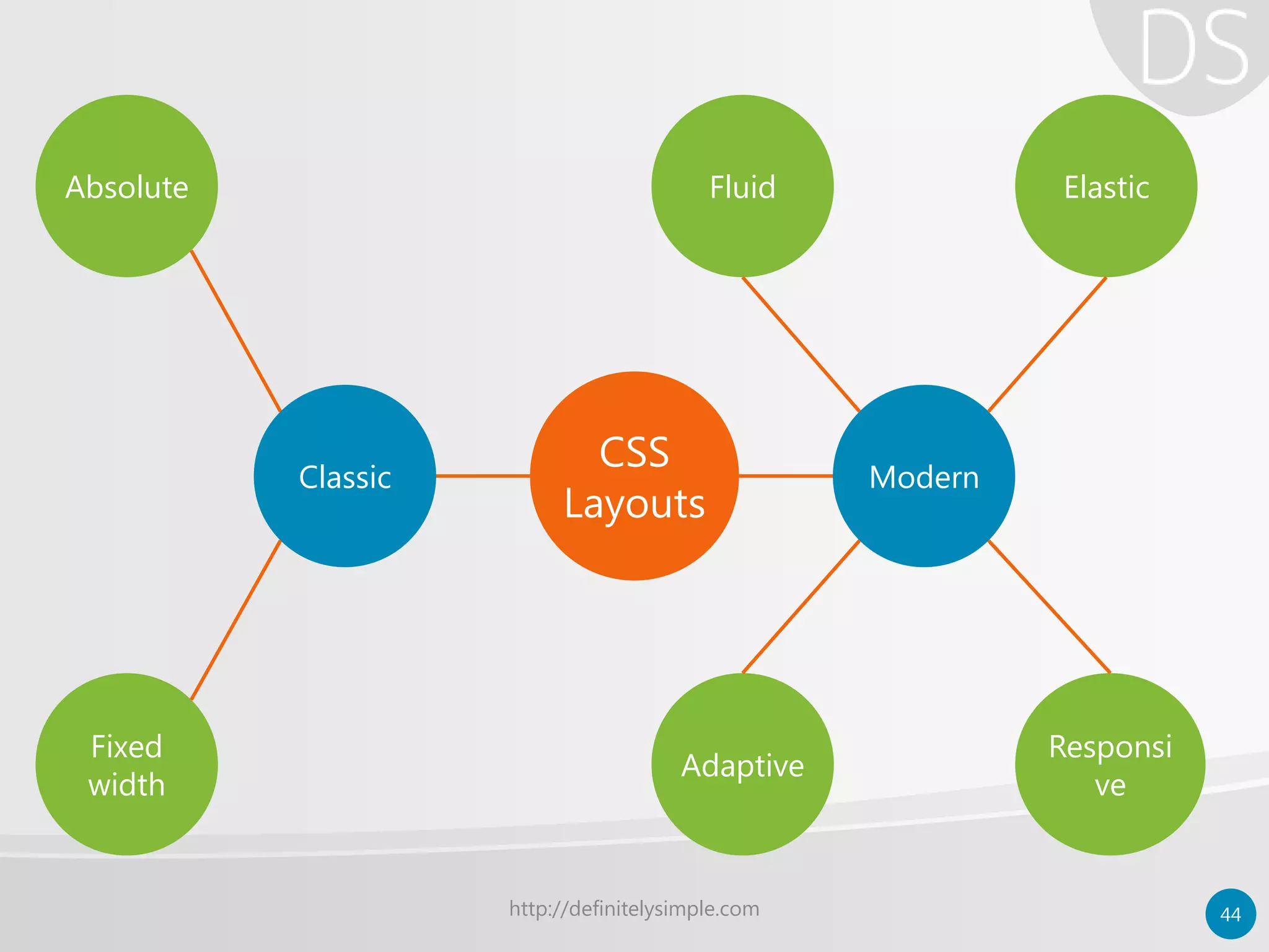

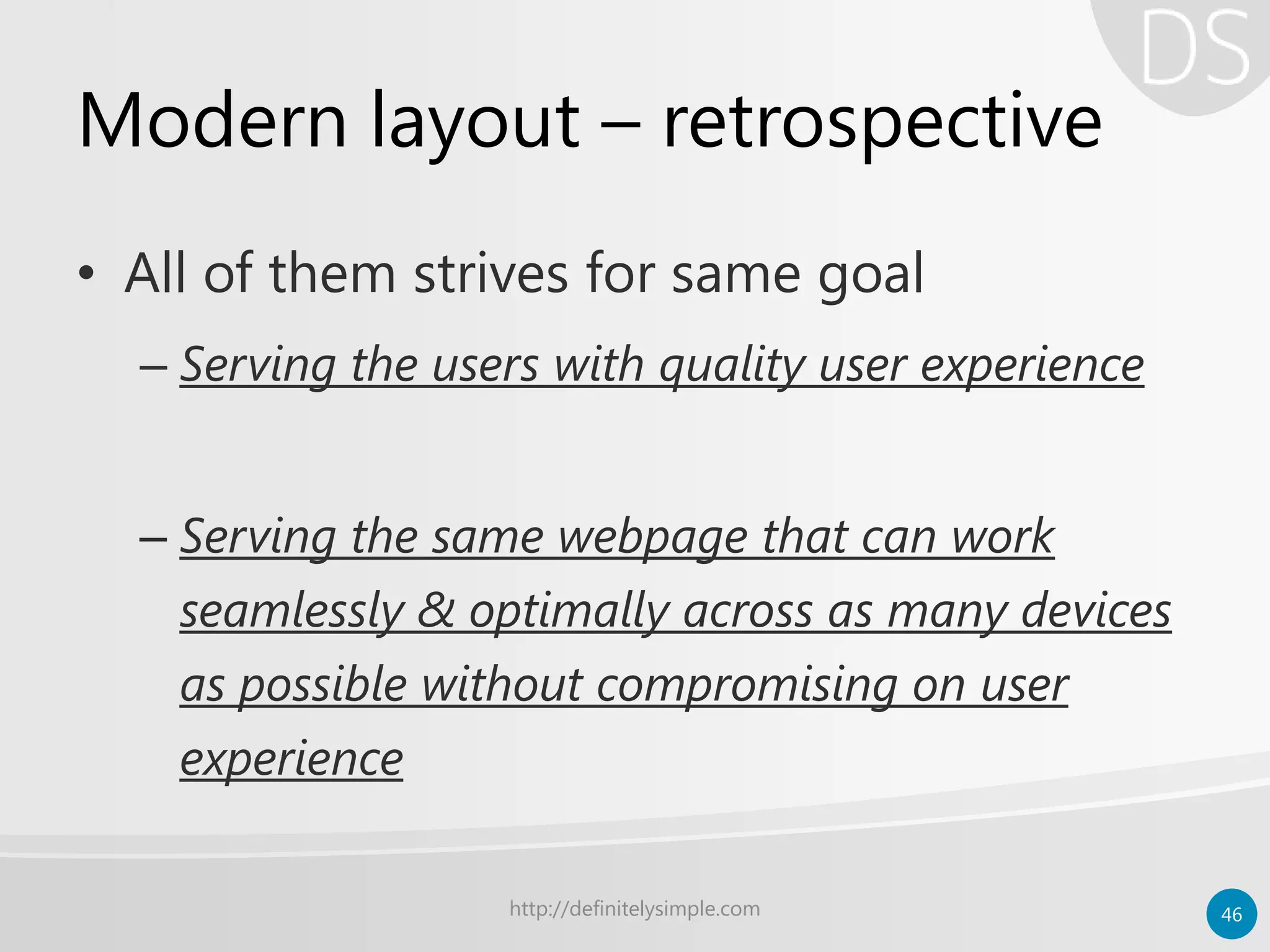


The document outlines various CSS layout techniques and their evolution from basic text-based sites to complex web applications. It compares traditional layout methods using HTML tables to modern CSS approaches, highlighting the advantages and disadvantages of fixed, fluid, elastic, adaptive, and responsive layouts. Additionally, it distinguishes between adaptive web design and responsive web design, emphasizing the importance of user experience across different devices.


![The Box Model [CSS Introduction]](https://cdn.slidesharecdn.com/ss_thumbnails/chapter3-part2-boxmodel-150120083129-conversion-gate01-thumbnail.jpg?width=640&height=640&fit=bounds)