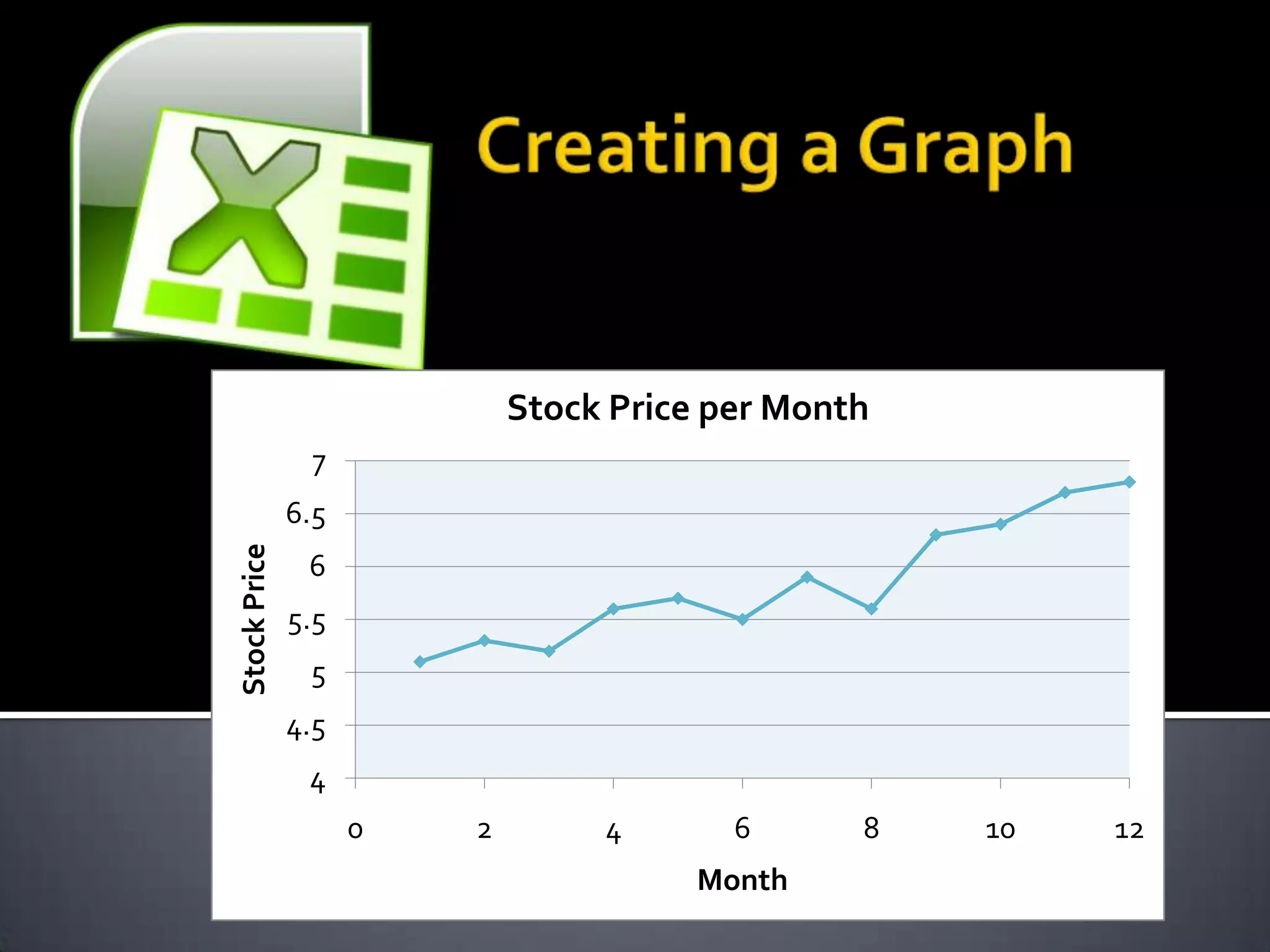
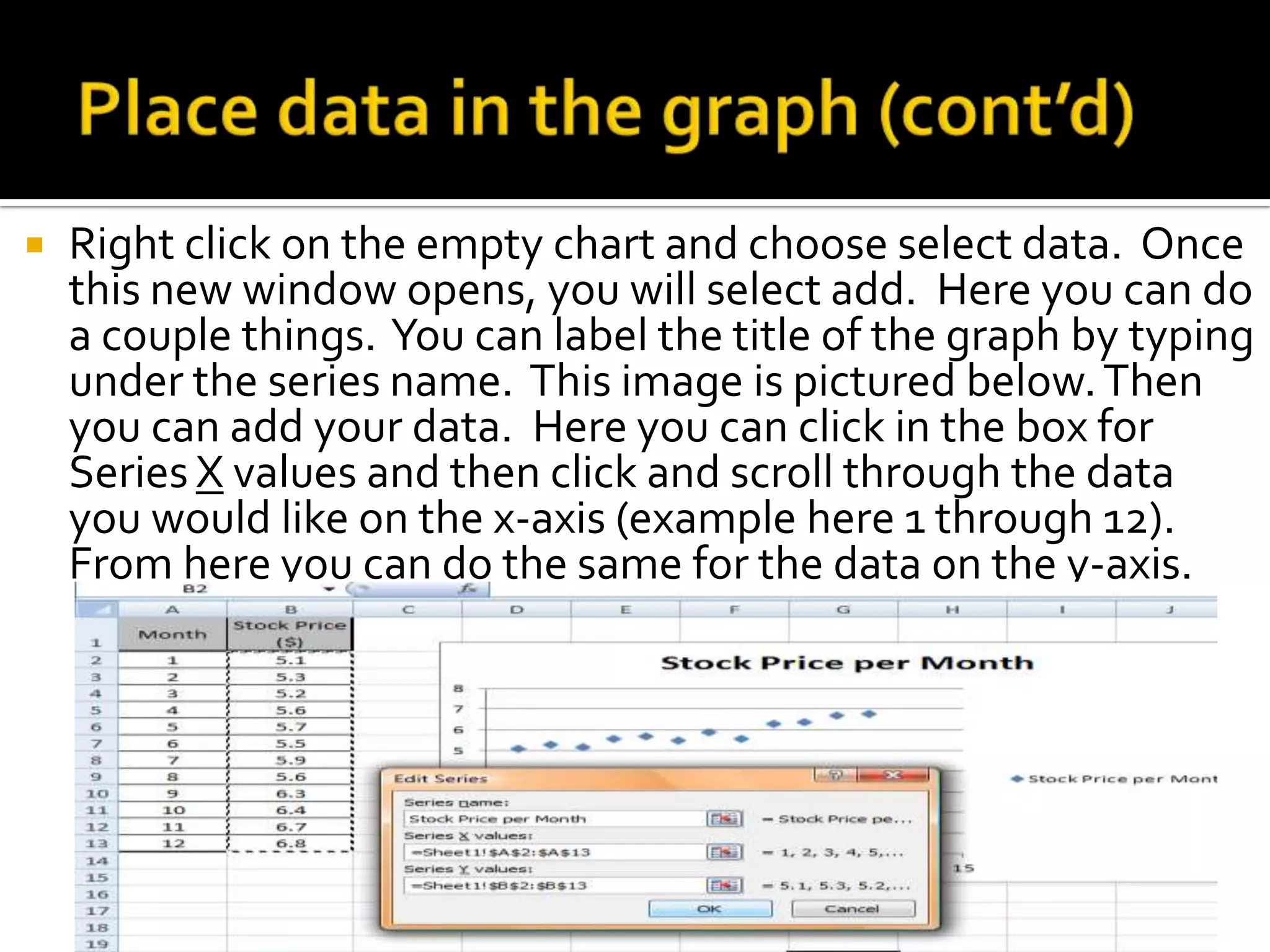
Stock Price per Month
               7
              6.5
Stock Price


               6
              5.5
               5
              4.5
               4
                    0   2        4       6      8   10   12
                                       Month
   The first step in creating a graph is collecting
    the data. This data could vary depending on
    what type of graph you are attempting to
    create. Typically this data is collected in the
    field through
    surveys, measurements, counting, collecting
    information, etc.
   Before putting your data together, you have
    to find a computer with Microsoft Excel
    loaded on it. Once you have found a
    computer, turn it on and search for Excel.
    Open the application, and you are prepared
    to start your graph.
   Be sure to save your spreadsheet before you
    begin. Ensure you remember the location to
    which you are saving it, either your hard drive
    or flash drive and the name of the file. It is
    standard to name the file something relevant
    to the data you researched.
   From here you can began entering your
    data into rows or columns. It’s ideal to
    create a table with the title of each row
    or column before the information in
    order to keep it well organized. As you
    can see to the right the information
    collected is placed below the title. To
    place the data in Excel, simply click on
    the cell (box) in which you want the
    information to go and type the
    information collected.
   Now you are prepared to insert your graph. Look at
    the top of Excel for a tab labeled insert. Click this tab
    and a menu of options appears as shown
    below, choose the type of graph that will best
    represent your information. This can either be a
    line, column, pie, bar, area, scatter, or many other
    graphs. The most common graph is a scatter plot.
   Have the data you want on the graph highlighted.
    Then select the type of graph you want. The graph
    should appear automatically. If the graph didn’t
    automatically appear, you will need to take another
    step to get the data on the graph.
   Right click on the empty chart and choose select data. Once
    this new window opens, you will select add. Here you can do
    a couple things. You can label the title of the graph by typing
    under the series name. This image is pictured below. Then
    you can add your data. Here you can click in the box for
    Series X values and then click and scroll through the data
    you would like on the x-axis (example here 1 through 12).
    From here you can do the same for the data on the y-axis.
   To create labels on the x and y axis, you will first need to click
    on an open area of the graph. Once you have done this, you
    should see an option at the top of Excel labeled Chart Tools
    and Layout. Select Layout and locate the item Axis Titles.
    Here you can select the vertical and horizontal axis titles and
    where you want them located on the graph. Once you select
    the type you would like, type the title of the axis.
   From the same layout
    tab you could create a
    legend by selecting
    the location you
    would want your
    legend. This will
    allow the person
    viewing your graph to
    have a better
    understanding of
    what is going on.
   Looking under the chart tools tab at the top of
    the screen, you can add many different features
    to your graph. From the design tab you can
    change the color, change the layout design, and
    switch the column and rows. From the Layout
    tab you can add pictures, shapes, text
    box, titles, add gridlines and trendlines, change
    chart name, and customize your axes. Then
    from the format tab, you can change the colors
    of various parts of the graph and add different
    effects to emphasize different points of the
    graph.
   It’s very simple to edit your
    graph. You can do this by
    double clicking or right
    clicking and choosing format
    on the item you want edited.
    This can either be the
    axis, chart
    title, gridlines, legend, data
    points, or the line. From here
    you can choose to change the
    colors, numbers, alignment, a
    nd various options depending
    on what you are trying to
    edit.

Creating a graph in excel

  • 1.
    Stock Price perMonth 7 6.5 Stock Price 6 5.5 5 4.5 4 0 2 4 6 8 10 12 Month
  • 2.
    The first step in creating a graph is collecting the data. This data could vary depending on what type of graph you are attempting to create. Typically this data is collected in the field through surveys, measurements, counting, collecting information, etc.
  • 3.
    Before putting your data together, you have to find a computer with Microsoft Excel loaded on it. Once you have found a computer, turn it on and search for Excel. Open the application, and you are prepared to start your graph.
  • 4.
    Be sure to save your spreadsheet before you begin. Ensure you remember the location to which you are saving it, either your hard drive or flash drive and the name of the file. It is standard to name the file something relevant to the data you researched.
  • 5.
    From here you can began entering your data into rows or columns. It’s ideal to create a table with the title of each row or column before the information in order to keep it well organized. As you can see to the right the information collected is placed below the title. To place the data in Excel, simply click on the cell (box) in which you want the information to go and type the information collected.
  • 6.
    Now you are prepared to insert your graph. Look at the top of Excel for a tab labeled insert. Click this tab and a menu of options appears as shown below, choose the type of graph that will best represent your information. This can either be a line, column, pie, bar, area, scatter, or many other graphs. The most common graph is a scatter plot.
  • 7.
    Have the data you want on the graph highlighted. Then select the type of graph you want. The graph should appear automatically. If the graph didn’t automatically appear, you will need to take another step to get the data on the graph.
  • 8.
    Right click on the empty chart and choose select data. Once this new window opens, you will select add. Here you can do a couple things. You can label the title of the graph by typing under the series name. This image is pictured below. Then you can add your data. Here you can click in the box for Series X values and then click and scroll through the data you would like on the x-axis (example here 1 through 12). From here you can do the same for the data on the y-axis.
  • 9.
    To create labels on the x and y axis, you will first need to click on an open area of the graph. Once you have done this, you should see an option at the top of Excel labeled Chart Tools and Layout. Select Layout and locate the item Axis Titles. Here you can select the vertical and horizontal axis titles and where you want them located on the graph. Once you select the type you would like, type the title of the axis.
  • 10.
    From the same layout tab you could create a legend by selecting the location you would want your legend. This will allow the person viewing your graph to have a better understanding of what is going on.
  • 11.
    Looking under the chart tools tab at the top of the screen, you can add many different features to your graph. From the design tab you can change the color, change the layout design, and switch the column and rows. From the Layout tab you can add pictures, shapes, text box, titles, add gridlines and trendlines, change chart name, and customize your axes. Then from the format tab, you can change the colors of various parts of the graph and add different effects to emphasize different points of the graph.
  • 12.
    It’s very simple to edit your graph. You can do this by double clicking or right clicking and choosing format on the item you want edited. This can either be the axis, chart title, gridlines, legend, data points, or the line. From here you can choose to change the colors, numbers, alignment, a nd various options depending on what you are trying to edit.