Downloaded 19 times


![2004 Rachel
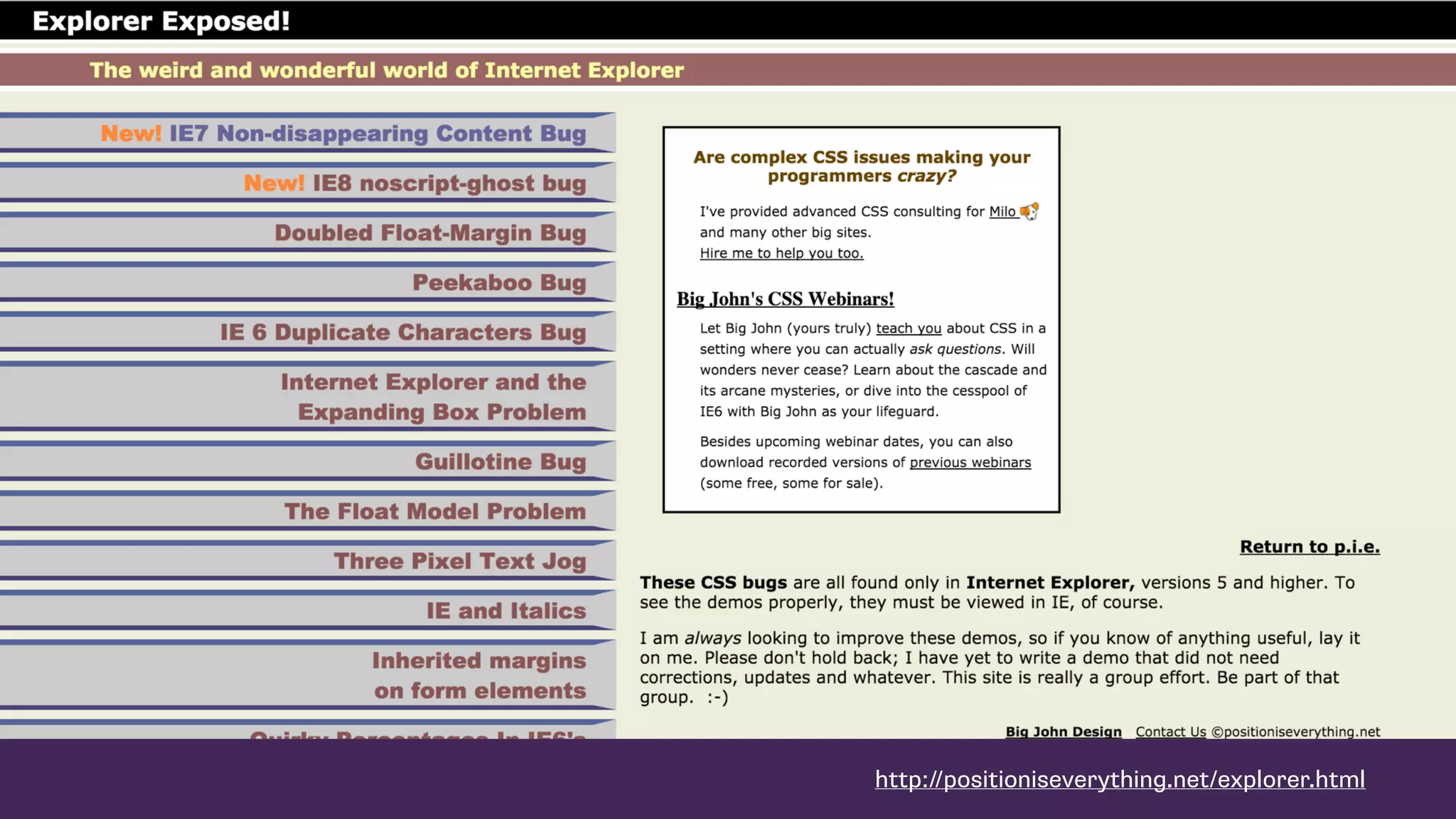
“Users [of IE] might see square corners
instead of rounded ones […] but they’ll
be able to use the site just as well as
their Mozilla-wielding counterparts.”](https://image.slidesharecdn.com/making-sense-of-layout-160225155017/75/ConFoo-2016-Making-Sense-of-CSS-Layout-75-2048.jpg)


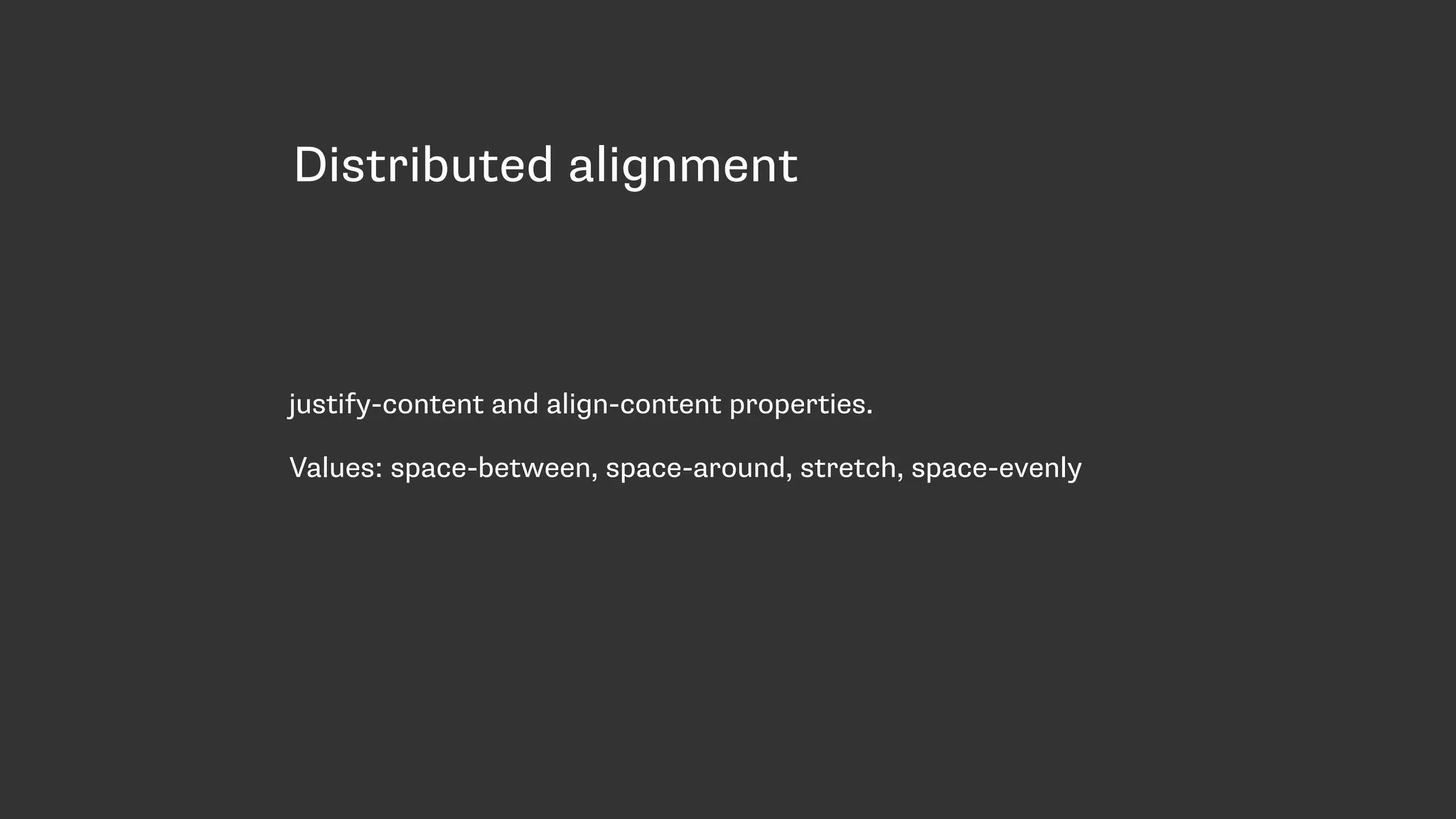
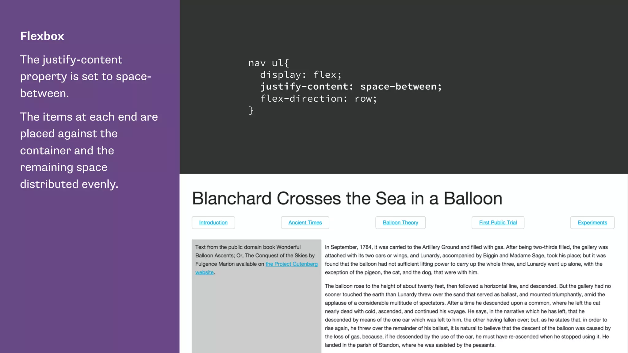
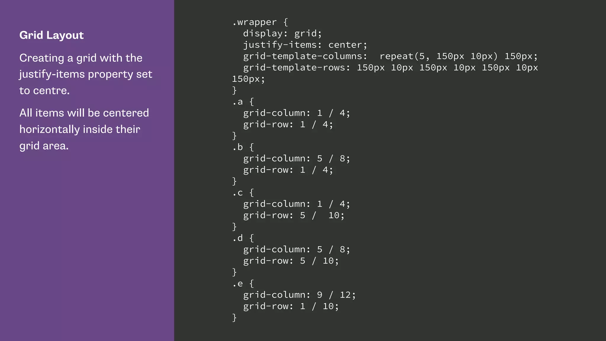
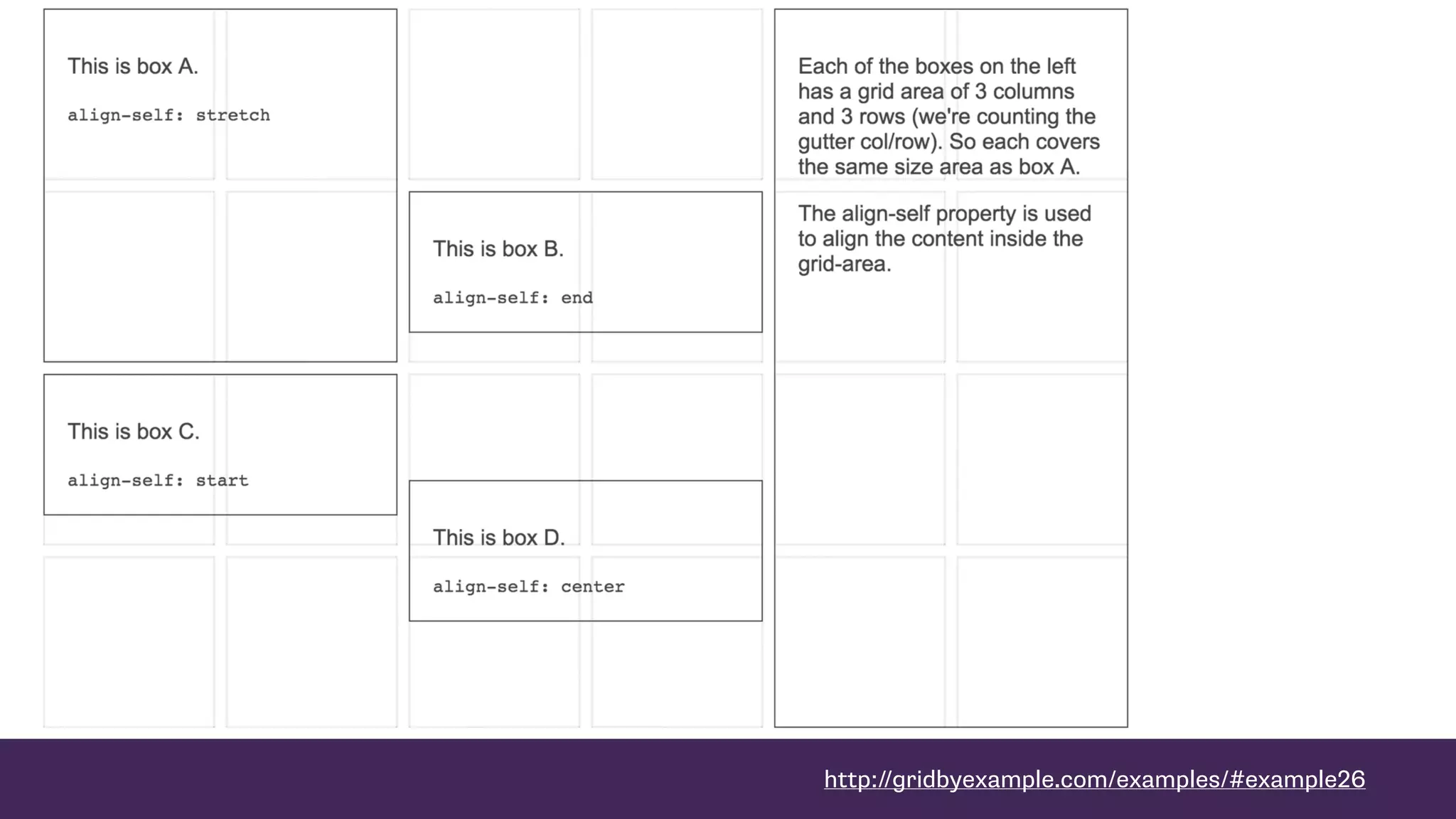
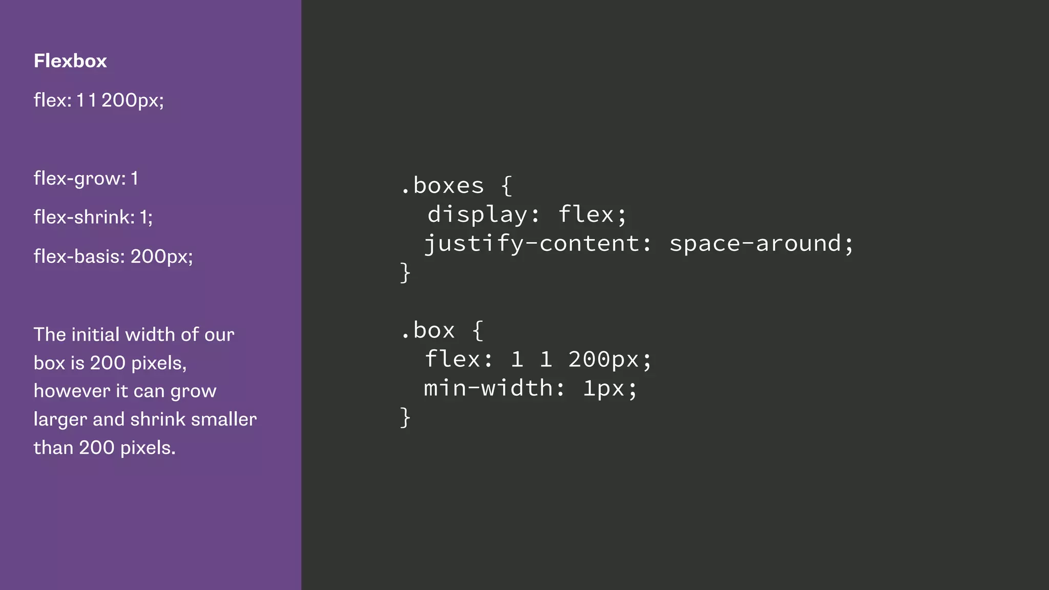
This document summarizes Rachel Andrew's presentation on modern CSS layout techniques. It discusses some common layout methods like floats, inline-block, and frameworks. It then covers the introduction of Flexbox and CSS Grid Layout as ways to achieve responsive and flexible layouts by default. Key benefits include true separation of document structure from visual layout, precise control over alignment both horizontally and vertically, and items understanding themselves as part of an overall layout.


