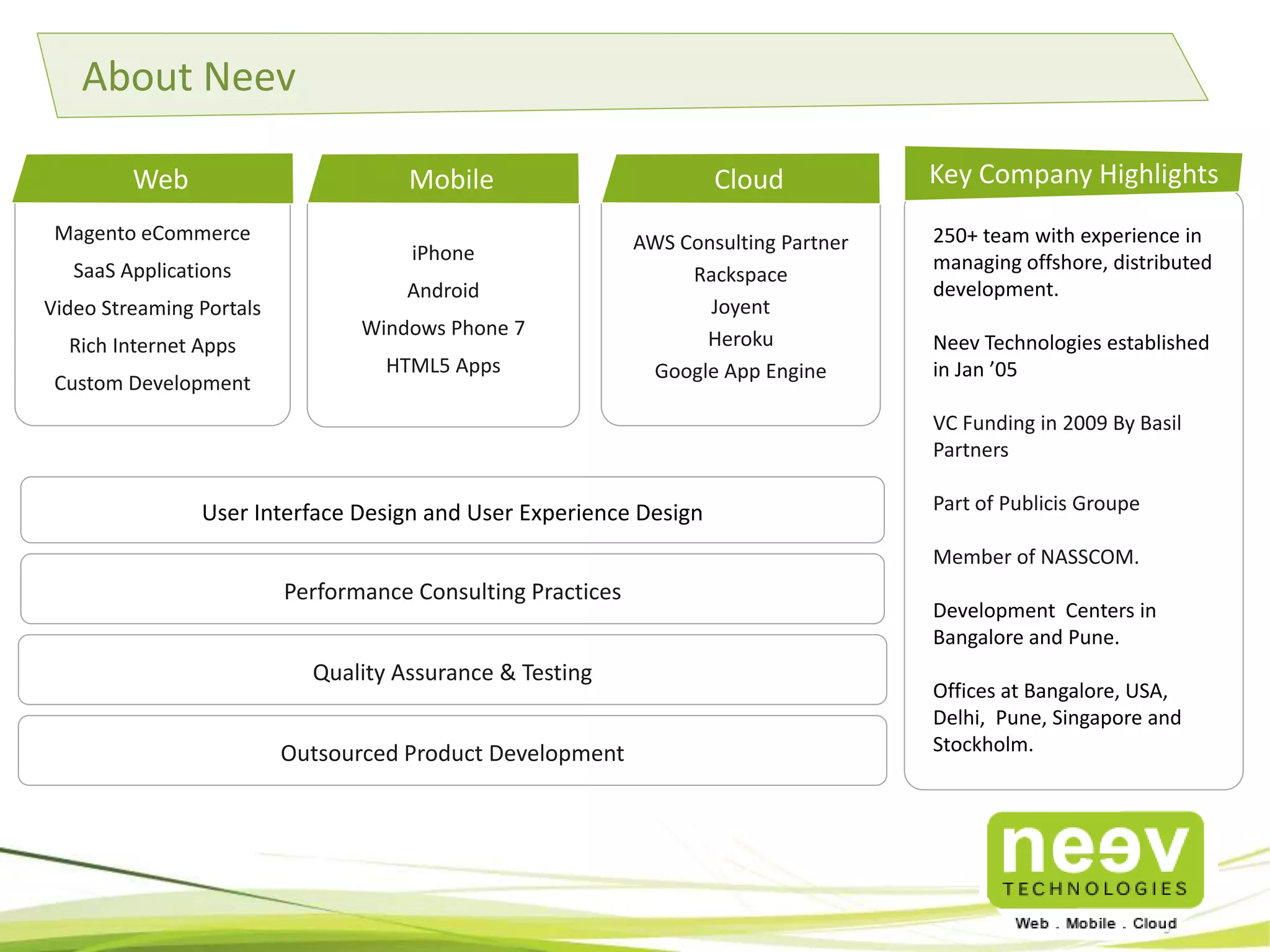
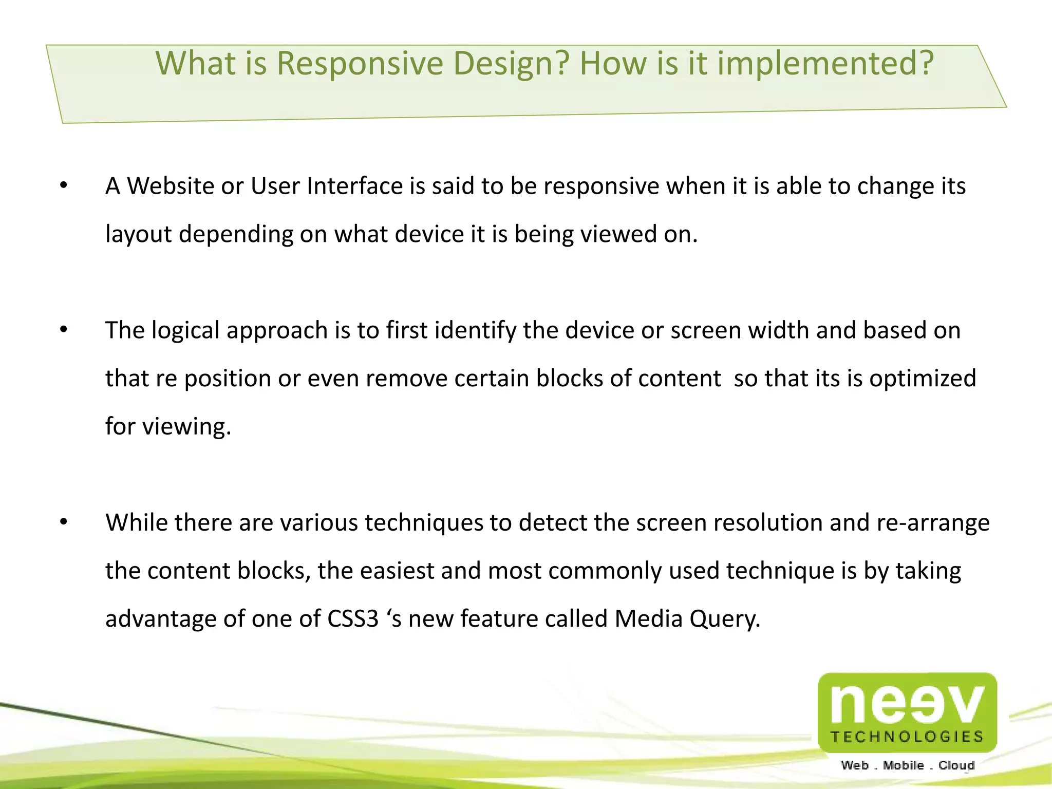
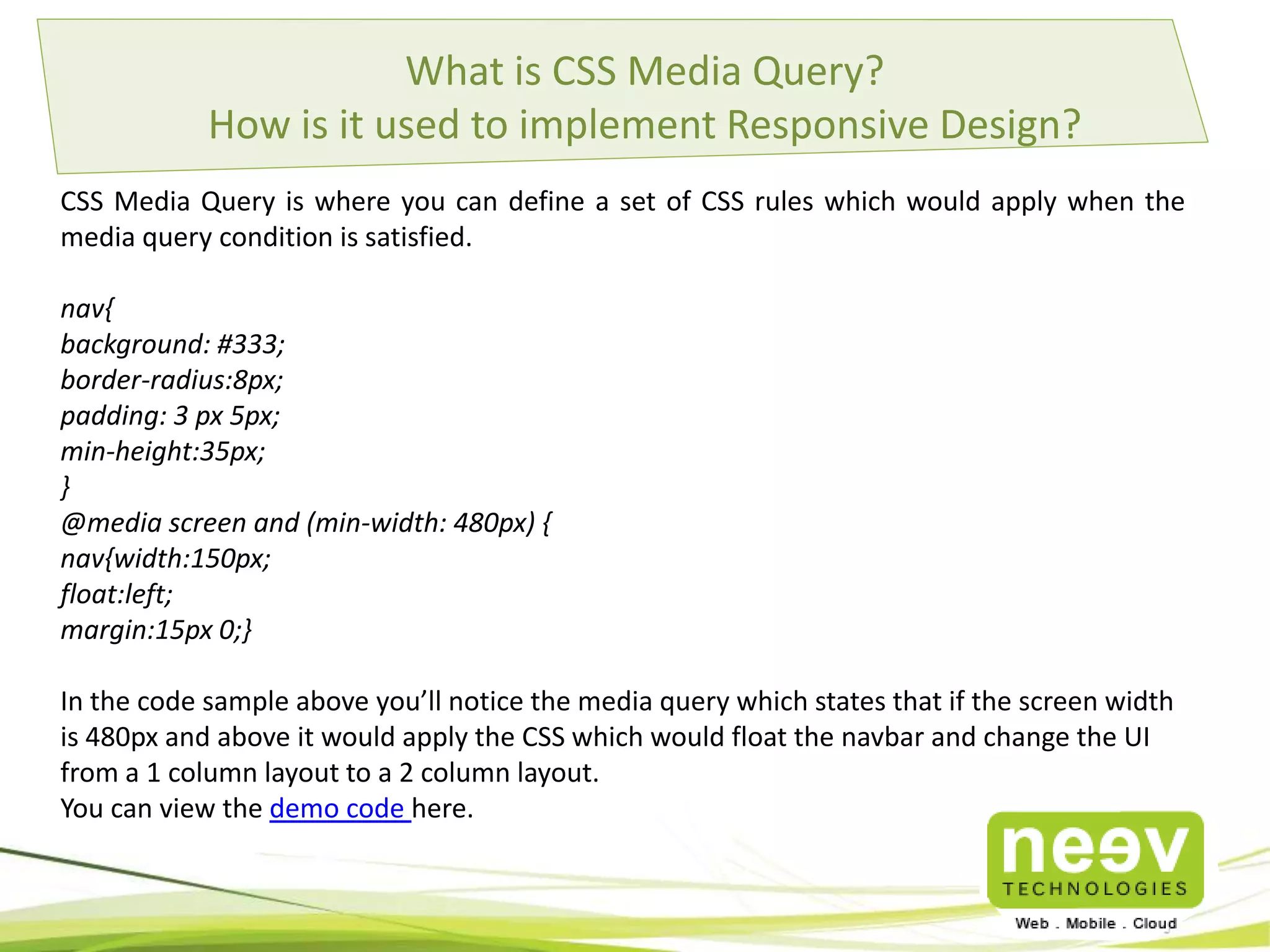
Responsive UI Using CSS Media Query
Magento eCommerce
SaaS Applications
Video Streaming Portals
Rich Internet Apps
Custom Development
250+ team with experience in
managing offshore, distributed
development.
Neev Technologies established
in Jan ’05
VC Funding in 2009 By Basil
Partners
Part of Publicis Groupe
Member of NASSCOM.
Development Centers in
Bangalore and Pune.
Offices at
Bangalore, USA, Delhi, Pune, S
ingapore and Stockholm.
Key Company Highlights
iPhone
Android
Windows Phone 7
HTML5 Apps
Web
User Interface Design and User Experience Design
Performance Consulting Practices
Quality Assurance & Testing
AWS Consulting Partner
Rackspace
Joyent
Heroku
Google App Engine
Mobile Cloud
About Neev
Outsourced Product Development
What is Responsive Design? How is it implemented?
• A Website or User Interface is said to be responsive when it is able to change its
layout depending on what device it is being viewed on.
• The logical approach is to first identify the device or screen width and based on
that re position or even remove certain blocks of content so that its is optimized
for viewing.
• While there are various techniques to detect the screen resolution and re-arrange
the content blocks, the easiest and most commonly used technique is by taking
advantage of one of CSS3 ‘s new feature called Media Query.
What is CSS Media Query?
How is it used to implement Responsive Design?
CSS Media Query is where you can define a set of CSS rules which would apply when the
media query condition is satisfied.
nav{
background: #333;
border-radius:8px;
padding: 3 px 5px;
min-height:35px;
}
@media screen and (min-width: 480px) {
nav{width:150px;
float:left;
margin:15px 0;}
In the code sample above you’ll notice the media query which states that if the screen width
is 480px and above it would apply the CSS which would float the navbar and change the UI
from a 1 column layout to a 2 column layout.
You can view the demo code here.
Clients
India - Bangalore USA Sweden
The Estate, # 121,6th Floor,
Dickenson Road
Bangalore-560042
Phone :+91 80 25594416
Neev Information Technologies Pvt. Ltd.
1121 Boyce Rd Ste 1400,
Pittsburgh PA 15241
Phone : +1 888-979-7860
Neev AB, Birger
Jarlsgatan 53, 6tr,
11145, Stockholm
Phone: +46723250723
sales@neevtech.com
India - Pune
#13 L’Square, 3rd Floor
Parihar Chowk, Aundh,
Pune – 411007.
Phone : +91-64103338
Singapore
#08-03 SGX Centre 2, 4
Shenton Way,
Singapore 068807
Phone: +65 6435 1961
For more info on our offerings, visit www.neevtech.com

Responsive UI using CSS Media Query

  • 1.
    Responsive UI UsingCSS Media Query
  • 2.
    Magento eCommerce SaaS Applications VideoStreaming Portals Rich Internet Apps Custom Development 250+ team with experience in managing offshore, distributed development. Neev Technologies established in Jan ’05 VC Funding in 2009 By Basil Partners Part of Publicis Groupe Member of NASSCOM. Development Centers in Bangalore and Pune. Offices at Bangalore, USA, Delhi, Pune, S ingapore and Stockholm. Key Company Highlights iPhone Android Windows Phone 7 HTML5 Apps Web User Interface Design and User Experience Design Performance Consulting Practices Quality Assurance & Testing AWS Consulting Partner Rackspace Joyent Heroku Google App Engine Mobile Cloud About Neev Outsourced Product Development
  • 3.
    What is ResponsiveDesign? How is it implemented? • A Website or User Interface is said to be responsive when it is able to change its layout depending on what device it is being viewed on. • The logical approach is to first identify the device or screen width and based on that re position or even remove certain blocks of content so that its is optimized for viewing. • While there are various techniques to detect the screen resolution and re-arrange the content blocks, the easiest and most commonly used technique is by taking advantage of one of CSS3 ‘s new feature called Media Query.
  • 4.
    What is CSSMedia Query? How is it used to implement Responsive Design? CSS Media Query is where you can define a set of CSS rules which would apply when the media query condition is satisfied. nav{ background: #333; border-radius:8px; padding: 3 px 5px; min-height:35px; } @media screen and (min-width: 480px) { nav{width:150px; float:left; margin:15px 0;} In the code sample above you’ll notice the media query which states that if the screen width is 480px and above it would apply the CSS which would float the navbar and change the UI from a 1 column layout to a 2 column layout. You can view the demo code here.
  • 5.
  • 6.
    India - BangaloreUSA Sweden The Estate, # 121,6th Floor, Dickenson Road Bangalore-560042 Phone :+91 80 25594416 Neev Information Technologies Pvt. Ltd. 1121 Boyce Rd Ste 1400, Pittsburgh PA 15241 Phone : +1 888-979-7860 Neev AB, Birger Jarlsgatan 53, 6tr, 11145, Stockholm Phone: +46723250723 sales@neevtech.com India - Pune #13 L’Square, 3rd Floor Parihar Chowk, Aundh, Pune – 411007. Phone : +91-64103338 Singapore #08-03 SGX Centre 2, 4 Shenton Way, Singapore 068807 Phone: +65 6435 1961 For more info on our offerings, visit www.neevtech.com