Jekyll2026-04-13T05:09:54+00:00https://learnui.design/feed.xmlLearn UI Design - BlogIn-depth articles and tutorials on user interface design, including color, typography, design process, and more.Erik D. KennedyDo What’s Hard To Do In Figma: A Design Manifesto2026-02-21T08:00:01+00:002026-02-21T08:00:01+00:00https://learnui.design/blog/hard-in-figmaThe designs we make are hugely influenced by our tools.
What our tools make easy becomes commonplace; what our tools make difficult remains rare.
If a design has a style that is both rare and done well, that design stands out. It feels fresh.
Inversely, if a design just uses the most readily-at-hand techniques our tools offer, it feels boring. I think it’s no accident that “boxy” is such a common complaint of clients. Rectangular images and rectangular textboxes, wrapped in rectangular containers? And you’ve done nothing to distract us from this fact? Sorry, you need to make it pop 😉
But if you, as a designer, want your designs to stand out, you should seek to use techniques and styles that are difficult in prevailing design tools. Perhaps the most simple way to phrase it is this:
Do what’s hard to do in Figma.
There are many levels at which you could take this advice.
For instance, by looking at what Figma makes easy, you could look for ways to slightlyspice up a design’s visual appearance, while still remaining in Figma.
So what does Figma make easy? For starters:
Rectangular text boxes with uniformly styled text
Rectangular images
Rectangular containers
And when we try to get one step more interesting than this, where does that lead us? Well…
Instead of uniformly styled text, you could highlight a word by way of changing fonts.
Instead of rectangular images, you could crop with an organic shape – while allowing some of the image to “spill out” from its container!
Instead of rectangular containers, you could make your section divider mimic a material that fits your brand.
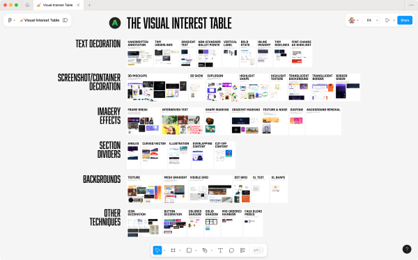
These examples are all from the Visual Interest Table, a database of techniques for spicing up a design. It‘s included as a resource in Landing Page Academy, my course on designing beautiful, high-converting landing pages.
Of course, the above techniques are still readily achievable in Figma. If we wanted to move farther afield, we could look at what‘s impossible or virtually impossible in traditional vector editors.
And, interestingly enough, many of the techniques that are impossible in Figma are, at this moment, becoming dramatically easier, thanks to AI. We‘re on the threshold of the most massive design tool and workflow shift of the last few decades, and now is a particularly advantageous time to explore what‘s freshly possible.
In that spirit, the rest of this article is a handful of things that (a) are quite hard to do in Figma, and (b) that you may reasonably consider exploring adding in your own designs.
(Are there more ways than these 10? Of course there are. But in enumerating, one makes less intimidating. Enjoy ✌️)
1/ Shaders and WebGL effects
A previously fairly-obscure technology, shaders are a way to create performant code-based drawings and animations to an HTML canvas element.
AI and new specialty tools are democratizing the ability to work with this technology.
Because the web is 2-D first, 3-D assets have always required complex specialty tools, like Blender. Now, AI-based tools (Meshy, Spline) are promising to make this easier – and, for an even quicker prototype, simply request a 3-D style from an AI image generator.
3/ 3-D front-end effects
As noted above, 3-D is a second-class citizen on the web. Nonetheless, with CSS and JS, you can skew, rotate, and move elements in 3 dimensions. In the broader context of the web, why do we hardly ever see these things? Perhaps because they’re all but impossible in Figma! A designer must think outside their design tools in order to even consider these effects.
Because of this, the bar is low. Even the most vanilla of 3-D effects can turn heads and looks fresh.
Preferred tool: designing with code in-browser
4/ Isometric illustration
Isometric illustration is the baby brother of true 3-D. It’s not easy to do in Figma, but, since there is no depth to it, it’s at least possible. That being said, I eagerly await an easy & powerful isometric-native tool.
3-D and animation are both “hard in Figma”. Put them together, even more so. Blender (open source) and Cinema 4D are the industry standards here, but I’ve not gone down this rabbit hole yet, so I don’t personally have a recommendation 🤷♂️
6/ Front-end animation (SVG or HTML)
You don’t have to master Blender to include bold motion effects in your site. If what you want to animate can be created in Figma, then it’s almost certainly animatable via HTML – or, lesser-used but certainly powerful - SVG.
Props to Josh Comeau for his Whimsical Animations course, which turned me on to SVG animation. With SVG, you can draw in Figma, export as an SVG, and then animate in code – via LLM or by hand.
Preferred tool: Figma for static design + coded animations
7/ Custom video
As opposed to stock video, which is one-size-fits-many, there’s a certain proof-of-work in having a video made for your site only. There are many examples of this, and it’s by no means a rocket science-level example, but it’s worth calling out as Hard To Do in Figma.
I’m sure there are AI-based tools for e.g. inserting your product into a short video, but I’m not sure the leading workflows. Leave a comment if you are, and I’ll update this 🙂
8/ Custom photography
What photo wouldn’t belong on any site except yours? That’s a custom photo.
Even though this is perhaps the oldest, most basic technique on this list, high-quality, on-brand photos still feel under-utilized! Perhaps it’s because you need basically professional-grade photography to actually look sharp.
Here are a few of my favorite examples:
9/ Custom illustration
There are a number of places where illustration shines relative to photography:
Friendlier brands
More abstract products
Cohesive and unique visual styles
Again, quality matters. And while basic illustration isn’t rare in Figma, next-level art skills are.
10/ Front-end effects
This is a catch-all for minimal-code effects that can make a big difference. Think creativity with respect to:
Hover effects
Scroll effects
On-appear animations
This category sort of blends into 3-D front-end effects and front-end animation, but feels worth calling out on it’s own. To all the parallax effects and cutesy hoverstates of the web, I salute you 🫡
Where to from here?
So yes: I view design trends through the lens of supply and demand. What is commonplace becomes boring. What is rare (and well-done) turns heads.
Through that lense, the implication is obvious. We’re at a tipping point right now. Within the last year – or even the last few months – many of the techniques listed above have become dramatically easier and more accessible to designers.
Yet, (a) realizing this and (b) executing these techniques on-brand and at-quality is not going to happen overnight. There’ll be a lag, and in the interim, I believe individual designers have an opportunity to create things at a much higher level than they could’ve a short while ago.
(I always try to practice what I preach, so, as a personal project, I’m creating a blog – yes, in 2026… – but with SVG animations, WebGL effects, and AI-generated video that I simply would not have done “the old-fashioned way”)
And, if I missed any techniques, leave a comment below 🙂
Praise for Design Hacks
Loved this email!!! This deserves to be in a ‘how-to content’ hall of fame!
Steven Young Fractional CMO
This is the first time in my life that I truly, completely, incomparably appreciated a newsletter… I (platonically) love you! Seriously, you have the best content ever.
Marika Designer, Head of Branding/Graphics
Design Hacks
Over 60,000 subscribed. No spam. Unsubscribe anytime.
]]>Erik D. KennedyWhere’s the AI design renaissance?2025-09-30T08:00:01+00:002025-09-30T08:00:01+00:00https://learnui.design/blog/wheres-the-ai-design-renaissanceI create and sell online design courses for many folks in tech – designers, aspiring designers, design-adjacent – and one question I’ve gotten a lot over the last two and a half years is: what is AI going to do to design?
I’ve been hesitant to answer too confidently, since things have been moving very quickly, and – as a teacher of design – I fall straight into a trap put so memorably by Upton Sinclair a century ago:
It is difficult to get a man to understand something, when his salary depends on his not understanding it. ― Upton Sinclair
That being said, if the robots are taking all the design jobs any time soon, I also would like to find my next act. So you can take this article with a grain of salt, and feel free to push back in the comments, on X, or via email 🙂
This post attempts to answer two questions:
Will AI take design jobs? If so, which ones?
In light of that, what should designers focus on?
This is a long article. Here are a few theses:
After 2.5 years of insane hype, there’s no evidence that current AI is making the design process faster
Good design comes from a broader process, not a one-off conversation – meaning the one-off chat paradigm is unlikely to generate good design for non-designers
AI architecture means it will continue to be worse at designs that are “out of the training data” – the bold, the novel, designs with very tight constraints
Today, AI design tools show the most promise for personal projects, internal prototyping, and small public projects (with some other constraints)
The current state of things
In 2022, I sent out some then-new Midjourney generations with the caption: If this doesn’t revolutionize design, I don’t know what will.
Three years later, I am surprised to note… there hasn’t been a revolution!
This is particularly notable, since the last 3 years have been a non-stop firehose of AI hype. And yet, so far as I’ve found:
There’s no evidence of massive designer productivity increases due to AI
There no evidence of designer job loss due to AI
I’ve not been able to significantly speed up my overall design process using AI
I’ve not talked to any designers who have significantly sped up their design process
If you had told me in late 2022 I’d be saying these things 3 years later, I would’ve been pretty surprised. “B-b-but - the tools are improving so fast! Your own workflow isn’t even noticeably improved!?”
Don’t get me wrong. I’ve had some incredibly productive moments with AI design tools. But I’ve had at least as many slogs, where I can’t get it to do some basic thing I should’ve done myself 45 minutes ago. And even those productive moments are generally for less important, less business-critical, less live-in-production design stuff.
My hunch: vibe coding is a lot like stock-picking – everyone’s always blabbing about their big wins. Ask what their annual rate of return is above the S&P, and it’s a quieter conversation 🤫
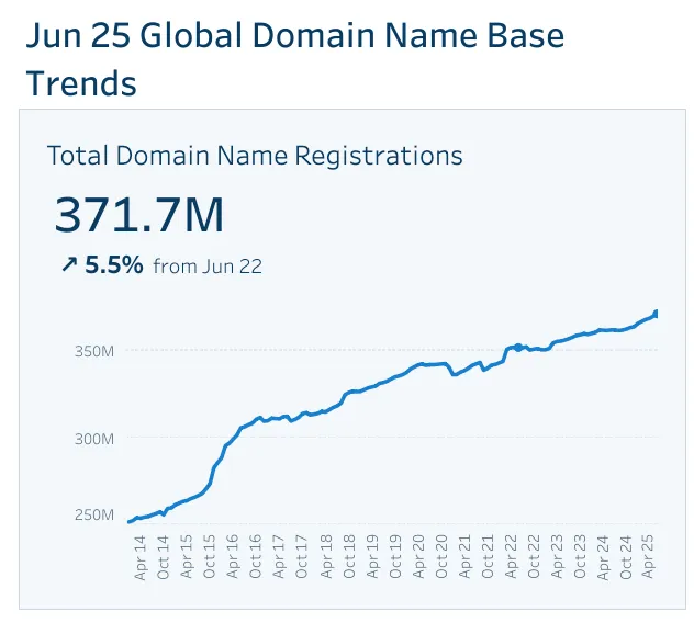
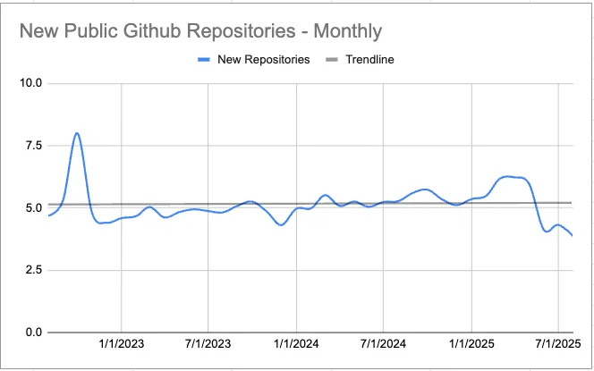
This, in my opinion, is how we end up with a firehose of AI hype, and yet zero signs of a software renaissance. As Mike Judge points out, the following graphs are flat: (a) new app store releases, (b) new domain names registered, (c) new Github repositories.
These are perhaps more dev-centric metrics, but if vibe coding enables less-technical people to publish software… it sure isn't showing!
And while the tech job market is tough right now, this seems more than explainable with:
Elevated interest rates
COVID overhiring that led to post-COVID layoffs
I still haven’t heard of any CEOs who’ve laid off their design team and replaced it with AI. Perhaaaps some folks are hiring more slowly than usual, thinking design will be automated next month? – seems reasonable, no data.
So, despite the deluge of hype, AI design tools aren’t replacing us tomorrow. Maybe… next year?
Design by one-off chat will not work
My take: a lot of designer knowledge is embedded in the design process.
Or, to sound less like a continental philosopher: one-off chats with an LLM are a terrible way for a non-designer to end up with a great design.
Why do I say this? Because one-off chats with a human designer are a terrible way to end up with a great design! Isn’t the classic joke that the client stands over your shoulder, telling you to “make the logo bigger” and “move the button to the right” and “change the shade of blue”? One subtext of this joke is that this changes are not actually improving the design in any real way! If the designer is any good, making the logo bigger won’t actually move the needle.
But if one-off requests aren’t a reliable way to get a solid design, how does good design happen at all?
It’s because all of these conversations are embedded in a larger process, where the designer can contextualize what they’re hearing. I advise all my students to start the process – and every subsequent design presentation – centered around business goals.
I may be in the most left-brained 1% of UI designers, but I start every project with a fluffy lil’ conversation about “how do you want your visitors to feel?”
Why? Because it makes a tangible difference to the output!
I recently received a request from a friend. He made this site in Lovable, but wanted a quote for some actual designer help. Why wasn’t Lovable cutting it? Look and see…
My take: it’s because there’s zero brand here. This is totally bland. But while a client might think “Hm, doesn’t pop”, a good designer will be looking at all the input they’ve gotten up to this point – goals, brand identity, other inspiration the client likes, the business model, etc. – to make a decision on where to go with it.
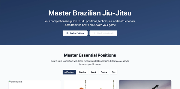
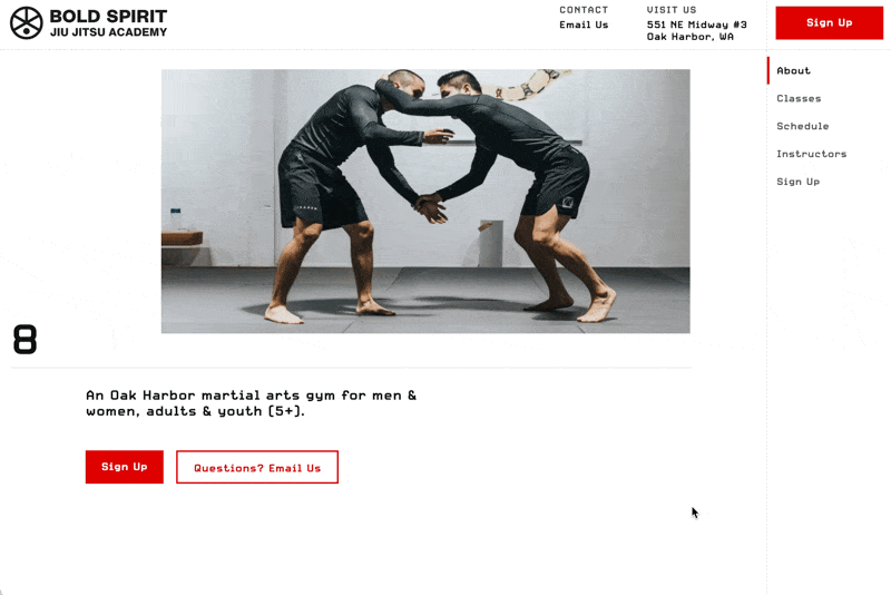
Coincidentally, I designed a site for a friend’s BJJ gym not too long beforehand. Here’s what I came up with:
It pops more, sure. But showing me the Lovable design #1 and saying “make it feel cooler” won’t give you design #2. I have to reverse-engineer that comment. And just as I can’t work miracles with a one-off request like that, no one should expect an AI will be able to either.
So if all AI does is hand clients the ability to make their own logo bigger, is that not just giving them more rope to hang themselves? And if they are successful with it, what are we (designers) even doing here? What are we adding? (This sets a high bar for us designers, but I think we should embrace it)
Now, to be perfectly fair, the retort to this is: what about an agentic AI (coming soon) that LEADS non-designers through the process? K, you’re welcome for the business idea. But even then, we should expect that the longer and more complex the process is, the worse the AIs will do for non-designer customers.
Which is a great segue into AI design limitations…
Designers should do what AI’s architecture prevents it from doing
I realize not all reader of this blog are technical, but I highly recommend to all learning about LLM architecture. Perhaps the first breath of fresh air that I experienced during the onslaught of AI news was after diving into how LLMs work. All of a sudden, so many questions and ponderings about that mysterious thinking silicon became so much clearer. Because LLMs aren’t magic; they’re algorithms.
In short, LLMs are prediction machines. They are trained mostly on the internet, but post-trained on many other special data sets and tasks. Because the best prediction of a common question is the right answer, they frequently give correct answers. Because the best prediction of a sufficiently-rare/difficult question may be a quasi-realistic falsehood, they hallucinate. Where someone can create an easy-to-difficult step-ladder of 10,000 verifiable tasks or problems, the LLMs can post-train and become even smarter.
It’s not that algorithmic improvements won’t happen. They have, and they will. But if you want to know the surest bets of where to focus your design efforts, look to what LLM algorithms don’t do well.
In particular, the farther something is from the median training datum, the harder it is for AI to do. In my estimation, this could be along any axis – an uncommon visual effect, high-touch animations, a pixel-perfect UI, a new interaction paradigms, especially high data density, etc.
AI design will be safe. If you ask it to be bold, it will be bold in a safe, reasonable, well-trod way.
If your design has an opinion, something the median half-decent design would never touch, then the LLMs are already steering away from it. They may help you build it, but they won’t replace you in building it.
They’ll be busy building “slightly above 2025 average”. But in a world inundated with average, what’s great will shine all the more. “Proof of humanity” will increasingly feel like a breath of fresh air in an onslaught of slop.
In a world of generic templates, pre-built systems, and AI-generated designs, visual design is a superpower.
Tools have lowered the barrier, anyone can create. But when everyone uses the same tools, it’s vision and craft that make the difference.
And, for what it’s worth, I’d recommend steering your own designs away from the hallmarks of UI-by-AI: Inter, cards displayed in parallel, everything being 8px rounded, etc. The time to know your brand, know your audience, know the problem you’re solving, and lean way in starts now.
Another axis that AI will start lower on is complexity. It already can one-shot a simple landing page; small tools aren’t hard to build. But it’s difficult to imagine AI doing anything in the “high complexity” column unless it’s generally intelligent (but, at that point, every job on earth is at stake, not simply design jobs).
Complexity
Design
Low
Landing pages
Medium-low
Simple websites w/ some interaction Small tools or extensions
Medium-high
Simpler web or mobile apps
High
Interaction-heavy web/mobile apps Particularly large site w/ many moving parts
A third axis that I think about is “tightness of constraints”. I have a working theory that AI performs best when constraints are loosest.
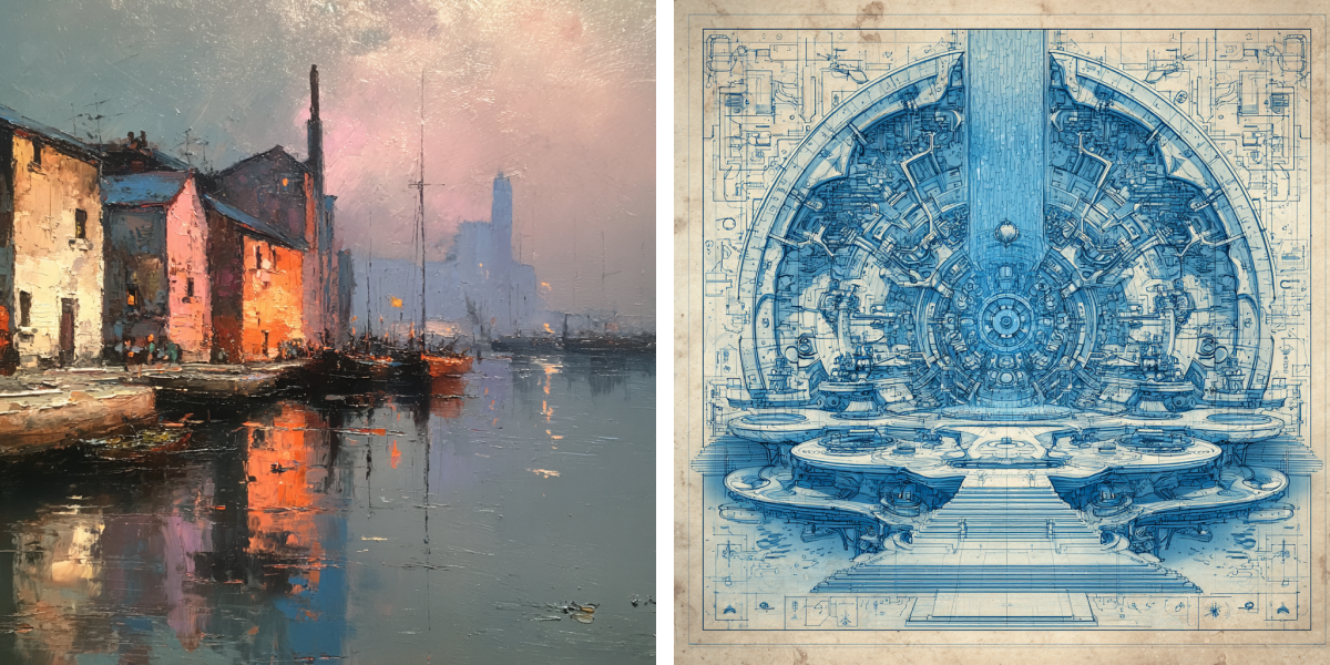
As a simple visual example, note how much better it is at impressionism than blueprints – one is about vibes, the other requires geometric exactitude.
'impressionist painting' vs 'blueprints'. AI nails what's vibes-based, but struggles with the tight constraints of geometric exactitude
Or, a more UI-focused example. Great at backgrounds, bad at logos. Again: one is about vibes, the other requires geometric exactitude.
'abstract dark, techie visuals' vs 'vector logo for quantum computing computing company called 'Superposition Technologies''. Again, AI is good with the vibey, worse with geometric precision
Here are other such constrained design tasks where I see humans being requisite for a long time:
Brand needs to stand out in a crowded industry
Logos with any sort of “cleverness” (very tight constraints around idea, brand, vector work)
High information density
High number of user actions, controls, or interactions
High conversion rate needed (AI might be able to brute-force this eventually?)
Performance (fast load times, all actions feel snappy, etc)
Where should a human designer focus their efforts over however long we remain without AGI? In short…
Focus on what is complex. Focus on what is interdisciplinary. Focus on what is novel. Focus on what is outside the training data.
(Or use AI to crank out basic landing pages for brick-and-mortar and make bank, idc 🤷♂️)
The narrow use-cases where AI is a game-changer
So… what can you design – or even launch – with AI that you couldn’t do before? What’s the diff?
Task-specific AI tools have sped up a lot of smaller design tasks
e.g. background image removal, realistic content generation, layer renaming, etc.
Creating supporting content (images, video, audio) is good – and improving rapidly
e.g. Midjourney, Sora, Suno
Those comfortable with code have a shot at launching small apps or tools (with zero or minimal developer support)
To me, the biggest news is the last bullet. But it has a caveat: “those comfortable with code” 😬
The revolution is kinda here, and it’s definitely not evenly distributed. The people who get the biggest power-up from AI, at least right now, are (1) somewhat familiar with front-end code, and (2) somewhat familiar with backend concepts.
(While I’m specifically referring to the current late-2025 state of things right now, creating out-of-training-data animations and front-end effects may require front-end code knowledge for a long time to come. To anyone who is open to learning more HTML/CSS/JS, I’d bet on it being worthwhile 👍)
Given that, here’s my take on what’s enabled by AI design tools now:
Task
How much does AI enable this?
The downsides, risks, or other considerations
End-to-end web app
❌ Not a whole lot
Likely too complex to vibe-code Potential security issues Potential liability issues
Full mobile app
❌ Not a whole lot
Likely too complex to vibe-code Potential security issues Potential liability issues
Small public webpage or tool
✅ Quite helpful
Probably need some coding knowledge Potential security/liability issues?
Small public plugin or extension
✅ Quite helpful
Probably need some coding knowledge Are you willing to support it?
Personal tool or plugin
✅✅✅ Perfect
Simpler to vibe code No security or liability issues if private
Portfolio
❓ Depends on level of complexity
At high level of complexity, LLMs choke At low level of complexity, why not use a template instead?
Prototype for testing or internal use
✅✅✅ Perfect
So long as it's not hooked up to real data, seems pretty safe
I have tried vibe-coding every chance I can, and the results have been wildly divergent.
✅ THE BEST experiences are when you’re trying to quickly set up a new site or project. I neither enjoy nor am good at this part of coding. Command line and packages and initial deployment stuff… yuck! Why does the AI succeed here? Boilerplate code is common in the training data, code complexity is low, success is easy to verify.
❌ THE WORST experiences are when I keep trying to push a project further along without really understanding (or correcting) the code. It feels like there’s a complexity ceiling to how much you can vibe code before the AI simply cannot understand how to fix its own errors. My gut hunch is there’s some dynamic like this: even if the code is 95% correct and great, the 5% of spaghetti sprinkled in there becomes too intertwined with everything else to easily correct. And at some point, you ask the LLM to do something that it just cannot get right, and you think, “Should I now try to understand these thousands of lines of code, or just start over?”
The sweet spot for designers launching their own projects with AI seems to be:
Small, low-complexity projects…
…with minimal security or liability risks…
e.g. Does the project involve a database that you’d hate to be deleted or have made public? If so, you might want to hire someone who can verify that won’t happen 😎
…that you don’t mind supporting as much as needed
e.g. Do you have paying customers? Do you have 20,000 free users who’ll want you to fix it when the next version of whatever causes bugs?
You won’t be making millions off of these projects, but if you were, you could easily hire a developer anyways 😉
Instead, I’d think about using AI for:
Small public websites/pages/tools - Use these to show off your design skills, add to your portfolio, and get hired (or find clients) 👍
Personal-use projects - Scratch your own itch. Wish you had a browser extension for something? Now you can! Wish you had a website that does X? Now you can! If you don’t publish it, there aren’t security/liability/support issues… and, if you want, you can always invest more later – adding it to your portfolio, making it public, etc.
Design prototypes - It’s never been easy to spin up a working, in-browser prototype of an idea and test it with real users. If it seems promising, then you and your team can spend the resources to design and develop it right. This swaps some steps of the typical design process from the last few decades, and I think we’ll see a lot more of it!
This is where I’ve gotten the most mileage, and certainly what I’d recommend to my students.
My recommendations, all summed up
Here are my recommendations from the article above, put in one place:
Become good at out-of-the-training-data skills. Pay attention when you see a design that feels way beyond AI’s capabilities. What makes it so? Can you do similarly? This includes:
Great visuals
High-touch animations
Pixel-perfect UI
New interactions or interaction paradigms
Learn to work well within tight constraints. Some projects require tighter coordination between many elements, and this seems to be something where AI especially drops the ball:
Brand needs to stand out in a crowded industry
Great logos
High information density
High number of user actions, controls, or interactions
High conversion rate needed (AI might be able to brute-force this eventually?)
Performance (fast load times, all actions feel snappy, etc)
Use the tools (mostly helpful for small and/or internal projects). Sure, everyone should use AI to quickly crop photo subjects from backgrounds. But for revolutionizing workflows, unless you’re a great developer already, AI is mostly helpful for small and/or internal stuff. Hopefully you’re already somewhat familiar with code. Either way, more familiarity will only be an asset.
Feedback appreciated! – I’ve put a lot of research and thought into writing this (but not with LLMs though; I write to be way better than the median training datum 😉)
]]>Erik D. KennedyTechnique Deep Dive #1: Mesh Gradients2025-03-06T08:00:01+00:002025-03-06T08:00:01+00:00https://learnui.design/blog/mesh-gradientsOne of my favorite underused design technique is mesh gradients.
Last month, I launched a mesh gradient generator tool that’s FREE for designers and developers to use. As I combed the web looking for mesh gradients to study, I found some AMAZING DESIGNS 🤩
I wanted to share a few today (with my own analysis). Feel free to bookmark/save any of these sites as inspiration later. I would!
Here are 5 reasons mesh gradients are a powerful & versatile technique:
Oh, by the way: this post was initially sent to my Design Hacks newsletter. Join 60,000+ readers in getting short, original design breakdowns. Subscribe here.
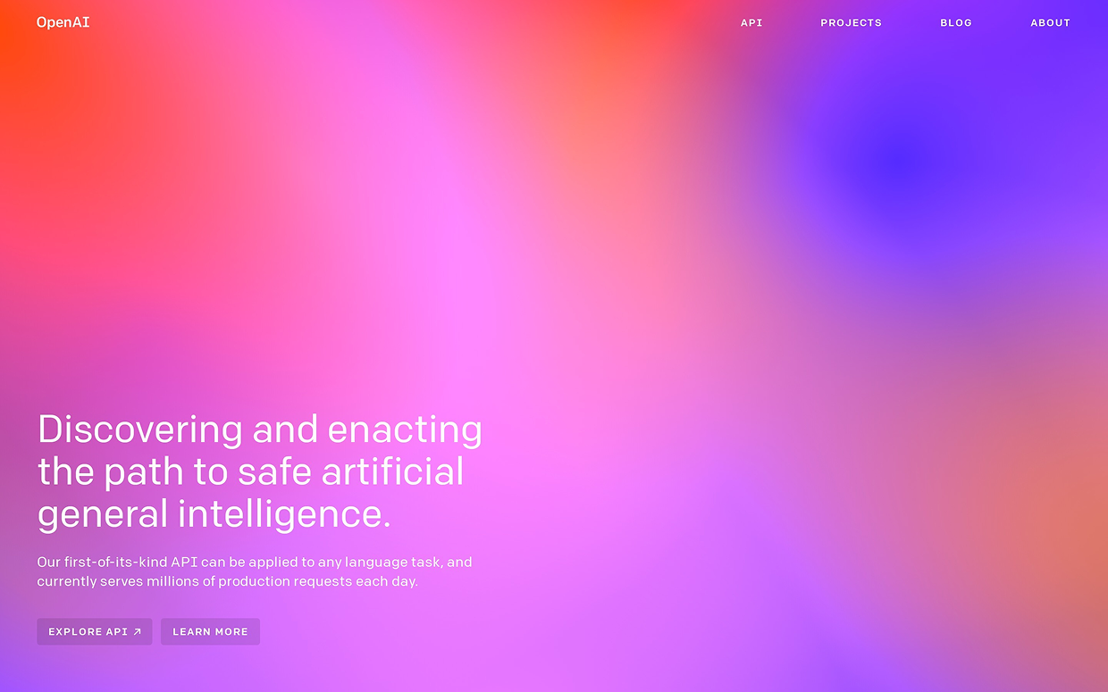
…to the bright, abstract cheerfulness of Open AI’s (old) branding…
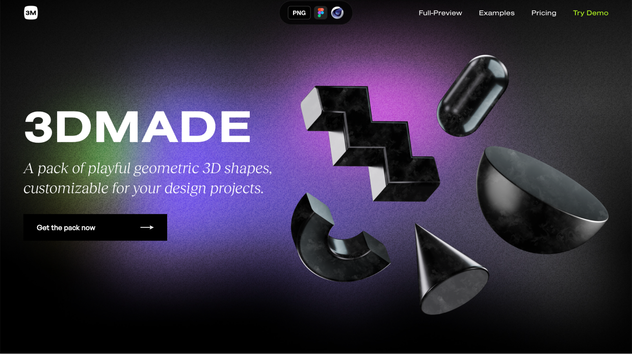
…to the quirky, dimly-lit glow of the 3DMADE site:
Mesh gradients can work across a huge variety of brands.
Dark? Yes.
Light? Yes.
Grainy? Sure.
Pensive? Absolutely.
Delicate? Yup.
Weatherworn and rugged? Totally.
It’s all fair game 😎
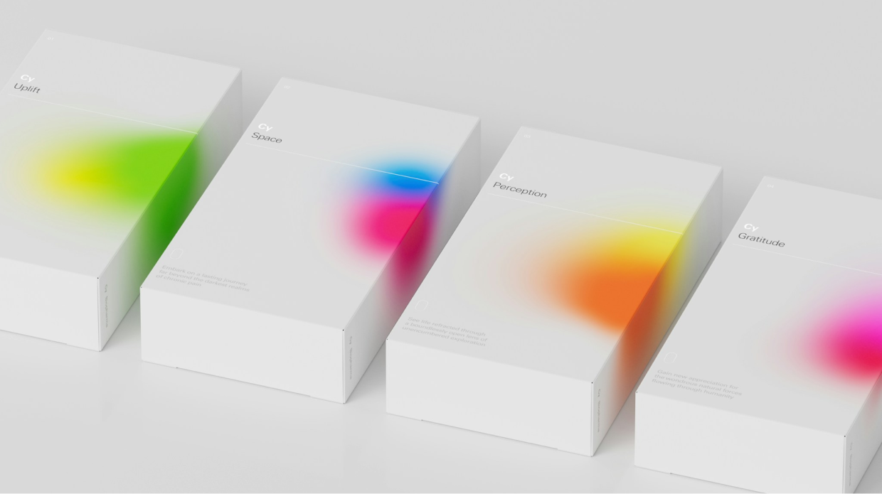
2/ Switch the colors to brand sub-elements
Since it’s pretty easy to swap out the colors in a mesh gradient and still have them ”go together”, you can use them to brand sub-elements of your brand.
Play Studio’s design for Cy Biopharma incorporates different meshes for different products:
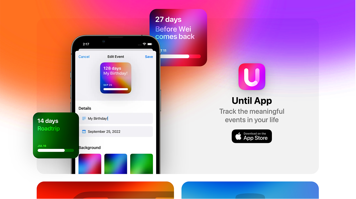
And with the Until app for iPhone, you can set reminders – and choose for each its own unique gradient:
The takeaway: anytime you have multiple sub-elements that can be branded slightly differently, you have a potential use-case for mesh gradients.
3/ Mesh gradients make backgrounds interesting
I’m a huge fan of dealing with design problems one level of abstraction higher.
It’s not “this background is boring! I’ll randomly try stuff until it’s interesting”…
Instead, think: “how do great designs make backgrounds interesting? Which of those techniques is most applicable here? Why?”
And one way is… 🥁 mesh gradients!
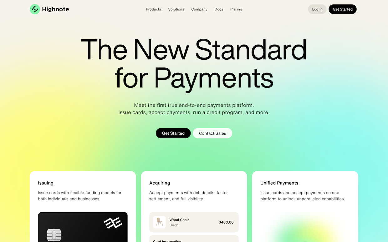
Highnote’s above-the-fold looks beautiful with a mesh:
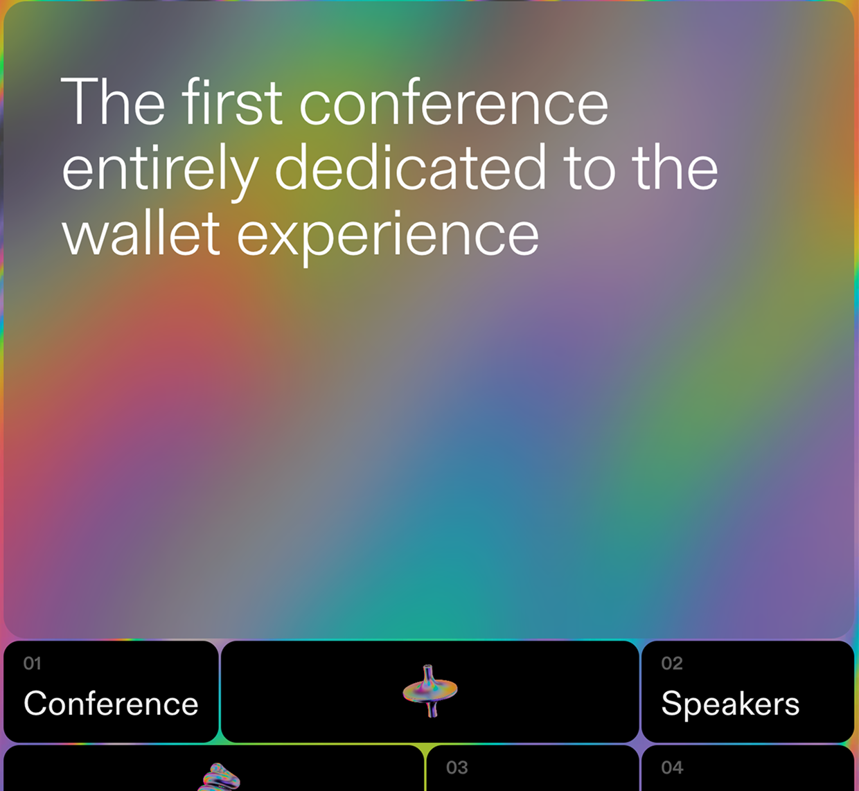
And here’s last year’s quirky WalletCon site.
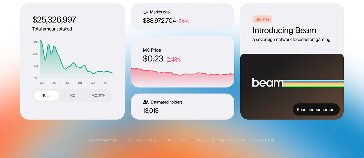
Below is a airy bento background from Merit Circle.
If the idea of “solve the design problem one level of abstraction higher” resonates with you, you will really like my courses:
Landing Page Academy: about creating visually-stunning, high-converting landing pages
Those courses where I teach everything I know about visual design techniques and frameworks 💪
4/ Mesh gradients can be used to highlight other elements
A good visual designer is like a magician. They direct your attention without saying a word. You looked where you were supposed to look, when you were supposed to look – and you didn’t even know it.
This means a good visual designer must have techniques to draw attention to certain elements. Again… mesh gradients, reporting for duty 🫡
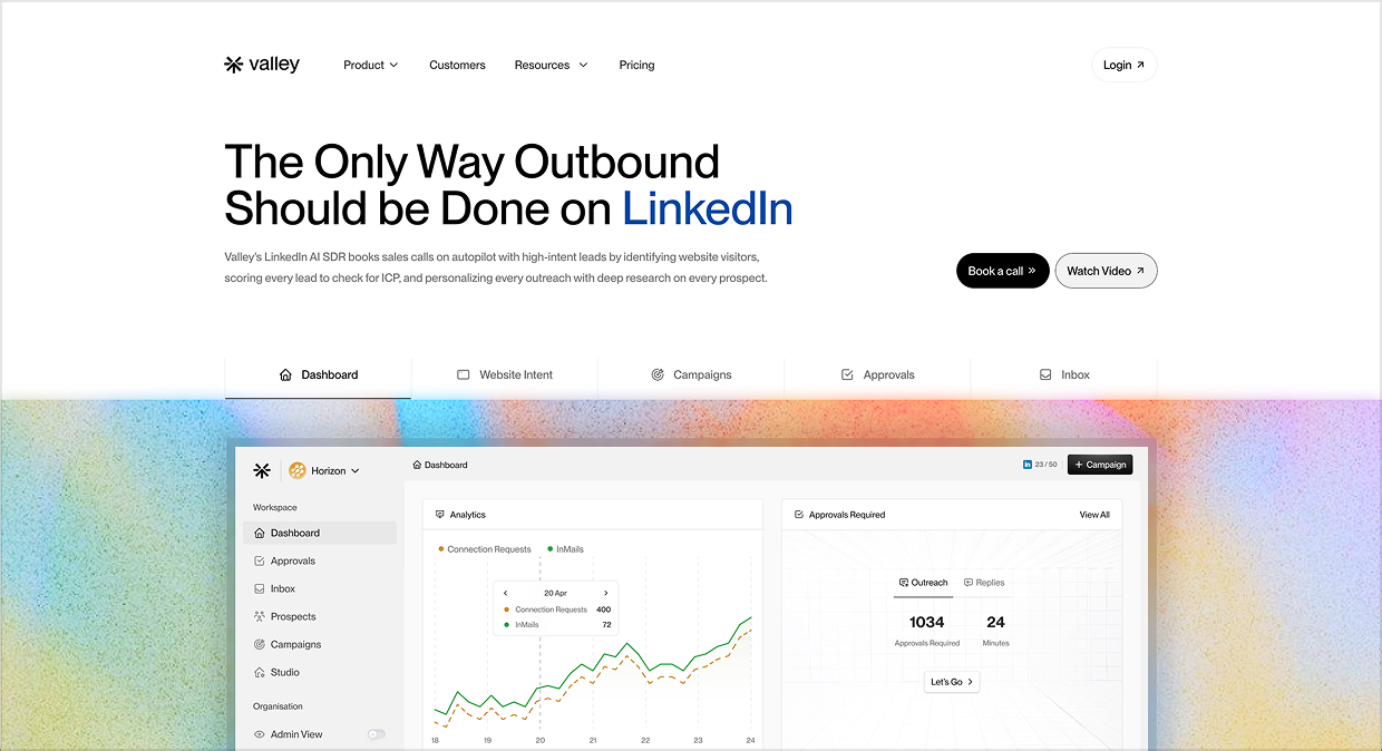
Valley uses this technique well to give their UI screenshot a glow-up 😘
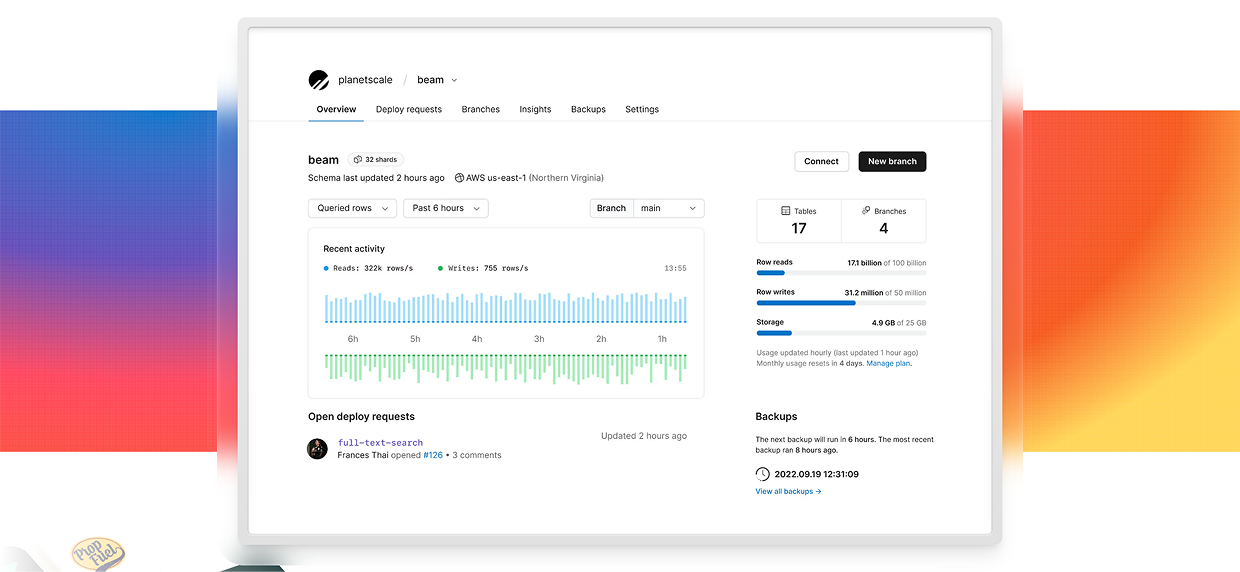
The previous design of Planetscale did the same thing 😍
And one more iOS Design Kit screenshot that is no longer live (but lives forever in my inspiration folder):
5/ Mesh gradients are ripe for animation
OK, final point in our deep dive: it’s super easy (relatively speaking) to animate amorphous blobs of color.
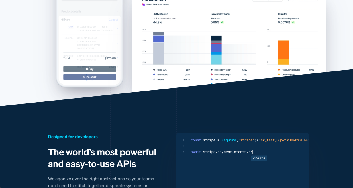
It wouldn’t be a design roundup without a Stripe screenshot, eh? But don’t look at me – I don’t make the rules! 😉
Now “Mesh gradients” is one of the DOZENS of techniques from Landing Page Academy’s database of visual design techniques to spice up landing pages – the Visual Interest Table. It’s a fantastic resource for those who can already make “clean and simple”, but want to take their designs to the next level.
The Visual Interest Table contains dozens of techniques for adding pizzazz to your designs
For breakdowns on more design techniques like this, subscribe to Design Hacks.
Praise for Design Hacks
Loved this email!!! This deserves to be in a ‘how-to content’ hall of fame!
Steven Young Fractional CMO
This is the first time in my life that I truly, completely, incomparably appreciated a newsletter… I (platonically) love you! Seriously, you have the best content ever.
Marika Designer, Head of Branding/Graphics
Design Hacks
Over 60,000 subscribed. No spam. Unsubscribe anytime.
]]>Erik D. KennedyCreating a Standout Design Portfolio: The Ultimate Guide2024-03-29T08:00:01+00:002024-03-29T08:00:01+00:00https://learnui.design/blog/portfolio
Let’s start with the facts: (1) the tech industry isn’t booming like it was a few years ago, plus (2) there are a ton of UX bootcamps out there, and (3) they’ve flooded the market with beginning UX designers looking for jobs.
This means it’s quiiite a bit harder to find a UX/UI design or product design role than it once was 😬
So how do you design a portfolio that stands out from the crowd and gets you hired?
I’ve created this series as an answer to that question. My aim is that it’s the best (free) design portfolio content on the web. (If there’s anything better, leave a comment below 😎)
How this portfolio series is organized
This guide is multiple parts, so let me give you a brief tour, and you can skip around as you’d like.
The 4 most-common mistakes in design portfolios. This is the best place to start. First, we’ll cover why design managers pass on so many portfolios. If you can avoid these mistakes, you’re already doing great.
Creating a great portfolio home page. Next, we’ll break down best practices for your portfolio homepage, from the above-the-fold experience to the very bottom of the page.
Writing a solid portfolio case study. Then, we’ll move on to the dreaded case study! But don’t worry – I don’t recommend writing an in-depth process essay here. Quite the opposite, and it may save you work.
From homepage to project case study, I'll send you 30 (illustrated) techniques for spicing up your portfolio.
Practical design tutorials. Over 60,000 subscribed. One-click unsubscribe.
]]>Erik D. Kennedy37 Easy Ways to Spice Up Your UI Designs2022-07-11T08:00:01+00:002022-07-11T08:00:01+00:00https://learnui.design/blog/spice-up-designsEver been working on a design that feels too plain? Let’s look at a few dozen simple ways to spice things up. Get ready to bookmark this page, because you’ll want to reference this list in the future. It’s unbelievable how many incredible pro-level designs feature solid foundations plus a few techniques listed below.
Every design has a background. Let’s start with some ways of making them a bit more exciting.
Angled Background Transition
Instead of using a “boxy” horizontal background transition, try an angled background transition to add a bit of extra life.
(Note this one also cuts off the product image – a Pocket Cut-Off – adding further interest)
Curved Background Transition
If the style of your website works well with soft shapes, this is another way to skip the ordinary flat background transition.
In this example the title sits across the background transition, which further adds interest.
Tilted Highlight Shape
It’s not difficult to add a shape behind an element and tilt it slightly. But especially if it’s colourful, it adds a lot of character to what could otherwise be an ordinary layout.
This example uses a gradient fill for the background shape, which helps add even more visual flair.
Background Highlight Shape
Sometimes you have a container that blends into the background and you don’t want to put a border around it. Try adding a shape behind the container so that it stands out more.
You could go geometric (above) or textured (below).
Play around, but make sure to find something that matches your brand or motif.
Icon Highlight Shape
Coloured shapes behind icons can reinforce brand colours, reinforce the meaning of the icon, add a bit of variety to an otherwise ordinary grid, and more.
These simple splashes of color add a ton to this design.
Subtle Pattern as Background
To make container backgrounds more interesting (without distracting from the content), try adding a subtle pattern.
Ideally, the pattern matches your brand 👍.
Subtle Lines as Background
Using lines – or other vector shapes – as a background are a simple way to add visual interest.
In this example diagonal lines are used, but any pattern could work as long as it’s not so busy that it distracts from the content.
XL text in Background
If you’re tired of hinting at concepts with abstract visuals, why not use words? Large, de-emphasised background text can communicate without distracting.
Or:
Tip: the larger your words, the lighter a style they should use. Size and contrast are a tradeoff 🙂
Spicing up Borders & Dividers
Be careful not to use too many – or too heavy – of borders. But when you have borders, remember: they can be an opportunity to add style to your design and further reinforce your brand.
Dotted Border
A dotted border around something can make it feel visually lighter and more textured.
In this example the dotted border is used well to reinforce the idea that the shape on the left is in the background.
Dotted Divider
A dotted divider doesn’t separate two sections as much as a solid line. This can be useful if you want those sections to feel like they belong together.
Because the contrast in the above example is so low, it adds flair without distracting from the content.
Double Border
To further add emphasis, a double-border can really set content apart from the background.
In this example, the extra white border helps the form really pop against the background. It’s an ever-so-slight skeuomorphism.
Gradient Border
A gradient border, especially if the colours are vibrant, sends a strong message: whatever is inside this border is exciting, important, or both.
This is a good way to reinforce brand colours without using up extra space.
Bevelled Border
This is a subtle one, but a border designed this way looks as if it’s “catching the light” on a couple of points around its border. This is an effect often seen on pieces of metal with a bright edge.
In this example the element uses a coloured gradient on the edges, instead of just white.
Hand-Drawn Border
Not everything on a website or app has to be drawn by computers. Borders that look hand-drawn can add a lot of character to a design, with not much effort.
Patterned Border
Repeating patterns can make good borders for containers. The extra texture draws the eye, and helps highlight whatever content is inside.
In this example the patterned border is only applied to the left edge of the container, but it does a good job to make the content feel important, especially because it uses stripes, which are common visual language for warnings.
Thick Transparent Border
A large border around an element, set to a lower opacity, helps to highlight, structure, and contrast an element with its background. Importantly, it’s visually lighter than an opaque border.
In this example the semi-transparent border around the screenshot uses a background blur, which makes for an interesting effect as it passes over the background colour transition.
Fading Borders
Add a colourful border. Then duplicate it, make it slightly larger, and lower the opacity. Repeat artfully, and you get an interesting fading depth effect.
This example uses the effect well to give the impression of a pulsing light behind a button (with a Dotted Border for good measure).
Spicing Up Shadows
In this section, we won’t be talking about your typical box shadows. Instead, we’ll look at how the concept of a shadow can be played with to add visual interest.
Floating Shadow
Most drop-shadows assume that an element is lying flat on the background of the website. With floating shadows, it is assumed that the website background is a plane stretching towards the horizon, and the element is floating above it, casting a shadow that is below, but separate from the element.
The floating shadows below each author image are paired with a Tilted Highlight.
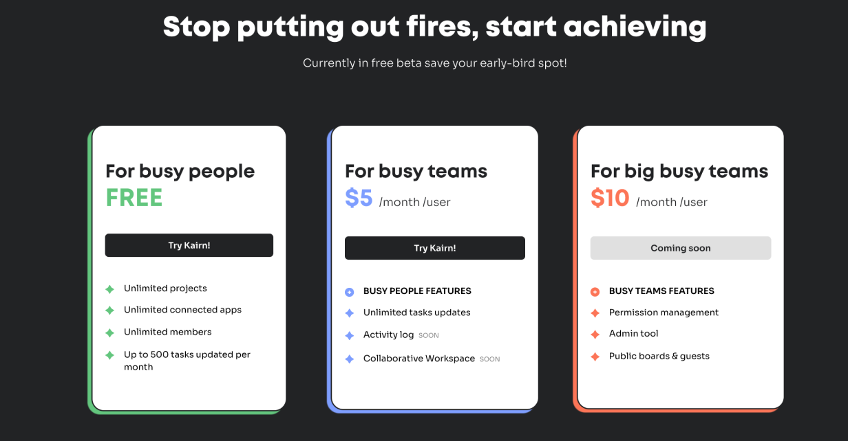
Solid Shadow
Drop shadows need not be blurred. You can have a “shadow” that is an offset shape of the same size as the container.
The coloured shapes behind these product tiers help to reinforce their differences, and make the whole section feel more exciting.
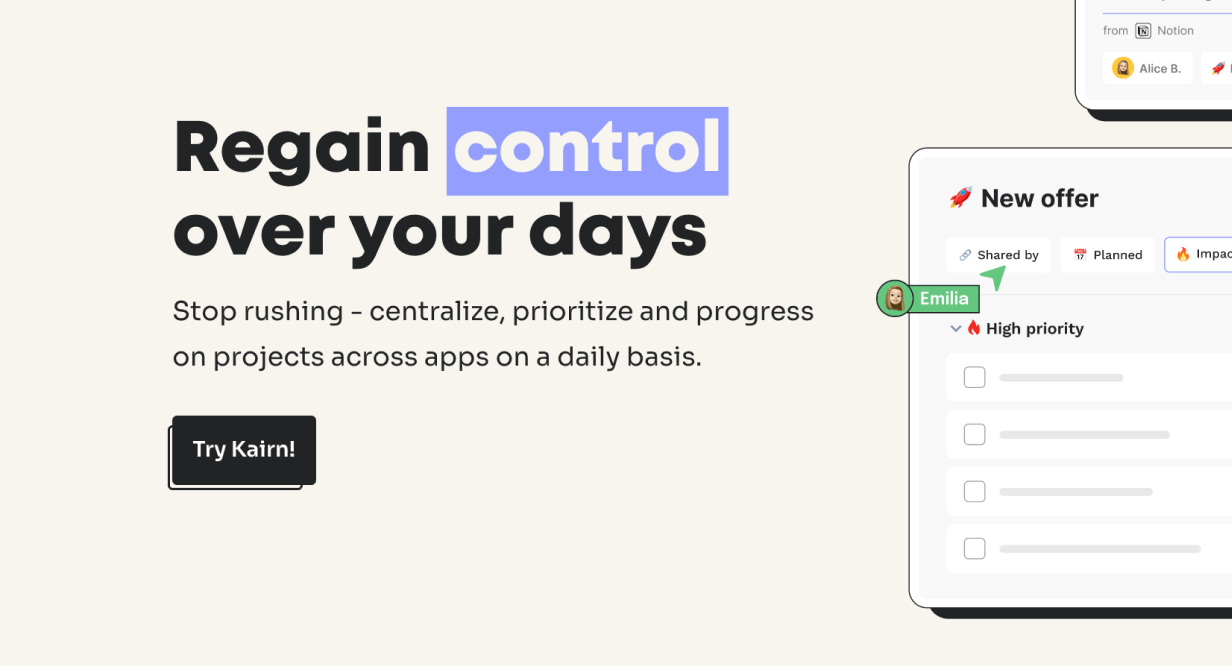
Outline Shadow
Similar to the previous technique, you can have an offset outline that functions as a shadow. Look at the “Try Kairn!” button below.
Drop shadows can be made of patterns. This is a good way to highlight an element because the texture grabs the eye.
Note that this pattern forms a motif with the space-filling patterned tiles used elsewhere.
Spicing Up Text
It might feel like text has less opportunity to provide visual interest, but there are a number of techniques to add flair with typography.
Layered Text
Interweaving text and imagery is a powerful technique to make the two really feel like they belong together.
This works best for titles, since the partially obscured text can still be read because of its size.
Inline Imagery
Adding icons, illustrations, or small visual elements in text can be quirky and unique.
Elizabeth Goodspeed has done a fantastic job compiling many such “nouveau rebuses” on twitter, and it’s well worth the look.
Interesting Bullet Points
Bullet points can be a bit boring. Try replacing them with more interesting (on-brand) imagery.
Bonus: bullet points are a great place to use a motif.
Thick Underlines
Standard underlines on the web are thin, and are often used for links. Thicker underlines like this are an opportunity to use brand colours, and help to highlight certain words more than a standard underline would.
They can be big and bold:
Or subtle and lighter:
Font-Change as Highlight
This method is gaining in popularity in some slightly quirkier sites. It adds emphasis to the switched-out word or phrase.
You already use bold and italics to emphasize certain text. But have you ever used a more extended or condensed width?
In the above example, the text width of each word is animated for an even more interesting effect. Worth checking out!
Other Techniques
There are a handful of other great ways to add flair to your design. Here’s the rest of them.
Dot Grid
Dot grids have become an easy way to add some visual excitement to a page. They add texture, they’re easy to create, and they can be used to “fill out” a space in the page grid. Because it’s a grid of dots, they’re not too visually heavy, as you’d find with a solid block of colour.
Bend the rules of design by having content spill out of its container.
In this example the text on the left is following the rules, and the imagery on the right is getting excited and spilling out of the container. It signals energy and playfulness.
Hand-Drawn Elements
Many websites could benefit from a human touch. Hand-drawn elements are one simple way to add this. They give the impression that someone has taken a pen and drawn on the website.
Note how the hand-drawn examples match the vibe of the product. Debugging is to code as editing is to text.
Enter the Third Dimension
If you want a retro sci-fi look, a fading gradient can be used to give a depth effect to a container.
In this example it almost looks like the blue container is flying towards you, which helps to promote the content.
Offset Background or Border
This is another way to subtly break the rules in interesting ways. An element’s border normally sticks to the edge of the element. But if you offset that border by a little, it can really grab the attention. This is also an interesting way to add depth effects.
Sometimes you don’t need to show the whole image (or you don’t have space). This method of cutting off imagery suggests that the images continue behind the next section of the website.
Duplicating a container and making each copy smaller can give an impression of fading into the distance. But, unlike shadows, it keeps everything feeling sharp.
Containers don’t have to be rectangular. That’s what’s easiest in HTML and CSS, but if you break that rule it can help a container stand out a lot.
This container is all over the place, but that just grabs the viewer’s attention even more – and matches the 5 features listed at the bottom.
Tilted Element
Clever use of shadows, and potentially even warping the shape of elements, can make them look as if they’re “tilting” in some direction.
In this example the white squares look as if they’re tilting a little to face the top of the website.
Visible Grid
Most websites have a hidden structure that guides the layout. Instead, try making it (subtly) visible.
Simple and satisfying.
That wraps it up. What techniques do you see out there that we missed? Leave a comment below 😎
Watch me do a UI project step-by-step
I’ll walk you through every part of a UI project — just like I’ve done for everyone from Fortune 100 companies to Y-Combinator startups.
Practical design tutorials. Over 60,000 subscribed. One-click unsubscribe.
]]>Erik D. KennedyIdentifying Fonts: the Complete Guide2022-03-18T08:00:01+00:002022-03-18T08:00:01+00:00https://learnui.design/blog/identifying-fontsOne of the most practical resources a UI designer can have is a personal font database – names, images, and notes of fonts you’ve liked over the years. The more fonts you know about and recognize, the quicker and more effective you will be at choosing typefaces for design projects.
There’s absolutely no substitute for having a good working knowledge of fonts.
But in order to do this, you need to be able to identify fonts in the wild. Fortunately, this is straightforward. Click on what you’re starting with…
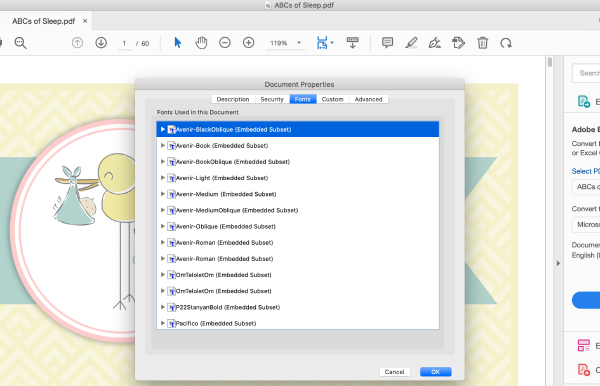
When a font is embedded in a PDF, it’s usually straightforward to identify it:
Open the PDF with Adobe Acrobat Reader (free at that link)
Click the File menu
Select “Properties”
Go to the “Fonts” tab
All fonts embedded in the PDF will be listed there
Every font in the whole PDF is listed here!
In the case that this method doesn’t work, you’ll have to resort to an image method.
How to identify a font in a mobile app
Here are a few ways to figure out what font is in a mobile app:
Visit the corresponding webpage for the app and use the web methods
Take a screenshot of the app and use the image methods
How to identify a font in an image
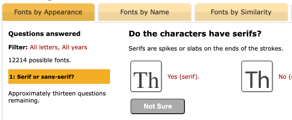
1. First choice: Identifont Quiz
✅ Good if: you have many sample characters
❌ Bad if: you can only see a few letters
The brilliant quiz at Identifont is like playing 20 questions, but only about fonts, and also, you’re playing against a huge and flawless database: if it knows about the font in question, it will correctly identify it.
That being said, their database seems to lack a bunch of common free fonts. In addition, it will often ask questions about more obscure characters (e.g. 4, $, ?) that you don’t have in your sample.
Still, this is one of my first stops.
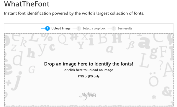
2. Second option: AI font identifiers
✅ Good if: you have a clear, head-on image of the font
❌ Bad if: you have a fuzzy, small, or skewed image of the font
Try both Font Identifier and WhatTheFont (there are other options; they typically have far worse user experiences).
Both of these tools claim to search over 100,000 fonts – but, in my experience, they have some gaps. And the AI algorithm isn’t perfect – you might have a perfectly clear image of some text, and the correct font is still the third result.
So these are best used in combination with each other and Identifont.
3. Final choice: Font identification forums
✅ Good if: you have a short sample of text that’s truly a stumper
❌ Bad if: you haven’t tried all the above methods
The WhatTheFont forum and DaFont forum hosts a bunch of type mavens who hand-identify scores of fonts a day, sometimes within minutes.
However, use these as a last resort – it’s poor form to post something if you haven’t already tried every other avenue.
The folks here know enough to say if you’re looking at custom lettering or a pre-existing font too – which no other solution can do. Extremely impressive level of knowledge 👍
Other font options
Even if you can’t ID a font spot-on, you can often find many similar options to use for your own projects. To those ends, I’ve written about free alternatives for popular fonts like Circular, Proxima Nova, DIN, and more.
If you want to see how I incorporate typography – as well as other design elements – in a full app redesign, check out below.
The Top 10 Free Fonts for UI Design
Get a PDF of the 10 best free fonts for web/mobile app design (including which free fonts not to use).
Practical design tutorials. Over 60,000 subscribed. One-click unsubscribe.
]]>Erik D. Kennedy15 Tips for Better Signup / Login UX2021-06-22T08:00:01+00:002024-06-19T00:00:00+00:00https://learnui.design/blog/tips-signup-login-uxOK, I hate long intros, so: this is a checklist of some of the most important UX tips for creating usable signup and login forms. It’s based on my experience looking at hundreds of beginning designer login flows, thanks to my courses Learn UI Design and Learn UX Design.
Let’s get started.
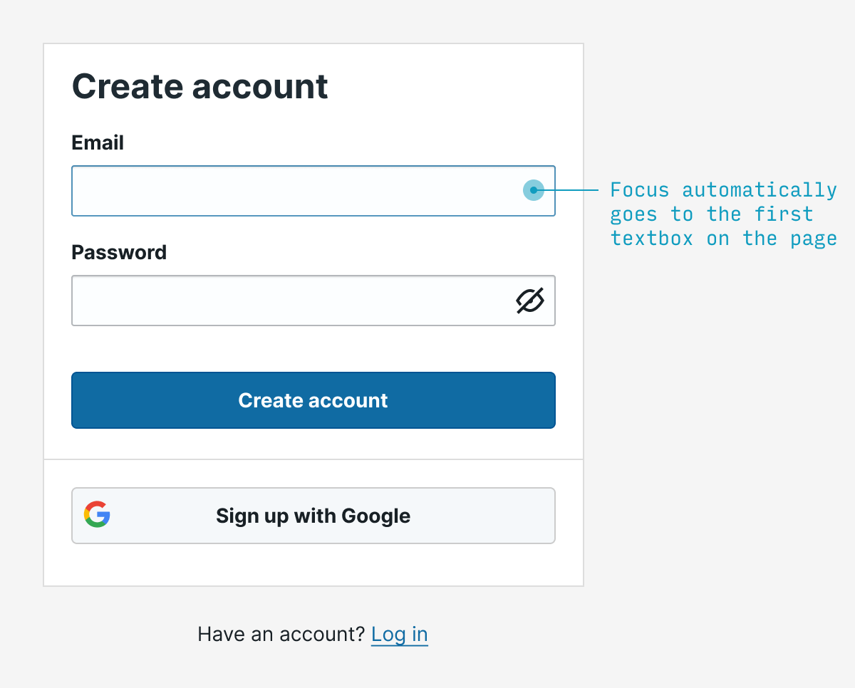
1. Autofocus on the first field
Ironically, the fundamental rule of interaction design is: remove interaction. Remove clicks, remove reading, remove waiting, remove thinking.
An easy example: if you know that literally 95% of people opening a signup form will immediately click into the first field, save them the trouble and auto-focus on it.
(Note that autofocusing can be a jarring to users using screenreaders, so it’s worth testing this experience 👍)
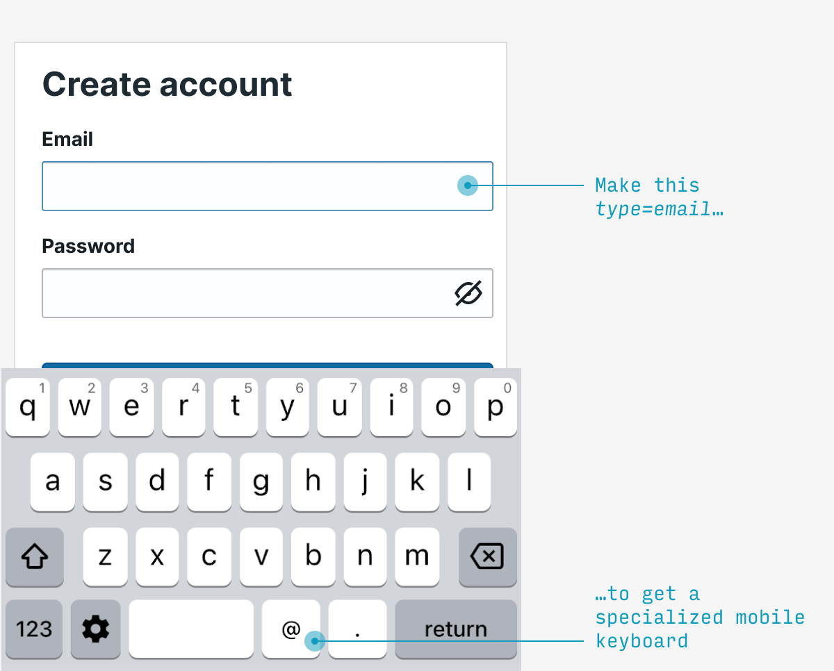
2. Use specialized mobile keyboards
The only things certain in life are (a) death and (b) email addresses have an “@” and a “.” in them. Fortunately, mobile phones have specialized email entry keyboards showing those characters – but you must label your textbox type=email in HTML. This is such a simple change to make mobile users’ lives easier.
Note: also applies to telephone numbers (type=tel), URLs (type=url), and numbers (type=num) in your signup flow.
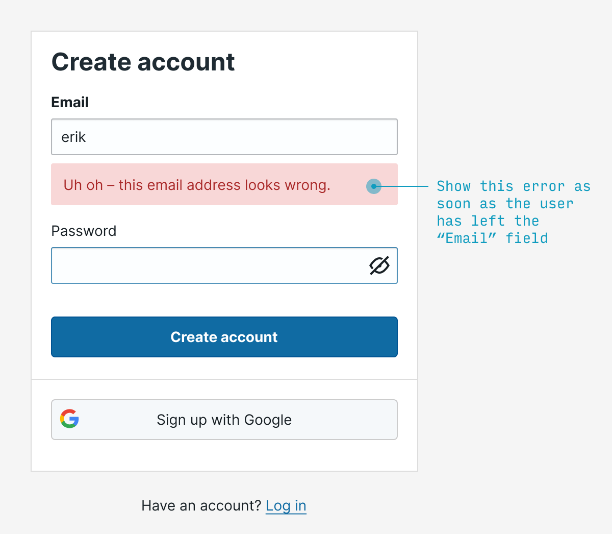
3. Validate fields on blur
Rather than waiting for the user to fill out the entire form before you point out any errors, let them know as soon as your system can tell there’s an error. For something like email, it makes sense to validate on blur (that is, when they focus on another field).
Typically I’d try to catch both blank as well as invalid email addresses.
4. Make labels clickable
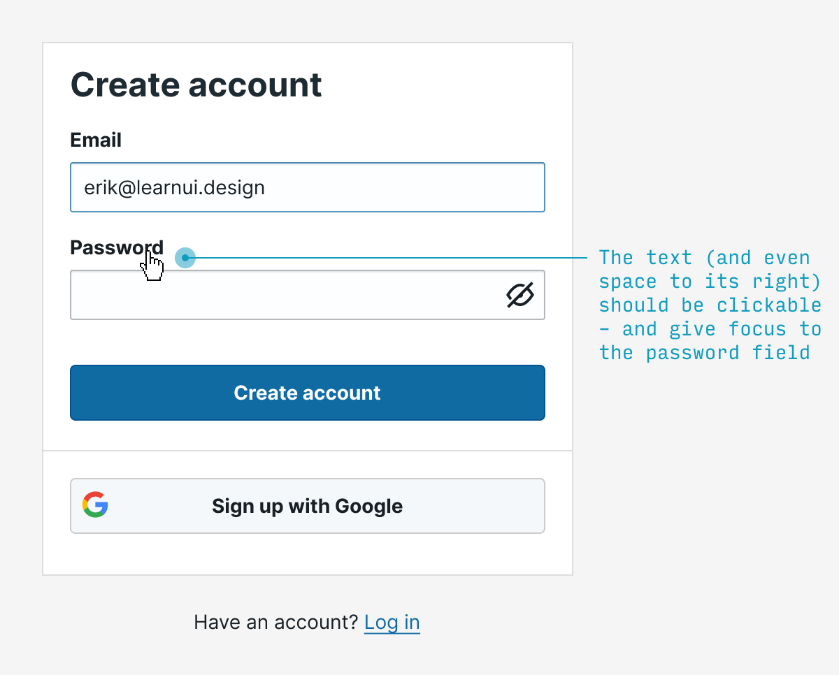
Every single labelled text input you ever create should have clickable labels. It’s a wonder this isn’t done by HTML by default, but simply add the input element inside its respective label element and you’re good to go. Not only does this (a) allow me to absentmindedly click the label to start typing, but (b) it also helps me if my clumsy finger accidentally misses the textbox by a bit.
(Accessibility tip ☝️ – screen readers don’t play nicely with input inside label – so also wrap the text describing the input in a separate span with a unique id, then add aria-labelledby="my-unique-id" to the input 👍)
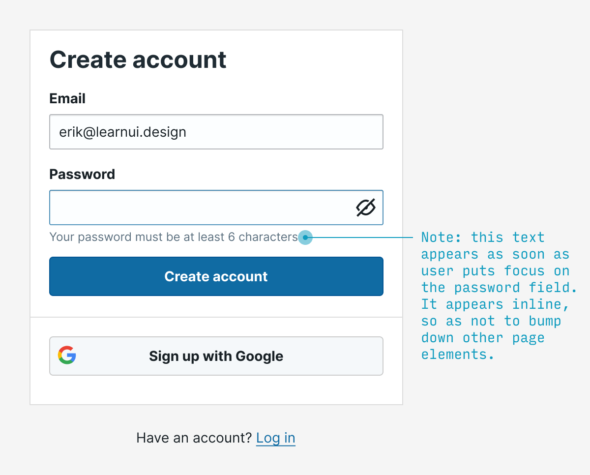
5. Show password requirements when users are choosing a password
No user should have to guess at what the password requirements are. Show them when they’re relevant (P.S. And remove them when they’re not).
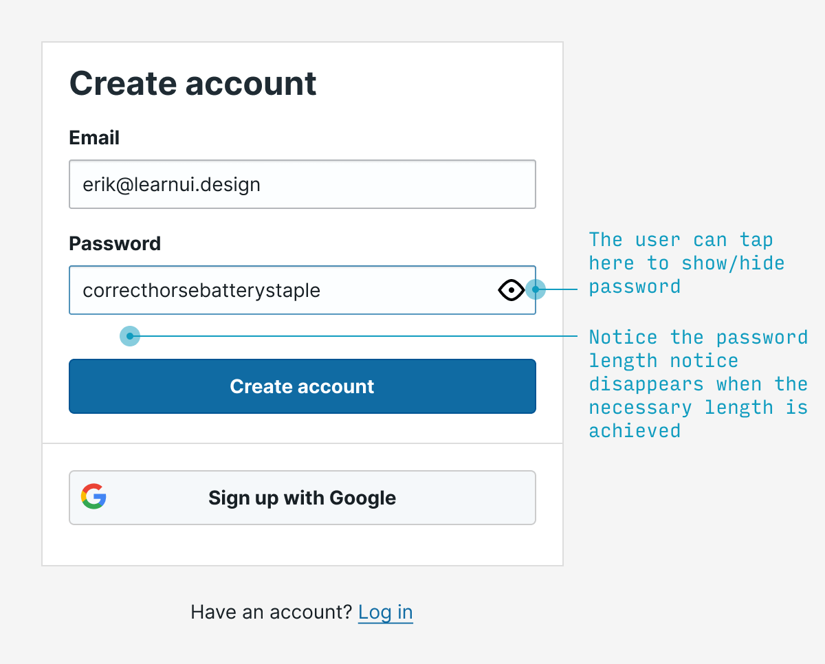
6. Let users see their password
Allowing users to view the password they’ve entered will prevent thorny UX issues with choosing a password they didn’t mean to – while also being less onerous than requiring them to type it twice.
(That being said, the latter method is still far better than nothing)
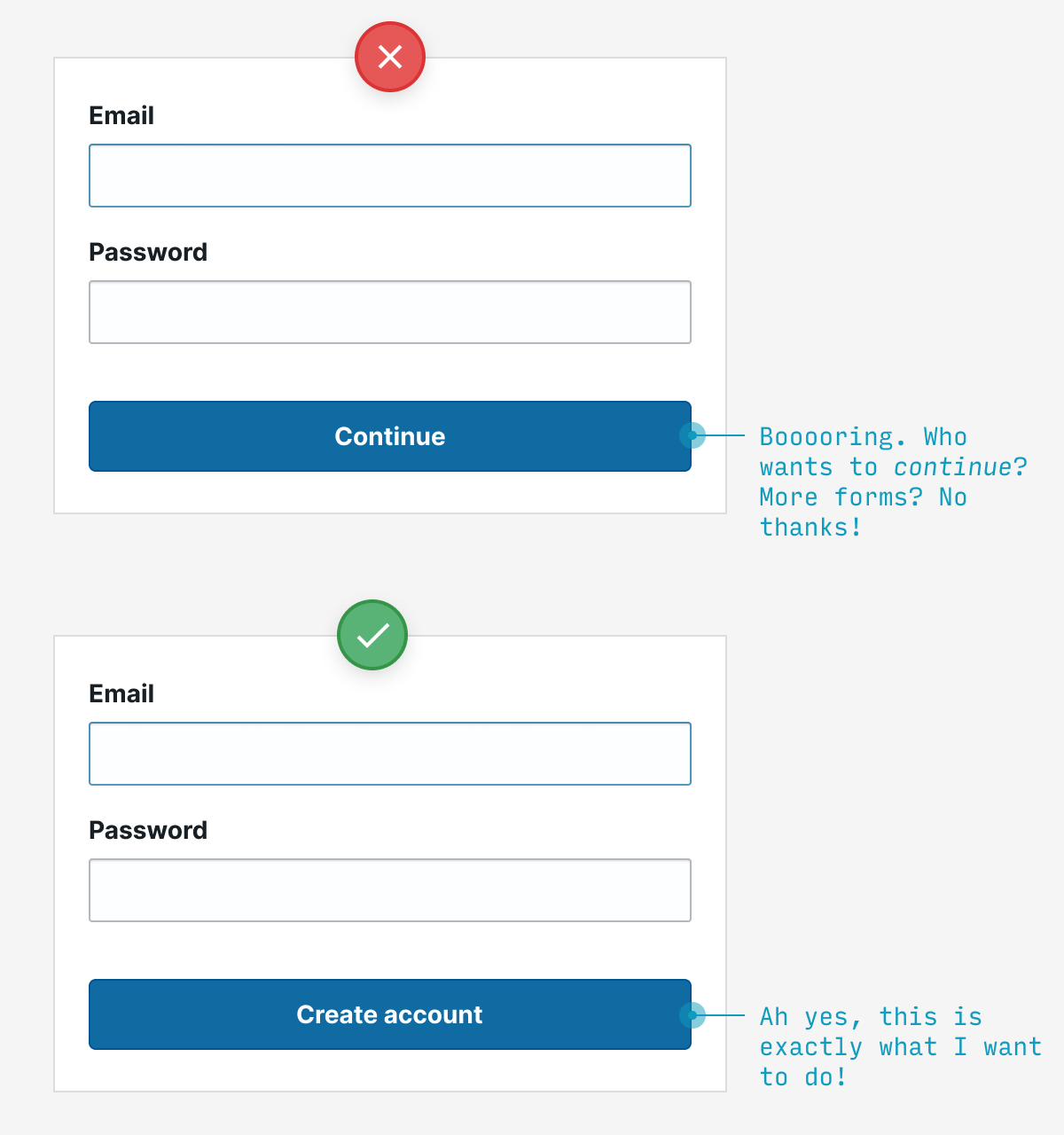
7. Use button text to expose the value waiting for users on the other side
The labels on your buttons are an opportunity – to tempt your users to click through, of course. If you label them with boring, non-descript stuff (e.g. “Continue”, “Submit”), well, yaaaawn.
But ask yourself: what value awaits a user on the other side? Is it getting my free account set up? Am I 30 seconds away from experiencing the future of work! Tell me, dang it!
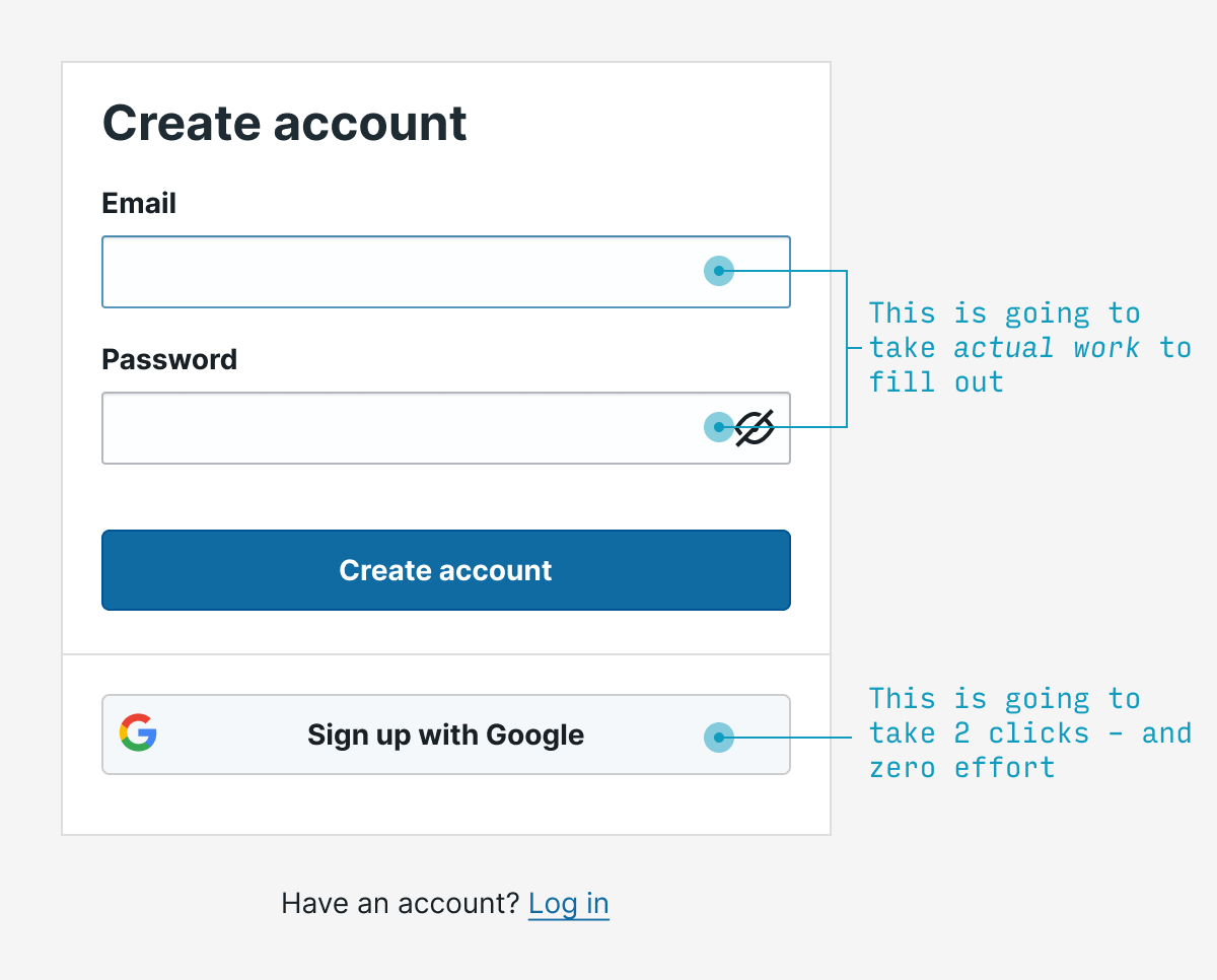
8. Allow for single sign-on
Why force users to pick yet another username and password to deal with for our hum-drum little service? What if – and hear me out on this – we allowed them to use an existing name and password? Like their Gmail account or twitter handle!
Crazy, right?
But that’s exactly what we can all be doing. And unless you have very specific reasons not to, it’s highly recommended.
(Now sites just need to remind users when they’ve already clicked this option)
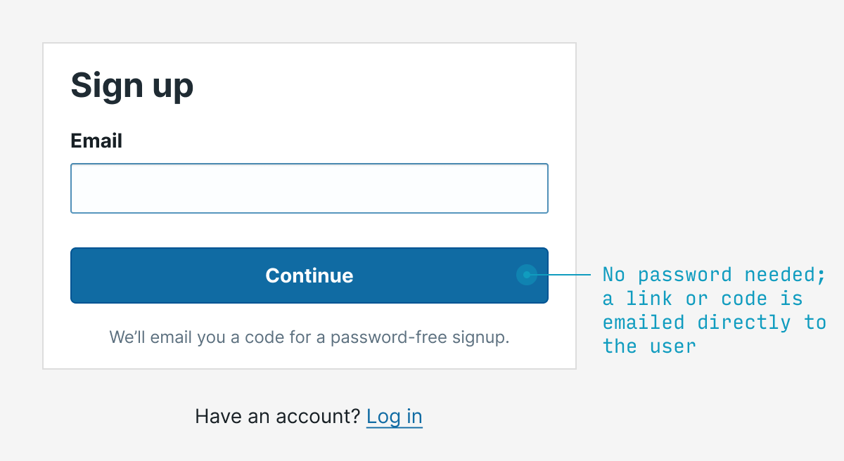
9. Skip the password; use a magic link (or code)
Remember, in interaction design, we’re trying to remove interaction. Well, one great source of typing/clicking/remembering/guessing in signup flows is passwords. Instead of requiring one, why not simply email someone (a) a link to click or (b) a one-time code to enter to login?
Why ditch passwords?
Many users forget them
Many users reuse them (making one app’s leak your potential problem too!)
Many users choose insecure ones
It’s often more work to recall a password than check your email
There are some caveats with this as-of-yet non-standard method:
If someone loses access to their email (e.g. unexpectedly laid off from their job), then they will lose access to the service 😬 (unless you allow other additional forms of authentication)
You should set time limits on the validity of a code or email link (30-60 minutes is common), so as to prevent old emails from being eternally-valid credentials
Many phishing scams involve clicking links in emails; it might be bad to make clicking a link in an email the only way to log in to your app (emailing a code to enter solves this)
The email could end up in spam, blocked, or delayed
That being said, magic links/codes are an easy way to remove interaction while being secure 👍
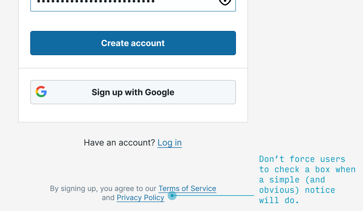
9. Save a click by notifying users they agree to the terms of service (not requiring their explicit permission)
OK, so first thing’s first: this isn’t legal everywhere. The EU, for instance, requires that sites require their users to explicitly check a box saying they agree to the site’s terms. My opinion? Privacy theater, and bad UX to boot. Save users a click – when you’re allowed.
(Do you take issue with me calling EULA checkboxes “privacy theater”? Well, 99% of the time I’ve clicked that I’ve read the terms and conditions, I’ve been lying. And my guess is other users are in a similar boat. And when we live in a world where everyone is lying 99% of the time, that is, indeed, theater)
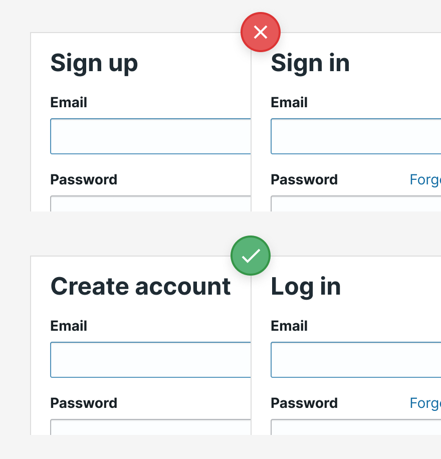
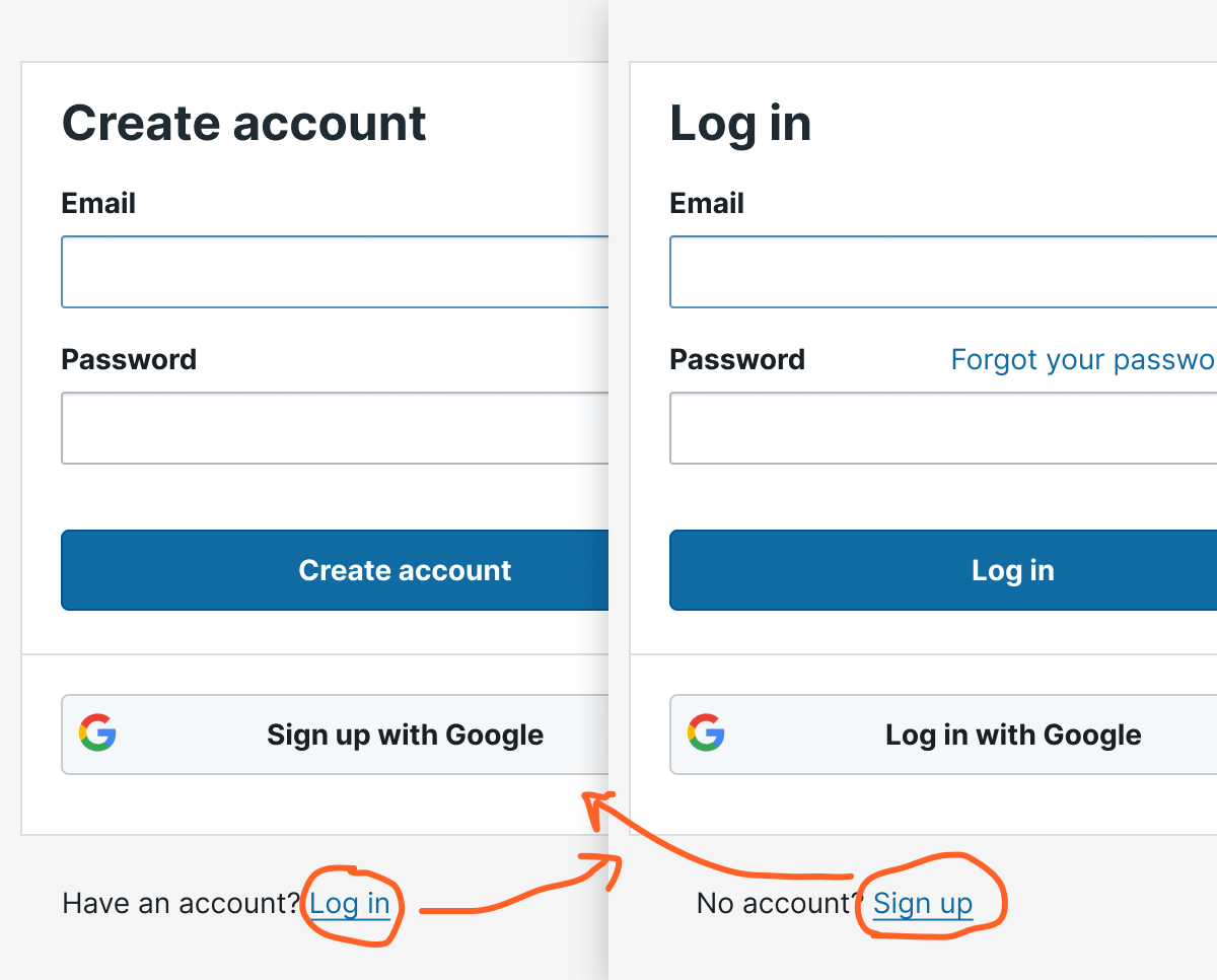
10. Use different terms for “sign in” and “sign up”
You want your sign-in to be so simple, the village idiot could still complete it half asleep without thinking.
To those ends, don’t use, say, “Sign in” and “Sign up” – which requires me to think for half a second whether I want “in” or “up”.
Instead, go with options like “Register” vs. “Sign in”, or other pairs of options that are more than 2 letters apart. It may only save your users a half a second, but if you wouldn’t save them half a second now, it’s not looking good for the rest of your app 😬.
11. Allow easy switching between “sign in” and “sign up”
In the case that someone does click the wrong option, you want it to be dead simple for them to switch from registration and logging in – and vice versa.
Most commonly, this is displayed as a link (not a button – a mistake beginning designers make weirdly often) located at the bottom of the form.
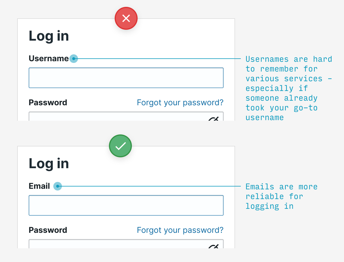
12. Log in with email, not username
Usernames are tough to remember for every individual service, and you may have been forced to pick something besides your usual. Emails are a much easier way to log in.
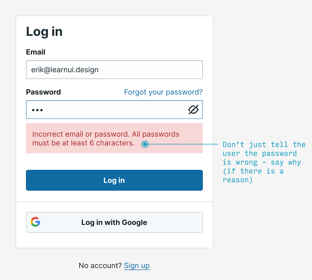
13. If the user guesses an invalid password, say why it’s invalid
If the user guesses a password that’s both (a) wrong and (b) doesn’t meet the password requirements, say which requirement the password failed to meet. Much more useful than saying “incorrect password”, but not giving the user a clue as to how they might fix it.
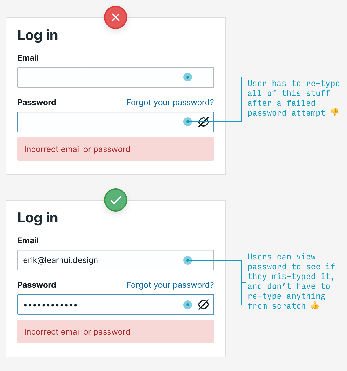
14. Remember typed values between password attempts
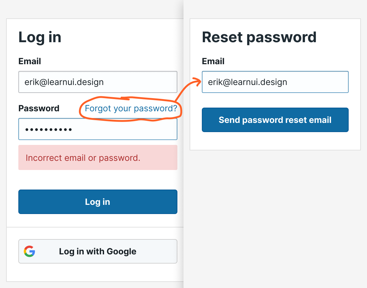
If the user enters their password unsuccessfully, they should not have to type their email again. In fact, if you allow them to see their password, don’t erase that either – they may want to check to see if they made a typo.
15. The “reset password” screen should remember which email you already entered
Far too often, if you click “Forgot password”, you’ll be forced to re-enter an email you typed just 30 seconds before. By the time the user has exhausted their guesses at their password and wants to reset, don’t pester them for information you already know.
Other signup UX questions?
Having looked at hundreds of signup flows from beginning designers, these tips address some of the most frequent problems I see. Implement all of them, and you’ll have a login UX that feels, well, as noticeable as air.
Remember: no one came to your app to log in. Heck, they probably didn’t even come to use your app for its own sake. In all likelihood, unless your app is for entertainment, most users probably want to use it to achieve a specific goal as quickly as possible, then get on with their life.
As good UX designers, let’s honor our users’ impatience and make this stuff as simple as possible.
Any other questions about registration/login UX? Drop them in the comments below.
Watch me do a UI project step-by-step
I’ll walk you through every part of a UI project — just like I’ve done for everyone from Fortune 100 companies to Y-Combinator startups.
Practical design tutorials. Over 60,000 subscribed. One-click unsubscribe.
]]>Erik D. KennedyFree Font Alternatives: The Ultimate Guide2021-03-26T08:00:00+00:002021-03-26T08:00:00+00:00https://learnui.design/blog/ultimate-guide-similar-fontsThis is not the most popular view among designers, but I’m totally in favor of using free fonts, especially as a beginning designer.
But free fonts get a bad rap. Mention them to many experienced designers, and they’ll complain that free fonts have poor quality, bad kerning, and missing features.
You know what? Those stereotypes are a little out of date. The truth is: you can find extremely high-quality free fonts. But sometimes you need to do a lot of research to find them.
In this guide, I’m going over some of the best free fonts that are similar to or good replacements for some of the most popular pro fonts out there.
It’s choose-your-own-adventure from here. So click on whatever’s most useful and we’ll get started!
A brief note on free fonts
A guide like this is a bit weird to write, since encouraging the usage of free fonts seems like discouraging the use of paid fonts. However, that is not my intention at all.
As a beginning designer, I wasted a fair share of my own money on paid fonts I lusted after, but rarely or never went on to use. Why? I simply didn’t have the experience to know which fonts would actually be useful in my career, and which were ones that simply looked nice, but I personally would not really need.
It was only after gaining far more experience – mostly with the best free fonts I could find – that I came to appreciate the best in professional fonts, and understood better what was worth paying for. Indeed, with the exception of a few short labels, every font on this page is paid.
So despite this guide’s focus on finding the best free fonts on the web, I encourage you to pay hardworking type designers for their best fonts. It’s not only gratifying, but – selfishly – it keeps the river of innovative and fresh new type flowing.
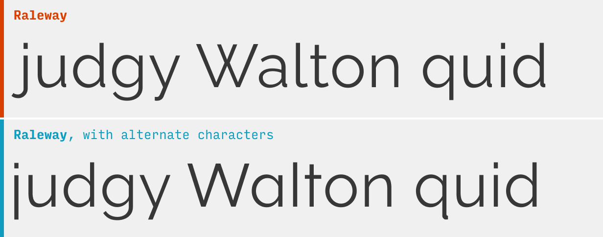
Alternate Character Styles
Many high-quality free (and paid) fonts live a secret double-life: they include alternate versions of some characters that you can only use if you know how to unlock them.
For instance, the above two samples of text are both from the free font Raleway. Yet every other character in them looks different. What gives?
They’re alternate characters, and they can be used to (a) make a popular font a little more unique or (b) give a font a slightly different style.
So: how do you do it? I’m glad you asked.
Using alternate characters styles in Figma
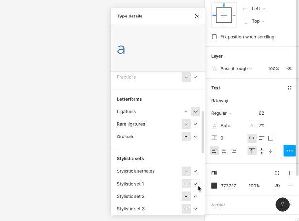
To try alternate characters in Figma, select some text, and click the “…” button in the “Text” section of the right menu.
Not all fonts have stylistic alternatives, but ones that do will list them as “Stylistic sets” if you scroll down through the menu.
Each row (a “stylstic set”) will have two versions of one or more characters that you activate. By default, the version on the left is active, but you can hover and click on the right option to activate the alternates for that textbox. For instance, in the image above, I’m hovering over the alternate “a” for the font Raleway.
When you duplicate the textbox with the alternate styles, the styling will automatically be applied to the duplicate. However, if you create another textbox, you’ll have to re-select the alternate styles.
Using alternate character styles in CSS
To use alternate characters on your website, you’ll use the font-feature-settings CSS property. The value will take the form of:
font-feature-settings: "ss01" 1, "ss03" 1;
Let me break this down a bit:
The “ss01” (and “ss03”) refer to the first and third stylistic set as they appear in the list in Figma (“Stylistic alternatives” in that menu usually just displays all at once and isn’t counted in this numbering).
The 1 means on, and you can specify to turn a stylistic alternative off by typing a 0 here instead.
If you’re only using one alternate style, you don’t need to comma separate anything – but if you’re using multiple, you should comma separate each from each other
Get a PDF of the 10 best free fonts for web/mobile app design (including which free fonts not to use).
Practical design tutorials. Over 60,000 subscribed. One-click unsubscribe.
]]>Erik D. KennedyThe Step-by-Step Guide for Pairing Fonts2020-08-07T08:00:00+00:002021-08-07T20:00:00+00:00https://learnui.design/blog/guide-pairing-fontsIf you google for how to pair fonts, you’re going to get a lot of awful results. A first-page result recommends pairings no experienced designer would touch with a 10-foot pole. Google Fonts hilariously recommends you pair literally everything with Open Sans and Roboto 🙄
In the article, I’m going to cut through the crap and give you a step-by-step plan for creating beautiful, professional-quality font pairings. Here’s the skinny (feel free to skip ahead):
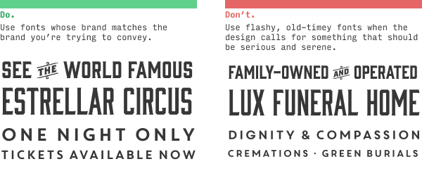
1. Determine your brand (because brand drives typography)
A font pairing that works great on one site may look ridiculous on another.
The reason is because different sites and apps have different brands.
Simply put, your brand is just a list of adjectives (or short phrases) that describe what you want your users to think of you.
Some sites need a brand that’s “clean, simple, and modern”, others want to be “luxurious, modern, and classy”.
But whatever your brand is, being able to list specific adjectives and phrases will make the process of choosing fonts easier.
I’ve released a video on YouTube that goes over brand adjectives – how to find them, and how they influence a design.
In particular, in this video, I talk about the 5 most common brands that beginning UI designers should learn how to design for:
Clean/simple – modern, minimalist
Classy – luxurious, erudite, classic
Friendly – casual, informal
Quirky – design-forward, creative
Techie – futuristic, geeky
(You can watch the video to see some examples of each)
We’ll use those terms regularly as examples throughout this lesson.
But whatever your design is, take the time to think of a few adjectives or short phrases that describe them. Actually writing them out will make the rest of this process much easier.
2. Brainstorm fonts that subtly convey your brand
Two of the biggest beginner mistakes in choosing typefaces are:
Choosing a font that doesn’t match your brand
Choosing a font that matches your brand in an over-the-top way (i.e. a novelty font)
The key to picking good fonts is to find something that conveys your brand – but subtly.
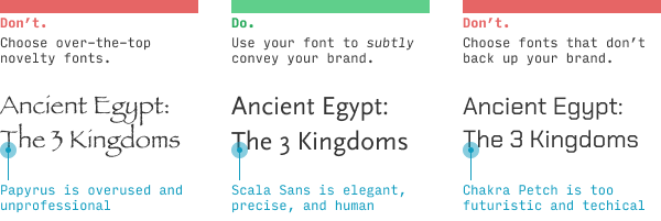
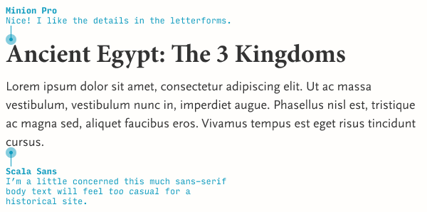
I’m big on examples, so here’s one. Let’s say you’re designing a small site/app about Egyptian history. We want a brand that’s professional, clean, and informative, but about a topic that’s ancient, grand, and a bit mysterious. (Did you catch those? Those are our brand adjectives)
Here are 3 takes:
If you’ve piddled around with your computer’s font list, you may know there is a tragically popular font called Papyrus that, in some sense, feels perfect to finally be used in an actual honest-to-goodness Egypt-related site (versus some suburban Tae Kwan-Do school whose sensei dabbled in graphic design for 15 minutes too long… or Avatar).
Alas, this sort of novelty font rarely makes for good design. Avoid it – at least until you’re a good enough designer to not be reading this article 😉
Likewise, the third font – Chakra Petch – while pretty awesome, is entirely inappropriate for the brand we’re trying to convey. It’s angular, techie vibe would be better for “Outer Space: The 3 Kingdoms”, ya know?
We’ve found a good middle ground with Scala Sans, which feels like it’s straight out of a museum placard. It’s what’s called a “humanist” sans-serif, meaning its letterforms are more inspired by human handwriting than, say, geometric shapes. And, like many humanist fonts, it feels precise and fine, like perfect handwriting would.
Now I wouldn’t expect every new designer to notice all of these details. In fact, I specifically recommend the newest designers simply stick to using fonts they already know to be great. But as you expand your typographical horizons, you’ll start to pick up on these little details. And even before you know the names or categorizations of things, you’ll develop a gut instinct for what looks good.
What other fonts subtly convey the brand of professional, clean, and informative, yet ancient, grand, and mysterious?
Well, Scala is much more on the “professional, clean, and informative” side. For “ancient, grand, and mysterious”, we’ll almost certainly be looking for a serif font.
(To be clear, we’re not looking for a font that is grand and mysterious – we’re looking for a font that subtly gives off grand and mysterious vibes. We have to take our brand and tone it back a bit)
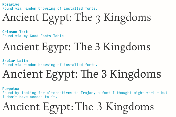
Let’s keep brainstorming. Here’s what I’ve found after a few minutes:
In under 10 minutes, I ended up looking at over 100 fonts, but only picked 4 as contenders. I came up with 2 of them through randomly browsing my font directory, one through my Good Fonts Table (a resource for all Learn UI Design students), and one via knowing the engraved Trajan might be worth trying (even though I don’t own it and had to Google for similar fonts instead). Will one of these be my final choice? No idea! – but this is how the brainstorm starts.
Switching gears: at a broader level, this step is all about translating brand adjectives to letterform shapes.
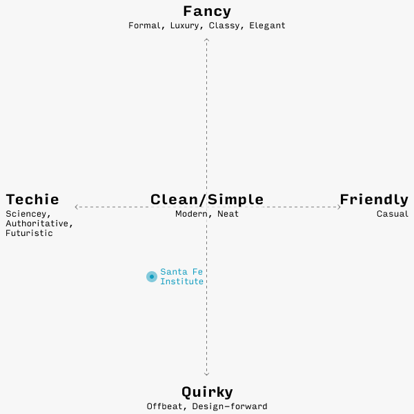
For instance, one of the 5 most common brands is “quirky”. What fonts do you use on a quirky site? Let’s take a look at the Sante Fe Institute website, a great example of a quirky/creative site (though as a technical institute, it will also have some “techie” elements to its brand). Go ahead and open it in a new tab – we’ll be referencing it throughout.
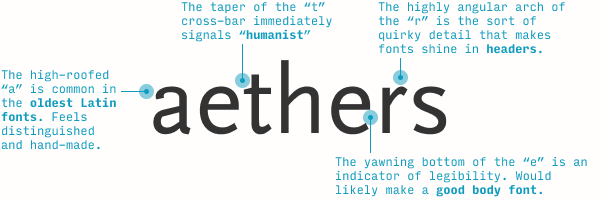
This font is called Chap, and all of its intentional inconsistencies, memorable details, and embraced awkwardness are the things that make it really shine on a quirky/design-forward site. It’s a solid pick here.
Also, none of things I call out in the image above take much design knowledge to notice. Anyone can see the “e” is weirdly misaligned, or the “f”’s top terminal got lopped off peculiarly. As for the “W”, pay attention – it’s a fairly common detail to include (usually in serif fonts), but it certainly does stick out a little bit when seen repeatedly in body text.
Even though typography gets a reputation as something highly subjective and artistic, a shocking amount of choosing the right fonts comes down to analyzing the shape of letterforms. Ultimately, your goal in this step is to connect (a) details about the shapes of letterforms in your chosen font to (b) your particular brand adjectives, and (c) just generate a lot of possible ideas.
Awesome. Let’s move on.
3. Choose a body font by legibility
When you have a handful of fonts on your shortlist, you’ll usually want to pick the body font first. Why? Because it has the tighter constraints – it needs to be legible at a smaller size, and be easy on the eyes if you read it for a longer time.
For beginning designers, the easiest way to check if a font works as a body font is read a dang description of it! For instance, the description of Scala Sans on MyFonts.com says it’s good for “book text” and “small text” – which is synonymous with it being a good body font 😎
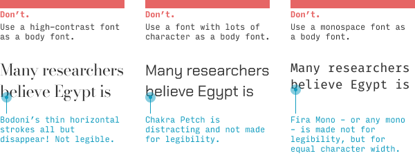
But it’s always nice to be able to identify good text typefaces on your own. The main indicator, at least from the perspective of a non-designer or beginning designer is… it’s boring! (I might be the only designer on the internet to admit to that 😛)
Seriously, though, a good body font will never call attention to itself – it lets the content, the words, have center stage. A good body font’s goal is legibility, so if you see a font that’s trying to achieve anything else – character, interestingness, equal-width characters – it’s probably not a good body font.
These are 3 excellent fonts… that don’t work for body text!
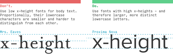
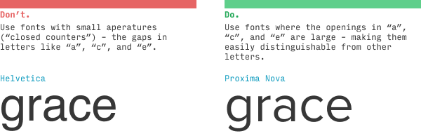
Instead, you’re looking for a plain serif or sans-serif font with – to use the typographical lingo – a high x-height and open counters.
The x-height is the height of the lowercase “x”. But it’s not so much measured absolutely as it is relative to uppercase letters (or tall lowercase ones, like “h”). Why does this matter? Because a tall x-height means the lowercase letters are, relative to other fonts the same size, larger – and therefore easier to read.
“Open counters” (or “large apertures”) means the gaps in letters like “a”, “c”, and “e” are relatively wide. Helvetica’s “c” doesn’t look that far from an “o” – while Proxima Nova’s “c” and “o” are much easier to distinguish.
These may not seem like particularly big deals (and you’ll see plenty of exceptions!), but imagine you had to read something very quickly, or on a phone that’s farther away than you’d like, or when it’s really sunny out. All of these will generally push you towards fonts with high x-heights and open counters.
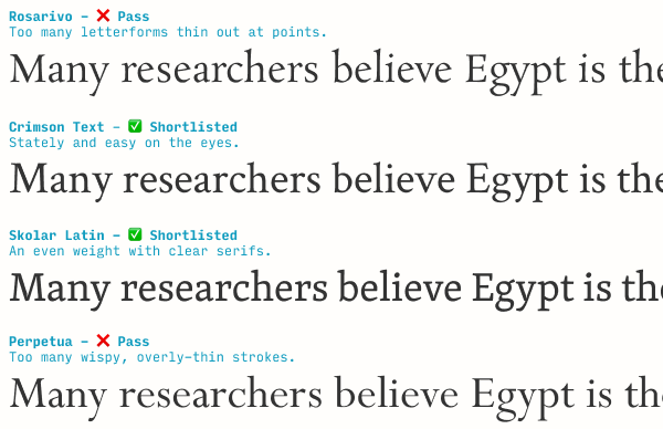
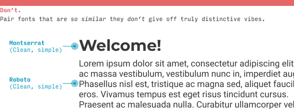
In the Ancient Egypt example, I’ve brainstormed a few serif fonts, and quickly landed on a highly legible sans-serif I like (Scala Sans). Since these serif fonts would largely make great body fonts too, I have an extra decision – which font to use as my body font: (a) Scala Sans or (b) one of the serifs.
Taking a look at the serifs, I notice I can disqualify some from body usage based on having extremely thin horizontal strokes – something that would make them a bit more difficult to read at smaller sizes, and perhaps appear “wispy”.
But a couple of these would work fantastically well. At this point, I don’t have a strong opinion on which to use. But as we move through the font-pairing process, one will emerge a winner.
4. Add an additional font to fill out another aspect of the brand
One fairly common mistake I see with my Learn UI Design students is they pair fonts that are quite similar.
Instead, use the addition of other fonts to fill out your brand in ways one font cannot.
(By the way, 95% of the time, this means you’ll be pairing a serif with a sans serif)
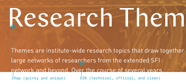
On the Sante Fe Institute website, their headline font Chap is pretty distinctive and quirky. But they’re a technical institution – ideally some part of their brand should say techie as well.
In the “brand chart” format that I show in the Brand & Goals lesson from Learn UI Design, the Santa Fe Institute website would be here:
Typographically speaking, their header font, Chap, nails quirky, but not techie. So the next font they use should cover the techie angle a little more.
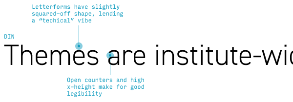
Pro tip ☝️: most fonts that feel technical/sciencey/futuristic are kind of squared off. But a body font needs to be simple and legible, which, as we saw with Chakra Petch, is sometimes at odds with being angular and geometric.
If you had asked me what font displays a perfect balance between (a) technical/geometric and (b) highly legible, I’d have suggested the wonderful DIN.
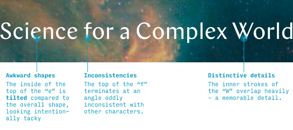
And you know what? The Santa Fe Institute thought the same thing! (And a lot of other designers would’ve too – ask them. I promise you this typography stuff is not as wild and subjective as it looks 🙂)
The net effect is great – definitely quirky and creative, but the angular DIN, backed up by photography of complex systems (like nebulae and traffic flows), adds a technical vibe.
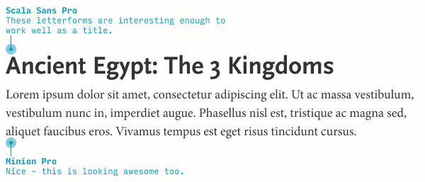
For our Ancient Egypt example, I’m looking for something that feels a little older and more mysterious (but remember: subtly so) compared to Scala Sans. It will definitely be a serif font.
I’ve narrowed down my choice to Skolar and another serif called Minion.
How did I pick Minion? 🤔 Well, I noticed Crimson Text is what’s called an “Old Style” serif – one of the earliest styles of design, based on calligraphic forms, and quite legible (not to mention perfect for something with historical vibes). I decided to browse through a few other Old Style serifs I had remembered – but, if you don’t know any off the top of your head, you can always google “old style serif site:typewolf.com” and you’re two clicks away from learning about Minion.
Now it’s just a matter of figuring out what should be body and what should be header. Let’s just pick a couple and try.
We could do much worse than this – but we might also be able to do a little better. Let’s switch the typefaces and see what that looks like.
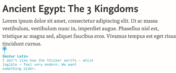
Awesome! But since we have two possible serifs fonts, we should see what Skolar looks like as a body font as well.
Honestly, the serifs in Skolar feel too big and thick. I like how they were more delicate and precise feeling in Minion.
(Knowing a bit more about typography, this is perfectly reasonable. Skolar is a modern serif font, and many modern serif fonts have larger serifs that make for better legibility at very small sizes!)
So now we have a font pairing – Scala Sans and Minion. What do we do with it?
5. Define your new font’s rules of usage
As we add more fonts, it becomes more and more important to be clear about which is used when.
With just two fonts, you’d think this is pretty simple, right?
Headers: Scala Sans
Text: Minion
Not so fast! Even in a fairly straightforward text-based site, there are plenty of other places we will need to pick a font:
Bylines
Subheaders
Navigation menus
Contact forms (labels, text inputs, buttons)
Footers
The naive solution is just to (a) use the header fonts for all titles and subhead and (b) use the text font for everything else. Guess how great of an idea that is…
But in reality, picking fonts is only a small fraction of the battle. The vast majority of typography in day-to-day UI design is styling fonts you’ve already chosen.
And even at the font-pairing stage, we want to start styling fonts to see how they could work.
We’ve started to define some more rules for how we use our fonts now:
Menus: Minion
Byline: lighter-gray Minion italic
Labels: lighter-gray Minion italic
Categories and tags: smaller uppercase Scala Sans bold
But even these are subject to change. For instance, the italicized lighter-gray label would look weird next to text input. Do I therefore use a different style for both labels, or is there a compelling rationale to have two label styles (one for categories and one for form controls)?
As you add more fonts to your design, it becomes more and more essential to be crystal clear about when and how you use each.
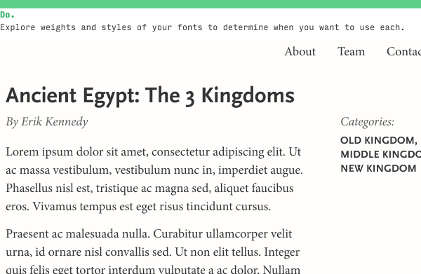
For instance, on the Learn UI Design site, I regularly use 3 different typefaces – Avenir Next, Rajdhani, and Freight Text. But, in a sense, I’ve defined “rules” around how I use each:
Avenir Next: Used as body text. Can italicize or bold as needed.
Rajdhani: Used for subhead and as an accent font. Only used uppercase and bold.
Freight Text: Used for the parts of the page that represent someone speaking – e.g. the questions in the FAQs, the testimonials from students, and the “About Me” section. Only used in heavier weights.
So despite technically having 2 sans-serif fonts, each font is used in different enough ways that the design never feels inconsistent, messy, or overloaded – or does it? 😉 Technically, you’re the judge here!
Anyhow, pick an additional font, then define it’s rules of usage. It’s that simple.
6. Repeat steps 4 and 5 as necessary
In starting to define different styles for your fonts, you may notice that (a) you’re still not hitting some important part of your brand or (b) in your experimental usage of the fonts you’ve picked out, none of them can solve a typographical problem you have.
Any questions or comments on pairing fonts? Leave ‘em below! I’ll be responding to every question 😎
The Top 10 Free Fonts for UI Design
Get a PDF of the 10 best free fonts for web/mobile app design (including which free fonts not to use).
Practical design tutorials. Over 60,000 subscribed. One-click unsubscribe.
]]>Erik D. Kennedy100 Things a UX/UI Designer Should Know2020-04-07T20:00:00+00:002021-08-07T20:00:00+00:00https://learnui.design/blog/100-things-ux-ui-designer-knowArchitect Michael Sorkin recently died from coronavirus, and in a tribute to his beautiful piece 250 Things an Architect Should Know, I’ve compiled a list of 100 things a UX/UI designer should know.
Some are practical, some are poetic; all pay homage to the wonderful complexity of designing things for our fellow human beings.
Decide, beforehand, on the goals that constitute a successful design. Focus all design presentations on how your design achieves those goals, and the feedback you recieve will also then by of the same type.
The thing you're building is likely not how the user wants to spend their time. You're merely their best option for getting where they want to go. Best to keep this in mind.
100ms-250ms is pretty quick. A 500ms fade-out will feel slow, and, if multiple nearby elements have such fade-outs, the user will feel like they're leaving "ripples" with their cursor.
Position punctuation that precedes text – e.g. open-quotataion marks, dashes, or bullets – into the left margin so as to create a stronger sense of alignment. More here.
For left-to-right languages, right-aligning should be saved for (a) numbers that are comparable digit-for-digit (e.g. prices or counts – not ID numbers, ZIP codes), (b) the headers labelling such numbers, and (c) rare occasions when you need a strong right edge for the text.
Gmail is showing you specific search endpoints (messages), which you're interested in matching directly. On the other hand, Google Search is guessing your query, so what you haven't yet typed is the key differentiator.
Bar and line charts are similar, however line charts are more closely associated with time series and are easier to read for larger numbers of series. Use pie charts only for categories that add up to 100%; bar charts are best when one item can appear in multiple categories.
Saturation is the richness of the color (with gray, white, or black being 0 saturation). Brightness is akin how "on" a dimming light bulb is. High brightness may be white or a very bright color, but 0 brightness is always black. More.
[Futura](futura-similar-fonts.html). Though designed in the 1920s, no font more strongly conveys the 60s. Use for brands needing a slight retro feel, or use thick weights (often uppercase) for sporty, street brands.
The Pioneer spacecraft is equipped with a small plaque designed for any aliens that might intercept the craft. On it is perhaps the greatest data visualization of all time – showing male and female figures to scale with an image of the craft, a diagram of our solar system, and a map of where to find us, using a galactic map of pulsars. It is also my twitter background.
Inductive: using past observations to predict a general rule. Deductive: using logical rules to create airtight predications. This mirrors the two primary ways interfaces teach users new concepts, cf. Teach By Example.
Color is 3 dimensions, whether you measure it RGB, CMY, HSB, HSL, or Lab. Understanding that any two colors can differ in 3 ways allows you to think more clearly about how to create color variations.
Darken is great for displaying white-background images on slightly darker colors. Layers of black on Overlay or Soft Light create darker variations of what's beneath them. Black Multiply layers can be an alternative to darkening an image. Conversely, a white Overlay layer can make an image more washed out, yet with more vivid colors than typical desaturation.
Have a focal point. Make it clear, interesting, and in-focus. Look for places where imagery can be symmetrical, repetitive, or obey the rule of thirds.
Your database doesn't have what they wanted. They made a typo. They used a synonym or similar word to what the system uses. They accidentally filtered out the result they wanted.
Be polite. Be succinct. Don't use jargon. Recommend a course of action. Remember the user will be seeing this at a low point in their experience with the app.
Avoid the generic ("click here"). Expose the benefit to the user ("Start My Free Trial"). Make it relevant to the viewer, given everything you know about them. And make the button visible.
Rather similar to how one might expect an "audio version" only of the web to work. Text is read. Controls – and their state – are described. Shortcuts can be used for skipping to elements of various types – search bars, headlines, links, etc. Sudden interface changes (e.g. notifications) can be problematic. Semantic HTML augmented with ARIA labels can help.
Don't start from the top-left and work down the page. Instead, start from the primary goals of the design needs to meet, and show the multiple ways in which your design achieves each goal.
The name for a phenomenon in which data is concentrated around a particular low value, but tapers off into a long tail of higher values. When users need to pick Poisson-distributed dates (scheduling a meeting), you should use a different control than when users need to pick a more evenly-distributed dates (entering birthdays). More.
"Users spend most of their time on other sites. This means that users prefer your site to work the same way as all the other sites they already know". More.
No one wants to wait around to see all images. They can only be navigated by clicking impossibly small translucent circles. They reflect a lack of prioritization of content.
The former is someone who trust, can share the trivial minutiae of your day with, and share large parts of a worldview with. The latter is someone who can see your facebook posts in their feed – and vice versa. The point? Your software will piggyback off of real-world nouns. Mind them.
Google's algorithm for ranking the importance of webpages. In short, every page's score is determined by the score of the sites linking to it, which are in turn determined by the sites linking to them, etc. More.
In finding the optimal solution to a problem, do you stick with the best solution you know of so far (exploit), or do you keep looking (explore)? Across domains, people (such as designers or users) explore early and exploit later.
iOS and Android both offer special keyboards for email addresses, URLs, numbers, and phone numbers. Never make a user type a phone number on a standard alphanumeric keyboard.
Complementary goods are things you buy in addition to the original thing – like peanut with jelly. Substitute goods you buy instead of the original thing – like almond butter instead of peanut butter. These are two powerful paradigms when considering what content you can recommend to your users. Consider what they're looking for, and what might complement or substitute for it.
In short, because they're too polite, too forgetful, and too close to their own problems. Better to ask them what they do. Better still to just watch them do it.
Be succinct. Be conversational. Make the strongest true statement you can. Have a list of writers who you can channel when lacking inspiration (I use Steven Pressfield's non-fiction).
Print it out and read it aloud. Rephrase what you stumble over. Imagine you are paid $1000 for every word you cut. Remember: the reader won't miss all the good bits you removed. They'll only judge the good bits you included.
If you don't make and enforce clear rules, you've already lost. If you make and enforce clear rules, congrats – now you have to legislate a million edge cases. Also see the road rage question.
80% of the output comes from 20% of the input. Examples: 20% of your ideas will contain 80% of the potential, 20% of your pages will get 80% of your traffic, 20% of your users will be 80% of your app's usage, etc.
They present a challenge. Bounded and safe, yet needing to perform in real-time heightens arousal. The best games are not too difficult (discouraging) or too easy (boring).
In general: variable reward, the illusion of control, the Gambler's Fallacy (the belief that many losses means you're "due" for a win), and, of course, the fact that they're games, and games are fun.
Bodoni, [Helvetica](helvetica-similar-fonts.html), [Times New Roman](times-new-roman-similar-fonts.html), Century, and [Futura](futura-similar-fonts.html).
Simplicity is elegant. Bargains are about the price. But if you want the best, price is a triviality. Also, signalling: "$9.99" signals "We're trying to make this look cheap". "10" signals "This isn't about the price".
(A) Remove it entirely. If it can't be removed, (B) lighten it, or (C) put it behind a menu. As a last resort, simply (D) align it with other items and (b) make it consistent with them, so as not to stand out.
Non-essential, but makes for good party trivia. Gary Hustwit has done a lot of PR for our profession. In any case: Helvetica has horizontal/vertical terminals.
Keep them open-ended. Use mirroring to encourage talking. To understand future behavior, don't ask about it directly. Instead, ask about – and understand – current behavior.
Designers and developers do a lot of their best work in large chunks of uninterrupted time. Managers and PMs are more like switchboards in human form. Understand your team member's optimal needs, and adjust accordingly. More.
Be specific. Once you name names, you can start slowly pushing your career in their direction. For me, I want to do some design work for Rigetti. Know anyone there?
The purpose of line height is to make it easy for your eyes to track from the end of one line to the beginning of the next. If you make a line longer (as measured in characters), then it needs more line height. There are two ways to make a line longer: shrink the font size, or increase the width.