Using Plotly.js
The Plotly.js Graphing module functions by creating a new field type (Plotly.js Graph) for use in your Drupal installation.
You can add Plotly.js Graph fields to any content type through your site's structure configuration. (Administration > Structure > Content types > Manage Fields).
After adding a Plotly.Js graphing field to your content, you should then be able to add and customize graphs to your content.
To do so, simply add or modify an existing piece of content of the type for which you just added a Plotly.Js field.
In the example below, we will be implementing the "Line Chart and a Bar Chart" example seen here
https://plot.ly/javascript/graphing-multiple-chart-types/#line-chart-and...
You will be first asked to name your graph and select how many "Series" are in the graph. A "series" is a unique display of data, such as a set of scatter points in a scatter graph, a set of bars in a bar graph, etc. In many cases, you only want a single series of data, but if you wish to display multiple sets of data on a graph, you will need multiple series. For example, if you wanted to display multiple lines on a line chart, or both a bar graph and a line graph on the same chart. Because we are implementing two unique data sets (a bar chart and a line chart), we need 2 series. Clicking "Add Additional Series" will give us the 2 series we need.

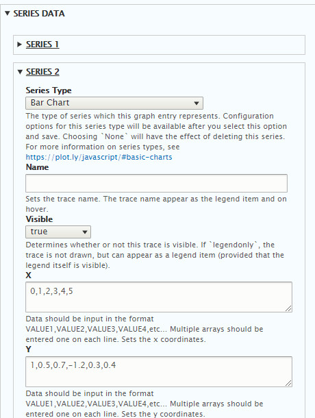
You will now be able to begin to set up your series data. We are displaying a bar chart, and a line chart, so I have selected the appropriate series types below (line charts are simply scatter plots with the points connected by lines). For more information on which series type you need for the graph you are creating, see the Plotly.Js documentation at https://plot.ly/javascript/#basic-charts

After save, your settings will now be available for these series types. First, I will set up my Line Chart. Please note that there are many, many settings available for each series type, but you will likely only need a few of them to set up your chart the way you wish. Usually, you can graph a basic chart using only one or two of these settings. More information on the functions of each setting is available at https://plot.ly/javascript/reference/
Here, I am simply creating my line chart by adding a list of points and that's it! No additional settings required.

The bar chart is set up similarly, just a list of points with no additional configuration required.
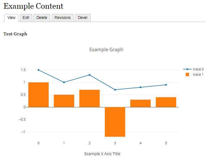
Finally, you can change the layout of your graph with the settings available under the "Layout" heading. In this example, I am only going to change the title of the X Axis.

That's it! After saving, the graph is displayed.
You can implement any graph type you wish following this same method. You can get an idea of how to modify your settings to produce the type of graph you want by looking through the examples available in the Plotly.Js documentation at https://plot.ly/javascript/#basic-charts
Help improve this page
You can:
- Log in, click Edit, and edit this page
- Log in, click Discuss, update the Page status value, and suggest an improvement
- Log in and create a Documentation issue with your suggestion

