
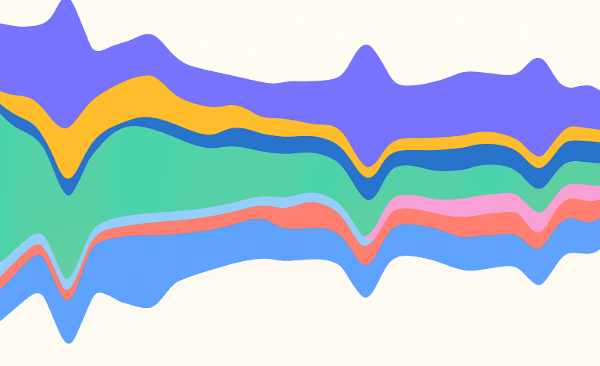
If you want to create a presentation your clients won’t forget, there is arguably nothing more important than the way you visualize your data. A good AI data visualization tells a story—highlighting key insights, revealing patterns, and making complex information instantly understandable.
But creating effective charts has traditionally been a time-consuming and messy process, requiring manual data cleaning, designing visuals from scratch, and even custom R code in some cases.
Now, with AI chart generators improving at a rapid pace, researchers can automatically create memorable, interactive visualizations in seconds.
Yes, this is a massive time-saver. But with so many different AI-powered visualization tools on the market (each with its own strengths) it can be tricky to pick the one that best fits your needs.
What is AI Data Visualization?
Broadly speaking, AI data visualization is the process of turning complex datasets into charts, graphs, and dashboards using artificial intelligence to automate and enhance the visualization process. However, how different tools actually use AI to automate the visualization process varies from case to case.
To understand it fully, it helps to break AI data visualization down into its key components.
At its core, data visualization AI blends two disciplines:
-
Data visualization – the art and science of presenting information visually, using charts, maps, and infographics.
-
Artificial intelligence – machine learning algorithms capable of pattern recognition, natural language processing, and predictive analytics.
This gives teams the ability to visualize data at scale, uncover insights in real time, and spend less time wrangling data. Instead of manually building each chart, AI chart generators can automatically select the most effective visualization, apply consistent formatting, and even highlight trends or anomalies you might have missed.
Want to learn how to make memorable data visualizations? Check out Displayr's latest whitepaper.
How AI Data Visualization Tools Work
As mentioned above, different tools take different approaches to AI-powered data visualization. Some tools connect more seamlessly with various data files, while the number and complexity of the visualizations available within the tool vary.
However, largely speaking, most AI chart generators operate in the same way - by automating the key steps in the data visualization process. This can be boiled down to the following:
- Data ingestion – The tool connects to your dataset (spreadsheets, survey platforms, databases, or live data feeds).
- Data preparation – AI can automatically detect variable types, clean up messy labels, remove duplicates, and flag anomalies that could distort your visuals.
- Visualization selection – Using algorithms trained on best-practice design principles, the AI recommends or directly applies the chart type that will best tell your data story.
- Formatting and styling – Colors, labels, legends, and layouts are automatically applied to ensure readability and consistency.
- Insight highlighting – Some tools go a step further, using natural language generation or statistical analysis to call out trends, outliers, or patterns you might have missed.
By combining these steps, AI data visualization tools drastically reduce the time from raw data to presentation-ready visuals, while ensuring the output is clear, accurate, and tailored to the audience.
Want to learn more? Check out our guide to the best AI-powered analysis platforms.
Best AI Chart & Graph Generators in 2025
When it comes to creating visuals quickly and effectively, AI chart generators and AI graph generators automate the process of data presentation by recommending the best formats, uncovering hidden trends, and adapting to your unique needs.
Displayr
Best for: Market researchers and consumer insights analysts working extensively with survey data and statistical modeling.
AI Features: With Displayr’s Research Agent, you can turn raw survey data into AI-powered visualizations instantly—no manual chart building required. The built-in AI chart generator not only selects the most effective visualization for your data but also produces editable outputs connected directly to your dataset. This means that if you spot an error or want to tweak the analysis, you can make the change once and have it update automatically across every chart, graph, and dashboard.
Visualization Focus: Displayr combines data preparation, statistical analysis, and visualization in a single platform, eliminating the need to juggle multiple tools. Its AI capabilities speed up the reporting process while maintaining a high degree of accuracy—essential for researchers who can’t afford to compromise data quality. Unlike many AI chart generators that focus solely on aesthetics, Displayr is built for complex, statistically driven research, making it particularly powerful for longitudinal studies, segmentation, and brand tracking.
Julius AI
Best for: Prompt-driven visualization generation for quick data exploration.
AI Features: Creates interactive charts, dashboards, and tables directly from text prompts. Can refine visuals based on follow-up instructions and apply statistical analysis before charting.
Visualization Focus: Designed for speed, users can go from question to chart in seconds. Best for rapid prototyping and exploratory analysis, but may need manual export for advanced design needs.
Tableau with Einstein AI (Salesforce)
Best for: Organizations seeking AI-assisted charting integrated with Salesforce CRM data.
AI Features: Integrates AI into Tableau to recommend chart types based on the dataset, highlight anomalies in visuals, and generate predictive trend lines. AI also assists with data grouping and segmentation before visualizing.
Visualization Focus: Produces a wide range of interactive charts, maps, and dashboards. The AI speeds up initial chart selection and formatting, but most customization still requires manual adjustments.
Microsoft Power BI (Copilot)
Best for: Teams that want to generate AI-powered visuals directly from Microsoft data sources.
AI Features: Copilot allows users to describe the chart they want in natural language, then generates it automatically. It can also summarize what the visualization shows and suggest alternative formats.
Visualization Focus: Works well for building dashboards that pull from Excel, Azure, and SQL Server. AI reduces the setup time for basic visuals, but fine-tuning layouts, colors, and interactions is still user-driven.
Google Looker Studio with Gemini AI
Best for: Users needing quick visualizations from Google Analytics and Workspace data.
AI Features: Gemini AI suggests suitable chart types for connected datasets, flags unusual spikes or dips in visuals, and generates predictive visual overlays to show where trends may be heading.
Visualization Focus: Effective for real-time dashboards pulling from Google tools. The AI provides a starting point for visuals, but the platform relies heavily on the user for deeper design and interactivity. Not a 'set and forget' tool like others.
Zoho Analytics with Zia
Best for: Smaller teams looking for AI-generated visuals without enterprise-grade setup requirements.
AI Features: Zia answers plain-language questions by generating relevant charts instantly, and applies simple predictive insights directly to the visuals. It can also recommend alternative chart formats based on the data.
Visualization Focus: Works best for standard visualizations like bar, line, and pie charts, but lacks the advanced charting options that can be found in more specialized tools.
ThoughtSpot
Best for: Search-driven chart creation across large datasets.
AI Features: Converts search queries into charts automatically, and highlights key trends or outliers within the visual. Can apply AI to refine the chart selection based on data patterns.
Visualization Focus: Best suited for rapid generation of common visualizations from natural language queries. Charts are functional but can be basic without manual customization.
Sisense
Best for: Embedding AI-assisted visualizations into products or portals.
AI Features: Uses AI to suggest chart types from data queries, merge multiple datasets into a single visual, and generate automated visual narratives to explain what the charts show.
Visualization Focus: Allows custom dashboards with embedded charts for end users. The AI speeds up the build process, but visualization styling is often dependent on manual configuration.
Tips for Choosing the Right AI Chart Generator
When selecting an AI chart generator or AI graph generator, consider these factors:
-
Ease of Data Import & Integration: Does it seamlessly connect to your data sources (surveys, CRM, databases)?
-
Variety of Chart Types: Does the tool support the visualizations you need, from basic charts to complex dashboards?
-
AI Capabilities: Look for features like natural language querying, predictive analytics, and automated chart suggestions.
-
Niche Suitability: Choose tools that specialize in your industry or data type for best results.
-
Pricing & Scalability: Ensure the pricing matches your budget with scalable plans as your data needs grow.
AI Data Visualization FAQs
What is an AI chart generator?
An AI chart generator is a tool that automatically creates charts and graphs from your data using artificial intelligence. It can analyze raw data inputs, suggest the best visualization types, and even uncover patterns or trends you might overlook.
How does data visualization using AI work?
AI data visualization uses machine learning algorithms to transform complex datasets into visually compelling charts, graphs, and dashboards. These platforms often support natural language queries, automate chart selection, and provide smart data-driven insights without manual charting.
What are the benefits of using AI for data visualization?
Using AI for data visualization saves time, removes guesswork, and enables non-technical users to generate meaningful insights effortlessly. AI tools can recommend visualizations, detect trends or outliers, automate reports, and democratize data exploration for everyone.
Who should use AI data visualization tools?
AI data visualization tools are beneficial for market researchers, business analysts, data scientists, financial professionals, and anyone who needs to quickly transform large or complex datasets into insightful visualizations.
Can I make custom charts with AI visualization tools?
Yes, many AI visualization tools allow you to customize your charts. In addition to automated suggestions, users can often tweak chart types, colors, filters, and data ranges to create tailored visualizations.
What’s the difference between an AI chart generator and a traditional chart tool?
An AI chart generator uses machine learning to automate visualization choices and insight discovery. Traditional tools typically require manual setup, chart selection, and lack built-in AI assistants to spot trends or recommend improvements.
Are automated data visualization platforms secure for sensitive data?
Most reputable AI data visualization platforms feature robust security protocols, including data encryption and user access controls. Always review a platform’s privacy policy and compliance certifications before uploading sensitive information.
Do I need coding skills to use AI-based data visualization tools?
No coding skills are needed for most modern AI visualization platforms. With intuitive interfaces and natural language support, these tools are accessible to users with no programming experience.
Can AI data visualization tools handle large datasets?
Yes, top AI data visualization tools are designed to handle massive datasets efficiently. However, as datasets get larger it will start to impact accuracy.
What are the best AI data visualization tools?
Popular AI-powered data visualization tools include Displayr, Tableau with Einstein AI, Microsoft Power BI (Copilot), Google Looker Studio with Gemini AI, Zoho Analytics with Zia, ThoughtSpot, and several niche solutions for specific industries.
Want to see how Displayr can instantly visualize your survey data? Start a free trial of Displayr today.