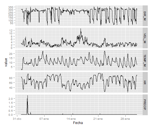
After succeeding (with your help) in plotting meteo variables in single (one variable) graphs I'm trying to produce a panel with time series of the different variables in my data in a single panel, like the one in ggplot2 webpage example. I have tried to reproduce that example (the last graph at bottom of the page) with my data but without success
My data span for several years but I attach just a month. You can see the output of dput(datos) at http://ubuntuone.com/42j1RqUmNmxUuCppW4gElX
and this is the code I'm trying
datos=read.csv("paterna.dat",sep=";",header=T,na.strings="-99.9")
dm=melt(datos,id="FECHA.H_SOLAR")

datos$PRECIP[is.na(datos$PRECIP)]=0
dm=melt(datos,id="FECHA.H_SOLAR")
qplot(date, value, data = dm, geom = "line", group = variable) +  facet_grid(variable ~ ., scale = "free_y")
Error: geom_line requires the following missing aesthetics: x
Además: Mensajes de aviso perdidos
1: In min(x) : ningún argumento finito para min; retornando Inf
2: In max(x) : ningun argumento finito para max; retornando -Inf
I try qplot as it appears in the cited example but maybe it's better to use ggplot and set the aesthetics. Then I could also customize axes.
Thanks in advance
ggplotI only needed to remove NAs (changing to 0) in the case of plotting precipitation withgeom_bar(), not needed for geom_line. Maybe aftermeltcommand is it needed to remove NA? I've usedmeltas it was in the cited example