Page MenuHomePhabricator

[Design] Re-evaluate breakpoint for hiding page tools/toc to keep content width more consistent
Open, MediumPublic

Description

Currently, there are these breakpoints

below 1200px, margins get narrower
below 1001px, page tools get auto-hidden
below 1000px, toc gets auto-hidden

Having the toc and the page tools hide at virtually the same time creates a squeeze effect on the content.
You go from wide, to very narrow and then really wide again. This seems not ideal, the content is the most important area, it's sizing shouldn't make such a big jump...

I think it would be better to have something like:

below 1200px, margins get narrower
below 1200px, page tools gets auto-hidden
below 1000px, toc gets auto-hidden

or

below 1200px, margins get narrower
below 1000px, page tools gets auto-hidden
below 750px, toc gets auto-hidden

or even !

below 1200px, margins get narrower
below 1000px, toc gets auto-hidden
below 750px, page tools gets auto-hidden (reflecting that pagetools hide/showing is perhaps a more active decision by and editor than the ToC/menu)

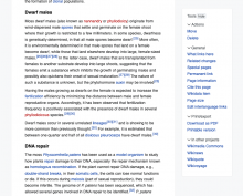
Basically, both sidebars should not hide at the same time, because the content area shrinks from 960px to 500px and then blows up to 1000px (wider than in high width view (without the full width toggle enabled)). I think this transition can be more gradual.

Event Timeline

TheDJ renamed this task from Re-evaluate breakpoint for hiding page tools/toc to Re-evaluate breakpoint for hiding page tools/toc to keep content width more consistent.Feb 24 2023, 9:45 PM
TheDJ updated the task description. (Show Details)
ovasileva triaged this task as Medium priority.Mar 6 2023, 10:35 PM

@alexhollender_WMF, @KieranMcCann - wondering what your thoughts are on this one?

@ovasileva I agree that the content width does get very narrow when the two sidebars are visible, so hiding one of them sooner would make the article more readable within that zone of 1200–1000px.

Personally I have a preference for hiding the page tools first as I would give priority to the ToC, so would opt for something around the area of this option:

below 1200px, margins get narrower
below 1200px, page tools gets auto-hidden
below 1000px, toc gets auto-hidden

That said @TheDJ makes a good point about the page tools being visible being an active choice of the user so people may expect that to remain visible. So that might be something to test?

Two thoughts:

  • I think we decided to collapse the sidebars at 1000px initially because it seemed like a reasonable width, and we already had a breakpoint there. But I think that number is worth reevaluating. Maybe the interface actually works reasonably well with the content + a sidebar at widths below 1000px? The sidebar column is perhaps more narrow than is ideal, but the reading experience seems reasonable and the added utility of having a visible TOC (or page tools menu) is perhaps significant. In all honesty we haven't yet spent much time thinking about the ideal layout at smaller screen sizes (including how elements in the site header respond), so flagging that as an area for more exploration.
Screenshot 2023-03-09 at 10.07.25 AM.png (704×883 px, 324 KB)
Screenshot 2023-03-09 at 10.07.52 AM.png (716×885 px, 229 KB)

You go from wide, to very narrow and then really wide again...it's sizing shouldn't make such a big jump...

  • I think we should be thinking about key screen sizes that people will be using, and providing the best experience at those widths. I don't think it's particularly important how it feels as you transition between those key screen sizes, because that seems to be a fairly negligible part of your actual experience. Like yes, it might be a little weird, but ultimately you're using a static version of the interface, so what happens along the way seems kinda whatever.

below 1200px, margins get narrower
below 1001px, page tools get auto-hidden
below 1000px, toc gets auto-hidden

FYI, the inconsistency between page tools and TOC was a bug that was fixed with T331168, they should both get auto-hidden at 1000px

ovasileva changed the task status from Open to Stalled.Apr 24 2023, 6:47 PM
Jdlrobson subscribed.

Olga what is this one stalled on?

The Codex breakpoints have recently changed. We'll need to do some design analysis first on this task.

Jdlrobson renamed this task from Re-evaluate breakpoint for hiding page tools/toc to keep content width more consistent to [Design] Re-evaluate breakpoint for hiding page tools/toc to keep content width more consistent.Jun 11 2024, 4:38 PM
Iniquity subscribed.

When an article contains an infobox and a menu appears, the line length becomes too narrow and contains from 21 to 33 characters depending on the text size.

Small text sizeNormal text size
image.png (866×1 px, 266 KB)
image.png (889×1 px, 249 KB)

Is it possible to increase the breakpoint value to fit more characters: from 40 to 50?
Onwiki discussion: https://ru.wikipedia.org/wiki/Википедия:Форум/Предложения#c-Iniquity-20240912112700-AndyVolykhov-20240911203000

Looks like page is https://ru.wikipedia.org/wiki/%D0%A7%D0%B5%D0%B1%D0%BE%D0%BA%D1%81%D0%B0%D1%80%D1%81%D0%BA%D0%B8%D0%B9_%D0%BA%D1%80%D0%B5%D0%BC%D0%BB%D1%8C at 1124px.
In this situation, could the float of the infobox be disabled? Better responsive handling of infoboxes is is being tracked by us in T367519.

For Russian Wikipedia have you considered adding the following CSS to your infobox styles?

.mw-body-content {
  container-name: article-content;
    container-type: inline-size;
}

@container article-content (inline-size < 700px) {
  .infobox { 
    float: none !important;
    margin: auto;
  }
}

For Russian Wikipedia have you considered adding the following CSS to your infobox styles?

This is a good idea and should be done for resolutions below 720px, but I don't really like having this rule between breakpoints. A lot of jumping when changing size.

Iniquity changed the task status from Stalled to Open.Sep 24 2024, 6:29 PM

I'm not sure if the task is still stalled, correct me if so plz :)

I agree with the broad argument in this task. Ideally we would want a breakpoint that is defined by a minimum the characters per line in contexts like @Iniquity describes above. Ideally, the breakpoint would also be able to adapt to the text size a reader has chosen so that the main body text of an article never has a character per line count below ~35 (this is a typical readability heuristic). This gets more complicated in languages with long words (e.g. German), where text wrapping often means the practical CPL is much lower than the theoretical CPL. I got into this issue a bit in T356532. In those languages, the minimum CPL should probably be higher. I'd be open to patches that would effectively define breakpoints that accommodate minimum CPL values across different character sets and languages.

Per the web team's quarterly grooming, these tasks are being removed from the team's backlog.