-
-
Notifications
You must be signed in to change notification settings - Fork 1.7k
Update dashboard style #1824
New issue
Have a question about this project? Sign up for a free GitHub account to open an issue and contact its maintainers and the community.
By clicking “Sign up for GitHub”, you agree to our terms of service and privacy statement. We’ll occasionally send you account related emails.
Already on GitHub? Sign in to your account
Update dashboard style #1824
Conversation
|
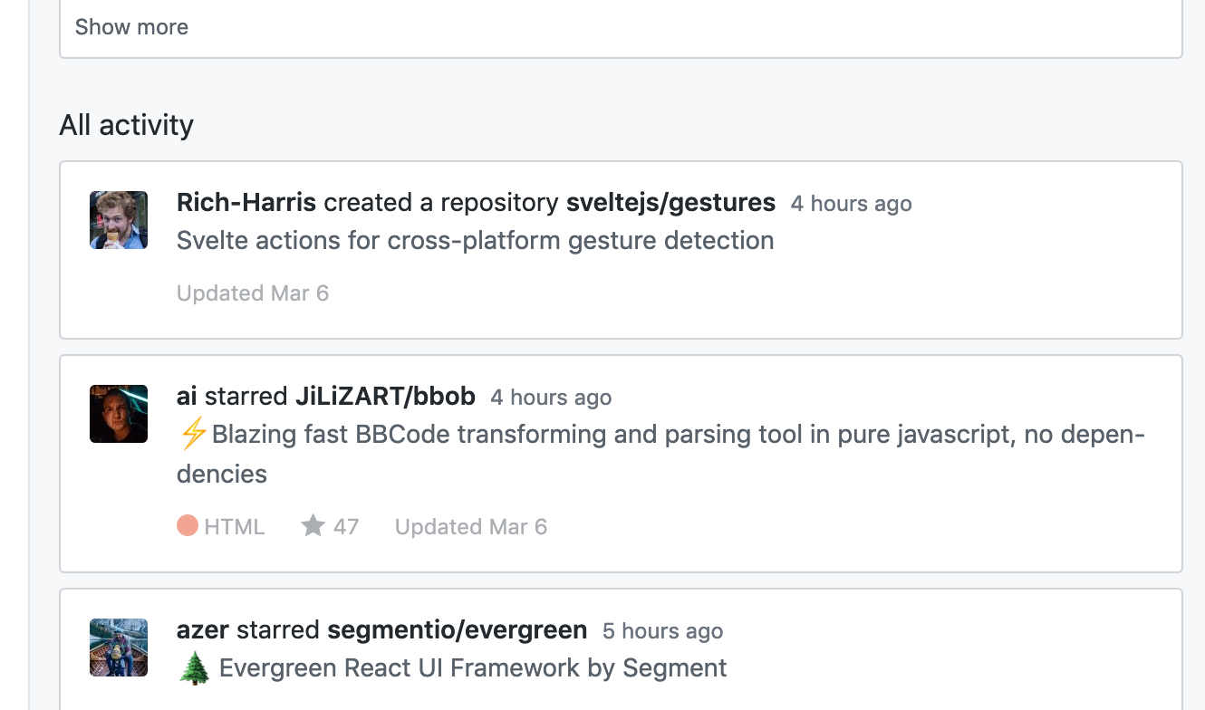
I think it looks worse this way. Maybe it would be better to have the whole contents in the white box instead of the title and timestamp outside of it? The text doesn't contrast enough with the background color IMO. |
|
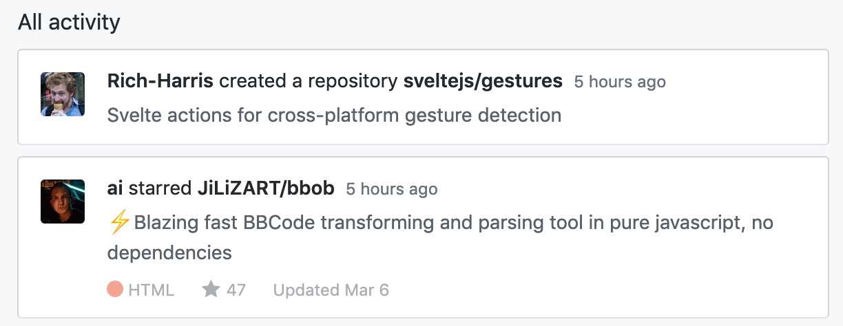
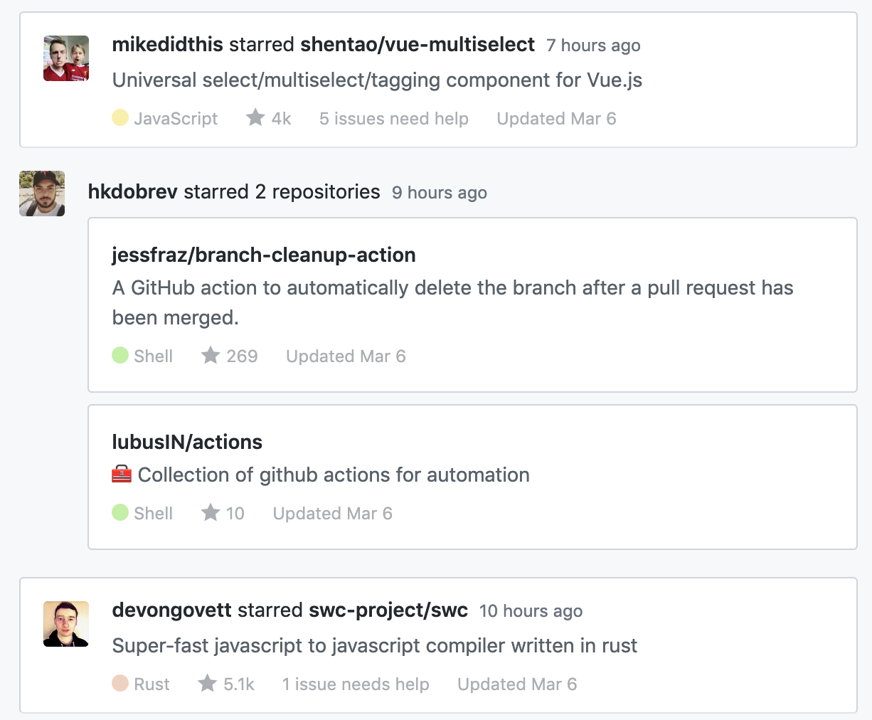
How about this? @sindresorhus I condensed the lines as (I thought you) requested but maybe they're a bit tight like that. Maybe I should just align it to the top. |
|
@bfred-it That looks really good. |
|
Also perhaps I should drop the |
|
Let's give this a go |


Before
After