feat(banner): added support/docs for status icons and text#5075
feat(banner): added support/docs for status icons and text#5075mcoker merged 3 commits intopatternfly:mainfrom
Conversation
|
Preview: https://patternfly-pr-5075.surge.sh A11y report: https://patternfly-pr-5075-a11y.surge.sh |
|
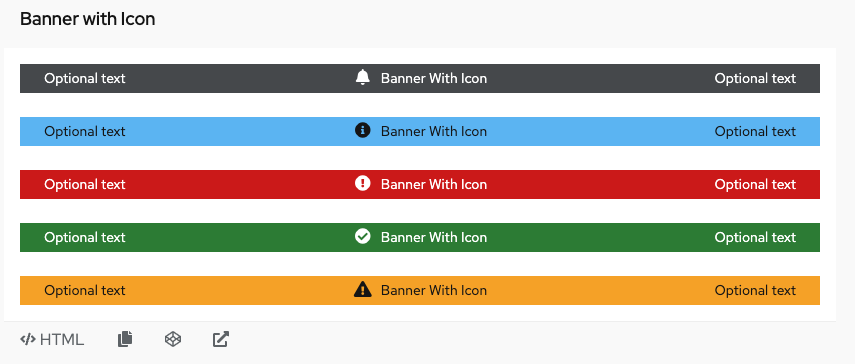
@mcoker can you give this draft PR a look over? Would like to make sure I am approaching it accurately. I am wondering if mulitple HBS files makes sense or should I place the flex layout under banner.hbs with an if statement that looks for modifier pf-m-icon to enable it? Thanks |
 mcoker
left a comment
There was a problem hiding this comment.
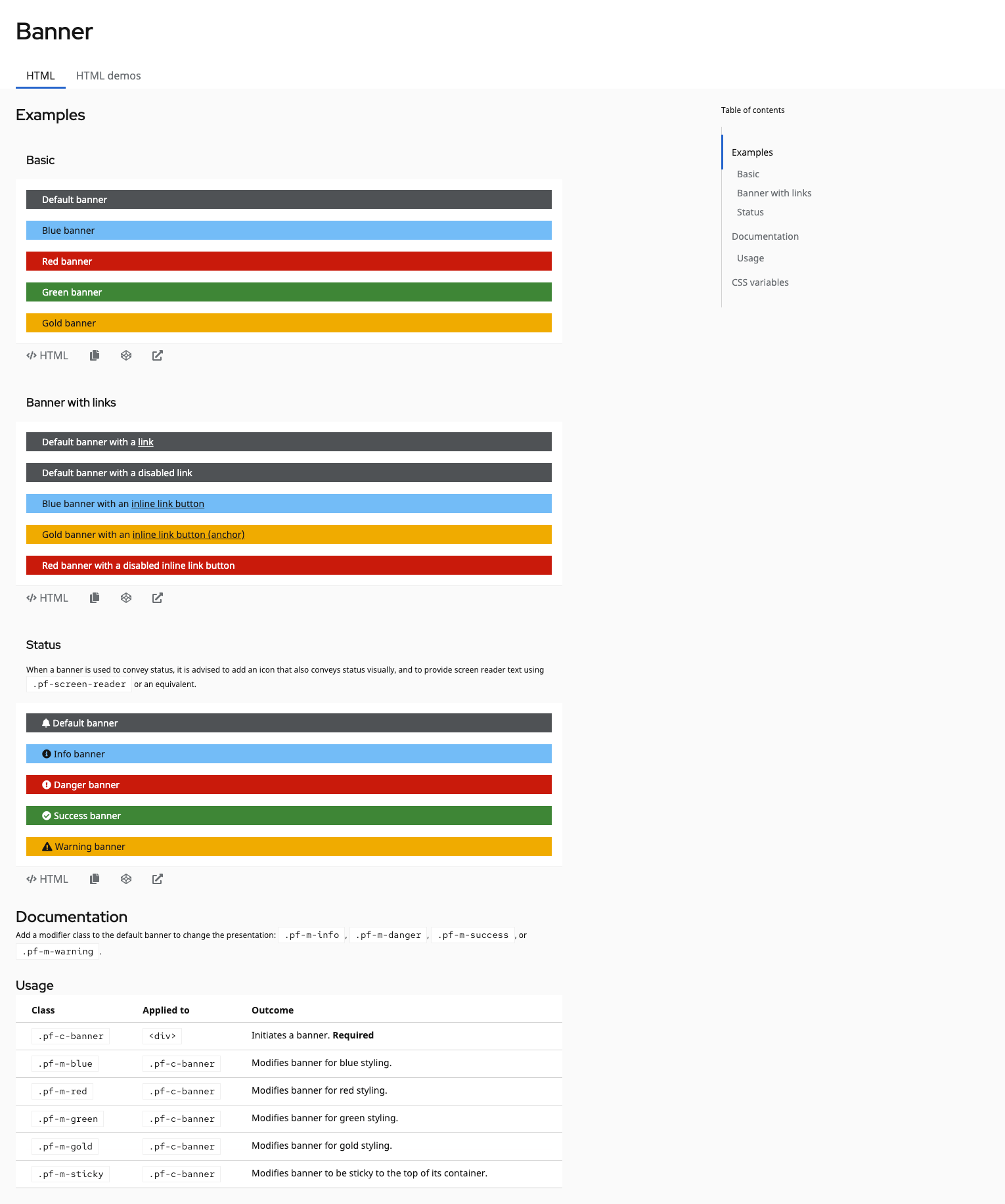
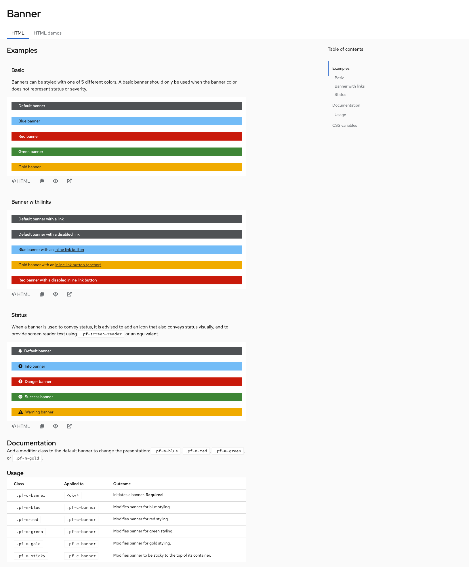
Hey, this looks pretty good! Though we're not really opinionated on what goes into the banner, so this should just be a demo that creates the different color/status variations you've shown here, but just uses a basic flex layout and an icon to space the icon and text.
So you shouldn't need to make any sorts of updates to the banner component itself - no CSS or handlebars or anything, you would just add a demo (or demos?) and call it/them "Banner with status" - or maybe individual demos like "Banner with [success/warning/error/etc] status icon" or "[Success/Warning/Error/etc] banner".
@mcarrano wdyt about how to present these as demos? We could also add a single demo that presents like an example (just inline, not a full page thing) that shows "Banners with status" one after another like the existing basic banner example, then incorporate one into a demo?
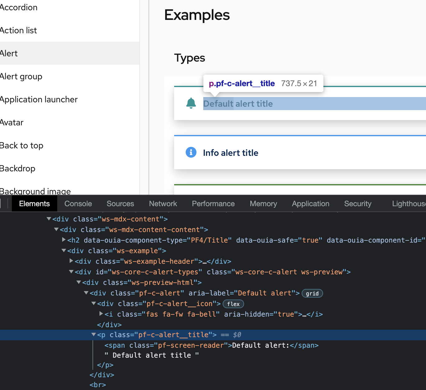
And similar to an alert or modal (with a status icon variation), you might also include some screen reader text like "Warning/Error/etc banner". Here's the alert as an example
I'm not sure. I like the way the current example looks as we have "Banner with links" and "Banner with icons" as examples of different things you can do. And then maybe leave the demo page to be full page examples like it is now that show placement and context? Maybe we update the Basic demo to include the icon since that's a more accessible solution? @thatblindgeye what do you think? I believe you originated this issue. |
@mcarrano I agree, though the existing component examples show features of the banner - the banner with links exists since we style links uniquely in the banner because they appear differently than links in the page content. Technically the banner icon won't be a feature of the banner (like links are), since we decided just to leave it up to users to specify an icon, manage spacing, etc - which is why we were going to add it as a demo. Though that's a technicality on our end, and I'm not sure that anyone looking at our examples would care about that. Just thinking out loud, we could:
I'm curious what @thatblindgeye thinks about that, too, and if we should add some sr-only text |
|
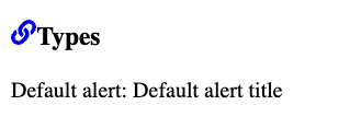
@mcarrano @mcoker based on Michael's comment above with some options, I think I would personally lean towards the option of "update the basic example just to include the default banner...". While users can ultimately add (or omit) whatever content from a banner, if a banner is being used to convey some sort of status/severity (especially if color is primarily being used to visually indicate status; I imagine users wouldn't be using variants solely to change color?) it'd be better to provide examples that provide improved accessibility. That would also require updating the "Banner with links" example, though since two banners in that example are already using the "default" variant that may not be a major issue. The default banner variant is kind of the wild card I feel like, though, since that's a banner where an icon might be more optional... If we did go down the path of adding a "status/variant" example and updating the "basic" example, we could have two "default" variant banners with one having an icon I suppose: I think sr-only text would work well here as well! Even if the text gets visually rendered due to the CSS not being applied, I don't think it would be super intrusive/confusing/verbose to users. Using the Alert example with CSS styles disabled as an example: |
|
I'm not 100% on when/where a banner is used. I recall it being added for a pretty specific use case. @mcarrano to @thatblindgeye's question - do you know if the color variations are always used to indicate status? And if it's not necessarily a status, the grey/default (and/or maybe blue/info?) variation is used? Or could they be used just because the color pops or works more for the app/layout, not necessarily to indicate "success" or "danger" status if a green or red banner is used? |
|
Good question @mcoker . The color coding does not necessarily need to be used for status. One of the primary use cases for this banner came from government systems where they were required to place a banner at the top and bottom of a page to indicate whether information on that page was classified. So red indicated "Classified" and green indicated "Unclassified." |
|
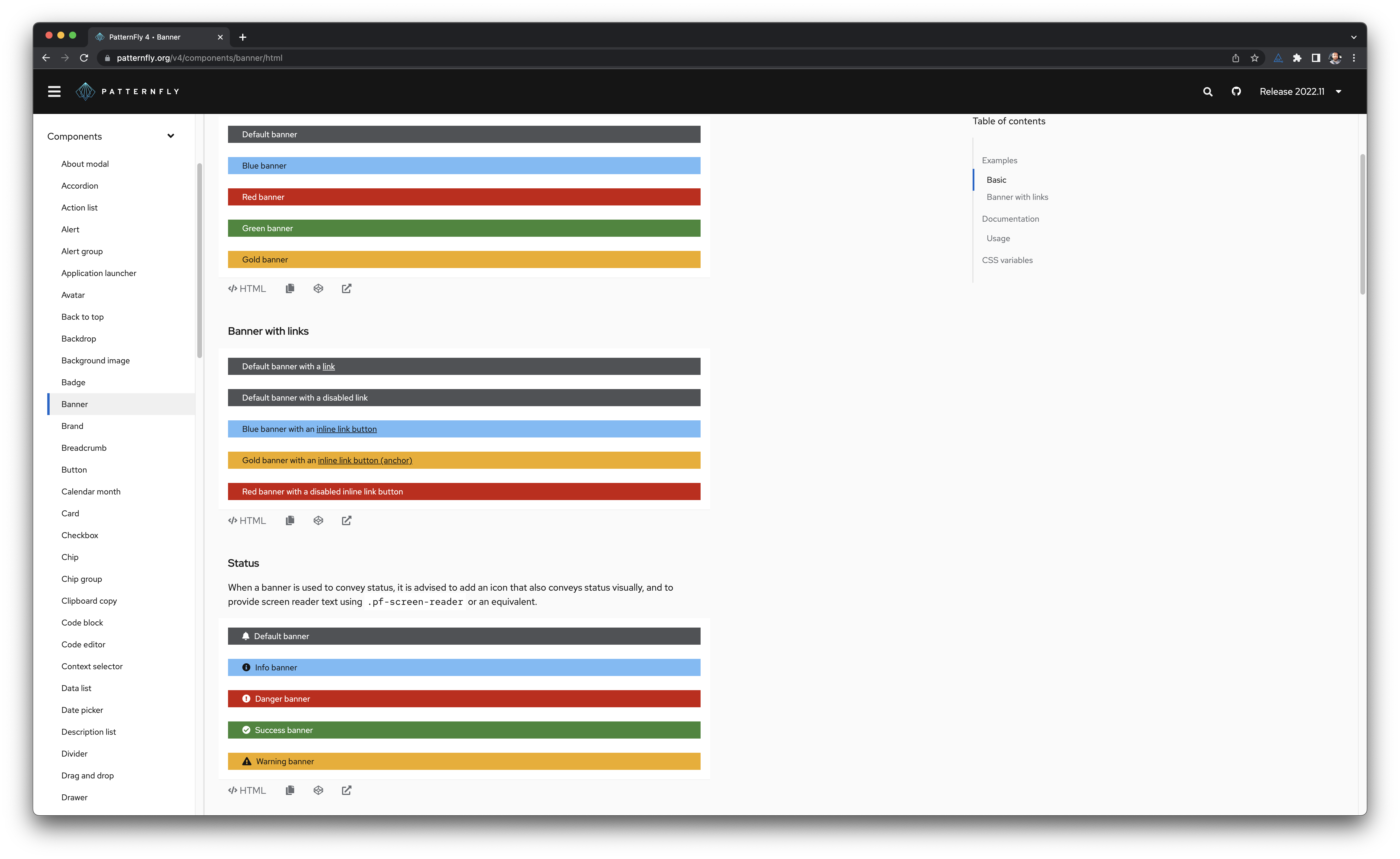
@mcarrano gotcha! in that case, seems like either adding an example or demo with all of the banners stacked, with documentation like "When a banner is used to convey status, you should [do all of these things...]", icons, and sr-only text called something like "Banner status" would be useful, then we could add a demo or update one of the existing ones to show it in context with the page. Though unless there is something unique about a full-page demo that we can't show in a stacked example/demo, I don't know that a full-page demo is necessary. wdyt? @thatblindgeye |
|
I'd agree with adding another example showcasing the banners with icons, with an example description as you described @mcoker ("When used to convey status do this...". In that case, it might be worth considering:
Mainly because right now, the HTML modifiers and React variant prop uses things like "danger" and "success", which make it seem like the intent is that these are mainly meant for status (though can be used solely for color). Re-ordering the examples may not really be necessary with proper example descriptions, though. I'm also unsure if there'd be much added benefit of seeing a "banner with icon/status" demo that isn't already gained from the existing demos (though I wouldn't object to one being added if others would like it added or anything). |
|
@blfetche my apologies, I forgot to mention earlier - looks like this branch may have been created from your tree view PR. If you look through the commit history and files changed, you'll see changes from the tree view in this PR: https://github.com/patternfly/patternfly/pull/5075/commits |
|
Thanks for the catch @mcoker |
@thatblindgeye yep! I was going to mention that we could rename the classes to just refer to the color, like the label, though that would be a breaking change. We could also add new color classes and leave the old legacy ones around until a breaking change, then remove them. That would clear up some of that confusion, though I dunno if it's that big of a deal. It might look something like this |
|
I agree that this would be better. We don't want people to confuse banners with alerts. The banner is not limited to notifying the user about error conditions so consumers might use color in a variety of ways. |
|
@mcarrano should we go ahead do what's in this comment and:
|
|
@mcarrano yep! |
|
Sounds like a plan, thank you all for the input! |
a980d20 to
b6fdfb5
Compare
|
@mcoker @mcarrano @thatblindgeye |
 mcoker
left a comment
There was a problem hiding this comment.
Awesome! Thanks for doing that so fast, too! 🚀
Just a couple of small comments.
 thatblindgeye
left a comment
There was a problem hiding this comment.
This looks great! Awesome job on this. I think the only nitpick I have is that it could be worth adding a description to the "Basic" example, stating something along the lines of, "Banners can be styled with one of 5 different colors. A basic banner should only be used when the banner color does not represent status or severity." Mainly my worry is the code from the first example being grabbed without looking further down the page at the "Status" example.
@blfetche @mcoker what do you think? We do already have the description on the "Status" example which covers when you should use it, so adding one to the "Basic" example may be a bit redundant admittedly.
 mcarrano
left a comment
There was a problem hiding this comment.
This looks great @blfetche . I agree with @thatblindgeye that it might be worth adding an additional note about not using the Basic configuration for anything reflecting status.
 thatblindgeye
left a comment
There was a problem hiding this comment.
🎉 Awesome job again on this!
|
🎉 This PR is included in version 4.215.0 🎉 The release is available on: Your semantic-release bot 📦🚀 |

Applies to update feature for issue #5013