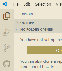
Change icon to more representative icon - #2294
Conversation


c9b3b3e to
1c76805
Compare

|
This seems to have been the icon at one point when looking at the readme's first gif |
|
Any comments on this? |

|
Hey Kai Sforza (@KaiSforza), sorry for the delayed response! I agree that this icon does a better job of representing the extension and is also easier to distinguish from the other icons in the activity bar. The reason this icon was changed is because of GitHub codespaces, which introduces its own GitHub icon on the activity bar:
Maybe an icon that combines the GitHub logo and the git pull icon would work for this scenario, like having the GitHub logo with it at the corner as the codespaces icon does with the VSCode logo. @misolori Do you think that would work? |


|
Rachel Macfarlane (@RMacfarlane) I think we'd need to ask the GitHub team as that is modifying their brand logo. My thought is they wouldn't be keen on it since it's not a product/feature. |

|
The current icon is actively harmful. It's very hard to distinguish the sidebar panel for making commits (which you need to use very frequently) from the GitHub issues/PR sidebar. |

 Rachel Macfarlane (RMacfarlane)
left a comment
Rachel Macfarlane (RMacfarlane)
left a comment
Rachel Macfarlane (RMacfarlane)
left a comment
There was a problem hiding this comment.
Thanks Kai Sforza (@KaiSforza), going to go ahead and merge this now since Codespaces no longer has a conflicting icon!

4 participants


Fixes #2280
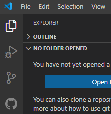
pull-request.pngwas extremely similar to the standard "Source Control" tab in vscode, this changes it to one that is much more github.Dark theme:
Light theme:
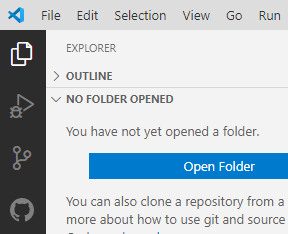
Light sidebar: