Demo of using a responsive image to load different types of image on different devices and screens using the srcset and sizes attributes
See it in action - https://responsive-images.pages.dev/
screen-recording-2022-08-30_20.54.34.mp4
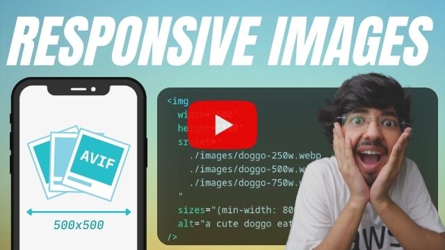
<img
  width="500"
  height="500"
  srcset="
    ./images/doggo-250w.webp   250w,
    ./images/doggo-500w.webp   500w,
    ./images/doggo-750w.webp   750w,
    ./images/doggo-1000w.webp 1000w,
    ./images/doggo-1500w.webp 1500w
  "
  sizes="(min-width: 800px) 500px, (min-width: 500px) calc(50vw - 2px), 100vw"
  alt="a cute doggo eating icecream"
/>