Repository navigation
Conversation


When the right panel is closed and the chat is at least 66rem wide, a
floating card in the chat's top-right corner shows the chat tree cost,
uncommitted changes, pull requests, sub-agents and agent attachments.
Each row opens the right panel on its tab, or the sub-agent's chat.
The transcript moves left to make room, keyed on layout only.
… card

One row component for buttons and links, a toggle that keeps focus,
reuse of DiffStatBadge, getPathBasename and DiffStats, a cost error
state, a shared useShowOverviewRoom hook, Tailwind variable shorthand,
named fixtures and an expanded-list story.

Keep a loaded cost on a failed refetch, carry PR numbers in the
overview data, share the room and card breakpoint classes from the
card module, label sections by their headings, and add no-cost and
full-width stories.

Member
Author
Dogfood on eph-pr-31260Preview: https://8080--dev--eph-pr-31260--tk--apps.dogfood.cdr.dev (frontend mode against dogfood, sign in with your dogfood account). Deployed commit: I ran the plan's acceptance checks with agent-browser against real dogfood chats: an older chat with two PRs, an older chat with three subagents, and a new demo chat. The screenshots show only the demo chat. All nine checks pass.
Panel closed at 1440x900 (chat column only):
The Changes row opened the Git tab:
1280x800, no card:
Known limits of the prototype:
The demo chat created the workspace |


…r toggle

The card no longer moves the transcript. A top bar toggle opens it, an
outside click or Escape closes it, and a pin keeps it open in every chat.
The card and its toggle show only on a chat at least 84rem wide, where
the card fits beside the centered transcript.
…round

Move the open state into hooks/useOverviewCard.ts, show a loading line
while an empty card still waits for data, and tighten comments, tests
and stories.
…ments

Apply the fourth frontend review round: a Loading story for the card's
loading line, a simpler Escape guard, and shorter comments.
…ew card is open

The card now shows from a 66rem chat. While it is open, the transcript
and composer move left only as far as they must to clear it, which is
nothing from an 84rem chat on. A closed card moves nothing.
…he overview card

A chat can have 100+ subagents. The card now lists only subagents that
work or need the user (running, interrupting, requires_action, error),
at most 5 rows with no toggle, and counts them in the section heading,
for example "Subagents · 7 of 112 active". The sidebar chat tree still
lists every subagent.
…s toggle closes it

The top bar toggle now works as the pin did: an open card stays open in
every chat and after a reload, and only the toggle closes it. Outside
clicks, Escape, and row clicks no longer close the card. The pin button
in the card header is gone, with the refs and listeners that only the
closing logic used. The stored key is now agents.overview-card-open.
# Conflicts:
#	site/src/pages/AgentsPage/components/ChatPageContent.tsx
This was referenced Oct 28, 2026
Merged
ThomasK33
added a commit
that referenced
this pull request
Nov 10, 2026


…d view (#31409) Adds `ChatOverviewCardView`, a small card that lists a chat's cost, its repositories with their uncommitted line counts, the pull requests, and the attachments. Nothing mounts the view yet, so this PR changes no page. #31412 mounts it in the chat's top-right corner while the right panel is closed. A row calls `onOpenTarget({ tabId })` with the right panel tab that holds its details: **Summary** for cost and attachments, **Git** for repositories and pull requests. A repository row shows the repository's folder name, with its branch below it, or "No branch" when HEAD is on no branch. A repository without uncommitted changes shows `+0 −0` as plain text, with no hover state and no click, because the Git panel has nothing to show for it. A button row's label truncates in the 16rem card. When the label or subtitle is cut off, a tooltip shows it in full on hover and on keyboard focus. A row that fits gets no tooltip, so a screen reader does not hear its text twice. The plain-text row wraps instead, and it takes no tab stop. Long lists show three rows and a toggle that names the section, such as "Show all 5 repositories" and "Show fewer repositories". While the card is empty and loading, it shows skeleton rows in a `status` region that reads "Loading overview", and the card is marked `aria-busy`. The card has no animation. The code comes from the prototype in #31260 (do not merge), adapted to the `MessageAttachment` type from #31140. #31260 stays the hands-on reference for the whole card. The card with a long list, where the third repository has no branch: 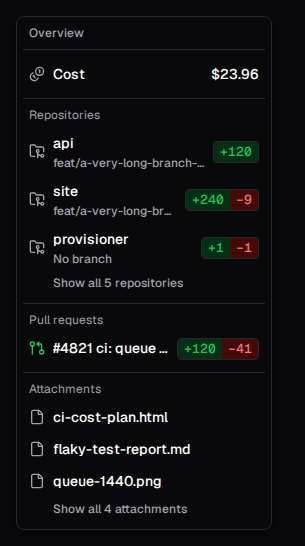 The expanded list, and a clean repository without cost: 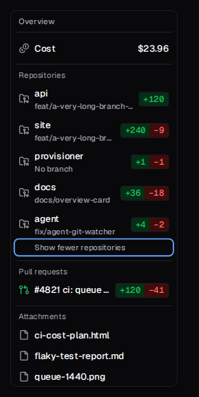 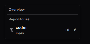 A repository row whose branch is cut off, on hover: 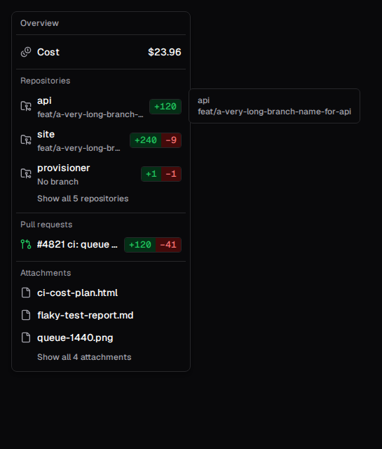 The loading state:  ## How to test 1. Open Storybook at `pages/AgentsPage/ChatOverviewCardView` and step through the stories. `TruncatedRowTooltip` hovers a repository row whose branch is cut off. 2. Run `pnpm exec vitest run --project=unit src/pages/AgentsPage/components/ChatOverviewCardView.test.tsx` in `site/`. The tests check the target each row sends, that a clean repository row is not a button, that a truncated row's tooltip opens on hover, that a row that fits gets no tooltip, and that Tab skips a clean repository row. ## What to look at first 1. `OverviewRow`: one row renders as a button with `onClick`, or as plain text without it, inside the shared `Tooltip`. 2. `OverviewListSection`: the shared "title, first three rows, toggle" list for Repositories, Pull requests, and Attachments. 3. `hasChanges` and `RepoDiffStat`: the clean repository rule lives in one predicate. <details> <summary>Review history</summary> Review follow-up: the Changes section listed repositories but labeled each row with its branch, so two repositories on the same branch looked the same, and the toggle counted repositories as changes. The section is now **Repositories**: each row shows the repository name, with the branch (or "No branch") as the subtitle and a repository icon. The view model gained `name`, and #31590 fills it. The stack above was updated by merges. The repository's frontend-deep-review ran three rounds on the first version, then one strict code quality review ran, then a polish pass and one final review round (a code quality review plus frontend-deep-review) ran on the whole stack. Polish pass changes in this PR: - Renamed the file to `ChatOverviewCardView.tsx`. The container lives in `ChatOverviewCard.tsx` in #31590 and the toggle joins it in #31412, like `AgentChatPage` and `AgentChatPageView`. - `onOpenTab(tab)` became `onOpenTarget({ tabId })`, so #31478 only adds a Git view to the target. The existing row test now expects `{ tabId: tab }` instead of `tab`. That is the only changed assertion, and it follows the rename. - Added `OverviewListSection`, `RepoDiffStat`, and `hasChanges`. - Clean repository rows became plain text. Before, a click opened the default Git view. The new test "opens nothing from a repository without changes" fails without this change. Final round fixes: folded `OverviewList` into `OverviewListSection`, named the clean repository check `hasChanges`, made `getCostSubtitle` return `undefined` instead of an empty string, and shortened the card's doc comment. Accessibility review from Jaayden (four threads) and an audit against site/AGENTS.md "Accessibility and robustness", FE6 and the frontend-deep-review SA6 checkpoint: - The clean repository row is plain text again: no `tabIndex`, no tooltip, no `oxlint` exception, and its label wraps. This reverses the follow-up fix below. The keyboard test now checks that Tab skips the row and lands on the next button, found by role. - The loading state uses skeleton rows in `role="status"` with screen reader text, and the card gets `aria-busy`. - The list toggle drops `aria-expanded` and names the section in its visible label. - The tooltip opens only when the text is truncated, measured with a `ResizeObserver` as the Git panel does for its PR title. New test: "adds no tooltip to a row whose label fits". - New story `TruncatedRowKeyboardFocus` screenshots the focus ring and the tooltip from the keyboard. - Declined from the audit: `aria-expanded` on the toggle (the review asked for one state signal), moving focus after a subagent link opens another chat (the sidebar chat links behave the same way), and moving focus when the window shrinks below 84rem while focus is in the card (rare). - Declined from the advisor: `useCallback` for the measuring ref. The React Compiler memoizes it, and the frontend rules forbid manual memoization in compiled folders. - I merged `origin/main` into this branch and carried it up the stack by merges, without a force push. Follow-up fixes, after the final round: - Added the row tooltip, with the shared `Tooltip` primitive. The plain-text row gets `tabIndex={0}` and an `oxlint` exception with its reason, as `SecretsTable.tsx` does, so the keyboard can open its tooltip. Its earlier "no focus" behavior changes for that reason only. - Two new tests check the tooltip through the row's accessible description, by hover and by keyboard. Each fails when the tooltip stays closed. The test file now renders with `renderComponent`, which adds the tooltip provider. No existing assertion changed. - New story `TruncatedRowTooltip` gives the open tooltip a screenshot. - The PR grew to 605 changed lines, most of them stories and tests. I kept it in one PR. Skipped in the polish pass: - A cost model that carries `coversWholeTree`. It moves a conditional into the container and changes the tested `getOverviewCost` contract without deleting a branch. - A shared helper for the unpriced-requests sentence. The two copies are short and use different punctuation, and the helper would touch `ChatSummary` in an unrelated PR. - A `CostRow` component from the final round. It overlaps the cost model item above and saves about three lines. Declined in earlier rounds: - Story fixture factories (`mockRepo`, `mockAttachment`) instead of named `Mock*` constants. They build view-model rows for one component, not shared API entities. - Stories for the "Pull request" and attachment name fallbacks, and for merged, closed, and draft pull request icons. `getPRIconConfig` and `getAttachmentDisplayName` are shared helpers with their own coverage. - A fallback label in the view for an empty branch name. The container passes `repoBranchLabel(root, repo)`, the same label as the Git panel. - A loading line while some sections already show data. Sections render as their data arrives, by design. </details> --- _Generated with [`xum`](https://github.com/coder/xum) • Model: `anthropic:claude-opus-5-5` • Thinking: `high`_ --------- Co-authored-by: Jaayden Halko <jaayden.halko@gmail.com>
jaaydenh
added a commit
that referenced
this pull request
Nov 13, 2026
…n the overview card (#31410) Adds a Subagents section to the overview card view from #31409. It lists at most five subagents that are not idle, with no toggle. A row links to the subagent's chat. When its title is cut off, a tooltip shows it in full on hover and on keyboard focus. Chats can have 100 or more subagents, and the sidebar's chat tree already lists all of them. Subagents that need the user (`error`, `requires_action`) sort first, so the five-row cap hides them last. The order within each group stays as the API returns it, newest first. The heading reads "Subagents · N of M not idle" and counts every subagent. A chat whose subagents are all idle shows that heading instead of "Nothing to show yet". The prototype in #31260 said "active" and counted errored subagents. The shared `isActiveChatStatus` leaves errors out, so I kept errors in the list and changed the word to "not idle". That matches the "Idle" label of the `waiting` status. The wording is an open question for Jaayden in #31412.  ## How to test 1. Open Storybook at `pages/AgentsPage/ChatOverviewCardView`, stories `ManySubagents` and `IdleSubagents`. 2. Run `pnpm exec vitest run --project=unit src/pages/AgentsPage/components/ChatOverviewCardView.test.tsx` in `site/`. ## What to look at first 1. `SubagentsSection`: the filter, the sort, the cap, and the count in one component. 2. `OverviewRow`: the new link form. Its props type allows `onClick` or `to`, never both. <details> <summary>Review history</summary> Follow-up fix: the link row uses the tooltip from #31409, which now opens only for truncated text. A new test focuses a truncated subagent row and checks its accessible description. It fails when the link row skips the tooltip. No existing assertion changed. `origin/main` reached this branch by merge from #31409. Polish pass changes: extracted `SubagentsSection` and named the two status checks `isIdle` and `needsUser`. Behavior and test assertions are unchanged. Declined: - Earlier round and final round: delete the view tests for the filter, cap, sort, and count, and the all-idle count, as checks of rendered content. They cover the selection logic, and each fails when the sort or the section condition is reverted. The requester also asked to keep existing assertions unchanged. - Final round: a stronger assertion in the all-idle test. Same reason. - Final round: inline `isIdle`. The polish plan named this check on purpose, and it reads next to `needsUser`. </details> --- _Generated with [`xum`](https://github.com/coder/xum) • Model: `anthropic:claude-opus-5-5` • Thinking: `high`_ --------- Co-authored-by: Jaayden Halko <jaayden.halko@gmail.com>
jaaydenh
added a commit
that referenced
this pull request
Nov 18, 2026
Shows the overview card container from #31590 in Coder Agents chats. The card sits in the chat's top-right corner, and a list button in the chat top bar shows and hides it, as in the Codex desktop app. The card and the button exist only while the right panel is closed, the transcript is not full width, and the page is not an embed. Both show only from an 84rem chat, so the card never covers the transcript and the transcript never moves. Below 84rem the card does not mount, so its cost and attachment requests do not run. Phones and narrow windows do not show the card. The card shows by default and stays open until the user hides it. The choice is stored in localStorage under `agents.overview-card-open`, for every chat. The right panel keeps its own saved preference. A row opens the right panel on its tab, which hides the card. The card returns when the panel closes. The Repositories section lists every repository the git watcher reports, by folder name with its branch below. A clean repository shows `+0 −0`, so a chat keeps a Repositories row when AI Gateway turns cost off. The card reads the attachments through `useChatAttachments` from #31411, so it shows the Summary panel's list and shares its query. When the earlier attachments fail to load, the card shows the error and a **Retry** button in Attachments, as the Summary panel does. The docs describe the card in the Coder Agents overview and add it to the places that show spend. #31260 (do not merge) stays the hands-on reference. 1600px chat with the card open:  1600px chat after the user hid the card:  960px chat, no card and no button:  ## Decision and open questions for Jaayden Decision you can reverse: a clean repository row is plain text, not a button. The Git panel lists only repositories with changes, so a click on a clean row used to open the default Git view. To reverse it, give the clean row its `onClick` back in `ChatOverviewCardView`. 1. Should a new chat show the card instead of the Summary panel? This PR keeps the right panel's saved preference as it is. 2. A chat with no repository and no cost shows "Nothing to show yet". Is that the placeholder you want? 3. Subagents (#31410): the heading says "not idle" instead of "active" because errored subagents stay in the list, and the ones that need the user sort first. Do that wording and order work for you? 4. A row click (#31478) moves focus to the active right panel tab. Do you prefer the Git view switcher instead? ## How to test 1. Open Storybook at `pages/AgentsPage/AgentChatPageView`, stories `OverviewCardBesideTranscript`, `OverviewCardHiddenWhenNarrow`, `OverviewCardHiddenInFullWidth`, and `OverviewCardHiddenByUser`. 2. Run `pnpm exec vitest run --project=unit src/pages/AgentsPage/AgentChatPage/AgentChatPage.test.tsx src/pages/AgentsPage/hooks/useChatOverview.test.ts` in `site/`. The page tests set the chat width with the repo's `MockResizeObserver`. They check that a narrow chat requests none of the card's data, and that **Retry** in the card requests the earlier attachments again. 3. In a dev deployment, open a chat in a window at least 84rem wide. Hide the card with the list button, reload, and check that it stays hidden. ## What to look at first 1. `hooks/useChatOverview.ts`: one `canShow` value gates both the toggle and the card, so the page only renders what the hook returns. The hook measures the chat's outer element with a `ResizeObserver` through `observeChat`, and `OVERVIEW_MIN_CHAT_WIDTH_REM` holds the 84rem value in one place, so the button and the card cannot disagree. 2. `AgentChatPageView.tsx`: the page passes `observeChat` as the chat element's ref and destructures it from the hook result. The React Compiler treats an object that holds a ref callback as a ref, so the page keeps it apart from the other values. 3. `components/ChatOverviewCard.tsx`: this PR adds `ChatOverviewToggle` to the container from #31590. <details> <summary>Review history</summary> The repository's frontend-deep-review ran three rounds on the first version, a clean-context advisor ran once, then one strict code quality review ran, then a polish pass and one final review round ran on the whole stack. Polish pass changes: - Split `ChatOverviewCard.tsx` into the container plus `ChatOverviewToggle`, with the view in `ChatOverviewCardView.tsx` (#31409). The `getOverviewCost` tests moved to `ChatOverviewCard.test.tsx` unchanged. - Added `useChatOverview`, which owns the visibility gate and the open state. - The card builds repository rows with `repoLabel`, the repository's branch, and `countRepoChanges`. Before, it filtered repositories through `computeRepoStats` only to add the clean ones back. - The docs say that you cannot select a clean repository row. Final round fixes: renamed the top bar prop `overview` to `overviewToggle`, inlined the toggle value in the hook, and corrected three doc comments. Follow-up fixes, after the final round: - The card no longer mounts below an 84rem chat. Before, it stayed mounted and CSS hid it, so its queries kept running. The repo has no element-size hook, so `useChatOverview` observes the chat element itself. The `@container/chat` class and the `@min-[84rem]/chat` classes are gone. - The card wires the earlier attachments request into the view, so a failure shows its error and a retry. - New tests: the hook test checks the 84rem boundary on both sides, and two page tests check the narrow chat's requests and the card's retry. Each fails without its fix. The existing page tests now set a 1600px chat width before they look for the card. Their assertions did not change. - The container moved to #31590, because this PR grew past 600 changed lines. GitHub cannot insert a PR in the middle of a stack, so I removed stack #31413 and linked the six PRs again as stack #31591. - Safari: Playwright 1.63.0 downloaded WebKit, but WebKit does not start on this host, because system libraries such as `libsoup-3.0` and `libGLESv2` are missing. I did not check the narrow right panel or the card in WebKit. The `@container/chat` wrapper that the check was about no longer exists. Skipped in the polish pass: passing the card's placement class from the page. That keeps the 84rem breakpoint in one file with the toggle, and moving it adds a pass-through prop. Declined: - The page test checks that the card is gone while the right panel is open (`toBeNull`). That unmount is the behavior under test, and no callback or request captures it. - `@container/chat` traps the right panel's `fixed inset-0` overlay below the `lg` breakpoint. I rendered `NarrowWithSidebarPanel` at 390px and 900px in Chromium, and the panel still covers the viewport. The follow-up fixes removed `@container/chat`. - `try`/`catch` around `localStorage` in `overviewCardStorage.ts`. The file follows `sidebarTabStorage.ts`. - Final round: move `ChatOverviewToggleProps` into the hook. The hook imports only a type from the component file, so no runtime cycle exists. </details> --- _Generated with [`xum`](https://github.com/coder/xum) • Model: `anthropic:claude-opus-5-5` • Thinking: `high`_ --------- Co-authored-by: Jaayden Halko <jaayden.halko@gmail.com>
This branch has not been deployed
This file contains hidden or bidirectional Unicode text that may be interpreted or compiled differently than what appears below. To review, open the file in an editor that reveals hidden Unicode characters.
Learn more about bidirectional Unicode characters
Sign up for free
to join this conversation on GitHub.
Already have an account?
Sign in to comment

Add this suggestion to a batch that can be applied as a single commit.This suggestion is invalid because no changes were made to the code.Suggestions cannot be applied while the pull request is closed.Suggestions cannot be applied while viewing a subset of changes.Only one suggestion per line can be applied in a batch.Add this suggestion to a batch that can be applied as a single commit.Applying suggestions on deleted lines is not supported.You must change the existing code in this line in order to create a valid suggestion.Outdated suggestions cannot be applied.This suggestion has been applied or marked resolved.Suggestions cannot be applied from pending reviews.Suggestions cannot be applied on multi-line comments.Suggestions cannot be applied while the pull request is queued to merge.Suggestion cannot be applied right now. Please check back later.
Prototype, do not merge. This PR exists to collect opinions on a session overview card in Coder Agents. The idea comes from the ChatGPT desktop app (Codex) and from Xum.
A list button in the chat's top bar opens a small card in the chat's top-right corner. The card shows the state of the chat. Each row opens the right panel on its tab, or the subagent's chat. While the card is open, the transcript moves aside as far as it must, so the card never covers it.
/chats/{id}/cost. Only with AI Gateway visible, and hidden while the chat has no requests. "Unavailable" when the request fails.+adds −delsfor each repository, from the git watcher (computeRepoStats, the same counts as the Git tab)chat.diff_statuses, the same refs as the top-bar chip)The Changes, Pull requests, and Attachments lists show 3 rows and a "Show N more" toggle. A section without data does not render. An open card with no data says "Nothing to show yet", or "Loading…" while cost or messages load.
How it opens:
localStoragekeyagents.overview-card-open), as a pinned summary does in Codex. A click outside the card and Escape do not close it.The transcript moves only while the card is open. The chat row is a
@container/chat. The card and the list button show from a 66rem (1056px) chat: 48rem for the centeredmax-w-3xltranscript and composer, plus 18rem for thew-64card, itsright-4inset, and a 1rem gap. While the card is open (in the loading view, while it is stored as open), the chat column sets--agents-overview-room: max(0px, calc(84rem - 100%)), which is the part of the 18rem the centered transcript lacks. The scroll viewport, the earlier-messages and scroll-to-bottom buttons, the empty state, and the composer read it. So a 1120px chat (a 1440px window with the sidebar open) moves the transcript 112px left, and from an 84rem (1344px) chat nothing moves. In full-width mode, in an embed, and while the right panel is open, there is no card, no button, and no room.Not in this prototype: token totals (a backend change), automations (they do not exist yet), a context meter, focus hand-off into the panel, deep links from a PR or repository row to that view in the Git tab, a move animation, room in the route-level skeleton, an experiment flag.
Screenshots
Storybook, a 1120px chat (a 1440px window less the left sidebar), card closed:
The same chat with the card open. The transcript and composer moved 112px left:
A 1600px chat with the card open. Nothing moves:
A 960px chat with the card left open: no card and no list button:
The card in a chat with 112 subagents, 7 of them running. It lists 5 and counts all 7:
Validation
pnpm lint(biome, oxlint, tsc, circular deps, React Compiler check, knip),pnpm check, andpnpm lint:typespass on the head.ChatOverviewCard.test.tsxhas 7 tests: each row opens its tab, a subagent row opens its chat, the card lists at most 5 active subagents and counts them, and the card stays open after an outside click, Escape, a row click, and in the next chat, until the button closes it. With ChatTopBar, ChatPageContent, and AgentChatPage, 27 tests pass in 4 files.ChatOverviewCard.stories.tsx,AgentChatPageView.stories.tsx, andChatTopBar.stories.tsx.frontend-deep-reviewran 6 rounds with 8 reviewers each. From round 4 on I fixed blockers only. Round 6 (the subagent cap) marked no finding blocking and 3 should-fix, listed under Follow-ups. A clean-context advisor recommended "ready with tracked follow-ups", and I stopped there because the review budget is used up. Round 5 marked 2 findings blocking. I fixed one: a room comment that was too long and described the wrong constant. I rejected the other: "the composer is narrower than the transcript at 66rem". The composer and the transcript share one center. Only in a 66rem to 67rem chat is the composer up to 1rem narrower on each side, and then it matches the transcript's text column, as it already does below a 50rem chat. Declined earlier, with reasons: inline the toggle's class string, use Radix Popover, store the pin as a user setting, split the PR.ACPContext, which conflicted inChatPageContent.tsx. I kept the room wrapper inside it. Lint, types, 27 Vitest tests, and 117 Storybook tests pass on it, and CI passed. On the preview at this head, opening the card in a 1440px window moved the transcript from x 491 to 1259 to x 379 to 1147, and closing it moved the transcript back.eph-pr-31260preview at head 217196b, in a 1440px window: the card had no pin button. It stayed open after a click in the transcript, Escape, a switch to another chat, and a reload. A click on Cost opened the panel and hid the card. Closing the panel brought the card back. Only the list button closed it.eph-pr-31260preview at head fb075fa: a chat with 3 idle subagents showed Cost and Attachments and no Subagents section. I did not test a running subagent on the preview. The Vitest test and the ManySubagents story cover that case.eph-pr-31260preview at head 4f078a1:Follow-ups
Review round 6 found items 1 to 3, and its advisor found item 4. Review round 7 found items 6 and 7, and its advisor found item 5. I left them because rounds 4 to 7 fix blockers only. Owner: the PR author. Trigger: fix them before this prototype becomes a real PR.
isActiveChatStatusdoes not count errors. RenameisActiveSubagentStatusand the heading word, or leave errors out.AgentChatPageView.stories.tsxsay "An open card ...: no card and no toggle", which reads as a contradiction. Write "A card stored as open ...".useOverviewCardnow only wraps one stored flag, and one component reads it. Consider a storage helper next to the otherutils/*Storage.tsmodules and auseStateinAgentChatPageView.Generated with
xum• Model:anthropic:claude-opus-5-5• Thinking:xhigh