Repository navigation
Design license banner #3211

Description

Problem
When an enterprise customer's license is in a grace period or exceeds their active user limit, there needs to be a banner on all pages alerting them to the non-compliance. It must be able to display an arbitrary number of warning strings, in case the customer is out of compliance on multiple fronts. It must not be dismissible, but it must not interfere with any functionality.
Definition of Done
A Figma mock-up showing the color, size, and placement of the banner.
Issues to keep in mind
What will happen if the banner gets longer due to additional warnings?
How much can we have the banner on the outside of all other content for ease of adding it to the component tree?
Prior art
To see the v1 license banner, set the System Banner here https://master.cdr.dev/admin?tab=appearance. The color is settable by the admin (not a requirement in v2 as far as I know) so the color below is not a meaningful design choice. Note that the banner stays at the top of the viewport as you scroll:


Activity
BrunoQuaresma commentedon Aug 15, 2022
My first suggestions
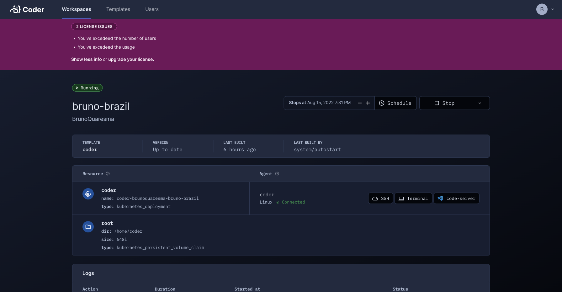
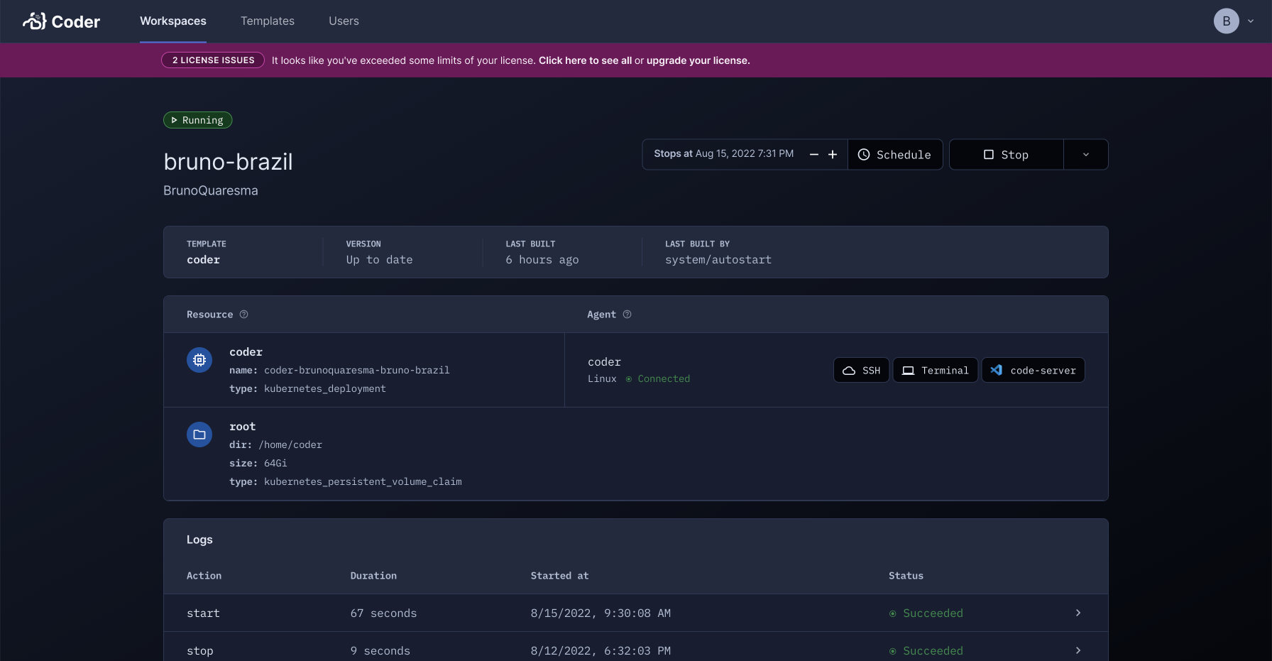
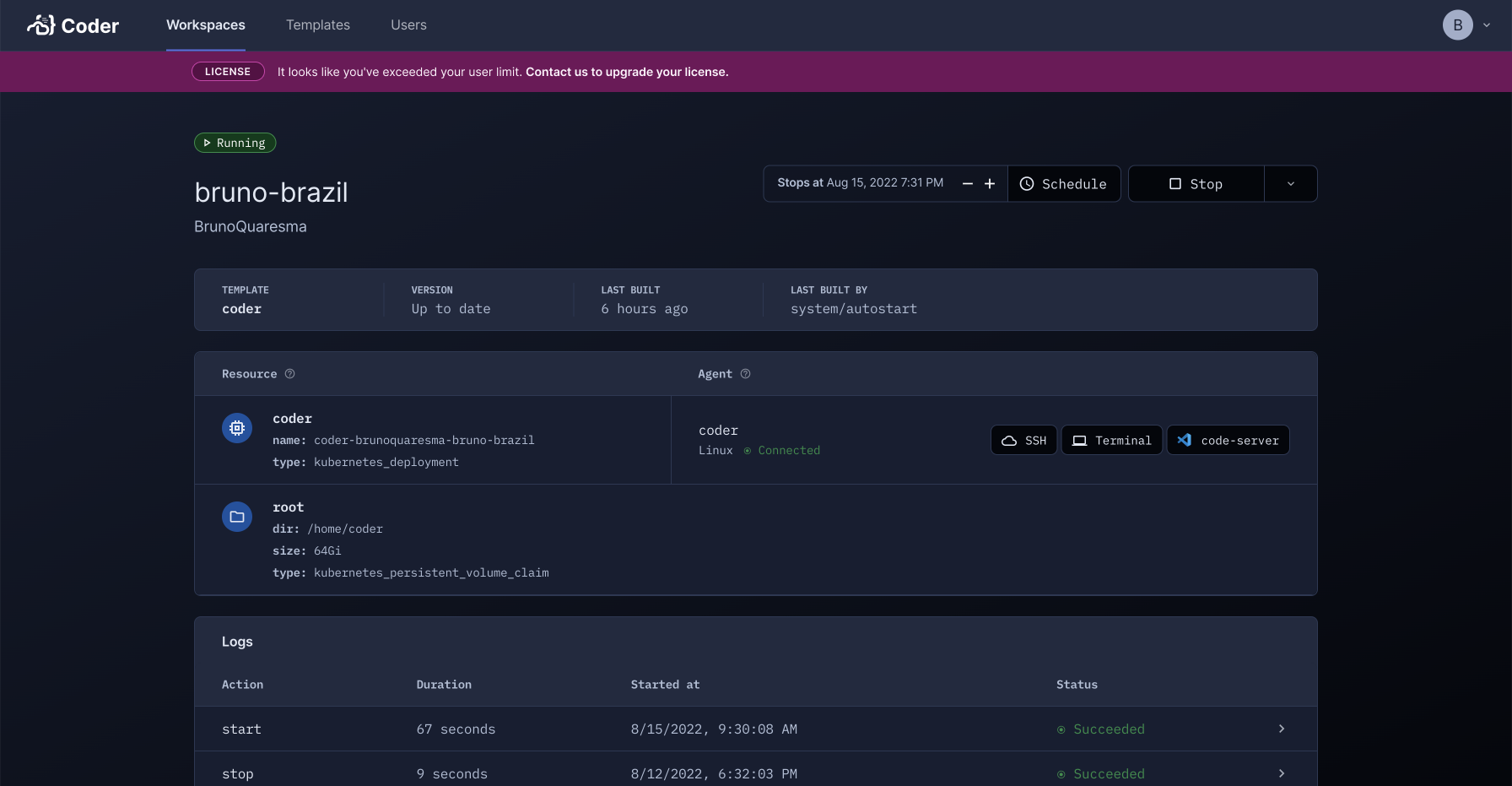
I used "Magenta" because it is a "red-ish" color but not so red, so the user will not confuse this message as an error. We also could use a more "blue-ish" color but I also would like to get the user's attention and say "This is critical".
Thoughts?
BrunoQuaresma commentedon Aug 15, 2022
Figma link: https://www.figma.com/file/YIGBkXUcnRGz2ZKNmLaJQf/Coder-v2-Design?node-id=674%3A587
BrunoQuaresma commentedon Aug 15, 2022
I made a version which is softer, and I liked it more:
When have multiple issues and it is open:
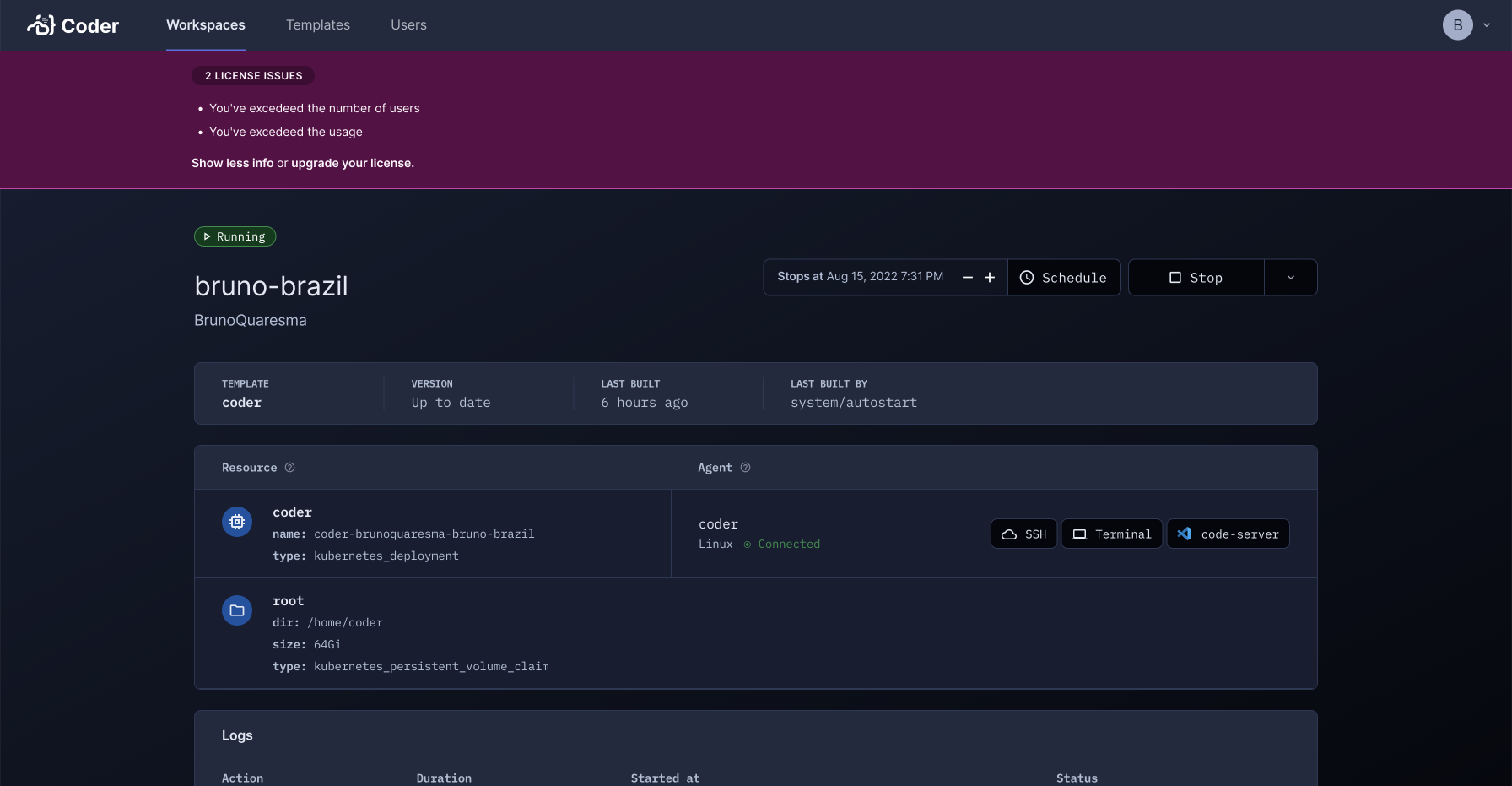
When have multiple issues and it is closed:
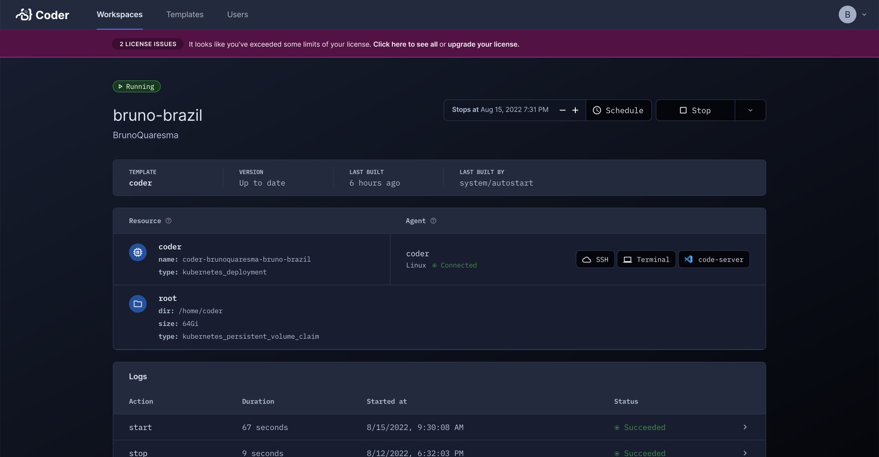
When have single issue:
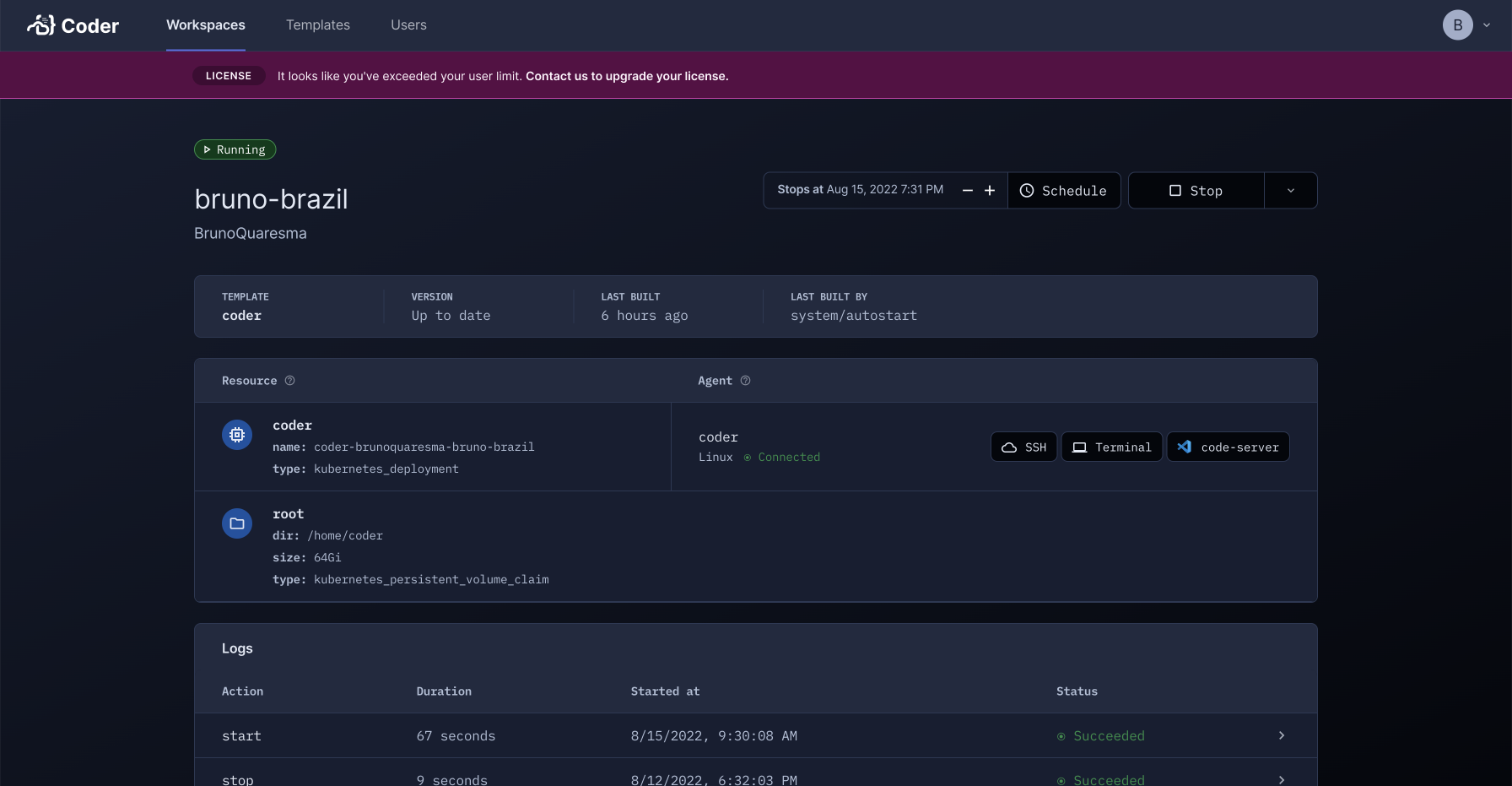
jsjoeio commentedon Aug 15, 2022
I like the color! I prefer the second one since it's not as tall.
BrunoQuaresma commentedon Aug 15, 2022
Same states using a gray color:
jsjoeio commentedon Aug 15, 2022
I feel like we should have a standard warning/error/info color and use that consistently throughout app. Then we could use the info or warning with the banner
Kira-Pilot commentedon Aug 15, 2022
I really like the magenta. I like it a lot more than our red error state and I wish we could use it for errors or warnings as well.
If we didn't want the licensing banner to be considered an error, we could use the grey and then add an icon or something in the magenta. That would be attention-grabbing but less severe looking.
It might be nice to be able to dismiss this banner with a corner icon (an 'X') instead of via a text link.
Looking good!
BrunoQuaresma commentedon Aug 16, 2022
Great feedback! @Kira-Pilot this banner specifically should not be dismissible.
presleyp commentedon Aug 16, 2022
We're getting input that this should be coded as a warning and be an orangey color. Aside from that I think the design is great!
ammario commentedon Aug 16, 2022
I guess magenta is too pretty for this purpose. Hopefully, we can find a use for it later.