Conversation
 enejb
added
Mobile App - i.e. Android or iOS
enejb
added
Mobile App - i.e. Android or iOS
|
Size Change: 0 B Total Size: 1.07 MB ℹ️ View Unchanged
|
| { flex: isRootList ? 1 : 0 }, | ||
| ! isRootList && styles.overflowVisible, | ||
| ] } | ||
| horizontal={ horizontal } |
There was a problem hiding this comment.
Unfortunately, reinstating the horizontal prop results in a broken layout on a wider-screen devices when there are multiple columns. This may be related to #34200 (comment).

I spent a little time debugging this, attempting to find an alternative solution. Unfortunately, I was not able to find one quickly. My guess is that we will need to refactor some of the styles to achieve the end goal without reinstating the invalid flex-wrap property.
A few things I have observed...
flex-wrap"is not supported" byVirtualizedList, it is recommended to usenumColumnsinstead.horizontalandnumColumnscannot be used in tandem.- We are likely missing a
align-items: stretchorjustify-content: stretchsomewhere, which causes the column item not to fill its parent.
If you'd rather not spend time searching for an alternative fix, it appears we could likely revert 3437ce3 as a quick fix. Doing so appears to avoid the overflowing column issue and fix the target issue of this PR. It, of course, would reinstate the warning #34200 attempted to address. I support a quick revert if that is your preference. WDYT?
Thank you for addressing this issue. 🙇🏻
|
I am closing this since this solution is not the one we want to go with. |
2 participants
Description
This PR intendes to fix wordpress-mobile/gutenberg-mobile#4081
The regression was due to #34200.
This PR revert the fix partially.
How has this been tested?
Notice that
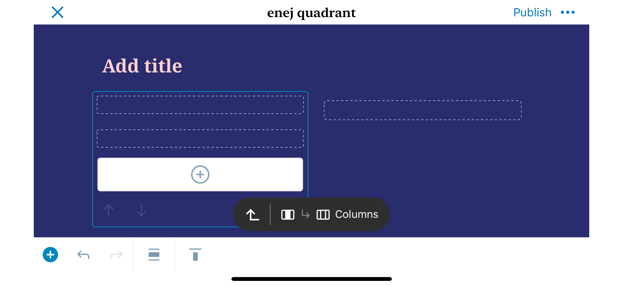
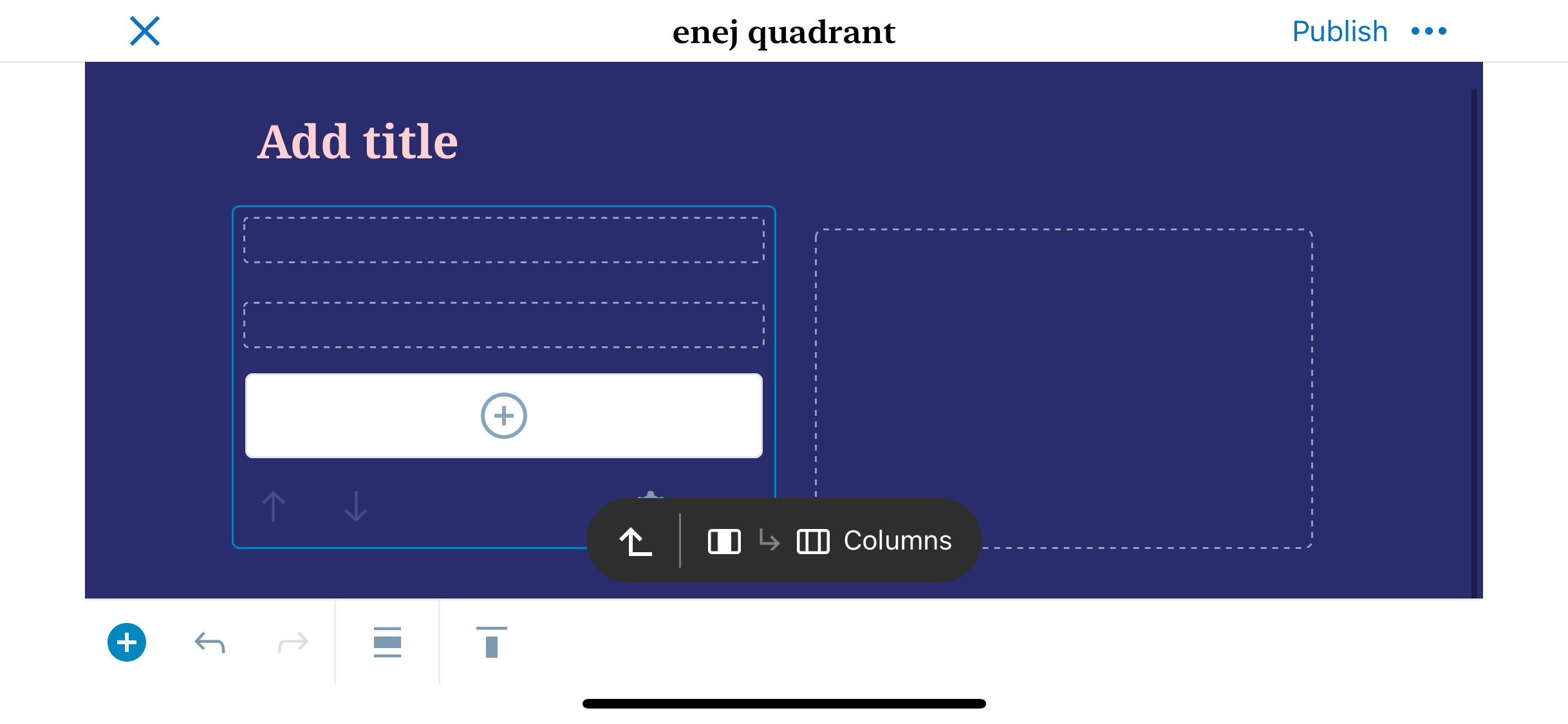
Screenshots
Before:
After:
Types of changes
Bug fix
Checklist:
*.native.jsfiles for terms that need renaming or removal).