Fixed responsiveness for desktop and mobile all the way down to 300px#154
Merged
adriandarian merged 1 commit intodevelopfrom Mar 31, 2021
Merged
Fixed responsiveness for desktop and mobile all the way down to 300px#154adriandarian merged 1 commit intodevelopfrom
adriandarian merged 1 commit intodevelopfrom
Conversation
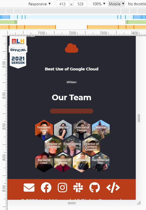
Mobile hexagon hover, where the user long-presses a hexagon and swipes somewhere outside of the hexagon and lets go, was making the hover text really large at lower resolutions like phones. So I had to move the texts upwards at different resolutions, and change text size.
adriandarian
added a commit
that referenced
this pull request
Oct 18, 2021
Fixed responsiveness for desktop and mobile all the way down to 300px
This file contains hidden or bidirectional Unicode text that may be interpreted or compiled differently than what appears below. To review, open the file in an editor that reveals hidden Unicode characters.
Learn more about bidirectional Unicode characters
Sign up for free
to join this conversation on GitHub.
Already have an account?
Sign in to comment
2 participants
Add this suggestion to a batch that can be applied as a single commit.This suggestion is invalid because no changes were made to the code.Suggestions cannot be applied while the pull request is closed.Suggestions cannot be applied while viewing a subset of changes.Only one suggestion per line can be applied in a batch.Add this suggestion to a batch that can be applied as a single commit.Applying suggestions on deleted lines is not supported.You must change the existing code in this line in order to create a valid suggestion.Outdated suggestions cannot be applied.This suggestion has been applied or marked resolved.Suggestions cannot be applied from pending reviews.Suggestions cannot be applied on multi-line comments.Suggestions cannot be applied while the pull request is queued to merge.Suggestion cannot be applied right now. Please check back later.
Mobile hexagon hover, where the user long-presses a hexagon and swipes somewhere outside of the hexagon and lets go, was making the hover text really large at lower resolutions like phones. So I had to move the texts upwards at different resolutions, and change text size.
Proposed changes
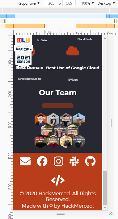
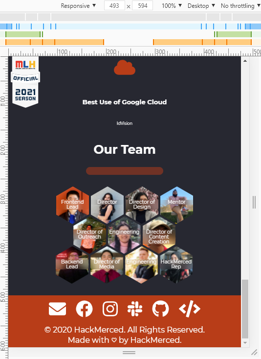
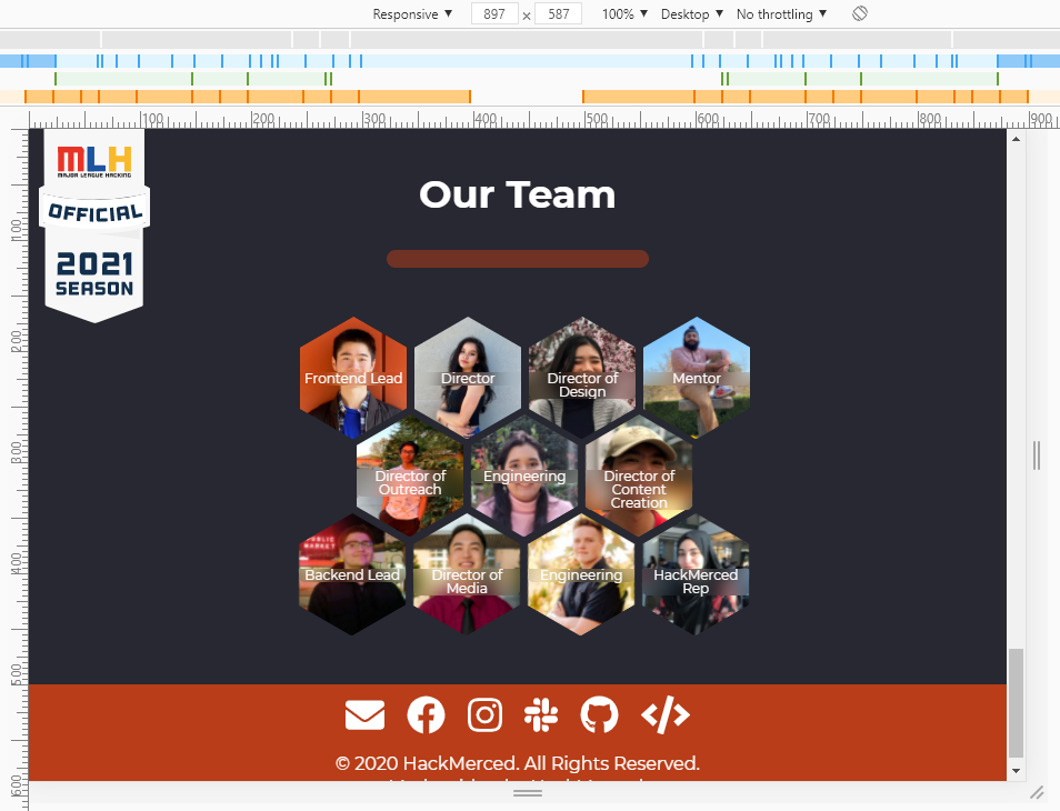
Had responsiveness for res width 800px or higher, but now hexagon hover is fully responsive from 300px - max width! Also fixed responsiveness for mobile view, so that works too now.
Types of changes
What types of changes does your code introduce to HackMerced Hub?
Put an
xin the boxes that applyChecklist
Put an
xin the boxes that apply. You can also fill these out after creating the PR. If you're unsure about any of them, don't hesitate to ask. We're here to help! This is simply a reminder of what we are going to look for before merging your code.Responsiveness
Check off the different browsers and devices you have tested on. Note: testing includes Horizontal and Vertical alignments
Browsers
Devices
Phones
Tablets
Desktops
Screenshots
Desktop view:
Mobile view:
Further comments
N/A