Describe the feature you'd like
More a design flaw, than a bug. But also not quite a feature request.
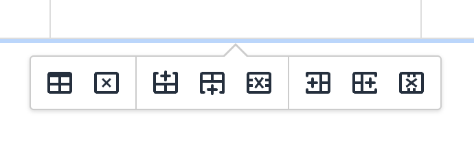
Compared to the previous design I find the new icons for table editing hardly decipherable, especially at very dense display resolutions (as smaller the icons, as more difficult to distinguish). If not replacing those icons entirely, one should at least make the X in the icons red and the + green.
Describe the benefits this would bring to existing BookStack users
Better usability.
Can the goal of this request already be achieved via other means?
No.
Have you searched for an existing open/closed issue?
How long have you been using BookStack?
1 to 5 years
Additional context
No response
Describe the feature you'd like
More a design flaw, than a bug. But also not quite a feature request.
Compared to the previous design I find the new icons for table editing hardly decipherable, especially at very dense display resolutions (as smaller the icons, as more difficult to distinguish). If not replacing those icons entirely, one should at least make the X in the icons red and the + green.
Describe the benefits this would bring to existing BookStack users
Better usability.
Can the goal of this request already be achieved via other means?
No.
Have you searched for an existing open/closed issue?
How long have you been using BookStack?
1 to 5 years
Additional context
No response