Gutenberg Block Styler in Fluent Forms: Style Forms Like a Pro
Designing forms inside WordPress just became a lot more practical.
Instead of juggling between different screens or relying on CSS for simple adjustments, you can now style every part of your forms directly inside the Gutenberg editor.
Pick your form using the Fluent Forms block, tweak the design visually, and publish, everything happens inside the page.
TL;DR
- Style Fluent Forms right inside Gutenberg.
- Tweak labels, inputs, placeholders, radios, checkboxes, buttons and more from the General tab.
- Adjust container background, padding, borders, shadows, messages and more from the Misc tab.
- Live preview shows every change instantly.
- Embed a form by adding the Fluent Forms block and selecting a saved form.
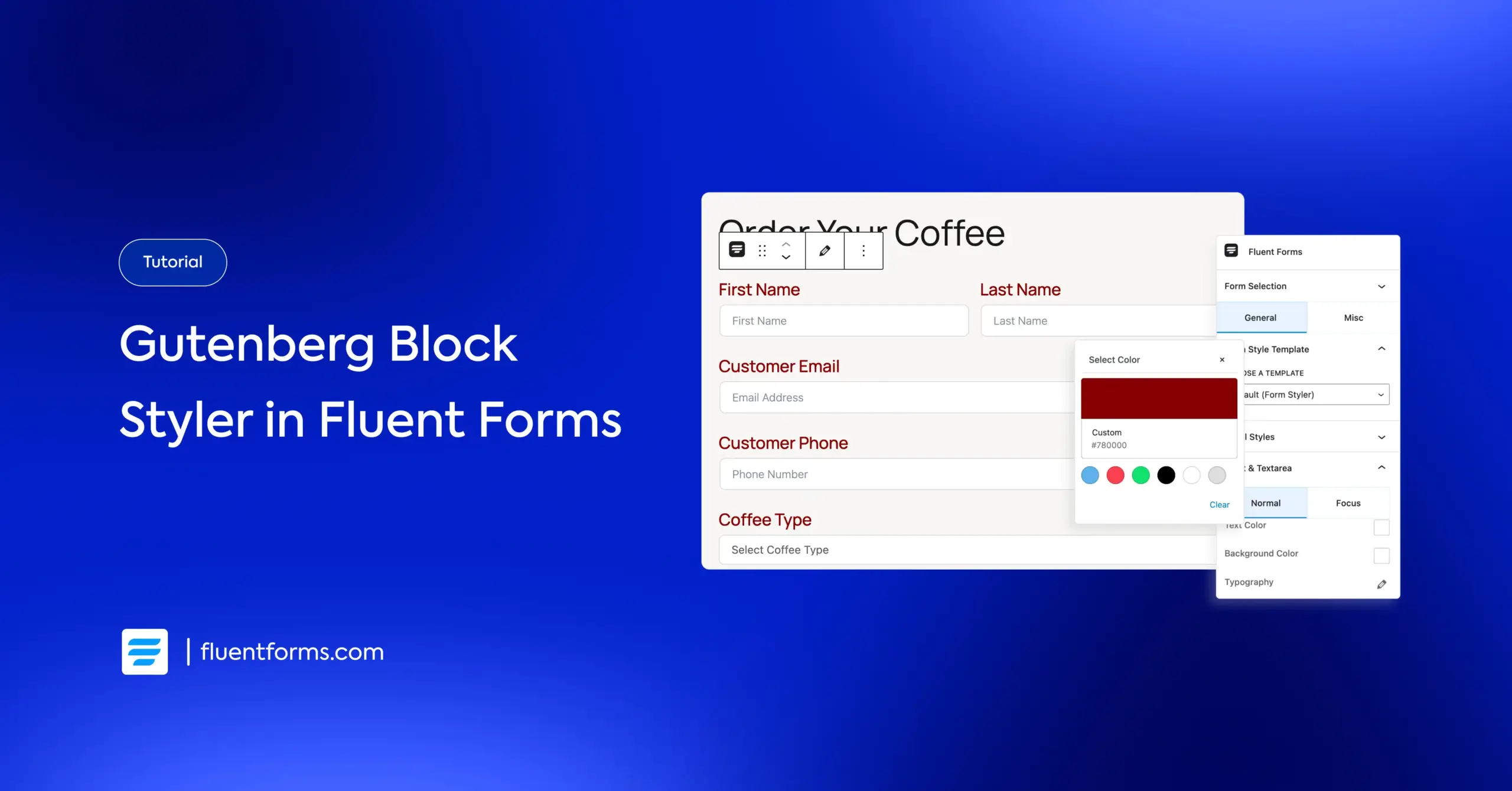
Introducing the Fluent Forms Gutenberg Block Styler
Fluent Forms has its own Advanced Form Styler where you can customize your forms to match your brand identity.
However, with the Gutenberg Block Styler, styling your forms happens entirely inside the WordPress editor.
Once you add a Fluent Forms block to your page or post, the Block Settings sidebar gives you two tabs: General and Misc. These tabs let you control every aspect of your form’s design.
- General Tab: Style labels, input area, placeholders, radio & checkboxes, buttons and more.
- Misc Tab: Adjust the form container, background, padding, borders, shadows, various message styles and more.

Every change is visible immediately in the editor, so what you see is exactly what gets published.
Build Smarter Forms for Free
Style every part of your form in Gutenberg
The Gutenberg Block Styler gives you control over every element of your form without touching CSS unless you want to. Everything is live, visual, and instant. Let’s dive deeper into each of the styling options that it offers.
General Tab
The General tab controls every major element inside your form. You can begin with a Form Style Template – Modern, Classic, Bootstrap, Inherit, or Custom. From there, you fine-tune the details right inside Gutenberg.

Key controls in this tab include:
- Label Styles: Adjust color and typography of the input field labels to keep everything readable and consistent.
- Input & Textarea: Configure text color, background color, typography, spacing, border and box shadow. The preview updates instantly, so you always know what you’re getting.
- Placeholder Styles: Set a custom placeholder color and tweak the typography for a cleaner visual hierarchy.
- Radio & Checkbox Styles: Resize and recolor these elements for better clarity and accessibility.
- Button Styles: Control alignment, button width, colors, typography, padding, margin, borders, box shadows, and hover behavior. This is where your call-to-action takes shape.

This tab handles most of the design work and keeps it simple enough for any user.
Misc Tab
This tab focuses on the overall structure and background of your form. It’s where you shape how the form sits within the layout.

You can customize the following elements from the Misc tab:
- Container Styles: You can style the form container with options for classic or gradient backgrounds, background images, padding, margin, box shadows, and borders.
- Asterisk Styles: Adjust the asterisk color for required fields so it matches your design instead of standing out awkwardly.
- Inline Error Messages: Set the background color, text color, and alignment to make errors clear without being visually harsh.
- After-Submit Success Message: Control the background, text color, and alignment to create a clean, reassuring confirmation state.
- After-Submit Error Message: Style the error state the same way, keeping everything consistent and easy to understand.

This tab is all about the subtle design choices that make your form feel professionally built.
How to embed a form in a page/post using Gutenberg
Adding a form built with Fluent Forms to any page or post is straightforward.
- Open your page or post, click the + icon, search for Fluent Forms, and insert the block. The block drops right into the layout like any other Gutenberg element.
- A dropdown appears inside the block. Choose any saved form, and it loads instantly with a live preview.
Once the form appears, the Block Settings sidebar becomes the control center from where you can style your form. Switch between the General or Misc tab to style every part of the form while seeing changes in real time.
When you’re done, hit Publish or Update, and the design goes live exactly as you see it in the editor.
Best practices for designing WordPress forms
Designing a WordPress form isn’t rocket science, but it is the difference between a user completing a task or abandoning your site. Good forms feel invisible. They guide people smoothly, keep them focused, and remove every possible friction point.
Here’s how to build forms that look clean, load fast, and actually get filled out.
Know the form’s job
Every form should have a single purpose. When a form tries to do everything, for example, register users, collect leads, and submit support queries, it ends up overwhelming the person filling it. Start with one clear outcome and shape the flow around it.
Once the purpose is clear, decisions become easier.
Collect only what matters
Users don’t like sharing unnecessary information. And honestly, you probably don’t need half the fields most websites ask for. If a piece of data won’t help you make a decision or take an action, don’t ask for it. Forms get abandoned not because they’re long, but because they feel pointless.
Make the layout scannable
People don’t read forms. They skim them. That means your design should help the eye move in a straight, predictable path – top to bottom. Keep it simple with concise labels, logical grouping of fields using a multi-column layout and consistent vertical spacing.
A clean layout reduces mental effort, which directly boosts completion rates.
Use the right input for the right job
Nothing derails a form faster than mismatched field types. Date fields should have pickers, numbers should only allow numeric inputs, and emails should enforce proper form validation. These small choices prevent user frustration and save you from cleaning up messy submissions later.
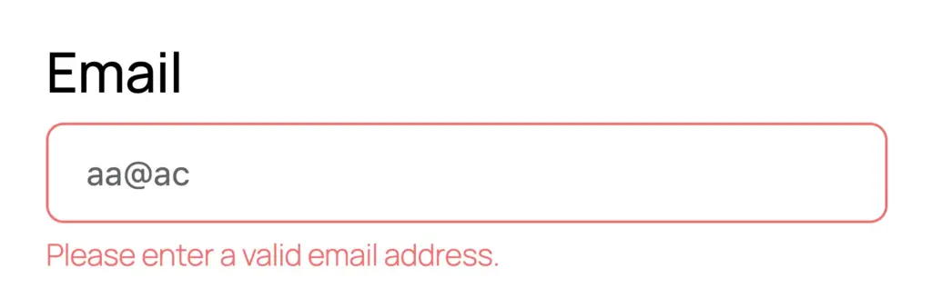
Make error/validation messages friendly
Validation isn’t there to punish users; it’s there to guide them. Inline validation works best because it corrects mistakes right away instead of surprising people at the end.
Keep error messages human and helpful – “Please enter a valid email” beats “Error: invalid input” any day.
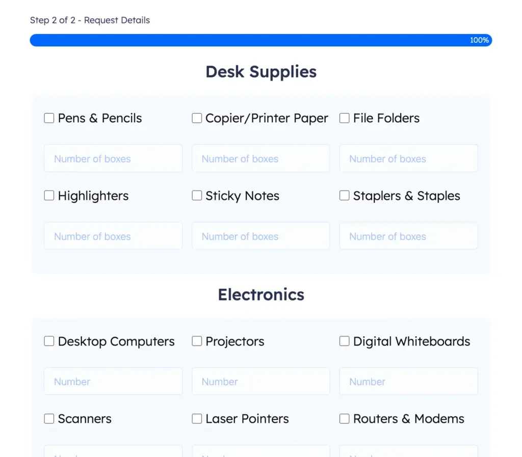
Break long forms into steps
If your form is longer than six or seven fields, split it. Multi-step forms feel lighter, even when the total number of fields stays the same. Each step acts like a psychological checkpoint, making the user feel progress instead of pressure.

Make your CTA impossible to miss
Your call-to-action button should be visually strong, easy to tap, and obvious. A high-contrast color and direct wording (“Submit,” “Apply Now,” “Complete Order”) are enough. When users hesitate at the final step, conversions die.

Keep the visuals simple
Forms aren’t the place to show off special effects. Minimal styling – soft borders, sensible spacing, subtle shadows, performs better than dramatic gradients and animations. A form succeeds when it looks trustworthy and stable, not flashy.

Fluent Forms offers a massive collection of ready-to-use form templates with clean visuals for every purpose of your business.
Don’t forget accessibility
Accessible forms aren’t optional. Proper labels, logical tab order, good contrast, and descriptive error messages help everyone, not just people using assistive technologies. You don’t need to be an accessibility expert; just don’t ignore the basics.
Enjoying this article?
We regularly publish actionable content on our blog. Subscribe to get them delivered straight to your inbox.
We won’t spam you. You can unsubscribe whenever you want.
Wrapping up
Whether you’re a seasoned Fluent Forms user or a non-technical WordPress user who just wants the form to “look right,” this Gutenberg Block Styler feature makes the entire process of styling forms faster, easier, and far more predictable.

An Econ major turned into a Digital Marketer by choice. Hello! This is Ashraf and I am here to enlighten you on various WordPress topics and help you make informed decisions.


Leave a Reply