Table of Contents
What began as a replacement for the old “Classic” text box has evolved into a powerful, block-based system for building your entire website, from the header to the footer. It represents the future of WordPress itself. This guide will serve as an in-depth tutorial, taking you from the absolute basics of the block editor to the advanced concepts of full-site editing and how it all fits into a professional web creation workflow.
Key Takeaways
- Gutenberg is the Default WordPress Editor: It is the official block-based editor built into the core of WordPress. It replaced the old “Classic Editor” (a single text box) in 2018.
- It Is a “Block” Editor: Instead of one continuous document, all content is organized into individual, movable “blocks.” There are blocks for paragraphs, headings, images, columns, videos, and more.
- Gutenberg is More Than a Content Editor: With the rise of “Block Themes,” Gutenberg has evolved into a Full Site Editor (FSE). This means you can use the same block interface to build and edit your site’s header, footer, and page templates.
- It Simplifies Rich Content: The block model makes it incredibly easy to create complex layouts with columns, media, and text that were difficult or impossible in the Classic Editor without code.
- Gutenberg Works with Your Theme: The editor’s styling (fonts, colors, sizes) is controlled by your active theme. A “Block Theme” unlocks its full-site editing capabilities.
- It Coexists with Website Builders: Gutenberg is the default WordPress experience. For total design control, an “all-in-one” workflow, and advanced features, many professionals use it alongside or as an alternative to dedicated website builders like Elementor.
The Core Philosophy: Why “Blocks” Changed Everything
To truly understand Gutenberg, you must first understand the problem it solved. For over a decade, WordPress ran on the “Classic Editor.” This was essentially a word processor text box, similar to Microsoft Word. You had a single field where you typed your text, formatted it, and inserted images.
This worked fine for simple blog posts, but it was terrible for building modern, visually rich web pages. How do you create a three-column layout? How do you add a full-width image with a button on top? The answer was usually a messy combination of custom HTML, plugins, and finicky shortcodes.
The Gutenberg editor, first introduced in WordPress 5.0, threw that entire concept away. It is built on the philosophy of “blocks.”
A block is a distinct, standalone piece of content.
- A paragraph is a block.
- An image is a block.
- A heading is a block.
- A video embed is a block.
- A set of columns is a block.
Every single element on your page is its own self-contained unit. You build a page not by writing in a single document, but by stacking and arranging these blocks, much like building with digital LEGOs.
This block-based approach has several massive advantages:
- Modular Control: You can move any block, anywhere. You can drag and drop a whole paragraph above an image. You can change a block’s settings (like color or size) without affecting anything else on the page.
- Rich Content, No Code: It democratizes web design. You can now create a beautiful, complex layout with multiple columns, background images, and buttons just by adding and arranging the right blocks.
- Consistency: Blocks can be saved, reused, and shared. This helps you maintain a consistent design and layout across your entire website.
- A Foundation for the Future: This modular structure was the necessary first step to allow Gutenberg to move from editing just posts to editing your entire site.
Navigating the Gutenberg Interface: A Guided Tour
When you first open a new page or post, the Gutenberg interface can feel minimalist, but it is packed with tools. Let’s break down the four main areas you will interact with.
1. The Top Toolbar
This black bar at the very top of the screen is your main command center.
- Plus Icon (+): This is the main “Block Inserter.” Clicking it opens a panel on the left where you can search for and browse all available blocks.
- Tools (Pen Icon): By default, this is set to “Edit.” You can switch it to “Select” mode, which makes it easier to click and select blocks without accidentally starting to type.
- Undo/Redo: Standard undo and redo arrows.
- Document Details (i icon): A quick overview of your page’s word count, heading structure, and block count.
- List View (Three-lined icon): This is arguably the most important tool for complex pages. It opens an outline of every single block on your page, nested in its proper order. If you ever get “lost” or cannot select a block, the List View is your map.
- Save/Publish: On the far right, you will see “Save Draft,” “Switch to Draft,” “Preview,” and the main “Publish” or “Update” button.
2. The Main Content Area
This is the central, white part of the screen where you do your work. It is your “canvas.” You will see a “Type / to choose a block” prompt, which is the fastest way to add content. Simply start typing your text to add a Paragraph block, or type / followed by the name of a block (like /image or /heading) to insert it instantly.
3. The Settings Sidebar
This sidebar on the right is the context-aware control panel. It has two tabs:
- Post / Page: This tab contains all the settings for the entire document. This is where you set the URL (slug), assign categories and tags, set a featured image, check the revision history, and change the page template.
- Block: This tab is dynamic. It changes to show the specific settings for whatever block you currently have selected. If you click on a Paragraph block, you will see settings for font size, color, and drop caps. If you click on an Image block, you will see settings for alt text, image size, and border styles.
4. The Block Toolbar
This is a small, floating toolbar that appears directly above or below any block you click on. It contains the most common, in-line controls for that specific block. For a Paragraph block, it shows alignment, bold, italic, and link controls. This toolbar also lets you change the block type or drag it to a new position.
Mastering the Essentials: Your First 10 Blocks
The best way to learn Gutenberg is to use it. Let’s walk through the 10 most common blocks you will use to build almost any standard web page.
1. Paragraph (P) Block
- What it is: The default, most basic block for all standard text.
- How to use it: Just start typing on a new line. WordPress automatically creates a Paragraph block for you.
- Key Settings (in Sidebar):
- Typography: Control the font size (small, medium, large, or a custom value).
- Color: Set the color for the text and the block’s background.
- Drop Cap: Toggle a switch to make the first letter of the paragraph large and stylized.
2. Heading Block
- What it is: Used for page titles and section titles.
- How to use it: Type /heading and press Enter.
- Key Settings:
- Level: In the block toolbar, you can choose the heading level from H1 to H6. This is critical for both SEO and page structure. Your page title is H1. Your main sections should be H2s, and sub-sections H3s, and so on.
- Alignment: Center, left, or right-align your heading.
- Color: Change the text and background color in the sidebar.
3. Image Block
- What it is: The standard way to add a single image.
- How to use it: Type /image and choose to upload a new file, select one from your Media Library, or insert from a URL.
- Key Settings:
- Alt Text: The most important setting. This is the text that describes the image for screen readers and search engines.
- Image Size: Choose from preset sizes like Thumbnail, Medium, Large, or Full Size.
- Aspect Ratio: Crop the image to a specific shape, like 1:1 (Square) or 16:9 (Widescreen).
- Styles: In the sidebar, you can give the image a border or a circular mask.
4. Button Block
- What it is: Creates one or more clickable buttons.
- How to use it: Type /button. You can type your button text and click the link icon to add a URL. You can add multiple buttons side-by-side.
- Key Settings:
- Styles: Choose between “Fill” (solid color) and “Outline.”
- Color: Set the text and background color for your button.
- Border Radius: Make the button more or less rounded.
- Link: Set the URL and choose to open it in a new tab.
5. List Block
- What it is: Creates a standard bulleted (unordered) or numbered (ordered) list.
- How to use it: Type /list. You can also just type – or 1. followed by a space to start a list automatically.
- Key Settings:
- Style: In the block toolbar, you can switch between bulleted and numbered lists.
- Indentation: You can indent list items to create sub-lists.
6. Columns Block
- What it is: This is your primary layout tool. It lets you split your page into vertical columns.
- How to use it: Type /columns. It will ask you to choose a layout (e.g., 50/50, 30/70, or three equal columns). Once created, each column acts as a mini “canvas” where you can add any other block inside.
- Key Settings:
- Layout: You can add or remove columns and change their percentage widths in the sidebar.
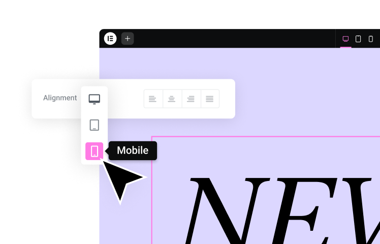
- Stack on Mobile: By default, columns will “stack” vertically on mobile devices. You can disable this, but it is generally not recommended.
7. Group Block
- What it is: A container block. It lets you “group” other blocks together so you can treat them as a single unit.
- How to use it: Select multiple blocks by holding Shift and clicking them, then click the three-dot menu in the block toolbar and select “Group.”
- Key Settings:
- Background Color: This is the most common use. You can put several blocks inside a Group and give the entire Group a background color to create a distinct section.
- Layout: You can set a maximum width for the content inside the group.
8. Quote Block
- What it is: A block designed to make testimonials or citations stand out.
- How to use it: Type /quote. You can write the quote text and add a citation below it.
- Key Settings:
- Styles: Choose between “Default” (a simple indented style with a border) and “Plain” (just text).
9. Separator & Spacer Blocks
- Separator: Type /separator to add a horizontal line. You can change its style (solid, dots, wide) and color.
- Spacer: Type /spacer to add invisible, empty space. You can drag its handle to increase or decrease the spacing, giving you precise control over the vertical rhythm of your page.
10. Gallery Block
- What it is: Displays multiple images in a grid.
- How to use it: Type /gallery. You can upload or select multiple images at once.
- Key Settings:
- Columns: Choose how many columns your grid should have.
- Crop Images: For a clean grid, you can toggle this on to make all image thumbnails the same size.
- Link to: You can have each image link to its media file or its attachment page.
Building Smarter: Layouts, Patterns, and Reusable Blocks
Once you have mastered the basic blocks, you can move on to Gutenberg’s more powerful workflow features. These are what separate a basic post from a professionally designed page.
Understanding Columns vs. Groups for Layout
This is a key concept.
- Use the Columns block when you want to place content side-by-side.
- Use the Group block when you want to put a “wrapper” around a section of content, usually to give it a shared background color or padding.
A common professional technique is to nest these. For example:
- Add a Group block. Give it a light gray background color.
- Inside that Group block, add a Heading block.
- Below the Heading, add a Columns block set to 50/50.
- In the left column, add an Image block.
- In the right column, add a Paragraph block and a Button block.
You have just built a clean, two-column “feature” section inside a distinct, full-width container. You can check this structure anytime using the List View.
The Power of Block Patterns
A Block Pattern is a pre-designed collection of blocks that you can insert with one click. Think of it as a page-building template, but for individual sections.
- What are they? Instead of building that feature section above from scratch every time, you could save it as a pattern.
- How to use them: Click the main + icon in the top toolbar and click the “Patterns” tab. You will see a huge library of patterns (many provided by your theme) for things like “Call to Action,” “FAQ,” and “Pricing Table.” When you click one, it inserts the full block structure, which you can then edit.
- Pattern Directory: You can even browse the official WordPress Pattern Directory and copy-paste new patterns directly into your site.
Reusable Blocks: Your “Save As” for Gutenberg
Reusable Blocks are different from patterns. When you insert a pattern, you get a copy of the blocks to edit. When you insert a reusable block, you are inserting the original block.
If you edit a reusable block in one place, it updates everywhere it is used on your site.
- When to use them: This is perfect for content you need to be identical across many pages. Think of a “Call to Action” at the end of every blog post, an author bio, or a contact information block.
- How to create one: Select any block or group of blocks, click the three-dot menu in the block toolbar, and choose “Create Reusable Block.”
- How to insert one: Type /reusable or find it in the Block Inserter.
The Next Evolution: Gutenberg and Full Site Editing (FSE)
For years, Gutenberg could only edit the content area of your page (the part between the header and footer). But the ultimate goal was always bigger. That goal is Full Site Editing (FSE).
What is Full Site Editing?
Full Site Editing (FSE) is a collection of WordPress features that allow you to use the Gutenberg block editor to design and edit your entire website. This includes your:
- Header
- Footer
- Sidebars
- Page Templates (like your 404 page or blog archive)
To use FSE, you must have a “Block Theme” installed and activated (like the default “Twenty Twenty-Four” theme).
The Site Editor vs. the Content Editor
When you have a block theme active, you will see a new menu item under “Appearance” > “Editor.” This opens the Site Editor. It looks just like the Gutenberg editor, but instead of editing a single page, you are editing your site’s templates.
Key Components of FSE
- Templates: A template is the full layout for a specific type of page. You can edit the “Single Post” template to change how all your blog posts look, or the “Page” template for all your standard pages.
- Template Parts: These are the global, reusable pieces of your site, like your “Header” and “Footer.” You edit your Header template part in one place, and it updates across your entire website.
- Global Styles: This is the most powerful FSE feature. It is a single interface (the “Styles” icon in the Site Editor) where you can set your website’s global colors, typography (all H1s, all H2s, all paragraph text), and layout settings.
The Learning Curve and Limitations of FSE
Full Site Editing is an incredible leap forward for WordPress. It gives you a level of control that previously required custom code or premium page builders.
However, it is important to be realistic. FSE is a very different workflow, and it has a steep learning curve for those not accustomed to thinking in terms of “templates” and “global styles.” While it is powerful, achieving a highly custom, pixel-perfect design can be far more complex than using a dedicated visual builder. The interface for granular design (like precise spacing, negative margins, or overlapping elements) is less intuitive and direct.
Expert Tips for a Productive Gutenberg Workflow
As a web professional, I have spent thousands of hours in this editor. Here are my tips for working faster and smarter.
- Learn Keyboard Shortcuts: Press Shift + Alt + H (or Ctrl + Option + H on Mac) to see the full list. The most important one is / to insert blocks. Ctrl + S (Cmd + S) to save is also essential.
- Use the List View: I will say it again. For any page with more than 10 blocks, the List View is your best friend. Use it to select, move, and understand your page’s structure.
- Find Block-Friendly Themes: Not all themes are built for Gutenberg. A good “block-friendly” theme will provide its own custom Block Patterns and ensure all its styles look perfect in the editor, giving you a true “what you see is what you get” experience.
- Extend with Third-Party Block Plugins: The default blocks are great, but the real power comes from block “libraries.” Plugins like Kadence Blocks or GenerateBlocks add dozens of new, advanced blocks for things like “Icon List,” “Advanced Form,” or “Testimonial Slider.”
- Use Shift + Click: You can select multiple blocks at once by clicking one, holding Shift, and clicking another. This allows you to group them or move them all at once.
As my colleague, web creation expert Itamar Haim, often says:
“The block editor isn’t just a tool; it’s a new way of thinking. Professionals thrive in it when they stop fighting it and embrace a structured, component-based approach. Build a section, save it as a pattern, and reuse it. A disciplined workflow in Gutenberg is a fast workflow.”
Beyond the Default: When to Pair Gutenberg with a Website Builder
Gutenberg is the default, a powerful and capable foundation for modern WordPress. But is it the right tool for every job? The answer depends on your goals, your technical comfort, and the level of design control you need.
The Strengths and Limits of the Gutenberg Experience
It is crucial to understand what Gutenberg does best, and where its limitations lie.
Strengths:
- Core Integration: It is part of WordPress. It is fast, stable, and will always be compatible.
- Simplicity for Content: For standard, content-focused pages and blog posts, it is fantastic. The writing experience is clean and focused.
- No “Bloat”: You are not adding another major plugin to your site (though, you might add smaller block libraries).
- The Future of WordPress: Learning Gutenberg is learning the future of WordPress.
Limitations:
- Granular Design Control: Achieving a “pixel-perfect” design is hard. Things like complex overlapping elements, precise negative margins, or responsive settings that change dramatically between devices are far less intuitive than in a visual builder.
- Steep FSE Learning Curve: As discussed, Full Site Editing is powerful but not simple. It can be frustrating for users who just want to “click and change” their header.
- WooCommerce Customization: Customizing your WooCommerce shop pages, product pages, and checkout process with Gutenberg is extremely limited without a lot of custom code.
How Visual Builders Address Different Creator Needs
This is where third-party website builders come in. These are plugins that provide a complete, visual, drag-and-drop design interface that often replaces the Gutenberg editor on a page-by-page basis.
The most popular website builder platform for WordPress is Elementor. It is built to solve the exact limitations many users face with Gutenberg.
Elementor works differently. When you choose to “Edit with Elementor,” it opens a live, front-end editor where you see exactly what your visitors see. You drag widgets (its version of “blocks”) from a side panel directly onto the page.
This visual
Looking for fresh content?
By entering your email, you agree to receive Elementor emails, including marketing emails,
and agree to our Terms & Conditions and Privacy Policy.