Tag
WdTag
Applicable Scenarios
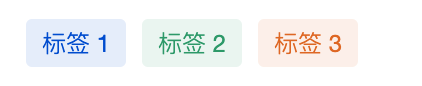
Small tags for labeling and categorizing, such as order status.
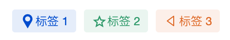
Tag with an icon, leading icon:
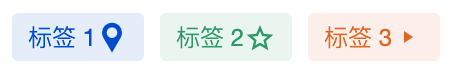
Tag with an icon, trailing icon:
Basic Capabilities Description
2.1 Configure Tags List
Configure the display name and label value directly via the [label] property. Note: The label value must be unique.
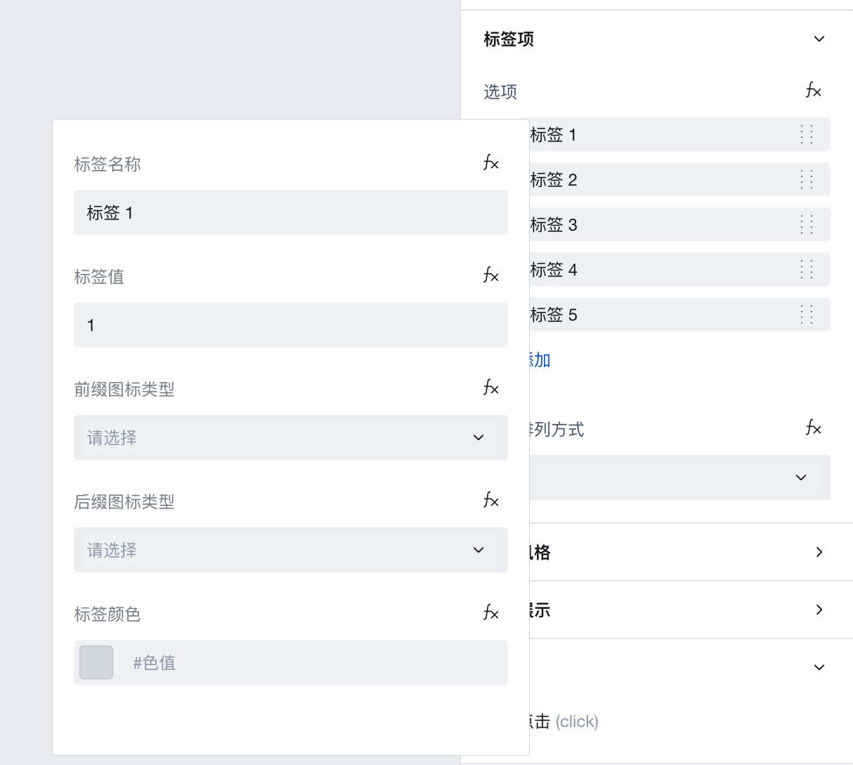
If you need to configure dynamic tags, refer to the configuration dynamic tags list.
Configure Dynamic Tags List
When the tab items are dynamic data obtained from the database, you need to bind dynamic expressions, as shown below.
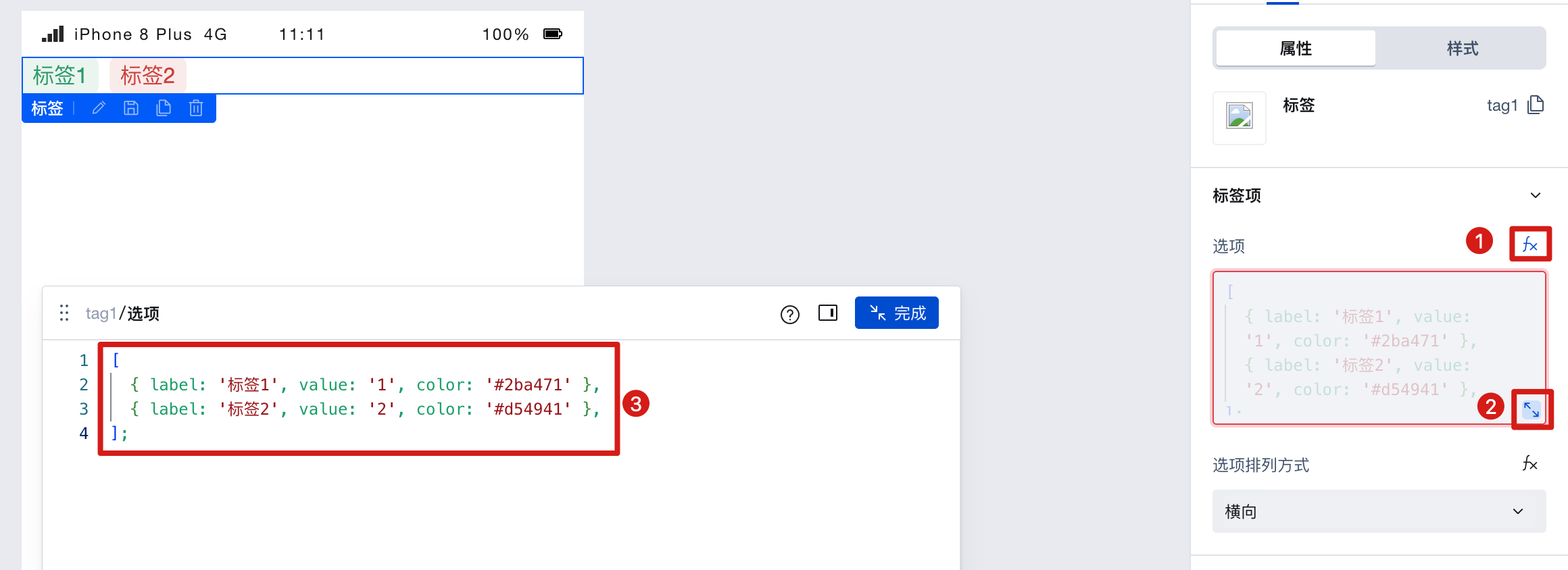
At this point, the data format must be:
[
  { label: 'Tab 1', value: '1', color: '#2ba471' },
  { label: 'Tab 2', value: '2', color: '#d54941' }
];
Example: Dynamically generate labels via data model data
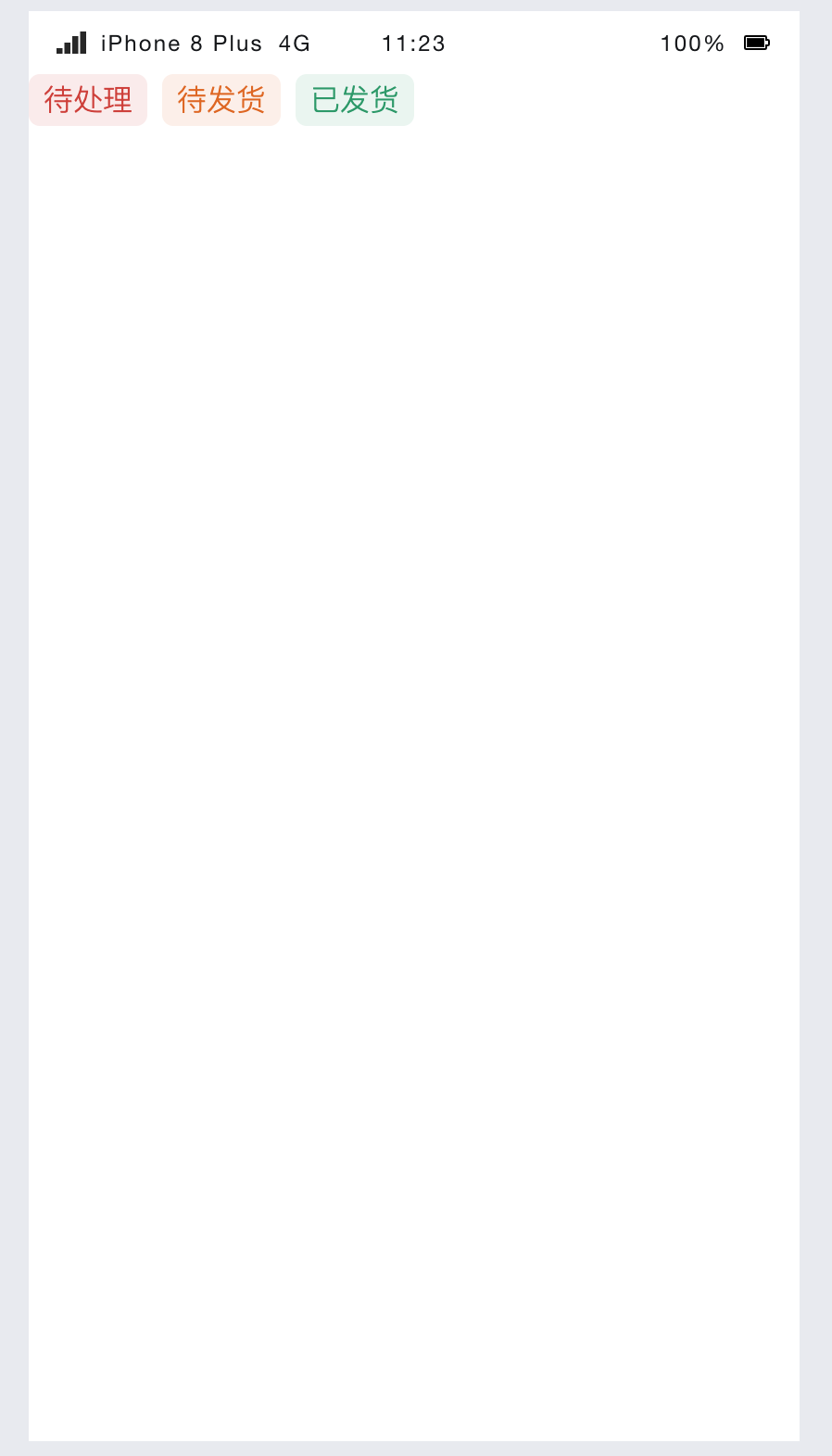
The tab items are dynamically retrieved from the data model. The expected effect is as follows:
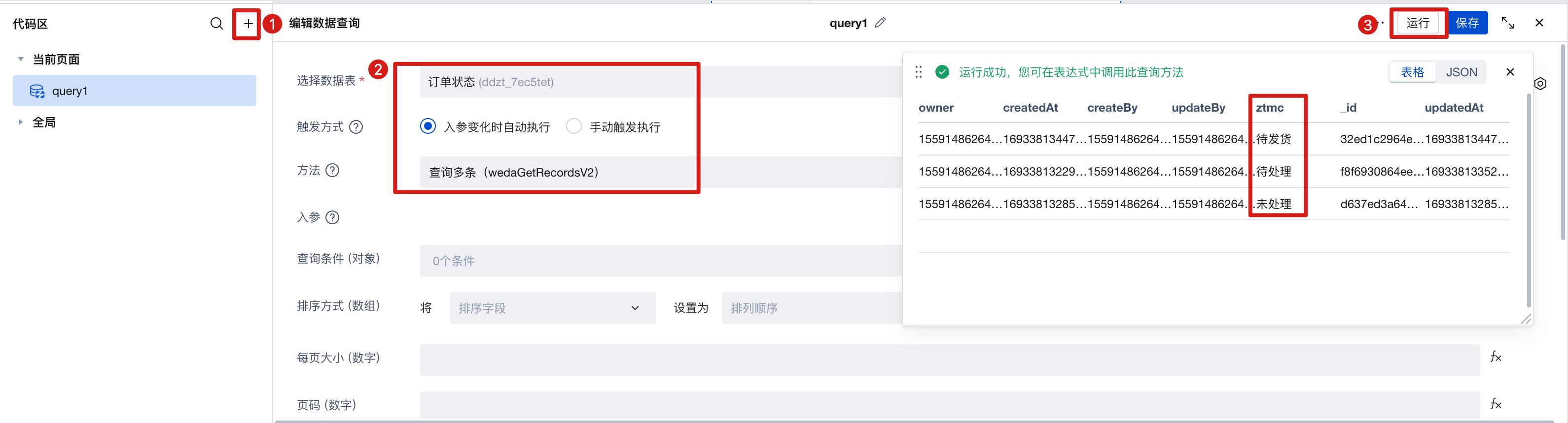
- Create one data model and add new "Status Name" and "Status Color" fields.
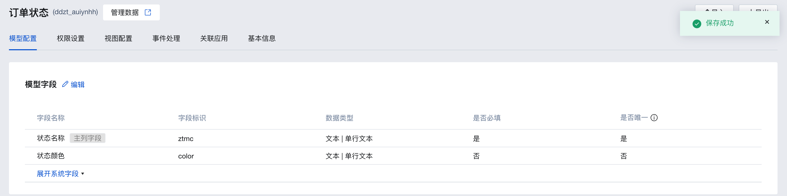
- Enter several status example values in this model, such as: Pending, Ready to Ship, Shipped
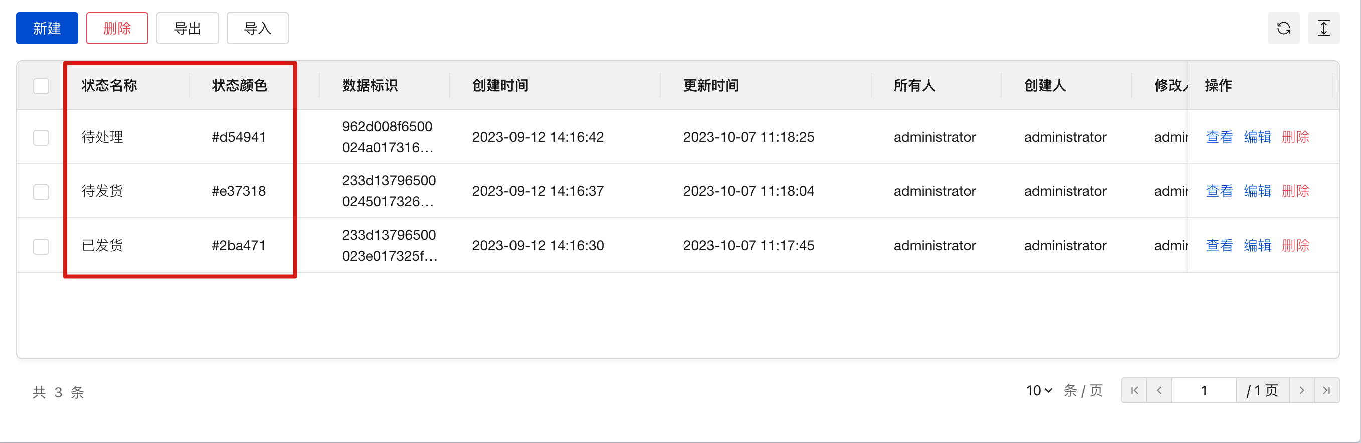
- Create a query named query1, select the data model you just created as the data table. Trigger method [Automatic], method [Query Multiple], run it to view the results and save. As shown below:
- For the tab items, click the binding variable to bind the query result of query1
$w.query1.data.records, and convert the format to label, value, and color.
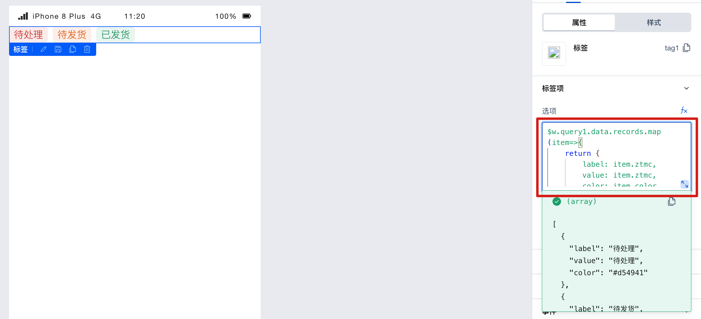
The data format is:
$w.query1.data.records.map((item) => {
  return {
    label: item.ztmc,
    value: item.ztmc,
    color: item.color
  };
});
You will find that the labels display the pre-entered data from the data model.
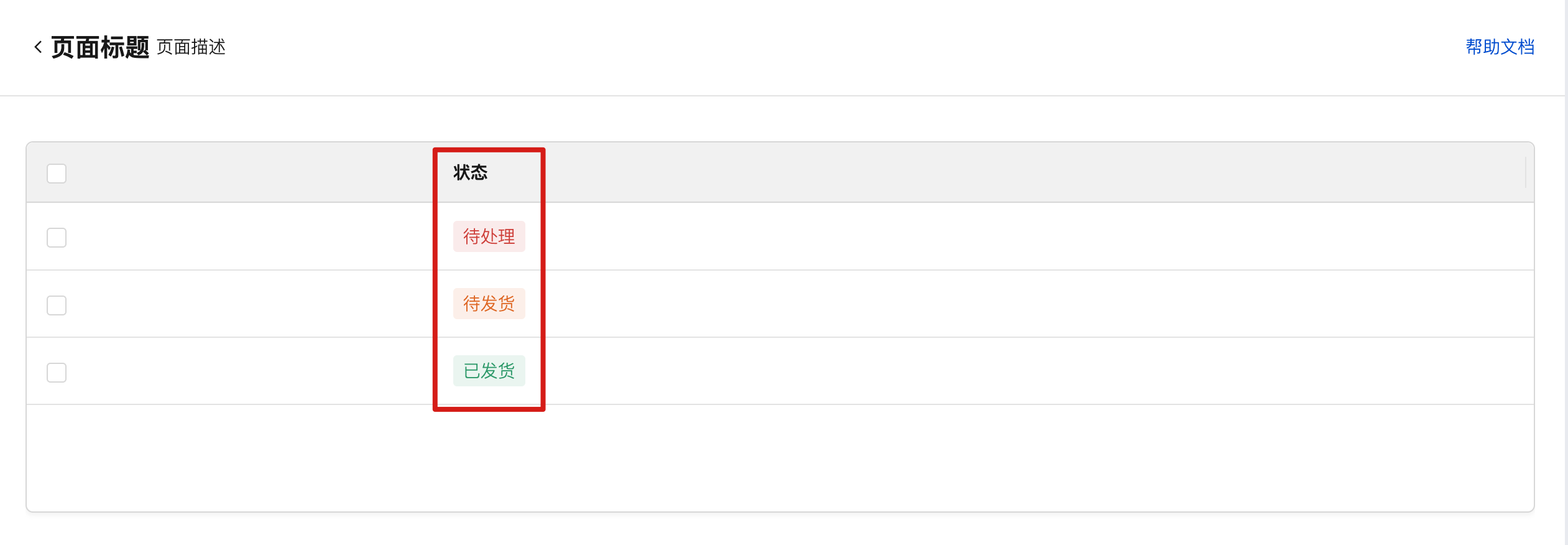
Example: Displaying Labels in Table Columns
The table columns are displayed as labels obtained from the data model. The expected effect is as follows:
Create one data model and add new "Status Name" and "Status Color Field"
Enter several status example values in this model, such as: Pending, Ready to Ship, Shipped
Create a query named query1, select the data model you just created as the data table. Trigger method [Automatic], method [Query Multiple], run it to view the results and save. As shown below:
Bind the table binding expression to
$w.query1.data.records.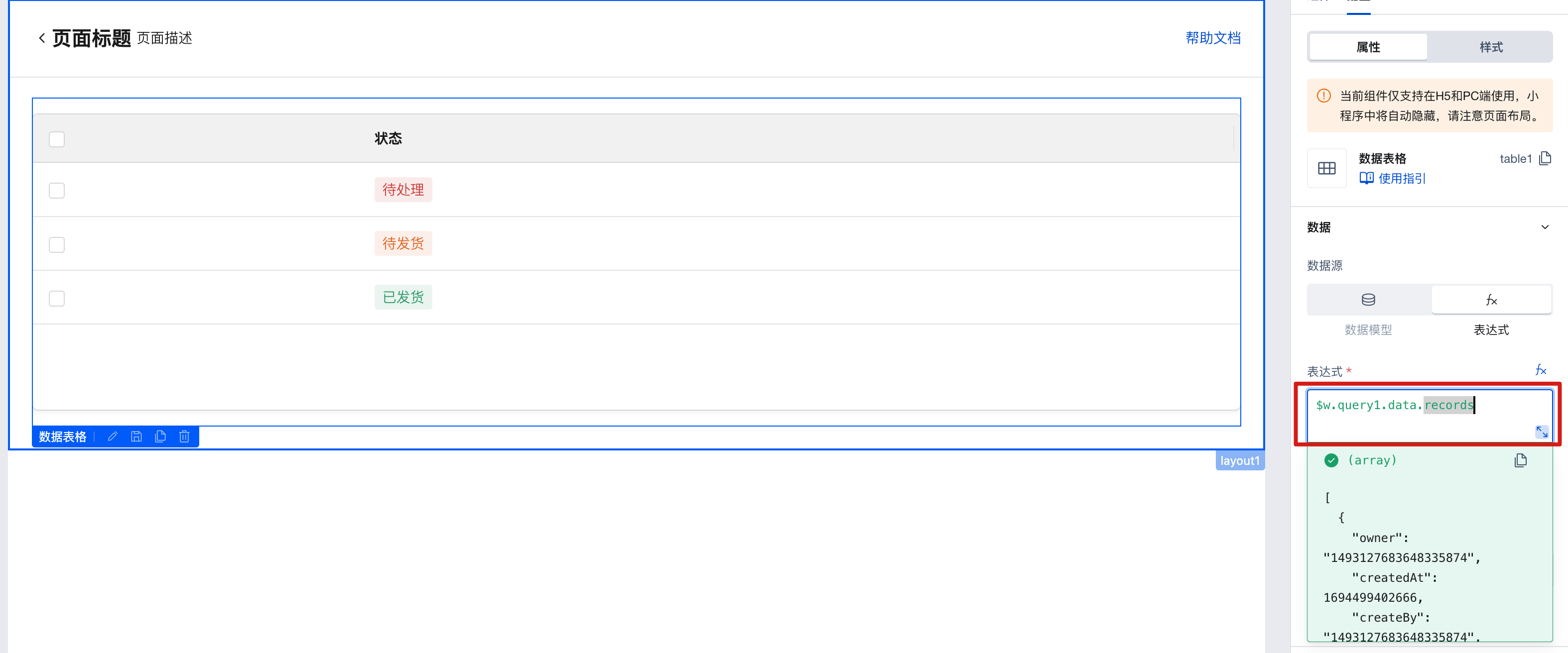
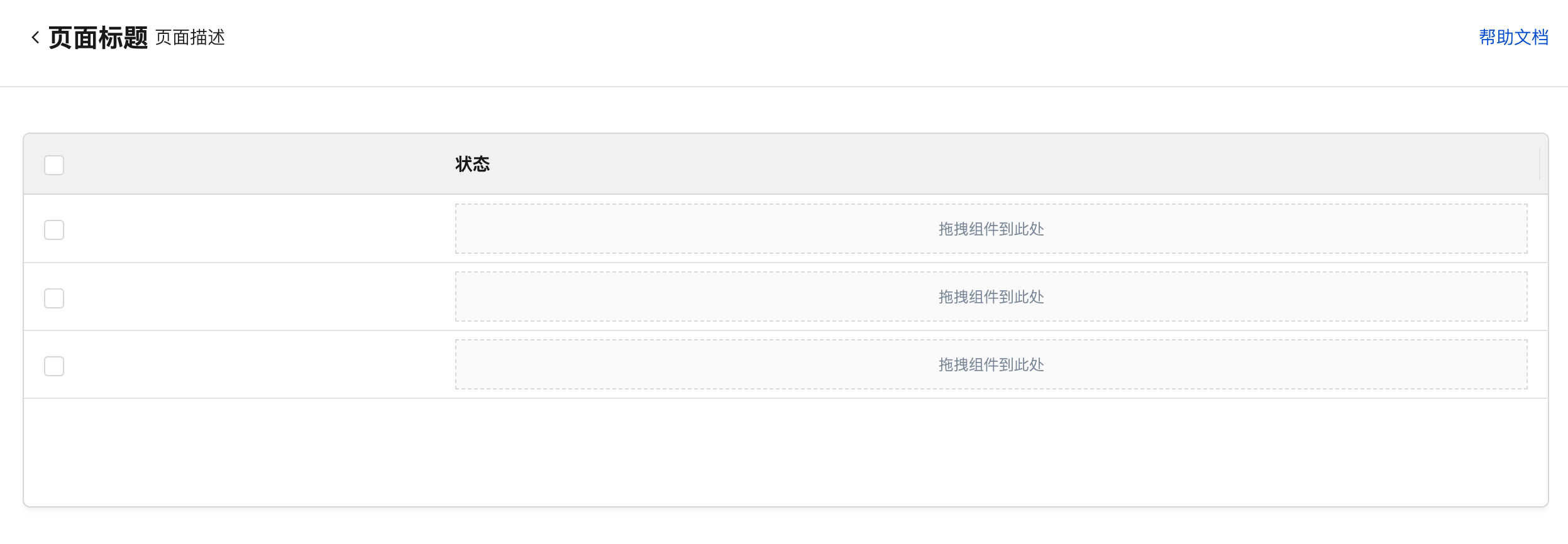
Select the table column configuration [Status] and set the display content to custom content.
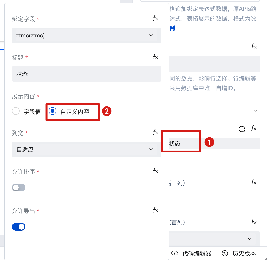
As shown below, you can then add components to this column.
- Add a tag component to the table column. For the tag item, click to bind a variable, bind the status value of the current row, and convert the format to label, value, and color formats.
[
  {
    label: $w.table1.cell_ztmc.record.ztmc,
    value: $w.table1.cell_ztmc.record.ztmc,
    color: $w.table1.cell_ztmc.record.color
  }
];
where ztmc is the status field in the model. color is the color field in the model.
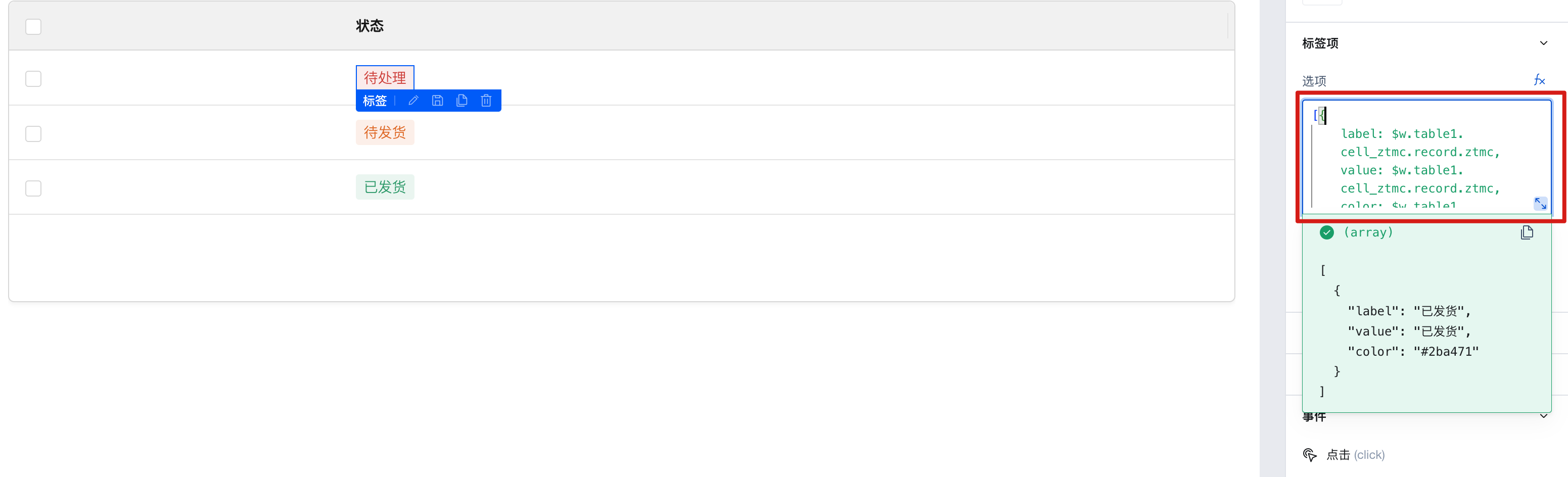 You can see that the data labels pre-entered in the data model are displayed in the table columns. For more guidance on custom columns and binding expressions for tables, see Table Documentation
2.2 Tab Style
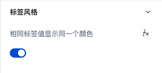
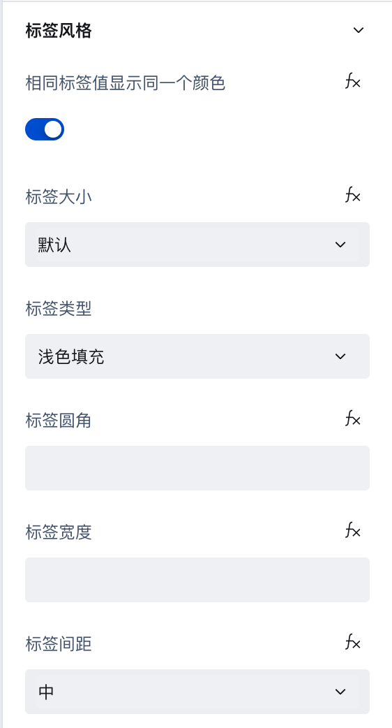
The color of each tag can be set via the tag color.
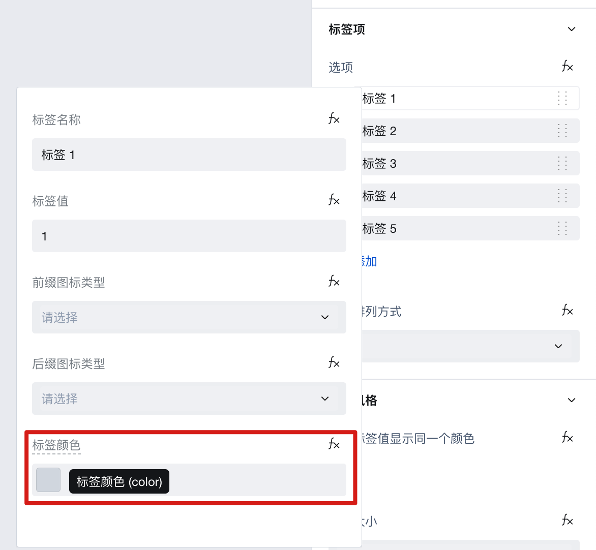
Tags with the same value use the same color. When tag 1 and tag 2 have identical values, they will share the same color.
Other tag style settings are as follows:
Example
Interactive Preview
Tag Color
Properties
External properties received by the component
Property Name | Property Identifier | Type | Description |
|---|
| Tag values with the same value display the same color | tagSameColor | boolean | Default value: true |
| Tag size | size | string | |
| tag type | tagStyleType | string | Example: "light" |
| Tag rounded corners | tagStyleRadius | string | |
| Mobile terminal tag width | tagStyleWidthType | string | Default is Adaptive Width, valid only in H5/mini program Default value: "flex" |
| Number of tag columns in mobile terminal | tagStyleWidthCols | number | Valid only in H5/Mini Program Example: 4 |
| Tag spacing | tagStyleSpace | string | Default value: "md" |
| Option | range | array | Option List Example: [ { "label": "标签 1", "value": "1" }, { "label": "标签 2", "value": "2" }, { "label": "标签 3", "value": "3" } ] |
| Arrangement mode | direction | string | Default value: "inline" |
Events
Events exposed by the component. You can listen to component events to trigger external actions
Event Name | Event Code | Event Output Parameters event.detail | Applicable Scenarios | Description |
|---|
| click | click | Compatible with all platforms | Output Data is range |
Properties API
Through the Property API, you can access the internal state and property values of components. You can access internal values using$w.componentId.propertyName, such as $w.input1.value. For details, please refer to Property API
Read-only Property Name | Property Identifier | Type | Description |
|---|
| Option | range | array | Option List |
Style API
Through the Style API, you can override the styles of internal elements in components to achieve customization. For example, in the low-code editor, you can write styles for all button components using #wd-page-root .wd-btn, and control individual component styles with :scope. For detailed instructions, please refer toStyle API
Name | Class Name | Description and Examples |
|---|
| root element | .wd-tag-root | tag component root element |
| PC-side root element | .wd-pc-tag-root | Write tag styles for PC |
| H5 root element | .wd-h5-tag-root | Write style for H5 tag |
| Mini program root element | .wd-mp-tag-root | Can be write style for mini program tag |
| tag item | .wd-tag-item | The style of a single tag can be written, but pay attention that its priority is lower than inline style. |