These are prompts which I find are just generally useful, without requiring changing the inherent workflows I use for programming my apps. While I’m starting to tactically deploy agents for general programming tasks, I feel like the line of when I manually code and let the agent do it is currently more fluid.
Add a SwiftUI preview for TrainingBlockDraftEditorView, including data variants for each of the flows through the view
SwiftUI previews are huge benefit for my productivity when iterating on the UI/UX of a view, but I find the setup and creation of the data needed to drive them a bit of a pain to setup. But this is a perfect thing for an LLM to generate. I even had a great use recently where I was working on a weather view and I asked it to create different data blocks for different locations (to see how rainy vs sunny would render) and it worked out the API keys necessary to do some CURL requests to get actual data to use.
Look at the publishSnapshot: method. Identify all the uses of it and determine what it does and how it is used. Describe its function and how it acts in all different uses of it
While I in theory it would be good for every one of my methods to been neatly documented, in practice that almost never happens. I work by myself in the code, so rarely need to document things like I would if I worked as part of a larger team. All the same, sometimes I find old code which I don’t fully remember or am making a change to something which I want to have full understanding of all uses of it. This ‘realtime documentation’ works a treat and has the added advantage over static documentation of being 100% up-to-date (rather than slowly slipping out of sync with reality of time).
Look at the git diff since XXXX and locate any newly introduced user visible strings in the app which need to be localized. Add entries for each of these strings to each language supported by this app with relevant translations.
A pattern I’ll use for many of these prompts is the “Look at the diff since XXXX” where XXXX is the git hash of the last released version. This helps narrow down the changes and lets me isolate the updates to the relevant, new code.
In this case I want to have it seek out any newly added user-facing strings which were introduced and then add translations to the .strings files for each supported language. For years I’ve used LLMs to power the baseline translations I use in the app, so this shortcuts the process. It also has helped me to identify spots where I was using strings in a way which wouldn’t actually get triggered by the localization system (like a string literal passed into a view).
Look at the git diff since XXXX and create a recommended testing plan to provide good coverage of the areas of the app which are either new or were changed. Including likely user paths which could now include incorrect behaviour. Generate the export as a nicely formatted PDF checklist.
This works to evaluate all the code which has changed and then it gives me a list of things which I should do to make sure the app update didn’t introduce regressions. This has a few times identified little user paths which I might not have thought to test, or just generally helps me find areas to be more thorough with.
Look at the git diff since XXXX and explore whether the newly added code has introduced any bugs or likely unexpected results. Consider how the newly added code interacts with existing code and whether it will change existing behavior. Also, identify any areas where the newly added code is inconsistent with the general style and design pattern of the related, existing code.
The hit rate for this prompts I relatively low (maybe 20%), but the reality is I am always very grateful for any bug which I can find before it ships to customers, so having a second opinion on things is great.
Look at the git diff since XXXX and identify any new features or changes which would be visible to the user. Write a summarized release notes for the changes organized by size of the change (Major features, minor features, bugfixes).
This isn’t something which I expect to use directly for the user, but is a very helpful baseline for the creation of the real release notes. Also, this has helped me when I’ve been working on a larger, more sprawling update and I forget all of what I’ve done.

In order for that to work I need to know precisely where each and every widget is on each and every iPhone model. This involved a massive process of screenshotting and a custom app for doing pixel precise analysis. There are 31 iPhone models which support iOS 26 (which I required for this update), so for each of these I needed to collect nine screenshots.

That all went well, but then I was faced with a slight dilemma about how/if I should support Display Zoom. This is a feature which increases the effective size of your iPhone’s controls by rendering your iPhone’s screen at a lower resolution and then enlarging it to fill the actual screen.
Since Display Zoom creates a new virtual resolution for the iPhone I would need to duplicate all the work I did to support the regular widget positions for each iPhone. This effort is made doubly tricky because the iOS simulator doesn’t properly render Display Zoom so I’d have to rely on screenshots from devices to which I have physical access.
To better inform this decision I went looking for statistics about the usage of Display Zoom, but couldn’t really find anything. So in a recent update to Widgetsmith I built in analytics code which reported Display Zoom usage.
What I found was that overall usage of Display Zoom was at 1.9%, which was lower than I would have guessed. For Widgetsmith I see 18% of users with their Text Size set to something larger than the default size, so I’d have guessed the number would have been much higher than 1.9%.
But that helps me to feel better about not supporting Display Zoom for this feature. That is simply not enough users for it to be viable to sustain the effort supporting it would require.
Here is a breakdown of the Display Zoom adoption by iPhone model family. It seems to skew heavily towards the smallest and largest iPhones.
| Category | Userbase | Display Zoom |
|---|---|---|
| SE | 0.5% | 4.90% |
| Mini | 1.2% | 4.60% |
| Air | 0.2% | 3.80% |
| Plus | 5.0% | 3.20% |
| Pro Max | 20.3% | 2.70% |
| Regular | 50.9% | 1.80% |
| e | 1.0% | 1.80% |
| Pro | 10.8% | 0.90% |
| Overall | 1.90% |
And I can say that without any hyperbole.
In April of 2020, while the world was struggling through the early stages of the COVID pandemic, I launched an app for creating highly customizable complications for the Apple Watch. Watchsmith was my attempt at filling the void left by the lack of 3rd-party watch faces on watchOS.

It let you chose from loads of different colors, fonts and display types to make your watch face your own.
The app did alright commercially at launch—it was a niche app for a niche purpose. Much like many of my other apps at the time, I was building things which I wanted to exist and hoping that they’d find some audience with folks who had similar needs and desires.
Then that June at WWDC Apple announced iOS 14 and with it the introduction of a new widgets system for iOS. For the very first time iPhone users had the ability to personalize the look of their home screens (beyond their choice in wallpaper).
This then kicked off a busy summer for me adapting the work I’d done for Watchsmith to iOS. Because Watchsmith was my first top to bottom SwiftUI app I could actually re-use a lot of the code between the two and so by mid-July I had the early prototypes of this ready:
I’m planning to bring the customization options of @WatchsmithApp to widgets this fall. Since the complications are now all SwiftUI there is a ton of shared code and functionality between them. Got the first few types translated to test out the concept and seems to work great. pic.twitter.com/aYzRiDVRks
— David Smith (@_DavidSmith) July 14, 2020
I was very much viewing this as a project which would have a similar lifespan as Watchsmith. I was building a niche tool for niche users. I thought it was a good idea, and one I’d enjoy using myself, but at this point my expectations for it were still very managed.
When Apple announced that their September event would be on September 15, I thought I was mostly ready. I had a good basic version of the app with most of the feature-set copied over from Watchsmith.
I remember watching the video keynote, enjoying it as it went right up until this moment when Tim said:

…tomorrow! Usually we get a few days between when Apple releases their final “Gold Master” versions of an iOS version and when it will come out to the public. But in this case we had less than 24 hours to get our apps submitted, approved and ready for the world.
So I frantically got to work on final touches and build and at 5:54pm, I got it submitted.

Phew.
Then 6 hours later (at 11:30pm) Widgetsmith was approved by Apple, ready for when iOS 14 would be released the next day.
So at 4:21PM on Wednesday, September 16, I hit release for Widgetsmith v1.0. The app launched as part of a much wider release schedule I was mananging at the time with updates for Pedometer++, Sleep++ and Watchsmith all going out that same day.
Introducing Widgetsmith. Fully customizable, scheduleable widgets for iOS 14, including widgets for Date, Time, Weather, Calendar, Reminders, Health, Tides & Astronomy. You choose the fonts, colors and appearance. Take control of your home screen. https://t.co/7BLTa31r3z pic.twitter.com/hUIbn01x3I
— David Smith (@_DavidSmith) September 16, 2020
The initial response to the app was warm but nothing out of the ordinary. Widgetsmith was the 59th app I had launched so I’d been through this process a lot over the preceding twelve years of indie app development. Typically you see a little swell of interest in the first few days. Then things settle down into a stable level and you move onto the maintenance and gradual improvement of the app.
This was what I thought would happen with Widgetsmith and the indications for the first few days were that this was exactly what would happen.
So the next day I left home with my family for our first proper holiday since the start of the pandemic, heading down to the beach.
That Friday (September 18) I awoke and went about my morning like normal. Checking in on things a bit here and there but mostly enjoying some welcome down-time with my family. We went for a walk in a local nature preserve and generally had a nice quiet day.
It wasn’t until we got back from our walk that I had my first indication that something was up. Someone reached out to me on Twitter saying they’d seen Widgetsmith getting mentioned on TikTok. I click through to the video they linked to and discovered that there was a walkthrough video by Katarina Mogus which was going viral at the moment. Her video showed how to use Widgetsmith to make your home screen look Aesthetic AF.
@katamogz Reply to @an.elementopqrs #ios14 #ios14update #iphonetricks #iphonehack #ios14homescreen #learnontiktok ♬ Daisy (I’m Crazy But You Like That) - Ashnikko
I then opened my helpdesk page and I was shocked by what I saw. There were new emails coming in at a rate of several per second. A literal waterfall of customer outreach. I couldn’t even tap on things because the rate was too high. I was rather bamboozled at to what exactly is happening but at this point I realized something was different.
Widgetsmith had taken off in a way I could never have had the imagination to hope for. It was everywhere. It was being mentioned in the news, I even recall it getting a shout out in Vogue. Complete madness.

Widgetsmith quickly became the #1 App in the App Store, and remarkably stayed there for a couple of weeks.
I will be forever grateful for the App Store for the opportunity it allowed me. It still, to this day, doesn’t seem like it should be possible for a solo, indie developer to build something on their laptop. Hit submit, and then have it end up on over a hundred million people’s phones.
The initial few weeks after Widgetsmith’s launch are a bit of a blur to me now. I remember frantically coding up requested features, trying to keep up with the outreach, and generally trying to keep holding everything together.
Eventually things settled down out of the frantic stage and into a new only-slightly-frantic stage. The app matured and developed and I was able to craft and adjust it towards the features its newly found audience wanted. What I had built as a niche tool for niche users had become a mainstream tool for mainstream users.
I wasn’t ever really sure if it would be a flash in the pan — a meteoric rise followed by a meteoric crash. Happily, five years on I can report that it was not a flash in the pan. Widgetsmith’s usage and userbase continue to grow. As of my writing this the app has received around 131 million downloads.
I continue to find enjoyment from coming up with ways to enhance and improve the app. Most recently with a fresh new re-design for iOS 26 and support for the new Liquid Glass widget styles.
I have no idea how long Widgetsmith will continue to be relevant, but I do know for sure that I am incredibly grateful for the opportunities and experience it has provided me.
The final styling of each redesign is different between the two apps but in both cases I feel like they landed on a solid interpretation of the new Liquid Glass design language.
I figured the best way to explain the design I went with for Pedometer++ was to make a short video walking through the design and narrating my thought processes for some of the major screens in the app:
The funny thing about working on my Liquid Glass redesign for the Pedometer++ watchOS app is how very little needs to actually be done. A couple of years ago with watchOS 10 Apple introduced a very similar design language, with edge-to-edge backgrounds and frosted overlays. This redesign also carried with it the underlying nudge to move away from any form of custom navigation and instead rely on system provided mechanisms.
So when I did a simple rebuild of the project with Xcode 26 the result for many of my screens was already pretty close. Here’s the main current steps screen.

Other than the buttons going from the flat frosted material to the glassy sheen there is very little which initially needs to be done here. Similarly, the basic workout screen has a similar result.

Where things start to get slightly more interesting is when I look at some of the more sophisticated screens in the app. For example the route planner screen.

Here the initial step is the same to switch the corner buttons to glass.

But what to do with that distance indicator at the bottom? My instincts here is that there are really two ways to approach an element like this: blend it into the device frame or harmonize it with the glassy buttons.
Blending it into the device frame would look like this:

Which works visually but also feels like it might be contrary to the general watchOS design language where we aren’t supposed to be emphasizing black edges of the device. So let’s try glass instead:

That feels very harmonious. I’m not 100% convinced though as it does feel slightly odd. The glass texture and effect is continuing to be changed and developed with each successive beta, so I don’t want to make any decisions based on its current look. Instead, what I’m thinking I’ll do is leave it there for now and see what it is like in a few betas time.
Another place where there are subtle changes which need to be made is in the start workout chooser. Again the starting version has the watchOS 10 frosted material look.

One area I’m still struggling a bit with in Liquid Glass is exactly when to use which variant of the glassy texture. This feels like a place where some glass is in order.
I start with the prominent glass variant.

But that feels too heavy and a visually distracting. So maybe a lightly tinted variant of the regular glassy style.

I like that. It draws colors from the background but still gives each workout type a distinct flavor.
I have found that the contrast between the prominent and muted variants of glass really work well for indicating state changes. In the metric chooser there is a list of entries which you can choose between for display, with each either enabled or disabled.
I found that using a prominent style for selected and a muted for unselected visually is really clear.

Additionally, the transition between the two states is visually gorgeous.

The workout control screen is another place where I found myself wrestling between different button styles and prominences. Here is the starting point:

A straight forward conversion to Liquid Glass buttons would look like this:

Which is pretty solid. The next thing I explored was to have the button icons all the same color.

Nope, don’t like that. Maybe in a brighter button mode?

That actually works pretty well. But maybe they should be circles?

No, I think that makes them visually too small. These buttons are used in a dynamic physical context during workouts, so larger touch targets are almost certainly better.

So here they are all in the bright mode. That works alright, but I think is just too bright and bold. So I think I’ll go back to the initial conversion for now.

That is it for where I’ll leave the core parts of the app for now. This transition from a watchOS 10 design to watchOS 26 has been relatively straightforward.
Where things start to get interesting is with the longer term ideas I have for the app. These likely won’t ship with the September updates, where I’m expecting to mostly ship an updated variant of the current app. Nevertheless I’m starting to think about them, here’s a little preview of some of the ideas I’m playing with:


It seemed like the best place to start looking for some inspiration would be in the Apple Maps app, which does essentially the same thing…just without the backcountry and fitness abilities.

The overall direction of map focused with glass overlay seemed like the obvious place to start. So first to go is the bottom section, to be replaced by a floating glass panel.
NB: These screenshots were mostly taken with Beta 2, so had a much stronger glass effect, the last ones were Beta 3 where Liquid Glass turned into Frosted Glass.

I tried to make the top panel also have a glass background but I find that doesn’t look quite right and feels a bit disjointed.

So instead I tried to mirror more of the Apple Maps during a navigation session look with the status on the bottom.

That’s much better. In this early draft I tried putting the end and pause buttons on the top like I have in a number of other views for closing map editors…looking at that now that was an awful idea which thankfully later on I will remedy in due course. But until then I experimented with adding a fuller metric display here.

But I think that is visually not as nice and I’m not sure is super helpful.
So streamlined things and added in the maps buttons for controlling route selection, weather and basemap.

I then had the good sense to bring down the workout control buttons to the bottom of sheet. They are hidden when the sheet is collapse and visible when the user taps or pulls up on it.

I played around with adding the additional metrics in the expanded sheet. I was recreating a feature in the old version where you could get a just text display (hiding the map entirely). Visually I’m not in love with this.

But I think the map view is too crowded with all those buttons, so let’s pull them down into the bottom panel, hidden by default.

I tried having the weather display up in the corner (like the Apple Maps app). But I also feel like the two lines of metrics is too much. Instead, I’m going to make the shown metrics configurable, allowing the user to see what they like here.
The buttons in the bottom feel a bit unbalanced so I played around with their button styles.

When I showed this design to a designer friend (Ben), who has much better design sense than I do, they pointed out that arranging the buttons horizontally would make for larger targets, ideal for users who are working out and might not be as precise with their taps.

That was better but then we iterated a few more times on the idea. Drawing inspiration from the Apple Workouts cycling mode screen.

I really like emphasizing the pause button as it is likely the one to be hit most often and the circular arrangement feels good too.

That is where I’ll leave it for now. That feels very streamlined and clean. The core functionality is all still here but in a very easy to read, map focused way.
This one proved pretty straightforward, at least to get to the solid draft stage.

The initial step was to adopt the new Tab Bar design. Pedometer++ had previously used a completely custom tab bar control, which caused all manner of complexity and trouble. So this seems like the opportune time to switch back to the system one, especially since it is so glassy and a hallmark of the new look.
Similarly the top navigation bar buttons are adapted to the new button shapes and looks.

Note that the tab bar tint being blue is just an artifact of the way SwiftUI Previews work, in the app it is actually green.
Right away this is looking pretty much at home in the new design language. But there is something which bothers me a bit. All the empty white space feels a bit expansive in a less useful way. One of the features of the old design was that the top bar would tint based on your current day’s goal performance. I try to have visual clues and encouragements in the UI to help motivate you to reach your step goal.
So let’s try making the whole background rather than white, a tinted color matching the current goal state.
Here it is way overdone on purpose to show what I mean.

Or here it is adapted to each of the red, orange, green states at a more appropriate level of strength. I think that overall works better. Especially for the glassy controls, they seem to work really well against something which has some color. On completely white they drop a bit of their distinctiveness and are harder to quickly identify as buttons.

Lastly I just need to clean up the backgrounds of a few of the views which were previously assuming a white background and so now look a bit weird (like in the streak length marker label). Also, I think the title text needs to be a bit bigger to better balance with the button sizes.

That’s pretty solid. I like it, it feels ‘new’ but not in a way which I think will cause confusion or complaint. This root screen is the heart of Pedometer++, and has been very similar for nearly 10 years now. I want to be very conservative with updating it, so as not to cause customer frustration.
Here is a before and after:

Pedometer++ has a number of mapping based features for planning and reviewing your walks, hikes or runs. Within Apple’s own iOS 26 apps, I’d say that Apple Maps is one of the prettiest implementations of the new design. Conveniently it also includes several of the kinds of features which Pedometer++ has to find a design for.

This is a screen which actually neatly falls into a clear separation between “content” and “controls”. In the “Start Workout” screen this was much squishier, but here we have the map and its annotations and then things which either edit or report on that contents. This is a perfect spot for concentric glassy elements overlaying the content.
Here is my starting point:

This design feels very constrained in the perspective of the new language, the map is squished between the two white bars and overall this feels like it creates an unstable tension.
So the very first thing I need to do is to get that map going edge to edge.

That already feels much fresher, but the text based top buttons feel a bit heavy and distracting. So let’s swap those out for some of the newly defined Standard system icons.

Often the “primary action” is given the prominent button style. So let’s try that for now.

Now let’s put the elevation graph and route stats panel back as a floating glass sheet. The proper API to round this sheet (.containerConcentric) doesn’t appear to be in Beta 2, so I’m just fudging this for now with some hard coded corners radii. The overall effect is pretty good, just enough of the map shines through to give a pretty effect but still very legible.

I think I’m gonna drop the toggle for distance vs time scale on the chart. The difference is way too subtle in most situations to be useful and I think it just creates confusion overall. That leads to a much cleaner looking chart.

Next to start putting back in the buttons which control the route editing. First up the search for location button. This is used to allow the user to jump to a named place rather than having to swipe around the map.

Then the route editing controls for removing points or switching between snapping to paths or straight line plotting. To start with I just plopped the current buttons in their with a .glass button style.

That is obviously way too wordy and doesn’t really fit with the sleek UI I’m going for. So I’m gonna make two changes. I’m gonna drop the “Remove All” option from this primary editing UI. It is rarely used and dangerous so likely best put in the “Settings” area for the route. Then I’m switching over to simple icons for the buttons.

That is visually a lot better but I think it makes it much more confusing about what the snap to path vs straight line plotter button does. So I think I’m gonna put a status area above the info sheet. This also can contain transient messages when it is doing route processing or similar.

I think the info sheet could benefit from a bit of visual distinction between the elevation graph and the route information. They are related but look a bit too smushed together right now.

I think I might also try pulling down the route name into the button sheet and the settings button too.

That’s the right idea but the settings button isn’t right there. It should likely be next to the route name area.

That is getting pretty close but I think the scaling isn’t right. So let’s make the button a bit bigger and move the route name out of the header.

I like that but I think the “Edit Route” text is kinda redundant and makes the map feel a bit squished again. So maybe let’s leave it open so that the map can fade gently to the top bar.

Getting pretty close to a first draft, but the more I look at it I don’t like the way the top right button is the only filled in button. While it is the ‘primary’ action it feels off balance to me. So let’s go back to a simple tinted symbol.

Much better. I feel pretty good about that as the starting point for now. That feels very ‘iOS 26’-ey to my eye. The metrics are still a bit off, and I think the graph styling feels a bit disconnected but this is a good place to stop for now and move on to the next screen.
I’m starting by focusing exclusively on the design update portion of my iOS 26 work. While there are a variety of other functional changes I need to make, what is most important right now is to build a basic design so that I can start living with it and see how it feels in practice.
The overall complexity of the design changes are much simpler in Pedometer++, and so that’s where I’m going to start (rather than Widgetsmith). Then within Pedometer++ I need to decide where am I going to begin work.
I need to establish the visual language that I’m going to carry through the app. The new Design Language of iOS 26 is not wholly prescriptive, it leaves large room for individual interpretation and places for me to put my own spin on things.
So I took a look at Pedometer++’s screens and picked out a handful of “core” screens which I think if I get right will serve as a strong foundation to then apply to all the other parts of the app.
The first of these core screens is the “Start Workout” screen:

I’m starting here because it includes a number of the custom controls I’ve built for Pedometer++ and also because it is a good example of a “configurator” screen.
My design process while still trying to learn the new design language is that once I pick the screen I want to work on then I will scour the Apple provided apps for examples of things which hold similar components. I’m looking for inspiration and examples of the numerous small details which make up a consistent design. Apple has a clear head-start on my own understanding and so I’m trying to shortcut as many pitfalls as possible.

I put all these screenshots into an “Inspo” folder and regularly scan through them while I’m mulling over a design detail to see if there are components I can draw from. In this case I found that the “Create Reminder” screen is probably the closest thing to my “Start Workout” screen, with the “New Event” screen a close second.
The first things I need to do is to change the bottom “Start Workout” button from a translucent sheet to a glassy button with an edge blur along the bottom. I think this fits well with the general ideas of placing important controls along the bottom edge and using glass to indicate a navigation/structural control.

Next the headers in the sections are way too big and heavy, so these are toned down.

My custom segmented control looks out of place now. I could either change it to being a capsule shape (which generally seems to be the default control shape now), or I could try using the default system segmented control picker.

That feels more at home in the design, but I also find having several of these next to each other visually very busy. So instead I’m gonna try using the menu based picker instead.

For a user choice which likely doesn’t change very often this feels much cleaner and clearer. This control will default to your most recently used option so most users will likely only change it once. I like that much better, so will also apply that to the Workout Goal setting.
Next up are the shadowed, round-rect buttons I was using before. I start off by making them capsule shapes and giving them a flat appearance.

I think the sections being colored and the background being white doesn’t look quite right so let’s flip that around.

Much cleaner, but now the inline buttons look way too strong and have the same visual prominence of the main “Start Workout” button. So let’s tone those down by making them use the secondary color for their background, keeping the color in the text instead.

Much better. The contrast in the buttons still needs some work, but overall the structure and general “feel” seems pretty good now.
Here is the before and after for comparison.

This picks up a lot of the general design cues of the “Add Reminder” page but in a way which (hopefully) feels familiar to someone who was coming from the iOS 18 version.
Next up…maps.
There are two major considerations to make before doing this: one more obvious, the other more subtle.
If you drop support for older versions of iOS, existing users who haven’t updated but who have the app already downloaded will continue on as though nothing happened. Should they delete and want to re-download the app they can do so from their App Store history. Generally speaking their only impact is that they won’t get any new updates, which could include bug fixes or improvements which would benefit them.
iOS generally has really good adoption of new versions. With the vast majority of devices which can update running it within a few months of release.
Looking at Widgetsmith today I see that 86.5% of my users are on iOS 18.

Which means that 9 months in, if I went iOS 18+ only today I would be locking around 13% of my users onto the current version (with a reasonable expectation that more would subsequently update to either iOS).
Things get a bit more complicated when considering the impact on the future growth of the app. While existing users will continue to be offered the last compatible version of your app by the App Store, new users will not be able to acquire it. If they open the App Store they will be told this app is not compatible with their device.
While I would, in some ways, prefer it if Apple instead showed them the last compatible version for download, I can understand how that would cause confusion. But as an app developer it means that any time I increase my required iOS version I’m also reducing my prospects for future growth.
When I look at my current new downloads by platform version I see a distribution broadly similar to the one in for usage but skewed slightly newer.

For example, if I went iOS 18 only today I’d exclude around 9% of my current new users from acquiring the app. Which from my perspective is kinda huge. If I could do something which boosted my downloads by 9% I’d be delighted.
The story gets even more complicated for newly released versions of iOS, the initial adoption of iOS versions is very metered (I imagine while Apple ensures all is smooth and well with the update). So if you were to require the latest version on launch day you’d dramatically reduce your audience for a while, until adoption broadened out.
Here is the distribution of new downloads by platform version for Widgetsmith for the iOS 18 release cycle:

While I saw an initial surge of downloads on iOS 18 (peaking around 60% on launch weekend), it then quickly retreated to 40% and then slowly increased from there. There is a big jump (to about 80%) at the end of November when Apple enabled broad automatic updates.
Every app is different but this gives a general idea of how you’ll reduce your new downloads by requiring newer versions.
This data can be found for any app in App Analytics > Metrics > New Downloads (viewed by Platform Version)
My general approach is to only increase my requirement once the new download rate drops to a percent or so. The technical and practical benefits become justifiable to me once I’m only loosing that many users. Otherwise it feels like I’m doing something to make my technical life a bit easier but my business meaningfully worse. That tradeoff will vary by app and business goals, but generally I consider it wise to take a cautious approach whenever possible.
Something in particular which I heard a few times was that I was overusing Liquid Glass. Which I suppose makes sense, it is the literally shiny new thing. Looking back at these early redesigns, I was mostly just rounding everything and adding Liquid Glass to all interactive elements.
Here is a basic example of this in action:

For the Route list, I just added the .glass button style to the share and delete buttons. When you’d tap on them, they’d then get the cool lift-up fluid effect.
Something my design lab consultant said, which was really clarifying for me, was that Liquid Glass should generally be used to highlight content underneath the button. So if that content is plain/flat, then it is likely not appropriate. In this case, if the button was over the map preview, then it might be appropriate, but since the whole section is tappable, then I’d have two levels of interactivity, which is generally not great.
In this case after the lab I took another attempt at redesigning the route chooser rows and ended up with this:

This isn’t definitely done yet but feels much better, and more in keeping with the general look of the new design language. I still need to do work on the overall layout here, but moving the buttons into the row’s selection sheet feels much better and gives me much more flexibility about how I layout this page.
As will likely often be the case for posts like this, I can finish with the relevant page in the HIG.

Be careful how much you use the new shiny new Liquid Glass effect. A good new design isn’t one which uses that everywhere; it is one which uses it to great effect.
The very first thing I did once I got the new Xcode versions installed was a simple build-and-run of my apps to see how far I have to go with adopting the new design. The result showed just how far I have to go.

Having now watched a bunch of the Session Videos about the new Design is clear that Apple has done a lot of thinking about this new direction they want their platforms to head and it is gonna be far more than just a simple coat of paint.
While the core functionality of my apps will remain the same I expect I will need to do some deep thinking and exploration of how I can best adjust the hierarchy, layout and adornment of my apps to fit in.
This talk “Get to know the new design system” by Maria Hristoforova in particular lays out the fundamental concepts which undergird the thinking I need to adjust to adopt.
I’m also learning (the hard way) that I will need to be careful to properly understand the new system before I get carried away with my ideas for adopting things.
Something I have a tendency to do is want to build lots of little custom interactions, which serves me well in some contexts but here it would be rather unwise. Apple has spent a lot of effort crafting this new design system and likely explored and tried a great number of different paths which they now advise us to avoid.
As a result, my first rule I’m adopting for myself in this initial redesign is that I will 100% follow the system guidance and use all default system behaviors.
There might come a time when I have enough knowledge, experience and confidence to go my own direction with a design element, but what I should do first is be completely default in my implementation. I’m going to try and hold myself to a rule that I don’t do anything custom.
I think should try to follow the proverb “Imitate, then Innovate”. Until I know the design system backwards-and-forwards, I not going to think I know better than the defaults.
This rule is top of mind for me right now because of a little exploration I did this morning. I saw how in a few places the new design will have a search button as an element along the bottom trailing edge of the Tab Bar.

I saw that and was like “ooo, I wonder what it would be like to put a universally accessible action button there”, like maybe I could put a “Start Workout” button in there for Pedometer++.
Trying to implement this I immediately discovered that there was no default, system method in the new design’s API to do this. The Search button is a specifically unique action which the system supports.
That didn’t stop me from trying to see if I could do it anyway. So a bit of hacking around with onChange and other abuse of SwiftUI I got something working.

Then I caught myself and gave myself a metaphorical slap on the wrist. Nope, don’t do that. This summer is all about learning the common path, the default path. I shouldn’t spend time hacking around the system.
This was then confirmed all the more when I started reading the new Human Interface Guidelines and what should I see when I get to the Tab Bar section.

The exact thing I wasted a few hours working on was specifically called out as a bad idea.
So that is now my mission for the summer. I want to adapt Widgetsmith and Pedometer++ into the new system without a single hack. If I can do that then I should reach a point where I deeply understand things and then maybe at that point I could starting thinking about places where I might be able to reasonably innovate on top of it. But until then it would be hubris and folly to think I know better.
Six months ago, I found myself really demotivated with my health and fitness. For a long time I’d been on a good run with working out and staying fit but I found that I was struggling to head to the gym and keep consistent with taking care of myself. This isn’t the first time this has happened to me but as I get older I am very aware that it is vital that I continue to fight against this tendency because the longer I let it go the harder it will be to come back. What I needed was a project.
I tend to work best when I a working towards something specific rather than just “general health”. As much as it would make sense to be working towards “a long and healthy life”, the reality is that just doesn’t get me out of bed. I needed something more tangible and short term. I need something which lets me tell myself that if I slack off now, I’ll pay for it later, and soon.
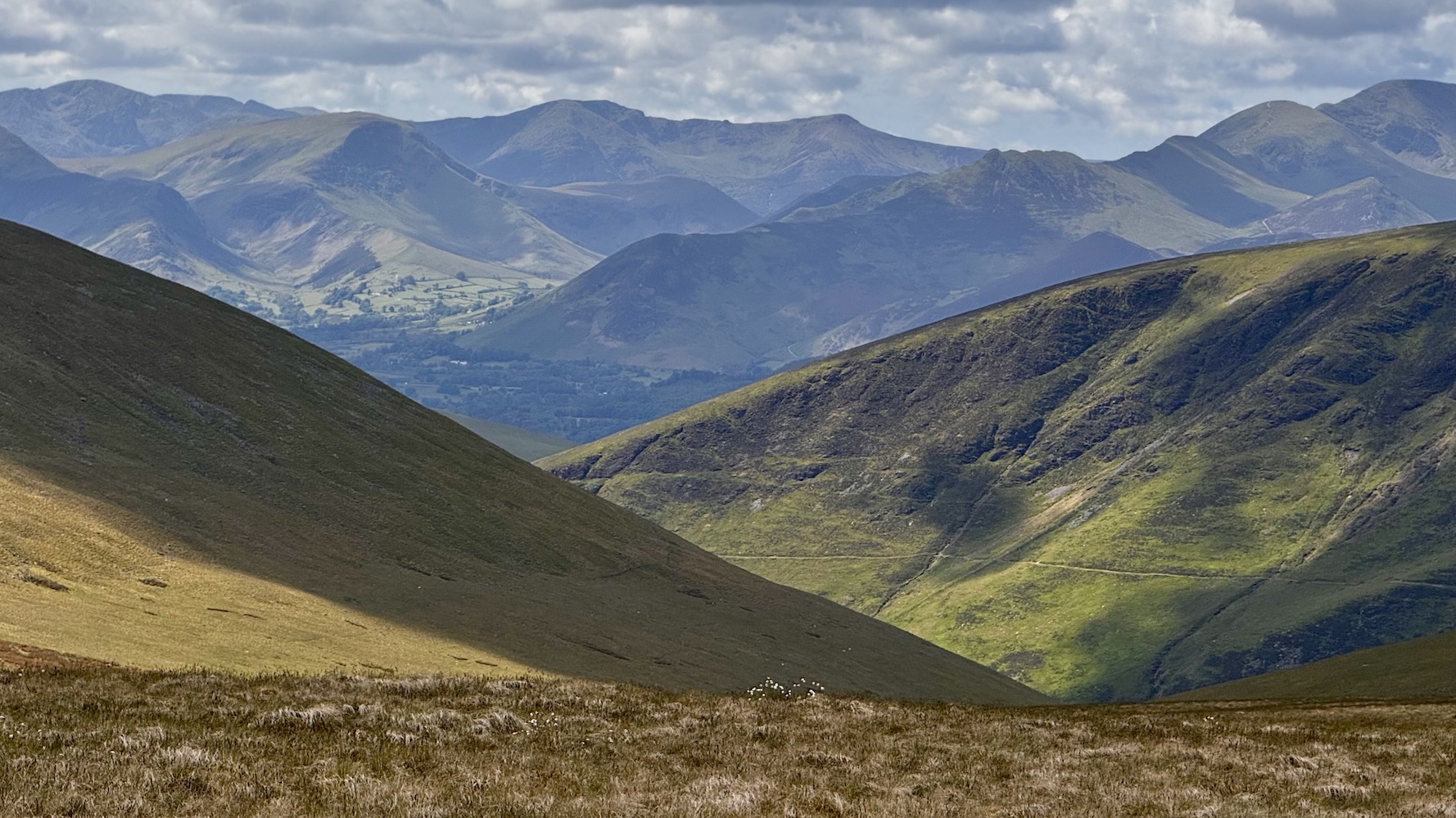
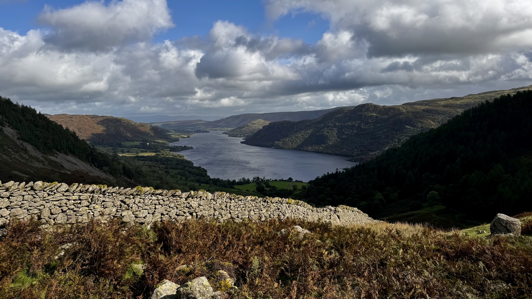
Last week I turned 42. Which ended up being the seed of the plan I came up with. My favorite place on earth is the English Lake District. Its combination of water, mountains and culture resonates with my soul at a fundamental level. I am never so happy as I am when I am out in the fells1. The relevant part of the Lake District’s mountain culture for me is the concept of the “Rounds”, long circular routes which circumnavigate the area.
The most famous of which is the Bob Graham Round. This is a roughly 66 mile route which visits 42 high fell tops in a wide reaching loop of most of the Lake District, involving around 26,000 feet of elevation gain and loss.

There are some fell runners which attempt (and remarkably complete!) the entire round in 24 hours. That didn’t appeal to me (nor the health of my knees), but I thought I might try completing it in 42 hours instead.
42 peaks in 42 hours at 42 years old. I liked the sound of that, and so a project was born.
I now had a reason to get up each morning to exercise. A reason to manage my diet and a goal to work towards both physically and logistically.
So I began planning towards my Round. Timing wise it looked good for me to plan to come up to The Lakes for my kids school holiday at the end of May (right after my 42nd birthday). I’d come up here for a week and plan to attempt my round on the best two days of weather.
My plan was to complete the first 35 miles of the round on Day One. Starting at dawn and hiking until dusk, then having a brief rest and then heading out at dawn again on Day Two to complete the final 31 miles.
One of the essential rules I have for this kind of expedition is that I avoid any and all unnecessary risk so I didn’t want to travel in the dark. Especially since I am doing this attempt solo/self-supported it isn’t wise to be out in the wilderness by myself after dark. Thankfully the Lakes is pretty far north (54° 36’ N), so in mid-summer the days are very long. I’d have around 18 hours of usable light to work with each day.
I also began to learn and explore the world of ultra trail running. While I would only need to maintain a pace of roughly 2.0 mi/hour for the 18 hours of daylight to complete each of my legs, the terrain I’d need to cover is rough and rocky in sections so I‘d have to run whenever I could to offset these slower sections.
I‘ve been a runner my whole life but never over terrain and in the mountains. I had to learn about the different way you need to pack your gear, fuel yourself and techniques for maintaining your footing on uneven ground.
This was all very fun to me. I love learning new things, indeed that is a huge reason I undertook this challenge. In addition to the physical conditioning it required, it also provided a new venue for me to learn and explore. Something which at 42, I am very aware that if I don’t regularly stretch my mind it will become much less limber.
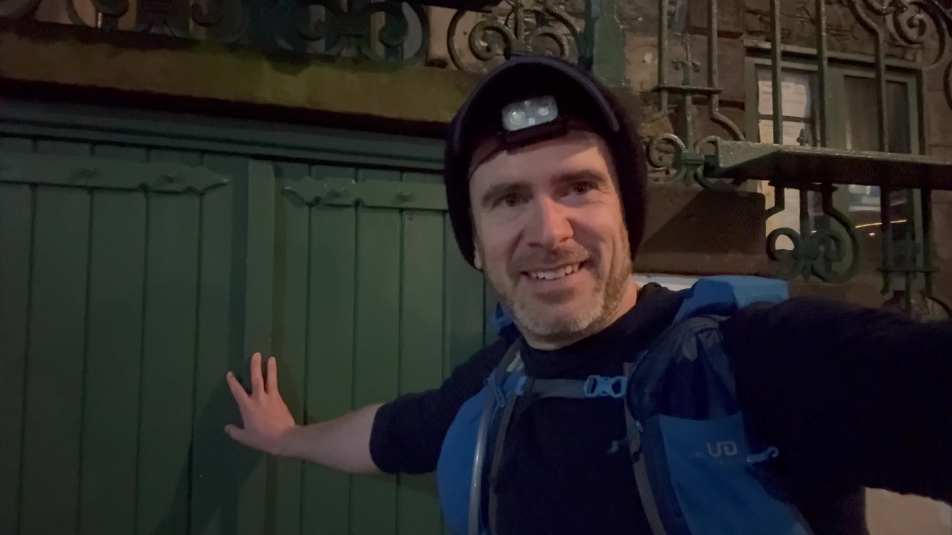
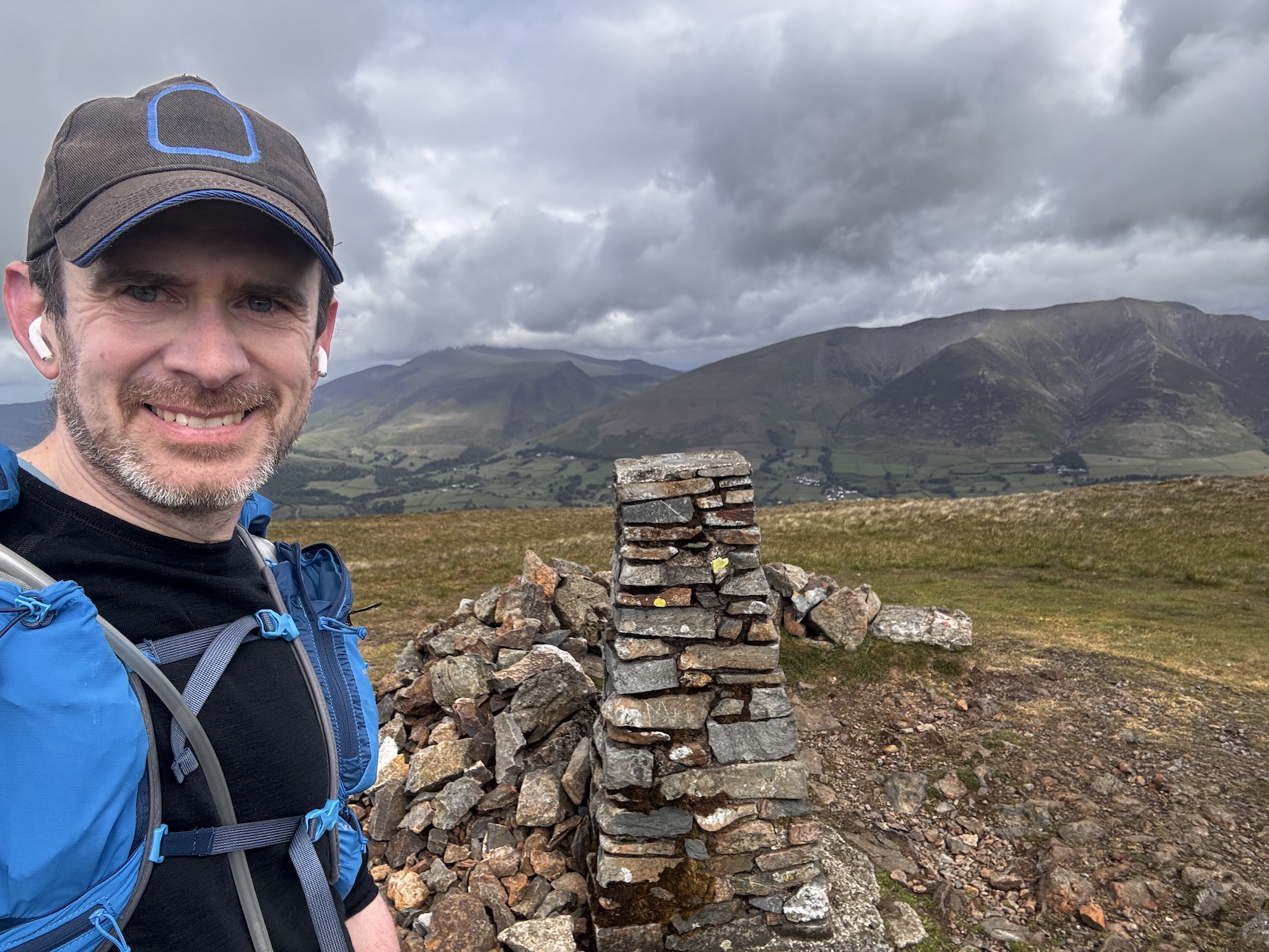
So this brings me to Tuesday, May 27 at the lower door of the Moot Hall in Keswick (the traditional start of the Round), at 3:30am.

There was a bit of comedy in the weather surrounding this expedition. For most of April and May England has been experiencing the sunniest and driest Spring on record. With long periods of fair, dry weather across the entire country. Indeed, I’d had to start making contingency plans for dealing with a lack of water along the route, as high mountain streams were likely all dry. It turned out, however, that those plans were not needed as the day I arrived in the Lakes the drought was broken and the rain arrived.
Rather than the full days of sunshine the last several weeks had seen, I instead needed to find the best 42 hour period I could and hope for the best. The forecast for the day when I started was to be beautiful for most of the day until late-afternoon when a storm would arrive. The nature of my Day One route was that hopefully by then I would have gotten past all the highest peaks for the day and be low enough that I’d be able to weather the storm without much fuss. I am no stranger to rain in the Lakes.
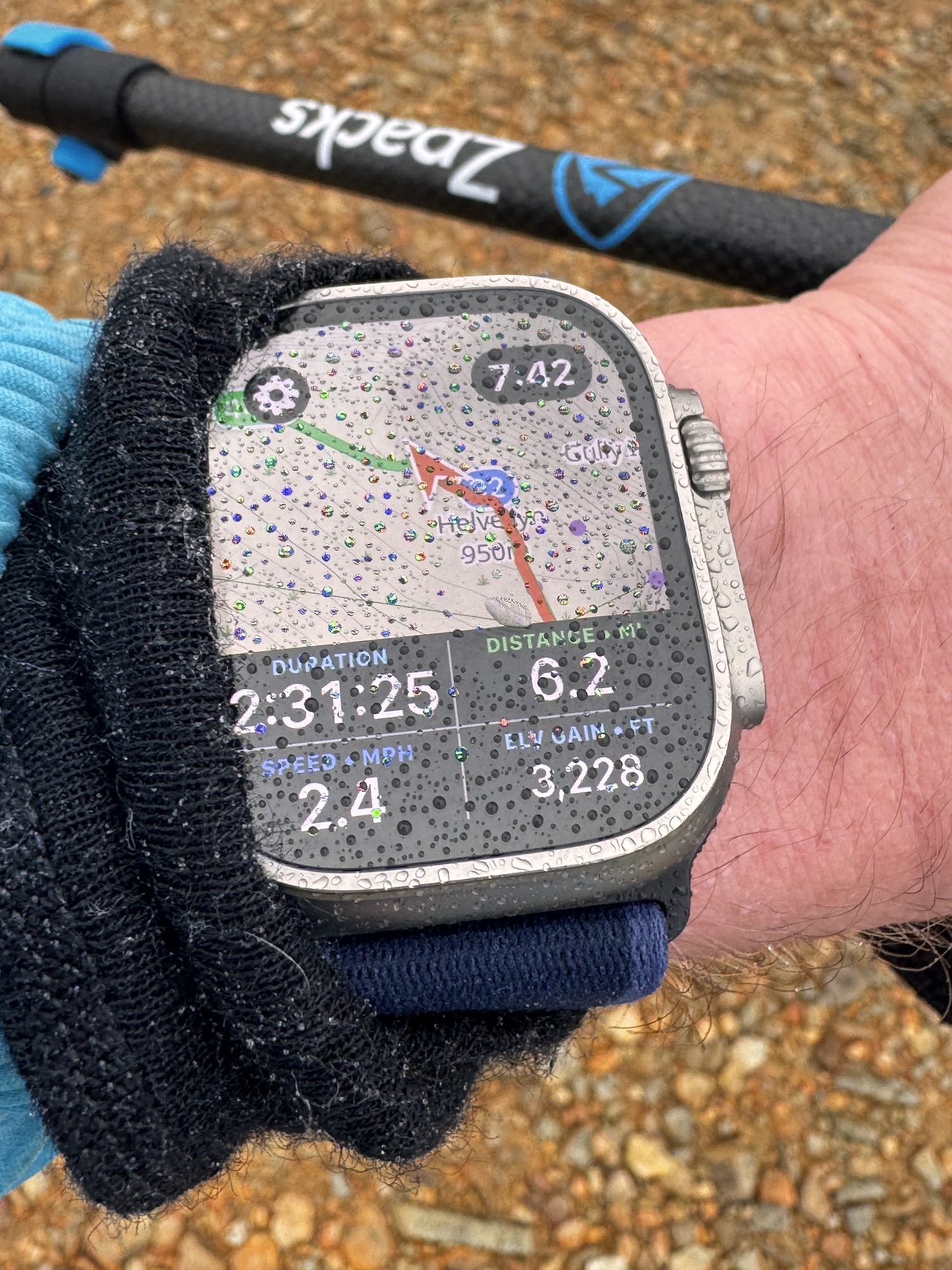
The first part of the day went largely as expected. I reached the first of my 42 fell tops after a steady initial climb.

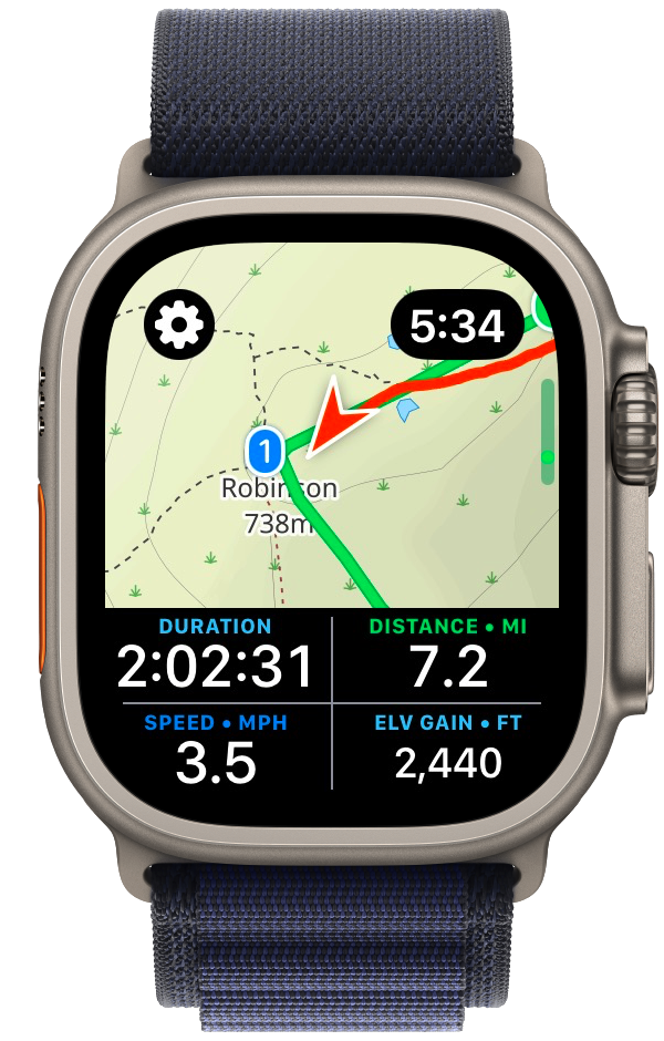
From there things went better than I could have hoped for the next several peaks. I was in a good flow and actually was a full hour ahead of schedule. My training and planning seemed to have been successful and I was able to move quickly and efficiently over the route. Owing to my very early start I had the mountains completely to myself and was thoroughly enjoying my adventure.

That is until just after I reached the top of my eleventh peak (Red Pike).

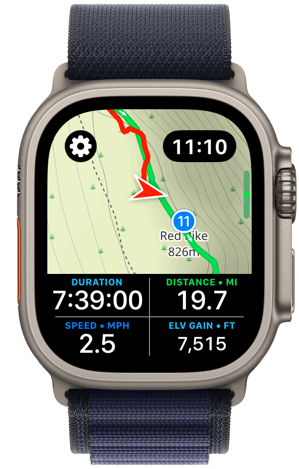
Here things took a rapid and undesirable turn. The storm which had been forecast to arrive mid-afternoon blew in from the Irish Sea, and with a strength and vigor beyond which was expected. Things quickly went from high clouds and gentle breezes to drenching rain, dense fog, and buffeting winds.
My wife has always been very supportive of my heading out on solo adventures in the wilderness. She knows how much I value this time and how helpful it is to my mental and physical health. But we have two rules which I must steadfastly follow:
I’ve spent a lot of time in the wilderness, in all manner of weather and conditions, I know when things are fine and when they are definitively “not fine”. I was well equipped for bad weather with high strength rain gear, multiple thermal layers and a warm puffy jacket. But I also was about to reach my final “bailing point” before I headed up into the Scafell ridge where I’d reach the highest point of my Round (and indeed the highest point in all of England).
I put on all of my storm gear and proceeded on for a few miles but it very quickly became clear that it was not wise for me to continue. Something I often say is that the key to staying safe in the wilderness is to be very conscious about what assumptions you are making. I was warm and safe in that moment but I was also at the limit of what the gear I had brought could support. If things got much worse, or if I had a minor accident and needed to slow down or stop for a rest, I would be in real trouble. The early and aggressive turn in the weather had consumed all of my safety margin.
So it was in that moment that I made the very disappointing, but correct, decision to bail off the mountain ridge I was on and drop down into the nearest valley as quickly as possible. While I was extremely disappointed that I wouldn’t be able to complete the route I had planned, reassuringly it wasn’t a difficult decision. I was 100% confident it was the correct thing to do, that it was the only safe path forward.
I dropped down off the ridge and made for the nearest car park and called my wife to come and pick me up. As I descended out of the howling wind I felt warmer and warmer, and as I looked up into the mountains, still wreathed in fast moving clouds, I became more confident in my choice.
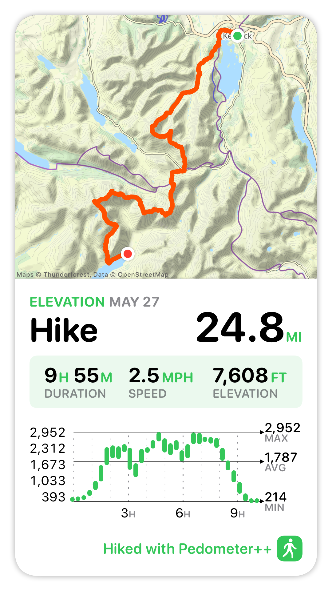
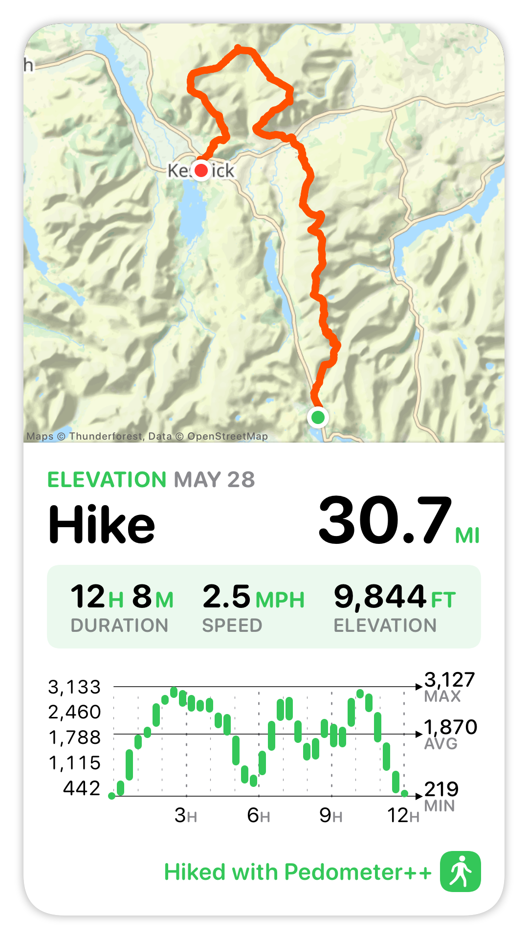
So Day One ended up being just shy of 25 miles, with 7,600ft of elevation gain. Not quite what I’d planned but still a big day out.

A number of friends and family were following along my adventure (in realtime via a custom website I had created). After it was clear I wasn’t going to complete my planned hike for Day One they reached out with sympathy and encouragement. Which was lovely to receive but strangely I found it wasn’t too much needed. There was certainly a bit of disappointment, but what I found was a certain peace too. What I kept coming back to was that in order to have a true “Adventure”, there has to be a high degree of likelihood that you won’t complete it as planned. If the outcome is all but a foregone conclusion when you begin, then you aren’t exploring, you aren’t finding the edges of your abilities.
That uncertainty is a big part of why I wanted to attempt this Round. Sometimes we get to choose the challenges in our life, but often we don‘t. There have been countless times in my life when brutal, unforeseen circumstances have borne down on me. I’ve gotten through those with the help and support of loved ones, but also to some degree by cultivating the skill of perseverance.
When life isn’t bearing down on me, if I choose challenges which stretch me I will become more comfortable with difficulty. So when the external pressures do arrive they are a little bit less overwhelming.
In this case the essential uncertainty of a wilderness adventure helped to build my resilience, and so I am less disappointed.
Next I had to answer the question of what to do the following day. I clearly wasn’t going to be able to complete the Round in 42 hours as originally planned, so should I continue along? I decided to push on as planned. So I got up very early the next morning and headed out for Day Two of the planned adventure.
This would be a roughly 31 mile section with about 10,000ft of elevation gain. It covered my favorite part of the route and included long beautifully runnable sections way up in the mountains (the Dodds section if you‘re familiar with it). I decided to head out with a renewed sense of fun. I no longer had the self imposed “pressure” of trying to hit my goal, it was now just about enjoying the fitness I had built to get here and having a lovely big day out.

I went through the 31 miles of that day with a big smile on my face. I was out in my favorite place, doing my favorite activity and was feeling healthy, fit and safe.
The weather wasn’t perfect, but it was the kind of mix I was fully prepared for, so didn’t cause much trouble.
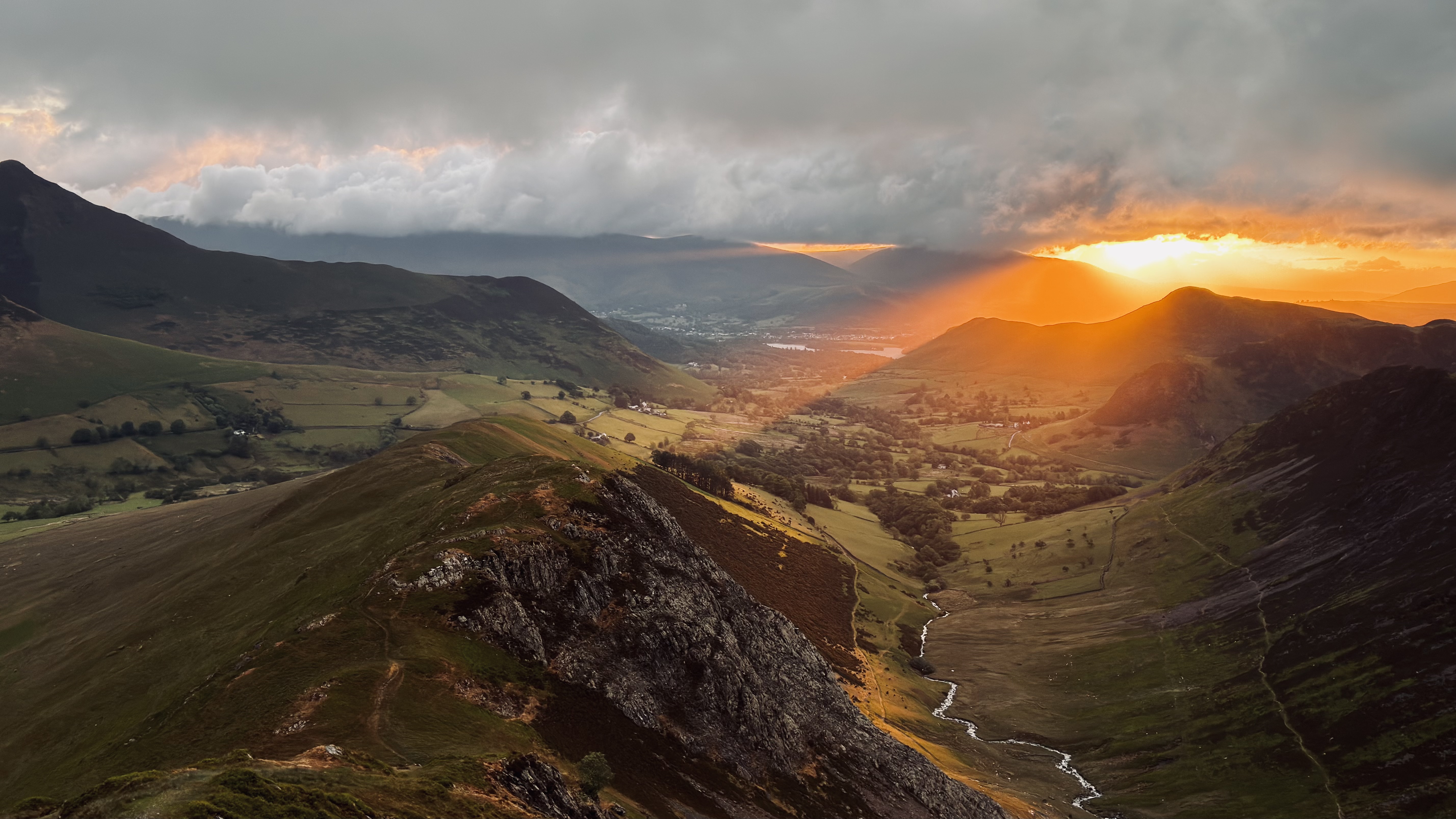
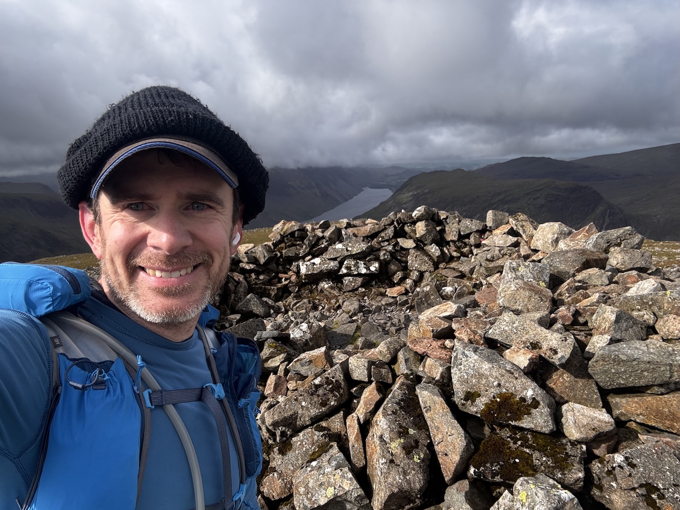
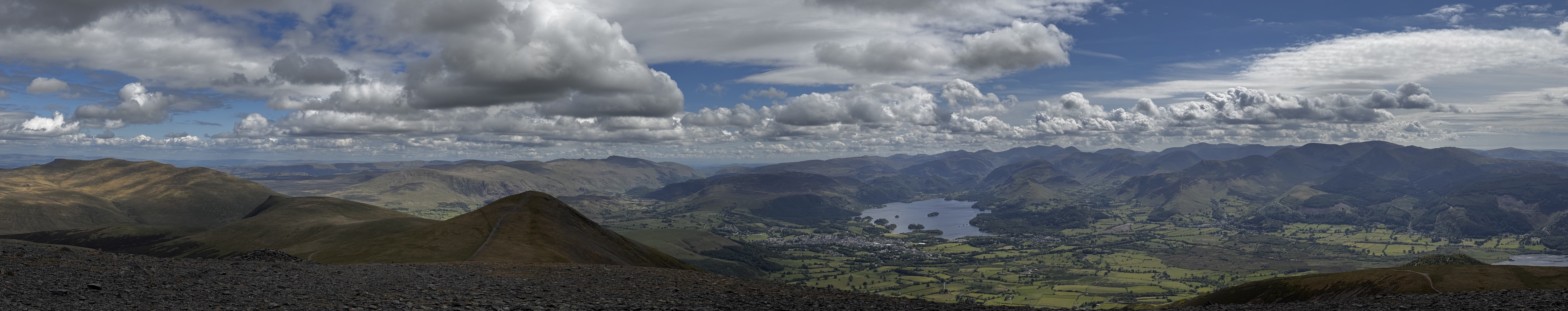
After eleven hours of steady work I summited the final fell of the route (Skiddaw). While not the specific accomplishment I had been planning towards, it was nevertheless a wonderful moment to crest the final hill and see the whole Lakes ahead of me. From that vantage point I could see nearly the entire route laid out before me. It was wild to see how far off in the distance several of the mountains I had been walking on hours before now seemed.

Now there was just the matter of getting down off this final mountain ridge and making my way back to where I had begun.

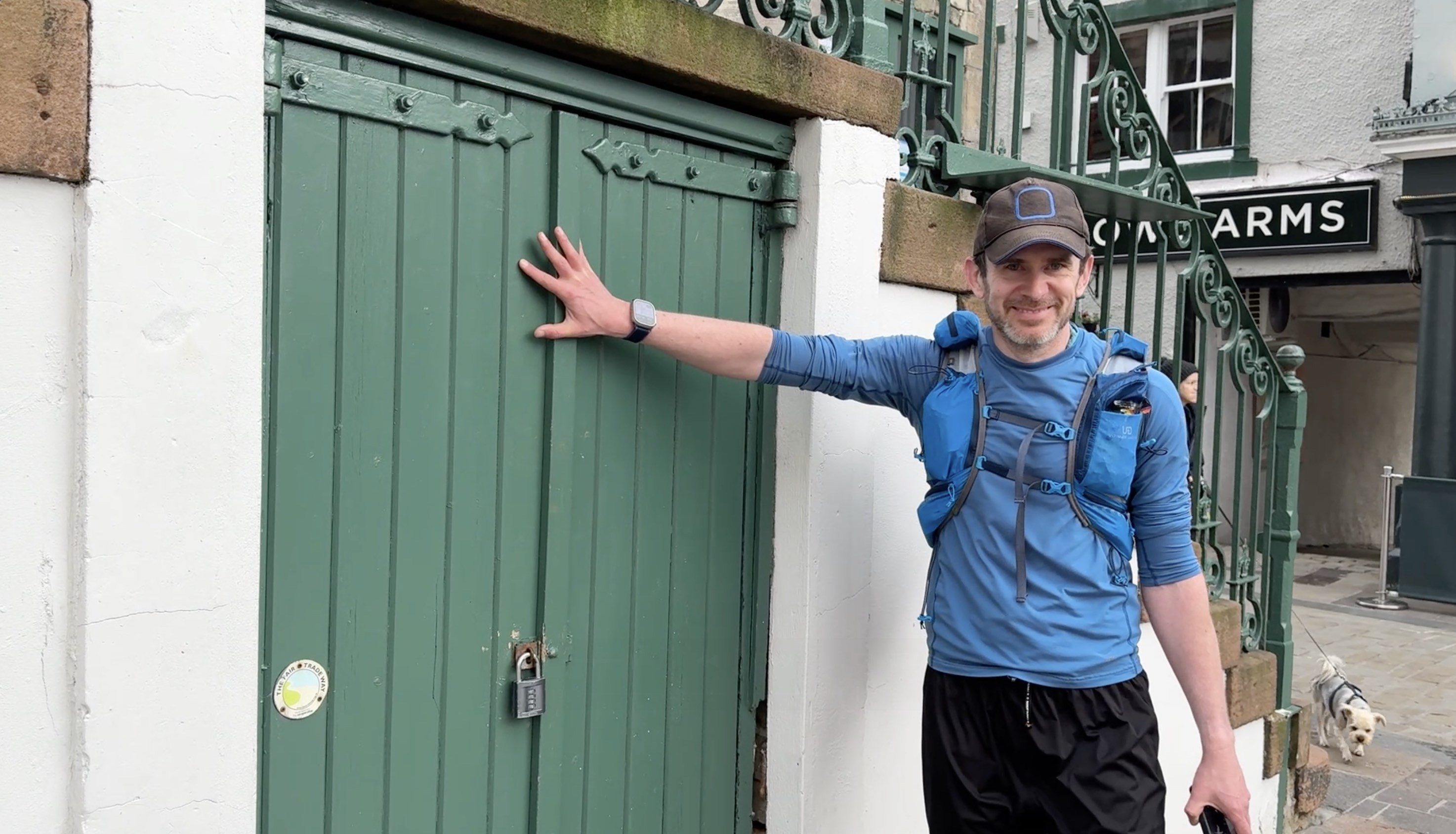
I touched the door at the Keswick Moot Hall at 7:20pm, 38 hours after I had set out initially. The route between those two points was not as planned, but still took me to wonderful places both physically and personally.

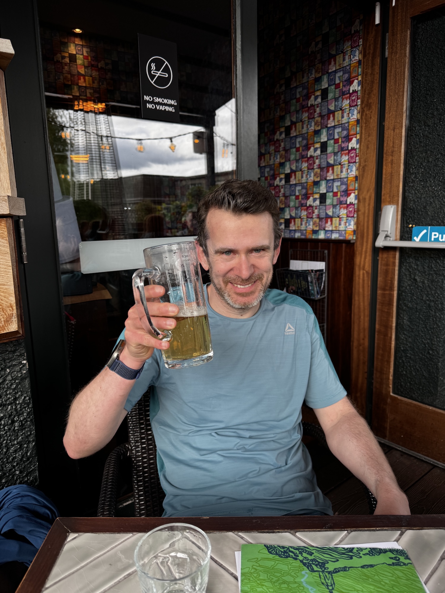
Reaching the end, there was really only one thing to be done. Sit down at the aptly named “The Round” pub next door and enjoy a lovely meal with my family.

The final stats for the trip where:
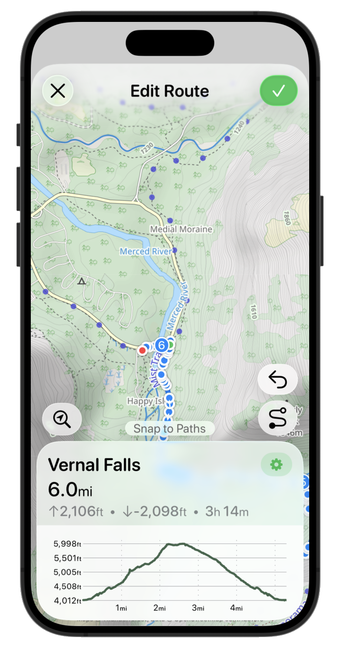
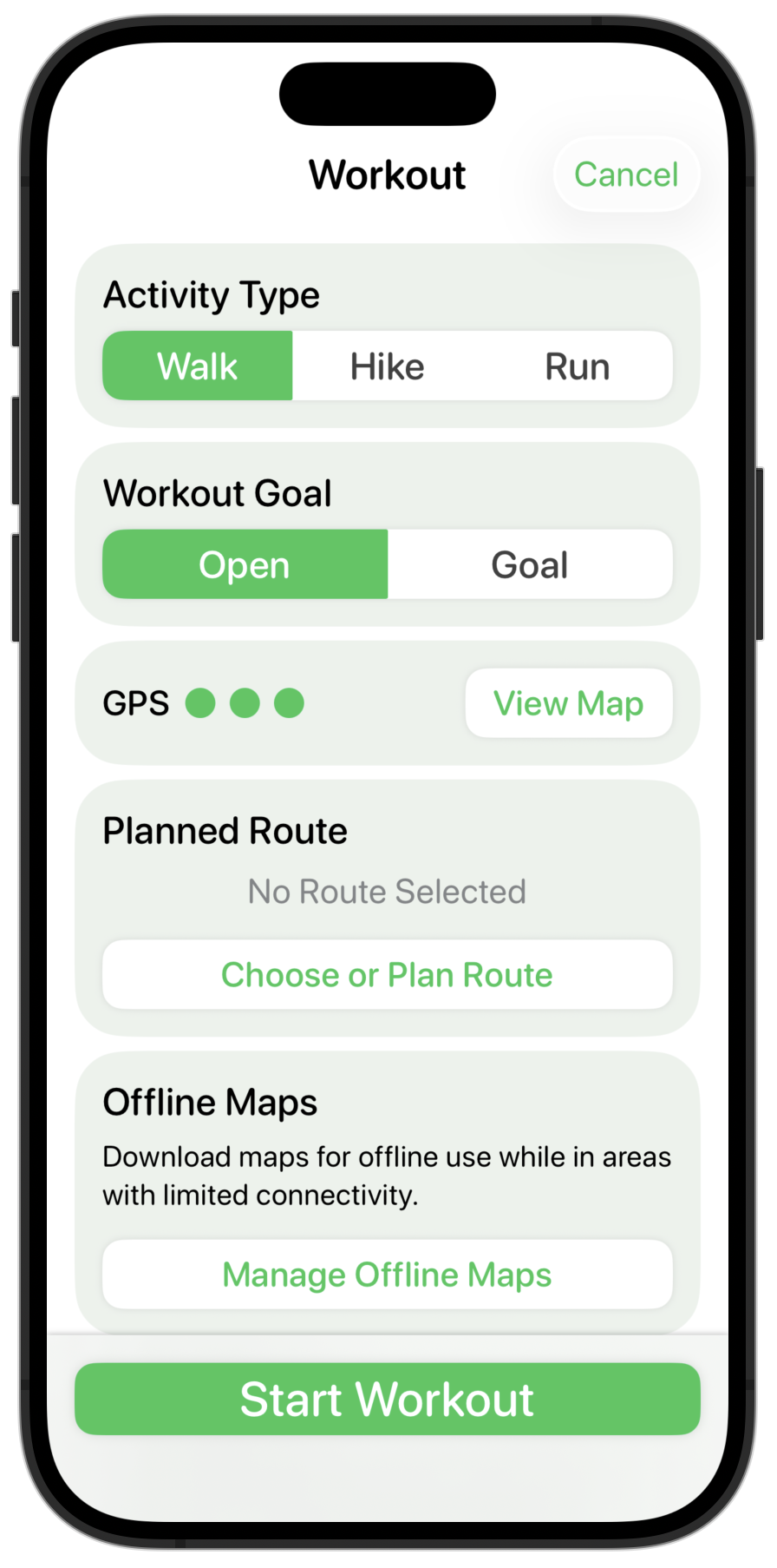
Now I couldn’t finish a trip report like this without discussing the various bits of technology which supported and help me along this adventure. I built a number of features specially to help me on this outing, which will now serve as the basis for major updates I expect to roll out in my apps over the next coming months.
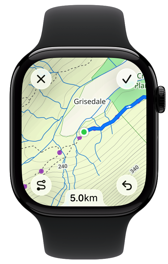
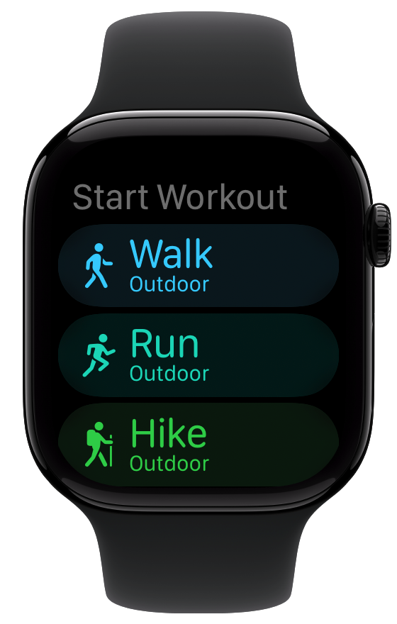
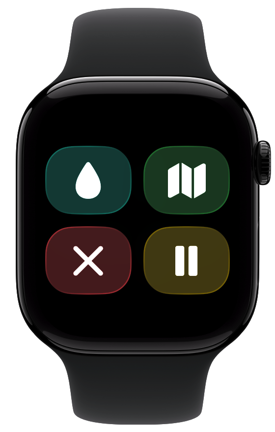
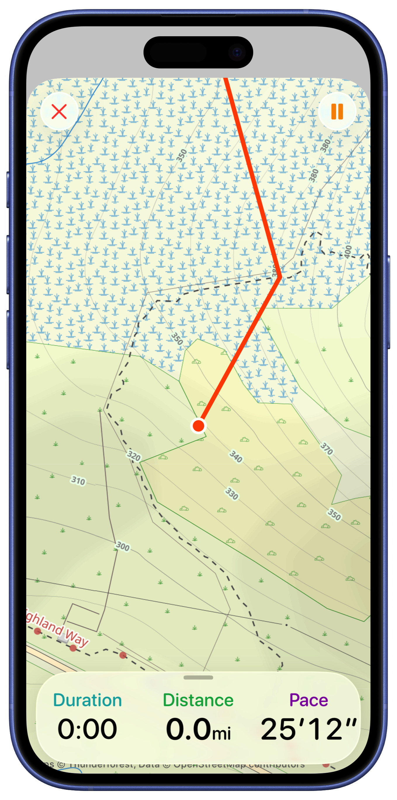
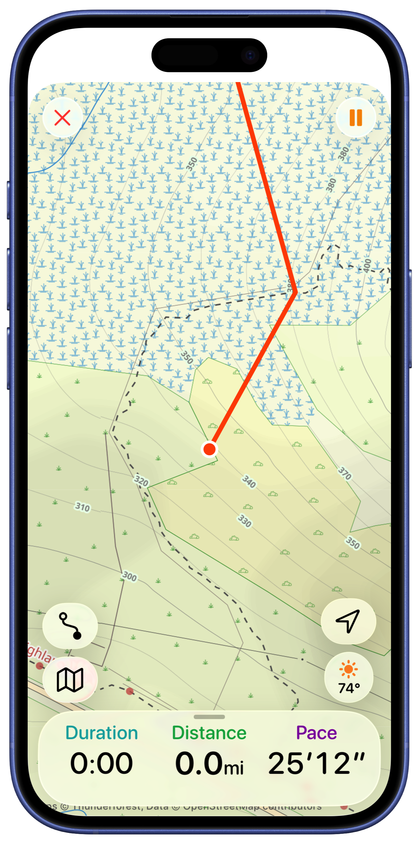
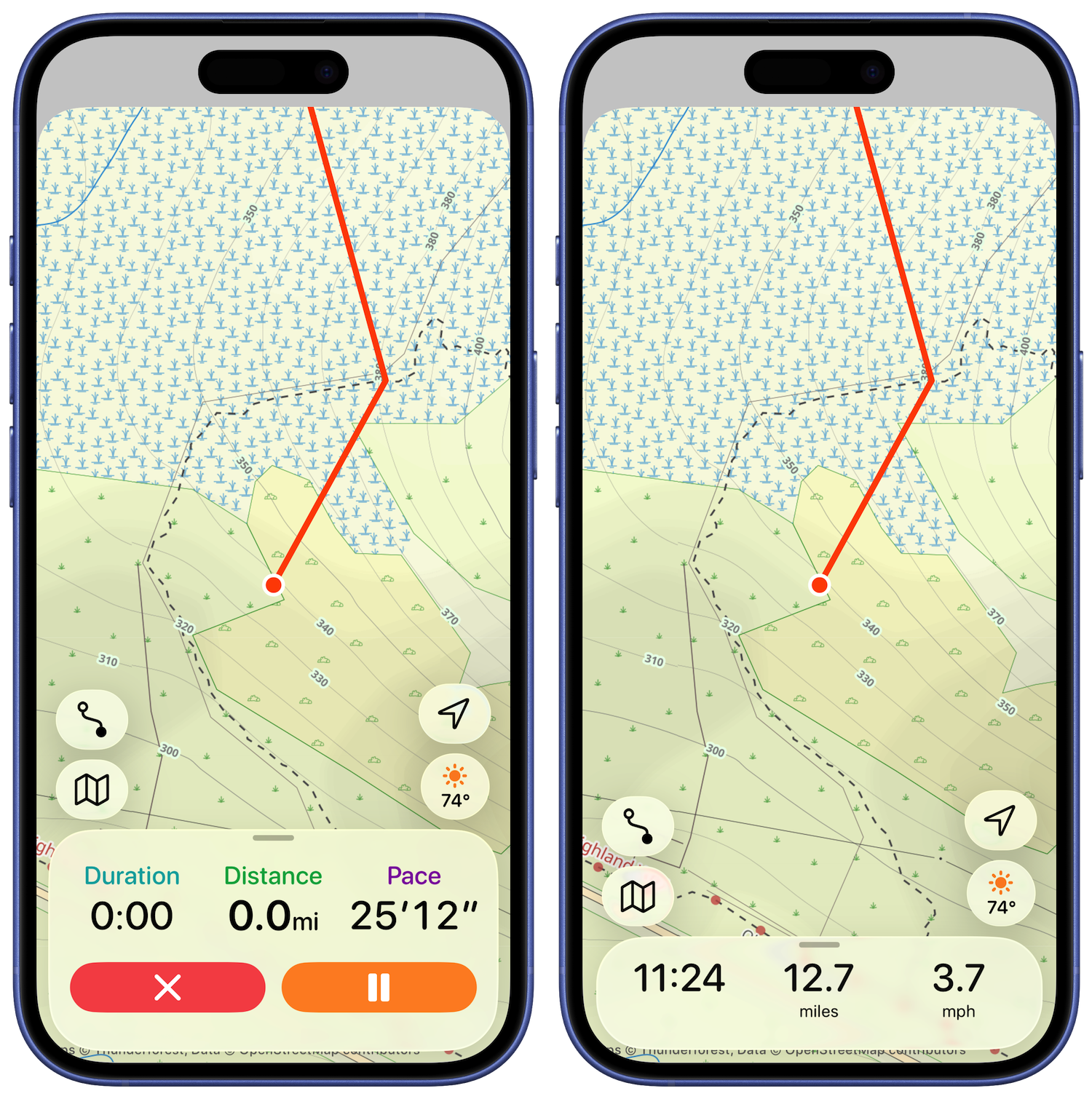
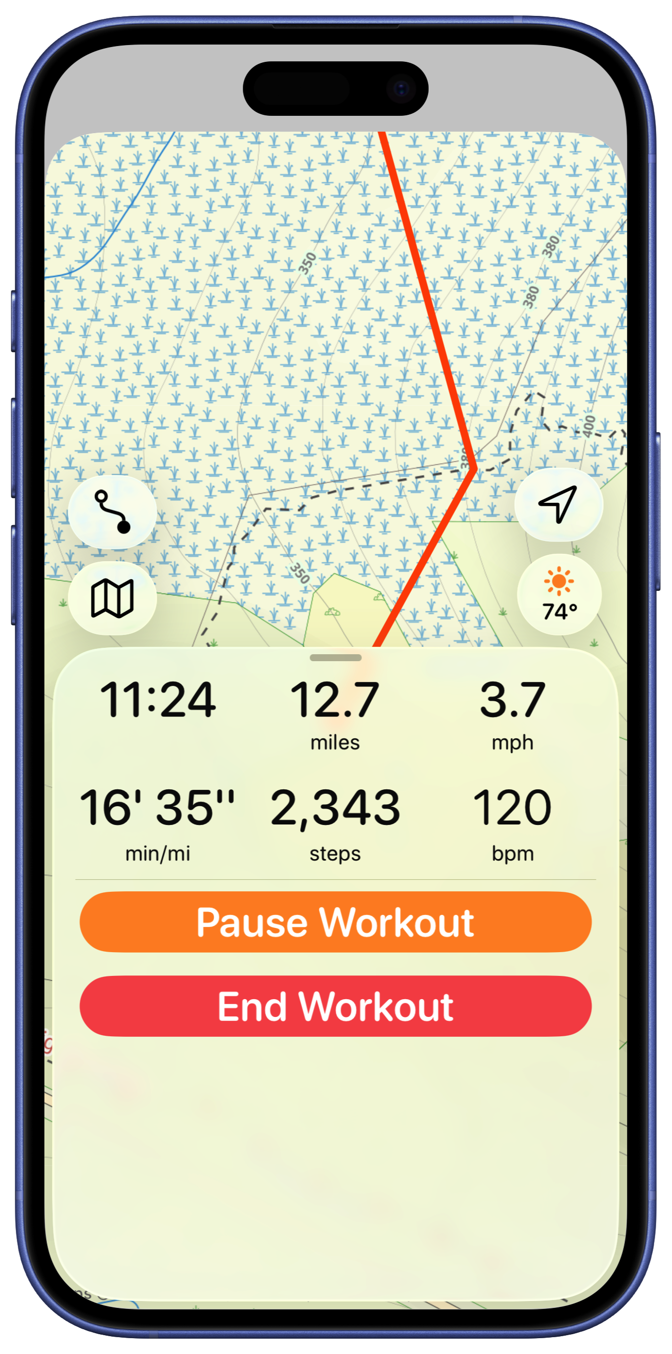
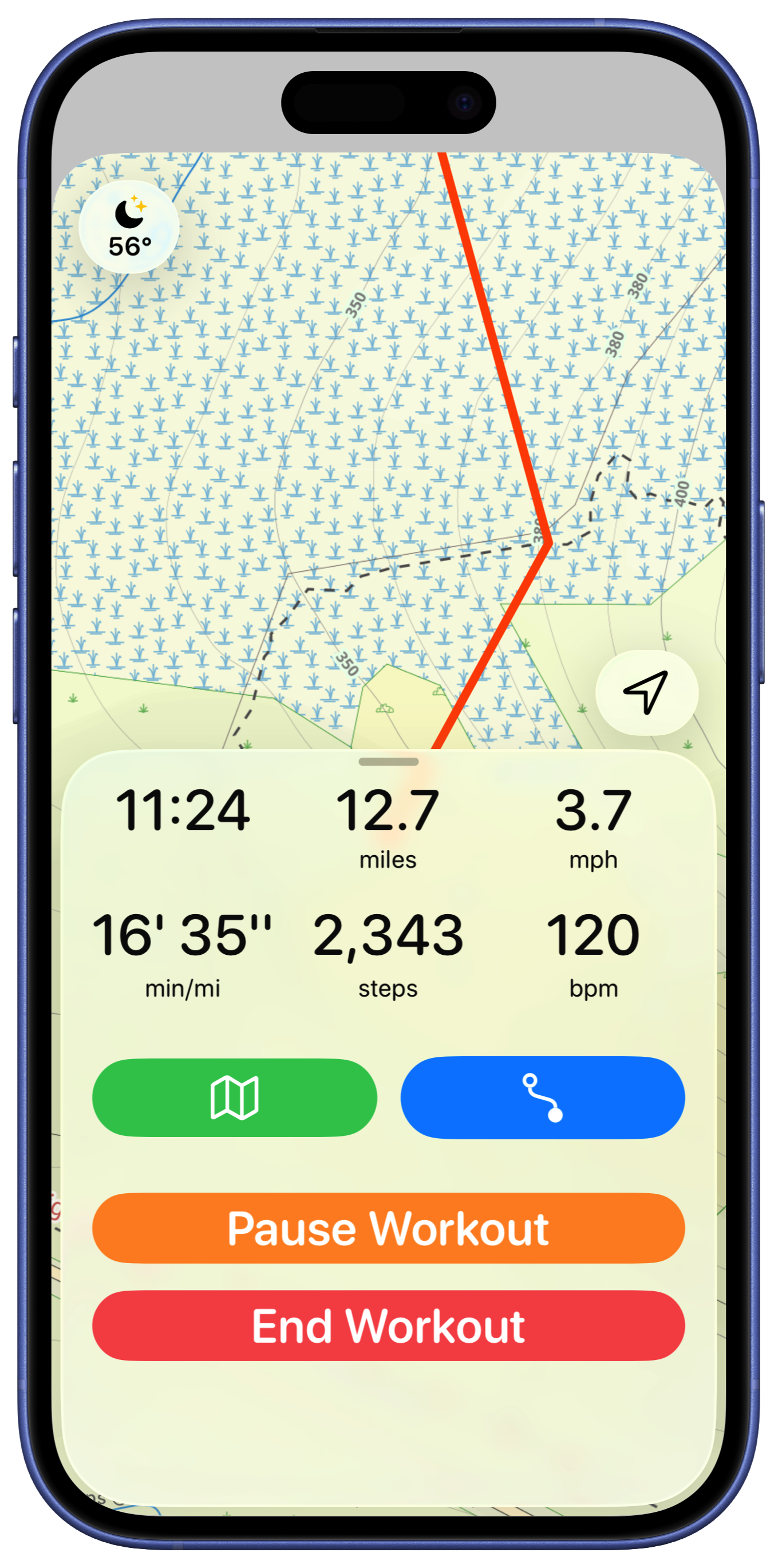
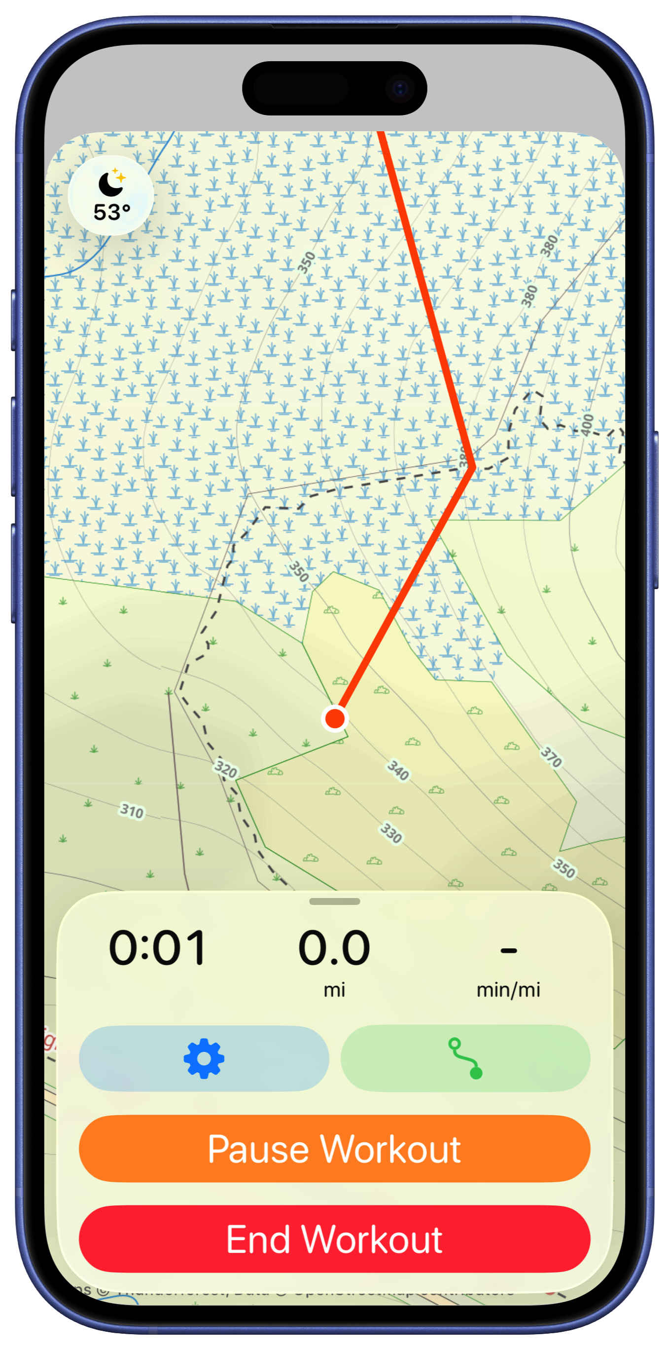
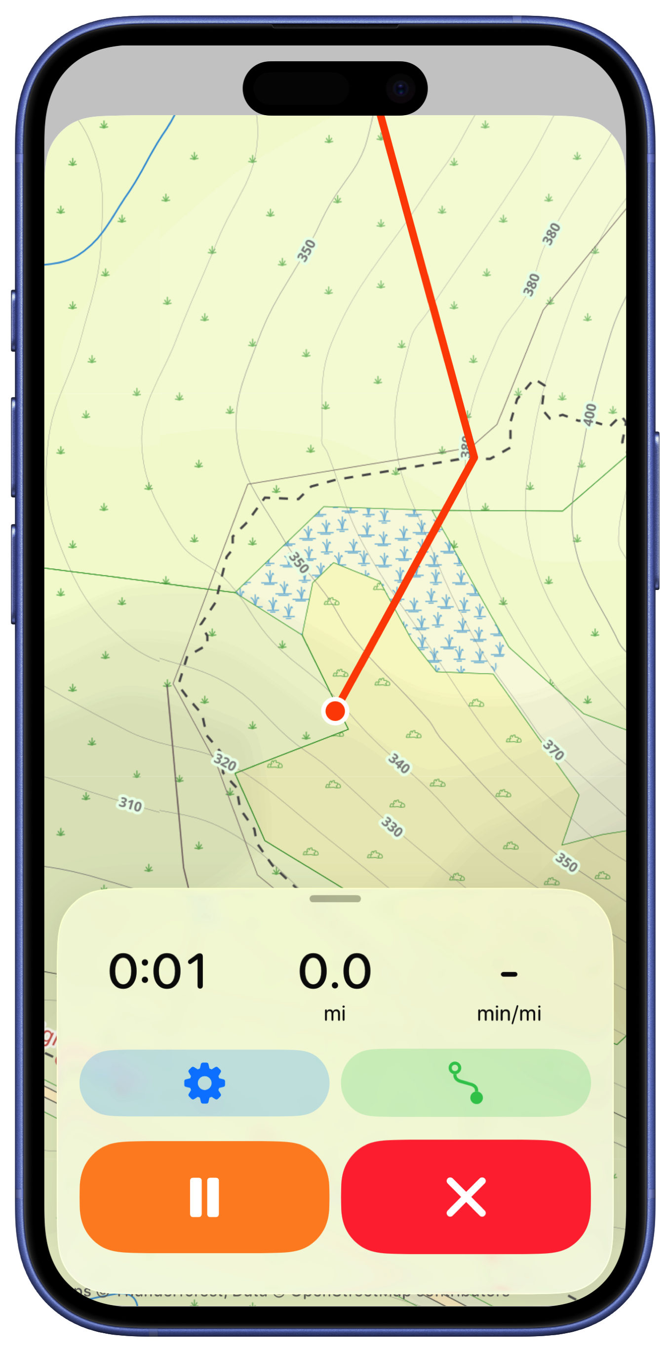
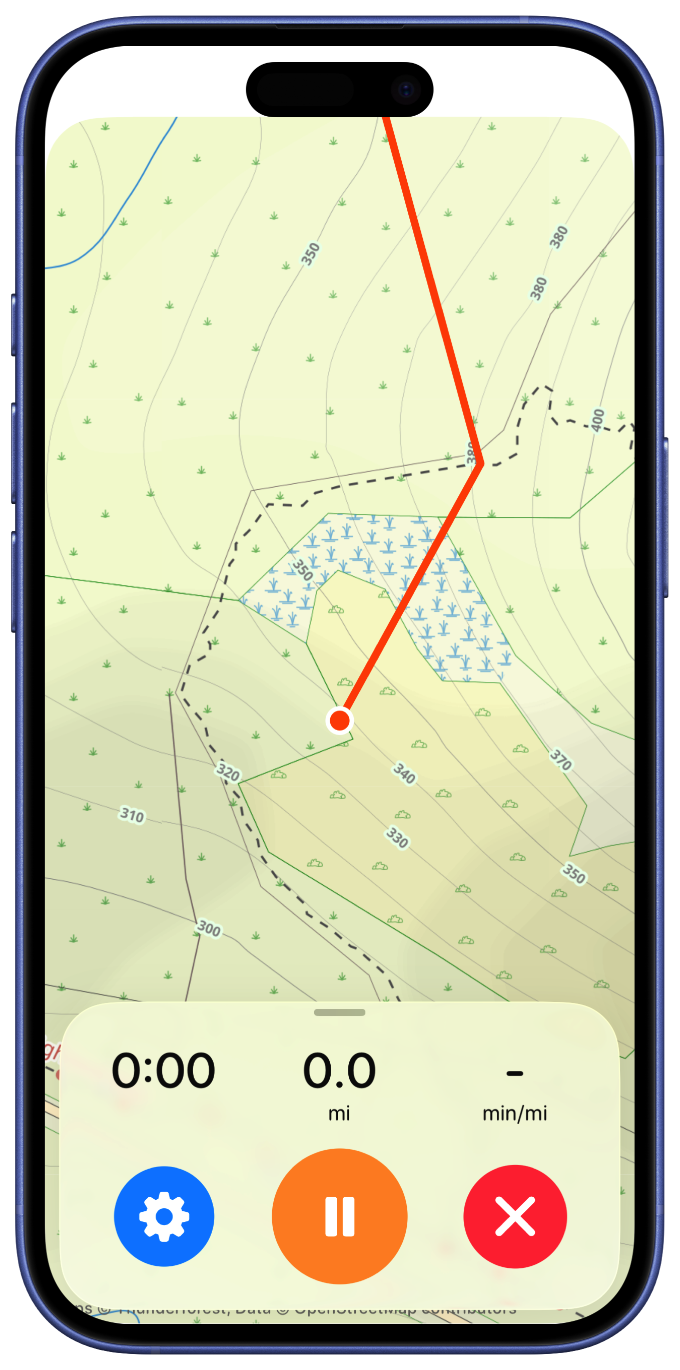
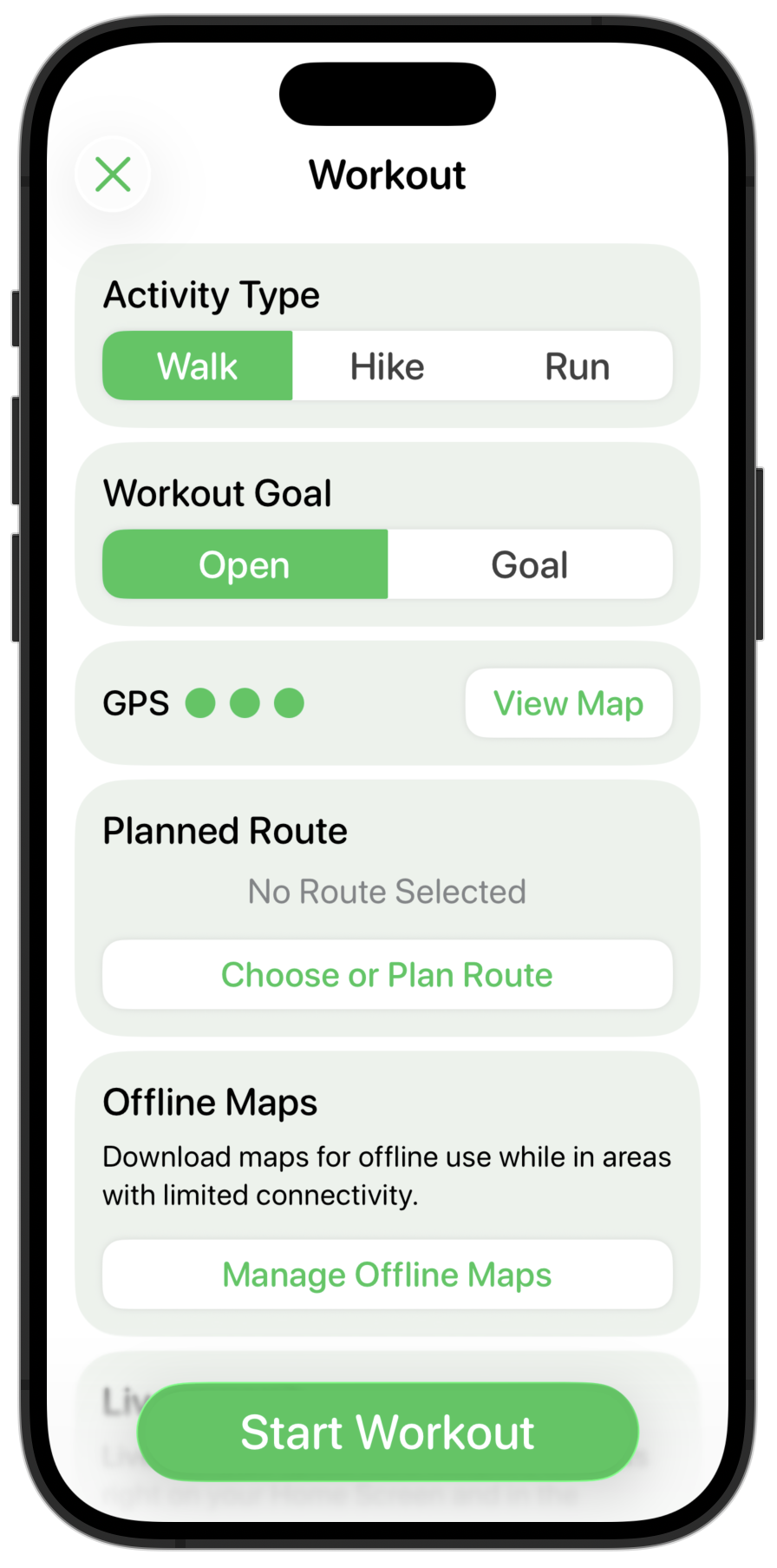
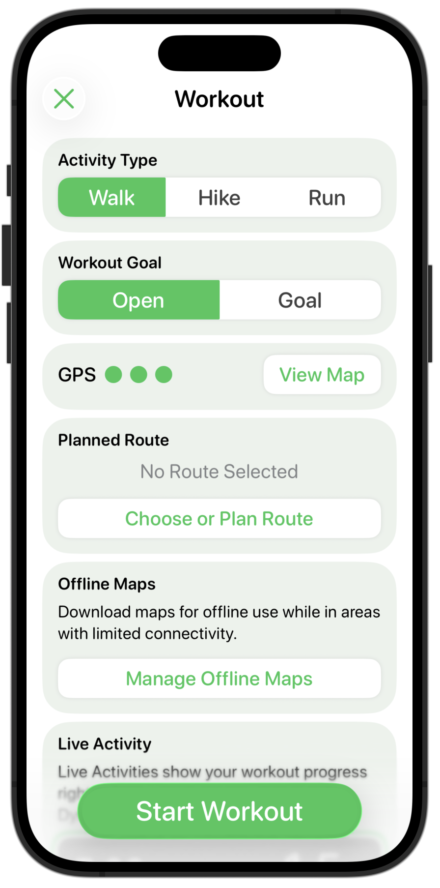
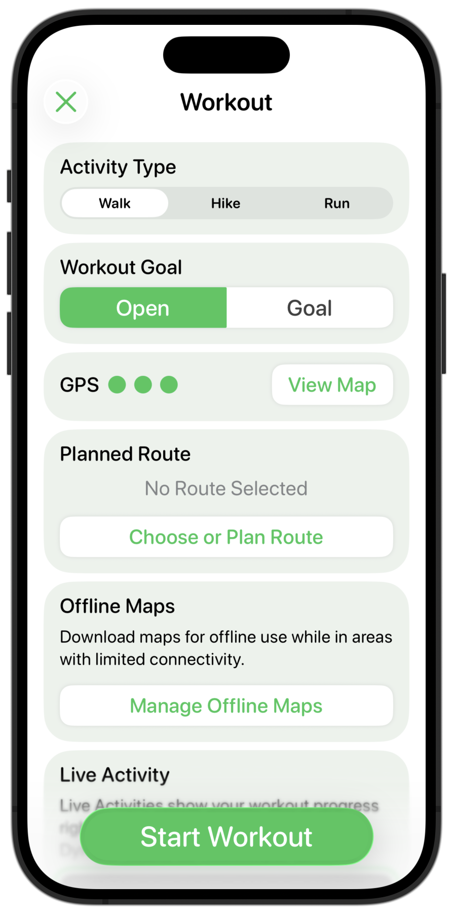
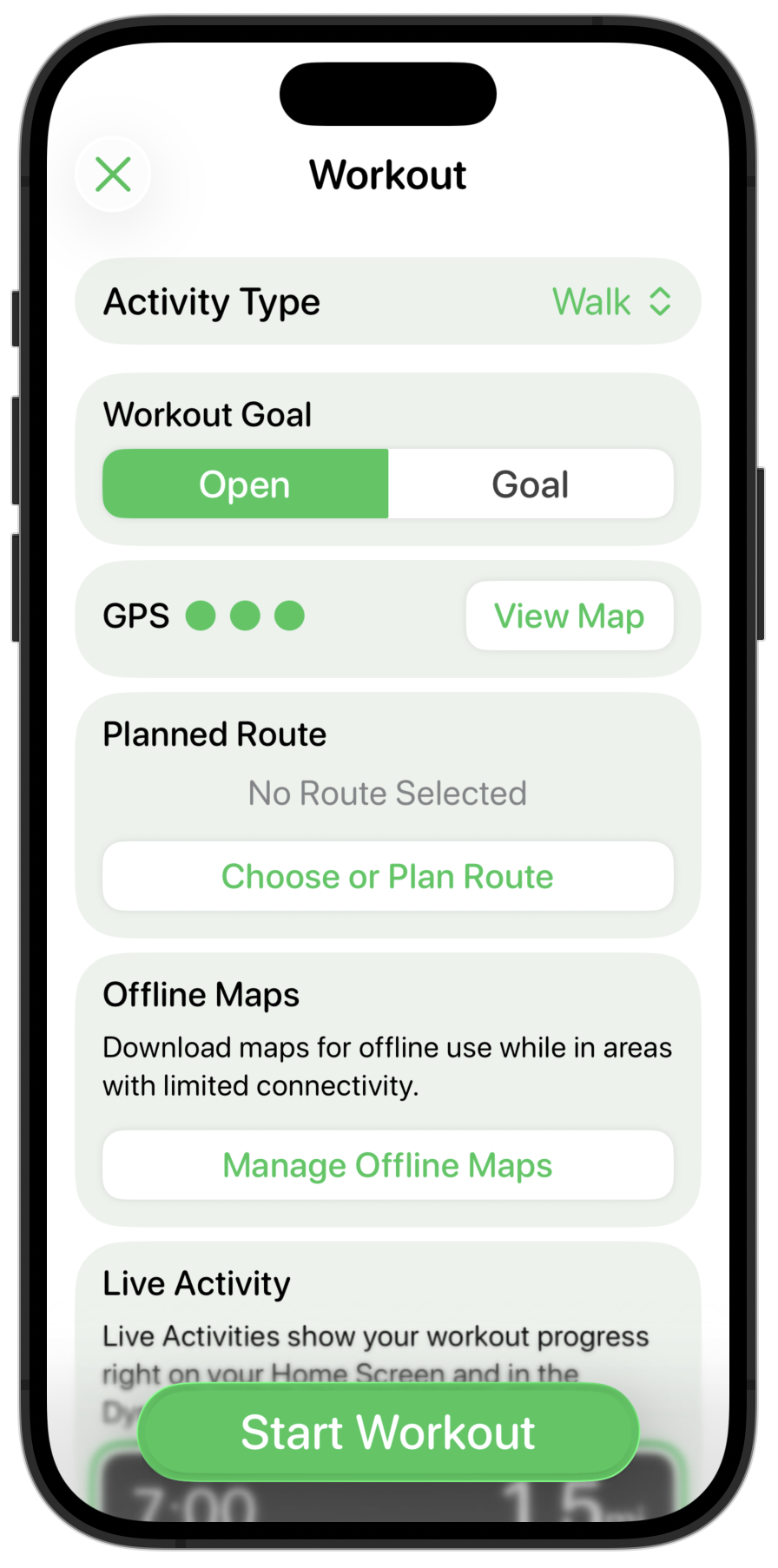
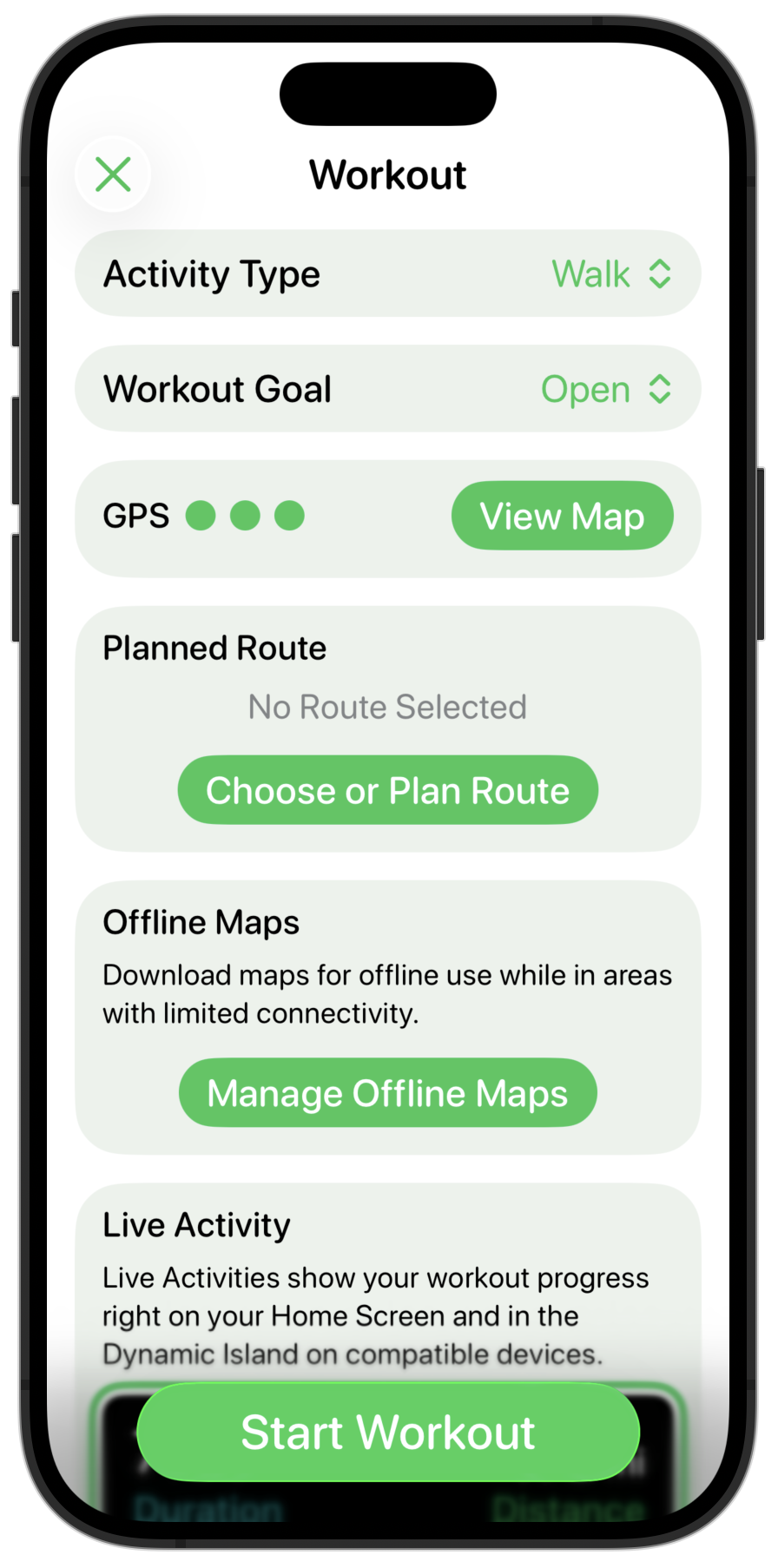
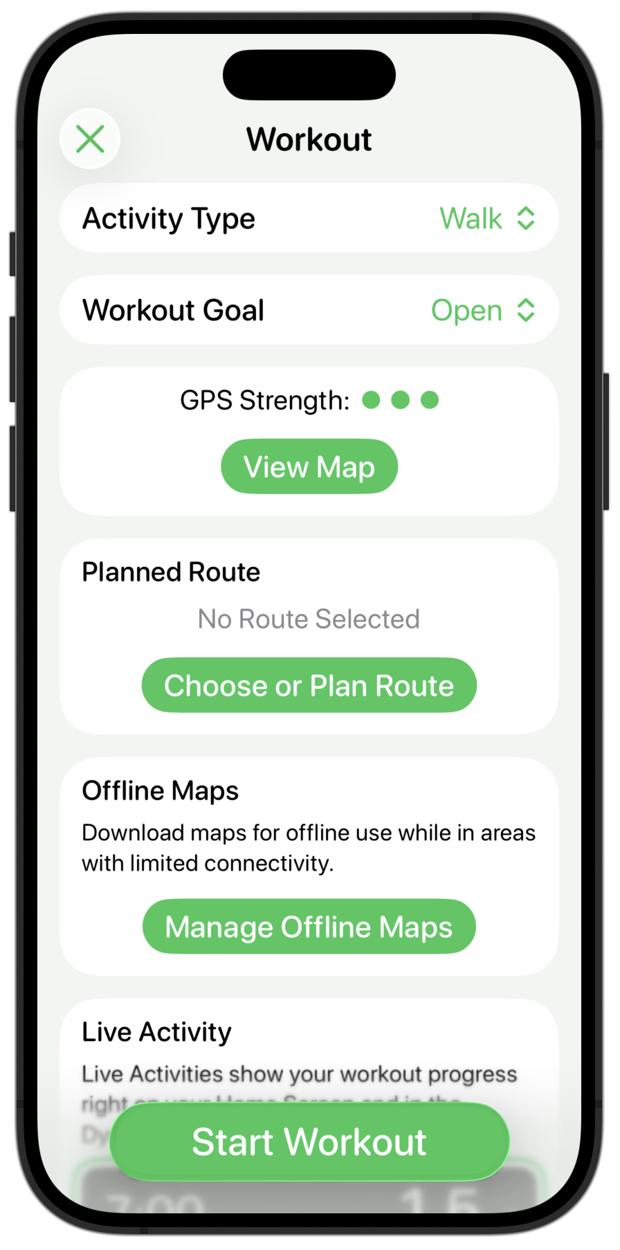
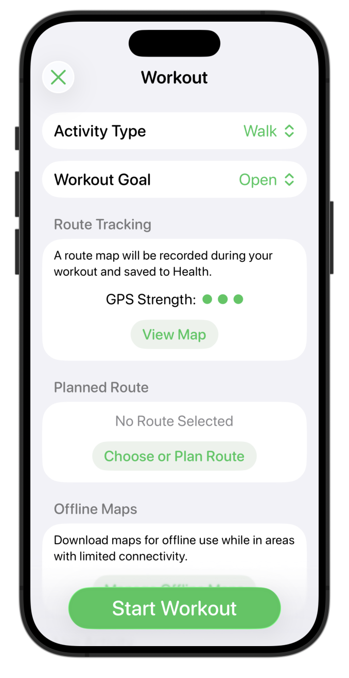
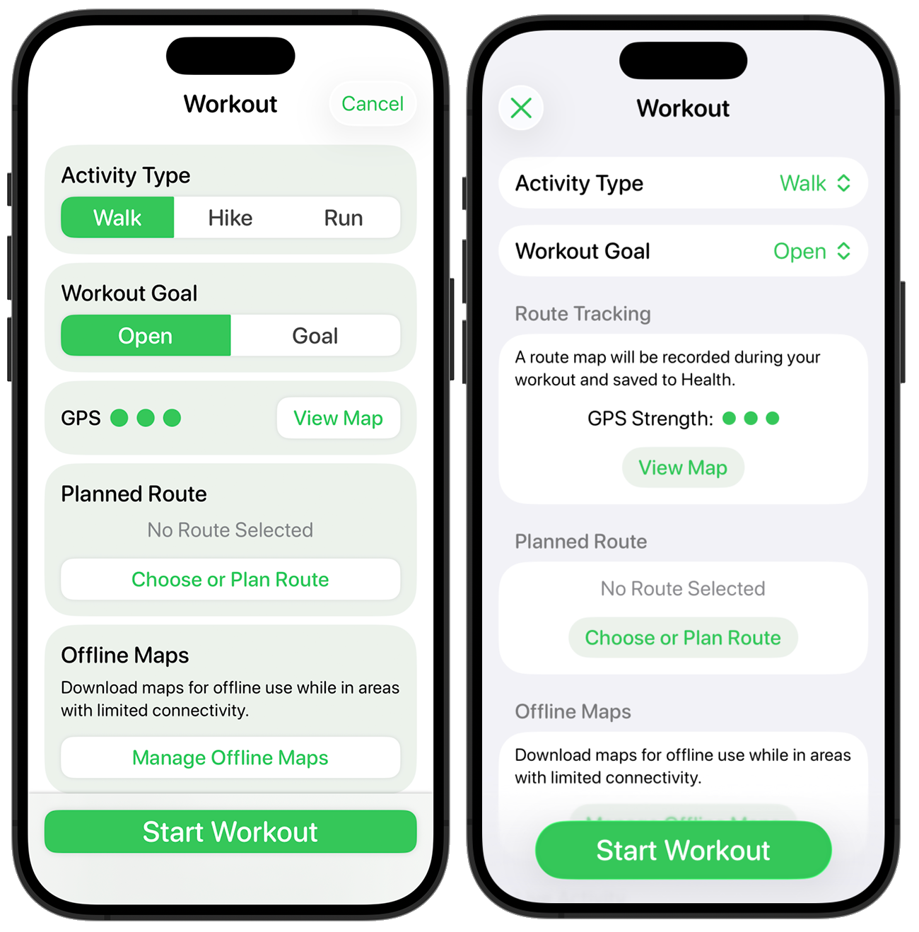
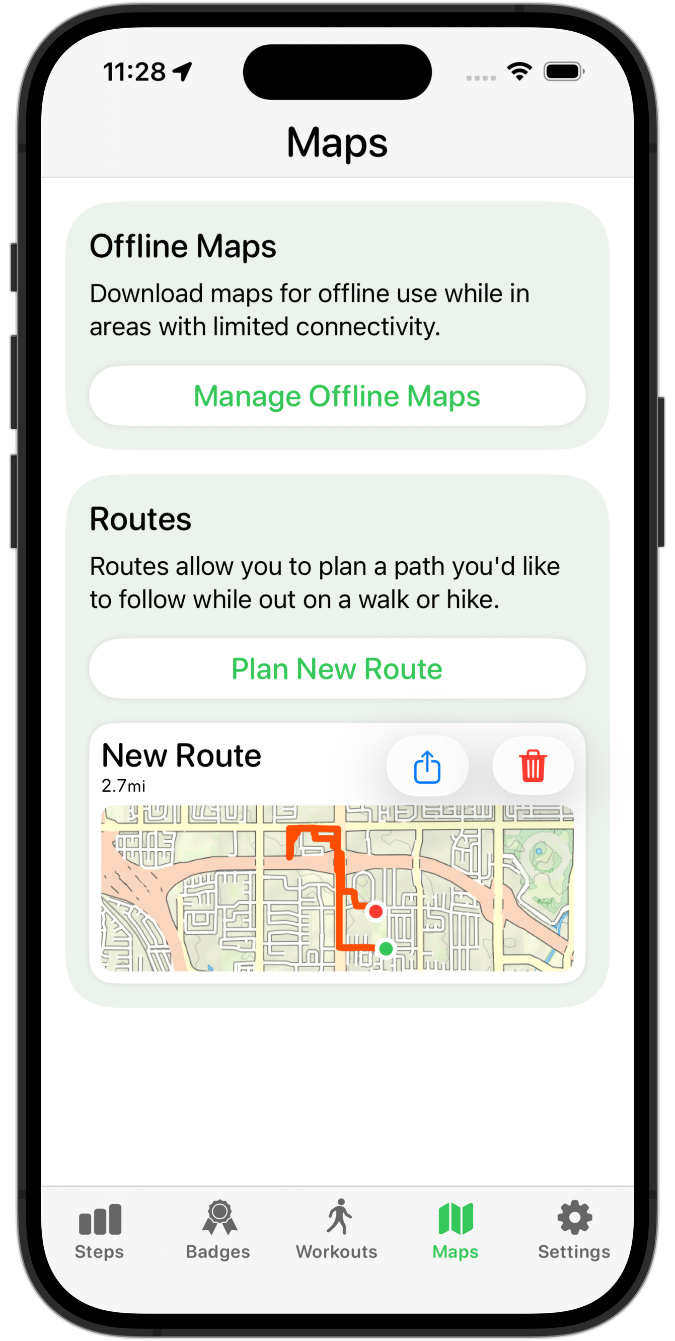
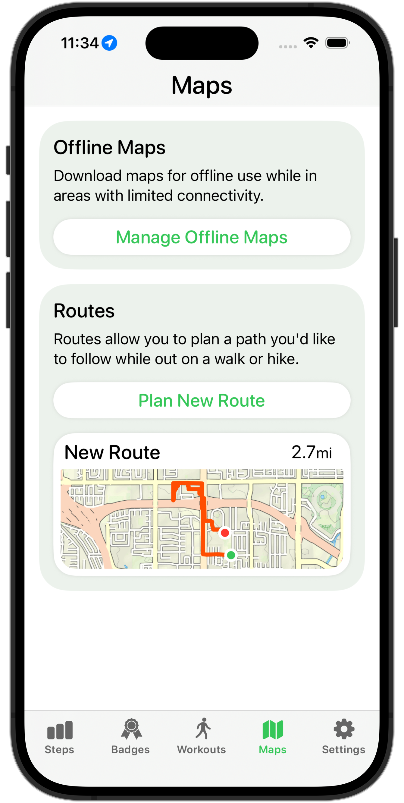
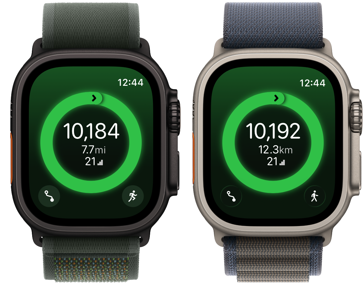
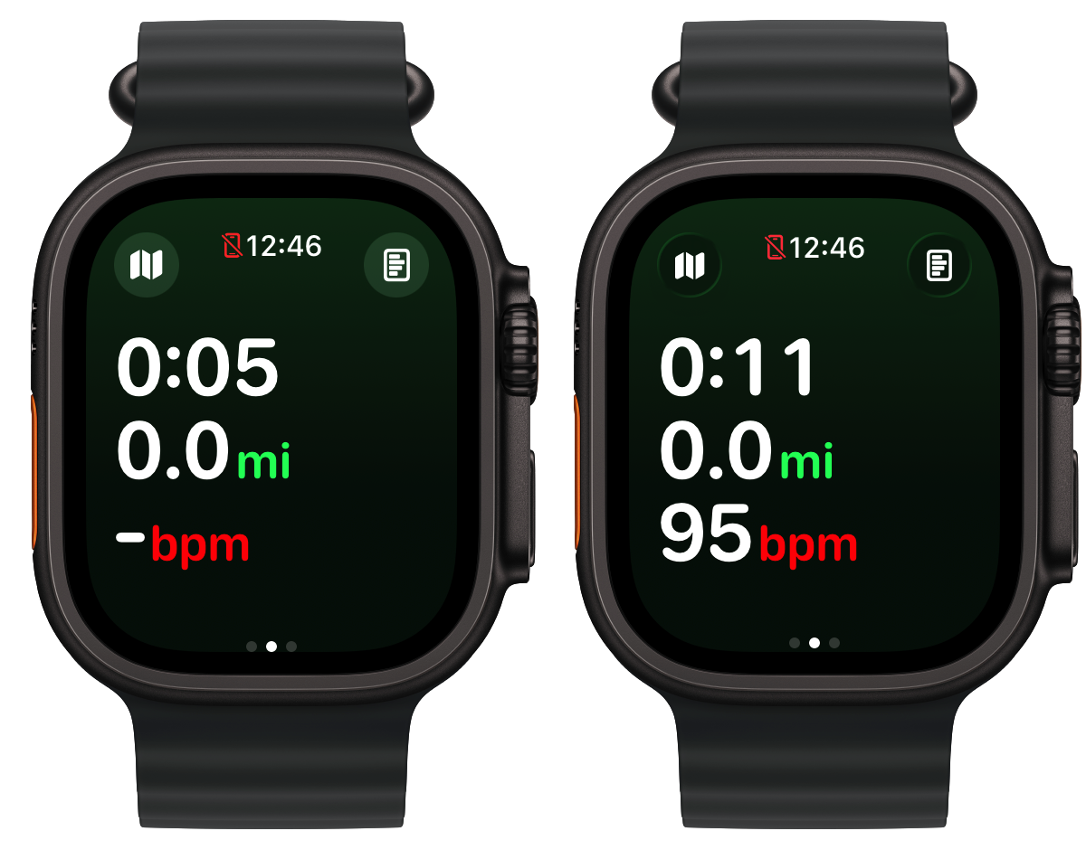
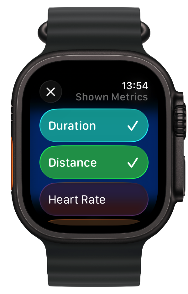
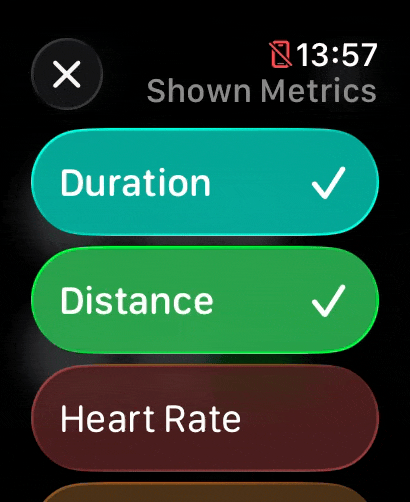
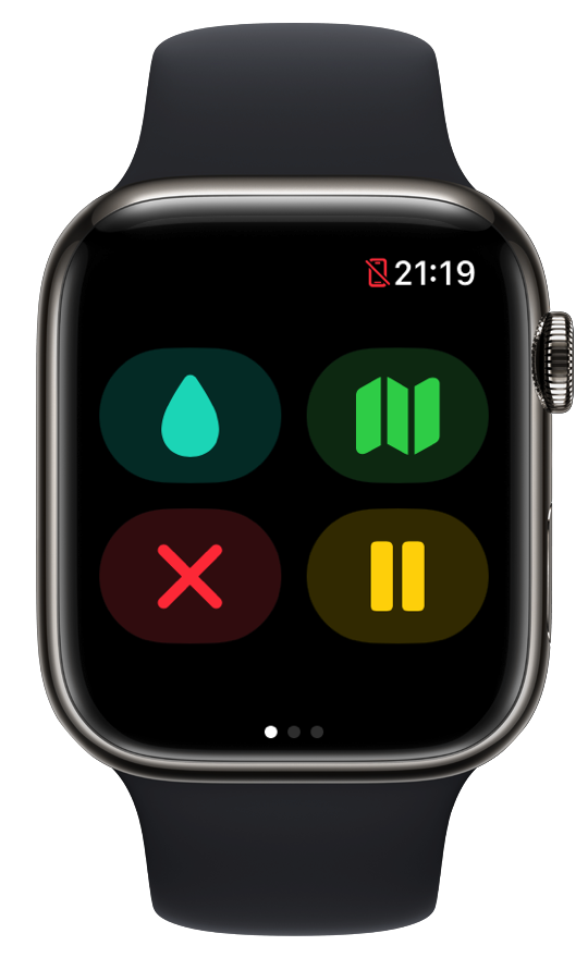
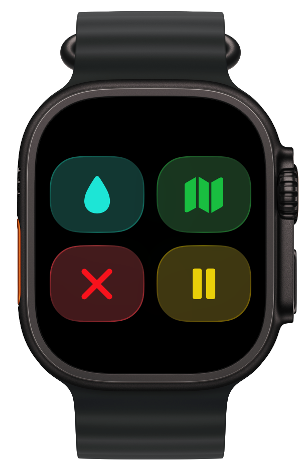
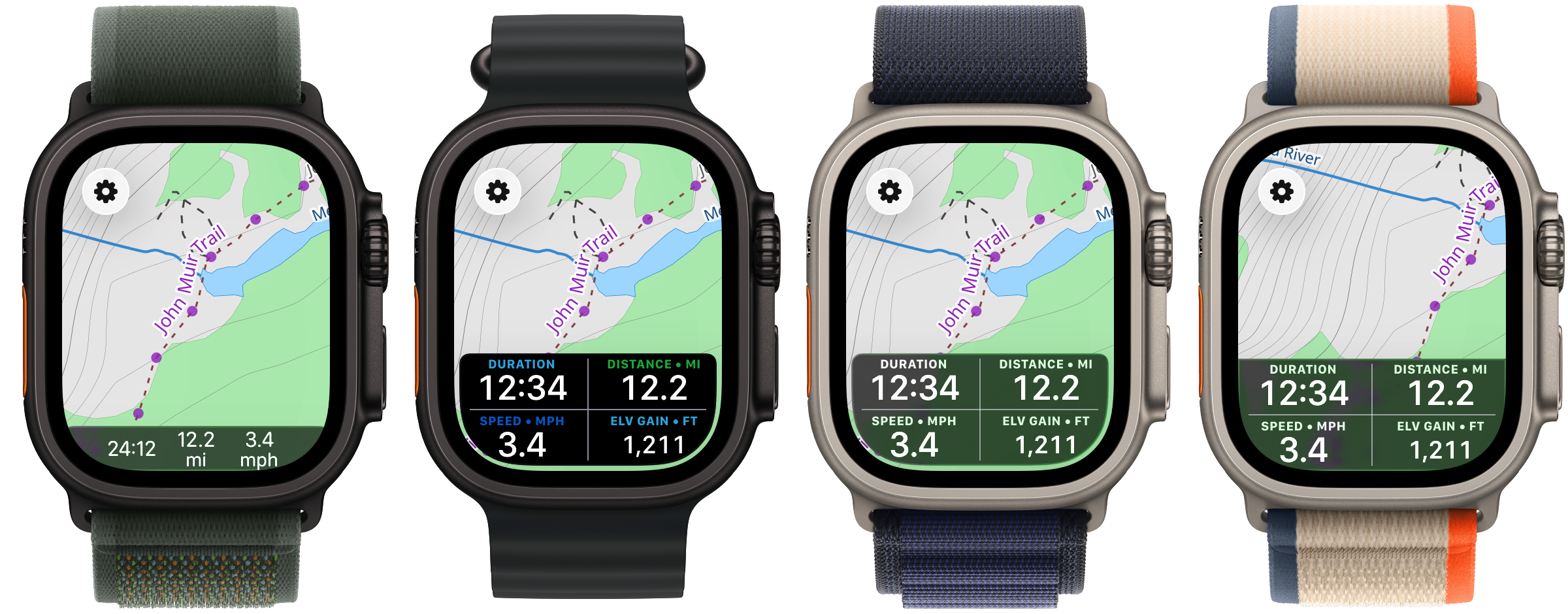
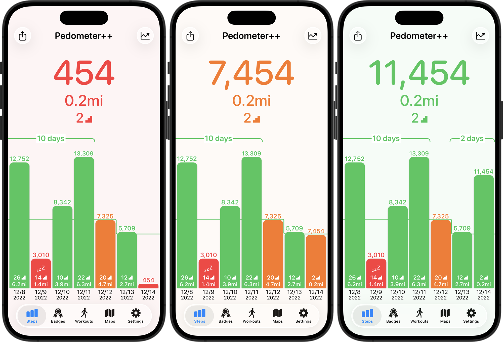
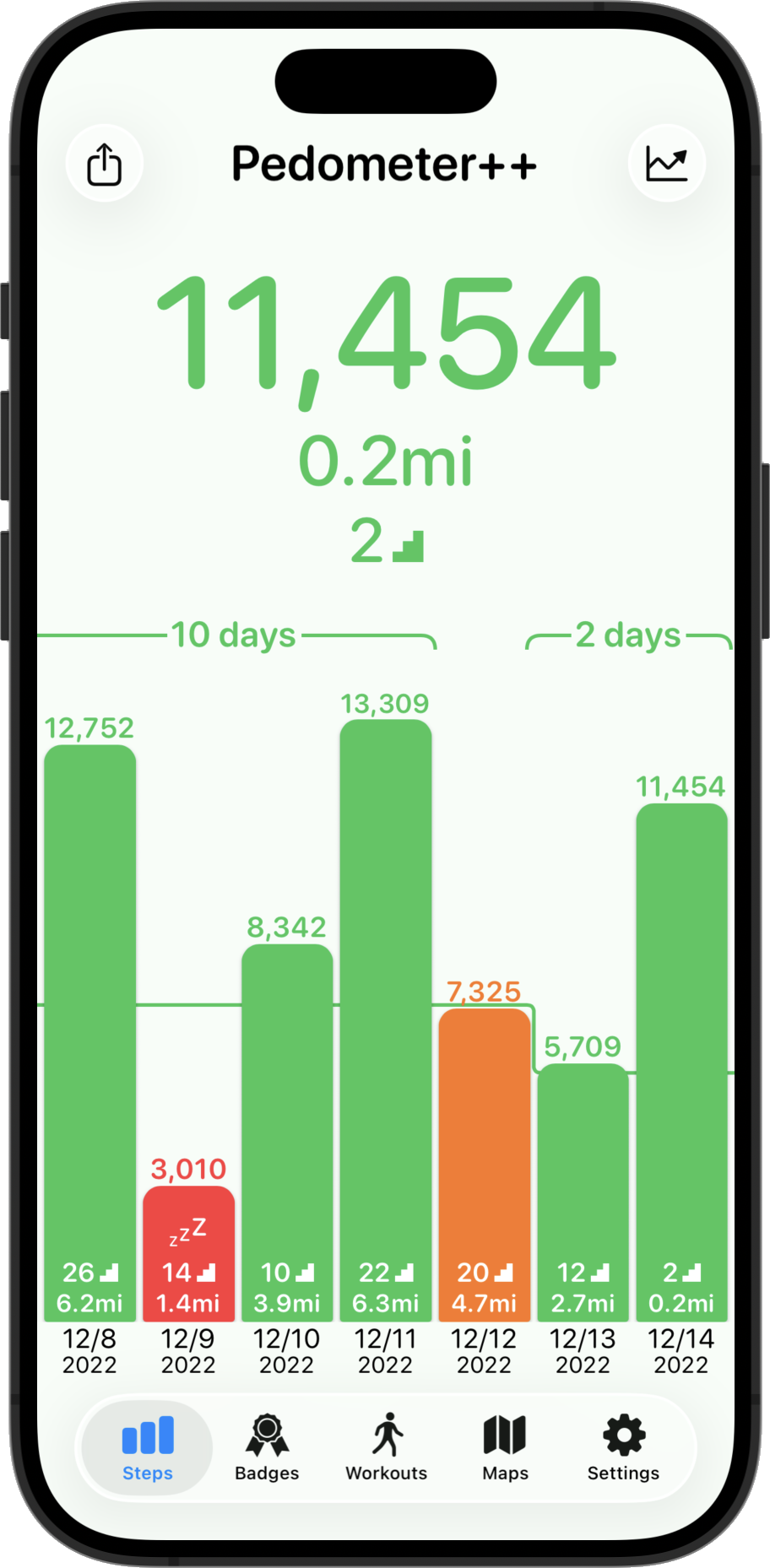
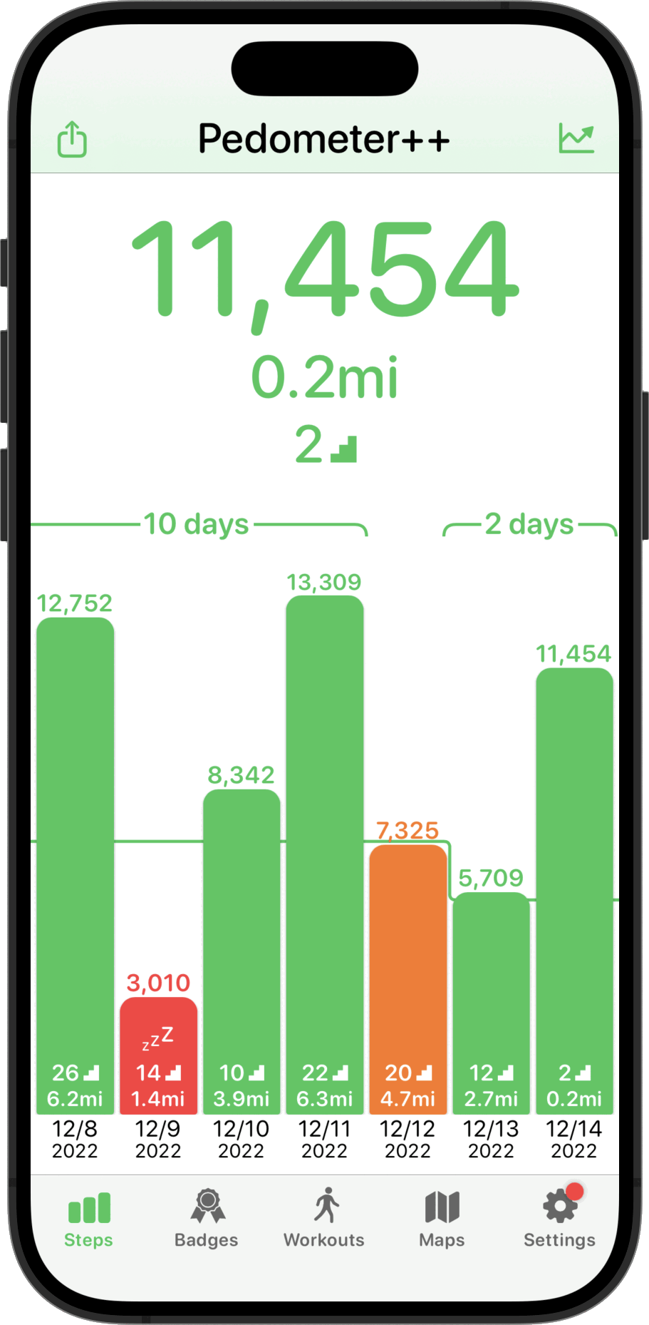
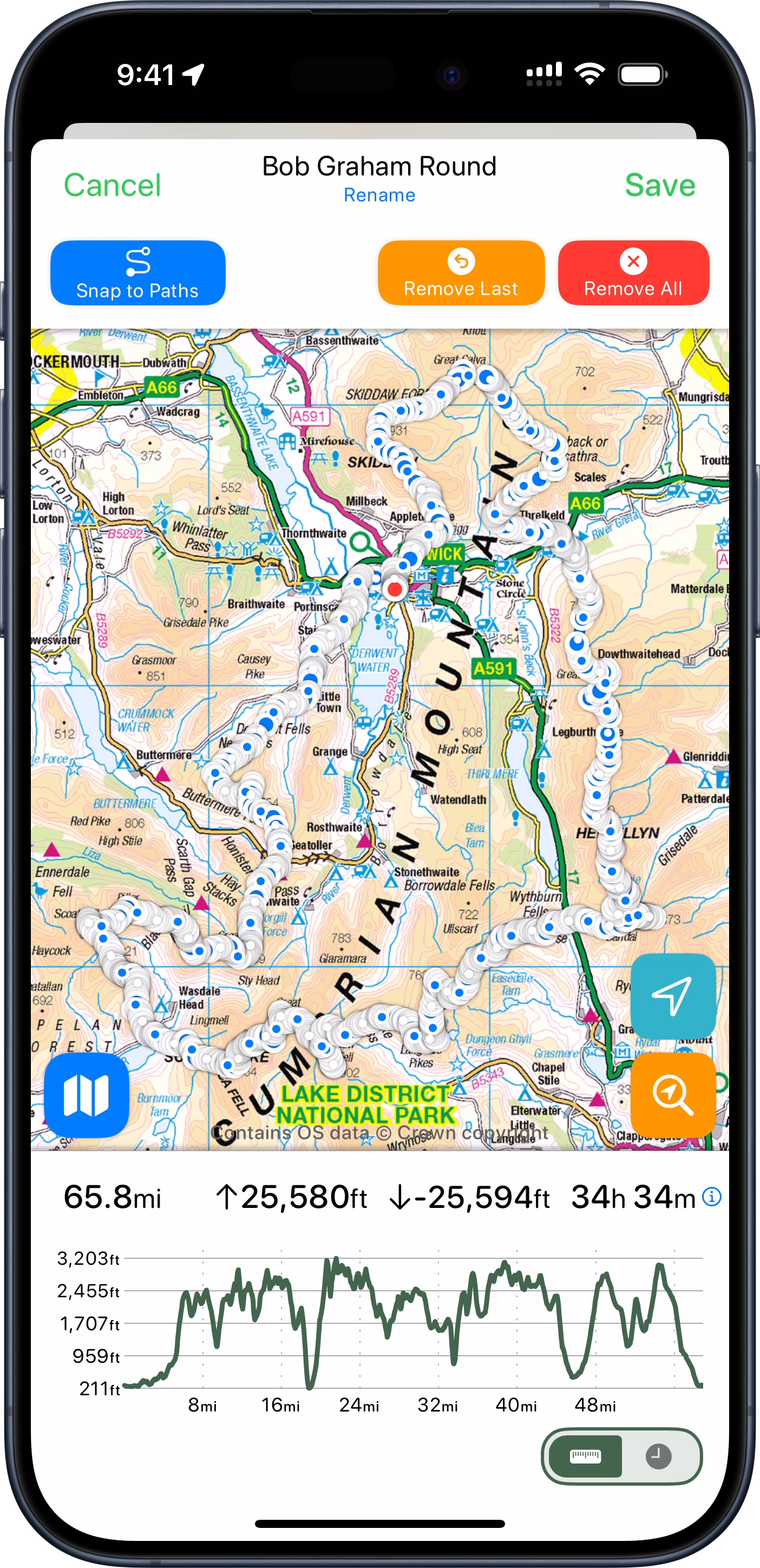
While I could have tracked and navigated this adventure using my app Pedometer++. I was concerned that if Day One had extended out to the full 17 hours that my schedule predicted that the battery life in my 18 month old Apple Watch Ultra 2 wouldn’t have. So I set out to build a custom variant of Pedometer++ which was optimized solely for battery life.

I learned a tremendous amount about how to extend the battery life of an Apple Watch app from this experience. I was eventually able to get the battery consumption on my 18 month old watch down to around 3.5% per hour, which would extrapolate out to around a 28 hour max adventure duration. That is with full-time on wrist navigation and guidance.

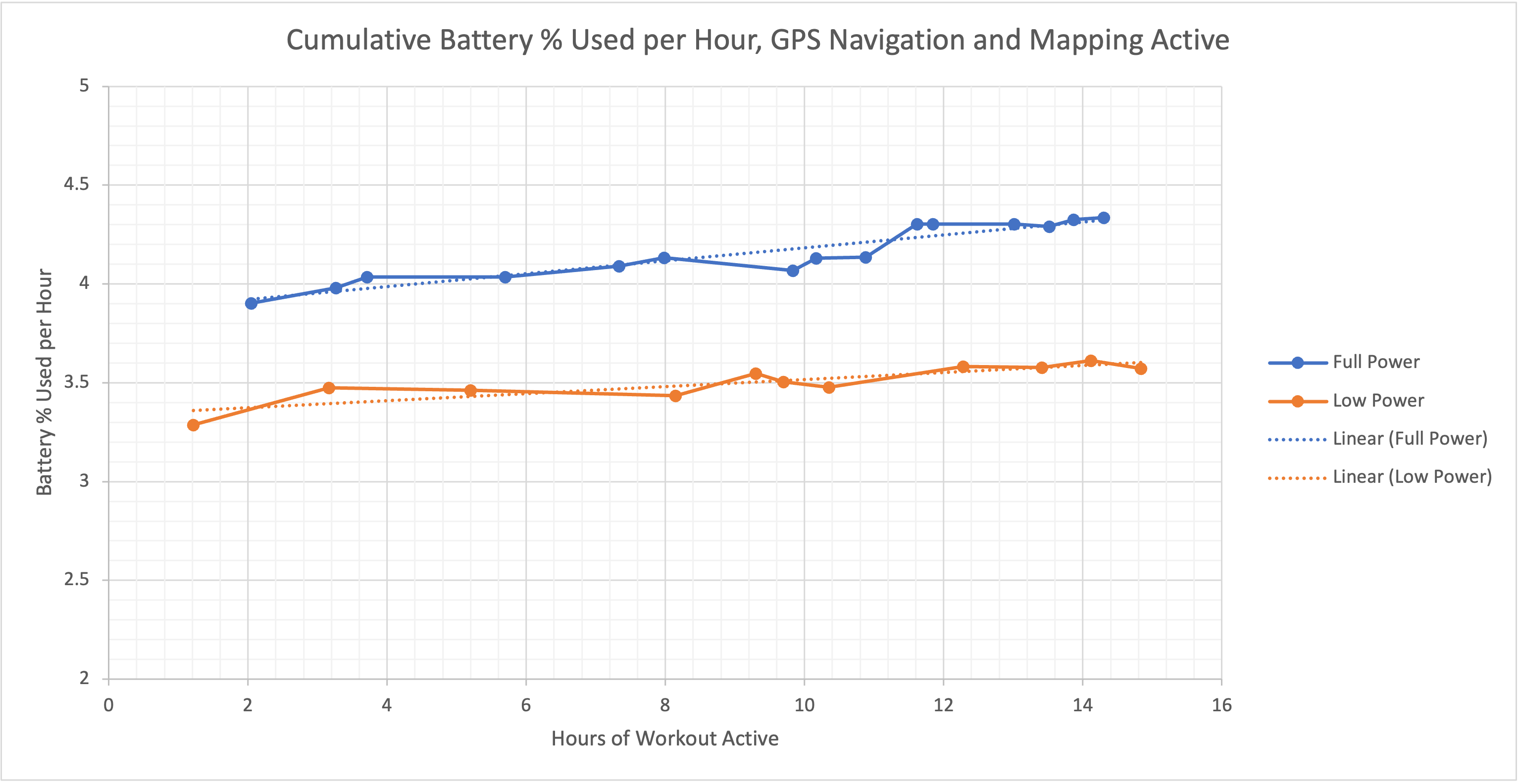
I also made a few other speciality improvements to the app, for example, increasing the size of the time shown in the top right corner to make it more legible and building a pre-caching system to fully download the route‘s maps to my watch before setting out to further avoid any power intensive operations while walking.

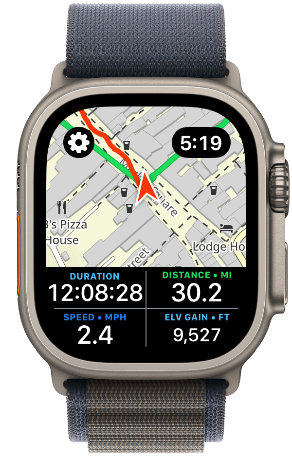
Many of these improvements will now filter back into Pedometer++ itself. The new dual map/statistics view is especially something I’ve found to be excellent for the kind of quick checks I was regularly doing.
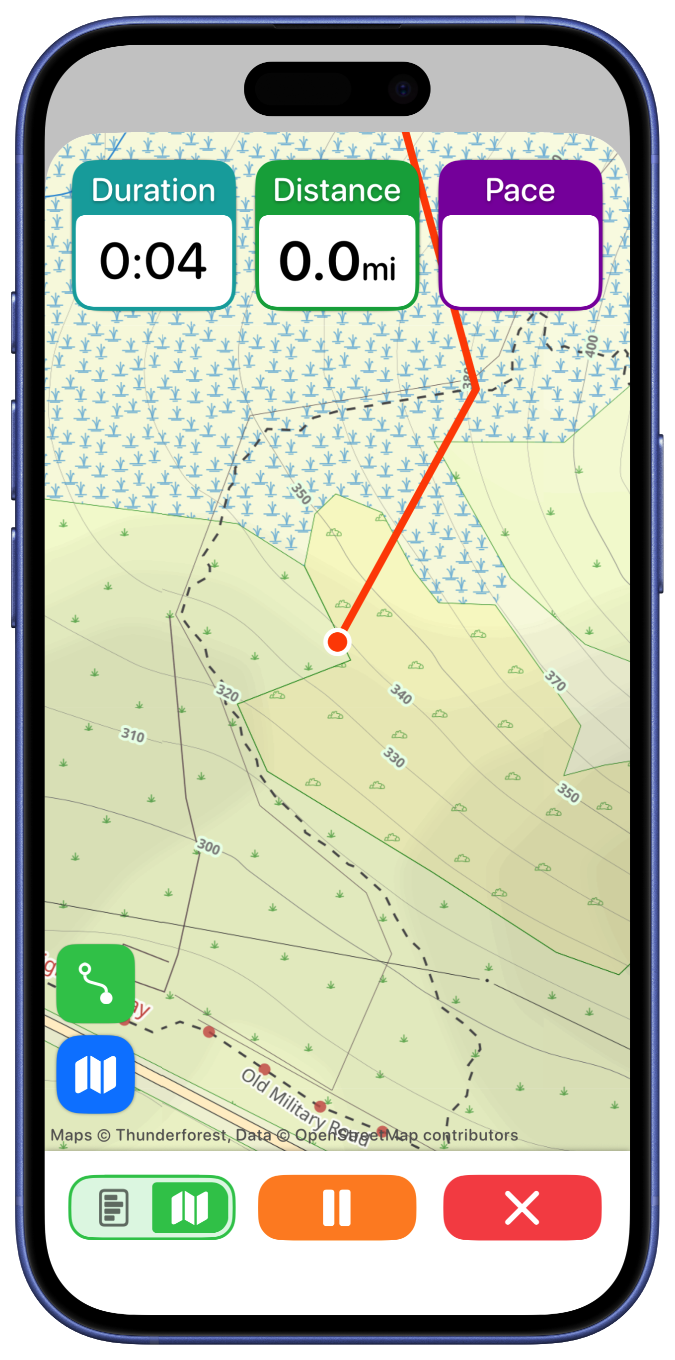
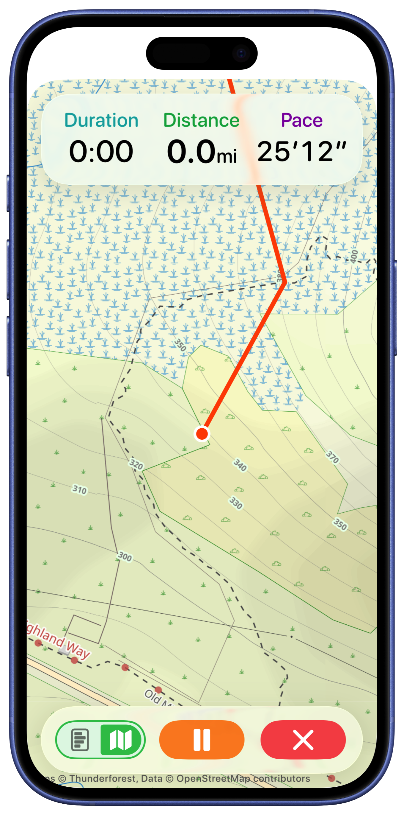
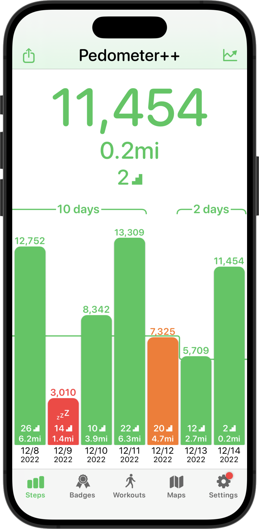
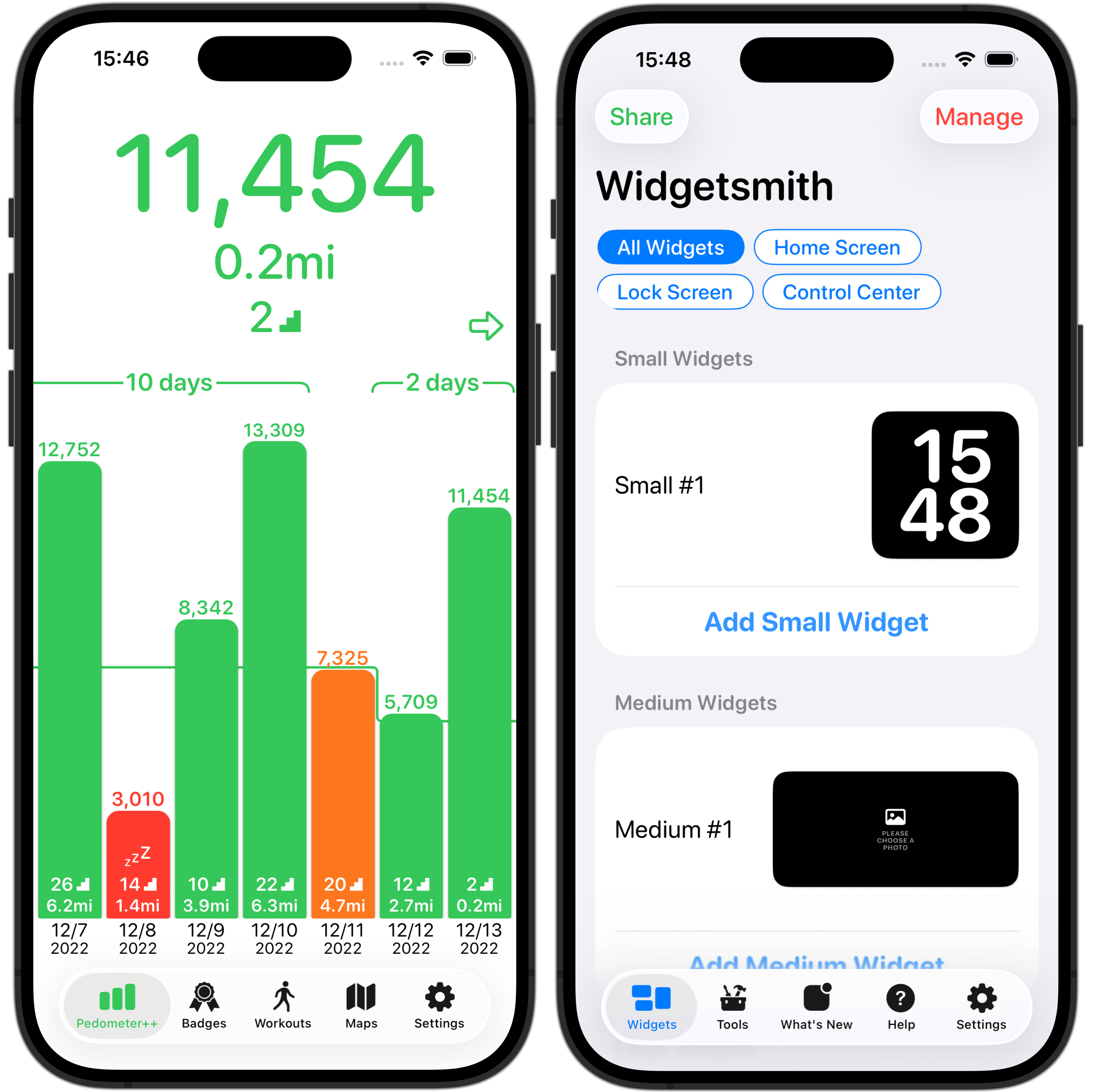
Because this was a time-based expedition, having an accurate prediction for how long various segments would take me was of incredible help. Pedometer++ already has a basic form of time estimation based on the Naismith Rule, but I needed something a bit more robust.

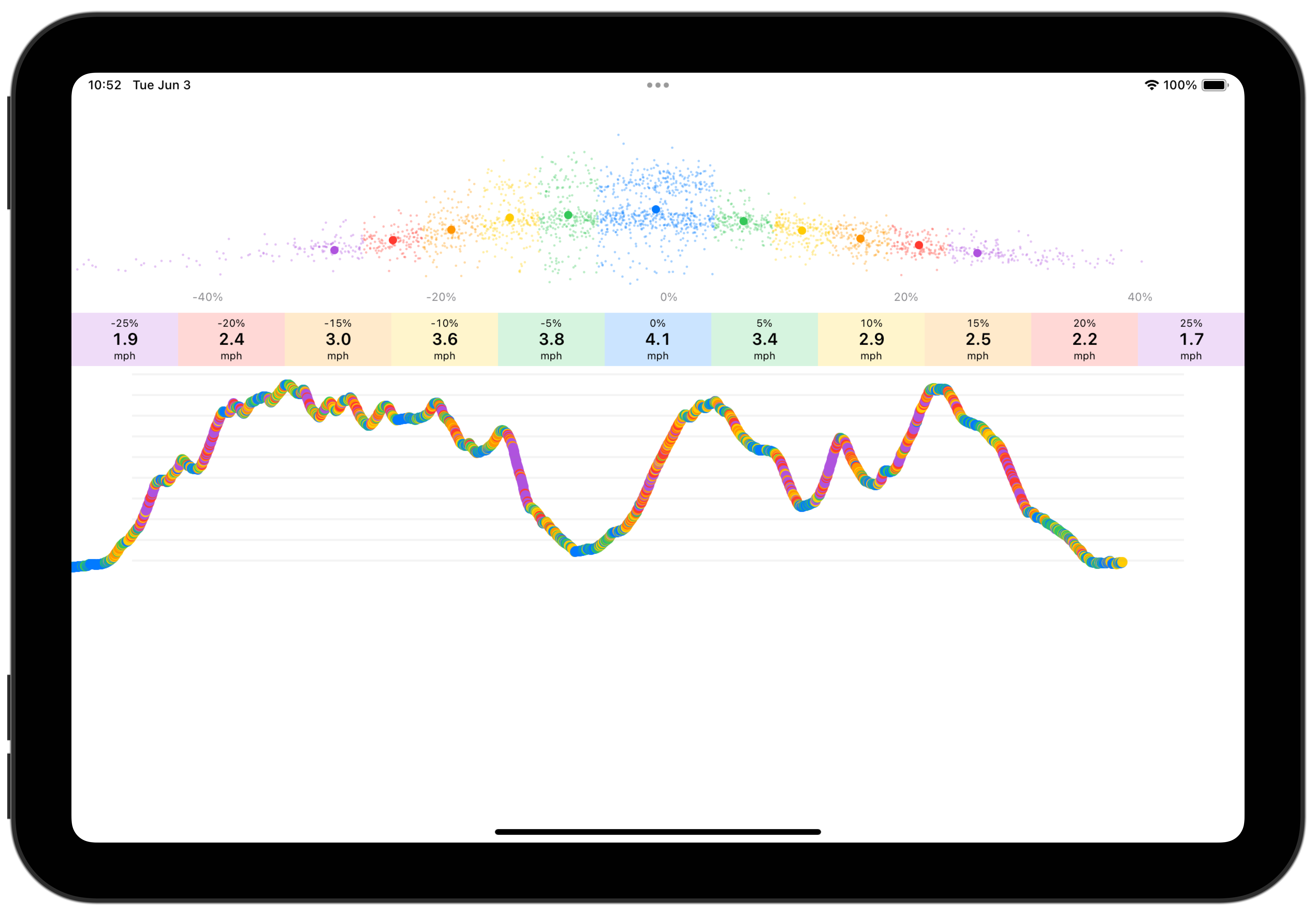
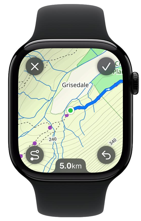
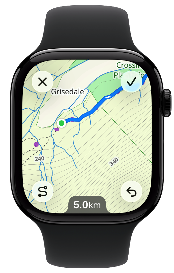
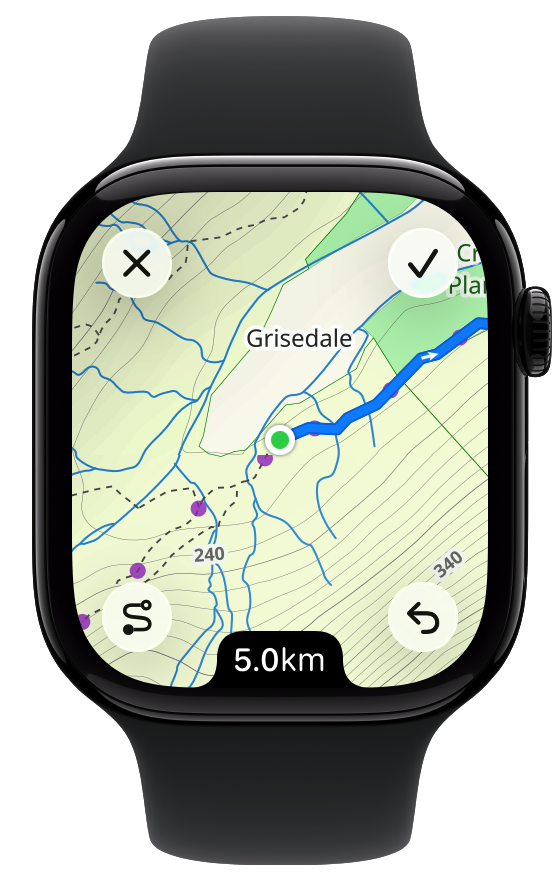
So I built a tool which analyzes past workouts to build a personalized speed profile for me. This segments the workout based on elevation gradient and determines your typical speed for that kind of terrain. Once this model was built I could then take the GPX route file of my planned trip and apply the speed estimates to it to build a prediction of my time for each segment.

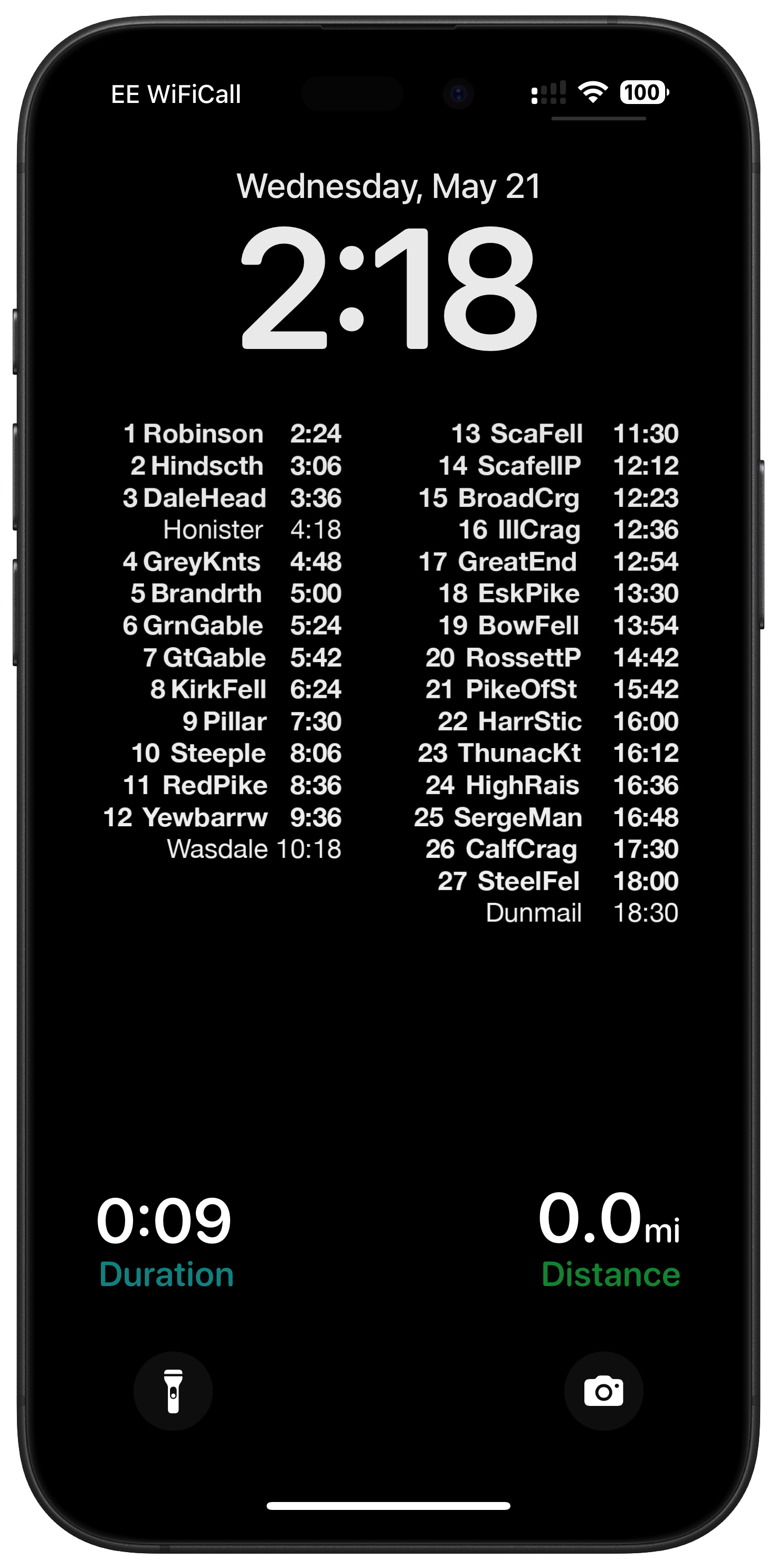
In practice this estimate proved extremely accurate for me. I took the output of this and made a super simple Lock Screen wallpaper for my iPhone which showed my predicted time arriving at different points along the route, aligned so that I could see the Pedometer++ live activity below showing my current stats. So every time I pulled out my iPhone I could check-in about whether I was on track or not.
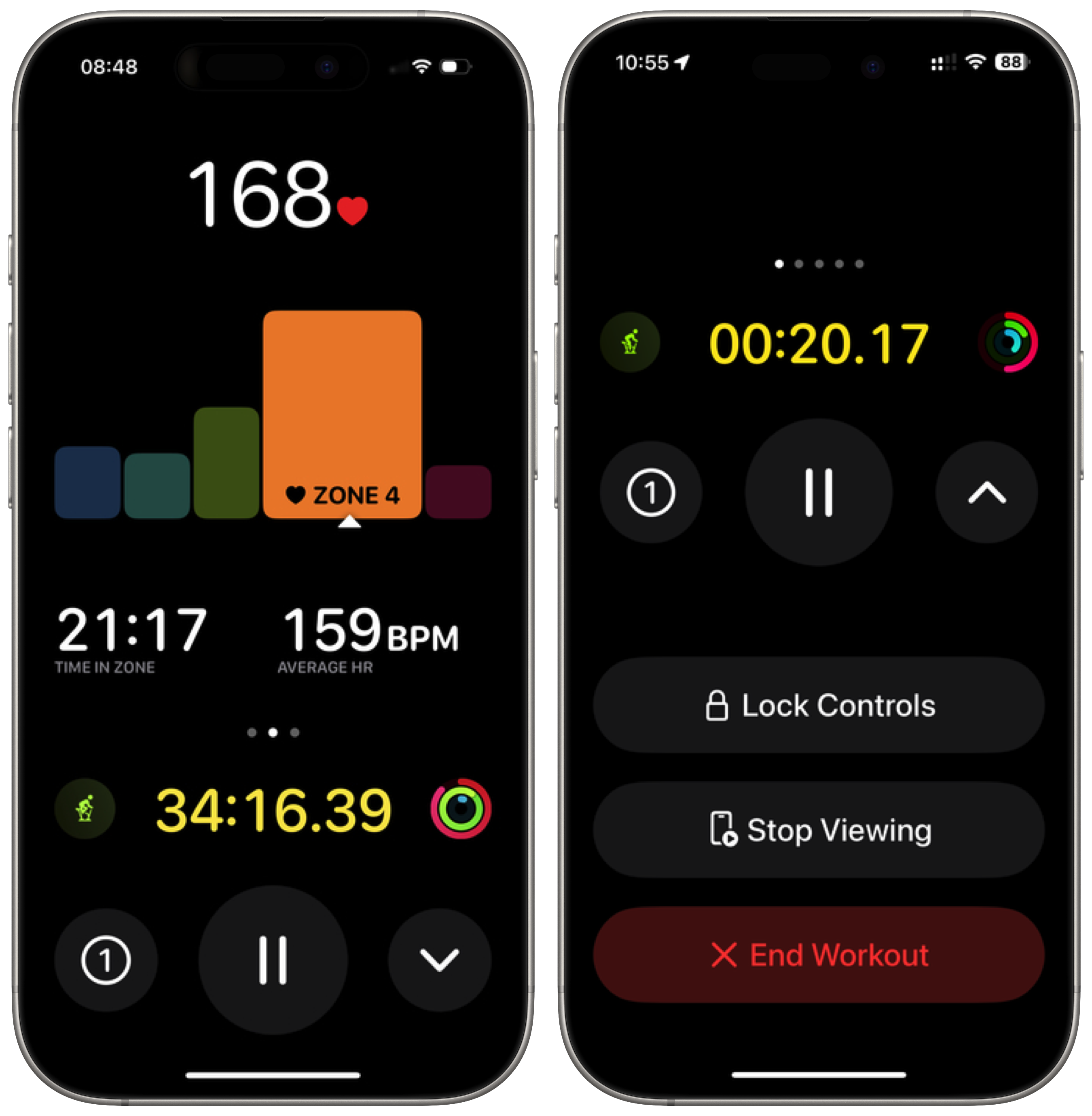
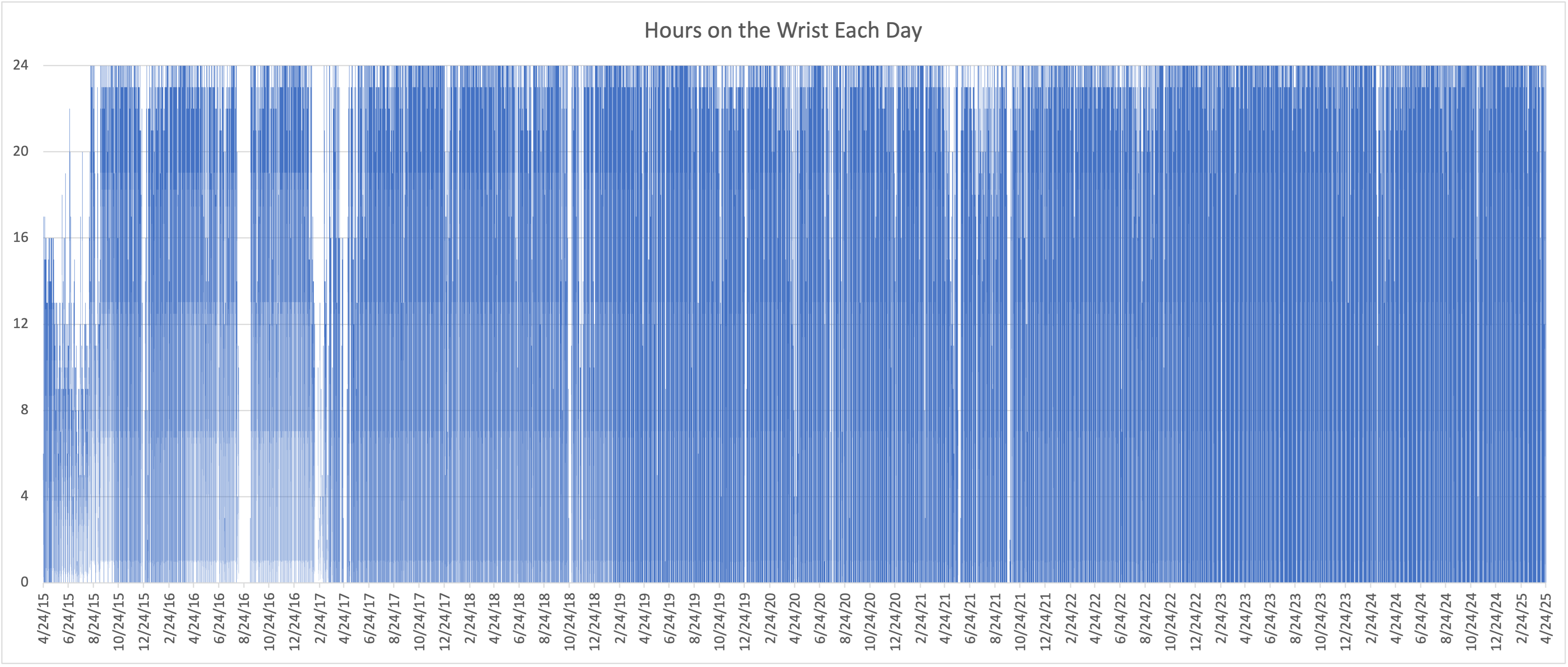
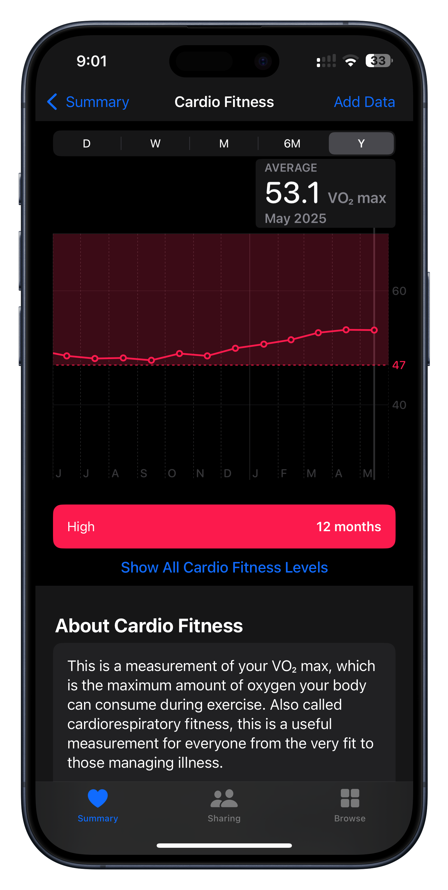
I didn’t build this but I nevertheless found it incredibly motivating during my training. The Apple Watch can generate a predicted VO2 max value whenever you do an outdoor walk or run. I have no idea about the clinical accuracy of the number it generates but I have found that it is incredibly good at measuring my relative fitness.
You can clearly see in the graph above how my fitness was slowly diminishing towards the end of last year and then how once I set the goal of my Bob Graham Round it started to gradually rise until it peaked right before I started my attempt.
So much of training is about putting in repetitions hoping that you’ll see improvement, but that progress is so often impossible to perceive in the short term. The VO2 number is something tangible and encouraging to keep me going when I feel like I’m putting in the work, but not yet seeing the result.
I recently came across the incredibly helpful Peak Weather app by Piotr Knapczyk.

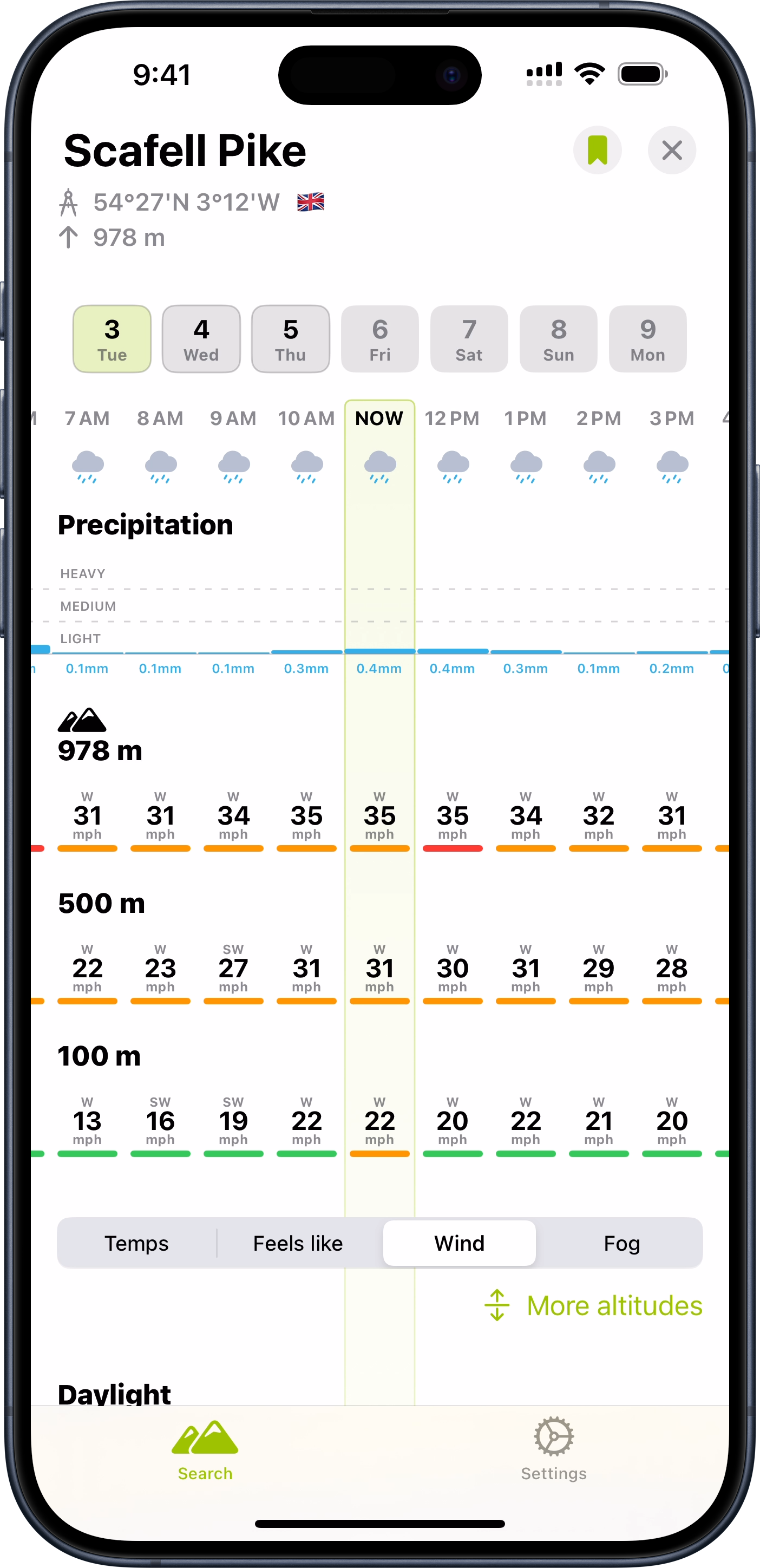
This is a weather app with a hiking oriented twist which I found super helpful in my planning. Rather than just showing the forecast at a particular location, it gives elevation based forecasts as well. So it gives you a sense of what to expect at different parts along the climb of a summit.
While I never was able to find 42 hours of good weather in my trip, this tool was very helpful in identifying the best 42 hours I possibly could.
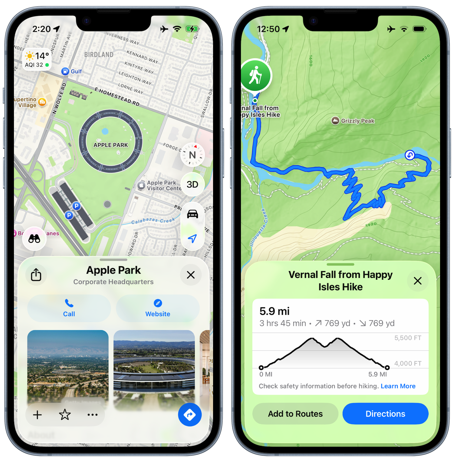
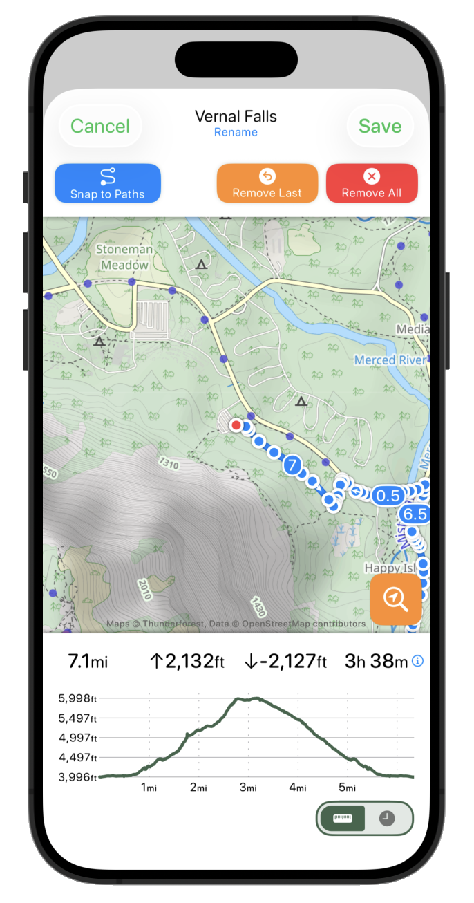
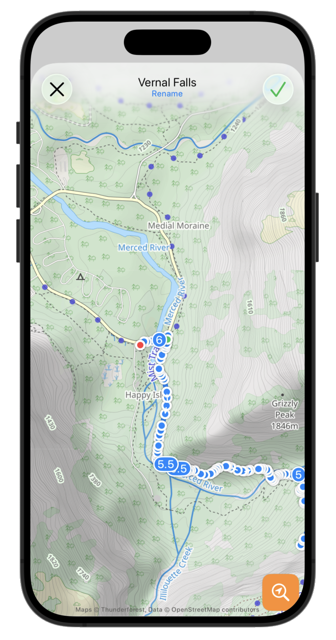
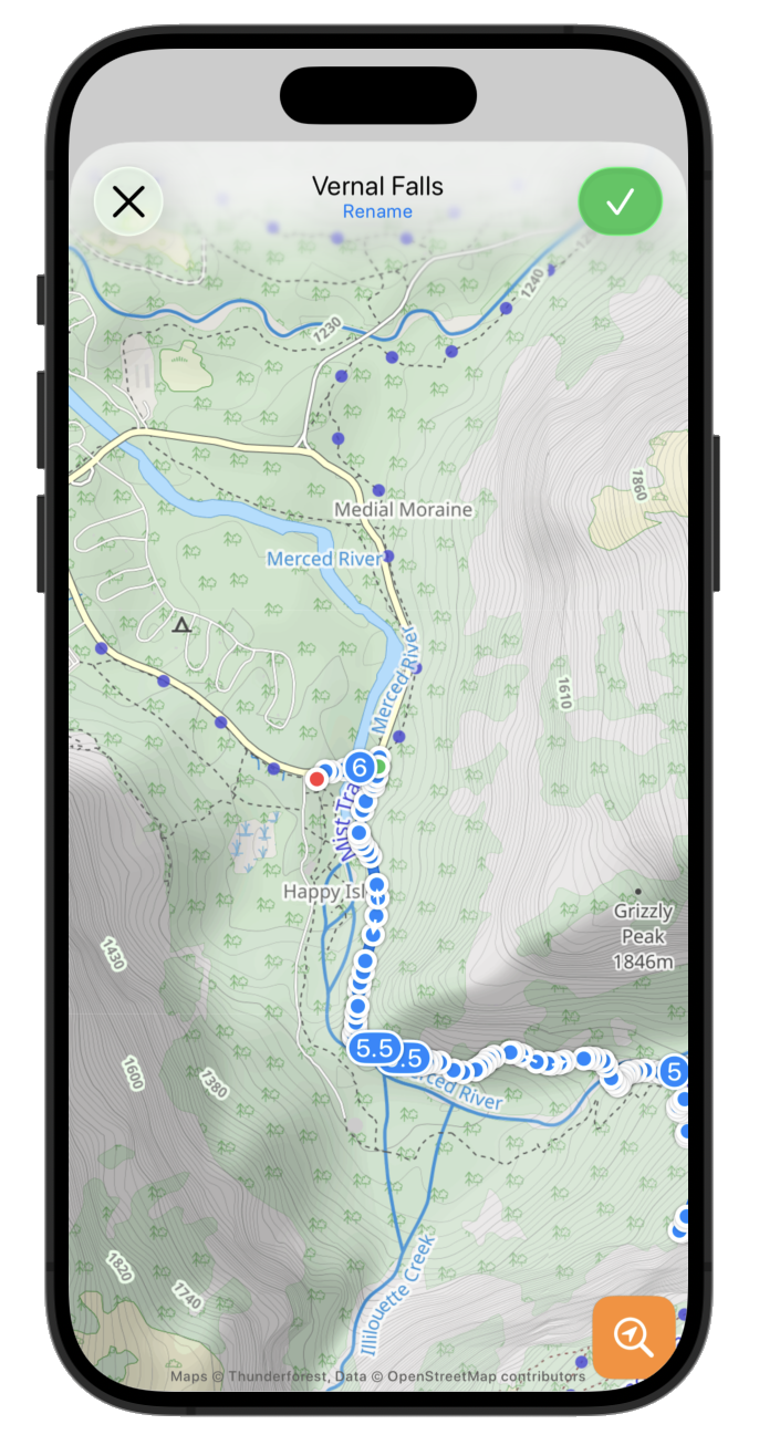
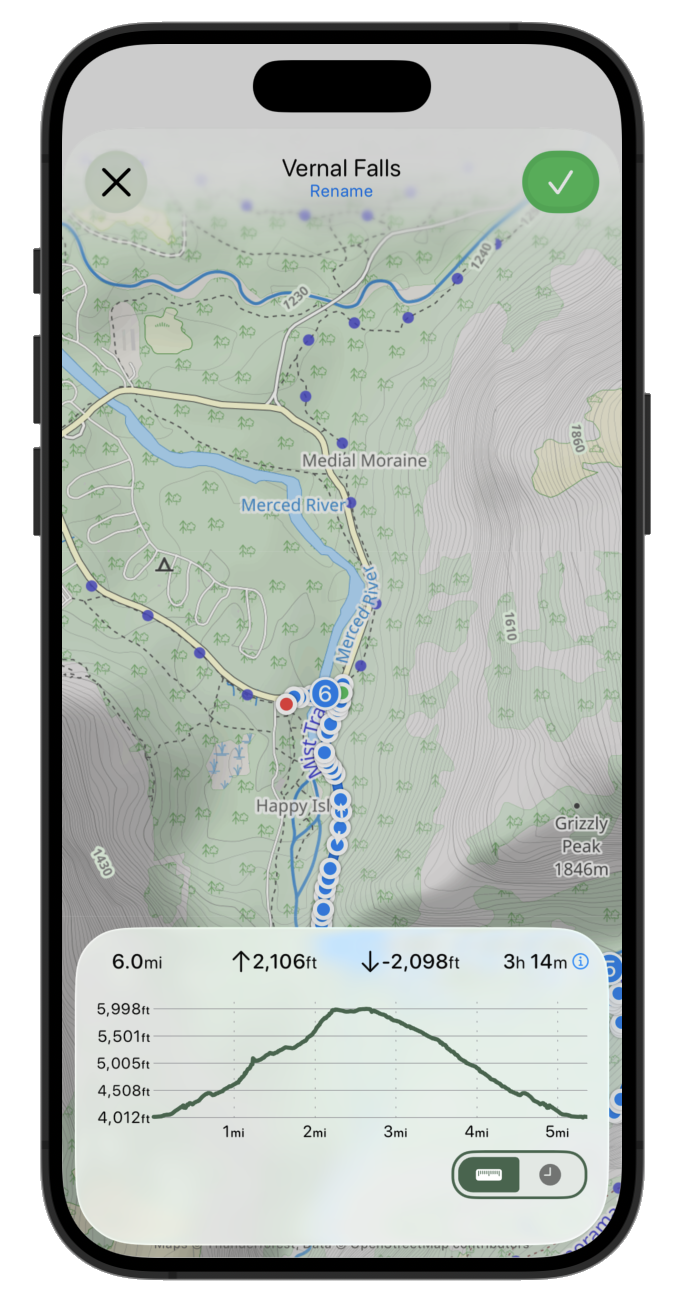
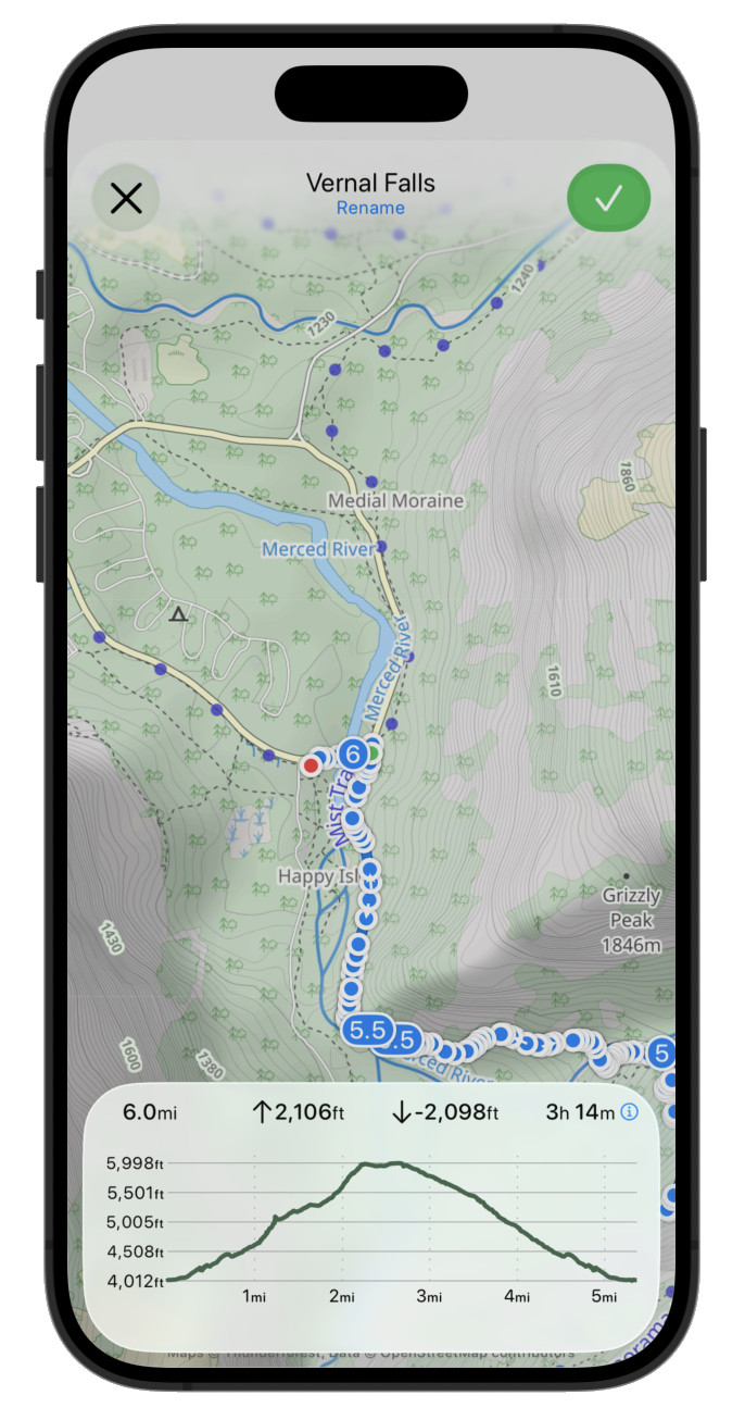
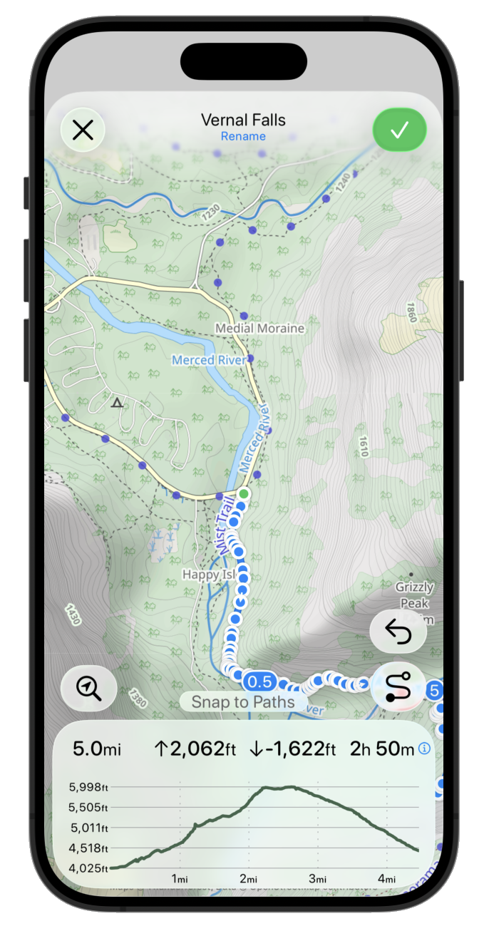
I wanted to give my family and friends a way to track my progress along the attempt (and also give my wife additional peace of mind with knowing my current position for safety purposes). I used a personal tracking beacon for this purpose which reports back my location to a central service every few minutes. The backend system for that service was not something which is particularly feature rich so I built a custom tracking website which pulled my data from their backend API.
This allowed me to overlay my location not just with a map, but also an annotated route map showing my progress along the 42 peaks. Thus giving folks a sense of how far I was along and how much more I had to do.
![]()
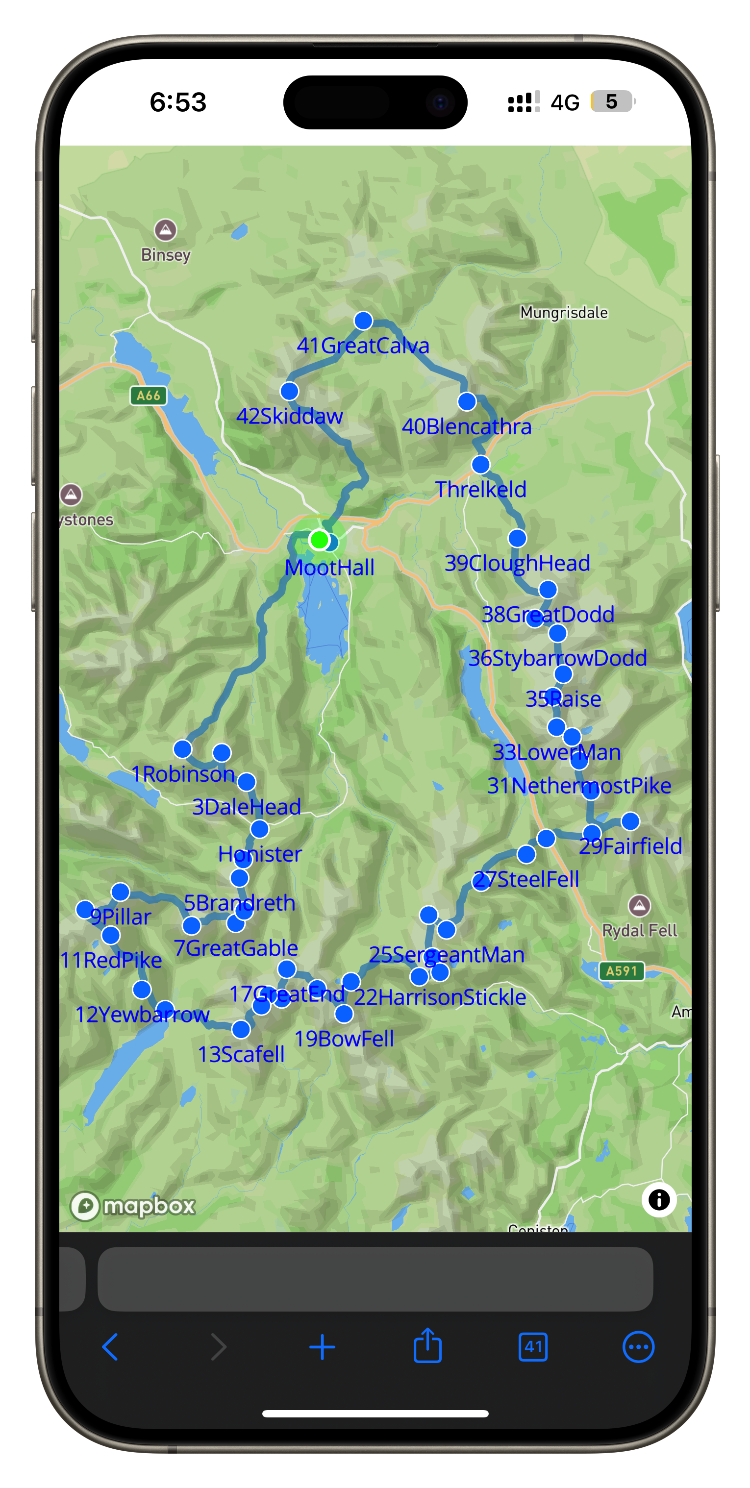
This was one of my first times doing some proper “vibe coding”. I’m not all that up to date with Javascript development so I worked with an AI to build the site. The process went very well and I was generally impressed with how much you can do with a little bit of know how and a lot of AI help.
In the Lake District, mountain peaks are referred to as “fells”, from the old Norse word fjall. ↩

Typically, this time of year it makes little sense to start any major new projects, so heading out on a break before the intensity of the WWDC-to-September season makes a lot of sense.
This year in particular, this time away has been incredibly helpful.
The last 12 months have been a very turbulent period for developer relations at Apple. It feels like there has been situation after situation which has challenged our relationship and made it tricky to feel awesome about being an Apple developer.
With the benefit of a week away, I feel way more excited about once again heading to Cupertino for WWDC1.
Nothing externally has changed, but my perspective has improved and I was able to remind myself of a few fundamental truths about my job.

I love making apps. It really is that simple. My very first job 25 years ago was developing handheld railroad inspection software for the Palm V, and I haven’t looked back since.
The ability to have an idea, open Xcode, and then a few hours later see that idea exist in reality is truly magical.
There isn’t another job I’d rather be doing. For however long I am able to keep making my livelihood doing the exact thing I love, I will be incredibly grateful.
Every now and then I’ll open App Store Connect and pull up the “Lifetime Units” tab to see how many downloads my apps have accumulated over the years. Right now that number stands at 166 million(!).

How can a single developer pick up their MacBook Pro, write a bit of code, and then publish it to 2.5X the population of the United Kingdom? It just doesn’t seem like that should be possible, but it is, and it is the App Store model which has made that possible.
I will forever be overwhelmingly grateful for the tremendous opportunity being an Apple developer has afforded me.

WWDC is like Christmas morning to an app developer. We get to unwrap all the “presents” the talented folks within Apple Engineering have been working on for the last few years.
I’ve had the great privilege of getting to know many of these engineers over the years, and it never ceases to be a thrill to hear the excitement in their voices as they discuss the newly announced features.
Additionally, WWDC is the best time of year when I get to spend time with the broader Apple developer community. While smaller gatherings and other conferences are wonderful, WWDC is the time when the most folks get together from the most places.
Many of my best friends I’ve met at WWDC over the years. Whatever is announced on Monday, it is a gathering of like-minded people who care so much about the things I’m passionate about.

This year has been a tough one, I won’t sugar coat that. I’ve had to work through some really complicated feelings about my relationship with Apple and my work. There remain some fundamental challenges for the Apple developer community. I hope many of them will be addressed next week. Maybe they will, maybe they won’t.
But I also know some other things for sure. I love my job, I’m privileged to have the opportunity to do what I do, and I love the people in this community (within Apple and without). After taking a step back from the drama and developing some perspective, I’m reminded of these great things and now head to Cupertino with a refreshed sense of excitement and anticipation.
This is not naive, blind fanaticism; I remain profoundly aware of the challenges ahead of us. But I am choosing a thoughtful positivity, which is appropriately grateful for all the positives this week represents and the tremendous opportunities it will hold.
This will be my 17th consecutive WWDC, I’ve been in the room for the Keynote every year since 2009 (Covid aside) ↩
What really interests me is where this situation came from and where we can constructively go from here.
Let me start off by saying that I am absolutely an idealist; I want to believe the best in all situations. I want to drink the Kool-Aid (as it were) and live in the joyful bliss of optimism. I do that because it allows me to do my best work and make (hopefully) wonderful things. If I am forever distracted by the latest drama and allow myself to be wrapped up in it, I will be unable to focus on the work that I truly value.
A few years ago, I mentioned whatever the developer drama-du-jour was to my wife. She is very aware of the Apple developer business, having been married to me through the 17 years it has been my profession, but she isn’t mired by the day-to-day convulsions of it as I have been. She said something that was brilliantly succinct and insightful:
It sure sounds like Apple has forgotten what made them great.
That really stuck with me.
What drew me to Apple and gave me such affection for them was their professed desire to make wonderful, delightful, exquisite products that surprise and delight their customers. That ethos is both the implied and explicit brand promise. Because their products were so exquisite, they cost more, but that cost was justified by their quality and in an open market customers would choose their products because of their inherent excellence. That is a huge reason why the iPhone wasn’t destroyed by cheaper Android phones. The iPhone was simply better, with great customer satisfaction, and so it won.
Apple may have at one point in history viewed their developer offerings in this light. Seeking to improve their end-user customer satisfaction by building amazing, wonderful developer tools and services that allow and empower their developers to make apps that align with their ethos and values. That doesn’t feel like the case anymore. While there are people and departments within Apple which I am confident feel that way, by and large, at the highest levels, it has been made clear we are viewed as a commodity resource to be extracted from.
I am honestly not all that interested in following Epic, Spotify, Amazon, and others in changing their apps to take advantage of what this injunction allows. I currently don’t have any plans to offer payment outside of IAP.
However, what worries me most is reading the internal discussions at Apple and the posture and thought process that led Apple to this place.
Apple is at its best when it is focused on building great products that serve its customers well. I am a two-fold Apple customer. I buy many of their consumer products and services and enjoy using them in my personal life. I also own a business that is an Apple customer, which has paid Apple a huge amount in the last 17 years for the developer services it has sold me. I don’t begrudge them those fees at all, they have provided the basis and means of my building a business I’m proud of, and I am genuinely grateful to Apple for that.
Where I see Apple’s biggest mistake in their current line of thinking is that while I pay Apple huge sums of money each month, they don’t view me as a customer to be served. They don’t seem to see the benefit of making my experience and offerings better and better. They aren’t trying to win me over by being excellent; they are assuming my loyalty through strong-arm tactics and intransigence.
I’d love to see Apple adopt a new posture towards these things where they win on merit, not by fiat. Apple does have something of value which developers would be happy to pay for: a platform with highly engaged and monetizable users and a large collection of payment accounts attached to those users, which streamlines conversion. This is valuable and Apple has every right to be compensated for this value, but it would be wise to do so in a manner in which both they and their developers win.
For example, selling their payment processing system to developers at competitive rates which are inline with their value. Make your payment processing fees competitive broadly (credit card fees plus fraud and tax compliance), then add on a “convenience fee” commensurate with the conversion enhancement being the built-in provider allows.
Developers aren’t stupid — if they can make more money using Apple’s provided platform…they will! And then both Apple and the developers win. If their interests are aligned, both parties win, and the partnership between Apple and its developer community is sustainable and mutually agreeable.
If Apple serves developers as valued customers, regularly and consistently striving to find areas where we both benefit, then the path forward seems much brighter. Like I said at the start of this, I am an idealist; I want to believe that this change is possible through desire and choice on Apple’s part. That it doesn’t have be handed down to them through injunction and legislation.
Externally mandated change ultimately harms Apple, its customers, and its developers. I firmly believe they’d be much better off choosing a self-directed path of improvement, seeking to act positively rather than with miserly defense.
WWDC is just four weeks away. I’ve had the privilege of attending every WWDC since 2009, and I suspect this year will feel very different from others. This is an opportunity for Apple to reset their developer relationships and make announcements that clearly show a desire for our mutual benefit. I hope to shelve this distraction and get back to work, building wonderful products for this wonderful platform. We’ll see if Apple agrees.
Marco and I discussed this topic on this weeks episode of Under the Radar. Which expands on these thoughts in more depth.
In the ten years since the Apple Watch was released I have worn one for at least part of 78,537 hours. My method for measuring this is to to search HealthKit for the existence of a heart rate sample during each hour. This isn’t a perfect method but should be very close proxy to the times when it was on my wrist, as the watch generally records a heart rate reading at least once per hour.
That equates to my wearing an Apple Watch on 97.1% of possible days.

Since August 2015 when I had the idea for Sleep++ (long before the watch got official sleep tracking support), I have worn the watch all day (& night) in 77% of those days. More dramatically, in the last three years I’ve only had two days when I didn’t wear it at all.
The Apple Watch has become an essential part of my life and lifestyle. Wearing it has helped to be healtier and more active. It has been my companion on countless adventures and helped me navigate while hiking in my favorite places.
Developing apps for it has been my favorite part of my job over this period. I really enjoy working on this platform and the possibilities it allows. I am very grateful for the role it has played in my life these ten years and look forward to continuing to wear it for years to come.

PS. I’m a bit infamous for wearing multiple Apple Watches at a time (typically all summer while I’m concurrently working on the new beta watchOS with the current stable release). For the purposes of this analysis I didn’t double count the hours where I had multiple watches on. If I did then the number of combined hours of “watch on wrist” time would be dramatically higher. 🤪

However, after wandering around in the (literal) wilderness for most of last week testing Pedometer++, my current reaction is now much more optimistic. Not because the fundamentals of the situation have changed, but because I’ve decided that it is essential that I develop a practice of optimism to navigate this complicated season in the Apple developer world.
Optimism isn’t enthusiasm. Enthusiasm is a feeling, optimism is a choice. I have much less of the enthusiastic feelings these days about my relationship to Apple and its technologies (discussed here on Under the Radar 312), but I can still choose to optimistically look for the positives in any situation. Something I’ve learned as I’ve aged is that pessimism feels better in the moment, but then slowly rots you over time. Whereas optimism feels foolish in the moment, but sustains you over time.
I’m not talking about a blind optimism which ignores the realities of a situation, but more the realistic pursuit of the positives of a situation which (at the risk of sounding a bit like Paddington Bear) if you look for, you can nearly always find. Realistically focusing on how things can go well and the positive outcomes will help me sustainably continue to grow and improve my chosen field of expertise which is ultimately my career goal.
So with that in mind…here are six positive reasons for optimism about a possible major redesign coming to iOS 19.
That is the list of things I came up with. The process of coming up with the list was itself a useful exercise. By focusing on the positive outcomes I felt much more balanced in my reaction and think I am now better able to look towards a summer of potentially challenging work with a more hopeful, growth based perspective. I’m not saying in all of this that anyone shouldn’t feel negatively towards Apple or its announcements right now, but this is just a practice/approach I’m cultivating to preserve my mental health and allow me to continue to do my best work in my chosen area of expertise.
The above image represents the sum total of the progress I made yesterday. It sure doesn’t look like much. It is a grid system for an upcoming widget feature I am working on for Widgetsmith. I’m almost embarrassed to post it as the collective effort for an entire day’s professional work, but that is ultimately the point of this post.
I always find coming back from the Christmas break (or any break for that matter) challenging. The regular routines of my working life are joyously disrupted, providing a welcome break and opportunity to re-charge. But when I now sit down at my computer and face the wide-open expanse of possible work endeavors, I rarely have a clear sense of where to start and how to get back into the swing of things.
I’ve faced this struggle hundreds of times over the years of my career and navigated it with varying degrees of success. Over those years, I’ve built up a variety of “tricks” to get me going again. These are little habits or rituals which help steer me towards any degree of productivity again.
The above screenshot is an example of what I call my “Accomplish One Thing” rule. On any day when I’m supposed to be working, I have developed the habit of looking back at my day and looking for at least one thing which I really accomplished that day (ideally something tangible or visible). I tend to think about this as I’m clearing up my desk, ready to return to home life. It really doesn’t matter how big or small that thing is, but there needs to be something which I can point to.
The real magic of this habit is how it helps me earlier in the day. If I know I’ll need to have something tangible to point to later on, I find I am much more inclined to choose meaningful, but manageable tasks on these early days back. Tasks which are useful but also scoped to not overwhelm or daunt me. Obviously, not all jobs which need doing are atomic enough to be accomplished in a day’s work, but usually I find that I can either break larger tasks into smaller pieces or structure the sequence of work to allow for some of these.
The goal here is not to make massive progress; it isn’t about getting back up to full speed again, going from 0 to 100 miles/hour in one swift step. It is about building up my working inertia again. Speed is useful, but inertia is powerful.
Inertia in my working life is the thing which I find most powerfully motivates and animates my progress. It gives you that sense of inevitability about accomplishing the outcome and desire each morning to keep the ball rolling. Inertia is what will get you through the inevitable slumps, disappointments, and mistakes later on in a project. So I want to get it accumulating as soon as I can.
So yesterday I built that grid; today I’ll tackle the next thing I can accomplish in this project, and who knows what will come on Monday. But I know from experience that if I can string together a few days of tangible progress, the future will sort itself out.

This event got me thinking a lot about longevity, especially as it relates to starting and sustaining a business. While nothing in business is ever certain, I firmly believe that Myke and Stephen didn’t reach this anniversary by accident. They have been careful and deliberate in their approach to building Relay, maximizing the chances of its enduring over time.
I feel like there are two extremes when it comes to starting a business you can build it optimizing for fast growth or you can build it optimizing for sustainability.
In the fast case you are likely rapidly increasing your costs and spending your way to growth. The goal here is to increase your customer base as quickly as possible and use whatever means possible to accomplish that.
In the slower, more sustainable case you are instead being extremely conservative with your costs and growing only as fast as you can without overreaching beyond your stable base.
Having been a close observer of the way Relay has grown and developed over the last decade it was clear they took the sustainable approach. Adding shows and employees at a very measured, deliberate pace. Never getting ahead of themselves and as a result rarely putting themselves in a tenuous position.

It reminds me of the Dry Stone Walls you will often see while wandering in the north English countryside. These walls divide farmers pastures and criss-cross the terrain on hillsides often battered with awful conditions. Yet these walls endure because they were built to endure. The process of building one of these walls is slow and deliberate. Only being able to progress at a rate of maybe 2-3 meters per day, but their lifespans are measured in centuries as a result. Compare that to something like a wooden split rail fence which can be put up at a rate of hundreds of meters per day, but have a useful lifespan measured only in years.
There are no free lunches here. If your goal is to make something which will endure, which can stand up against the storms which will inevitably batter it, you need to start building it with that in mind.
This isn’t to say that the fast, unsustainable approach doesn’t have its place, but moreover it is vital to be deliberate about what you want and be clear eyed about what that will mean for your future prospects. But if you want to make something which will be around to celebrate its 10 year anniversary you’ll probably to build it with stone rather than wood.
It was their farewell message as they signed off.
Stay hungry. Stay foolish.
And I’ve always wished that for myself. And now as you graduate to begin anew, I wish that for you.
Stay hungry. Stay foolish.
Early in my career when I heard that quote it hit me as a lovely bit of motivational speaking. Something to encourage you to “get out there and do some good work”. The kind of thing you often hear at commencement speeches. I heard it has a positive affirmation.
Now that I’m further along in my career (and life) it hits me very differently. Now I hear it as a word of warning, a cautionary admonition.
When you are early in your career the best path forward is typically to hungrily strive forward. Embracing every possible opportunity, maybe not with foolish abandon but with consistent, unrelenting determination. You have everything to gain, and nothing to lose.
That works well enough until you achieve some level of success. Success is wonderful and lovely, but it also brings with it obligation. Once you have achieved something worth holding on to, you now need to do the work to maintain it. Once you have had some success now you suddenly have less to gain, and something to lose.
I noticed this in my own mindset after I had my first successes. It became much more difficult to pursue new opportunities with the same determined vigor as I did in the early days. I now would filter my decisions and new pursuits through an analysis of how they could negatively impact my existing accomplishments. It now felt reckless to undertake every opportunity, to jump at every idea.
Rather than being “Hungry and Foolish” it was now the prudent course of action to instead be “Defensive and Skeptical”. To be incredibly circumspect of which opportunities are worth the risk. To take actions which provide stability and preserve what you already have. To become comfortable with slow, measured growth.
I have no idea if this is what Steve Jobs meant in his commencement speech. He could have simply meant it in the positive, motivational sense. But increasingly I wonder if he may have also meant it in the cautionary sense as well. He had certainly overseen tremendous success and undoubtedly had to wrestle with the tension between preserving what you have and gaining something new.
Where I have settled in my own work is to strive to keep some meaningful part of my mindset hungry and foolish. To continue to be open to new opportunities and eager to explore them. I don’t want to end up miserly defending what I have already achieved, I want a professional life still rich with tackling interesting problems. Though admittedly I am more thoughtful in this pursuit.
In doing so one of the weird paradoxes of life also starts to emerge. I start to see that the only way to truly defend what you have is through continuous action. That defensiveness and skepticism are actually more likely to lead to loss. That it is action, and sometimes bold action at that, which allows you to keep hold of whatever success you have. Inactivity is depletion.