Featured Video
McDavid Reaches Milestone 🎖️

Ranking Every NHL Team's Road Jersey for the 2025-26 Season
Of the many truths around the NHL, it's objectively true that we love to rank our favorite things. Players, free agents, trades...you name it, you're putting them in order from best to worst. It's also true about jerseys and team fashion in general. Last week, we brought you the best home jerseys for this season, and now it's time for the road sweaters to get their due.
Many of you tend to overlook the road jerseys because they're "plain," "boring," and "just white jerseys, big deal." And listen, we hear you, and in many cases, we might even agree with those takes.
Then again, there are plenty of teams that absolutely nail the look of what used to be the home jerseys (and should be again, dang it, get off our lawn).
All 32 teams will face judgment, and a few of them even have new ones for us to figure out where they belong. Who's ready to get upset by our obviously perfect takes?
32. Washington Capitals
1 of 32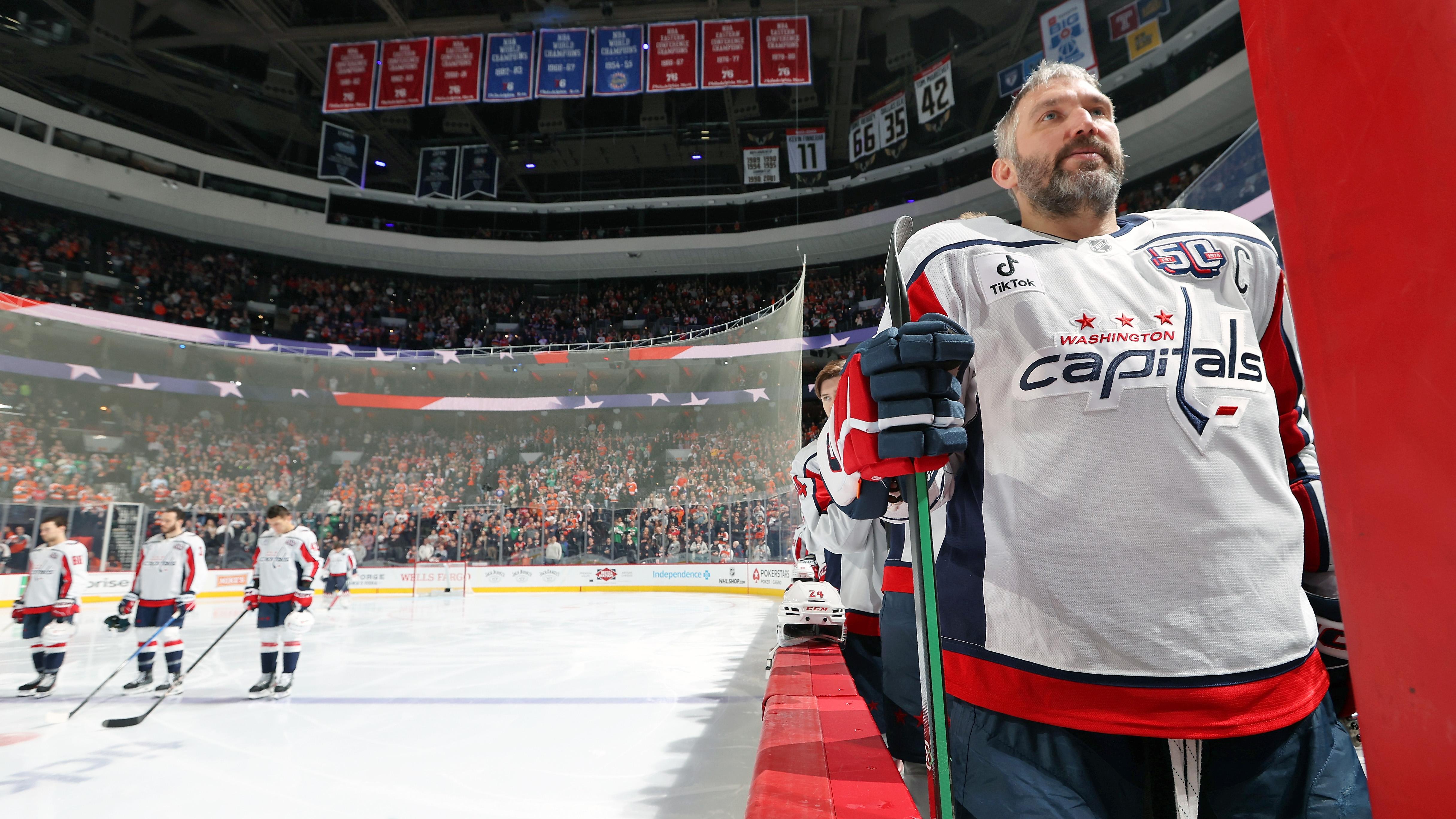
One day... one day the Capitals will change their home and road jersey set and we will have to find a new dead horse to beat, but until that day comes, here we are.
The Caps leaving their home and road jerseys virtually untouched since 2007 is madness, given all the design quirks that came into play then that are so out of touch now. These quirks are almost less offensive on the road jerseys until you start looking at them too long and start to notice more about them that makes you lose your mind.
They won the Stanley Cup in these, so they'll stay around forever, but boy, do they need a change.
31. Florida Panthers
2 of 32
Now that the Panthers have won back-to-back Stanley Cups with these jerseys (and their red home sweaters), they'll live forever in the imagery and hearts of their fans.
That's honestly a bummer because a team based in South Florida is capable of so much more.
The striping on the white jerseys is very good. It helps make their logo look a lot better. The sleeve/shoulder logos give it a military-like feel (and that's not an accident), which, in turn, makes it somewhat cluttered in an odd location.
It'd be great to see them have a more fun design, and while this one is OK, we're looking for something more from a team based near Miami.
30. Tampa Bay Lightning
3 of 32
The Lightning, with a jersey style similar to that of their division rivals, the Toronto Maple Leafs, makes it difficult to grade them appropriately.
After all, the Maple Leafs have had their look for a very long time, and the Lightning using that style as an inspiration makes a lot of sense because it's a proven winner.
Then again, the Lightning once had their own unique look, which they had a ton of success with, including winning a Stanley Cup in it in 2004. Of course, they've won two more Cups with their current look, and by the "what have you done for me lately" scale, it's the look that wins.
It's not as if the Leafs have done any winning beyond designing great jerseys lately anyway, right?
29. Minnesota Wild
4 of 32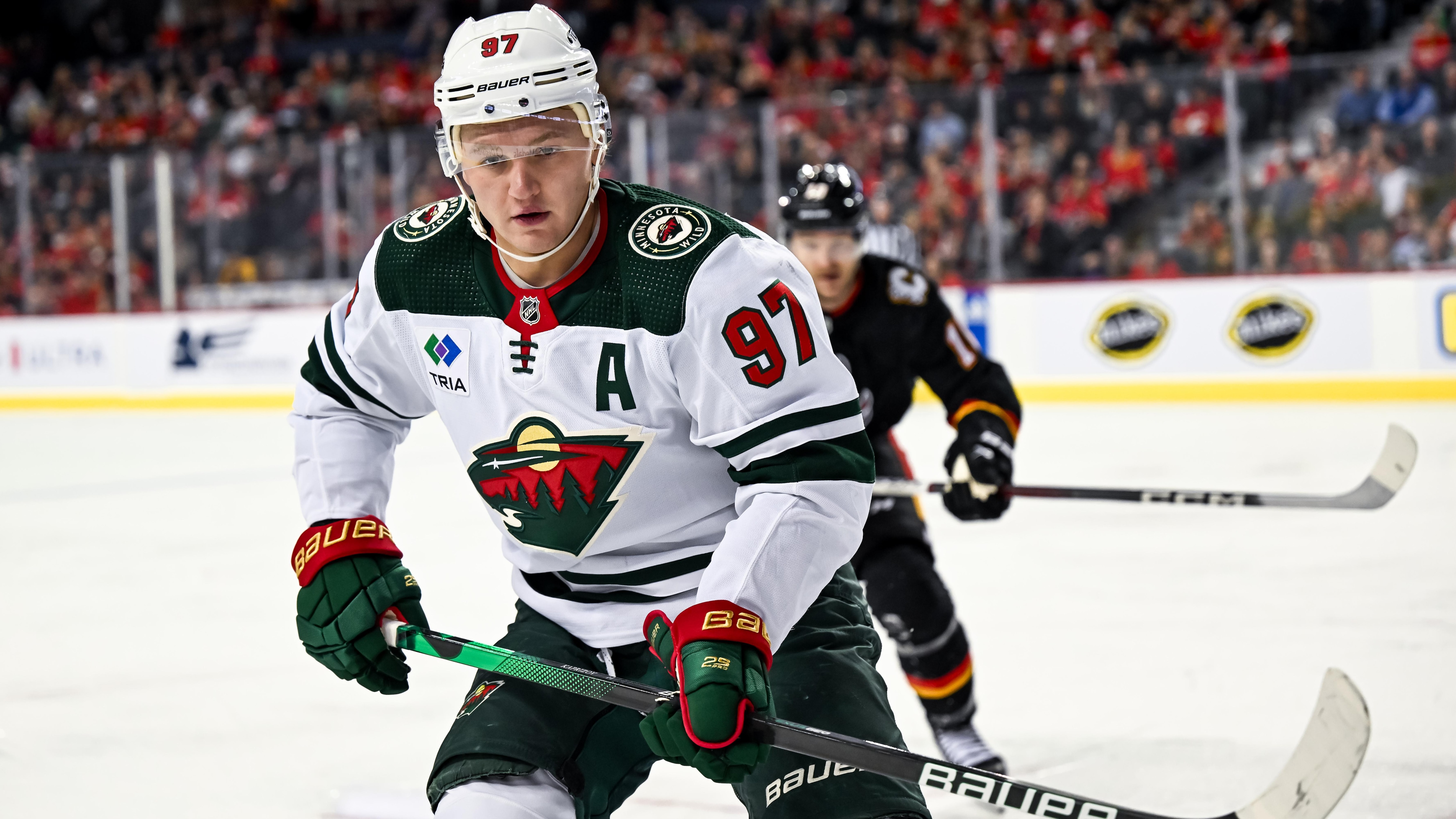
The Wild's road sweater is the ultimate ideal jersey. It nails the look. It has everything you need from a road sweater, and it even comes with shoulder patches that might even be a little unnecessary.
The ideal thing about this jersey is that it's actually white, unlike the off-white/cream white color of the home jersey. If there's a knock with these jerseys, it's that they're almost too plain.
A lot of road jerseys go out of their way to be simple for simplicity's sake, and, unfortunately, this one qualifies. Yes, we called it an ideal jersey, but if the Wild roll into your town wearing the road whites, the jerseys won't leave the impression of, "Whoa, we just watched the Wild!"
28. Vegas Golden Knights
5 of 32
The toughest thing for the Vegas Golden Knights now, when it comes to their jerseys at least, is that they've created such a banger of a home jersey with their golden sparkle jersey that their other two jerseys that make up their original home and road set suffer for it.
Fans generally really liked Vegas' original jersey set, and their white road sweater had a lot of love heaped on it for good reason. The gold in the sleeves sparkled with designs woven into it. The combination of pewter, silver, and red on the sleeves created a unique look that matched the pewter and black home jerseys of the time.
Now, with the gold home jersey being such a big winner and how different the road sweater now looks because of it, it all seems a bit out of sync. The road jersey is still pretty good, but the lack of harmony definitely hurts it now.
27. San Jose Sharks
6 of 32
A good way to gauge our jersey rankings is by comparing the road jersey to the home jersey. In the case of the San Jose Sharks, the road jersey is good, but it doesn't quite match the teal home sweater.
The Sharks' road white jersey is good, but the striping design, particularly when compared to the home sweater and the '90s jerseys that inspired it, is where we get stuck. The issue is the amount of white in the sleeve striping.
There's a lot more white involved in the road sleeves, and that mutes the rest of the look and almost washes it out in an odd way. Again, we still like the look, it's just different enough to be a little unsettling, which, hey, they're the Sharks, so it checks out.
26. Utah Mammoth
7 of 32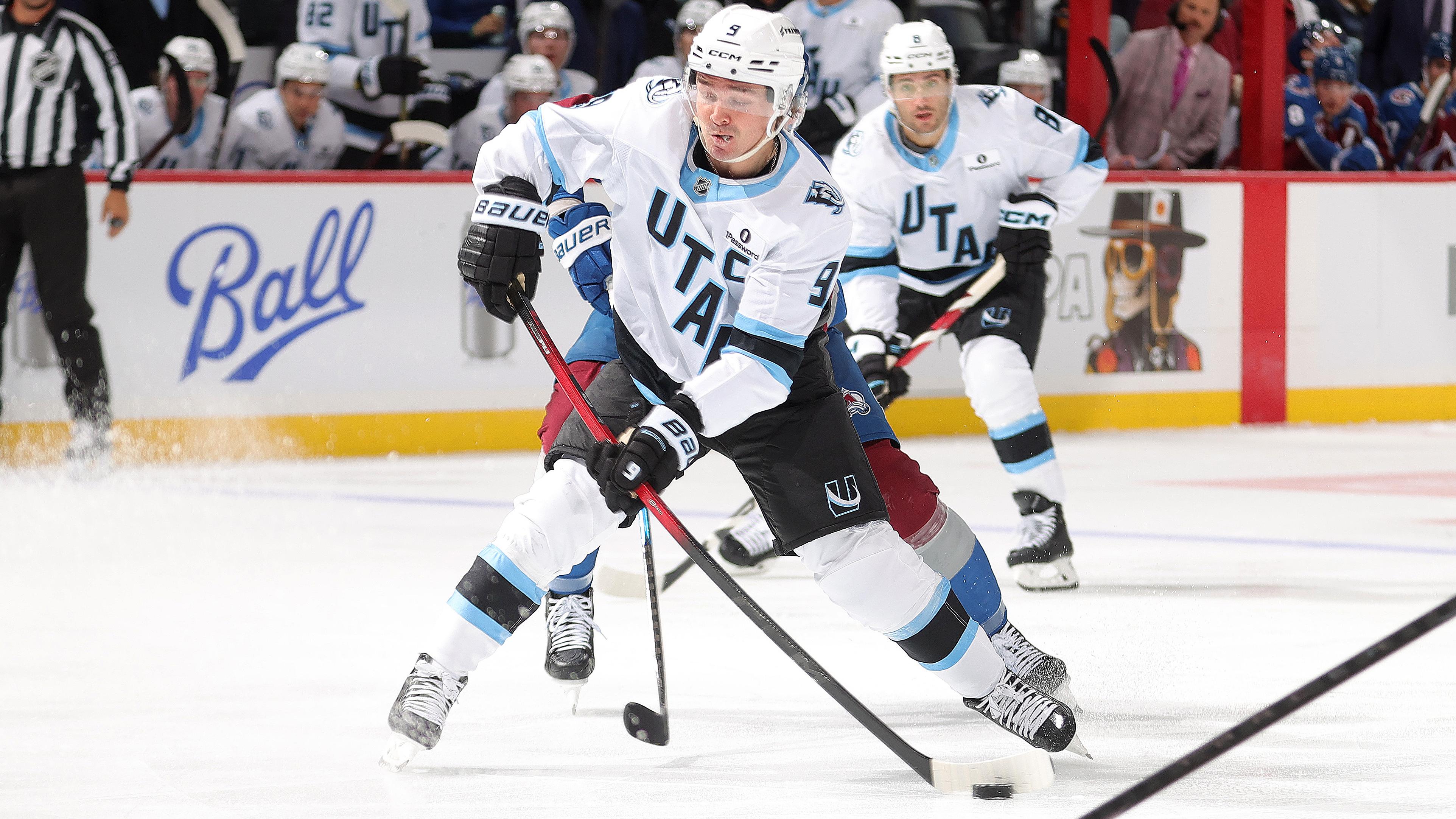
The Utah Mammoth might be new, but their road sweaters sure aren't.
The Mammoth kept one thing from their season, known as the Utah Hockey Club, the road sweaters' only change comes in the form of the Mammoth's new logo on the shoulders, while the vertically diagonal spelling of "UTAH" remains the same.
We're disappointed, despite liking the look. Our hope when they picked a name for the team was that we'd see a road jersey that complemented the home jersey with their new team crest on the front.
We think it's fine that they kept the look from a year ago, but we'd love to see more use of the new logos they designed with the new name.
25. Nashville Predators
8 of 32
When the Predators moved to lean heavily into wearing gold, it was something we were all about, and while that's really tough to also do with the white home sweater, they sure as heck tried to make it work there, too.
Nashville's jamming as much gold into their road jersey look works well, partly because it's a lighter color. Unfortunately, that's something that also works against it a little bit.
We're not saying we need more blue involved; there's plenty of that as is with the trim. It's really tough to achieve a big win with any design when white and gold are the top two colors required. The Predators' logo is great, and the guitar pick shoulder patch is outstanding, so there's a lot to love, but overall, it's in a crowded field where the best ones are so much further ahead of the rest.
24. Carolina Hurricanes
9 of 32
The Hurricanes sent their old word mark style home jersey packing and brought in the reversed look of their black 2023 Stadium Series sweaters. This wasn't a bad idea!
It ensured that the Hurricanes' actual logo is on the front of one of their main sweaters, and the rugged design from the Stadium Series of that logo looks really great. Making that logo look mean works well. The faux-vintage stylization of their mascot "Stormy" as one of the shoulder logos is a fun touch, and the fonts for the numbers and letters are good.
It feels a bit busy, but maybe that's just because we need more time to let it sink in. It's good, but there was little chance it would've been worse than what they had been using.
23. Columbus Blue Jackets
10 of 32
Although we're not big fans of Columbus's home jerseys, their road white jerseys do a nice job of making it work.
The design itself is maybe a little dated, but the team is still relatively new (even if they are having their 25th anniversary this season). In the annals of hockey, 25 years isn't very long, and the white jersey lets everything about their look breathe a bit.
The team logo isn't drowning in blue on the front, and the shoulder logos pop nicely there. No, that's not meant to be a cannon pun, but we guess it is now. Deal with it.
The Blue Jackets' road jersey is better than their home jersey, but it gets lost in the sea of more superior looks around the league.
22. Seattle Kraken
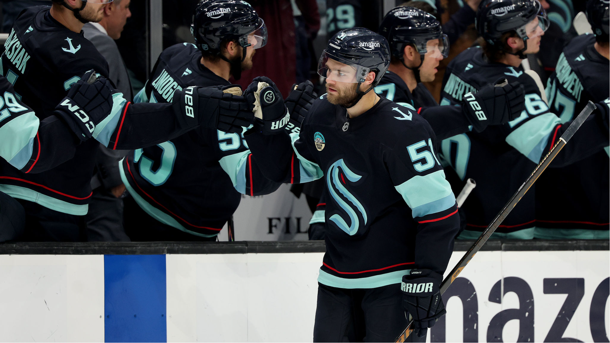
11 of 32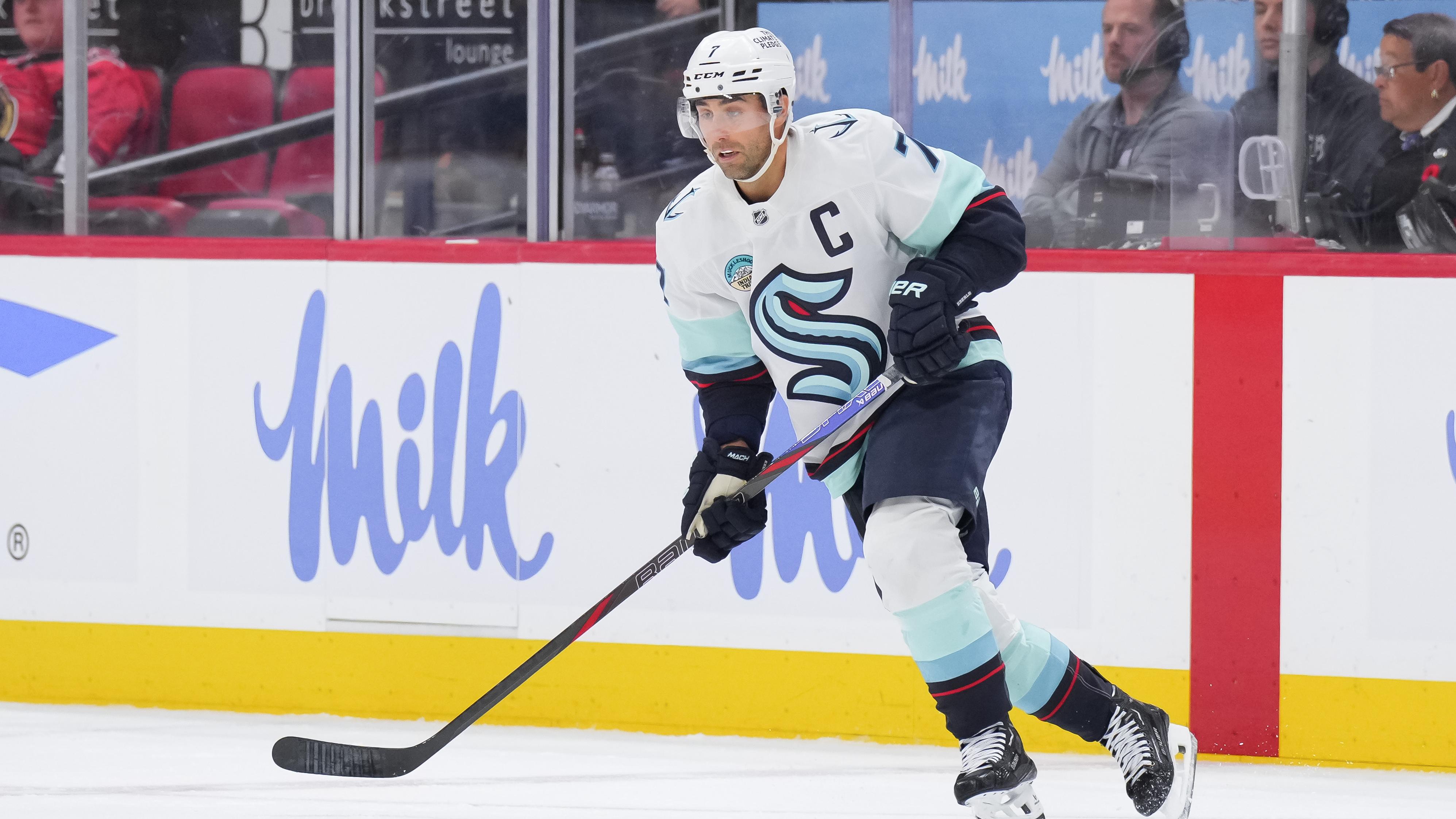
We loved the Kraken's home sweater and their new black alternates for invoking the grim horror of the deep, thanks to the deep, dark colors used on both. The contrast with the white road sweaters is quite striking.
Imagine seeing an abyssal horror in the brightest of daylight out on the high seas. Would it still be scary and a life-altering experience, or would you try to get a long-distance selfie with it in the background while on a ship or on shore?
That's kind of where our head is at on this one.
21. Anaheim Ducks
12 of 32
As gloriously orange as the Ducks' home jerseys are, their road sweaters are just as sweet with their modern old-school look.
The striping is good and there's still plenty of orange to be found in the sleeves and the shoulder yoke, but it's again so good to see the modern version of their original "Mighty" logo adorning the front.
It's a really good road sweater, and depending on your opinion of orange, it could be seen as superior to their home jersey. That's more of a dealer's choice kind of thing.
For us, it's a top-tier jersey.
20. Colorado Avalanche
13 of 32
While we nitpicked the Avalanche's home jersey a bit with some of the design choices for this modernization of their original jerseys from 1995, we're not as eager to do the same for their road sweaters.
Could it use a hint of black with the trim? Maybe, but using silver/gray for the outline to separate the burgundy and white works just as well and makes it a little more subtle.
What's not subtle is using the lighter blue color for the numbers on the back of the jersey. It's been like that since 2021, and we're still getting used to it. We liked black better for that, but leaning into your own team colors is something we can't really hate on, even if it makes us a little twitchy.
19. Chicago Blackhawks
14 of 32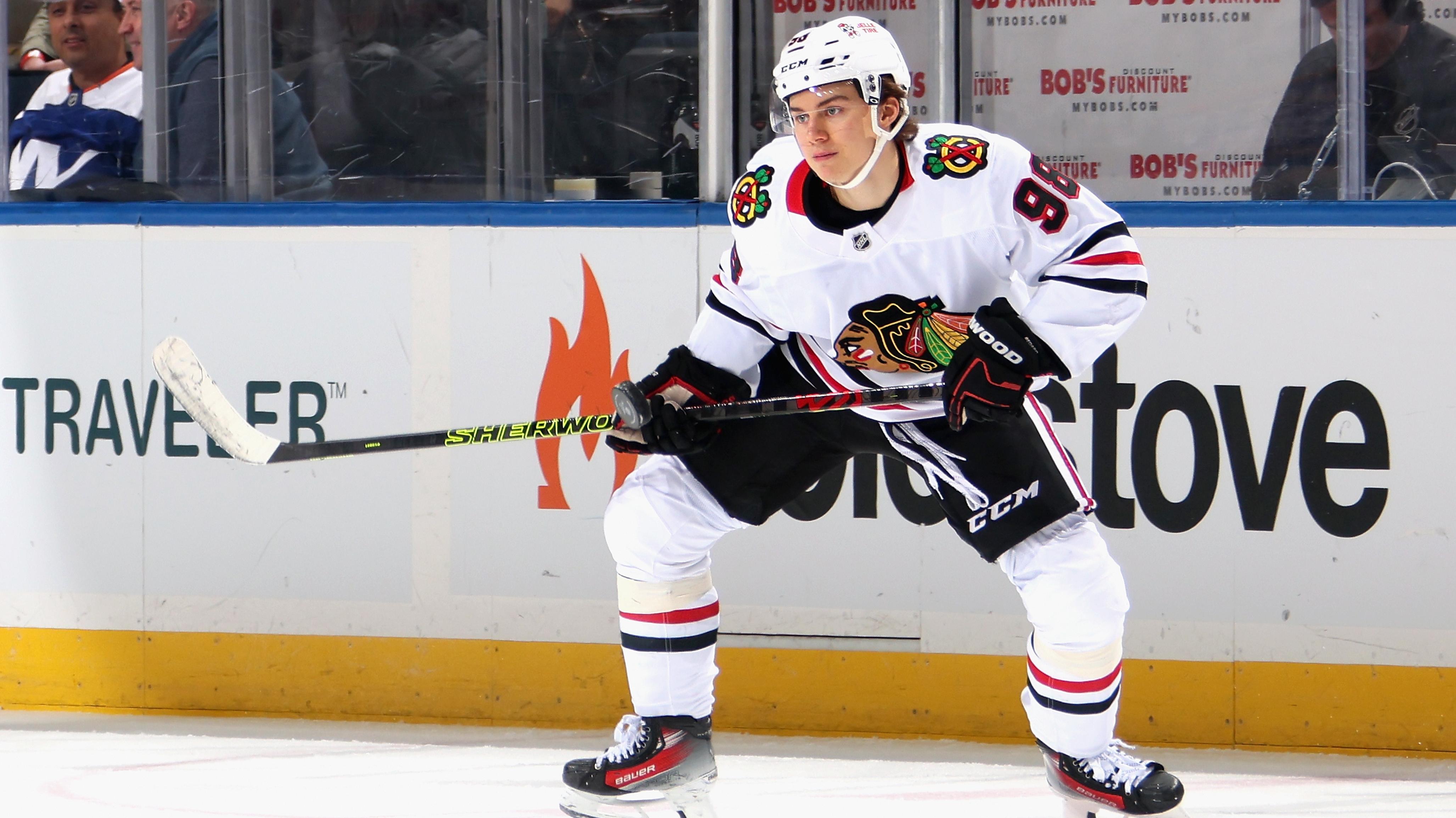
Chicago's road white sweater has been virtually unchanged since 1977, when the team was forced to put names on the back of the jerseys as per NHL rules. If you want to go back even further, then it's been basically unchanged since 1973, when they added trim to the numbers.
It's a classic look that's beloved by many and a style that's all their own.
18. Dallas Stars
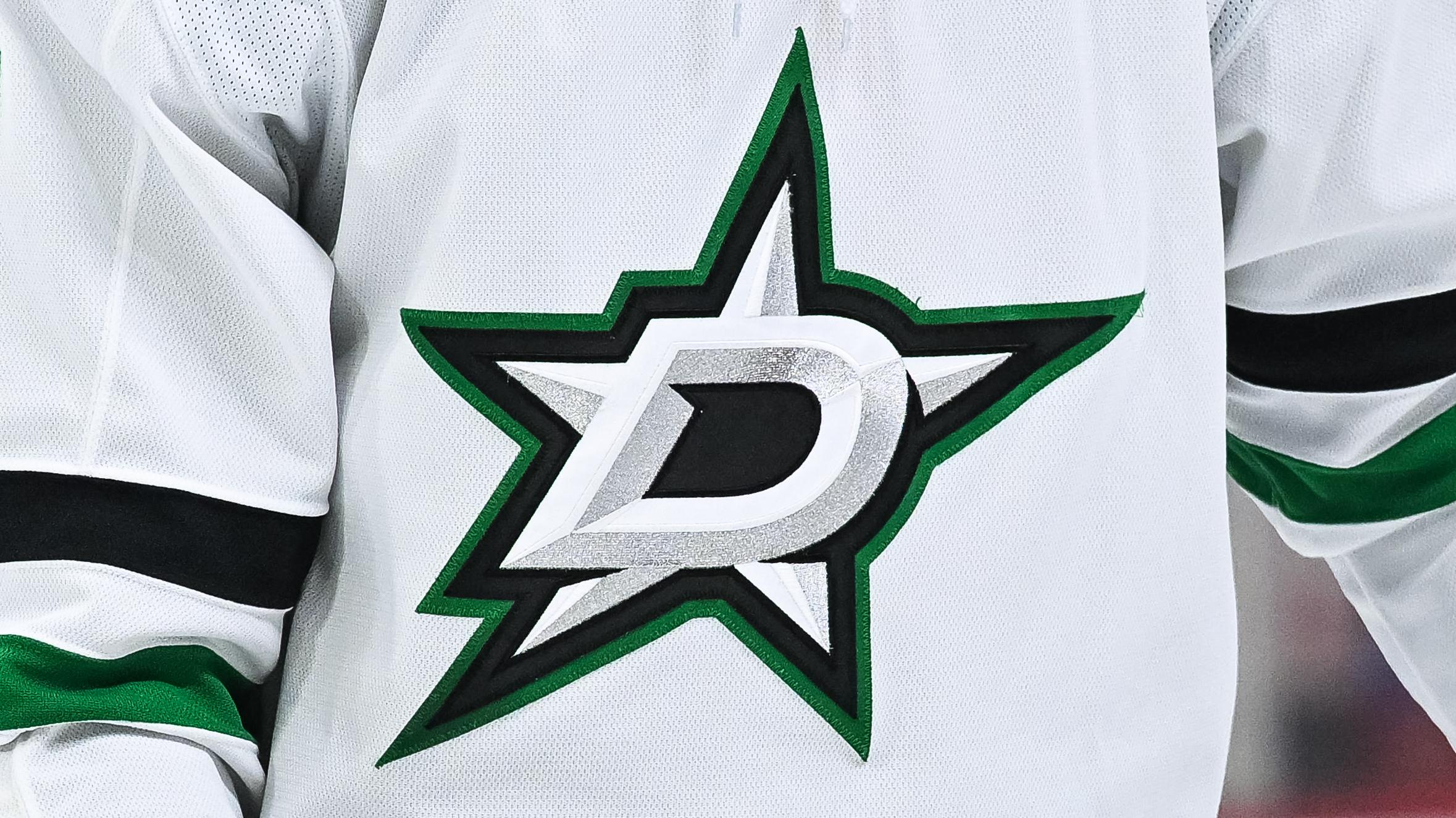
15 of 32
We were preparing ourselves to dog on the Stars' road jerseys after lauding the home sweaters so much, but when you soak it in and look at it with fresh eyes again, it really does just look fantastic.
Dallas knew the road jersey didn't need to be overly flashy with such a great logo on the front, and they also knew they needed to incorporate as much green as possible on a jersey meant to be mostly white.
Done and done.
The stripes on the sleeve are ideal, and the green shoulder yoke serves as a reminder that, yes, your team is facing the Dallas Stars. Simple, clean, and outstanding.
17. New York Islanders
16 of 32
Sure, we might be all-consumed by nostalgia here, but the simplicity of the New York Islanders' road white jersey is just so, so good.
There's no messing around here. White jersey, blue and orange stripes, giant Islanders logo crest. The blue numbers and letters with orange trim are simple and block, too.
Is it plain? Sure. Is it simple? Yes. Is it boring? You could call it that, but when you factor in the history involved with that look, it's suddenly very much iconic.
16. Ottawa Senators
17 of 32
When the Senators turned back the clock in 2021 with their home and road jerseys, Ottawa fans were the biggest winners, as their team's white jerseys, worn on the road, create a legendary look that's not that old.
Ottawa's road jerseys are styled after what they wore when the team began play in 1992 and wore until 2007. With their original logo back as the crest, the classic red and black style of striping, and their original secondary logo back on the shoulders, it was a look fans missed desperately.
The Senators rolling it back to this jersey was a huge win for them, and now that they've made it back to the playoffs in it, it feels like a long-time wrong has been righted.
15. Winnipeg Jets
18 of 32
While the Winnipeg Jets' home jerseys lost a comparison battle with their alternate jersey, the road white sweaters don't have any such in-house distraction, and for good reason.
The Jets' road sweaters are outstanding.
Winnipeg hasn't changed its home and road sets since moving up from Atlanta, and although this can sometimes cause issues since people prefer new looks or the originals become outdated, that hasn't been the case here.
The Jets' road white jersey has some of those past designer quirks to it (sleeve stripes wrapped around the sleeves that are split colored), but it all feels and looks good. Maybe it's the color scheme or the outstanding team logo with superb secondary logos on the shoulders, but it's harmonious in a way that it really shouldn't be at all.
14. Vancouver Canucks
19 of 32
Vancouver's road sweaters are the epitome of clean when it comes to looks.
The white jersey with blue and green stripes and the Canucks' orca logo on the front is genuinely a very good look, and the jersey just pulls it all together in a way that screams "hockey."
Like with their home jerseys, using a stylized version of the Canucks original logo on each shoulder adds to the look and pays reverence to the team's roots as well. Every bit of this jersey scratches a particular itch, and it's just a really good-looking sweater in general.
13. New Jersey Devils
20 of 32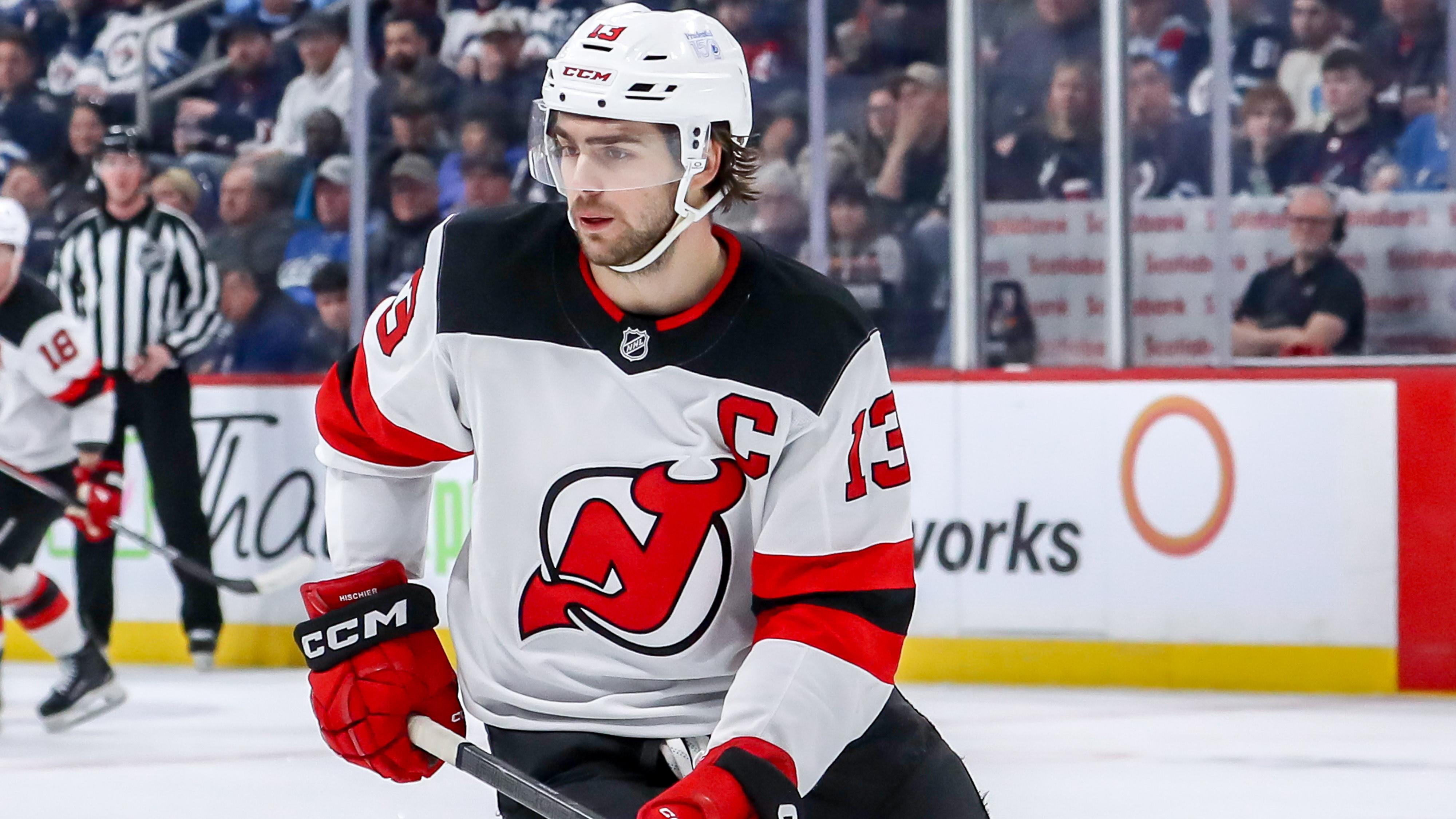
It's impossible to dislike the Devils' road white sweaters unless you're a New York Rangers or Islanders fan.
The Devils' color scheme is perfect for who they are, and with the iconic logo crest, it's a simple jersey that doesn't need to do any more than it's already set to do. If there's one issue we've got with this jersey (and with a few others) it's the squared off shoulder yoke.
We're sure that makes it easy to make the jerseys and keep the seams in harmony; we don't care for how it looks. Good thing for the Devils that everything else they've got going on with their jerseys is spot-on.
12. Los Angeles Kings
21 of 32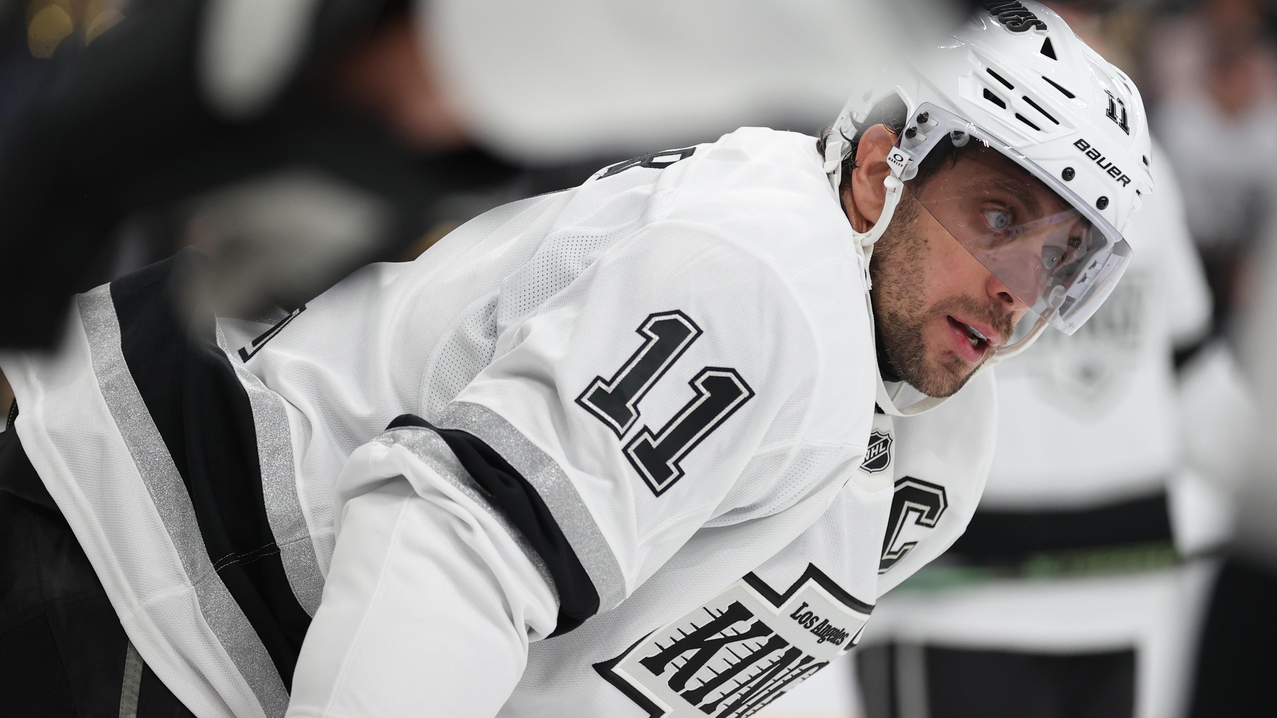
The Kings' decision to wind the clock back to the 90s and break out the silver and black attack once again, this time with a bolder version of that logo, was a great move. It helped us remember how absolutely sick the white jerseys were.
When the Kings come to town wearing these white sweaters with the silver and black stripes and that logo, if you're old enough to be immediately nostalgic, you are. And if you're not? You're wondering why they didn't wear these jerseys sooner.
It's a classically styled jersey with a simple design. When you've got a logo as good as the Kings have, you don't have to do a lot of work to grab more attention. These jerseys command it the second you see them hit the ice.
11. Philadelphia Flyers
22 of 32
The Flyers bringing back their look from the 80s, including the slightly darker shade of burnt orange to go with black, made it feel like all was right in the world again.
With orange sleeves with black cuffs and the Flyers' iconic logo on the front, it's an ideal look for them and for hockey in general. Whether it makes you think of Bobby Clarke and Bill Barber or Brian Propp and Ron Hextall, it all makes sense.
The smallest of small nitpicks we have for this jersey is with the sleeve numbers. Having them just be white without black trim makes us a bit twitchy, but we also understand that's what sets it apart from more recent looks. Fine.
10. Boston Bruins
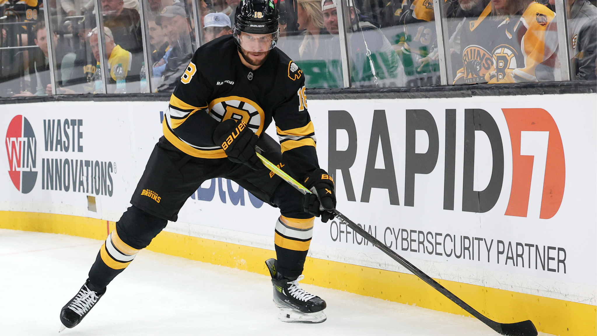
23 of 32
The Bruins' wholesale change to their home and road jerseys is a massive overall win, and while the black home jersey is excellent, the road white one is equally impressive in terms of clean, perfect design.
We know these jerseys were based on their home and road sweaters from the late '70s, '80s, and early '90s, and as far as inspiration goes, that's the right way to go with it. The white road jerseys remind us of when Cam Neely and Ray Bourque owned the ice through the '80s and '90s in Boston, and how, if it wasn't for those pesky Edmonton Oilers, they might've won a couple of Stanley Cups.
The new-old white road jerseys are among the best in the league.
9. Pittsburgh Penguins
24 of 32
The truth about doing rankings on road jerseys is that there are so many absolute bangers that it's hard to give ranks without upsetting people, who might think we dislike a jersey.
We're mentioning this now, not because this classic all-time great Penguins look is going to rank out poorly, far from it, but also because the Pens were one of the leaders in the clubhouse for switching back to an old look that probably never should've been changed in the first place.
The skating penguin logo on the front of the white jersey, paired with a triangle, creates an all-time great look. The striping and the way the yellow and black pop make it so good that it's worth noting how they revisited this '90s look in 2016 and never looked back.
8. St. Louis Blues
25 of 32
Remember when the Blues wore this style of jersey at the 2022 Winter Classic, and many of us wondered why they didn't wear it for the rest of the season on the road?
Fortunately, the Blues heard those internal cries and put them into action when they changed their home and road kits this year, and the road sweaters really hit it big.
The Blues took virtually the same jerseys they wore during that Winter Classic, ditched the old-timey cream color for natural white, and ran with it.
Why didn't they do this forever ago?!
This jersey is instantly among the best in the league, a stark contrast to the years of having one of the worst jersey sets in the league. It's such a rapid change for the better; our heads are still spinning.
7. Toronto Maple Leafs
26 of 32
Say what you will about the Maple Leafs, and we certainly already have, their road sweaters are as good as it gets.
The white jersey with blue stripes and the Maple Leafs logo crest on the front embodies the essence of hockey. It's a history of both the franchise and the sport itself. The rivalry with the Canadiens, especially when they wear their iconic red sweaters, creates one of the most visually appealing matchups in all of sports.
On-ice playoff success aside, very few teams can outclass the Maple Leafs when it comes to how they look on the road. There's no mistaking who is in town when they hit the ice on the road, and chances are you'll hear it from their fans decked out in the same gear, too.
6. New York Rangers
27 of 32
The teams in the tri-state area consistently deliver with their sweaters.
The only catch is that the New York Rangers have been around a lot longer than the Islanders and Devils, and they nailed their looks ages ago.
The Rangers' white road sweater is among the most easily identifiable looks in the league, hands down. The striping on the sleeves and hem, the unique shoulder striping, and the drop shadowing of the letters and numbers are elements they've been incorporating into Rangers sweaters since 1947.
Love or hate the Rangers all you want, they're always going to look good, especially when they're on the road.
5. Montreal Canadiens
28 of 32
We all love the classics, don't we, and the Montréal Canadiens' road sweater is as good as it gets.
This particular style for the Habs has been in use since 1947, and we're pretty sure the only reason why they're a little different now is because the NHL mandated that teams put last names on the back of jerseys in 1977. Otherwise, the Canadiens would be out there with just numbers on the back and sleeves like they did back when Rocket Richard was roaring up and down the ice at The Forum.
Like everything with the Canadiens, they're often imitated and never duplicated with the class and respect these jerseys command.
Simple, elegant, perfect.
4. Detroit Red Wings
29 of 32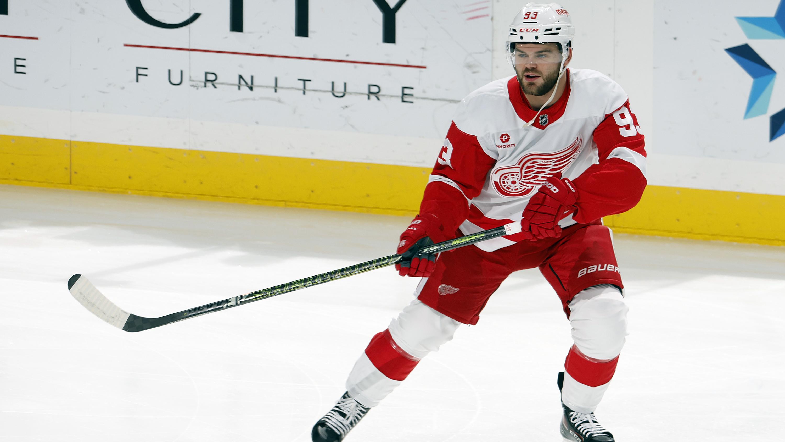
If jersey designs and classic looks were what determined the Stanley Cup finalists every year, the Detroit Red Wings would be Cup contenders every year without fail.
Detroit's road white jersey is perfect. The red stripes are simple, the winged wheel logo in red and white is iconic, and as simple and block as the numbers are, the arched italic lettering on the back is iconic on its own.
It's easy to be an Original Six team and be able to run back designs that have worked for decades, but it's something else to make it look great even when things on the ice might be a bit more trying.
3. Buffalo Sabres
30 of 32
It's probably because I'm based in Buffalo and cover the Sabres that most of the comments I heard about where I ranked their home blue sweaters were accompanied by takes from fans about how the white road jerseys are better.
And they are.
They're far, far better than the royal blue home sweaters, but that doesn't mean the sky-high ranking we gave the Blues was wrong. Oh no, that just meant the white ones would be right in the same neighborhood.
The white jerseys allow the blue and gold to pop and seize your eyes. The striping and shoulder yoke design are perfect, and with the team's logo as the crest, it once again proves that old designs are the best designs.
2. Calgary Flames
31 of 32
The Flames' full uniform set, home and road, is elite. It's S-tier great, and very few teams can even consider themselves to compete to have the best set in the NHL.
As good as the home red jerseys are for being red, the road white sweaters allow the full palette to not just sing but melt your face off with how incredible it is. The white jersey with the red and gold stripes and the incredible flaming "C" logo is an untouchable look.
What started in Atlanta was perfected in Calgary in many ways, but these jerseys, which received their brightest spotlight in the '80s, were always among the best, and the franchise's decision to bring them back years ago was the best move they could've made.
1. Edmonton Oilers
32 of 32
It's kind of amusing that for so many years, the Oilers changed up their jersey looks in an effort to break the shackles of the past and move forward, where all they had to do to really make it work was just keep winning and go to the Stanley Cup Final repeatedly.
The Oilers' road white jersey is as good as it gets, and the fact that the current age of hockey's best players, like Connor McDavid and Leon Draisaitl, also get to wear the same style that Wayne Gretzky and Mark Messier wore in the '80s adds to the iconography of it.
From the logo to the stripes to the shoulder yoke, every element screams hockey and greatness, and it's a scar against history that the Oilers' decision makers ever thought they could do better than this.

-(1).jpg)
-(3).jpg)

.jpg)
.jpg)
