JMenuBar JToolBar JMenuItem JMenu JSeparator
Restrict JToolBar docking to vertical only.
Section titled “Restrict JToolBar docking to vertical only.”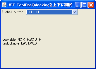
DockingConstraint
This setting restricts JToolBar docking to only the top and bottom, ignoring left and right docking.
Right-align icon buttons in JToolBar
Section titled “Right-align icon buttons in JToolBar”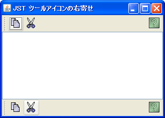
Add a semi-transparent shadow to the menu.
Section titled “Add a semi-transparent shadow to the menu.”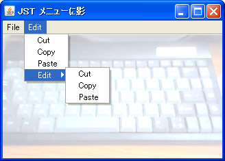
MenuWithShadow
A border is set for the JPopupMenu opened from JMenu, and a semi-transparent shadow is added.
Add recently used files to JMenu
Section titled “Add recently used files to JMenu”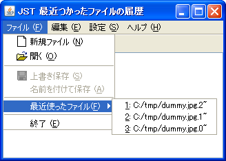
The Separator is displayed with a wavy line.
Section titled “The Separator is displayed with a wavy line.”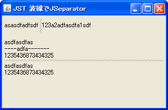
WavyLineSeparator
We will create a JSeparator that generates wave patterns using icons and then arranges them in order to draw a wavy line.
Separator gradient
Section titled “Separator gradient”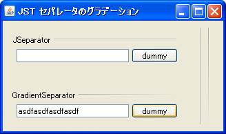
Gradient
We will create a JSeparator that gradually blends into the background color using a gradient created with GradientPaint.
Generate a menu bar from a resource file.
Section titled “Generate a menu bar from a resource file.”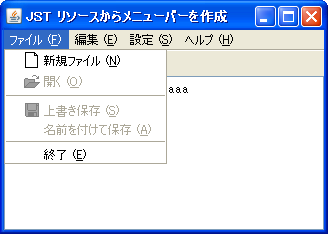
Open a pop-up menu from JToggleButton
Section titled “Open a pop-up menu from JToggleButton”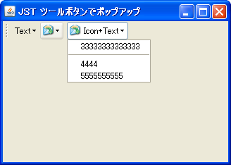
ToolButtonPopup
Create a JToggleButton that displays a pop-up menu when clicked, and add it to the toolbar.
Display JPopupMenu by long-pressing the button.
Section titled “Display JPopupMenu by long-pressing the button.”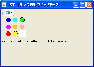
PressAndHoldButton
Add a button to JToolBar that displays JPopupMenu when long-pressed and the selected menu when clicked.
Display an image as the background of the JMenuBar.
Section titled “Display an image as the background of the JMenuBar.”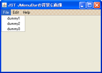
MenuBarBackground
If JMenu is not selected, its background will be made transparent, allowing the image set as the background of JMenuBar to be displayed.
Change the check icon of JCheckBoxMenuItem
Section titled “Change the check icon of JCheckBoxMenuItem”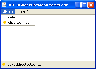
Change the check icon of JRadioButtonMenuItem
Section titled “Change the check icon of JRadioButtonMenuItem”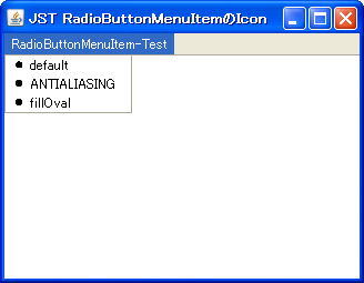
JMenuBar’s JMenu wrap
Section titled “JMenuBar’s JMenu wrap”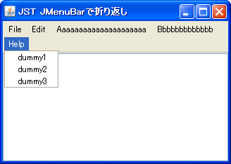
Transparency and animation of JToolBar
Section titled “Transparency and animation of JToolBar”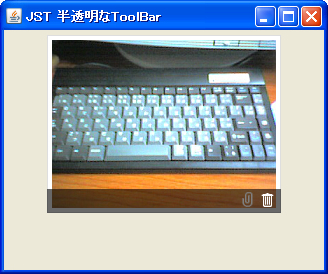
TranslucentToolBar
This adds a semi-transparent JToolBar that only appears when the mouse cursor is over the component.
Create a TitledSeparator using TitledBorder and MatteBorder.
Section titled “Create a TitledSeparator using TitledBorder and MatteBorder.”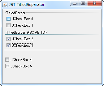
Makes the PopupMenu opened from JMenu etc. semi-transparent.
Section titled “Makes the PopupMenu opened from JMenu etc. semi-transparent.”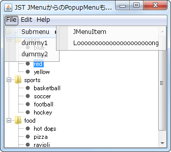
TranslucentSubMenu
Make the parent JWindow, JMenu, and JMenuItem of JPopupMenu transparent, and make JPopupMenu semi-transparent.
A pop-up menu can be displayed within the JMenu area using the mouse cursor.
Section titled “A pop-up menu can be displayed within the JMenu area using the mouse cursor.”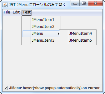
PopupWithoutClickOnMenu
This setting will cause a pop-up menu to open when the mouse cursor enters the JMenu area.
Close the window from JPopupMenu, etc.
Section titled “Close the window from JPopupMenu, etc.”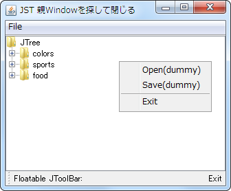
WindowClosingAction
Create an Action in JPopupMenu or JToolBar to close the parent window.
Testing highlighting for disabled JMenuItem
Section titled “Testing highlighting for disabled JMenuItem”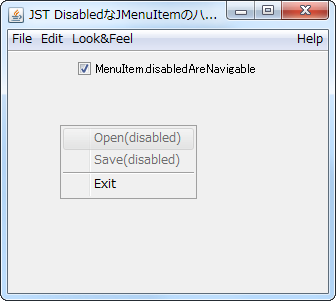
DisabledAreNavigable
We test whether a disabled JMenuItem can be highlighted for each LookAndFeel.
Drag and rearrange the icons placed in the JToolBar.
Section titled “Drag and rearrange the icons placed in the JToolBar.”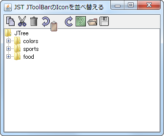
RearrangeToolBarIcon
You can rearrange the icons placed in the JToolBar by dragging and dropping them.
Right-align the display of the Accelerator in JMenuItem.
Section titled “Right-align the display of the Accelerator in JMenuItem.”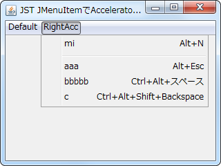
MenuItemAcceleratorAlignment
This changes the alignment of the JMenuItem's Accelerator display to the right.
Place a JButton inside a JMenuItem.
Section titled “Place a JButton inside a JMenuItem.”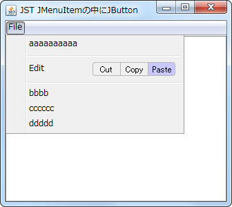
ButtonsInMenuItem
Place a JButton inside the JMenuItem to perform cut, copy, and paste operations.
Add JSeparator to JTextPane
Section titled “Add JSeparator to JTextPane”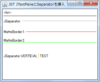
SeparatorOnTextPane
Add elements such as hr, JSeparator, or a JLabel with a MatteBorder to the JTextPane as separators.
The JToolBar can be moved by dragging, but it cannot be detached.
Section titled “The JToolBar can be moved by dragging, but it cannot be detached.”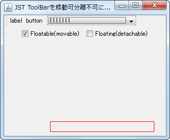
NonDetachableToolBar
This setting allows you to drag and move the JToolBar within the same container, but prevents it from being separated into a different window.
Align the text positions of JMenuItems and other elements added to the JMenu.
Section titled “Align the text positions of JMenuItems and other elements added to the JMenu.”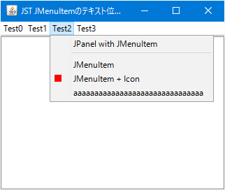
MenuItemTextAlignment
This aligns the text positions of components such as JMenuItem and JLabel that have been added to the JMenu.
Configure the system so that clicking the JCheckBoxMenuItem does not close the JPopupMenu.
Section titled “Configure the system so that clicking the JCheckBoxMenuItem does not close the JPopupMenu.”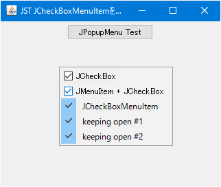
StayOpenCheckBoxMenuItem
Add a JCheckBoxMenuItem or JCheckBox to JPopupMenu that is configured to keep the popup open even after clicking.
Always display the underline for Mnemonics such as JMenuItem.
Section titled “Always display the underline for Mnemonics such as JMenuItem.”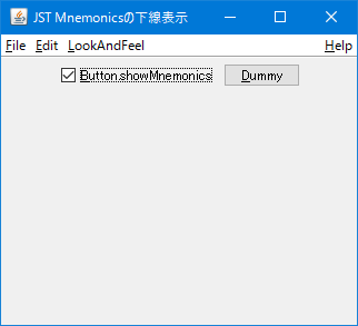
ShowMnemonics
This setting ensures that the underline of the Mnemonic you've set for JMenuItem, JButton, etc., is always displayed when using WindowsLookAndFeel.
Configure JToolBar to float at a specified position upon startup.
Section titled “Configure JToolBar to float at a specified position upon startup.”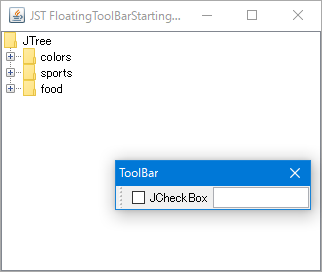
FloatingToolBarStartingLocation
This setting ensures that when the application is launched, the JToolBar is positioned in a floating state at the specified location.
Set the minimum width of JPopupMenu.
Section titled “Set the minimum width of JPopupMenu.”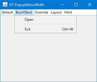
Set the rollover state of the JToolBar.
Section titled “Set the rollover state of the JToolBar.”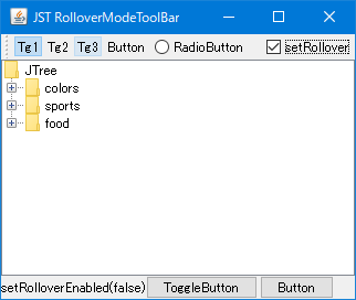
RolloverModeToolBar
This sets the rollover state of the JToolBar and changes the display of internally configured elements such as the JToggleButton.
When a JToolBar is dragged out, change its LayoutManager.
Section titled “When a JToolBar is dragged out, change its LayoutManager.”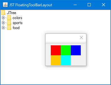
FloatingToolBarLayout
When a JToolBar is dragged out, its LayoutManager is changed from the default BoxLayout to GridLayout.
Change the ArrowIcon in JMenu
Section titled “Change the ArrowIcon in JMenu”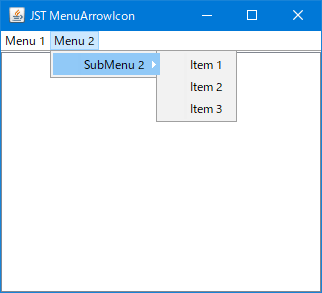
MenuArrowIcon
This modifies the shape and selection color of the ArrowIcon displayed on the far right of JMenu.
Adjust the position of the check icon in the JCheckBoxMenuItem.
Section titled “Adjust the position of the check icon in the JCheckBoxMenuItem.”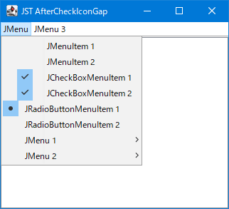
AfterCheckIconGap
Adjusts the position where the checkbox icon is displayed for JCheckBoxMenuItem and JRadioButtonMenuItem.
Set the border color of the button placed in the JToolBar.
Section titled “Set the border color of the button placed in the JToolBar.”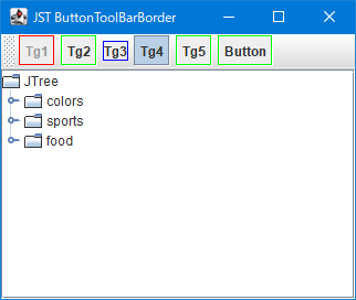
ButtonToolBarBorder
This sets the border color of JToggleButtons and JButtons placed in the JToolBar.
If you cancel a JMenu in the JMenuBar, the selection state will be maintained.
Section titled “If you cancel a JMenu in the JMenuBar, the selection state will be maintained.”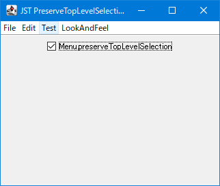
PreserveTopLevelSelection
This setting determines whether the selection state of a JMenu directly under the JMenuBar is retained when it is closed by canceling.
Configure the behavior when a Mnemonic key for another JMenu is pressed while a JMenu is already displayed.
Section titled “Configure the behavior when a Mnemonic key for another JMenu is pressed while a JMenu is already displayed.”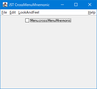
CrossMenuMnemonic
This setting determines whether to toggle the popup display of a top-level JMenu when a Mnemonic key is pressed to open another top-level JMenu while a top-level JMenu is already displayed.
Change the behavior when canceling JPopupMenu opened from JMenu.
Section titled “Change the behavior when canceling JPopupMenu opened from JMenu.”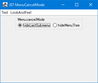
MenuCancelMode
This setting determines whether to close the JPopupMenu opened from JMenu via the current submenu or close the entire menu tree when the JPopupMenu is canceled.
Disable right-click selection in JMenu and JMenuItem.
Section titled “Disable right-click selection in JMenu and JMenuItem.”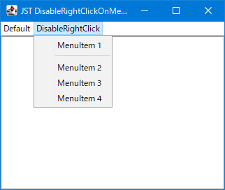
DisableRightClickOnMenu
This setting disables the right-click selection of JMenu and JMenuItem when using WindowsLookAndFeel.
Add headers and footers to JComboBox dropdown lists
Section titled “Add headers and footers to JComboBox dropdown lists”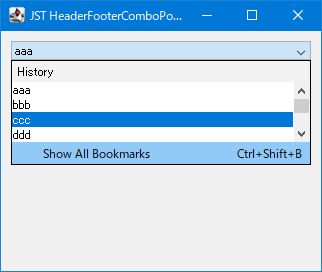
HeaderFooterComboPopup
This adds a JLabel header and a JMenuItem footer to the JComboBox dropdown list.
Change the position of JPopupMenu, which is opened from JMenu.
Section titled “Change the position of JPopupMenu, which is opened from JMenu.”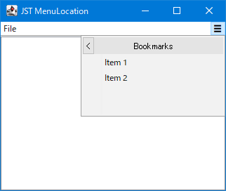
MenuLocation
Select JMenu and change its position so that JPopupMenu, which opens, is displayed within the parent window.
Change the drag icon in JToolBar
Section titled “Change the drag icon in JToolBar”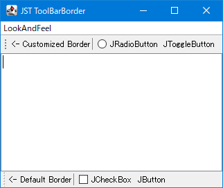
ToolBarBorder
This modifies the drag icon that appears as a border when the JToolBar is movable.
Retrieve the JMenu used as the SystemMenu.
Section titled “Retrieve the JMenu used as the SystemMenu.”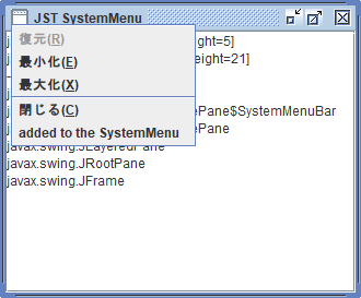
SystemMenu
This searches for the child components of JRootPane and retrieves the JMenu being used as the SystemMenu.
Change the layout of the popup window opened from JMenu to two columns.
Section titled “Change the layout of the popup window opened from JMenu to two columns.”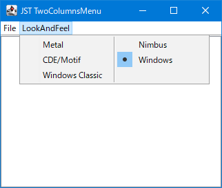
TwoColumnsMenu
Change the layout of the popup window that opens when you click JMenu to GridLayout to display JMenuItem and other elements in two columns.
Draw paragraph borders using JSeparator.
Section titled “Draw paragraph borders using JSeparator.”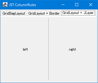
ColumnRules
This draws a JSeparator as a border between columns created using a GridLayout or similar.
Use the checkbox to toggle the display of the JSlider added to JPopupMenu.
Section titled “Use the checkbox to toggle the display of the JSlider added to JPopupMenu.”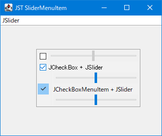
SliderMenuItem
You can toggle the display of JSliders added to JPopupMenu using JCheckBoxes and JCheckBoxMenuItems, which are also added to JPopupMenu.
Change the background color of the JToolBar when it is moving or dockable.
Section titled “Change the background color of the JToolBar when it is moving or dockable.”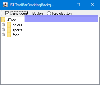
ToolBarDockingBackground
This changes the background and border colors of the JToolBar when it is moving or when it is in a position where it can be docked while moving.
Disable drag-out with the right mouse button in JToolBar.
Section titled “Disable drag-out with the right mouse button in JToolBar.”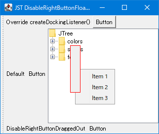
DisableRightButtonFloating
This restricts drag-out of the JToolBar to only being possible with the left mouse button.
Place a JMenuBar inside a JToolBar and configure it to be detachable and movable.
Section titled “Place a JMenuBar inside a JToolBar and configure it to be detachable and movable.”
FloatableMenuBar
By placing a JMenuBar inside a JToolBar, you can create a menu that can be separated and moved.
Specify the size of the JSeparator for JToolBar.
Section titled “Specify the size of the JSeparator for JToolBar.”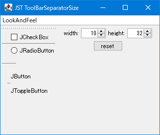
ToolBarSeparatorSize
This tests the resizing of the JToolBar.Separator, which is specifically for JToolBar.
Hide the check icon for JRadioButtonMenuItem and reduce the text offset.
Section titled “Hide the check icon for JRadioButtonMenuItem and reduce the text offset.”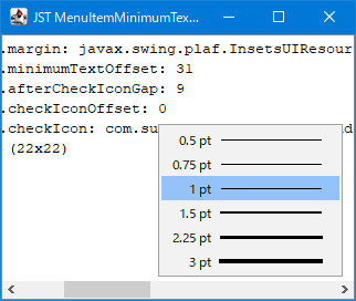
MenuItemMinimumTextOffset
The check icon of the JRadioButtonMenuItem is hidden, and its spacing is reduced by changing the minimum text offset.
Set ToolTip text for JMenuItem
Section titled “Set ToolTip text for JMenuItem”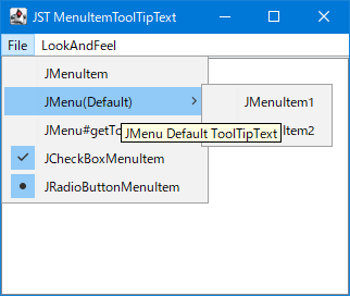
MenuItemToolTipText
This sets the ToolTip text for MenuElements such as JMenuItem, JMenu, and JCheckBoxMenuItem.
Set the delay time from when JMenu is displayed until JPoppupMenu is displayed.
Section titled “Set the delay time from when JMenu is displayed until JPoppupMenu is displayed.”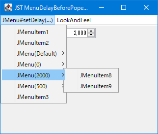
MenuDelayBeforePopedUp
If JMenu is a submenu, set the delay time before JPopupMenu is displayed.
Change the display of the Accelerator in JMenuItem
Section titled “Change the display of the Accelerator in JMenuItem”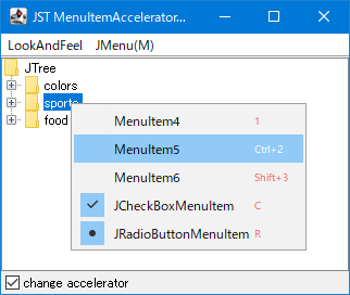
MenuItemAcceleratorFont
This changes the font size and color of the Accelerator set in the JMenuItem.
Switch the display direction of JToolTip depending on the position of the JToolBar.
Section titled “Switch the display direction of JToolTip depending on the position of the JToolBar.”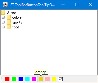
ToolBarButtonToolTipOrientation
The JToolTip display position of JButtons placed inside the JToolBar is always switched to face inward, depending on the JToolBar's position, orientation (vertical/horizontal), and language-dependent orientation.
Round the corners of JPopupMenu
Section titled “Round the corners of JPopupMenu”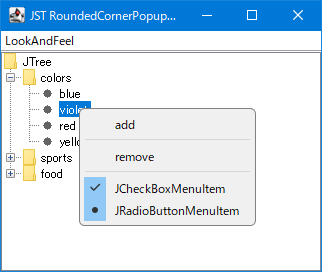
RoundedCornerPopupMenu
The background of JPopupMenu is made transparent, and a rounded border is applied to it.
Draw a rounded rectangle over the selection rollover of a JMenuItem.
Section titled “Draw a rounded rectangle over the selection rollover of a JMenuItem.”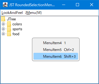
RoundedSelectionMenuItem
This sets the JMenuItem selection rollover to draw a rounded rectangle instead of a simple rectangle.
Switching between JToolBar and JMenuBar
Section titled “Switching between JToolBar and JMenuBar”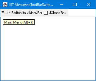
MenuAndToolBarSwitching
Click the hamburger menu-style JButton placed in the JToolBar to switch it with the JMenuBar.
Change the height of the JSeparator for JPopupMenu
Section titled “Change the height of the JSeparator for JPopupMenu”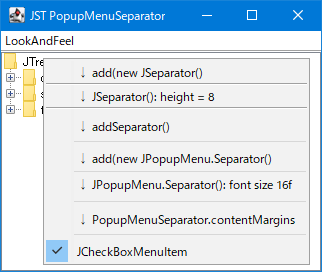
PopupMenuSeparator
This modifies the height and length of the JSeparator added to JPopupMenu.
Change the layout of the JMenuBar to position the JMenu vertically.
Section titled “Change the layout of the JMenuBar to position the JMenu vertically.”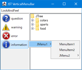
VerticalMenuBar
We will change the JMenuBar layout to a vertical BoxLayout to create a sidebar that arranges the JMenus vertically.
Distinguish whether the TrayIcon was single-clicked or double-clicked.
Section titled “Distinguish whether the TrayIcon was single-clicked or double-clicked.”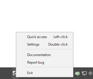
SingleAndDoubleClicksOnTrayIcon
TrayIcon distinguishes between single-click and double-click with the mouse and switches the window that opens accordingly.
Place JSpinner as a MenuItem in JPopupMenu.
Section titled “Place JSpinner as a MenuItem in JPopupMenu.”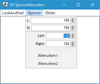
SpinnerMenuItem
Use components such as JSpinner or JSlider that do not implement MenuElement as MenuItems for JPopupMenu.
Place a scrollable JList in the JPopupMenu of the JMenu.
Section titled “Place a scrollable JList in the JPopupMenu of the JMenu.”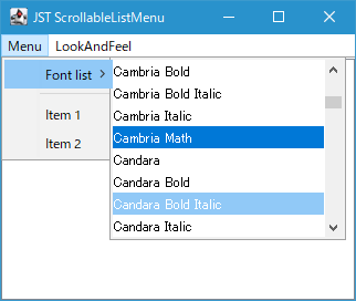
ScrollableListMenu
Instead of using JMenuItem, we'll use JList, which allows scrolling and selection, for the JPopupMenu of JMenu.
Move JMenu items that overflow from the JMenuBar to the overflow menu.
Section titled “Move JMenu items that overflow from the JMenuBar to the overflow menu.”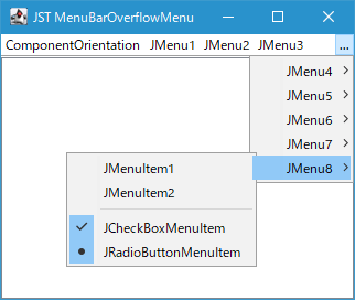
MenuBarOverflowMenu
This program moves JMenus that overflow the JMenuBar's display width to a newly created overflow menu, making them viewable.
Filter the display of JMenuItem using a JTextField added to JPopupMenu.
Section titled “Filter the display of JMenuItem using a JTextField added to JPopupMenu.”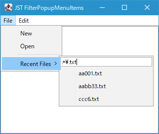
FilterPopupMenuItems
A JTextField is placed at the beginning of the JPopupMenu, and the regular expression pattern entered is used to filter the display state of the JMenuItem, which is also placed within the JPopupMenu.
The ends of the JSeparator are drawn with a fade-out effect.
Section titled “The ends of the JSeparator are drawn with a fade-out effect.”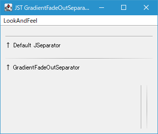
GradientFadeOutSeparator
We'll use RadialGradientPaint to draw the JSeparator so that both ends fade out.
Adds a selection highlight to a JMenu
Section titled “Adds a selection highlight to a JMenu”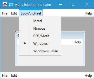
MenuSelectionIndicator
Adds an underline or overline to the top-level JMenu you added to the JMenuBar to highlight its selected state.
Group JList items
Section titled “Group JList items”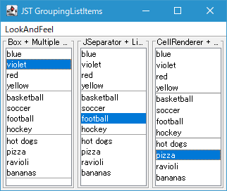
Drag and rearrange JMenus placed on the JMenuBar
Section titled “Drag and rearrange JMenus placed on the JMenuBar”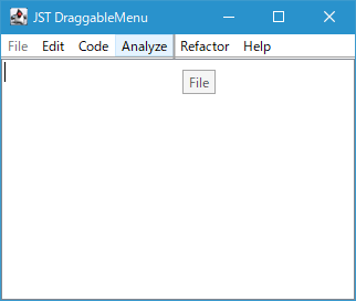
DraggableMenu
Enables rearranging top-level JMenus placed on the JMenuBar via mouse drag.
Display JPopupMenu and JToolBar simultaneously in a popup window.
Section titled “Display JPopupMenu and JToolBar simultaneously in a popup window.”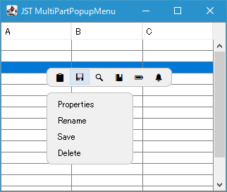
MultiPartPopupMenu
Change the JPopupMenu background to transparent and separate the JToolBar and menu button to display both at the same time.