JComboBox
Arrange two JButtons, one on the left and one on the right, within the JComboBox.
Section titled “Arrange two JButtons, one on the left and one on the right, within the JComboBox.”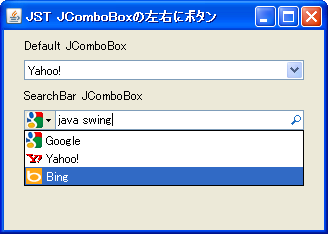
SearchBarLayoutComboBox
We'll change the layout used by JComboBox to create a search bar-like component.
Place a JButton in the EditorComponent of the JComboBox.
Section titled “Place a JButton in the EditorComponent of the JComboBox.”
ButtonInComboEditor
Place JButtons, JLabels, etc., into the EditorComponent of the JComboBox.
JComboBox inner margin
Section titled “JComboBox inner margin”
PaddingComboBox
This sets the inner margins for the editor and other elements of the JComboBox.
Clip the item string of the JComboBox from the left side.
Section titled “Clip the item string of the JComboBox from the left side.”
LeftClippedComboBox
If the item string of the JComboBox is longer than the component, it will be clipped from the left.
Using enums as the model for JComboBox
Section titled “Using enums as the model for JComboBox”
Maintain the JComboBox dropdown list width above the specified value.
Section titled “Maintain the JComboBox dropdown list width above the specified value.”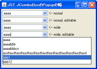
ComboPopupWidth
This setting ensures that when the JComboBox dropdown list is displayed, it will not fall below a certain width, even if the main body is narrow.
JComboBox Item History
Section titled “JComboBox Item History”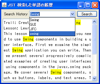
DropDownHistory
This function sequentially saves items such as text entered in a JComboBox.
Disable item selection in JComboBox
Section titled “Disable item selection in JComboBox”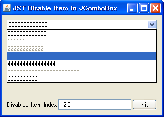
DisableItemComboBox
This method disables the selection of a specified item in a JComboBox dropdown list.
Looping through item selection in a JComboBox
Section titled “Looping through item selection in a JComboBox”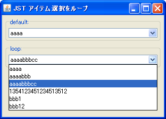
LoopComboBox
This sets the JComboBox item selection to loop using the up and down arrow keys.
Scroll a popup menu using JComboBox
Section titled “Scroll a popup menu using JComboBox”
Clip the JComboBox items to the left and right to position them.
Section titled “Clip the JComboBox items to the left and right to position them.”
ClippedLRComboBox
The layout within the JComboBox item is split into two parts, a main and a sub, and each displays a string abbreviated to an appropriate length.
Grouping JComboBox items by decorating them with a border.
Section titled “Grouping JComboBox items by decorating them with a border.”
Insert JSeparator into JComboBox
Section titled “Insert JSeparator into JComboBox”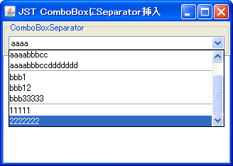
Arrange the JComboBox items on the left and right.
Section titled “Arrange the JComboBox items on the left and right.”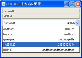
Change the color of the JComboBox
Section titled “Change the color of the JComboBox”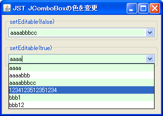
Change the text color of the JComboBox.
Section titled “Change the text color of the JComboBox.”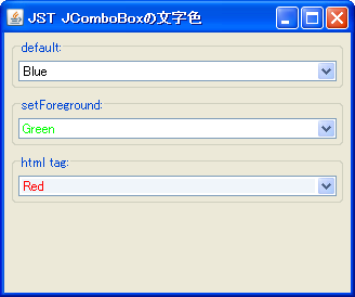
ComboBoxForegroundColor
This sets a cell renderer in the JComboBox that changes the text color of the selected cell item.
Display icons in JComboBox
Section titled “Display icons in JComboBox”
IconComboBox
Make the JComboBox editable and display icons in the text input and list sections.
Display a list of candidates using JComboBox
Section titled “Display a list of candidates using JComboBox”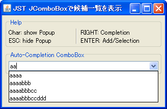
ComboBoxSuggestion
This adds a feature to display a list of suggested inputs to the JComboBox.
Change the value of the JComboBox using MouseWheel
Section titled “Change the value of the JComboBox using MouseWheel”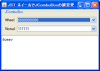
WheelCombo
When the JComboBox has focus, its value is changed by moving the MouseWheel up and down.
Set JComboBox to JTable’s CellRenderer
Section titled “Set JComboBox to JTable’s CellRenderer”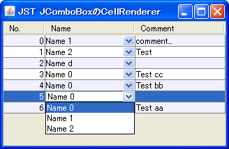
Set a JComboBox in the CellEditor of a JTable.
Section titled “Set a JComboBox in the CellEditor of a JTable.”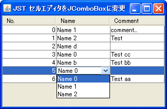
ComboCellEditor
We will use a JComboBox in the JTable's CellEditor to allow the user to select a value from a list.
Specify the width of JComboBox etc. by the number of columns.
Section titled “Specify the width of JComboBox etc. by the number of columns.”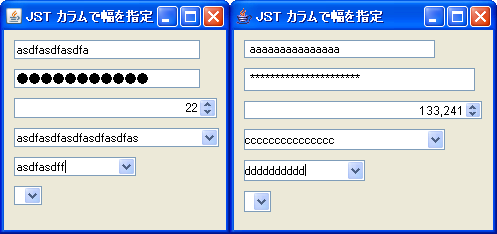
SetColumns
The widths of JTextField, JPasswordField, JSpinner, and JComboBox are compared by specifying the number of columns.
Changing the text color when JCheckBox etc. are disabled
Section titled “Changing the text color when JCheckBox etc. are disabled”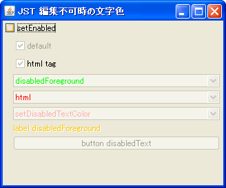
DisabledTextColor
This changes the text color when components such as JCheckBox and JComboBox are disabled.
Hide the ArrowButton in the JComboBox
Section titled “Hide the ArrowButton in the JComboBox”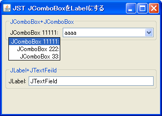
HideComboArrowButton
This hides the ArrowButton and makes the JComboBox display in a JLabel-like manner.
Change the height of the JComboBox
Section titled “Change the height of the JComboBox”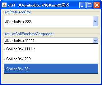
ComboItemHeight
This modifies the height of the JComboBox itself and the height of the items within the dropdown list.
Disable right-click in JComboBox dropdown list
Section titled “Disable right-click in JComboBox dropdown list”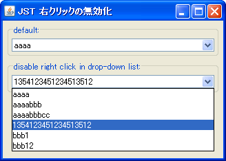
DisableRightClick
This disables right-click functionality in the JComboBox dropdown list.
Display the JComboBox’s PopupMenu on the right side.
Section titled “Display the JComboBox’s PopupMenu on the right side.”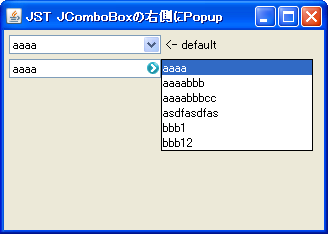
RightPopupMenuComboBox
Configure the JComboBox so that a PopupMenu is displayed to the right of it.
Displaying JComboBox items in a tree-like structure
Section titled “Displaying JComboBox items in a tree-like structure”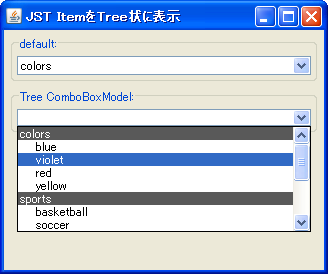
TreeComboBox
The items to be displayed in the JComboBox dropdown list are arranged in a tree-like structure.
Display JProgressBar within JComboBox
Section titled “Display JProgressBar within JComboBox”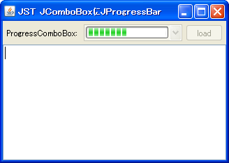
Change the border of the JComboBox
Section titled “Change the border of the JComboBox”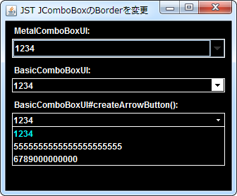
ComboBoxBorder
This modifies the border and color of the JComboBox display area, arrow buttons, and dropdown list.
Round the corners of the JComboBox.
Section titled “Round the corners of the JComboBox.”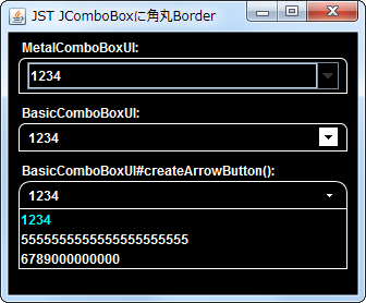
RoundedComboBox
This sets a border to round the top-left and top-right corners of the JComboBox.
Displaying an AnimatedGIF in a JComboBox
Section titled “Displaying an AnimatedGIF in a JComboBox”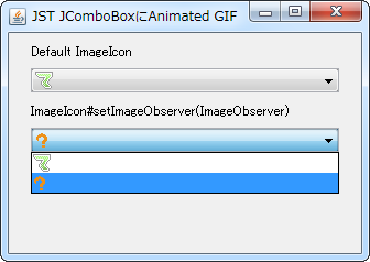
AnimatedIconInComboBox
This displays an animated GIF in a JComboBox and its dropdown list.
Add padding to the JComboBox set in the JTable’s CellEditor.
Section titled “Add padding to the JComboBox set in the JTable’s CellEditor.”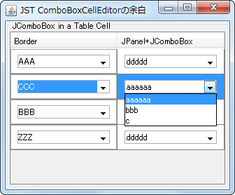
ComboBoxCellEditorInsets
This adds padding to the JComboBox set in the JTable's CellEditor.
Delete an item using a JButton added to the dropdown list of a JComboBox.
Section titled “Delete an item using a JButton added to the dropdown list of a JComboBox.”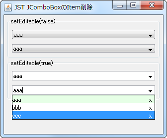
RemoveButtonInComboItem
In the JButton dropdown list, add a clickable JButton for each item and then remove it.
Sets the maximum number of items displayed in a JComboBox dropdown list.
Section titled “Sets the maximum number of items displayed in a JComboBox dropdown list.”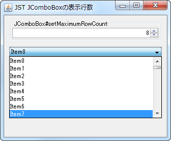
MaximumRowCount
This changes the number of items that can be displayed in a JComboBox dropdown list without using a scrollbar.
Use JComboBox instead of JSpinner
Section titled “Use JComboBox instead of JSpinner”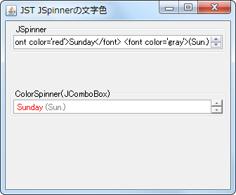
SpinnerTextColor
By using JComboBox instead of JSpinner, we are able to change the text color and other properties of the items.
Use JPanel, which contains JComboBox and other elements, in the JTree cell editor.
Section titled “Use JPanel, which contains JComboBox and other elements, in the JTree cell editor.”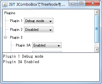
ComboBoxCellEditor
We will use JPanel, which contains JComboBox and other elements, as the cell editor and cell renderer for JTree.
Set prototype values to determine the cell size of the JComboBox.
Section titled “Set prototype values to determine the cell size of the JComboBox.”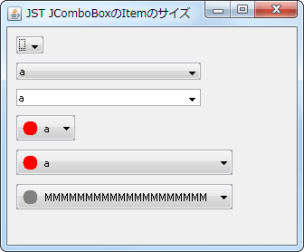
PrototypeDisplayValue
This sets the prototype value that the JComboBox uses to determine its cell size.
Set a JComboBox with hidden ArrowButtons in the CellEditor of a JTable.
Section titled “Set a JComboBox with hidden ArrowButtons in the CellEditor of a JTable.”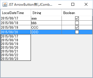
NoArrowButtonComboCellEditor
We will use a JComboBox with the ArrowButton hidden as the CellEditor for the JTable.
Set a JLayer in the ComboBoxEditor to display the validity of the input.
Section titled “Set a JLayer in the ComboBoxEditor to display the validity of the input.”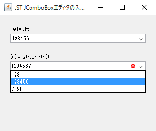
ComboBoxEditorVerifier
A JLayer is set in the ComboBoxEditor of the JComboBox, and an icon is displayed if the input is invalid.
Configure the JComboBox cell editor so that the dropdown list is not displayed immediately after editing begins.
Section titled “Configure the JComboBox cell editor so that the dropdown list is not displayed immediately after editing begins.”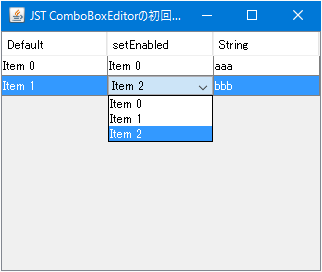
CellEditorTogglePopup
When a JComboBox is set as the cell editor for a JTable, and editing of that cell begins, the dropdown list will not be displayed immediately; instead, the cell will be in a selected state.
Select the edited text in the JComboBox from the dropdown list.
Section titled “Select the edited text in the JComboBox from the dropdown list.”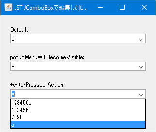
ComboBoxDropdownSelection
This setting allows you to select an item from a JComboBox if the edited text is present in the dropdown list.
Setting rounded corners for a JComboBox dropdown list.
Section titled “Setting rounded corners for a JComboBox dropdown list.”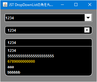
RoundedDropDownList
We obtain a BasicComboPopup from the JComboBox and set a rounded border for it.
Select multiple JCheckBoxes displayed as items in a JComboBox.
Section titled “Select multiple JCheckBoxes displayed as items in a JComboBox.”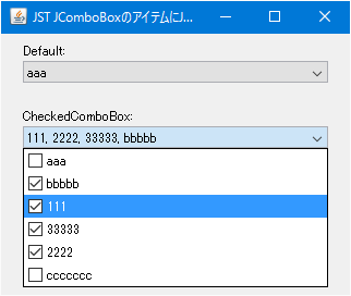
CheckedComboBox
This displays a JCheckBox as an item in a JComboBox, and sets it to allow multiple selections while keeping the dropdown list open.
Use an editable JComboBox as the cell editor for a JTable.
Section titled “Use an editable JComboBox as the cell editor for a JTable.”
EditableComboCellEditor
Apply an editable JComboBox as a cell editor for the JTable, allowing you to add cell values and perform other actions.
Set the JComboBox to a state where no selection is made.
Section titled “Set the JComboBox to a state where no selection is made.”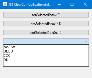
Set ToolTipText for each item in the JComboBox and for each ArrowButton.
Section titled “Set ToolTipText for each item in the JComboBox and for each ArrowButton.”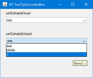
ToolTipInComboBox
Set a different ToolTipText for each list item in the JComboBox and for each ArrowButton.
Set the placeholder string for when no item is selected in a JComboBox.
Section titled “Set the placeholder string for when no item is selected in a JComboBox.”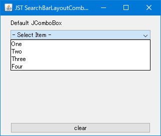
ComboBoxPlaceholder
This sets a placeholder string to display when no item is selected in a JComboBox.
Update the state of the items in the JComboBox dropdown list.
Section titled “Update the state of the items in the JComboBox dropdown list.”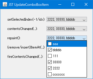
UpdateComboBoxItem
Updates the state and rendering of the items set in the JComboBox dropdown list.
Test the behavior of the ActionListener when the Enter key is pressed in a JComboBox popup menu.
Section titled “Test the behavior of the ActionListener when the Enter key is pressed in a JComboBox popup menu.”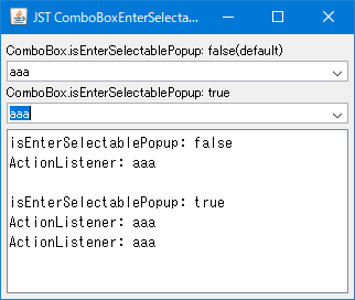
ComboBoxEnterSelectablePopup
This tests the behavior of an ActionListener when the Enter key is pressed in the pop-up menu of an editable JComboBox.
Change the background color of the selection in the JComboBox dropdown list.
Section titled “Change the background color of the selection in the JComboBox dropdown list.”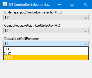
ComboBoxSelectionBackground
This modifies the background color and text color of the selected JList item used in the dropdown list of a JComboBox.
Move the focus to the target JTextField before opening JPopupMenu.
Section titled “Move the focus to the target JTextField before opening JPopupMenu.”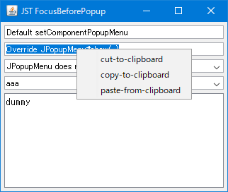
FocusBeforePopup
When opening a JPopupMenu set in a JTextField or similar by right-clicking with the mouse, move the focus to it and select all the text.
Using a JTable as a dropdown list in a JComboBox
Section titled “Using a JTable as a dropdown list in a JComboBox”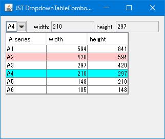
DropdownTableComboBox
Use a JTable instead of a JList as the dropdown list for the JComboBox.
Let’s compare the differences in behavior between ItemListener and ActionListener.
Section titled “Let’s compare the differences in behavior between ItemListener and ActionListener.”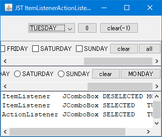
ItemListenerActionListener
This test compares the behavior of ItemListener and ActionListener set in JComboBox, JCheckBox, etc.
Change the target of the JComboBox’s FocusBorder from the internal items to the JComboBox itself.
Section titled “Change the target of the JComboBox’s FocusBorder from the internal items to the JComboBox itself.”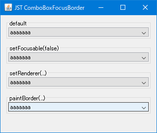
ComboBoxFocusBorder
This method hides the dotted FocusBorder applied to internal items in a JComboBox using WindowsLookAndFeel, and instead displays a solid FocusBorder on the JComboBox itself.
Disable item selection via keyboard input in JComboBox
Section titled “Disable item selection via keyboard input in JComboBox”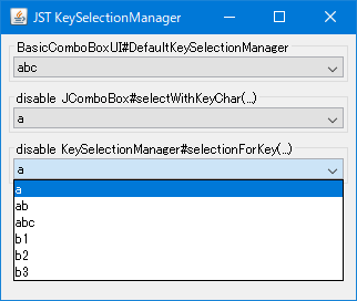
KeySelectionManager
This disables item selection in a JComboBox dropdown list if the first character of an item matches a key input.
Sets the key input delay time used for leading string searches in JComboBox, JList, JTree, etc.
Section titled “Sets the key input delay time used for leading string searches in JComboBox, JList, JTree, etc.”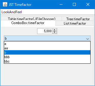
TimeFactor
This setting configures the multi-key input delay time used for searching the first string via key input in the detailed views of JComboBox, JList, JTree, JFileChooser, etc.
Add an editable JCheckBox to the ComboBoxEditor of a JComboBox.
Section titled “Add an editable JCheckBox to the ComboBoxEditor of a JComboBox.”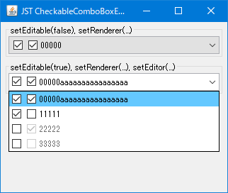
CheckableComboBoxEditor
Set the JComboBox to be editable and configure a JPanel containing multiple JCheckBoxes and JTextFields as the ComboBoxEditor.
Copy JComboBox items using keyboard input or JPopupMenu.
Section titled “Copy JComboBox items using keyboard input or JPopupMenu.”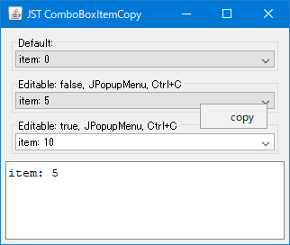
Set a JLayer in a ComboBoxEditor to display placeholder strings.
Section titled “Set a JLayer in a ComboBoxEditor to display placeholder strings.”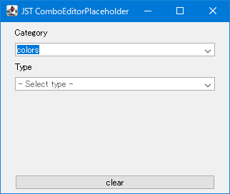
ComboEditorPlaceholder
This code sets a JLayer to the ComboBoxEditor of a JComboBox and displays a placeholder string if its text is empty.
Enable the display of a JToolTip when the text in a JComboBox overflows.
Section titled “Enable the display of a JToolTip when the text in a JComboBox overflows.”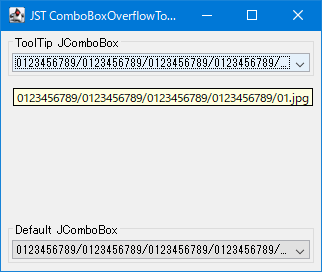
ComboBoxOverflowToolTips
This setting allows JToolTip to be displayed only when the item string of the JComboBox overflows from the JComboBox itself or the dropdown list cell.
Set the cell layout of the JComboBox dropdown list to newspaper style.
Section titled “Set the cell layout of the JComboBox dropdown list to newspaper style.”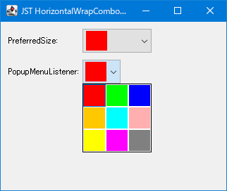
HorizontalWrapComboPopup
This changes the cell layout of the JList elements in the JComboBox dropdown list to a newspaper style.
Round the corners of the JScrollPane.
Section titled “Round the corners of the JScrollPane.”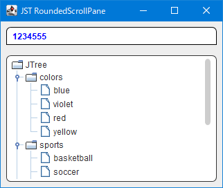
Highlight list items in a JComboBox using the Highlighter.
Section titled “Highlight list items in a JComboBox using the Highlighter.”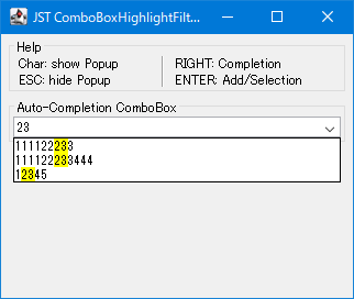
ComboBoxHighlightFilter
Use a JTextField as the cell renderer for a JComboBox to highlight the string in the list item that matches the string being entered in the editor.
Add headers and footers to JComboBox dropdown lists
Section titled “Add headers and footers to JComboBox dropdown lists”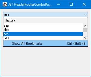
HeaderFooterComboPopup
This adds a JLabel header and a JMenuItem footer to the JComboBox dropdown list.
Change the JScrollBar used in the dropdown list of the JComboBox.
Section titled “Change the JScrollBar used in the dropdown list of the JComboBox.”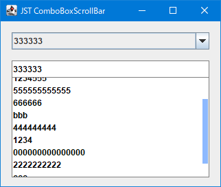
ComboBoxScrollBar
This modifies the width, style, and presence/absence of increment/decrement buttons of the vertical JScrollBar used in the JComboBox dropdown list.
Configure the JComboBox dropdown list to open using the up arrow key.
Section titled “Configure the JComboBox dropdown list to open using the up arrow key.”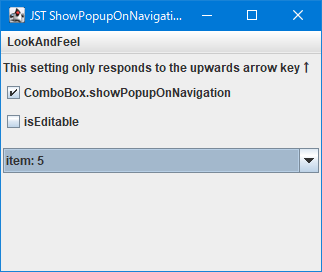
ShowPopupOnNavigation
This setting allows the dropdown list to open not only with the down arrow key but also with the up arrow key when the JComboBox has focus.
NimbusLookAndFeel toggles whether an uneditable JComboBox displays as a button-like rollover.
Section titled “NimbusLookAndFeel toggles whether an uneditable JComboBox displays as a button-like rollover.”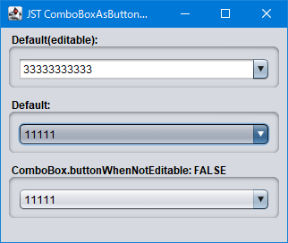
ComboBoxAsButtonWhenNotEditable
This toggles whether NimbusLookAndFeel displays a rollover state like a JButton when the mouse cursor hovers over a non-editable JComboBox.
Modify NimbusLookAndFeel to retrieve the cell selection color from JList.
Section titled “Modify NimbusLookAndFeel to retrieve the cell selection color from JList.”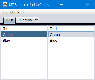
RendererUseListColors
This will modify NimbusLookAndFeel to retrieve the cell selection color from JList instead of using the color set in UIDefaults.
If the focus movement to the JComboBox is rejected by InputVerifier validation, cancel the display of the dropdown list.
Section titled “If the focus movement to the JComboBox is rejected by InputVerifier validation, cancel the display of the dropdown list.”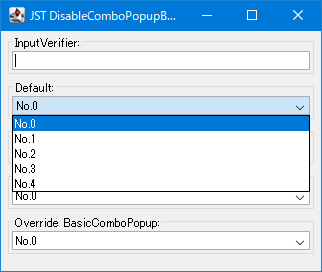
DisableComboPopupByVerifier
If a mouse click to a JComboBox is rejected by an InputVerifier set in another component, the display of that dropdown list will be canceled.
Disable cursor key navigation in JComboBox dropdown lists.
Section titled “Disable cursor key navigation in JComboBox dropdown lists.”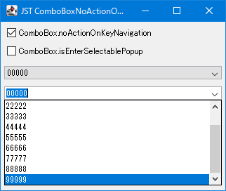
ComboBoxNoActionOnKeyNavigation
This setting prevents the display of items in the JComboBox itself from changing even when the item selection state in the JComboBox's dropdown list changes due to cursor key input.
Change the height of the JComboBox dropdown list by dragging with the mouse.
Section titled “Change the height of the JComboBox dropdown list by dragging with the mouse.”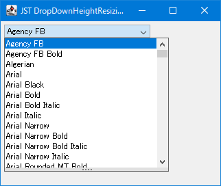
DropDownHeightResizing
This adds a draggable icon to the bottom of the JComboBox's dropdown list, allowing you to change its height by dragging it with the mouse.
Use a JList that can display multiple items as a ComboBoxEditor.
Section titled “Use a JList that can display multiple items as a ComboBoxEditor.”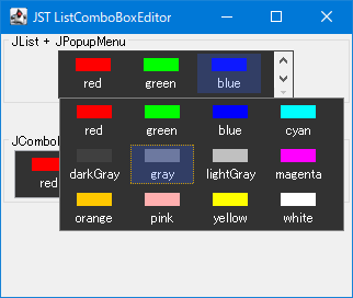
ListComboBoxEditor
We will use a newspaper-style JList as the ComboBoxEditor, which allows for the display and scrolling of multiple items.
Create a ButtonGroup or JComboBox for selecting an Enum constant using JRodioButton.
Section titled “Create a ButtonGroup or JComboBox for selecting an Enum constant using JRodioButton.”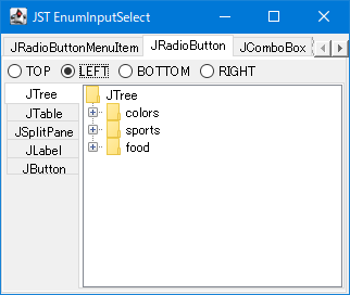
EnumInputSelect
This process creates selection components such as JRadioButton's ButtonGroup, JComboBox, and JSpinner from a list of enum constants and retrieves the specified enum constant.
Change the JComboBox dropdown list to two rows.
Section titled “Change the JComboBox dropdown list to two rows.”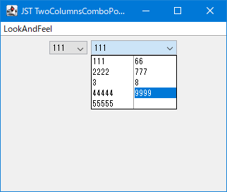
TwoColumnsComboPopup
Change the layout of the JComboBox dropdown list to display list items in two rows.
Change the cell selection color of a JComboBox using NimbusLookAndFeel.
Section titled “Change the cell selection color of a JComboBox using NimbusLookAndFeel.”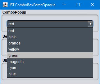
ComboBoxForceOpaque
NimbusLookAndFeel is used to change the background color, cell selection color, and selected text color of a JComboBox.
Change the item selection status display in the JComboBox dropdown list to a rounded rectangle.
Section titled “Change the item selection status display in the JComboBox dropdown list to a rounded rectangle.”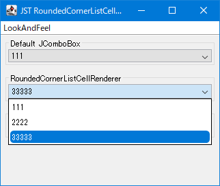
RoundedCornerListCellRenderer
This creates a ListCellRenderer that changes the item selection status display for the dropdown list used in a JComboBox to a rounded rectangle.
Switch the border of a JComboBox depending on whether the dropdown list is displayed.
Section titled “Switch the border of a JComboBox depending on whether the dropdown list is displayed.”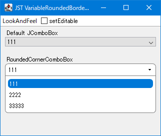
VariableRoundedBorderOnComboBox
Switch the JComboBox's border setting while the dropdown list is displayed, so that the left and right edges are drawn as straight lines.
Modify the selection movement action using the up and down arrow keys in a JComboBox.
Section titled “Modify the selection movement action using the up and down arrow keys in a JComboBox.”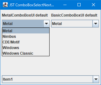
ComboBoxSelectNextPrevious
The selection movement actions using the up and down arrow keys in a JComboBox differ depending on the LookAndFeel, so we will unify them.
Get the component that implements ItemSelectable from ItemListener.
Section titled “Get the component that implements ItemSelectable from ItemListener.”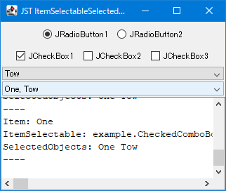
ItemSelectableSelectedObjects
This test retrieves the source component that implements the ItemSelectable configured with the ItemListener, as well as the selected item, etc.
Set the upper limit for the number of selectable items within a JCheckBox group.
Section titled “Set the upper limit for the number of selectable items within a JCheckBox group.”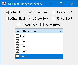
LimitNumberOfCheckBoxSelections
This feature groups JCheckBoxes based on whether they are located within the same JPanel or JComboBox, and then limits the number of JCheckBoxes that can be selected within that group.
Using cells of different heights in a JComboBox dropdown list
Section titled “Using cells of different heights in a JComboBox dropdown list”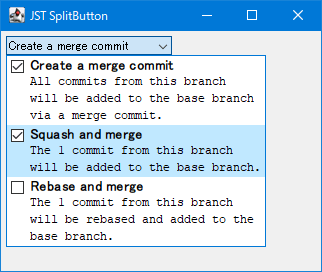
SplitButton
As a cell renderer for a JComboBox, a JPanel containing a JCheckBox for selection status, a JTextArea for multi-line text, etc., is used to draw cells of different heights.
Always open JPopupMenu as a heavy popup.
Section titled “Always open JPopupMenu as a heavy popup.”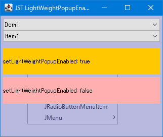
LightWeightPopupEnabled
Instead of switching between lightweight and heavy popups based on the display position of JPopupMenu, configure it to always use the heavy popup.