JCheckBox JCheckBoxMenuItem
Display a JCheckBox in a JTable cell and change the row background color.
Section titled “Display a JCheckBox in a JTable cell and change the row background color.”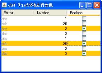
CheckedRowColor
If a JCheckBox displayed in a JTable cell is checked, the background color of that row will be changed.
Changing the text color when JCheckBox etc. are disabled
Section titled “Changing the text color when JCheckBox etc. are disabled”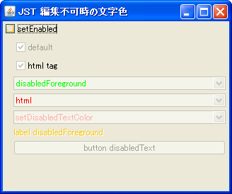
DisabledTextColor
This changes the text color when components such as JCheckBox and JComboBox are disabled.
Change the check icon of JCheckBoxMenuItem
Section titled “Change the check icon of JCheckBoxMenuItem”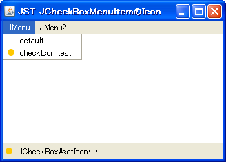
Add a JCheckBox to the JTableHeader to switch the cell value.
Section titled “Add a JCheckBox to the JTableHeader to switch the cell value.”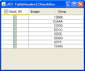
TableHeaderCheckBox
Add a JCheckBox to the JTableHeader and switch all the values displayed in the JCheckBoxes in the same column.
Roll over a JCheckBox cell.
Section titled “Roll over a JCheckBox cell.”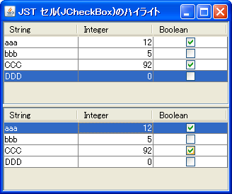
RolloverBooleanRenderer
This setting allows you to configure JCheckBoxes to roll over with the mouse cursor even when using them in JTable cells.
Place multiple JCheckBoxes in a JTable cell.
Section titled “Place multiple JCheckBoxes in a JTable cell.”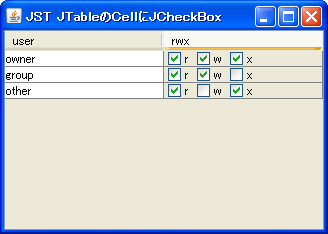
Convert JTree leaf nodes to JCheckBoxes
Section titled “Convert JTree leaf nodes to JCheckBoxes”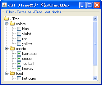
Display directory structure with JTree with JCheckBox
Section titled “Display directory structure with JTree with JCheckBox”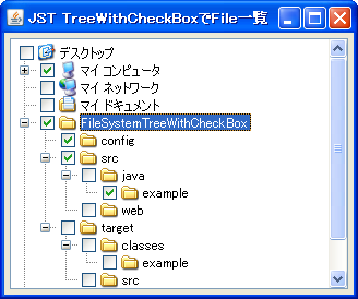
FileSystemTreeWithCheckBox
This displays the directory structure using a JTree with editable JCheckBoxes added to the nodes.
Use JCheckBox in JList cells
Section titled “Use JCheckBox in JList cells”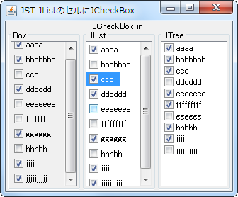
Add an icon with an undefined state to JCheckBox.
Section titled “Add an icon with an undefined state to JCheckBox.”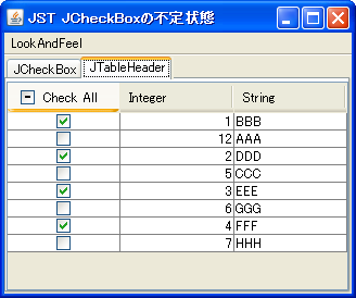
TriStateCheckBox
In addition to the selected and unselected states of JCheckBox, an icon will be added to represent an undefined state.
Add a JCheckBox to all nodes in the JTree.
Section titled “Add a JCheckBox to all nodes in the JTree.”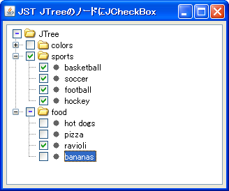
Using EnumSet for JTable columns
Section titled “Using EnumSet for JTable columns”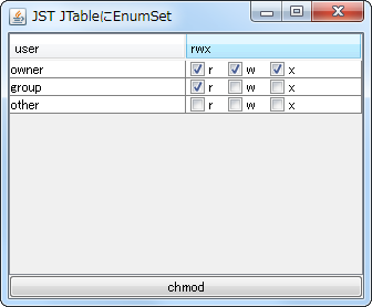
EnumSet
This code sets an EnumSet to a column in a JTable and displays its state using a renderer that utilizes a JCheckBox.
The JCheckBox check icon is positioned in the center of the first row.
Section titled “The JCheckBox check icon is positioned in the center of the first row.”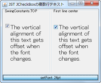
VerticalIconAlignMultilineText
This setting ensures that the check icon is centered on the first line when the JCheckBox text spans multiple lines.
Receive events when a JTable model is changed.
Section titled “Receive events when a JTable model is changed.”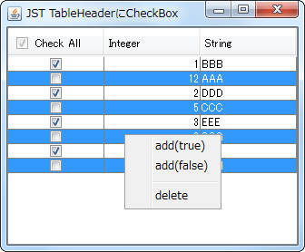
TableModelEvent
This process receives changes to the JTable model and updates the JCheckBox added to the JTableHeader.
Make only JCheckBoxes inside JTable cells clickable.
Section titled “Make only JCheckBoxes inside JTable cells clickable.”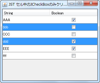
CheckBoxCellEditor
Set a JCheckBox placed in the center of the JPanel as the cell editor for the JTable, and configure it so that the selection state changes only when the JCheckBox is clicked.
Configure the system so that clicking the JCheckBoxMenuItem does not close the JPopupMenu.
Section titled “Configure the system so that clicking the JCheckBoxMenuItem does not close the JPopupMenu.”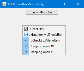
StayOpenCheckBoxMenuItem
Add a JCheckBoxMenuItem or JCheckBox to JPopupMenu that is configured to keep the popup open even after clicking.
The selection state of a JCheckBox is stored in a BigInteger, and the UndoManager is used to undo or redo the changes.
Section titled “The selection state of a JCheckBox is stored in a BigInteger, and the UndoManager is used to undo or redo the changes.”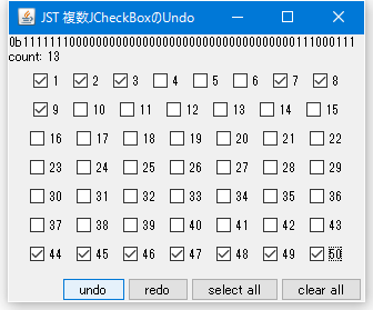
UndoRedoCheckBoxes
The selection states of multiple JCheckBoxes are stored in a BigInteger, and undo/redo operations are performed using UndoManager.
Select multiple JCheckBoxes displayed as items in a JComboBox.
Section titled “Select multiple JCheckBoxes displayed as items in a JComboBox.”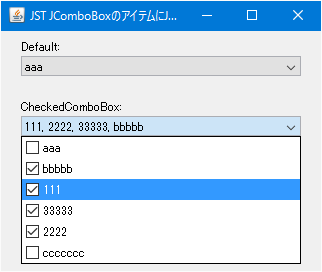
CheckedComboBox
This displays a JCheckBox as an item in a JComboBox, and sets it to allow multiple selections while keeping the dropdown list open.
Add an editable JCheckBox to the ComboBoxEditor of a JComboBox.
Section titled “Add an editable JCheckBox to the ComboBoxEditor of a JComboBox.”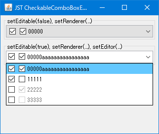
CheckableComboBoxEditor
Set the JComboBox to be editable and configure a JPanel containing multiple JCheckBoxes and JTextFields as the ComboBoxEditor.
Change the check icon in JCheckBox
Section titled “Change the check icon in JCheckBox”
Add a JCheckBox to the JTabbedPane tab.
Section titled “Add a JCheckBox to the JTabbedPane tab.”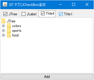
The selection state of a JCheckBox is managed using a BitSet.
Section titled “The selection state of a JCheckBox is managed using a BitSet.”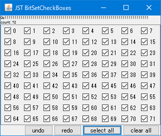
BitSetCheckBoxes
The selection states of multiple JCheckBoxes are managed using a BitSet.
Change the border of the check icon in JCheckBox to flat.
Section titled “Change the border of the check icon in JCheckBox to flat.”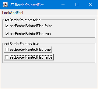
BorderPaintedFlat
This changes the border of the checkbox icon in JCheckBox to a flat drawing.
Enable JCheckBoxes in groups.
Section titled “Enable JCheckBoxes in groups.”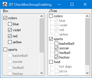
CheckBoxGroupEnabling
A group of parent and child JCheckBoxes is created from the TreeModel, and the child JCheckBox group is activated only when the parent JCheckBox is selected.
Resizing the checkbox icon in JCheckBox.
Section titled “Resizing the checkbox icon in JCheckBox.”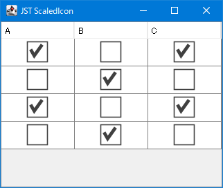
ScaledIcon
This resizes the checkbox icons of JCheckBoxes set in the JTable's cell editor and cell renderer according to the row height of the JTable.
Change the RolloverIcon of JCheckBox
Section titled “Change the RolloverIcon of JCheckBox”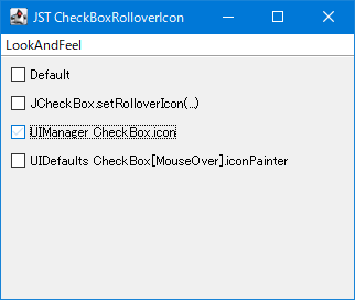
CheckBoxRolloverIcon
This modifies the RolloverIcon that appears when the mouse hovers over a JCheckBox.
Change the display magnification of the JTable.
Section titled “Change the display magnification of the JTable.”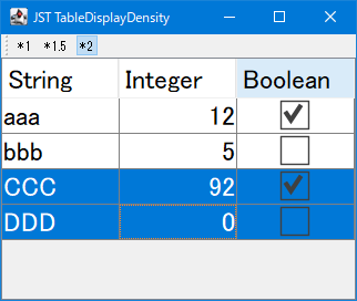
TableDisplayDensity
This modifies the display magnification by scaling the font size, row height, and check icons in the JTable.
Add row selection checkboxes to JTable cells.
Section titled “Add row selection checkboxes to JTable cells.”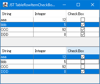
TableRowItemCheckBoxes
Add row selection checkboxes to JTable cells to enable the selection of multiple rows without keyboard input.
Set the upper limit for the number of selectable items within a JCheckBox group.
Section titled “Set the upper limit for the number of selectable items within a JCheckBox group.”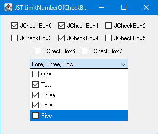
LimitNumberOfCheckBoxSelections
This feature groups JCheckBoxes based on whether they are located within the same JPanel or JComboBox, and then limits the number of JCheckBoxes that can be selected within that group.
Change the background color of the checkbox and JRadioButton check icons.
Section titled “Change the background color of the checkbox and JRadioButton check icons.”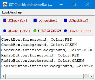
CheckIconInteriorBackground
This modifies the interior background color used for drawing the check icon of JCheckBox and JRadioButton.
Add a JCheckBox to a JList cell to enable multiple selections using only the mouse.
Section titled “Add a JCheckBox to a JList cell to enable multiple selections using only the mouse.”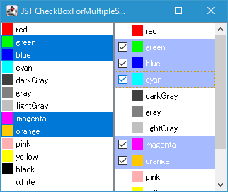
CheckBoxForMultipleSelectionsInListCell
Add a JCheckBox to a JList cell and configure it so that clicking the JCheckBox with the mouse allows you to select or deselect the cell.